Kabel
•
2 likes•2,111 views

A typographic research about Kabel by Rudolf Koch. Written and Designed by Suwachani Uyangodage.

More Related Content
What's hot
What's hot (20)
Similar to Kabel
Similar to Kabel (20)
Recently uploaded
Recently uploaded (20)
Kabel
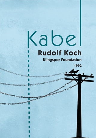
- 1. z1234567 890?/!@# $%^&* () +}| {abcdef ghijklmnop q rstuvw xy z123456 7890?/!@#$%^&*()+}|{abcdefghijklnolpqrstuvwxyz abcdefghijklmnopqrstuvwxyz1234567890?/!@#$%^&*()+}|{ abcdefgh i jk lm n opq/!@#$%^&* ()+} | {abcdefghi jklmnopqrstuvwxyz1234567890?/!@#$() ijklmnop qr stuvwx yz 123456789 0?/ ! @#$%^ &*()+ }890?/!@ #$%^&*()+ }|{ab cdefg hijklmnopqrstuvwxyz abcdefghijklmnopqrstuvwxyz1234567890?/!@#$%^&*()+} |{abcdefgh ijk lmn opqrstuvwx yzacdefg h ijklmnop qrstuvwxyz 1 23456 78 90 ?/ !@#$%*?}+( ) Kabel Rudolf Koch Klingspor Foundation 1992 l l l
- 3. Kabel Rudolf Koch Klingspor Foundation 1992
- 6. Copyright © 2013 Suwachani Uyangodage Essay copyright © 2013 Suwachani Uyangodage Library of Congress Catalog Number: x000111000 ISBN: 9-780733426-09-4 All right reserved. No part of this book may be reproduced in any form or by any electronic or mechanical means without written permission of the publisher and author except for brief quotations in reviews or critical articles. Published in 2013 by Art 430: Typography III The Art 430: Typography III class produces books related to the history of type design. Printed in the United States of America Distributed by S.U. Publishers, Baltimore, MD. Cover Image Detail, list content
- 7. Contents Rudolf Koch Kabel Typeface Challenges Technology Conclusion Bibliography Colophon 1 6 10 13 17 22 23
- 8. Figure 5 – Map of central Germany drawn by Koch
- 9. Rudolf Koch Rudolf Koch (Figure 1) the extraordinary artist was born in Nuremberg, Germany on November 20th, 1876. He was an artist, calligrapher, teacher, book designer, typographer, illustrator, and illuminator. He was a major influence on decorative art in twentieth century Germany. His contribution to modern typography can be considered as a glorification of old calligraphy style. Koch was born as the third child and the only son of Paul Koch. After his father’s death, one of his father’s friends took young Koch in as an apprentice into his manufacturing facility of metal goods in Hanau in 1892. While he was working for his father’s friend, Koch joined the Art Academy in his leisure time. After three years, Koch decided to attend the School of Applied Arts full time and he returned to Nuremberg. While he was studying at the Art school, he decided on the career of Drawing Master and went to Munich to continue his further studies at the technical college. After two terms he was refused permission to take the exam because he had gone through part of his training out of Bavaria, so he found a job as a draftsman and painter in a lithographic printing-house. He worked for a very short time at Wezel & Naumann and ended up resigning and ran about Leipzig with his portfolio of drawings he had created. Eventually he became an efficient draftsman from 1899-1902 working at the Leipzig Book Binding Company. Rudolf Koch is not only a typographic artist but also a great teacher and an author. He designed The little ABC book of Rudolf Koch (Das ABC Buchlein) in 1934 (Figure 2). He also wrote a book comprised of 493 old world symbols, monograms, and runes titled as in The book of Signs published in 1930 by Dover Publications, Inc. According to Wonker, Koch resigned from this firm and worked for himself and he married the daughter of a printer of copper engraver in 1903, and remained in Leipzig for four years designing for the book trade. The Klinspor Foundry hired Koch as a type designer at the age of 30. Calligraphy proved to be a passion for Koch (Figure 3). In 1908 he decided to start teaching a graphic arts and lettering class at the Offenbach School of Arts and Crafts. It is in this career that he produced almost three decades of exquisite work that has had an influence on type designers and letters that is still with us today. In 1910, Koch 1 Rudolf Koch Figure 1 – Rudolf Koch
- 11. produced his first typeface, “Koch Bold”. In 1918, Koch created the group of scribes who formed a workshop (Offenbach Scribemen) under Koch’s guardianship. He made his first woodcuts in 1919 (Figure 4). One of the many typeface that he designed, Kabel, stands out as being part of the Sans Serif movement of the 1920’s. The typeface Kabel has a balance between elegance and raw energy because of Koch’s extreme passion for infusing the elegance of Baroque forms. Variations of the four main styles include Zeppelin, which was crated in 1929 and is a shadow Kabel. According to Cinamon, Prisma, which created between 1928-1931 is another variation of Kabel. It is an eye catching display face using fine parallel strokes. Koch’s personal form of this Geometric Sans Serif started at the Bahaus in 1926 and was eventually designed for the Klingspar Foundry in 1927. Wonker states ”The Four Gospels were hand set in 1926 at the printing shop of the Klingspor type foundry and printed for Koch. The typeface Jessen Schrift was used for the first time with this project.1” From 1925 to 1935 Koch with the collaboration of Fritz Kredel, Berthold Wolpe, and Richard Bender designed the Map of Germany. This map consisted of towns, land features, and the coasts of arms of the different German states. Quotations from German authors were placed in important spots in the map. (Figure 5). From 1922 to 1929 Koched designed a book called Das Blumenbuch (Book of Flowers). This book was comprised with sketches of flower plants. (Figure 6) In 1932 Koch suffered from leukemia, the discomfort from the illness kept him away from his work and had to rest often. He created beautiful manuscript leaves for his friends. However, they were only seen after his death. He died two years later at the age of 58, and is buried in Frankfurt am Main. 3 Rudolf Koch Figure 6 – Drawing and printed page for Das Kleine Bluemenbuch. Figure 3 – Lord Have Mercy on Me Calligraphy by Rudolf Koch. Figure 2 – Original sketch for a page from The Little Book of ABC. Figure 4 – Koch filling a punch
- 12. a g G W e K Figure 8 – Uppercase characters are broad and lowercase characters show influence of monumental Roman capitals Figure 9 – Letter construction for Book of Signs
- 13. 5 Typeface Kabel Typeface Figure 7 –Trans-Atlantic Telephone Cable System. Kabel is typeface designed by a German designer Rudolf Koch. It was released by the Klinspore foundry in 1929. Today the typeface is licensed by the Elsner+Flake GbR foundry. Kabel font was named to honor the trans- Atlantic telephone cable completed by Bell Company in 1927 (Figure 7). According to Cinamon’s Letterer Type Designer Teacher, during the late 1920s, every major German type foundry was actively working on a new kind of sans serif design based on geometric character shapes. Ludwig and Mayer released Erbar, the Bauer foundry was developing Futura, and Berthold was busy creating Berthold Grotesque. In order to be competitive, Klingspor wanted to release a similar typeface. Ultimately they employed Rudolf Koch to design Kabel. “The modular principal, implying interchangeability, is certainly inherent in experimental typefaces such as Huszar’s capital letters for De Stijl Journal before 1921, but was applied with greated attention to legibility and the effects produced by modern automatic typesetting equipment. Other foundries followed with their own competitive version of modular sans-serifs typefaces in Germany, for instance, Rudolf Koch’s Kabel… .”2 Kabel is a geometric sans serif, similar to Futura, Erbar, and Nobel. Different influences are detected in the Kabel font. Koch was greatly familiar with the Bauhaus, a school focusing on crafts, fine arts, and design, which started in Germany from 1919 to 1933. Kabel has som similarities to Futura, also released in 1927. Forms of the Kabel characters has more influence on Expressio nism movement in Germany comparing to Modernism movement of that time. The stroke weights of Kabel are more varied than most geometric sans-serifs. The vertical strokes or terminals are cut to a near eight-degree angle. This gives the sense of not quite placed on the baseline and making for more curved, less rigid feeling than Futura. Upper case characters are broad and show the influence of roman capitals. The capital W is wide and the G has no terminal. Lowercase characters e show an influence of Carolingian script because the cross bar is on the diagonal. This is another unique characteristic of Kabel.
- 14. Ihil is exerum volupta venimus explaturit, vendi nis ulpa dit et molorec tatur? Uga. Unt. Eprem ut fugia qui nus eost, officto restrupta ditatist quibus, ommolorempor aboremp elique nam que cus magnima que parcia volleste earum eat quate molorro vitionsequam vererum entium sedicatio. Tatempos molo dolorum exero to et quis estem iducia dolor amus, volore odi dellis essum utatum em que quae mi, sam, sed moditium hillab inimincit aut ipsam nos moluptatur rescia volorpo ssimagnis est a archicient as utent, sitatec Uga. Unt. Eprem ut fugia qui nus eost, officto restrupta ditatist quibus, ommolorempor aboremp elique nam que cus magnima que parcia volleste earum eat quate molorro vitionsequam vererum entium sedicatio. Tatempos molo dolorum exero to et quis estem iducia dolor amus, volore odi dellis essum utatum represte nonecepuda volesti atiscia dolupta cus ea quis est, aliti ut viducius ea simagniscomnima gnatem que quae mi, rescia volorpo ssimagnis est utent, sitatec Uga. Unt. Eprem ut fugia qui nus eost, officto restrupta ditatist quibus, ommolorempor aboremp elique nam que cus magnima que parcia volleste earum eat quate molorro vitionsequam vererum entium sedicatio. Tatempos molo dolorum exero to et quis estem iducia dolor amus, volore odi dellis essum utatum represte nonecepuda volesti atiscia dolupta cus ea quis est, aliti ut viducius ea simagniscomnima gnatem que quae mi, rescia volorpo ssimagnis est a archicient as utent, sitatec Uga. Unt. Eprem ut fugia qui nus eost, officto restrupta ditatist quibus, ommolorempor aboremp elique nam que cus magnima que parcia volleste earum eat quate molorro vitionsequam vererum entium sedicatio. Tatempos molo dolorum exero to et quis estem iducia dolor amus, volore odi dellis essum utatum represte nonecepuda volesti atiscia dolupta cus ea quis est, aliti ut viducius ea simagniscomnima gnatem que quae mi, resci ssimagnis est autent, sitatec Uga. Unt. Eprem ut fugia qui nus eost, officto restrupta ditatist quibus, ommolorempor aboremp elique nam que cus magnima que parcia volleste earum eat quate molorro vitionsequam vererum entium sedicatio. Tatempos molo dolorum exero to et quis estem iducia dolor amus, volore odi dellis essum utatum represte nonecepuda volesti atiscia dolupta cus ea quis est, aliti ut viducius ea simagniscomnima gnatem quest a archicient as utent, sitatec Kabel Book Kabel Medium Kabel Demi Kabel Bold Kabel Ultra
- 15. 7 Typeface The lowercase a of the Kabel family is different than most of the other geometric sans-serif typefaces. The lowercase g is perhaps the most unique of the Kabel characters. Like the lowercase a it reflects a Roman style influence, but with a modern style (Figure 8). Cinamon states that “the ligature of the ch. Koch’s drawings showing the letter construction of his Kabel capitals remind us of his brilliant minutes constructions created for the Book of Signs as well as inspirations for the letter or type-designer” (Figure 9). A number of humanistic features are detected within the typeface that caused Kabel to be both functional in text and elegant in display work. . The Kabel typeface obtains the basic elements of a typical geometric sans-serif font. As their name clearly suggests, Geometric sans-serif fonts are based on geometric shapes. One consistent characteristic of this kind of font is the optically circular O in each of the font families. Kabel originally came in the five different families such as Book, Medium, Demi, Bold, and Ultra (Figure 10). Today under new licensing and copyrights, Kabel comes in Light, Book, Heavy, Black, Std Light, Std Book, Std Heavy, Std Black, Pro Light, Pro Book, Pro Heavy, and Pro Black. Kabel’s character shapes and proportion can be traced to ancient Greek letters, Venetian old style type designs, and most definitely calligraphy. The rights to the original Koch design were ultimately transferred to the Stempel type foundry. In 1975, under a special license from Stempel, ITC commissioned Victor Caruso to revive the design for phototypesetting. Caruso was charged with the task of building a well-integrated type family suitable for text composition, but without losing charm and vitality of the original design. < Figure 10 Kabel font family
- 16. 8 Challenges Figure 12 – Kabel; as used in a 1927 Gebr Klinspor Advertiesment
- 17. Challenges Figure 11 – Koch in his Werkstatt D uring First World War Koch was recruited and sent to battlefronts in Serbia and France. He discharged in 1918, and was a changed man. As a result Koch became even more deeply engaged in his work, and the post-war years were to see the beginning of his most creative and productive period. With Kabel, Koch overcame his personal resistance to the sans serif letter (Figure 11). Kabel is in the Sans Serif font classification and to be more specific the Geometric Sans Serif. In the typographic equivalent of circumcision, sans serif are stripped to the bare minimum by losing the serif. They first appeared broadly in the mid-nineteenth century with the introduction of typefaces carved from wood. The increased development of sans serif in all widths and sizes remains today, as sans serifs prove to be quite adaptable. Like its contemporary Futura it bears influence of two earlier geometric sans- serif typefaces; the 1919 Feder Schrift, drawn by Jakob Erbar, and more so his 1922 design called Erbar. Still, Kabel comes less out of the influences of German modernism, but more German expressionism. While it wasn’t the very first sans serif, Akzidenz Grotesk, represents the mechanic structure of the Neo- Grotesques, which featured nearly even widths, as opposed to the Grotesques, which contained some characteristics of pen-drawn typefaces that have slight contrast of thicks and thins. Geometric sans serifs, like Futura, and Kabel from the 1920s, represent even more logic-driven letterforms taken of any possible decoration. Humanist sans serifs were submerge in the calligraphic traits of 15h century serifs rather than the evolution of wood types. Geometric Sans Serif was a direct result in 1920’s, in the typography of the modern art movements in Europe and the Bauhaus in Germany, a serious, functional style of sans-serif emerged. These mono-line types, which were simply constructed from straight lines, the circle, and the rectangle, stormed onto the typographical scene in the late 1920s. 9 Challenges
- 18. 10 Challenges Kabel’s most noticeable characteristics of the lower-case are a backward leaning a, the angled cross-bar of the lower-case e, the open descender of the g which was a specific preference of Koch’s, and the ligature of the ch. When looking at Koch’s drawings of construction of the Kabel upper-case letterforms, you can identify his brilliant symbol constructions created for the Book of Signs. According to Cinamon, Koch wrote that he enjoyed the challenges of his first Sans Serif by saying, “I was very tempted by the exercise of using a compass and straight-edge to create a typeface since, because of my lively interest in type form, I otherwise end up with very personal solutions, and I hoped for once to be free of this. People always think I am looking for a personal style, but this is not true. I avoid it whenever I can but not with any success. And I have no succeeded here either. May be that is why this typeface has not been given the same recognition as others in Germany because it projects a character in contrast with the spirit of the current style.” 3 We must not forget the situation in Germany at that time. Life was dominated by the Treaty of Versailles, which destroyed not only the economy and democracy in Germany, but pushed aside the hope for a better future and fundamental way of living. The occupation of the Rhineland by French troops, the runaway inflation of 1922–1923, combined with harsh compensations ordered by the Treaty, ruined the country and Germany was the land for the political turbulence, which led so many people to follow extreme political leaders. Versailles was poison for the democracy of the young German Republic. Even under such political influenced circumstances Koch manage to engage in his work. Koch’s works are absolute inspirations for all the letterers and type designers even today (Figure 12). “I was very tempted by the exercise of using a compass and straight-edge to create a typeface since, because of my lively interest in type form, I otherwise end up with very personal solutions, and I hoped for once to be free of this. People always think I am looking for a personal style, but this is not true. I avoid it whenever I can but not with any success. And I have no succeeded here either. May be that is why this typeface has not been given the same recognition as others in Germany because it projects a character in contrast with the spirit of the current style.”
- 19. 11 Technology Technology G erman graphic and typographic design in the first half of the 20th century represents an extraordinarily rich and diverse aspect of the history of visual culture. During this period the world was becoming increasingly independent on a modern and commercialized system of communication in which the designer was to play a major role. An exceptional amount of attention was devoted to printed subjects, whether as designs for graphic ornament, typefaces and logos in books and advertisements, or magazines, posters, signage, and exhibitions. In the printing world, German foundries, printers, and publishers could claim a prominent place. In the broad structure of historical development there has been a tendency to regard print culture as a consistently internationalized process, fulfilled in the late 20th century by techniques and styles of type design becoming consistent. As well as holding a prominent position for its foundries and printers, Germany could claim the discovery of lithography (Figure 13), which was the major medium for the color reproduction of works of art and typographic designs in popular prints and later for posters. With most necessary print technologies in place to provide effective communications, air transport became essential for rapid exchange and distribution between advertising and photographic agencies across the continents in the 20s. Paper manufacture, too, was highly developed in Germany. In these years there was an increasing varieties of paper for prestigious publications and packaging for the display of branded goods in many areas for retail. Accompanying these developments were those in the pigment and ink industries. In the last years of the 20th century, technical experimentation in fixing new chemical dyes made unusual choices of ink colors available to typographers, printers, and graphic designers. The first half of 20th century is the end of the Modern era, the moment when revived typefaces were flooding the typography mainstream. But it was also the time when a completely different font design was booming, called sans serif (which is French for “without serifs”). It wasn’t an absolutely new idea at that time, since first sans serif faces had appeared in the beginning of 19th century, but never before this seemingly outlying and exotic trend claimed so much importance as in 1920s and 30s. Cinamon states that “Rudolf Koch created the majority of his wonderful typefaces and unparalleled manuscripts using a broad quill pen.”4 One most influential type design of that era, the Kabel font, Figure 13 – Koch punch cutting
- 20. 12 Technology displayed the core of the Klingspor ideology; strictly geometric outline, lacking any decorative elements and showing influence of historical shapes of letters. The negative spaces of the letters are more open and broader than most geometric sans-serifs, and stroke weights are more limited. The resulting blend of geometric consistency and exaggerated roundness may be debatable, but it was at least something quite new, and therefore impressive, at that time. Even though we’re much more accustomed to the look of Kabel, the inborn extremism of the font still shows through. Around that period in Germany, the Nuremberg Rally was an annual rally of the Nazi Party held in Nuremberg (Figure 14). From 1927 on, they ran exclusively in Nuremberg. The primary aspect of the Nuremberg Rallies was to strengthen the personality adoration of Adolf Hitler, portraying Hitler as Germany’s savior, chosen by providence. The gathered masses listened to the Fuhrer’s speeches, swore loyalty and marched before him. The visitors of the rallies by their own free will were subordinate to the discipline and order in which they should be reborn as new people. Although this was what was happening in Nuremberg during the time the font was made, the font actually reflects the art movement during the time known as German Expressionism. This refers to a number of related creative movements beginning in Germany before the First World War that reached a peak in Berlin, during the 1920s. These developments in Germany were part of a larger Expressionist movement in north and central European culture. Kabel also has been believed to be made to compete with the existing font, Futura, both being Geometric Sans Serif and released during the same year. Figure 14 – Nuremberg Rallies
- 21. 13 Technology Conclusion Rudolf Koch introduced Kabel using a woodcutting style that was quite typical of Koch. Koch had moved away from the blackletter tradition to reach beyond and to create slightly modern and unique typefaces. His typefaces were never extremely decorates like Victorian typefaces, even though he worked with some script like typefaces. Rudolf Koch was similar to typeface designer counterparts from the United States, his popularity started in a foundry type for hand setting. However, in Germany, it took his designs longer than it would have taken an American type designer’s designs to become adapted for mechanical composition. Blackletter style was also being challenged within Germany during the era by Bauhaus modernists who promoted geometric sans serif typefaces. He was driven by a “religious sense of purpose” to combine his talent as a calligrapher and punch-cutter, which should have produced perfect typefaces. However, because calligraphy is too freeform, and punch cutting it too rough, perfect types were not achieved. Instead, he approached a different technique by creating Kabel. “Kabel”, as a name reveals much of its purpose to mirror the technology, progress and inventions occurring at the time, where other decorative typefaces were failing. Its geometric form and multi linear compositions are seems to be highly expressive to the trans Atlantic telephone cable. Koch’s fascination with classical type and practices of calligraphy are illustrated in the typeface. The balance between modern influence and antiquated elements are noticeable characteristics of Koch’s typefaces. Rizman states that Kabel taking characteristic from Roman font was not used by any other competing typefaces at that time5. Distinguishing it from the rest of the faces was a reason for Kabel to being sold at that time . Every artist inspired by somewhere, weather it is a certain style or a concept. Koch instead of being completely modern he left a hint of humanism behind, because modernism embraces the future and reject the tradition. The rejection of tradition is a method that artists took in this period. Koch manages to get away with this method because it is risky. He knew combining modern and tradition would work better, and it did. The popularity of geometric sans serif typefaces has not worn off quite yet. Kabel successfully changed type design. One of the most popular typefaces till this day, Helvetica, also inspired by the grotesque face Azkidenz Grotesque, has many similarities that stem back to geometric type. A year after Kabel designed, Eric Gill designed Gill Sans, which must be directly influenced by Kabel typeface. Plenty Figure 16 – NBC News station logo
- 22. Ihil is exerum volupta venimus explaturit, vendi nis ulpa dit et molorec tatur? Uga. Unt. Eprem ut fugia qui nus eost, officto restrupta ditatist quibus, ommolorempor aboremp elique nam que cus magnima que parcia volleste earum eat quate molorro vitionseq ut viducius ea simagniscomnima gnatem que quae mi, sam, sed moditium hillab inimincit aut ipsam nos moluptatur rescia volorpo ssimagnis est a archicient as utent, sitatec Uga. Unt. Eprem ut fugia qui nus eost, officto restrupta ditatist quibus, ommolorempor aboremp elique nam que cus magnima que parcia volleste earum eat quate molorro vitionsequam vererum entium sedicatio. Tatempos molo dolorum exero to et quis estem iducia dolor amus, volore odi dellis essum utatum represte nonecepuda volesti atiscia dolupta cus ea quis est, aliti ut viducius ea est utent, sitatec Uga. Unt. Eprem ut fugia qui nus eost, officto restrupta ditatist quibus, ommolorempor aboremp elique nam que cus magnima que parcia volleste earum eat quate molorro vitionsequam vererum entium sedicatio. Tatempos molo dolorum exero to et quis estem iducia dolor amus, volore odi dellis essum utatum represte nona archicient as utent, sitatec Uga. Unt. Eprem ut fugia qui nus eost, officto restrupta ditatist quibus, ommolorempor aboremp elique nam que cus magnima que parcia volleste earum eat quate molorro vitionsequam vererum entium sedicatio. Tatempos molo dolorum exero to et quis estem iducia dolor ucius ea simagniscomnima gnatem que quae mi, rescia volorpo ssimagnis est autent, sitatec Uga. Unt. Eprem ut fugia qui nus eost, officto restrupta ditatist quibus, ommolorempor aboremp elique nam que cus magnima que parcia volleste earum eat quate molorro vitionsequam vererum entium sedicatio. Tatempos molo dolorum exero to et quis estem iducia dolor amus, volore odi dellis essum utatum represte nonecepuda volesti atiscia dolupta cus ea quis chicient as utent, sitatec ITC Kabel Book 10/13 Futura Medium 10/13 Gill Sans Regular 10/13 Century Gothic Regular 10/13 Helvetica Regular 10/13
- 23. 15 Conclusion of typefaces can be traced back to one of these genera defining typefaces, most notably the rebirth of the grotesque. Without the emergence of the geometric sans serifs type design, it would be completely different. The rebirth of the grotesque genera is directly spawned by geometric type. Designers began to bring back a style with new concepts learned from modernist typefaces. These neo-grotesque fonts took the thicker line weights and less contrast of geometric type, and mixed it with the old design. Typefaces like Helvetica, Univers, and Avant Garde are all fine examples of the hard work Koch put into his Typefaces. The popularity of geometric sans serif typefaces has not worn off quite yet. Kabel successfully changed type design. One of the most popular typefaces till this day, Helvetica, also inspired by the grotesque face Azkidenz Grotesque, has many similarities that stem back to geometric type. A year after Kabel designed, Eric Gill designed Gill Sans, which must be directly influenced by Kabel typeface. Plenty of typefaces can be traced back to one of these genera defining typefaces, most notably the rebirth of the grotesque. Without the emergence of the geometric sans serifs type design, it would be completely different. The rebirth of the grotesque genera is directly spawned by geometric type. Designers began to bring back a style with new concepts learned from modernist typefaces. These neo-grotesque fonts took the thicker line weights and less contrast of geometric type, and mixed it with the old design. Typefaces like Helvetica, Univers, and Avant Garde are all fine examples of the hard work Koch put into his Typefaces. There was a revival of the typeface by Victor Caruso’s in 1975, licensed by D temple AG, for the International Typeface Corporation (ITC) follows the formulary ITC approach of a dramatically increased x-height accompanied by multiple weights from Book to Ultra. Kabel is a link between the early sans serif typefaces and their contemporaries. Even though effective in creating a modern and geometric typeface at that era, Kabel has been as successful as its peers of Futura and Gill Sans in resonating with contemporary society (Figure 15). There has been some prominent usage of the Kabel font in today’s society. For an example, Figure 17 – Monopoly board game < Figure 15 Kabel font family
- 24. 16 Conclusion NBC’s logo typefaces are in Kabel font (Figure 16). Kabel is used in the logo of the Toronto Maple Leafs hockey club. A shadowed bold weight version of Kabel was used for many years on MTV as the typeface in the opening/closing Lower third credits of music videos. The same heavy weight Kabel was also used for NBC Sports’ on screen graphics from 1985—1988. A lower-case Kabel font is used as the typeface in the logo and other promotional materials for supermarket chain Piggly Wiggly. The typeface was used in the titling of the Sofia Coppola film Lost in Translation .The typeface was used in its heavy weight. The typeface was used in the titling of the Joey (TV Series). The typeface was used in its book weight. The typeface was also used extensively in the credits and on-screen lyrics for the movie, Yellow Submarine. Kabel is used in the popular board game Monopoly (Figure 17). The K Desktop Environment uses Kabel in its logo and related artwork. A modified use of Kabel is used for the L’eggs Pantyhose logo. Kabel is used for the cast aluminum lettering on most buildings around Cornell University’s Ithaca, New York campus. ITC Kabel Medium is the font used for the Georgia Times logo. Kabel is used in the opening and closing credits of Saved By The Bell. Rudolf Koch ones expressed, “Letter making in every form gives me the purest and greatest pleasure and on numberless occasions in my life it has been to me what a song to a singer, painting to a painter, a shout to a the joyous, and a sigh to the afflicted- to me it is the happiest and the most perfect expression of my life.”6 Even after Rudolf Koch’s death, his creations and inventions lasted till today. He is not only a good typographer he is also a great teacher, patron, and human being. — — — — — — — — — — — — — — —
- 26. Aynsley, Jeremy. (2000). Graphic Design in Germany 1890-1945;. Themes & Hudson Ltd. London 13 (1): 21 Cinamon, Gerald. (2000). Rudolf Koch :. New Castle, Del. :: Oak Knoll Press ;. Greensfelder, Tom. 1996. Meditation. Letter arts review 13 (1): 12. Kredel, Fritz. 1996. Rudolf Koch, as I remember him. Letter arts review 13 (1): 11. Meggs. 1983. A History of Graphic Design. London Allen Lane 13 (1): 215 Rizman, D. 2003. History of Modern Design; UK: Laurence King Publishing 13 (1): 192 Wronker, Lili. 1996. Rudolf Kock: life, craft, and art. Letter arts review 13 (1): 2-6. . 1996. {Rudolf Koch: 4 article special section}. Letter arts review 13 (1): 2-6. 1 Lili Wonker, Letter Arts Review (1996) p. 5 2 David Raizman, History of Modern Design (London: Raizman, 2003) p. 192 3 Rudolf Koch in a letter dated 30 July 1931, quoted in J. Rodenberg, (1940) p. 109 4 Gerald Cinamon, Rudolf Koch Letterer Type Designer Teacher (2000) p. 123 5 Rizman, History of, p. 192 6 Cinamon, Rudolf Koch, p. 176-177
- 28. Book Design, Cover Design and Typography by Suwachani Uyangodage Produced using a Macbook Pro and InDesign 6.0. Typfaces used are Kabel Light, Book, Demi, Medium, Bold Ultra, ITC Kabel Book Printed by Minute Printers, Gaithersburg, MD Printed on 50lb Book/Text/Offset; 80lb Cover Art 430, Typography III Margaret Re, Instructor
- 30. 9780733426094 ISBN 978-0-7334-2609-4 abcdefghijklmnopqrstuvwxyz1234567890?/!@#$%^&*()+}|{abcdefghijklmnopqrstuvwxyz1234567890?/!@#$%^&*()+}|{abcdefghijklmnopqrstuvwxyz12345678 abcdefghijklmnopqrstuvwxyz1234567890?/!@#$%^&*()+}|{abcdefghijklmnopqrstuvwxyz1234567890?/!@#$%^&*()+}|{abcdefghijk90?/!@#$%^&*()+}| { abcde fghijklmnopq abcdefghijklmnopqrstuvwxyz1234567890?/!@#$%^&*()+}|{abcdefghijklmnopqrstumnopqrstuvwxyz1234567890?/!@#$%^&*()+}|{abcdefg abcdefghijklmnopqrstuvwxyz1234567890?/!@#$%^&*()+}|{abcdefghijklmvwxyz1234567890?/!@#$%^&*()+}|{abcdefghi