

Recommended
More Related Content
What's hot
What's hot (20)
Similar to Itten 7 contrasts
Similar to Itten 7 contrasts (20)
Recently uploaded
Recently uploaded (20)
Itten 7 contrasts
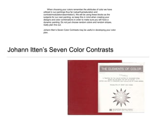
- 1. Johann Itten’s Seven Color Contrasts When choosing your colors remember the attributes of color we have utilized in our paintings thus far (value/hue/saturation and contrast/modulation/assimilation). We will be using these blocks as the subjects for our next painting, so keep this in mind when creating your designs and color combinations in order to make sure you will have a dynamic painting. Do not just choose random colors and random stripes, really plan this out. Johann Itten’s Seven Color Contrasts may be useful in developing your color plan.
- 2. In the mid 1900s, Johannes Itten developed a new kind of color wheel that changed the way color was seen, influencing artists and designers right up to the present moment. The Bauhaus in Weimar, Germany was home to many artists whose influence is still felt today in the worlds of art and design. It was there that Itten developed his book, "The Art of Color,"which was the definitive compilation of what was taught in the Basic Course which Itten oversaw, at the Bauhaus. At the Bauhaus, Germany's unequalled artists' mecca in the early part of the Twentieth Century, Itten taught his students about color harmony, which to him meant more than simply appreciating colors shown together with similar chromas, or different colors in the same shades. "Harmony implies balance, symmetry of forces," he writes, and goes on to say that such a balance would be expressed when the colors used together would produce not another color (such as when mixing yellow and blue to produce green) but when the colors mixed together produced gray. This was because "medium gray matches the required equilibrium condition of our sense of sight," he writes. But Itten also discovered that color harmony is quite individual, and that an individual will, if given free reign and a little knowledge, find his or her own "subjective colors."
- 8. Results from the fact that for any given color the eye simultaneously requires the complementary color and generates it spontaneously if it is not already present. The simultaneously generated complement occurs as a sensation in the eye of the beholder, and is not objectively present. Simultaneous Contrast
- 12. Robert Swain, Untitled, 10 x 31, 2014, 10 ft x 31 ft, Acrylic on Birch Panels. “Over the decades, Swain has organized 4,896 hues into a vast system. To make a painting, he selects a range of colors and deploys them in gradated sequences. Following a row of color-blocks across the surface we watch as, step by subtle step, a cool color becomes warm. A low-keyed color becomes bright. Degrees of saturation--color intensity--modulate. Interweaving these shifts in hue, brightness, and saturation, Swain brings the surface to life.” Carter Ratcliff Some additional ideas about selecting color.
- 13. Seeing the Attributes of Color The goal of our first assignment (utilizing found hues) is to begin to identify color, and understanding how to organize hues into groupings. Understanding how to see value, hue, and saturation (a.k.a. chroma) is the key to utilizing color to create space and, inevitably, to carry content. In your own practice, these basic principles may be utilized to help the viewer focus on a particular part of your subject, to heighten narrative, amplify mood, and to create subtlety or obscurity.
- 14. Tetrads A second reading on color is included in the ‘Readings’ folder in Module #1. If you need additional ideas for grouping color check out Chapter 3 of Basic Concepts: Organizing the Experience of Color.