Download as PDF, PPTX

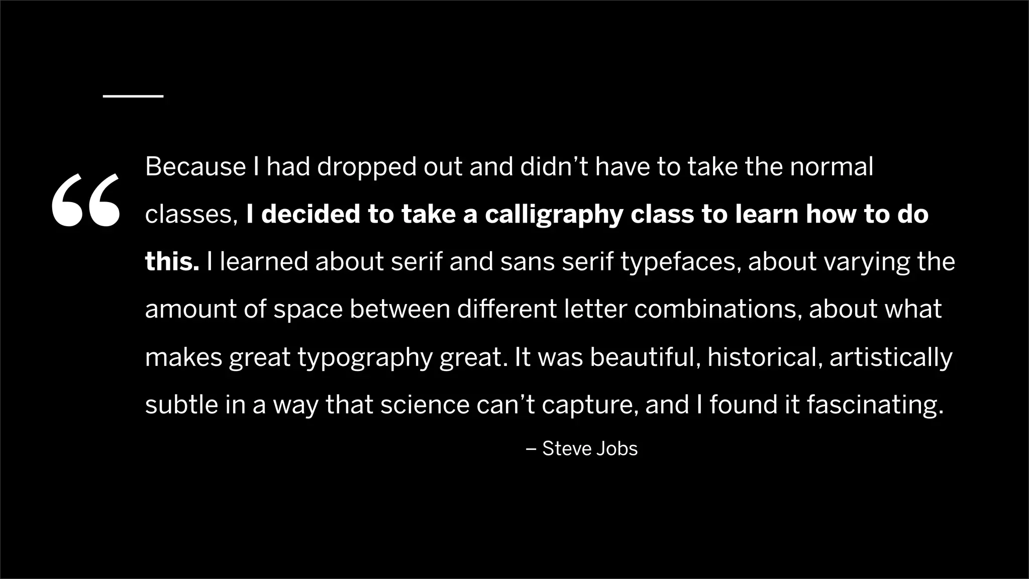

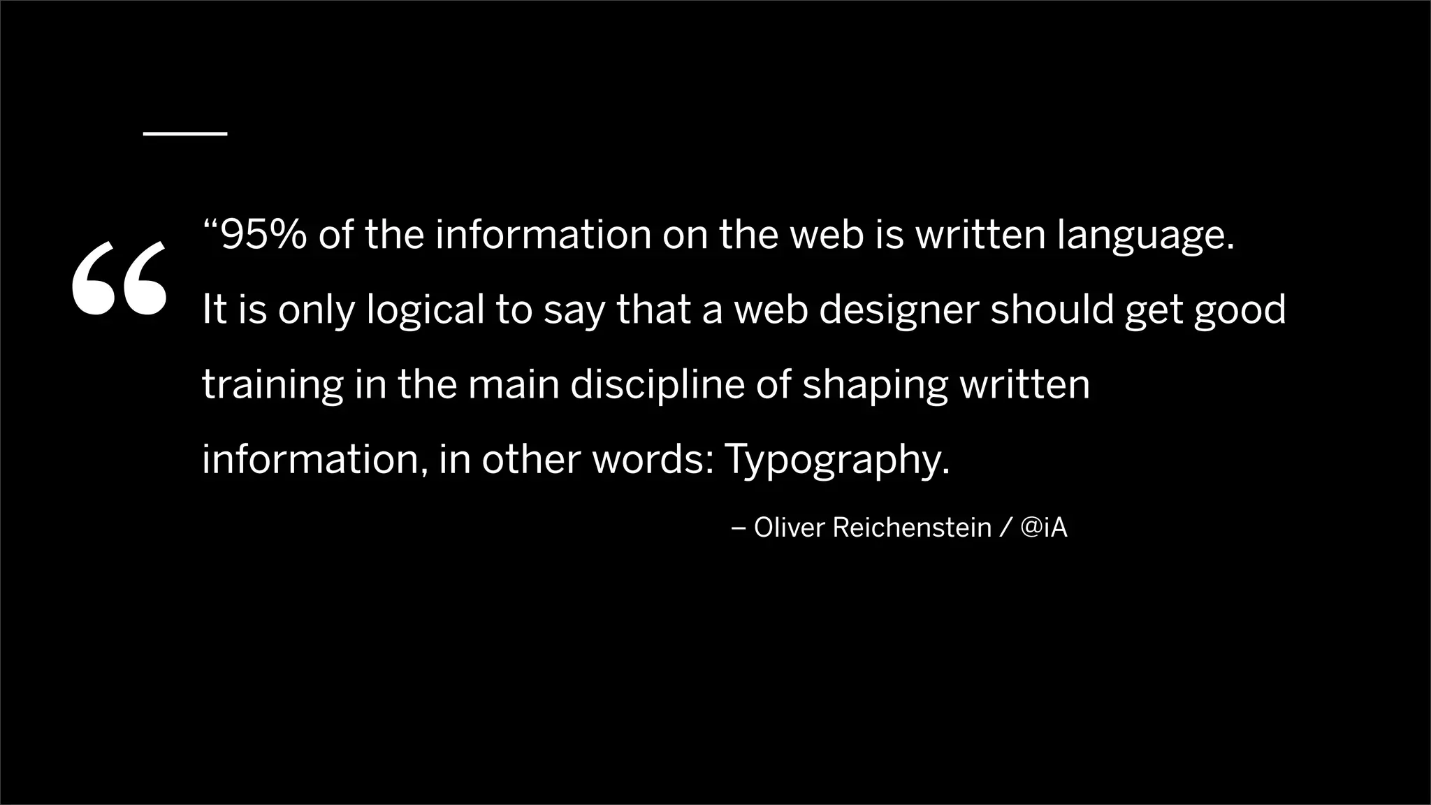


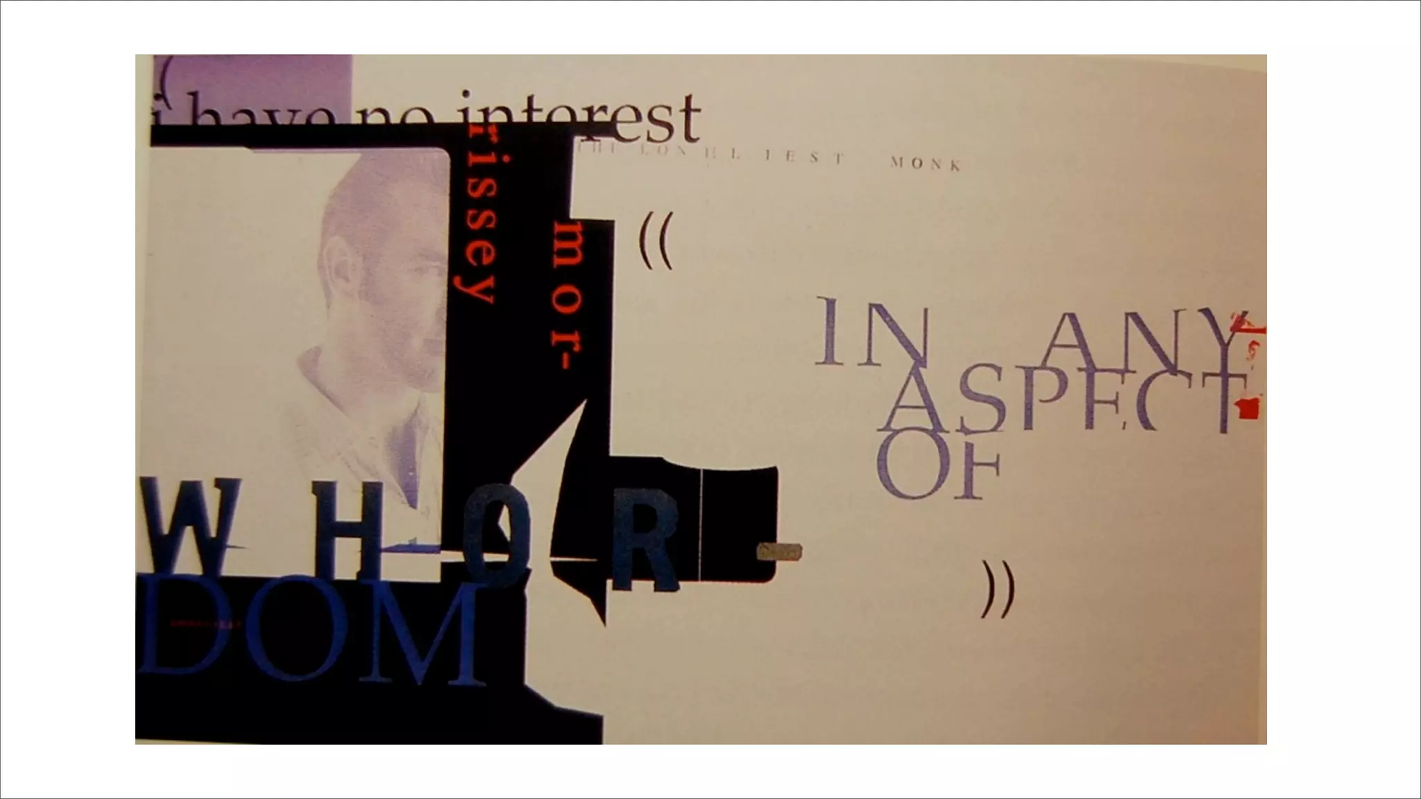


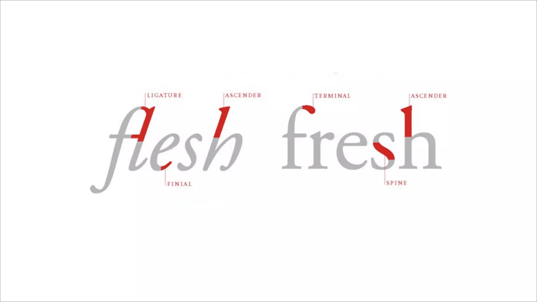
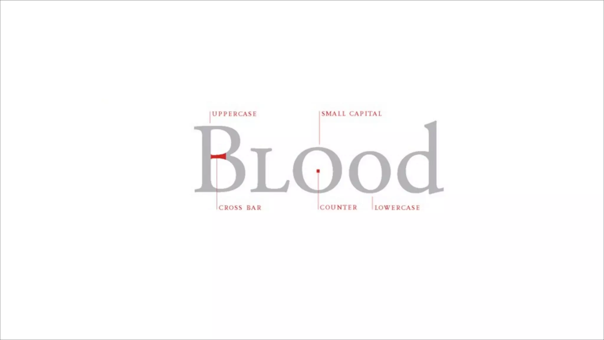
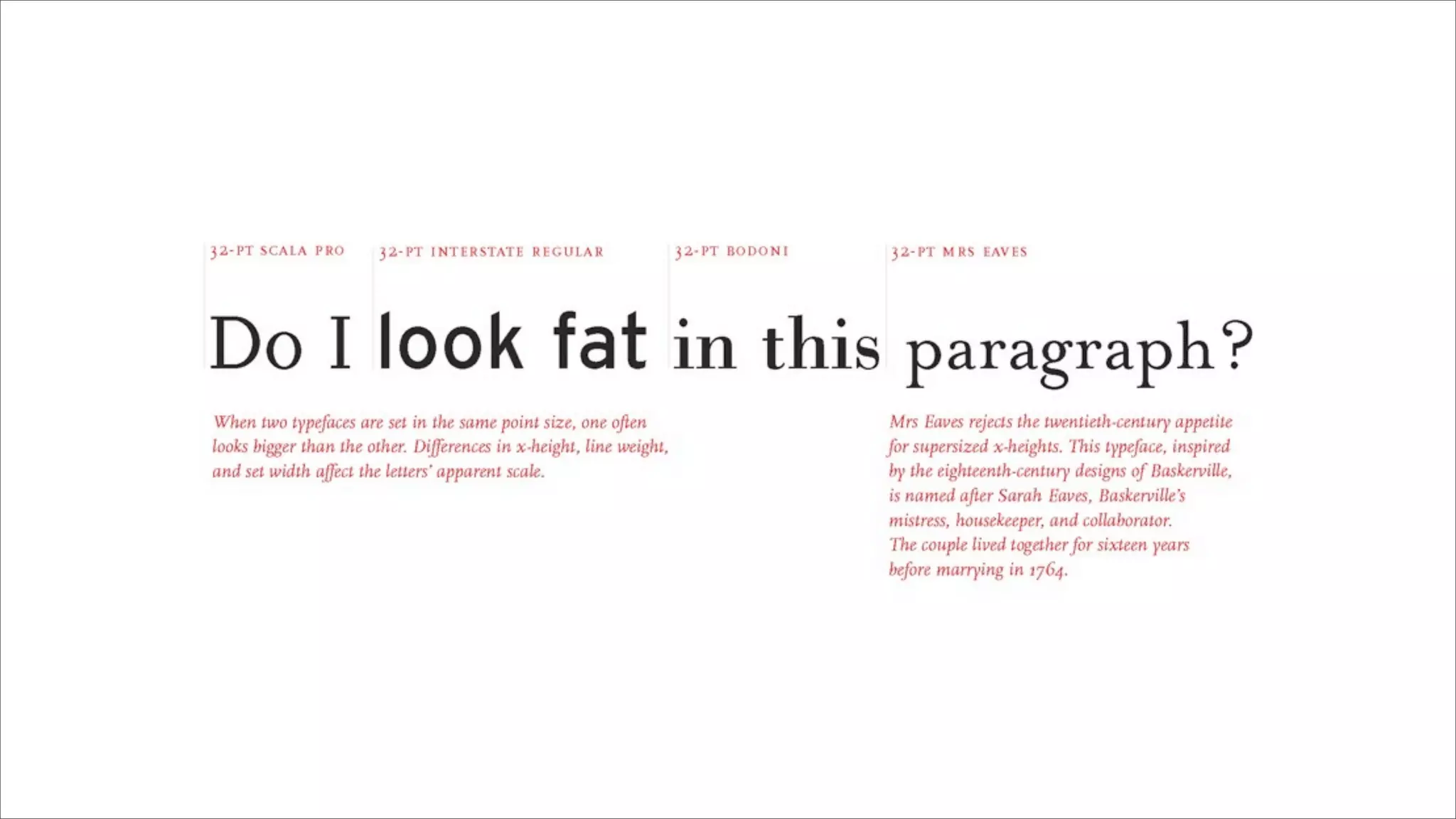


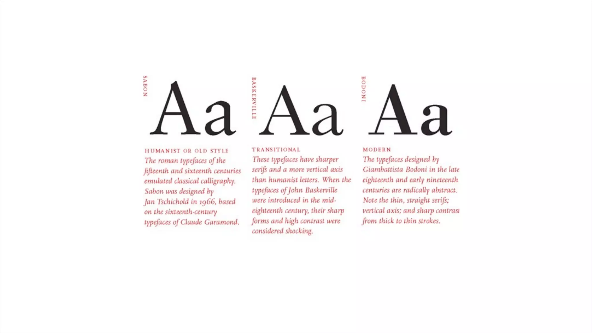
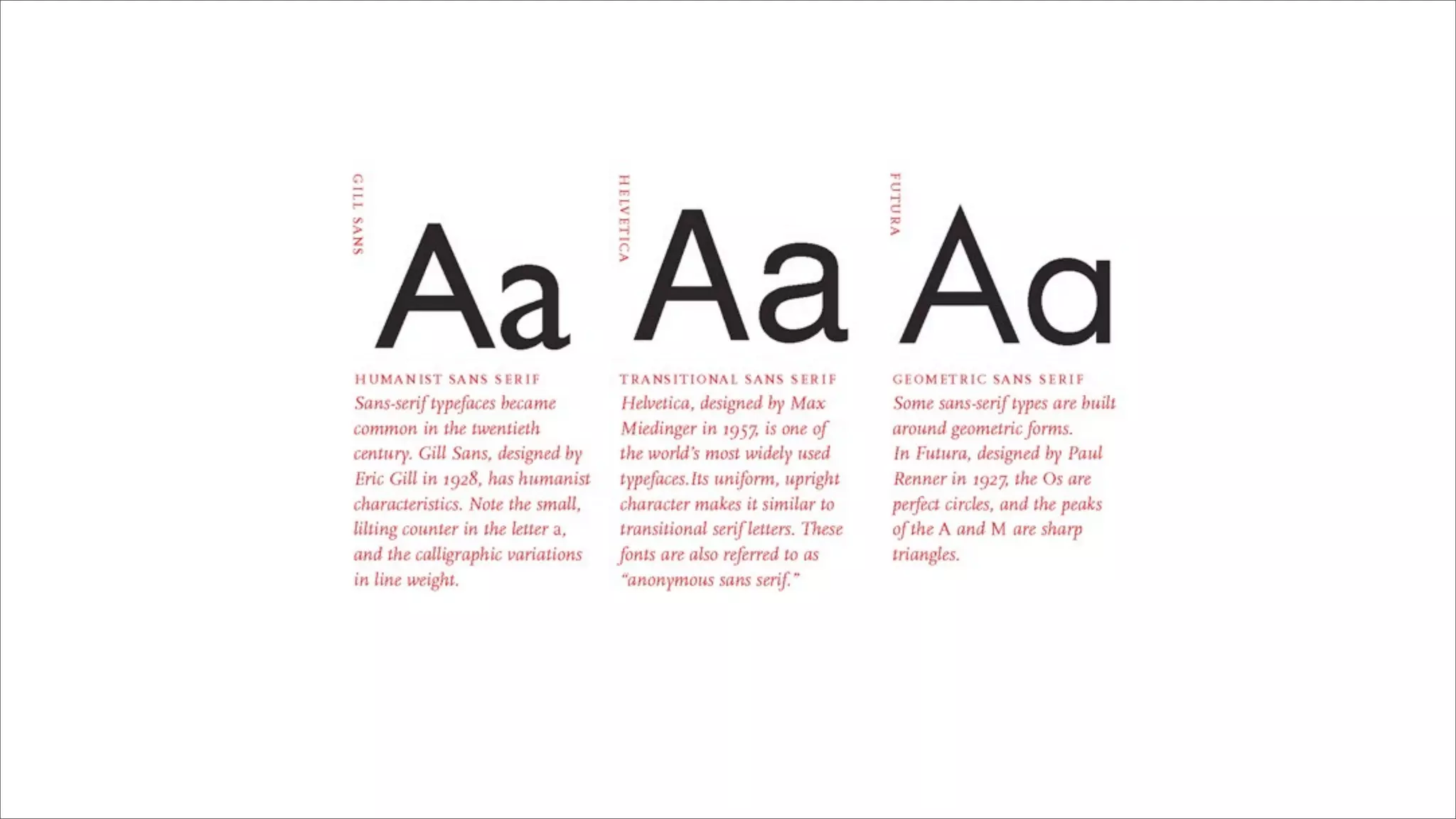
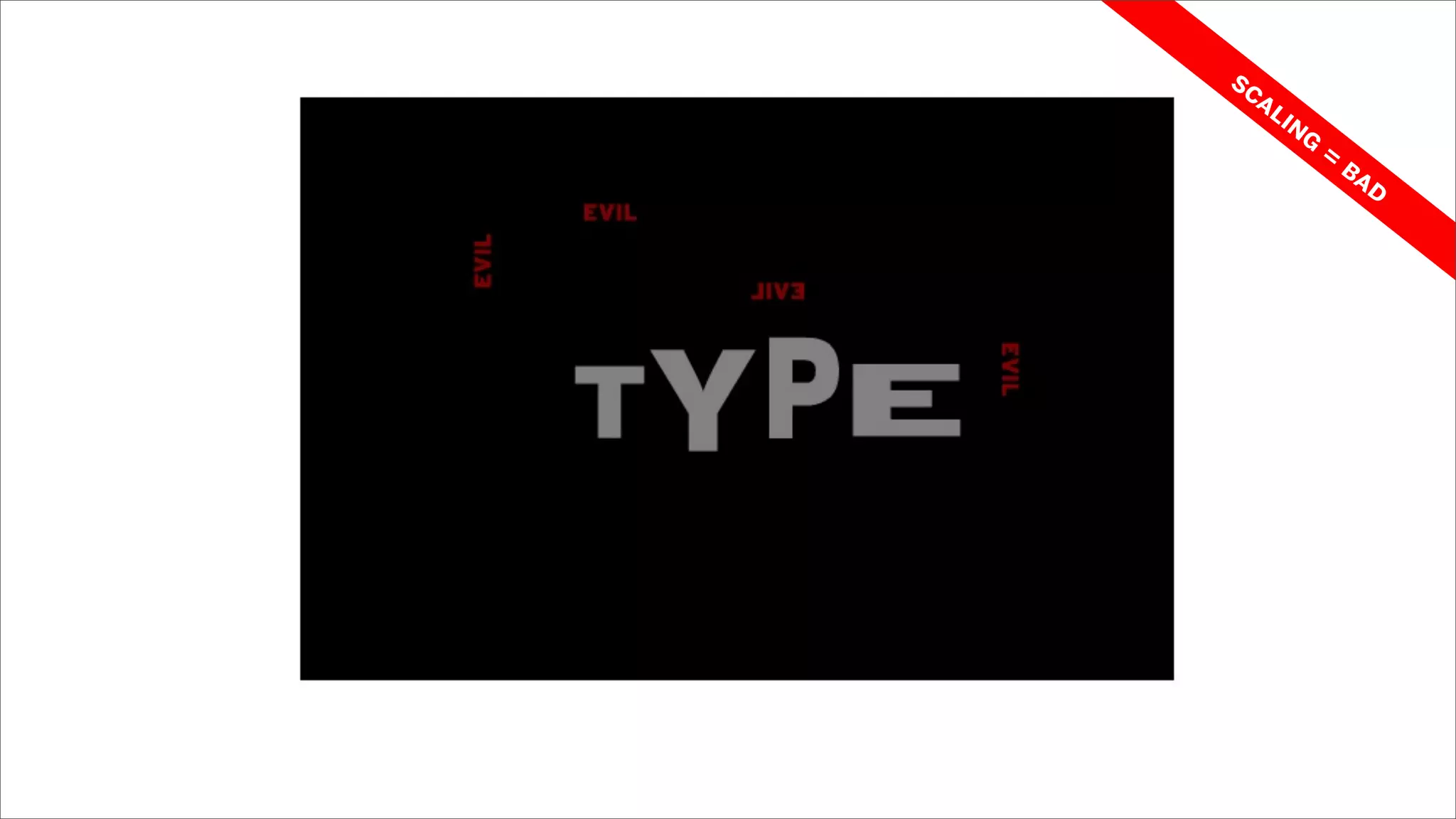


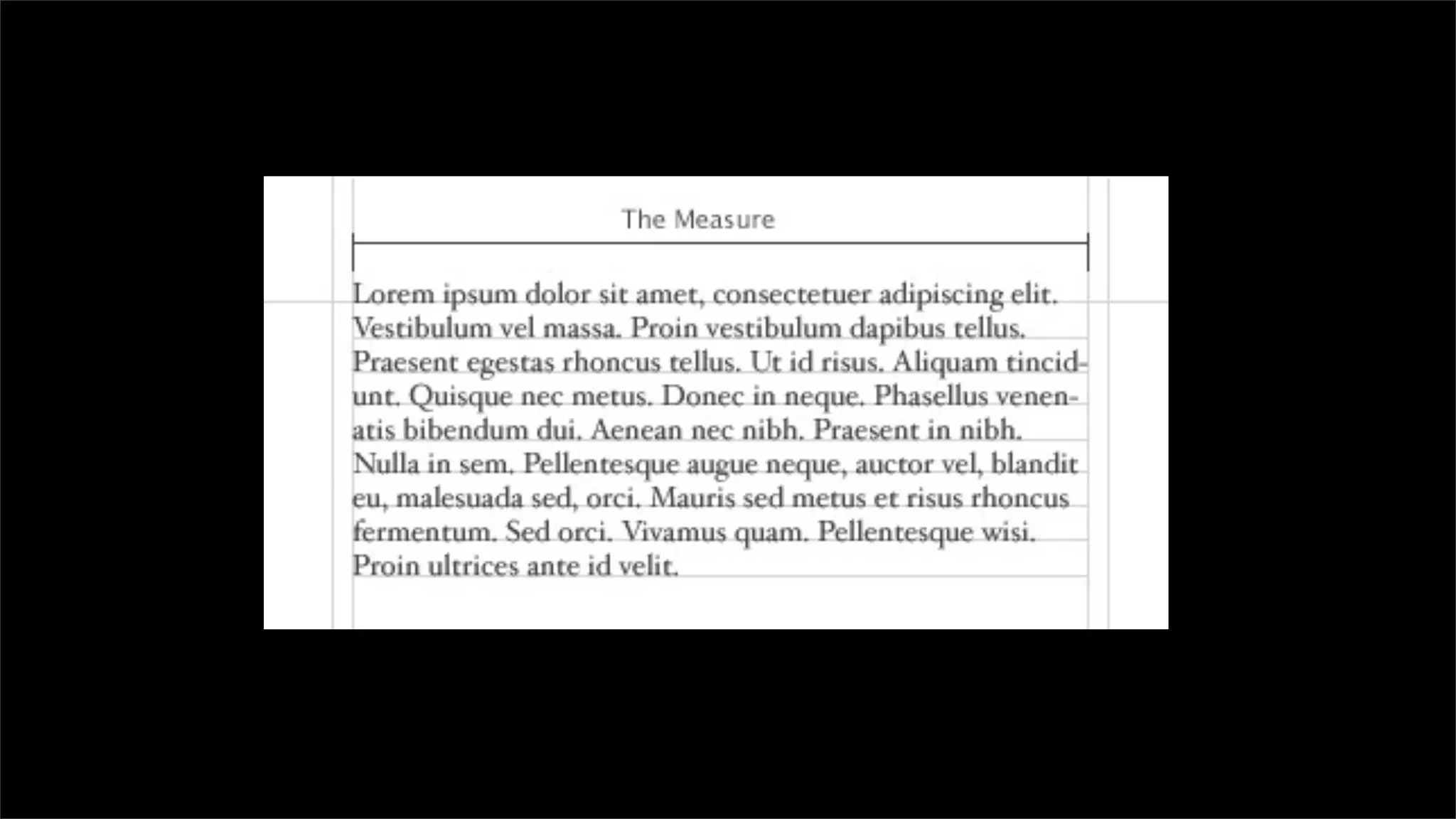

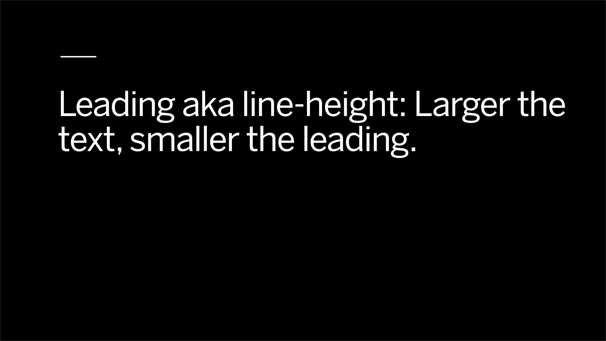


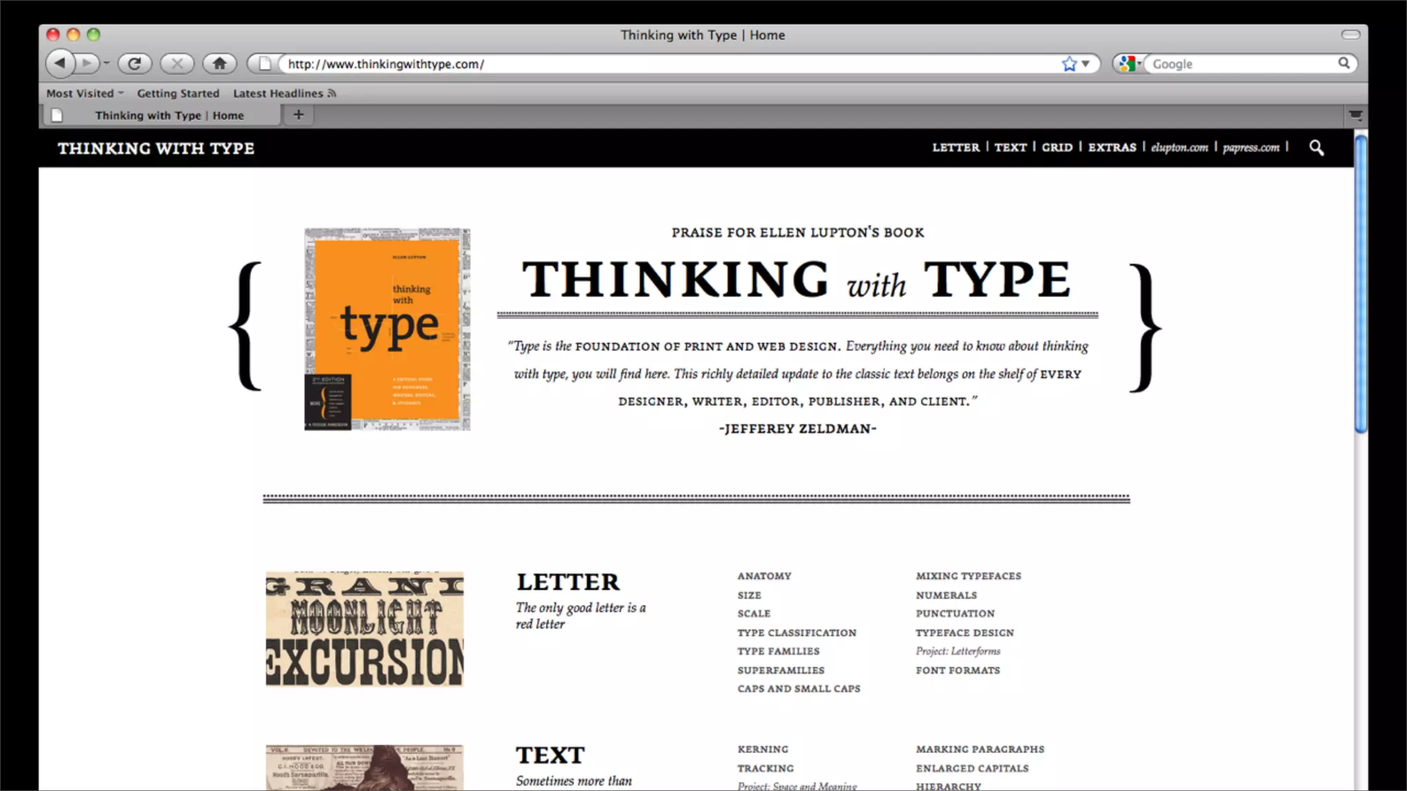

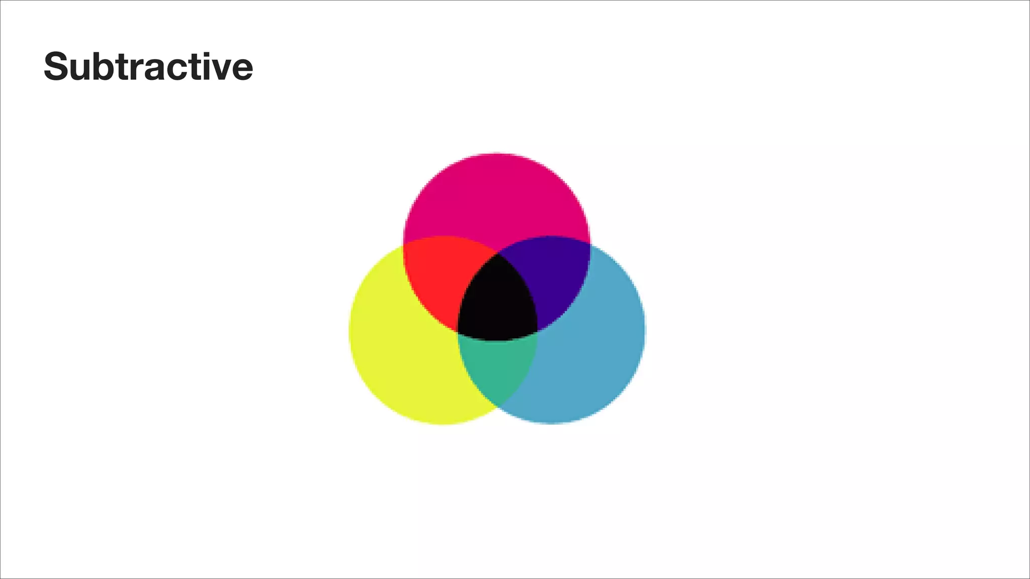
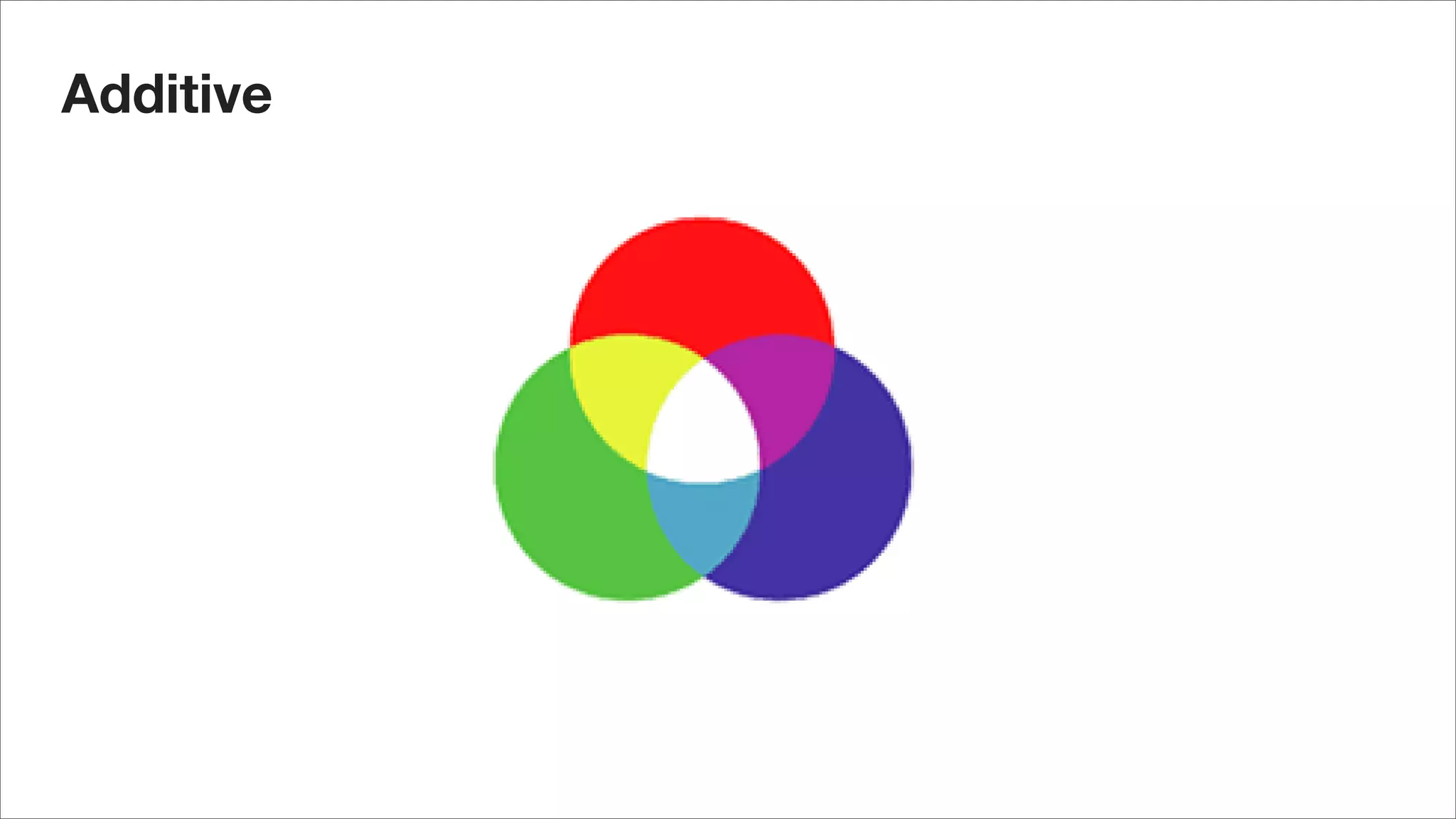

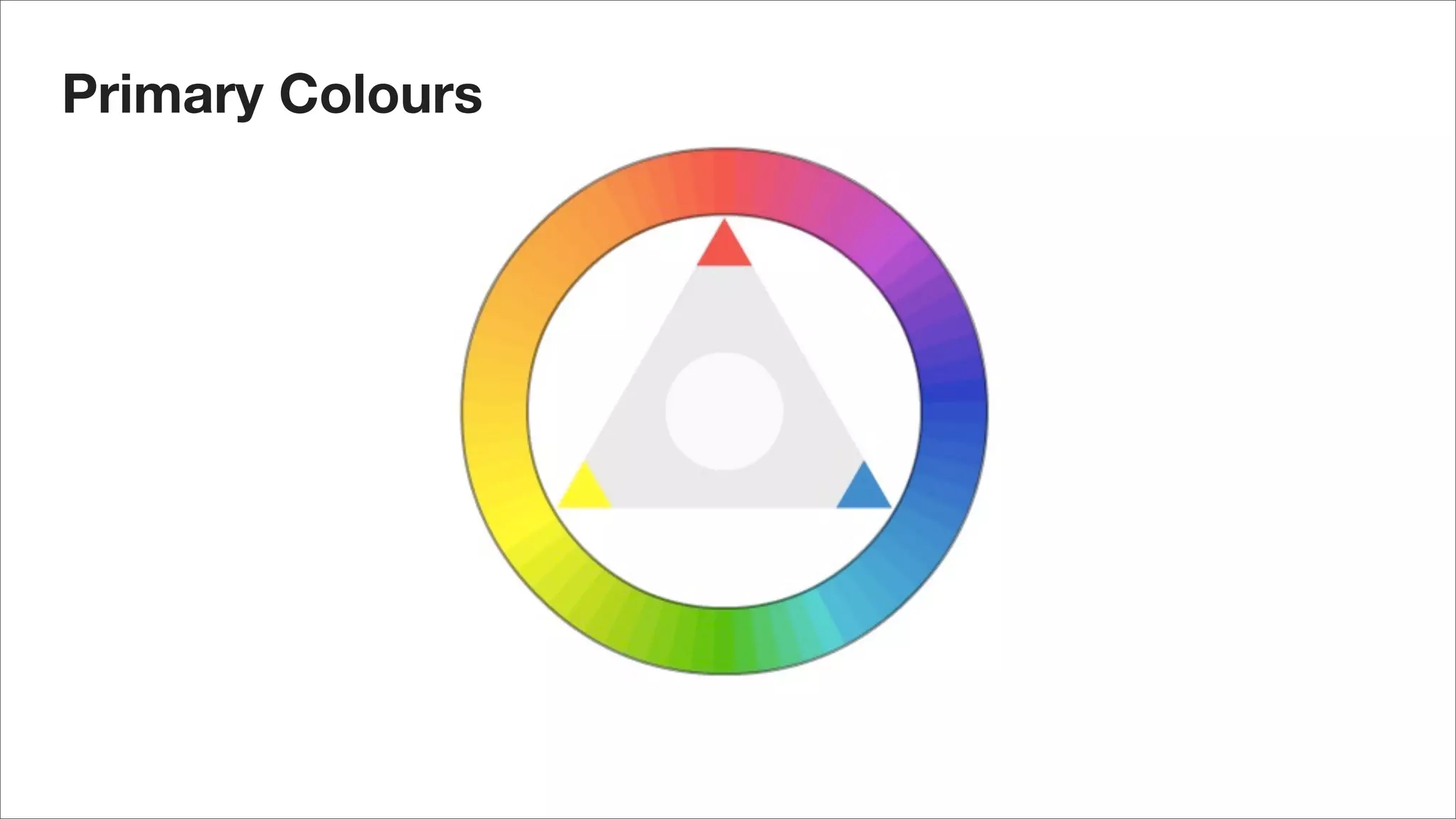

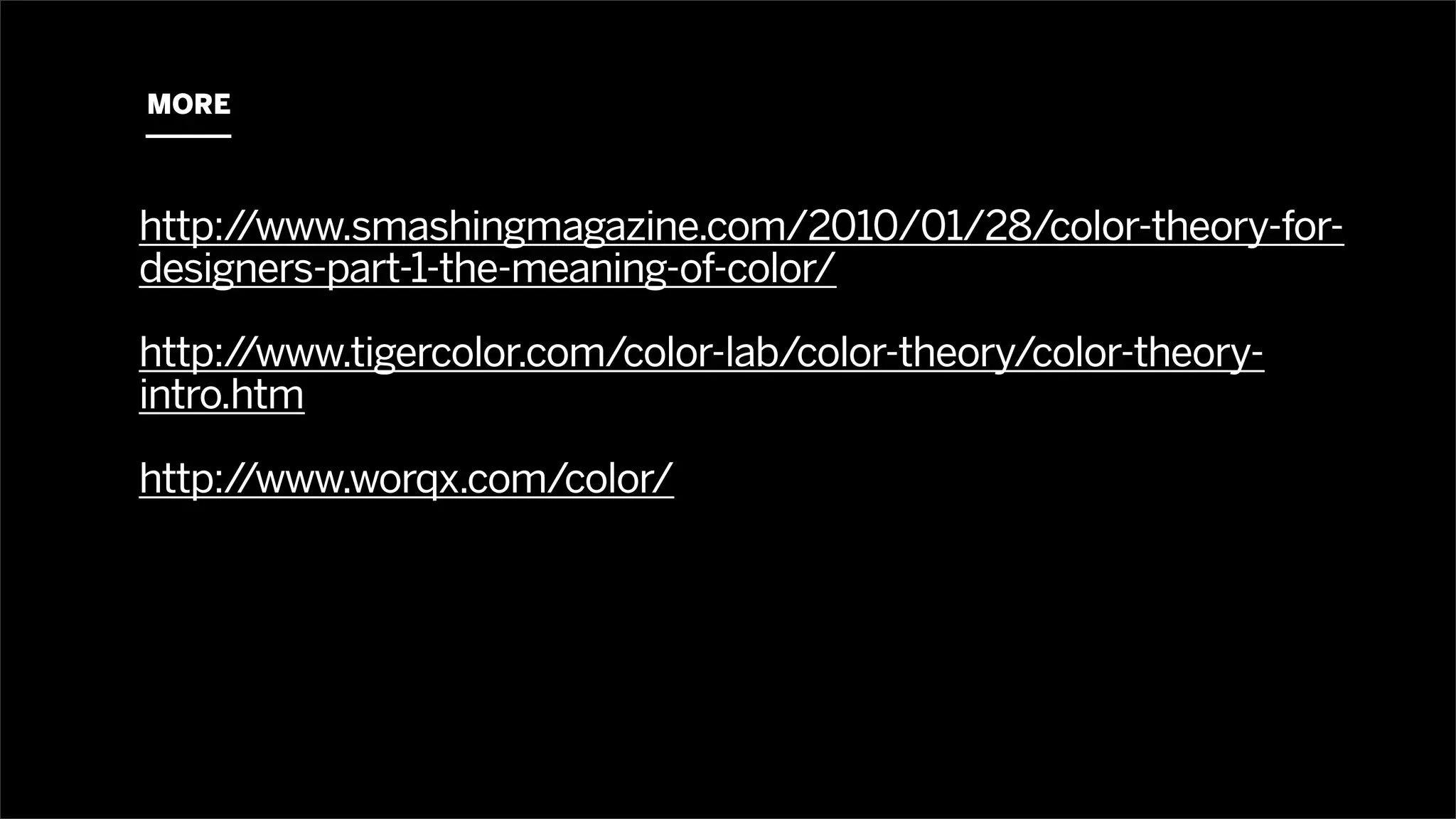
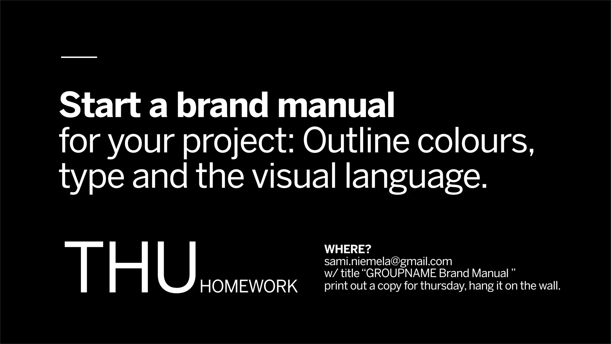


The document outlines a strategy and experience design course at Aalto University, focusing on graphic interaction design, typography, and color theory. It emphasizes the importance of typography in web design and provides resources for further exploration. Students are assigned to develop a brand manual for their projects, detailing colors, typography, and visual language.


![[BROCHURE] Italy Tour Project | @SlideON](https://cdn.slidesharecdn.com/ss_thumbnails/brochure8-251215152319-2805af68-thumbnail.jpg?width=640&height=640&fit=bounds)


