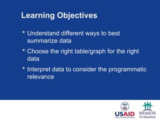
Learning Objectives
Understanddifferent ways to best
summarize data
Choose the right table/graph for the right
data
Interpret data to consider the programmatic
relevance
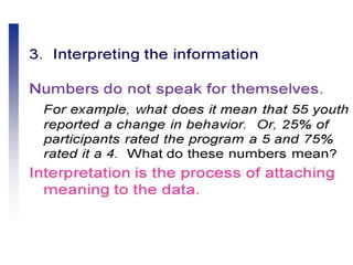
3.
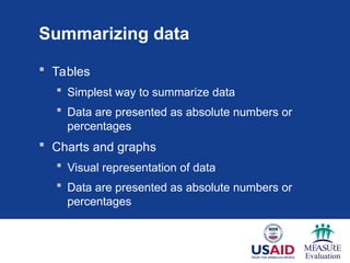
Summarizing data
Tables
Simplest way to summarize data
Data are presented as absolute numbers or
percentages
Charts and graphs
Visual representation of data
Data are presented as absolute numbers or
percentages
4.
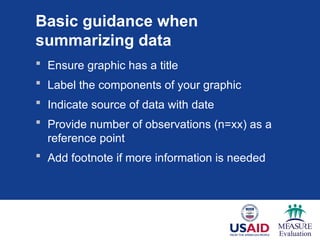
Basic guidance when
summarizingdata
Ensure graphic has a title
Label the components of your graphic
Indicate source of data with date
Provide number of observations (n=xx) as a
reference point
Add footnote if more information is needed
Tables: Relative frequency
numberof values within an interval
total number of values in the table
Year # births (n) Relative frequency (%)
1900–1909 35 27
1910–1919 46 34
1920–1929 51 39
Total 132 100.0
x 100
7.
Tables
Year Number ofbirths
(n)
Relative frequency
(%)
1900–1909 35 27
1910–1919 46 34
1920–1929 51 39
Total 132 100.0
Percentage of births by decade between 1900 and 1929
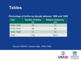
Source: KENYA. Census data, 1900–1929.
8.
Charts and graphs
Charts and graphs are used to portray:
Trends, relationships, and comparisons
The most informative are simple and self-
explanatory
9.
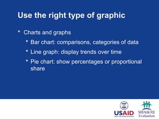
Use the righttype of graphic
Charts and graphs
Bar chart: comparisons, categories of data
Line graph: display trends over time
Pie chart: show percentages or proportional
share
Percentage of newenrollees tested for HIV at each
site, by quarter
0
1
2
3
4
5
6
Quarter 1 Quarter 2 Quarter 3 Quarter 4
%
o
f
new
enrollees
tested
for
HIV
Months
Site 1
Site 2
Site 3
Q1 Jan–Mar Q2 Apr–June Q3 July–Sept Q4 Oct–Dec
Data Source: Program records, AIDS Relief, January 2009 – December 2009.rce:
Quarterly Country Summary: Nigeria, 2008
12.
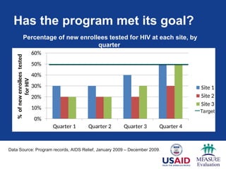
Has the programmet its goal?
0%
10%
20%
30%
40%
50%
60%
Quarter 1 Quarter 2 Quarter 3 Quarter 4
%
of
new
enrollees
tested
for
HIV
Site 1
Site 2
Site 3
Percentage of new enrollees tested for HIV at each site, by
quarter
Data Source: Program records, AIDS Relief, January 2009 – December 2009..
quarterly Country Summary: Nigeria, 2008
Target
13.
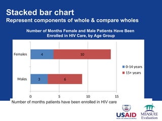
Stacked bar chart
Representcomponents of whole & compare wholes
3
4
6
10
0 5 10 15
Males
Females
0-14 years
15+ years
Number of months patients have been enrolled in HIV care
Number of Months Female and Male Patients Have Been
Enrolled in HIV Care, by Age Group
Data source: AIDSRelief program records January 2009 - 20011
14.
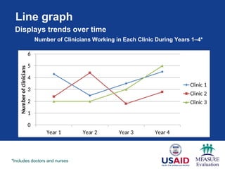
Line graph
0
1
2
3
4
5
6
Year 1Year 2 Year 3 Year 4
Number
of
clinicians
Clinic 1
Clinic 2
Clinic 3
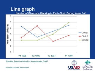
Number of Clinicians Working in Each Clinic During Years 1–4*
*Includes doctors and nurses
Displays trends over time
15.
Line graph
0
1
2
3
4
5
6
Year1 Year2Year3 Year4
Number
of
clinicians
Clinic1
Clinic2
Clinic3
Number of Clinicians Working in Each Clinic During Years 1-4*
*Includes doctors and nurses
Y1 1995 Y2 1996 Y3 1997 Y4 1998
Zambia Service Provision Assessment, 2007.
16.
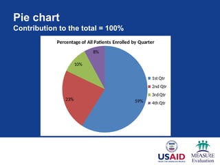
Pie chart
Contribution tothe total = 100%
59%
23%
10%
8%
Percentage of All Patients Enrolled by Quarter
1st Qtr
2nd Qtr
3rd Qtr
4th Qtr
N=150
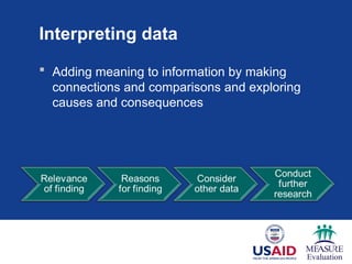
Interpreting data
Addingmeaning to information by making
connections and comparisons and exploring
causes and consequences
20.
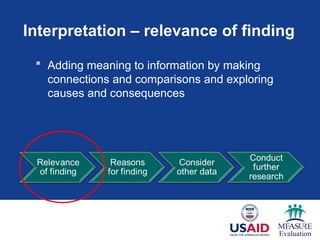
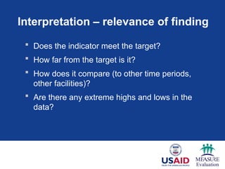
Interpretation – relevanceof finding
Adding meaning to information by making
connections and comparisons and exploring
causes and consequences
21.
Interpretation – relevanceof finding
Does the indicator meet the target?
How far from the target is it?
How does it compare (to other time periods,
other facilities)?
Are there any extreme highs and lows in the
data?
22.
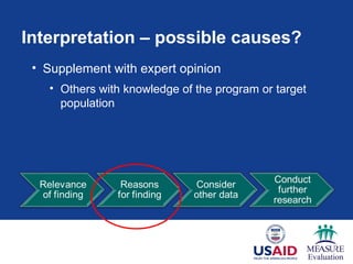
Interpretation – possiblecauses?
• Supplement with expert opinion
• Others with knowledge of the program or target
population
23.
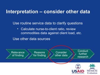
Interpretation – considerother data
Use routine service data to clarify questions
• Calculate nurse-to-client ratio, review
commodities data against client load, etc.
Use other data sources
24.
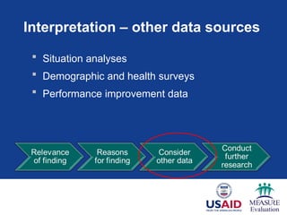
Interpretation – otherdata sources
Situation analyses
Demographic and health surveys
Performance improvement data
25.
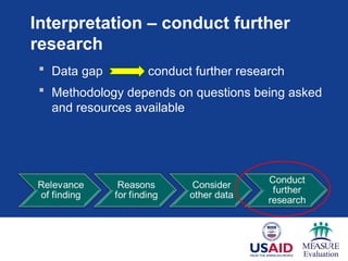
Interpretation – conductfurther
research
Data gap conduct further research
Methodology depends on questions being asked
and resources available
26.
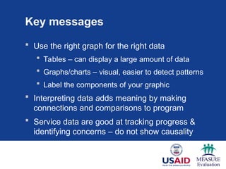
Key messages
Usethe right graph for the right data
Tables – can display a large amount of data
Graphs/charts – visual, easier to detect patterns
Label the components of your graphic
Interpreting data adds meaning by making
connections and comparisons to program
Service data are good at tracking progress &
identifying concerns – do not show causality
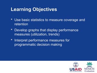
Learning Objectives
Usebasic statistics to measure coverage and
retention
Develop graphs that display performance
measures (utilization, trends)
Interpret performance measures for
programmatic decision making
29.
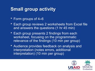
Small group activity
Form groups of 4–6
Each group reviews 2 worksheets from Excel file
and answers the questions (1 hr 45 min)
Each group presents 2 findings from each
worksheet, focusing on the programmatic
relevance of the findings (10 min per group)
Audience provides feedback on analysis and
interpretation (notes errors, additional
interpretation) (10 min per group)
30.
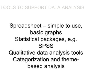
Spreadsheet – simpleto use,
basic graphs
Statistical packages, e.g.
SPSS
Qualitative data analysis tools
Categorization and theme-
based analysis
TOOLS TO SUPPORT DATA ANALYSIS
•Spreadsheet – simple to use, basic graphs
•Statistical packages, e.g. SPSS
•Qualitative data analysis tools
•Categorization and theme-based analysis, e.g. N6
31.
DATA SUMMARY
• Thedata analysis that can be done
depends on the data gathering that was
done
32.
• Qualitative andquantitative data may be
gathered from any of the three main data
gathering approaches
• Percentages and averages are commonly
used in Interaction Design
• Mean, median and mode are different
kinds of ‘average’ and can have very
different answers for the same set of data
33.
• Grounded Theory,Distributed Cognition
and Activity Theory are theoretical
frameworks to support data analysis
• Presentation of the findings should not
overstate the evidence
#3 The two main ways of summarizing data are by using tables and charts or graphs.
A table is the simplest way of summarizing a set of observations. A table has rows and columns containing data, which can be in the form of absolute numbers or percentages, or both.
Charts and graphs are visual representations of numerical data and, if well designed, will convey the general patterns of the data.
#4 To make your graphics as self-explanatory as possible, there are several things to always include:
Every table or graph should have a title or heading
The x- and y-axes of a graph should be labeled – include value labels, such as a percentage sign; include a legend
Always cite the source of your data and put the date of data were collection or publication
Provide the sample size or the number of people to which the graph is referring (N)
Include a footnote if the graphic isn’t self-explanatory
These points will pre-empt questions and explain the data. In the next several slides, we’ll see examples of these points.
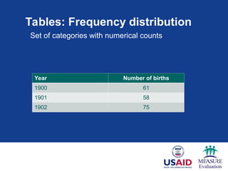
#5 Let’s start with tables. Most tables show a frequency distribution, which is a set of categories with numerical counts. Here, you see the year as the category and the number of births as the numerical count.
Answer – Title
Answer – Data source
#6
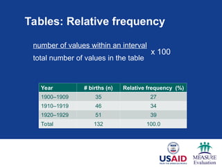
Another common way to summarize data is with relative frequency – which is the percentage of the total number of observations that appear in that interval.
It is computed by dividing the number of values within an interval by the total number of values in the table, then multiplying by 100 to get the percentage.
In this table, you see the proportion of the total number of births between 1990 and 1929 (132) by 10-year intervals.
The calculation for the first relative frequency is: 35/132 = 0.265 x 100 = 26.5 (approx 27%).
#7
To interpret this table, we should look at the relative frequencies. What do they tell us?
We can see data across the three decades and what percentage of births occurred in each one. The largest percentage of children were born between 1920 and 1929, compared to the other two decades.
We can interpret the data further by calculating the average or the mean number of births across 30 years. This will give us a summary of the data.
#8 Although they are easier to read than tables, charts provide less detail. The loss of detail may be replaced by a better understanding of the data.
#9 We’re going to review the most commonly used charts and graphs in Excel/PowerPoint. Later, we’ll have you use data to create your own graphics, which may go beyond those presented here.
Bar charts are used to compare data across categories.
Line graphs are used to display trends over time.
Pie charts show percentages or the contribution of each value to a total.
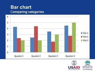
#10 In this bar chart, we’re comparing the categories of data, which are the different sites. You see a comparison between sites by quarters and between quarters over time.
What should be added to this chart to provide the reader with more information?
On the next slide, we see how the graph has been improved and is now self-explanatory.
#11 You see we’ve added a title. By adding a title, you know the population to which the graph is referring.
We’ve added labels for each axis. Labeling the y-axis (vertical) was critical because now we know that the values are percentages rather than absolute numbers.
We’ve added the source of the data – this let’s us know from where the data are derived and where to find additional information about this topic.
And we’ve clarified the quarters with months.
#12
Now let’s interpret this chart.
You will note that we have added the target for the number of new enrollees tested for HIV.
The target is to test 50% of new enrollees at each site in each quarter.
We see that sites 1 & 3 have met their targets, but that site 2 has not; it is at 30% new enrollees tested. What percentage of the target has this site met?
NOTE to facilitator: Wait for a participant response before answering.
30/50 = 0.6 or 60%
#13 A stacked bar chart is often used to represent components of a whole and compare the wholes (or multiple values).
Here, you see the number of months female and male patients have been enrolled in HIV care, by age group. By looking within each bar, you see the age breakdown by gender, and by looking at both bars together, you can compare the number of months enrolled for both males and females.
#14 A line graph should be used to display trends over time. While bar charts also are useful for showing time trends, line graphs are particularly useful when there are many data points. In this case, we have four data points for each clinic.
Here, you see the number of clinicians working in each clinic during years 1–4. You will note the asterisk in the title. This asterisk clarifies the definition of clinical to include both doctors and nurses.
What can be added to this graph to make it more clear?
.
#15 Data source is added and the actual years are defined.
#16 A pie chart displays the contribution of each value to the total. In pie charts, the values always add up to 100.
In this case, we used the chart to show the contribution of patients enrolled each quarter to the total enrollment for the year. For example, the first quarter contributed the largest percentage (59%) of enrolled patients.
#17 Once we have transformed data into information by summarizing them with tables, graphs, or narrative, we need to interpret the data. That is, we need to consider the relevance of the findings to our program – the potential reasons for the findings – and possible next steps.
In this process, we move from the ‘what’ is happening in our programs to the ‘why’ it is happening.
#19 Data interpretation is the process of making sense of the information. It allows us to ask: What does this information tell me about the program?
Here, you see a flow chart of the steps involved in interpreting data …
NOTE to facilitator: Read the steps outlined in the diagram.
#20 We start by wanting to know the relevance of our findings. Seeking the relevance of a finding is to:
#21 When interpreting data and seeking the relevance of our findings, we may ask these questions:
Asking these questions will help you to put the data in the context of your program.
#22 When seeking potential reasons for the finding, we often will need additional information that will put our findings into the context of the program.
Supplementing the findings with expert opinion is a good way to do this. For example, talk to others with knowledge of the program or target population, who have in-depth knowledge about the subject matter, and get their opinions about possible causes.
For example, if your data show that you have not met your targets, you may want to know if:
the community is aware of the service? To answer this, you could talk to community leaders or other providers to get their opinions.
Sometimes ad hoc conversations with experts are insufficient. To get a more accurate explanation of your findings, you often will have to consider other data resources.
#23 Let’s go back to the finding of ‘the program has not met its annual target’. Can we understand why this is happening by looking at other program indicators?
You may want to calculate the nurse-to-client ratio to determine if the facility is sufficiently staffed to meet the client load.
You also may want to review commodity data with client load to determine if there are shortages of commodities.
While it is important to consider other indicators in your analysis, remember – descriptive statistics do not show causality. In these cases, look at other data sources.
#25 Once you review additional data, it may become apparent that these data are not sufficient to explain the reasons for your findings – that a data gap exists. In these instances, it may be necessary to conduct further research.
The types of research designs that are applied will depend on the questions that need to be answered, and of course will be tempered by the feasibility and expense involved with obtaining the new data.
#27 In this small group work session, you will have the opportunity to practice analysis, presentation, and interpretation.
#29 Assign two worksheets per group. Participants should spend 1 hour and 45 minutes answering the questions on the worksheets. Remind participants after 50 minutes that they should begin working on their second worksheet to ensure that they have adequate time to address both worksheets.
After 1 hour 45 minutes, ask participants to present their results. Each group will be given about 10 minutes for its presentation. Then spend 10 minutes discussing the presentation with the larger group. The plenary (or facilitator) should point out errors or inaccuracies and provide feedback on how to better analyze, interpret, or present the information.


![[DSC Europe 25] Predrag Maletic - Scaling AI in Banking – Our Strategic Journ...](https://cdn.slidesharecdn.com/ss_thumbnails/qu2onv0aruwlvqtygmxx-predrag-maletic-scaling-ai-in-banking-260123083019-6cf1da1d-thumbnail.jpg?width=640&height=640&fit=bounds)


![[DSC Europe 25] Josip Saban - Career building for data professionals.pptx](https://cdn.slidesharecdn.com/ss_thumbnails/zroflcttkm1vmli0txea-josip-saban-career-building-for-data-professionals-260123083019-587cdb8c-thumbnail.jpg?width=640&height=640&fit=bounds)


![[DSC Europe 25] Milos Belcevic - Product Professional's Journey to Full-Stack...](https://cdn.slidesharecdn.com/ss_thumbnails/1zovd6fgsycdg4wvgvls-milos-belcevic-product-professionals-journey-to-full-stack-product-developer-260123083019-d993120d-thumbnail.jpg?width=640&height=640&fit=bounds)