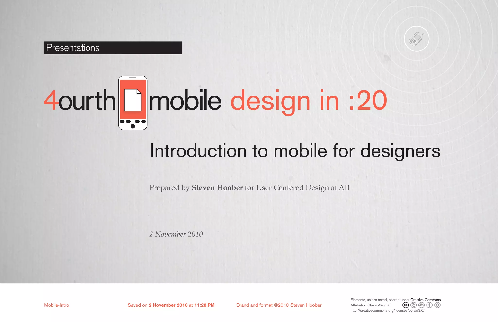
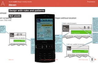
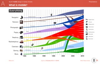
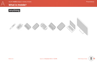
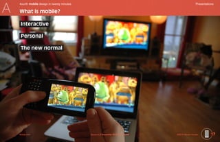
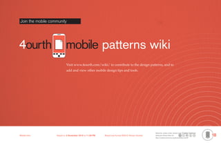
The document provides an introduction to mobile design for designers. It discusses key considerations for whether to build a mobile website or app, including user needs, marketability, content requirements, and costs. It also lists 11 things web designers should know before designing for mobile, such as using mobile analytics, understanding user contexts, and designing based on rules rather than pixels. The document explains that mobile is defined by being interactive, personal, and the new normal way technology is accessed. It encourages joining an online mobile design patterns community.
A chart to help museums plan mobile tours. The chart provides tips to consider when producing content, a list of considerations to keep in mind when thinking about what mobile platform the tour will be delivered on, considerations for whether the museum will provide the device or whether the visitor will, and marketing, sales and distribution considerations.
Insights on interface and interaction design for multitouch interfaces. A free workshop I did on the C-mine event in Genk, Belgium on 21-09-2010 especially for interface designers.
This white paper slide deck presents the increasing problem if icon organization, management and access of touchscreen mobile devices, and presents a system for solving the problem.
Size isn’t everything: Why the iPad isn’t just bigger; it’s a whole new UX, a...Liquid Reality
Exploring how the iPad shifts the mobile user experience paradigm, what this means to the iPhone, and how mobile applications can and will have to shift with it in order to become or remain successful.
Although they share an OS, the interactions offered by the iPad and it’s smaller siblings are very different. We will explore what these differences are, how they effect interaction, and why they demand distinct solutions that embrace and exploit the unique challenges, variations and opportunities between the two in order to deliver enjoyable, satisfying and successful user experiences.
Mobile web vs. native apps: It's not about technology, it's about psychologyiQcontent
Cold logic makes a hard case for opting for mobile web apps over native ones. If you can build it in HTML, CSS, and javascript, then do, right? Except for the pesky little detail called the real world, where marketers demand apps, boardrooms pay for apps, and even worse, users seem to prefer them. Or do they?
In this talk, Brian will try to reframe the web vs native vs hybrid debate into a conversation about what your customers really need, and what they’ll actually use. The technology you choose for your mobile approach is of strategic importance, but you need to be thinking about much more than just technology.
These slides (and comments) accompanied my talk to the 2011 Faculty Seminar at the Academy of Television Arts and Sciences on 11/10/11. The talk is structured around ten questions
Presentation by Allen Wirfs-Brock
Agile Portugal 2011, June 23, 2011
www.wirfs-brock.com/allen
@awbjs
One dimension of software agility is the ability to adapt to changing development technologies and infrastructure. Long-lived software systems may have to be adapted to several major technology changes over the course of their active use. Today, many project are increasing focused on web based applications that use web browsers as their primarily user interface. How durable is this application style going to be? Is the browser likely to continue to expand its primacy? Can we expect the basic structure of our web facing applications to remain fairly stable for the foreseeable future or do we need to be preparing to make drastic changes? If the browser is a transitional technology, what will replace it? In this talk I’ll explore these and related issues about what is likely to happen with web develop technologies over the next few years.
With more than 1.5 million developers worldwide, Appcelerator's ecosystem is a key part of its developers' success. Nolan Wright, Appcelerator's CTO, will discuss how ISVs like PayPal and Box.net are adding great fuel to the Titanium development fire with new capabilities and resources for mobile developers.
Nolan Wright, Co-founder and CTO, leads engineering and product management at Appcelerator.
This slide deck presents the concept of "richness+simplicity" as the holy grail of user interface design for mobile devices, and examines what "richness" and "simplicity" mean in that context.
Presented 12 December 2013 at MoDevEast13
We are finally starting to think about how touchscreen devices really work, and design proper sized targets, think about touch as different from mouse selection, and to create common gesture libraries.
But despite this we still forget the user. Fingers and thumbs take up space, and cover the screen. Corners of screens have different accuracy than the center. It's time to re-evaluate what we think we know.
Steven will review the current state of research on how people actually interact with mobile devices, present some new alternative ideas on how we can design to avoid errors and take advantage of this knowledge, and review work you bring so we can all come up with ways to improve real world sites and apps today.
Avoiding the Heuristic Solution: Creating Inspiring Mobile Design with UX Pri...Steven Hoober
* This is the version with my notes below the text. Only use it if you want to see descriptions. Else, another is under a similar name, as projected *
Steven’s forthcoming book Mobile Design Patterns (with Eric Berkman) will serve as a point of departure for a conversation on the topic of using the techniques of collaboration, team and workshop activities, and iterative design to develop inspired, delightful designs that can differentiate your product in the market, while still meeting proven design principles.
Presented 10 June 2011 at Float Mobile Learning Symposium, Bradley University, Peoria, Illinois.
Speaker notes were carefully crafted, but generally bear little relationship to what I said. While they communicate the basic point, they are in no way a transcript of my comments in person.
Presented at Float Mobile eLearning Symposium, at Chicago TechWeek, on 25 July 2012.
Buzzwords and trends in design, development and process hold much weight in our industries, and foster much arguing and staking out of opposite positions. But more of these are in fundamental agreement than is generally acknowledged, and merging approaches, much like collaborating with a varied team, can yield the most useful results.Steven will discuss the underlying principles of responsive & fluid design, progressive enhancement, adaptive design, device detection, multi-platform design, cross-platform development processes, and mobile device capabilities. He will present one possible unifying theory of how you can not just develop the shiniest iOS app, but design the best experience for your users, on every screen and with every interaction.
Bringing It All Together: One Click Case StudySteven Hoober
Presented by Jon Ochenas at Design for Mobile 2009.
This case study will examine Sprint's One Click user interface as the culmination of multiple independent efforts throughout the years. The success of these individual efforts provided the momentum and justification for bringing it all together into a complete package. We'll discuss how this complete experience achieved Sprint's business objectives and set the stage for the next generation of One Click.
See http://patterns.design4mobile.com/index.php/Bringing_It_All_Together:_One_Click_Case_Study for more
Presented at ConveyUX in Seattle, 7 Feb 2014
There is a gap between the most discussed and trendy practices in design, and the way many UX professional do their work. Sketching in the browser is fine for those who only design websites (and have a coding background) but what about apps, messaging, services and systems?
In this workshop Steven will outline some of the basic principles of good tools, and demonstrate with simple hands-on exercises how to use your existing software, and other simple techniques to design for multiple screen sizes, multiple contexts and every platform.
You will learn:
- How to consider scale, and really understand portability and touch.
- Design with adaptive and responsive needs in mind.
- Specifying design, so UX speaks the language of implementation.
- Service and systems design techniques.
- Quick techniques to assure that your designs will work in context.
How People Really Hold and Touch (their Phones)Steven Hoober
For the newest version of this presentation, always go to: 4ourth.com/tppt
For the latest video version, see: 4ourth.com/tvid
Presented at ConveyUX in Seattle, 7 Feb 2014
For the newest version of this presentation, always go to: 4ourth.com/tppt
For the latest video version, see: 4ourth.com/tvid
We are finally starting to think about how touchscreen devices really work, and design proper sized targets, think about touch as different from mouse selection, and to create common gesture libraries.
But despite this we still forget the user. Fingers and thumbs take up space, and cover the screen. Corners of screens have different accuracy than the center. It's time to re-evaluate what we think we know.
Steven reviews his ongoing research into how people actually interact with mobile devices, presents some new ideas on how we can design to avoid errors and take advantage of this new knowledge, and leaves you with 10 (relatively) simple steps to improve your touchscreen designs tomorrow.
The goal of this talk was to present alternative ways to address the growing fragmentation in the smartphone app world. The talk starts out discussing “web” apps then dives into “native” apps.
@morganschnee and @skawhomp discuss mobile options for nonprofits and help you decide which approach is right for your organization @keljar @guidecreative
Wrangling Apps in the Smartphone Wild West (January 2011)Ginsburg Design
The goal of this talk was to present alternative ways to address the growing fragmentation in the smartphone app world. The talk starts out discussing “web” apps then dives into “native” apps.
This white paper/slide deck discusses the issue of the threat to the Web from mobile apps, and proposes a solution (www.webhub.mobi) that tilts the playing field in mobile back to the Web.
Presentation at KULTUR PÅ NETT 2012 in Trondheim. The subject is Europeana's thinking and plans concerning development for mobile and its relation to our API-strategy during 2012 and the first half of 2013.
HTML5 or Android for Mobile Development?Reto Meier
Android apps or the mobile web? It's often a hard choice when deciding where to invest your mobile development resources. While the mobile web continues to grow, apps and app stores are incredibly popular. We will present both perspectives and offer some suggestions for making the most of each platform.
You can’t just build a successful mobile app or website without first understanding how the user thinks and what they need from you. Everything we design and build exists as a part of an ecosystem, the physical and digital environment in which the user perceives and uses it.
In this 3-hour Masterclass, we will discuss how to think specifically about the real use cases and how to pick the right technology to meet opportunities for your organization and your users.
We will practice using existing, well-proven UX design tools and methods to understand users, and to design your mobile products to engage real people.
We’ll wrap up by reviewing the actual products you are working on, to leverage what we’ve just learned to improve them even more.
Presented as a workshop at GPeC 2019 in Bucharest. Hands on parts you have to do on your own, therefore.
It’s okay to use hamburger menus! We know how people really use their mobile phones and tablets and have developed a human-centered design system to encourage your eCommerce users to find and understand your products better to close sales more easily.
Mobile touchscreens are not new. We have data on how people use their mobile phones and tablets. We can use this to create human-centered design systems for more consistent and usable design.
In this session you will learn a very simple set of tactics to place content, create more useful interactions, and design a consistent and readable navigation and way-finding system for your eCommerce mobile app or website.
Presented at GPeC 2019 in Bucharest
It's okay to use hamburger menus! We know how people really use their mobile phones and tablets, and have developed a human-centered design system to encourage your eCommerce users to find, understand, and transact better.
Presented at Mobile Trends Conference 2018, Krakow Poland
UX for Mobile with Steven Hoober at Pointworks AcademySteven Hoober
If you work on a team without sufficient time or resources and need to do design thinking outside your official role yourself, this workshop can help. There are roles in the workshop for product owners, information architects, interaction designers, content managers, UI/visual designers and developers.
In this course, you’ll discover:
The way digital products really work; layering, the stack and back
Proven UX design tools to get to the new needs of users, and how to think about exploiting new technologies
A brief history of design; how Swiss Modernism is what we mean by flat today
Designing by zones; touch accuracy and touch preference regions are not what you think
How to conquer Blank Page Syndrome by designing interfaces using mobile OS navigation patterns
The overlap between technology and use, including how people use different devices in different contexts at different times of the day
Design considerations unique to mobile, including features and sensors that aren’t available on desktop applications
Problems of poor connectivity, and how to plan for them; it’s not just “airplane mode”
How to create task flows that account for the user and the system all as one
Everything we design and build exists as a part of an ecosystem, the physical and digital environment
in which the user perceives and uses it. Though we should always have been designing like this, your
connected city, home and wearable devices give us an excuse to think specifically about the use and
technology to make it work best.
This session will discuss and demonstrate how to use proven UX design tools to get to the new needs
of users, and how to think about exploiting new technologies.
Participants will work as teams to create new product ideas, and develop them into workable services
by using technology and considering the user, their needs, and their environment.
Presented at UXPA-China UserFriendly 2016 in Suzhou, 17 November 2016.
Today’s world is full of open, and airy, beautiful, tediously identical, and unusable designs. Trends shouldn’t be taken too far, and we can easily make modern interfaces that work. But being authentically digital doesn’t just mean removing gradients and woodgrains.
In this workshop we’ll discuss principles, define how to make interfaces that work for real people in the real world, and redesign design your website, mobile app or other interface how people expect their various devices to work for them.
Presented at UXPA-China UserFriendly 2016 in Suzhou, 19 November 2016.
Phones Aren’t Flat: Designing for People, Data & EcosystemsSteven Hoober
A session at Society for Technical Communication (STC) Summit 2015
Tuesday 23rd June, 2015 9:45am to 10:30am
We like to think phones are flat slabs of glass our users touch, but it's not entirely true. Everything we design and build exists as a part of an ecosystem, the physical and digital environment in which the user perceives and uses it. Though we should always have been designing like this, multi-screening, smart homes and wearable devices give us an excuse to think specifically about the real ways people work. We'll discuss how to use technology to build products and services—not just apps and websites—for your business and users.
We will apply this with a brief exercise, so bring along a current or recently-completed project, or a favorite (or least favorite) tool you use day to day to work on.
Presented at MoDevUX on 23 March 2015
Everything we design and build exists as a part of an ecosystem, the physical and digital environment in which the user perceives and uses it. Though we should always have been designing like this, the ubiquity of mobile smart devices, connected cities, smart homes and the flood of wearables give us an excuse to think specifically about the real use cases and how to pick the right technology to meet opportunities for your organization and your users.
In this 3-hour workshop, we will discuss how to use existing, well-proven UX design tools and methods to get to the new needs of users, and how to think about exploiting new technologies in the best possible way. Participants will work together to design connected digital products through a series of engaging team exercises.
Fingers, Thumbs & People: Designing for the way your users really hold and t...Steven Hoober
For the newest version of this presentation, always go to: 4ourth.com/tppt
For the latest video version, see: 4ourth.com/tvid
Summary in text and all the linked articles, research and references are at: 4ourth.com/Touch
We are finally starting to think about how touchscreen devices really work, and design proper sized targets, think about touch as different from mouse selection, and to create common gesture libraries.
But despite this we still forget the user. Fingers and thumbs take up space, and cover the screen. Corners of screens have different accuracy than the center. It's time to re-evaluate what we think we know.
Steven reviews his ongoing research into how people actually interact with mobile devices, presents some new ideas on how we can design to avoid errors and take advantage of this new knowledge, and leaves you with 10 (relatively) simple steps to improve your touchscreen designs tomorrow.
Originally Presented at Mobile Trends 2014 in Krakow, Poland on 16 January 2014
Almost all mobile apps fail to make back even their development costs. Add user-centric tactics and principles to help you understand users and their needs, and validate your ideas before you spend the time.
Entrepreneurial User Experience: Improving your products on a shoestringSteven Hoober
Presented 6 & 8 January, 2013 at Kauffman Labs, Kansas City, Missouri
Many big, successful companies hire User Experience experts to help analyze and design the system from the user's point of view, and assure their users can use their digital products. But assuming you can't hire one of those yet, Steven Hoober will teach you a little about how to embed the principles of UX into everything you do, every day, and how to improve tasks you are already doing to better guarantee the right outcomes.
There will be a focus on mobile and multi-channel experiences, but the principles willapply to any digital platform. Whether you are trying to just improve the website for your product, or create an all-new, all-digital experience, come — and bring your whole team — to put these principles into practice.
Jan 6th, 6pm-8pm
What is UX, why it's not just colors and fonts, and why designing for experience matters.
Understanding your audience, their goals, and yours.
Ecosystem design. A website is not a digital strategy: finding what your experience strategy is.
Jan 8th, 6pm-8pm
Formalizing baseline analysis with heuristic evaluations.
Tactics for discount usability testing in a multi-device world.
What you should bring:
Paper Ticket for the class
Something to work on. I will provide you with a fake project for the exercises, but if you are willing to let others see your idea, or some subset or faked version of it, then go ahead.
Your whole team. We will mix and match and you can meet new people, but bring everyone in your company or department if they have the time. If you want, your actual team can be a workshop team so you get used to the tactics being taught.
Mobile Design: Adding Mobile to Your Learning EcosystemSteven Hoober
Presented at DevLearn 2013, 24 October 2013, Las Vegas
Every platform offers unique challenges and opportunities. As mobile becomes the preferred platform, you have to address what makes it work well to assure success, satisfaction, and maybe delight. And it’s a lot more than size and touch. Mobile and desktop are very different in their principles and in the way people use them. Learn about the pitfalls and fallacies of designing for mobile and multi-platform, multi-user experiences.
How People Really Hold & Touch (their phones)Steven Hoober
Despite decades of research and years of carrying a touchscreen mobile handset around, there’s a lot of myth, disinformation, and half-truths about how touchscreens work, how users actually interact with touch devices, and how best to design for touch.
Participants in this session will get research findings and other data in order to clarify and set aside misunderstandings about user behavior and touchscreen technologies. You’ll learn the different ways and types of interactions for touch devices that will give you a solid base of knowledge you will then use to review how behavior and interaction can influence design patterns and design choices.
The Trouble with All Those Boxes: Designing for Ecosystems Instead of ScreensSteven Hoober
The desktop web has all but ruined the practice of interaction design and information architecture by the assumptions about technology and user attention, and a rigid adherence to page-based design. Mobile is different and is exposing these problems more than any other digital system. We cannot gloss over bad design anymore because it can make or break your whole organization. Many organizations, even if they address the design or user experience head on, are built to work on the desktop Web so they are having trouble really embracing mobile at the tactical level, even if their leaders set goals and objectives to do so.
During this session, participants will discuss the pitfalls and fallacies of designing for mobile and multi-platforms. You’ll learn principles and tactics for building multi-user, multi-platform experiences and you’ll learn by attempting to improve an example project. This will give guidelines for how to meet user goals, needs, and expectations in all your platforms.
In this session, you will learn:
How to recognize and avoid pitfalls in your project development, UX design, and development practices
To design your digital products as universal, extensible services and ecosystems
The principles of resilience design, and how to design robust systems that function and satisfy even when mistakes occur
How to branch design to address platform-specific features, capabilities, and expectations
Turning Boxes into Ecosystems: Successful multi-channel, multi-platform, mult...Steven Hoober
Presented as a workshop at MoDevUX 2013 in McLean, Virginia, 9 May 2013
The desktop web has all but ruined the practice of interaction design and information architecture by assumptions about technology and user attention, and rigid adherence to page-based design.
If you are paying attention to what your users expect, you'll note that mobile is really exposing these problems. And it's just getting more complex as we have to make our digital products work on TVs and set top boxes, kiosks, and now think of interfaceless devices.
Steven will discuss pitfalls and fallacies of designing for mobile, and for multi-platform, multi-user experiences. Then we will all try out some principles and tactics to solve these on examples, and discuss ways they can be applied to your organization.
Designing for ecosystems and people instead of screens and pages Steven Hoober
How successful strategies involve focusing on and embracing complexity, fragmentation and unpredictability of the way users employ mobile digital and especially mobile systems.
BE SURE TO READ THE NOTES attached to each slide. The slides themselves are mostly pretty pictures, so won't make a lot of sense.
Presented 23 January 2013 at an IXDA Silicon Valley and BayCHI event hosted by Yahoo! in Sunnyvale, CA.
There are several ways that current development processes can miserably fail users and the business when trying to launch your project on multiple platforms. Massive changes, blame, or simply not understanding your missed opportunities, are the usual results.
The answer is not any of these, and certainly not to try to impose a new process. Instead, encompass all the existing processes to create a new philosophy of implementation. Avoid pitfalls and gaps, and play to the strengths of your team to operationalize a functional design and development processes.
Steven will talk about methods he's devised and used with business, analysts, and developers that make everyone happy and help assure projects actually launch.
Presented at D2WC in Kansas City on 17 March 2012
Key Trends Shaping the Future of Infrastructure.pdfCheryl Hung
Keynote at DIGIT West Expo, Glasgow on 29 May 2024.
Cheryl Hung, ochery.com
Sr Director, Infrastructure Ecosystem, Arm.
The key trends across hardware, cloud and open-source; exploring how these areas are likely to mature and develop over the short and long-term, and then considering how organisations can position themselves to adapt and thrive.
Welocme to ViralQR, your best QR code generator.ViralQR
Welcome to ViralQR, your best QR code generator available on the market!
At ViralQR, we design static and dynamic QR codes. Our mission is to make business operations easier and customer engagement more powerful through the use of QR technology. Be it a small-scale business or a huge enterprise, our easy-to-use platform provides multiple choices that can be tailored according to your company's branding and marketing strategies.
Our Vision
We are here to make the process of creating QR codes easy and smooth, thus enhancing customer interaction and making business more fluid. We very strongly believe in the ability of QR codes to change the world for businesses in their interaction with customers and are set on making that technology accessible and usable far and wide.
Our Achievements
Ever since its inception, we have successfully served many clients by offering QR codes in their marketing, service delivery, and collection of feedback across various industries. Our platform has been recognized for its ease of use and amazing features, which helped a business to make QR codes.
Our Services
At ViralQR, here is a comprehensive suite of services that caters to your very needs:
Static QR Codes: Create free static QR codes. These QR codes are able to store significant information such as URLs, vCards, plain text, emails and SMS, Wi-Fi credentials, and Bitcoin addresses.
Dynamic QR codes: These also have all the advanced features but are subscription-based. They can directly link to PDF files, images, micro-landing pages, social accounts, review forms, business pages, and applications. In addition, they can be branded with CTAs, frames, patterns, colors, and logos to enhance your branding.
Pricing and Packages
Additionally, there is a 14-day free offer to ViralQR, which is an exceptional opportunity for new users to take a feel of this platform. One can easily subscribe from there and experience the full dynamic of using QR codes. The subscription plans are not only meant for business; they are priced very flexibly so that literally every business could afford to benefit from our service.
Why choose us?
ViralQR will provide services for marketing, advertising, catering, retail, and the like. The QR codes can be posted on fliers, packaging, merchandise, and banners, as well as to substitute for cash and cards in a restaurant or coffee shop. With QR codes integrated into your business, improve customer engagement and streamline operations.
Comprehensive Analytics
Subscribers of ViralQR receive detailed analytics and tracking tools in light of having a view of the core values of QR code performance. Our analytics dashboard shows aggregate views and unique views, as well as detailed information about each impression, including time, device, browser, and estimated location by city and country.
So, thank you for choosing ViralQR; we have an offer of nothing but the best in terms of QR code services to meet business diversity!
Observability Concepts EVERY Developer Should Know -- DeveloperWeek Europe.pdfPaige Cruz
Monitoring and observability aren’t traditionally found in software curriculums and many of us cobble this knowledge together from whatever vendor or ecosystem we were first introduced to and whatever is a part of your current company’s observability stack.
While the dev and ops silo continues to crumble….many organizations still relegate monitoring & observability as the purview of ops, infra and SRE teams. This is a mistake - achieving a highly observable system requires collaboration up and down the stack.
I, a former op, would like to extend an invitation to all application developers to join the observability party will share these foundational concepts to build on:
Essentials of Automations: Optimizing FME Workflows with ParametersSafe Software
Are you looking to streamline your workflows and boost your projects’ efficiency? Do you find yourself searching for ways to add flexibility and control over your FME workflows? If so, you’re in the right place.
Join us for an insightful dive into the world of FME parameters, a critical element in optimizing workflow efficiency. This webinar marks the beginning of our three-part “Essentials of Automation” series. This first webinar is designed to equip you with the knowledge and skills to utilize parameters effectively: enhancing the flexibility, maintainability, and user control of your FME projects.
Here’s what you’ll gain:
- Essentials of FME Parameters: Understand the pivotal role of parameters, including Reader/Writer, Transformer, User, and FME Flow categories. Discover how they are the key to unlocking automation and optimization within your workflows.
- Practical Applications in FME Form: Delve into key user parameter types including choice, connections, and file URLs. Allow users to control how a workflow runs, making your workflows more reusable. Learn to import values and deliver the best user experience for your workflows while enhancing accuracy.
- Optimization Strategies in FME Flow: Explore the creation and strategic deployment of parameters in FME Flow, including the use of deployment and geometry parameters, to maximize workflow efficiency.
- Pro Tips for Success: Gain insights on parameterizing connections and leveraging new features like Conditional Visibility for clarity and simplicity.
We’ll wrap up with a glimpse into future webinars, followed by a Q&A session to address your specific questions surrounding this topic.
Don’t miss this opportunity to elevate your FME expertise and drive your projects to new heights of efficiency.
The Art of the Pitch: WordPress Relationships and SalesLaura Byrne
Clients don’t know what they don’t know. What web solutions are right for them? How does WordPress come into the picture? How do you make sure you understand scope and timeline? What do you do if sometime changes?
All these questions and more will be explored as we talk about matching clients’ needs with what your agency offers without pulling teeth or pulling your hair out. Practical tips, and strategies for successful relationship building that leads to closing the deal.
Smart TV Buyer Insights Survey 2024 by 91mobiles.pdf91mobiles
91mobiles recently conducted a Smart TV Buyer Insights Survey in which we asked over 3,000 respondents about the TV they own, aspects they look at on a new TV, and their TV buying preferences.
Generative AI Deep Dive: Advancing from Proof of Concept to ProductionAggregage
Join Maher Hanafi, VP of Engineering at Betterworks, in this new session where he'll share a practical framework to transform Gen AI prototypes into impactful products! He'll delve into the complexities of data collection and management, model selection and optimization, and ensuring security, scalability, and responsible use.
GraphRAG is All You need? LLM & Knowledge GraphGuy Korland
Guy Korland, CEO and Co-founder of FalkorDB, will review two articles on the integration of language models with knowledge graphs.
1. Unifying Large Language Models and Knowledge Graphs: A Roadmap.
https://arxiv.org/abs/2306.08302
2. Microsoft Research's GraphRAG paper and a review paper on various uses of knowledge graphs:
https://www.microsoft.com/en-us/research/blog/graphrag-unlocking-llm-discovery-on-narrative-private-data/
Transcript: Selling digital books in 2024: Insights from industry leaders - T...BookNet Canada
The publishing industry has been selling digital audiobooks and ebooks for over a decade and has found its groove. What’s changed? What has stayed the same? Where do we go from here? Join a group of leading sales peers from across the industry for a conversation about the lessons learned since the popularization of digital books, best practices, digital book supply chain management, and more.
Link to video recording: https://bnctechforum.ca/sessions/selling-digital-books-in-2024-insights-from-industry-leaders/
Presented by BookNet Canada on May 28, 2024, with support from the Department of Canadian Heritage.
SAP Sapphire 2024 - ASUG301 building better apps with SAP Fiori.pdfPeter Spielvogel
Building better applications for business users with SAP Fiori.
• What is SAP Fiori and why it matters to you
• How a better user experience drives measurable business benefits
• How to get started with SAP Fiori today
• How SAP Fiori elements accelerates application development
• How SAP Build Code includes SAP Fiori tools and other generative artificial intelligence capabilities
• How SAP Fiori paves the way for using AI in SAP apps
Encryption in Microsoft 365 - ExpertsLive Netherlands 2024Albert Hoitingh
In this session I delve into the encryption technology used in Microsoft 365 and Microsoft Purview. Including the concepts of Customer Key and Double Key Encryption.
Elevating Tactical DDD Patterns Through Object CalisthenicsDorra BARTAGUIZ
After immersing yourself in the blue book and its red counterpart, attending DDD-focused conferences, and applying tactical patterns, you're left with a crucial question: How do I ensure my design is effective? Tactical patterns within Domain-Driven Design (DDD) serve as guiding principles for creating clear and manageable domain models. However, achieving success with these patterns requires additional guidance. Interestingly, we've observed that a set of constraints initially designed for training purposes remarkably aligns with effective pattern implementation, offering a more ‘mechanical’ approach. Let's explore together how Object Calisthenics can elevate the design of your tactical DDD patterns, offering concrete help for those venturing into DDD for the first time!