Introduction
•Download as PPT, PDF•
0 likes•95 views
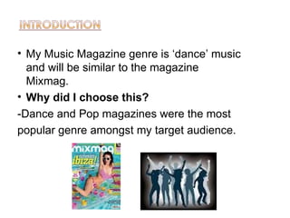
This magazine will focus on dance music similar to Mixmag. Dance and pop music magazines were the most popular genres among the target audience, which is why the genre of dance was chosen.
Report
Share
Report
Share
Recommended
Evaluation question 2
The document discusses how a media product represents different social groups:
- For age (16-19), informal language, slang, and references to music festivals and bands are used.
- For gender, a neutral color scheme and inclusion of both male and female models and bands aims to be unisex.
- For ethnicity, only white British models are used because the target indie music genre primarily features white British bands. However, the magazine is not intended to exclude other ethnicities.
- For class, the target audience is middle class, which connects to most indie bands' class and the affordable cost and DIY nature of indie music appealing to an aspirational middle class.
Q2
The document discusses how the media product represents different social groups. It represents:
- Gender: Mainly features male artists to match the genre of indie rock music focused on in the magazine. Images show all-male bands playing instruments.
- Age: Features people in the target audience's age range to increase relatability. The genre is mainly performed by younger musicians.
- Social class: Likely features artists from middle-class backgrounds to match the target audience, who would be more attracted to the affordable £3.50 price point.
- Ethnicity: Features only white people to realistically represent the genre, which is dominantly performed by white people, and reflect the local demographic where white people out
Attract audience address blogger
The document discusses how the author attracted their target audience for a music magazine. They used words like "rock and indie" on the front cover to indicate the genre. Color schemes of red, white, and black were used to attract attention. Pictures and text were balanced on the pages to guide the reader's eye. The article included interview questions about music careers to inspire other musicians. Fashion was also featured to show its importance in the industry. The document briefly outlines several audience theory models, such as the hypodermic needle model where the message is directly received, and the two-step flow theory where some explain media to others.
Evaluation 1
The document discusses magazine design conventions that were followed and deviated from in the creation of a classical music magazine. It utilized a color theme of red, brown, orange, and black throughout. It featured a female musician on the cover consistent with music magazines but avoided sexualizing the image. Sub-images on the cover and variety of fonts on pages were used to attract readers and show different contents. While mostly featuring young white models, the magazine aimed to appeal to a younger audience and represent more than just middle/upper class.
Question 2!!!
The document summarizes how a media product represents social groups through its design choices. It discusses using images of people the target audience can relate to on the main cover and inside pages. The content focuses on young, up-and-coming bands and artists similar in age to attract the target demographic. While aimed primarily at females, the magazine content is suitable for males of similar age as well. The informal writing style uses understandable language and music jargon to connect with intended readers.
Evaluation
The document discusses the development of an indie music magazine by the author Eve Hardman. She challenged her initial idea for the front cover photo shoot and went with a simpler image of her cover star holding an acoustic guitar to better portray an indie vibe. She chose to represent people in the magazine equally in terms of gender and used subjects in the target audience age range. The magazine focuses on portraying people as they would be perceived in everyday life without challenging stereotypes. The author wants to partner with established magazine distributors like Bauer who have experience distributing successful music magazines.
Evaluation q2
The magazine represents several social groups through its images, colors, and features. The images of the girl band on the cover would appeal to both male and female audiences interested in music. Additional concert photos represent the indie music genre. The mainly gray, black, and white color scheme with red and yellow accents appeals to indie music fans, while the feminine colors draw in female readers. Features like competitions attract those interested in entering contests. The interview article allows music lovers to learn about the featured girl band firsthand.
Q5 evaluation
Visuals were the main way to attract the audience. The magazine uses red, black, and white colors that are familiar for hip hop magazines. Bold sans-serif fonts are used to make the text clear and easy to read. The large, light-colored "DRILLINOS" masthead stands out on the front cover. The magazine addresses the audience through interviews, quizzes, and party advertisements. Informal language appeals to younger audiences. Photographs focus on costumes rather than settings, using dark clothing that is conventional for the genre. The model's pose on the contents page relates to the front cover story about power, wealth, and pain.
Q5
The document discusses the design of a magazine cover and contents pages for a music magazine. It summarizes feedback from focus groups and questionnaires. The cover features an attractive main image of the band that draws readers in. Bold colors and informal text are used to attract both male and female readers. The contents pages use a colorful layout with multiple images to highlight different artists and articles. Readers responded positively to the clear organization and personal feel created through images and text.
5. How did you attract/address your audience?
The document discusses the design choices made for an indie rock music magazine. It aimed to attract its target indie rock audience by using conventions from magazines like The Fly, DIY and NME. The layout and fonts were chosen to have a modern, minimal feel that fits the target demographic. The location and costumes of models were selected to communicate an edgy feel adhering to the indie rock genre. Feedback on the finished magazine was positive, particularly about the front page setting the tone and the double page spread looking professional.
Media evaluation
The document discusses how a teen pop culture magazine would represent and appeal to its target audience. It would focus on topics of interest to teens like relationships, music, movies and fashion. The target reader is described as enjoying social media, pop music from acts like One Direction, and shopping brands like Hot Topic. The magazine language uses slang like "awesome" and "poppin'" and features these popular artists to attract fans and make the magazine appealing and recognizable to its teen audience. Overall, the document analyzes how the magazine's content, language, and design fit its target demographic.
Question 2
This document discusses how the media product, a rock music magazine, represents various social groups. The magazine targets 15-25 year olds and features articles and artists popular within that age range. The choice of a young female model aims to be relatable to readers - she is dressed in a style typical of rock music fans and poses to convey a "rebellious" stereotype associated with the genre. Overall, the magazine leverages stereotypes around rock music, like using dark colors, to represent the genre and attract its intended target market of rock fans aged 15-25.
Social groups evalutation
The document discusses how the media product represents particular social groups. It aims to target indie music-loving teens through featuring artists they can relate to and aspire to be like. It discusses focusing on their interests like lyrics about views on the world and love. The target social groups are said to prefer an upbeat, friendly tone shown in indie music. The document also considers the target groups' income levels and willingness to pay in designing the product's expenses and features.
How does my media product represent different social
This document discusses how the author's media product, an indie music magazine called Vagabond, represents the social group of indie music fans. The magazine aims to appeal to a chilled, mellow indie crowd who dress in warm colors like burgundy, orange and brown. The cover features models with stony expressions representative of indie stereotypes. Inside pages show the models having fun to contrast the serious cover. The clothing, minimalist font, and block colors aim to match what typical indie fans would appreciate. Models on the cover are young British adults to match the intended readership.
Question five
The document discusses how the author attracted and addressed their target audience of teenagers and young adults for a music magazine. Bright colors, artistic photos of musicians, and informal language were used to appeal to this younger demographic. Short, bold text with intriguing words was also employed to engage readers and highlight exclusive music news and gossip.
Sams q5
The document discusses how a music magazine targeted at a hip-hop audience was designed to attract readers. Specifically, it mentions using dark colors like red, black, gray, and white in the design to signal the horror music genre. It also customized the magazine logo to appeal to the target audience and used colloquial language following conventions of hip-hop magazines. Fonts were made bold to ensure readability of coverlines and text. Features focused on styles and fashions as well as an artist from the target 16-45 age demographic to increase purchase and engagement from those groups. A consistent style throughout maintained a professional look.
Question 5
The magazine targets 16-23 year olds interested in rock/alternative music. Photography features young models to relate to the target audience and uses stereotypical rock styles. The house style keeps a consistent black, red, and white color scheme throughout for professionalism. Layout elements like the masthead, columns, and balanced text/images aim to fully inform readers as focus groups wanted. The cover draws readers with its masthead, selling line about festival tickets, and primary optical areas as research showed the target audience enjoys festivals.
Coursework evaluation question 5
The document summarizes how the magazine addressed and attracted its target audience of 16-20 year old students. It did so through the bold masthead displaying the genre, a fun indie/rock teen on the colorful front cover, featuring popular bands from audience research, offering 25% off clothing, using informal language throughout, spacing text with large colorful images, consistency in branding across pages, and portraying a professional magazine layout.
Presentation1 Jena
This magazine targets 17-27 year olds interested in indie/rock music. Stereotypes of this group include being hippies who smoke, drink, do drugs and have piercings/tattoos. The magazine represents this group while avoiding explicit images by including competitions, articles about music/festivals, and studio photos of casually dressed models with guitars. It uses proper English but an informal tone. A red/grey/white color scheme and affordable £2 price also appeal to this audience.
Evaluation Q5
The document summarizes how the author attracted and addressed their audience for their music magazine. They used relevant images, bright colors, and exclusive content like interviews to attract readers. The layout was designed to draw people in by breaking conventions. The masthead and colors portrayed the lifestyle of featured artists to attract and address young adult readers and make them feel connected to celebrities. Overall the design, images, and relevant content were meant to attract the target audience and get them to buy the magazine.
Question 2
The document discusses the target audience and representation in a music magazine design project. It summarizes that the main character in the double-page spread is portrayed as lower-middle class to relate to the dominant social class of the target audience. The magazine mainly features white females, challenging the stereotype of alternative rock appealing more to males, to match the results of the designer's research questionnaire showing more female respondents. Although some adults are included, most representations in the magazine are of teenagers around the same age as the intended audience.
Evaluation question 5
To attract their target audience of teenage girls interested in hip hop music and fashion, the author made design choices for their magazine like using pink font to convey femininity, only featuring female models, and using informal language. They also kept the price low to be affordable for students. Feedback from an audience focus group was positive about the color coordination and recognition of the hip hop genre from the clothing and headphones worn by the models. The focus group responded well to the informal "contents" heading design and feature photo intended to showcase fashion.
Natasha Dorey AS Evaluation
Natasha Dorey's music magazine follows conventions of the genre like a bold title and rebellious images, but also challenges conventions by doing a special issue. It targets anti-authority rebels aged 14-19 with colloquial language and images of an attractive young model. Stores like Tesco would distribute it due to its niche audience. The magazine uses eye-catching colors, photos, and minimal text to appeal to its target demographic. Creating the magazine required learning software like Photoshop and using diverse photos and fonts to improve engagement over her preliminary work.
Megan Summers Foundation Portfolio Evaluation
The Megan Summers Foundation provides concise 3 sentence summaries of documents:
The document discusses conventions used in real rock magazines that the author's media product follows, such as using bold mastheads and cover lines to catch readers' attention. It represents social groups by using various colors on each page to appeal to both male and female readers ages 16-25. The author would like the magazine to be distributed by Bauer Publishing, which has experience with the genre through Kerrang magazine and could advertise the new magazine to a large market through its multi-channel reach.
3. ipc media
IPC Media would be a suitable media institution to distribute the media product because they publish NME magazine, which was an inspiration for the magazine's style. IPC Media has experience with magazines and customers in the music genre. Distributing the magazine, which covers the unique Mod genre, could increase IPC Media's potential sales and market coverage as it appeals to an unfamiliar musical style that may attract new readers.
Evaluation question 2
The document discusses how the media product represents particular social groups through its targeting of age, gender, ethnicity, and social class. It aims its magazine at 16-22 year olds by featuring bands in this age group. It targets both males and females by including both genders on the cover and in featured content. While most subjects are white British, it incorporates other ethnicities by featuring an Asian female band member. The magazine mainly targets middle and working classes by how band members are dressed in casual indie style and through article topics about music festivals and DIY fashion on a budget.
Powerpoint
The document summarizes the process of creating a music magazine, including researching conventions from other magazines, taking photographs with editing in Photoshop, and creating multiple drafts to refine the format and design. The intended audience is described as young teenagers interested in fashionable music. Key conventions that were adopted include similar layouts, repeated color schemes and fonts used in other music magazines. The magazine aims to attract readers through eye-catching design elements and coverage of both well-known and lesser-known musicians.
Evaluation3
The document describes a music magazine called SPIRIT that was created by the author. SPIRIT follows conventions of real music magazines by providing information on rock/indie music genres, including reviews and interviews. It challenges conventions by using an old black and white aesthetic rather than typical rock magazine colors. The target audience is described as teenage rock fans, and the magazine aims to appeal to this group with interesting content and designs.
Capitulo xviillanganate licuy
Este documento resume los diferentes tipos de análisis estructural que se pueden realizar en programas como SAP2000, ETABS y SAFE. En menos de 3 oraciones, describe que se pueden definir diferentes casos de análisis, como análisis estáticos, modales, de pandeo y de respuesta espectral, los cuales pueden ser lineales o no lineales dependiendo de cómo responde la estructura a las cargas. Además, explica que los resultados de los análisis lineales se pueden superponer, mientras que los de los anális
Asamblea
Este documento parece ser un libro que contiene información sobre el Parlamento. No proporciona detalles sobre el contenido específico del libro, pero menciona una portada, secciones internas y una contraportada, lo que sugiere que se trata de una publicación impresa que cubre temas relacionados con el funcionamiento y la historia del Parlamento.
More Related Content
What's hot
Q5
The document discusses the design of a magazine cover and contents pages for a music magazine. It summarizes feedback from focus groups and questionnaires. The cover features an attractive main image of the band that draws readers in. Bold colors and informal text are used to attract both male and female readers. The contents pages use a colorful layout with multiple images to highlight different artists and articles. Readers responded positively to the clear organization and personal feel created through images and text.
5. How did you attract/address your audience?
The document discusses the design choices made for an indie rock music magazine. It aimed to attract its target indie rock audience by using conventions from magazines like The Fly, DIY and NME. The layout and fonts were chosen to have a modern, minimal feel that fits the target demographic. The location and costumes of models were selected to communicate an edgy feel adhering to the indie rock genre. Feedback on the finished magazine was positive, particularly about the front page setting the tone and the double page spread looking professional.
Media evaluation
The document discusses how a teen pop culture magazine would represent and appeal to its target audience. It would focus on topics of interest to teens like relationships, music, movies and fashion. The target reader is described as enjoying social media, pop music from acts like One Direction, and shopping brands like Hot Topic. The magazine language uses slang like "awesome" and "poppin'" and features these popular artists to attract fans and make the magazine appealing and recognizable to its teen audience. Overall, the document analyzes how the magazine's content, language, and design fit its target demographic.
Question 2
This document discusses how the media product, a rock music magazine, represents various social groups. The magazine targets 15-25 year olds and features articles and artists popular within that age range. The choice of a young female model aims to be relatable to readers - she is dressed in a style typical of rock music fans and poses to convey a "rebellious" stereotype associated with the genre. Overall, the magazine leverages stereotypes around rock music, like using dark colors, to represent the genre and attract its intended target market of rock fans aged 15-25.
Social groups evalutation
The document discusses how the media product represents particular social groups. It aims to target indie music-loving teens through featuring artists they can relate to and aspire to be like. It discusses focusing on their interests like lyrics about views on the world and love. The target social groups are said to prefer an upbeat, friendly tone shown in indie music. The document also considers the target groups' income levels and willingness to pay in designing the product's expenses and features.
How does my media product represent different social
This document discusses how the author's media product, an indie music magazine called Vagabond, represents the social group of indie music fans. The magazine aims to appeal to a chilled, mellow indie crowd who dress in warm colors like burgundy, orange and brown. The cover features models with stony expressions representative of indie stereotypes. Inside pages show the models having fun to contrast the serious cover. The clothing, minimalist font, and block colors aim to match what typical indie fans would appreciate. Models on the cover are young British adults to match the intended readership.
Question five
The document discusses how the author attracted and addressed their target audience of teenagers and young adults for a music magazine. Bright colors, artistic photos of musicians, and informal language were used to appeal to this younger demographic. Short, bold text with intriguing words was also employed to engage readers and highlight exclusive music news and gossip.
Sams q5
The document discusses how a music magazine targeted at a hip-hop audience was designed to attract readers. Specifically, it mentions using dark colors like red, black, gray, and white in the design to signal the horror music genre. It also customized the magazine logo to appeal to the target audience and used colloquial language following conventions of hip-hop magazines. Fonts were made bold to ensure readability of coverlines and text. Features focused on styles and fashions as well as an artist from the target 16-45 age demographic to increase purchase and engagement from those groups. A consistent style throughout maintained a professional look.
Question 5
The magazine targets 16-23 year olds interested in rock/alternative music. Photography features young models to relate to the target audience and uses stereotypical rock styles. The house style keeps a consistent black, red, and white color scheme throughout for professionalism. Layout elements like the masthead, columns, and balanced text/images aim to fully inform readers as focus groups wanted. The cover draws readers with its masthead, selling line about festival tickets, and primary optical areas as research showed the target audience enjoys festivals.
Coursework evaluation question 5
The document summarizes how the magazine addressed and attracted its target audience of 16-20 year old students. It did so through the bold masthead displaying the genre, a fun indie/rock teen on the colorful front cover, featuring popular bands from audience research, offering 25% off clothing, using informal language throughout, spacing text with large colorful images, consistency in branding across pages, and portraying a professional magazine layout.
Presentation1 Jena
This magazine targets 17-27 year olds interested in indie/rock music. Stereotypes of this group include being hippies who smoke, drink, do drugs and have piercings/tattoos. The magazine represents this group while avoiding explicit images by including competitions, articles about music/festivals, and studio photos of casually dressed models with guitars. It uses proper English but an informal tone. A red/grey/white color scheme and affordable £2 price also appeal to this audience.
Evaluation Q5
The document summarizes how the author attracted and addressed their audience for their music magazine. They used relevant images, bright colors, and exclusive content like interviews to attract readers. The layout was designed to draw people in by breaking conventions. The masthead and colors portrayed the lifestyle of featured artists to attract and address young adult readers and make them feel connected to celebrities. Overall the design, images, and relevant content were meant to attract the target audience and get them to buy the magazine.
Question 2
The document discusses the target audience and representation in a music magazine design project. It summarizes that the main character in the double-page spread is portrayed as lower-middle class to relate to the dominant social class of the target audience. The magazine mainly features white females, challenging the stereotype of alternative rock appealing more to males, to match the results of the designer's research questionnaire showing more female respondents. Although some adults are included, most representations in the magazine are of teenagers around the same age as the intended audience.
Evaluation question 5
To attract their target audience of teenage girls interested in hip hop music and fashion, the author made design choices for their magazine like using pink font to convey femininity, only featuring female models, and using informal language. They also kept the price low to be affordable for students. Feedback from an audience focus group was positive about the color coordination and recognition of the hip hop genre from the clothing and headphones worn by the models. The focus group responded well to the informal "contents" heading design and feature photo intended to showcase fashion.
Natasha Dorey AS Evaluation
Natasha Dorey's music magazine follows conventions of the genre like a bold title and rebellious images, but also challenges conventions by doing a special issue. It targets anti-authority rebels aged 14-19 with colloquial language and images of an attractive young model. Stores like Tesco would distribute it due to its niche audience. The magazine uses eye-catching colors, photos, and minimal text to appeal to its target demographic. Creating the magazine required learning software like Photoshop and using diverse photos and fonts to improve engagement over her preliminary work.
Megan Summers Foundation Portfolio Evaluation
The Megan Summers Foundation provides concise 3 sentence summaries of documents:
The document discusses conventions used in real rock magazines that the author's media product follows, such as using bold mastheads and cover lines to catch readers' attention. It represents social groups by using various colors on each page to appeal to both male and female readers ages 16-25. The author would like the magazine to be distributed by Bauer Publishing, which has experience with the genre through Kerrang magazine and could advertise the new magazine to a large market through its multi-channel reach.
3. ipc media
IPC Media would be a suitable media institution to distribute the media product because they publish NME magazine, which was an inspiration for the magazine's style. IPC Media has experience with magazines and customers in the music genre. Distributing the magazine, which covers the unique Mod genre, could increase IPC Media's potential sales and market coverage as it appeals to an unfamiliar musical style that may attract new readers.
Evaluation question 2
The document discusses how the media product represents particular social groups through its targeting of age, gender, ethnicity, and social class. It aims its magazine at 16-22 year olds by featuring bands in this age group. It targets both males and females by including both genders on the cover and in featured content. While most subjects are white British, it incorporates other ethnicities by featuring an Asian female band member. The magazine mainly targets middle and working classes by how band members are dressed in casual indie style and through article topics about music festivals and DIY fashion on a budget.
Powerpoint
The document summarizes the process of creating a music magazine, including researching conventions from other magazines, taking photographs with editing in Photoshop, and creating multiple drafts to refine the format and design. The intended audience is described as young teenagers interested in fashionable music. Key conventions that were adopted include similar layouts, repeated color schemes and fonts used in other music magazines. The magazine aims to attract readers through eye-catching design elements and coverage of both well-known and lesser-known musicians.
Evaluation3
The document describes a music magazine called SPIRIT that was created by the author. SPIRIT follows conventions of real music magazines by providing information on rock/indie music genres, including reviews and interviews. It challenges conventions by using an old black and white aesthetic rather than typical rock magazine colors. The target audience is described as teenage rock fans, and the magazine aims to appeal to this group with interesting content and designs.
What's hot (20)
How does my media product represent different social
How does my media product represent different social
Viewers also liked
Capitulo xviillanganate licuy
Este documento resume los diferentes tipos de análisis estructural que se pueden realizar en programas como SAP2000, ETABS y SAFE. En menos de 3 oraciones, describe que se pueden definir diferentes casos de análisis, como análisis estáticos, modales, de pandeo y de respuesta espectral, los cuales pueden ser lineales o no lineales dependiendo de cómo responde la estructura a las cargas. Además, explica que los resultados de los análisis lineales se pueden superponer, mientras que los de los anális
Asamblea
Este documento parece ser un libro que contiene información sobre el Parlamento. No proporciona detalles sobre el contenido específico del libro, pero menciona una portada, secciones internas y una contraportada, lo que sugiere que se trata de una publicación impresa que cubre temas relacionados con el funcionamiento y la historia del Parlamento.
Rosalía de castro
Rosalía de Castro fue una poetisa y novelista española del siglo XIX considerada una figura emblemática del Resurgimiento gallego, que escribió tanto en gallego como en español y fue pionera de la poesía moderna española con una visión angustiada de la realidad y nostalgia por su tierra natal.
Flok presentation Español - enero 2014
El documento describe el proyecto FLOK Society, un esfuerzo de investigación conjunto entre el gobierno de Ecuador y académicos para desarrollar propuestas de políticas públicas que promuevan una sociedad basada en el conocimiento común y abierto. El proyecto se centra en cinco áreas temáticas e incluye ejemplos de mejores prácticas de otros países. El equipo de investigación busca generar entre 10 y 15 documentos con recomendaciones para la transición de Ecuador hacia una economía del conocimiento abierto.
Java programacion
El documento presenta un proyecto de un sistema de reservación de vuelos para la aerolínea MackLine desarrollado por estudiantes utilizando las herramientas Neatbeans, PostgreSQL, JDBC, Servlets y Glassfish. El objetivo general del proyecto es permitir reservar boletos aéreos a través de agentes de viaje mediante un servicio web.
Viewers also liked (7)
Villa duflot hotel perpignan carte semaine du 13 au 19 03
Villa duflot hotel perpignan carte semaine du 13 au 19 03
More from lottie1995
Evaluation Q7
The document discusses the improvements made by the author in creating their final music magazine compared to their preliminary magazine. They gained more experience using Photoshop and developed new techniques. Their photography skills improved as they planned shots more thoroughly. They also enhanced their understanding of magazine conventions and how to effectively layout and display information. In conclusion, the author believes there is a huge contrast in quality between their preliminary and final magazines due to gaining industry knowledge and improving relevant skills.
Sketches
The document discusses conventions for the front cover, contents page, and double page spread of a magazine. For the front cover, it will include a pug to attract the target audience, a catchy main image using direct address, masthead and typography, barcode, free CD, footer claiming "world's best magazine", and a main storyline. The contents page will include the masthead using synergy, a genre-related main image, page numbers, and date matching the front cover. The double page spread will also include the masthead using synergy, an eye-catching genre-related main image using direct address, a standfirst introducing the article, engaging quotes, and a conventional layout.
Sketches
The document discusses conventions for the front cover, contents page, and double page spread of a magazine. For the front cover, it will include a pug to attract the target audience, a main image using direct address, catchy masthead and typography, barcode, free CD, footer claiming "world's best magazine", and main storyline. The contents page will include masthead about using synergy, eye-catching main image relating to the genre, page numbers, and date relating to the front cover. The double page spread will include masthead about using synergy, eye-catching and addressing main image, standfirst to introduce the article, quotes to involve readers, and layout conventions of a double page spread.
Location
This document discusses two potential locations for a magazine photoshoot - a club and a green screen. The club location is chosen for its suitability for dance music and themes of clubbing and partying, to make the magazine look fun and exciting for the target audience. A green screen is also considered as it allows for easy editing and placing images in different backgrounds, making it a conventional choice for a magazine.
Distributor
COMAG is the UK's most dynamic marketing and distribution company that represents high profile, market leading titles and global brands. They focus on marketing and distributing titles and brands to customers in the UK.
Marketing
This document discusses using various promotional methods for a magazine including posters on buses, television advertisements, and social networking sites like a Facebook page to engage a target audience.
Price
This product is priced at £2.99 to target working class consumers by offering a reasonable and comfortable price that can attract a large market.
USP
This magazine offers a free CD every two weeks with the latest dance music tracks to draw in new audiences to buy the magazine and sustain loyal customers.
Target Audience
The document appears to be about a 16-20 year old named Holly who enjoys clubbing, celebrity gossip, animals, and alcohol. It lists her name, age, and interests in a bullet point format without further details or context.
Target audience
The document appears to be about a 16-20 year old named Holly who enjoys clubbing, celebrity gossip, animals, and alcohol. It lists her name, age, and interests in a bullet point format without further details or context.
Masthead
This document discusses a piece of music and how it fits within the genre of dance music. It notes that the typography uses a sans serif, casual and fun looking font. Finally, it states that the music is catchy and reminds the audience of party music that would be played in club settings like those in Ibiza.
Magazine Analysis
The document analyzes magazine covers and contents pages from two different magazines - Bliss and Blender. For Bliss, a teenage girls' magazine, the front cover features Taylor Swift and uses pink colors associated with femininity. The contents page is neatly organized with bold headings and the magazine aims to discuss fashion and celebrity gossip. For Blender, a music magazine, the front cover features Katy Perry in a revealing outfit to appeal to its mainly young male audience. The contents page continues to promote Katy Perry and bands like Metallica through images and headlines. Both magazines use conventions like mastheads, prices and quotes to engage readers.
More from lottie1995 (14)
Recently uploaded
Advanced Java[Extra Concepts, Not Difficult].docx
This is part 2 of my Java Learning Journey. This contains Hashing, ArrayList, LinkedList, Date and Time Classes, Calendar Class and more.
Walmart Business+ and Spark Good for Nonprofits.pdf
"Learn about all the ways Walmart supports nonprofit organizations.
You will hear from Liz Willett, the Head of Nonprofits, and hear about what Walmart is doing to help nonprofits, including Walmart Business and Spark Good. Walmart Business+ is a new offer for nonprofits that offers discounts and also streamlines nonprofits order and expense tracking, saving time and money.
The webinar may also give some examples on how nonprofits can best leverage Walmart Business+.
The event will cover the following::
Walmart Business + (https://business.walmart.com/plus) is a new shopping experience for nonprofits, schools, and local business customers that connects an exclusive online shopping experience to stores. Benefits include free delivery and shipping, a 'Spend Analytics” feature, special discounts, deals and tax-exempt shopping.
Special TechSoup offer for a free 180 days membership, and up to $150 in discounts on eligible orders.
Spark Good (walmart.com/sparkgood) is a charitable platform that enables nonprofits to receive donations directly from customers and associates.
Answers about how you can do more with Walmart!"
What is Digital Literacy? A guest blog from Andy McLaughlin, University of Ab...
What is Digital Literacy? A guest blog from Andy McLaughlin, University of Aberdeen
Philippine Edukasyong Pantahanan at Pangkabuhayan (EPP) Curriculum
(𝐓𝐋𝐄 𝟏𝟎𝟎) (𝐋𝐞𝐬𝐬𝐨𝐧 𝟏)-𝐏𝐫𝐞𝐥𝐢𝐦𝐬
𝐃𝐢𝐬𝐜𝐮𝐬𝐬 𝐭𝐡𝐞 𝐄𝐏𝐏 𝐂𝐮𝐫𝐫𝐢𝐜𝐮𝐥𝐮𝐦 𝐢𝐧 𝐭𝐡𝐞 𝐏𝐡𝐢𝐥𝐢𝐩𝐩𝐢𝐧𝐞𝐬:
- Understand the goals and objectives of the Edukasyong Pantahanan at Pangkabuhayan (EPP) curriculum, recognizing its importance in fostering practical life skills and values among students. Students will also be able to identify the key components and subjects covered, such as agriculture, home economics, industrial arts, and information and communication technology.
𝐄𝐱𝐩𝐥𝐚𝐢𝐧 𝐭𝐡𝐞 𝐍𝐚𝐭𝐮𝐫𝐞 𝐚𝐧𝐝 𝐒𝐜𝐨𝐩𝐞 𝐨𝐟 𝐚𝐧 𝐄𝐧𝐭𝐫𝐞𝐩𝐫𝐞𝐧𝐞𝐮𝐫:
-Define entrepreneurship, distinguishing it from general business activities by emphasizing its focus on innovation, risk-taking, and value creation. Students will describe the characteristics and traits of successful entrepreneurs, including their roles and responsibilities, and discuss the broader economic and social impacts of entrepreneurial activities on both local and global scales.
Mule event processing models | MuleSoft Mysore Meetup #47
Mule event processing models | MuleSoft Mysore Meetup #47
Event Link:- https://meetups.mulesoft.com/events/details/mulesoft-mysore-presents-mule-event-processing-models/
Agenda
● What is event processing in MuleSoft?
● Types of event processing models in Mule 4
● Distinction between the reactive, parallel, blocking & non-blocking processing
For Upcoming Meetups Join Mysore Meetup Group - https://meetups.mulesoft.com/mysore/YouTube:- youtube.com/@mulesoftmysore
Mysore WhatsApp group:- https://chat.whatsapp.com/EhqtHtCC75vCAX7gaO842N
Speaker:-
Shivani Yasaswi - https://www.linkedin.com/in/shivaniyasaswi/
Organizers:-
Shubham Chaurasia - https://www.linkedin.com/in/shubhamchaurasia1/
Giridhar Meka - https://www.linkedin.com/in/giridharmeka
Priya Shaw - https://www.linkedin.com/in/priya-shaw
BÀI TẬP BỔ TRỢ TIẾNG ANH LỚP 9 CẢ NĂM - GLOBAL SUCCESS - NĂM HỌC 2024-2025 - ...
BÀI TẬP BỔ TRỢ TIẾNG ANH LỚP 9 CẢ NĂM - GLOBAL SUCCESS - NĂM HỌC 2024-2025 - ...Nguyen Thanh Tu Collection
https://app.box.com/s/tacvl9ekroe9hqupdnjruiypvm9rdaneThe History of Stoke Newington Street Names
Presented at the Stoke Newington Literary Festival on 9th June 2024
www.StokeNewingtonHistory.com
BÀI TẬP DẠY THÊM TIẾNG ANH LỚP 7 CẢ NĂM FRIENDS PLUS SÁCH CHÂN TRỜI SÁNG TẠO ...
BÀI TẬP DẠY THÊM TIẾNG ANH LỚP 7 CẢ NĂM FRIENDS PLUS SÁCH CHÂN TRỜI SÁNG TẠO ...Nguyen Thanh Tu Collection
https://app.box.com/s/qhtvq32h4ybf9t49ku85x0n3xl4jhr15বাংলাদেশ অর্থনৈতিক সমীক্ষা (Economic Review) ২০২৪ UJS App.pdf
বাংলাদেশের অর্থনৈতিক সমীক্ষা ২০২৪ [Bangladesh Economic Review 2024 Bangla.pdf] কম্পিউটার , ট্যাব ও স্মার্ট ফোন ভার্সন সহ সম্পূর্ণ বাংলা ই-বুক বা pdf বই " সুচিপত্র ...বুকমার্ক মেনু 🔖 ও হাইপার লিংক মেনু 📝👆 যুক্ত ..
আমাদের সবার জন্য খুব খুব গুরুত্বপূর্ণ একটি বই ..বিসিএস, ব্যাংক, ইউনিভার্সিটি ভর্তি ও যে কোন প্রতিযোগিতা মূলক পরীক্ষার জন্য এর খুব ইম্পরট্যান্ট একটি বিষয় ...তাছাড়া বাংলাদেশের সাম্প্রতিক যে কোন ডাটা বা তথ্য এই বইতে পাবেন ...
তাই একজন নাগরিক হিসাবে এই তথ্য গুলো আপনার জানা প্রয়োজন ...।
বিসিএস ও ব্যাংক এর লিখিত পরীক্ষা ...+এছাড়া মাধ্যমিক ও উচ্চমাধ্যমিকের স্টুডেন্টদের জন্য অনেক কাজে আসবে ...
Pengantar Penggunaan Flutter - Dart programming language1.pptx
Pengantar Penggunaan Flutter - Dart programming language1.pptx
How to Create a More Engaging and Human Online Learning Experience
How to Create a More Engaging and Human Online Learning Experience Wahiba Chair Training & Consulting
Wahiba Chair's Talk at the 2024 Learning Ideas Conference. How to Make a Field Mandatory in Odoo 17
In Odoo, making a field required can be done through both Python code and XML views. When you set the required attribute to True in Python code, it makes the field required across all views where it's used. Conversely, when you set the required attribute in XML views, it makes the field required only in the context of that particular view.
Traditional Musical Instruments of Arunachal Pradesh and Uttar Pradesh - RAYH...
Traditional Musical Instruments of Arunachal Pradesh and Uttar Pradesh
Wound healing PPT
This document provides an overview of wound healing, its functions, stages, mechanisms, factors affecting it, and complications.
A wound is a break in the integrity of the skin or tissues, which may be associated with disruption of the structure and function.
Healing is the body’s response to injury in an attempt to restore normal structure and functions.
Healing can occur in two ways: Regeneration and Repair
There are 4 phases of wound healing: hemostasis, inflammation, proliferation, and remodeling. This document also describes the mechanism of wound healing. Factors that affect healing include infection, uncontrolled diabetes, poor nutrition, age, anemia, the presence of foreign bodies, etc.
Complications of wound healing like infection, hyperpigmentation of scar, contractures, and keloid formation.
Recently uploaded (20)
Walmart Business+ and Spark Good for Nonprofits.pdf
Walmart Business+ and Spark Good for Nonprofits.pdf
What is Digital Literacy? A guest blog from Andy McLaughlin, University of Ab...
What is Digital Literacy? A guest blog from Andy McLaughlin, University of Ab...
Philippine Edukasyong Pantahanan at Pangkabuhayan (EPP) Curriculum
Philippine Edukasyong Pantahanan at Pangkabuhayan (EPP) Curriculum
Mule event processing models | MuleSoft Mysore Meetup #47
Mule event processing models | MuleSoft Mysore Meetup #47
Film vocab for eal 3 students: Australia the movie
Film vocab for eal 3 students: Australia the movie
BÀI TẬP BỔ TRỢ TIẾNG ANH LỚP 9 CẢ NĂM - GLOBAL SUCCESS - NĂM HỌC 2024-2025 - ...
BÀI TẬP BỔ TRỢ TIẾNG ANH LỚP 9 CẢ NĂM - GLOBAL SUCCESS - NĂM HỌC 2024-2025 - ...
BÀI TẬP DẠY THÊM TIẾNG ANH LỚP 7 CẢ NĂM FRIENDS PLUS SÁCH CHÂN TRỜI SÁNG TẠO ...
BÀI TẬP DẠY THÊM TIẾNG ANH LỚP 7 CẢ NĂM FRIENDS PLUS SÁCH CHÂN TRỜI SÁNG TẠO ...
বাংলাদেশ অর্থনৈতিক সমীক্ষা (Economic Review) ২০২৪ UJS App.pdf
বাংলাদেশ অর্থনৈতিক সমীক্ষা (Economic Review) ২০২৪ UJS App.pdf
Pengantar Penggunaan Flutter - Dart programming language1.pptx
Pengantar Penggunaan Flutter - Dart programming language1.pptx
How to Create a More Engaging and Human Online Learning Experience
How to Create a More Engaging and Human Online Learning Experience
Traditional Musical Instruments of Arunachal Pradesh and Uttar Pradesh - RAYH...
Traditional Musical Instruments of Arunachal Pradesh and Uttar Pradesh - RAYH...
NEWSPAPERS - QUESTION 1 - REVISION POWERPOINT.pptx
NEWSPAPERS - QUESTION 1 - REVISION POWERPOINT.pptx
Introduction
- 1. • My Music Magazine genre is ‘dance’ music and will be similar to the magazine Mixmag. • Why did I choose this? -Dance and Pop magazines were the most popular genre amongst my target audience.