Download as PDF, PPTX


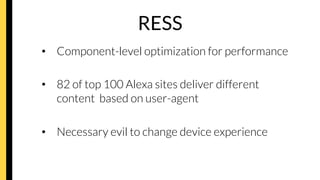
![Interactions
HTML 5 inputs
– tel
– number
– email
– date
– pattern
• e.g. pattern=”[0-9]*”](https://image.slidesharecdn.com/tomrobertshawresponsivemeetmagentospain-140324043844-phpapp02/85/Responsive-Web-Design-Tom-Robertshaw-21-320.jpg)


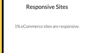
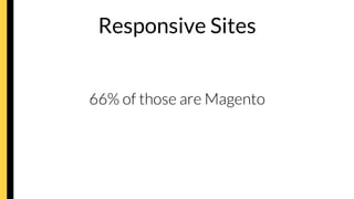
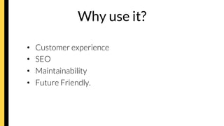
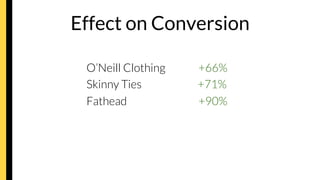
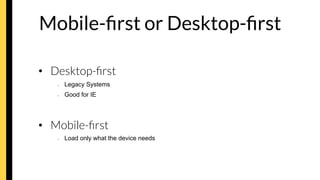
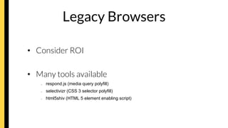
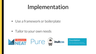
The document discusses the importance and principles of responsive design in eCommerce, highlighting its benefits for customer experience, SEO, and maintainability. It outlines the impacts on conversion rates, design methodologies, and necessary tools for implementation, while also addressing accessibility and performance optimization strategies. The conclusion emphasizes the urgency for businesses to adopt responsive design to ensure future-ready web experiences.


![Getting Started with Apache Spark: Big Data Made Simple [Free Meetup]](https://cdn.slidesharecdn.com/ss_thumbnails/apachesparkgettingstarted-260203175547-8361bcc3-thumbnail.jpg?width=640&height=640&fit=bounds)
