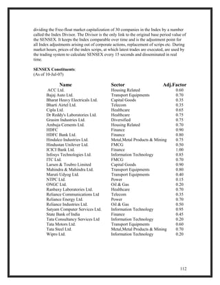
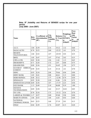
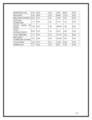
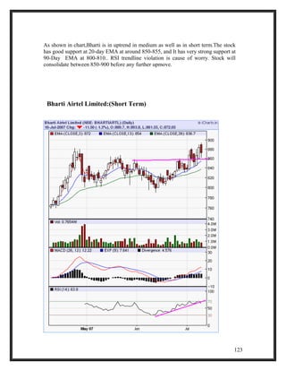
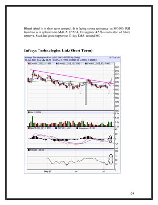
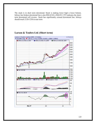
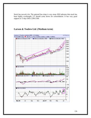
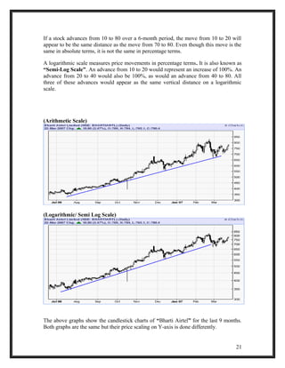
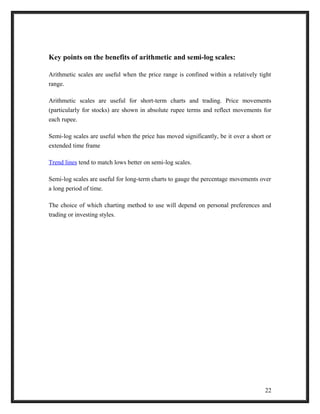
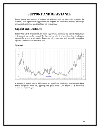
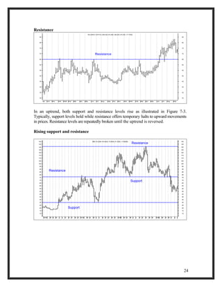
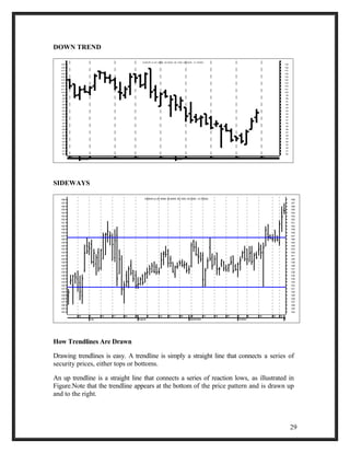
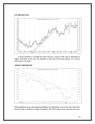
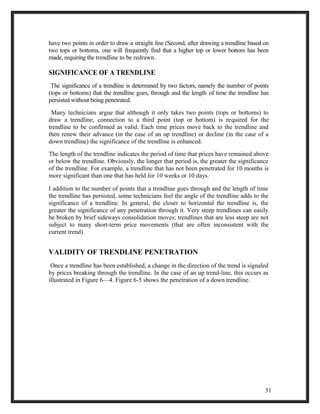
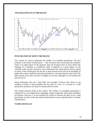
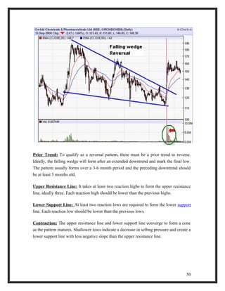
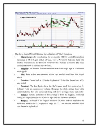
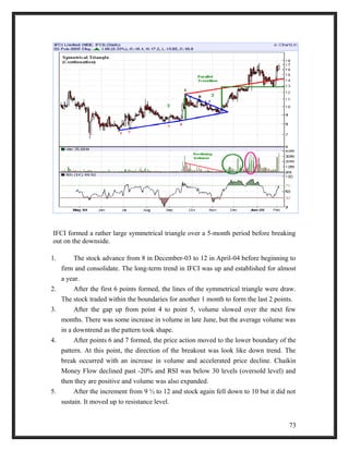
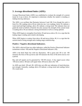
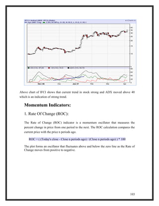
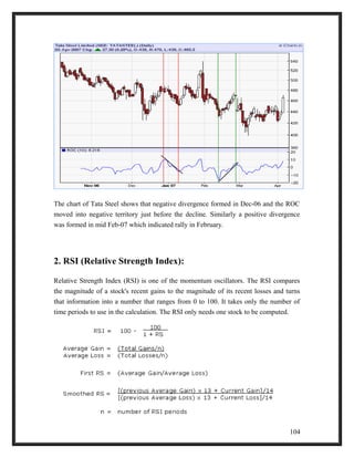
This document is a report on the basics of technical analysis submitted for an MBA program. It includes an acknowledgements section, table of contents, and abstract. The report provides an overview of technical analysis, different types of charts and patterns used in analysis, as well as common technical indicators. It also profiles Interface Brokerage & Research Ltd and analyzes short-term and medium-term price movements of leading Indian stocks using technical analysis techniques.

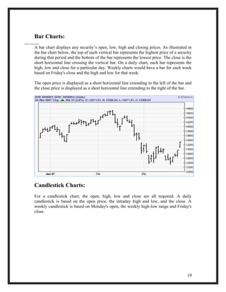
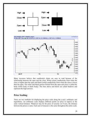

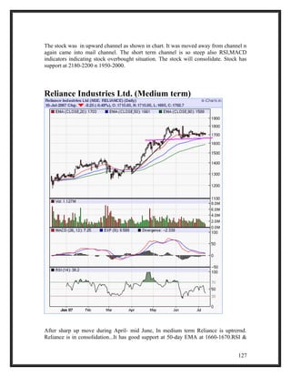
![The Multi Arc example shows extreme readings as well as positive divergence. In Nov-
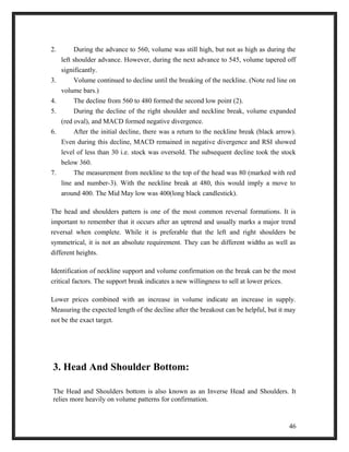
06, RSI reached oversold levels to mark the low around 43. The next extreme reading
(oversold) occurred in Feb-07. RSI reached oversold levels in late March-07 and moved
below 35. A positive divergence with centerline crossover formed in February followed
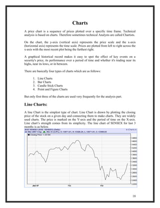
by a rally.
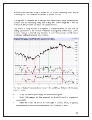
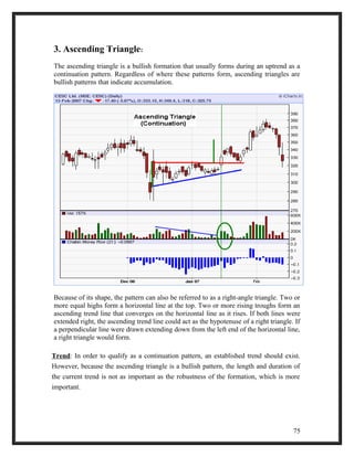
3. Williams % R:
Williams %R is a momentum indicator that works much like the Stochastic Oscillator. It
is especially popular for measuring overbought and oversold levels. The scale ranges
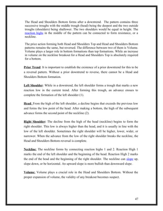
from 0 to -100 with readings from 0 to -20 considered overbought, and readings from
-80 to -100 considered oversold.
William %R, sometimes referred to as %R, shows the relationship of the close relative
to the high-low range over a set period of time. The nearer the close is to the top of the
range, the nearer to zero (higher) the indicator will be. The nearer the close is to the
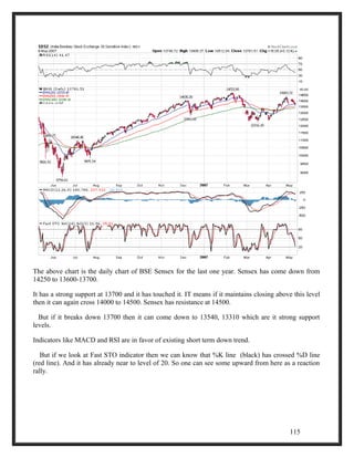
bottom of the range, the nearer to -100 (lower) the indicator will be. If the close equals
the high of the high-low range, then the indicator will show 0 (the highest reading). If
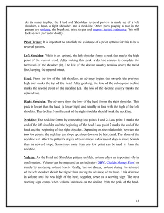
the close equals the low of the high-low range, then the result will be -100 (the lowest
reading).
%R = [(highest high over ? periods - close)/(highest high over ? periods - lowest low
over ? periods)] * -100
106](https://image.slidesharecdn.com/interfacebrokerageandresearchltdumang-141013005549-conversion-gate02/85/Interface-brokerage-and-research-ltd-umang-106-320.jpg)