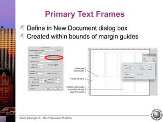
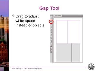
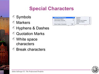
Adobe InDesign CC: The Professional Portfolio
Project 4:
Museum Exhibits Booklet
Working with
master pages
Controlling the
flow of text
Outputting
variations of files
Adobe InDesign CC: The Professional Portfolio
Facing Pages
Created in New Document dialog box
Reader’s spreads
Left = verso page
Right = recto page
Adobe InDesign CC: The Professional Portfolio
Master Pages
Create new
Create from
existing pages
Load from other files
Apply to layout
pages
Adobe InDesign CC: The Professional Portfolio
Overriding Master Objects
Adobe InDesign CC: The Professional Portfolio
Primary Text Frames
Define in New Document dialog box
Created within bounds of margin guides
Adobe InDesign CC: The Professional Portfolio
Gap Tool
Drag to adjust
white space
instead of objects
Adobe InDesign CC: The Professional Portfolio
Special Characters
Symbols
Markers
Hyphens & Dashes
Quotation Marks
White space
characters
Break characters
Adobe InDesign CC: The Professional Portfolio
Auto-Flowing Text
Smart Text Reflow
preferences
Shift-click loaded
place cursor when
STR is not active
Option/Alt-click to
place and leave
cursor loaded
Adobe InDesign CC: The Professional Portfolio
Working with Styles
Create new
Load from another
InDesign file
Import from Word
Adobe InDesign CC: The Professional Portfolio
Editing Styles
Double-click to edit settings
Local formatting overrides
Redefine Style
Adobe InDesign CC: The Professional Portfolio
Deleting Styles
Replace With
Preserve Formatting
Adobe InDesign CC: The Professional Portfolio
Paragraph Rules
Paragraph
formatting option
Save as part of a
paragraph style
Adobe InDesign CC: The Professional Portfolio
Page and Frame Breaks
Widow & orphan
control
Break characters
Keep paragraph
formatting options
Adobe InDesign CC: The Professional Portfolio
Based-On Styles
Parent-Child
relationship
Reset to Base
Adobe InDesign CC: The Professional Portfolio
Paragraph Composition
Paragraph formatting option
Adobe InDesign CC: The Professional Portfolio
Hyphenation
Paragraph
formatting option
Overrides
Adobe InDesign CC: The Professional Portfolio
Bullets and Numbering
Paragraph formatting option
Create as part of style definition
Adobe InDesign CC: The Professional Portfolio
Glyphs Panel
Window>Type & Tables>Glyphs
Adobe InDesign CC: The Professional Portfolio
Eyedropper tool
Sample colors Copy text
formatting
Adobe InDesign CC: The Professional Portfolio
Imposition
Press sheet
Ganging
Signatures
Reader’s spreads
Printer’s spreads
Adobe InDesign CC: The Professional Portfolio
Printing a Booklet
File>Print Booklet
Click Print Settings
to define printer-
specific options
Adobe InDesign CC: The Professional Portfolio
Page Transitions
Spread-specific setting
Preview in dialog box
Control settings in panel
Adobe InDesign CC: The Professional Portfolio
Export PDF (Interactive)
File>Export
Adobe PDF
(Interactive) option
Digital distribution
options

InDesign Project 4 Museum Exhibits Booklet

  • 1.
    Adobe InDesign CC:The Professional Portfolio Project 4: Museum Exhibits Booklet Working with master pages Controlling the flow of text Outputting variations of files
  • 2.
    Adobe InDesign CC:The Professional Portfolio Facing Pages Created in New Document dialog box Reader’s spreads Left = verso page Right = recto page
  • 3.
    Adobe InDesign CC:The Professional Portfolio Master Pages Create new Create from existing pages Load from other files Apply to layout pages
  • 4.
    Adobe InDesign CC:The Professional Portfolio Overriding Master Objects
  • 5.
    Adobe InDesign CC:The Professional Portfolio Primary Text Frames Define in New Document dialog box Created within bounds of margin guides
  • 6.
    Adobe InDesign CC:The Professional Portfolio Gap Tool Drag to adjust white space instead of objects
  • 7.
    Adobe InDesign CC:The Professional Portfolio Special Characters Symbols Markers Hyphens & Dashes Quotation Marks White space characters Break characters
  • 8.
    Adobe InDesign CC:The Professional Portfolio Auto-Flowing Text Smart Text Reflow preferences Shift-click loaded place cursor when STR is not active Option/Alt-click to place and leave cursor loaded
  • 9.
    Adobe InDesign CC:The Professional Portfolio Working with Styles Create new Load from another InDesign file Import from Word
  • 10.
    Adobe InDesign CC:The Professional Portfolio Editing Styles Double-click to edit settings Local formatting overrides Redefine Style
  • 11.
    Adobe InDesign CC:The Professional Portfolio Deleting Styles Replace With Preserve Formatting
  • 12.
    Adobe InDesign CC:The Professional Portfolio Paragraph Rules Paragraph formatting option Save as part of a paragraph style
  • 13.
    Adobe InDesign CC:The Professional Portfolio Page and Frame Breaks Widow & orphan control Break characters Keep paragraph formatting options
  • 14.
    Adobe InDesign CC:The Professional Portfolio Based-On Styles Parent-Child relationship Reset to Base
  • 15.
    Adobe InDesign CC:The Professional Portfolio Paragraph Composition Paragraph formatting option
  • 16.
    Adobe InDesign CC:The Professional Portfolio Hyphenation Paragraph formatting option Overrides
  • 17.
    Adobe InDesign CC:The Professional Portfolio Bullets and Numbering Paragraph formatting option Create as part of style definition
  • 18.
    Adobe InDesign CC:The Professional Portfolio Glyphs Panel Window>Type & Tables>Glyphs
  • 19.
    Adobe InDesign CC:The Professional Portfolio Eyedropper tool Sample colors Copy text formatting
  • 20.
    Adobe InDesign CC:The Professional Portfolio Imposition Press sheet Ganging Signatures Reader’s spreads Printer’s spreads
  • 21.
    Adobe InDesign CC:The Professional Portfolio Printing a Booklet File>Print Booklet Click Print Settings to define printer- specific options
  • 22.
    Adobe InDesign CC:The Professional Portfolio Page Transitions Spread-specific setting Preview in dialog box Control settings in panel
  • 23.
    Adobe InDesign CC:The Professional Portfolio Export PDF (Interactive) File>Export Adobe PDF (Interactive) option Digital distribution options

Editor's Notes

  • #2 This project introduces concepts related to long-document design. The skills you use to complete this booklet will be important for any job that is intended to be read like a book, or for any job with more than a couple of pages — catalogs, longer brochures, magazines, and even actual books. The previous project introduced master pages as a way to easily implement a consistent layout from one issue to another. This project expands on the concept, incorporating master pages to maintain consistency from one page to another within a long document. If you completed the previous project, you already learned a bit about working styles; in this project, you will expand on that topic to format a long story over multiple pages. You will also learn about a number of additional paragraph formatting options for exercising precise control over the text in a long document. Finally, you will learn about two new options for outputting files — creating a dummy booklet proof, and exporting an interactive PDF file for digital distribution.
  • #3 As a general rule, you should use facing pages any time a design will be read like a book — left to right, Page 2 printed on the back of Page 1 and facing Page 3, and so on. For facing-page layouts, the left page mirrors the right page of each spread. The side margins are referred to as “inside” (near the spine) and “outside” (away from the spine) instead of “left” and “right”. Multi-page documents, such as the booklet you build in this project, typically require special layout considerations so the pages will appear in the correct arrangement when the job is finished. You need to understand two issues related to setting up this type of file: •Books and booklets usually have facing pages, which means opposing left and right pages of a spread mirror each other. •Files with facing pages can have different margin values on the inside (near the spread center) and outside (away from the spread center) edges. Objects on regular layout pages are positioned relative to the page on which they are created. When you move a page from one side of a spread to the other (e.g., from left to right), any bleed object will continue to bleed past the same edge of its new page position — possibly interfering with the other page of the spread. (An example of this problem is shown on Page 226.)
  • #4 Think of master pages as page templates. Objects on the master page layout appear on all layout pages where that master is applied. If you make changes to a master page object, those changes are also reflected on any layout page where the edited master is applied. Master pages can be created from scratch. •Double-click the default A-Master icon in the top half of the panel to edit that layout, or •Add a new master using the panel’s contextual menu, then double-click that icon to edit the master layout. You can also create a new master page based on an existing layout page by choosing the Save as Master option in the page’s contextual menu. Finally, you can import master pages from another layout using the Load Master Pages option. If you import master pages from another file, any assets — styles, swatches, etc. — used on the imported master pages will also be imported. You can apply any existing master to any layout page by dragging the master page icon onto the layout page icon. Objects from the applied master will automatically appear on the layout page; any objects from the previously-applied master page will no longer appear on the layout page unless those objects have been detached from the master page.
  • #5 You can break the link from a master page by choosing Override All Master Page Items in the page’s contextual menu. When you override master page items, they become regular layout page items. You can also detach specific master page items by Command/Control-Shift-clicking those item on a regular layout page. Other master page objects are not affected unless you intentionally detach those too. When you are looking at a layout page, objects from the master layout have dotted edges. If you override master page objects, those objects have solid frame edges. Keep in mind that once you detach a master page object on a regular layout page, that object is no longer linked to the master page. If you make changes on the master page, those changes will not be reflected on any layout page where that object has been detached. Remember the potential issue caused by adding pages in a facing-page layout. Overriding and changing master page items on regular layout pages raises the potential for a similar problem. Adding pages to the middle of a layout moves those items relative to their new page position; the original master page objects are added directly behind the overridden objects. (An example of this problem is shown on Page 226.)
  • #6 The Primary Text Frame option creates an automatic text frame that snaps to the defined margins, using the number of columns and gutter width defined in the Columns area of the dialog box. This frame is placed on the default master page layout, so it will also appear on every layout page associated with the default master page layout. Unfortunately, changing the margins and columns on a master page layout does not automatically change the settings of the primary text frame. You have to change those separately using the Text Frame Options dialog box for that frame, or using the Gap tool. Keep in mind that if you add text on a layout page in a frame that is created from the master page — including the master text frame — those text frames are automatically detached from the master page.
  • #7 The Gap tool allows you to actively manipulate white space on a page. When you place the cursor between existing objects, or between an object and the page edge, the gray highlight shows which space you are editing; the arrow indicator behind the cursor icon shows what can be moved by clicking and dragging. When you edit the gap between a page edge and an object, you resize the object in the direction you drag. When you drag near the adjusted margin guide, the frame edge snaps to align with the guide. If you press Option/Alt while dragging a margin, you can increase the margin without affecting the object’s size; the existing object edge simply moves based on the new margin gap. Examples of options related to the Gap tool are shown on Page 229.
  • #8 In addition to regular text, page layout and typography often require a number of characters that are not simple letters. Some of these special characters have specific typographic functions — copyright symbols, en dashes, curly quotes, etc. Other special characters are contextual placeholders, such as page number markers. Still others, such as page and frame breaks, are non-printing characters that have specific functions in controlling the exact appearance and placement of text (especially in longer documents). All of the special characters can be placed using the submenus at the bottom of the Type menu. All of the available options are explained on Pages 235–236. Many special characters can also be added using keyboard shortcuts. These are listed on Page 237.
  • #9 Accessed in the Type pane of the Preferences dialog box, the Smart Text Reflow option makes it easy to place long stories into a document, automatically adding pages as necessary to accommodate the entire imported story. The specific options are explained on Page 239. If Smart Text Reflow is not active, you can press Shift and click the loaded text cursor in a master text frame (on a layout page) to automatically flow the entire story; InDesign adds pages as necessary to accommodate the entire story. (In this case, new pages are always added at the end of the document, regardless of the position of the text box where you first click to place the text.) You can also press Option/Alt and click the loaded text cursor to place the story into a frame, and leave the story loaded in the cursor so you can click again to manually direct the flow of text without needing to first select the overset text icon.
  • #10 Styles can be created from scratch using the New Style option in the panel Options menu (or the button at the bottom of the panel). You can also use the Load options in the panel Options menu to bring styles from one InDesign file to another. •If you use the Paragraph Styles panel, your choices are to Load Paragraph Styles or Load All Type Styles. •If you use the Character Styles panel, your choices are to Load Character Styles or Load All Type Styles. •In either case, these options open a dialog box where you can select specific styles to load. You do not have to load all styles in the selected file. When you import a word-processing file, you can choose to Preserve Styles and Formatting in the import options dialog box. Imported styles show a disc icon in the panel. If you load or import a style with the same name as an existing style, you will have to determine how to resolve the conflict. You can maintain both styles (Auto-Rename), use the loaded/imported style (overwriting the existing one), or use the existing one (overwriting the loaded/imported one). Keep in mind that the fonts used in an imported or loaded style must be available on your system. If you don’t have a required font, loading or importing styles will result in a missing font warning. If you load a style that uses a defined swatch, the required swatch will also be imported into your file.
  • #11 You can edit a style definition at any time by double-clicking the style in the panel. Keep in mind that the first click in the double-click will apply the style to any selected text; you might want to first deselect all text objects before double-clicking to edit styles. If you make formatting changes after applying a style, the applied style shows a plus sign in the panel. This symbol identifies a local formatting override, which means some formatting other than the applied style definition has been applied to the selected text. If you want to remove non-defined formatting, you can click the Remove Overrides button at the bottom of the panel. This restores the selected text to only the formatting defined in the applied style. You can also use the Redefine Style option to change the style definition to match what is applied to the selected text. Note: When you create a new style, the style defaults to the formatting of the currently selected text (or insertion point). Combined with the Redefine Style option, this makes it easier to experiment with formatting options in the context of the layout, and then define styles based on what you already created.
  • #12 You can delete a style using the contextual menu, or by dragging a specific style to the panel’s Delete button. Important note: If you use the drag method, clicking the style to drag it will apply that style to the selected text; you might want to first deselect all text objects before deleting a style. If you delete a style that is applied somewhere in the layout, you have to determine what to do with text that uses the style you want to delete. If you want to maintain the formatting of that text without applying a different style, you can choose [No Paragraph Style] in the Replace With menu. Any time you choose [No Paragraph Style] in the Replace With menu, the Preserve Formatting option becomes available in the Delete Paragraph Style dialog box. After the style has been replaced with another style, the associated text in the layout changes in appearance to match the replacement style’s definition.
  • #13 Paragraph rules are simply lines that are attached to a specific paragraph. Rules can be placed above or below any paragraph (or above and below a paragraph) to add visual interest and importance to specific text elements. Paragraph rules can be defined as part of a paragraph style. You can apply paragraph rules to paragraphs in the layout by placing the insertion point, and then choosing Paragraph Rules in the Paragraph panel Options menu. When Paragraph Rules options are visible, you can choose Rule Above or Rule Below in the first menu, and then check the Rule On box. Details about all of the Paragraph Rule options are available on Page 247.
  • #14 If it can be avoided, headings typically should not appear near the bottom of a page or column. The Start Paragraph option (in the Keep paragraph formatting options) determine where a specific paragraph can start: •Anywhere •In Next Column •In Next Frame •On Next Page •On Next Odd Page •On Next Even Page Typography conventions suggest that at least two lines of a paragraph should be kept together at the beginning and end of a column or frame. The Keep with Previous, Keep with Next, and Keep Lines Together options are used to control orphans (single lines of a paragraph at the end of a column) and widows (single lines of a paragraph at the top of a column, or a very short last line of a paragraph). Headings at the end of a frame or column are also sometimes considered orphans. Keep in mind that, despite all the available automation and productivity options, some things simply must be resolved manually. There is no way to tell InDesign, for example, “If only one secondary bullet fits in the first column, move the preceding primary bullet to the next column.” Resolutions to issues such as these, which add polish to a professional layout, must be determined and applied manually.
  • #15 When designing a long document, text should be formatted consistently throughout the entire layout; body copy (for example) should use the same basic font throughout. Consider what happens if you decide to change the font for the body copy (for example, changing from Times to Adobe Garamond). Changing the main body font means you should also change any related styles that are variations of the main body text, such as bulleted or numbered lists. The best way to manage this situation is to create secondary styles that are based on the main style. This way, changes to the main style (called the parent style) are reflected in styles that are based on that style (the child styles). You can use the Based On menu in the General options pane of the Paragraph Style Options dialog box to define the parent/child relationship between styles. The Style Settings area shows [Based On Style] + [formatting options]. Everything after the plus sign is different than the style defined in the Based On menu. Important note: When you use this option to redefine an existing style, InDesign tries to maintain the formatting of the style that you are editing. Clicking the Reset To Base button removes formatting other than the Based On style; you can then define only the settings that you want to differ from the edited style.
  • #16 InDesign offers two options for controlling the overall flow of text (called composition) within a paragraph: Adobe Paragraph Composer (the default) and Adobe Single-line Composer. Both methods create breaks based on the applied hyphenation and justification options for a paragraph. You can change the composition method for an individual paragraph in the Paragraph panel Options menu or the Justification dialog box; or you can change the composition method for a paragraph style in the Justification pane of the Paragraph Style Options dialog box. The Adobe Paragraph Composer evaluates the entire paragraph as a unit; changing one line of a paragraph might alter other lines in the paragraph (including earlier lines) to create what the software defines as the “best” overall paragraph composition. For example, adding a manual line break on Line 6 to eliminate a hyphen might also cause Lines 2 through 5 to reflow if InDesign determines the shift will create a better overall paragraph. (Although primarily a matter of personal preference, Adobe Paragraph Composer can be annoying for anyone who wants tight or exact control over the text in a layout.) The Adobe Single-line Composer is a better choice if you prefer to control your own text flow. Using Single-line Composer, adding a manual line break on Line 6 (for example) will not affect preceding lines in the paragraph.
  • #17 Automatic hyphenation is another key to professional page layout. Typographic conventions recommend no hyphenation in headings, no more than three hyphens in a row, and at least three characters before or after a hyphen. Some designers follow stricter rules, such as no hyphens in proper nouns; others prefer no hyphenation at all. Hyphenation paragraph options control the way InDesign hyphenates text. Specific hyphenation options are explained in detail on Page 256. If the Hyphenate box is unchecked, InDesign will not hyphenate text in the affected paragraphs. You can turn hyphenation on or off for a specific paragraph using the check box in the Paragraph panel (not the Paragraph Styles panel), and edit hyphenation options for specific paragraphs by choosing Hyphenation in the Paragraph panel Options menu. InDesign applies automatic hyphenation based on the defined language dictionary. You can override the hyphenation as defined in the dictionary by choosing Edit>Spelling>Dictionary. If you highlight a word before opening the dictionary, it automatically appears in the Word field. Clicking the Hyphenate button shows the possible hyphenation locations as defined in the dictionary. You can override the automatic hyphenation by adding or deleting the consecutive tilde characters in the Word field. When you change the hyphenation of a word, you have to click the Add button to add the new hyphenation scheme to the dictionary.
  • #18 You could manually type the bullet characters at the beginning of each paragraph in a list, but it is much easier and more efficient to use the Bullets and Numbering paragraph formatting options. You can apply this to a specific paragraph using the Paragraph panel Options menu, or you can define bullets and numbering settings within a paragraph style definition. Clicking the Add button to the right of the Bullet Character list opens a special dialog box, where you can define which character you want to use as the bullet. This defaults to the same font used in the style, but you can choose any font and font style from the menus at the bottom of the dialog box. The Remember Font with Bullet option is important if you use extended characters or decorative or dingbat fonts as bullet characters. If you select the solid square character in the Zapf Dingbats font, for example, changing to a different font would show the letter “n” as the bullet. After you add the character you want to use, you have to make sure that character is selected in the Bullet Character list; this does not happen automatically. Note: Changing the indent fields in the Bullets and Numbering options also changes the same fields in the Indents and Spacing options.
  • #19 In addition to special characters, InDesign also makes it easy to find extended characters — those that aren’t accessed by simply typing — in any font. ASCII fonts. Extended ASCII characters include symbols (bullets, copyright symbols, etc.) and some special characters (en dashes, accent marks, etc.). OpenType fonts can store more than 65,000 glyphs or characters in a single font. The large glyph storage capacity means that a single OpenType font can replace the multiple separate “Expert” fonts that contain variations of fonts. Unicode fonts include two-bit characters that are common in some foreign language typesetting (e.g., Cyrillic, Japanese, and other non-Roman or pictographic fonts). The Glyphs panel provides access to individual glyphs in a font, including basic characters in regular fonts, extended ASCII and OpenType character sets, and even pictographic characters in Unicode fonts. Using the Glyphs panel is simple: make sure the insertion point is flashing where you want a character to appear, and then double-click the character you want to place. You can view the character set for any font by simply changing the menu at the bottom of the panel. By default, the panel shows the entire font, but you can show only specific character sets using the Show menu.
  • #20 The Eyedropper tool, which you can use to pull or sample colors from existing objects, makes it easy to apply image colors to native object fills. After clicking to sample a color, the tool cursor is “loaded” with the sampled color. You can then click another frame to fill that frame with the sampled color. As long as the Eyedropper tool remains selected, it retains the last-sampled color so you can continuously apply the sampled attributes to multiple objects. Pressing Option/Alt allows you to sample a new color. You can also use the Eyedropper tool to copy character and paragraph attributes (including text color), and then apply those attributes to other sections of text. To copy formatting from one piece of text to another, click with the Eyedropper tool on the formatting you want to copy. If any text is selected when you click the Eyedropper tool, the selected text is automatically re-formatted. If nothing is selected, the Eyedropper tool “loads” with the formatting attributes — the tool icon reverses directions and shows a small i-beam icon in the cursor. As long as the Eyedropper tool remains selected, you can continue to select text to apply the same formatting. You can also change the formatting in the Eyedropper tool by pressing Option/Alt and clicking text with the new formatting attributes you want to copy.
  • #21 When a page is printed, it is typically output on a press sheet that is larger than the job’s trim size; the printed pieces are later cut from the press sheet and trimmed to final size. In some cases, different jobs can be ganged or combined to make the best use of space on the press sheet. Multi-page documents that use facing pages have special output requirements; understanding these requirements means you will also be able to see how your design might be affected by output processes after the file leaves your desk. When long documents are produced, they are printed in signatures of 8, 16, or more pages at a time. A signature consists of multiple pages, all printed on the same press sheet, which is later folded and cut to the final trim size. Imposition refers to the arrangement of a document’s pages on a printing plate to produce the final product. (Refer to Page 275 for a more detailed explanation of imposition.) •A reader’s spread is a set of two pages that appear next to each other in a printed document — Page 2 faces Page 3, and so on. •A printer’s spread refers to the way pages align on a press sheet so, after a document is folded and cut, the reader’s spreads will be in the correct locations. If you have questions about folds or imposition, you should always call your service provider.
  • #22 As a designer, you really do not need to think about creating full impositions for a press. At times, however, you might want to print proofs in printer’s spreads to show clients. InDesign’s Print Booklet command is far easier than manually rearranging layout pages, and it is non-destructive. The Print Booklet dialog box shows only the output options related to printing printer’s spreads. The Booklet Type menu in the Setup pane defines what kind of imposition to create. (See the explanations on Page 277.) The Preview pane shows a small thumbnail of each spread that will output when you click Print. To change the printer that will be used, as well as print-specific settings such as printer’s marks and bleeds, you need to click the Print Settings button at the bottom of the dialog box.
  • #23 To add interest to the digital version of a file, you can add interactive page transitions that affect the way new pages appear when users navigate through the PDF file. You can use the Page Transitions panel to apply a specific transition and control the timing of the effect. You can either call a specific transition in the menu, or choose Custom in the panel Options menu to open the dialog box where you can preview the various transitions. Keep in mind that a page transition applies to the active page, and remember that there can be a difference between the active and selected pages. Double-clicking the targeted page or spread in the Pages panel ensures that the spread you want is the one selected. You can define page transitions for each spread in a document, although this is not really a good idea. Different types of transitions in a single document makes the file seem disjointed and unprofessional. If you apply interactive page transitions, you have to export a PDF file that includes interactive elements. You can then open the resulting PDF file and use the Acrobat options to test the effects.
  • #24 After choosing File>Export, choosing the Adobe PDF (Interactive) option in the Format menu opens a simplified dialog box with only the settings that are relevant to PDF files intended for digital distribution. The available options are explained on Pages 281–282. Even if your file does not include interactive elements, the image handling options deserve special mention here: •Compression determines how images in the resulting PDF are managed to reduce file size for digital distribution. -JPEG (Lossy) removes data, and can result in poor image quality. -JPEG 2000 (Lossless) reduces file size without discarding image data, but can result in larger file size than JPEG (Lossy). -Automatic allows the software to determine the best quality for images. •JPEG Quality defines how much compression is applied if you choose JPEG (Lossy) or Automatic compression. Higher quality settings result in larger files. •Resolution defines the resolution of raster images in the exported PDF. High resolution is important if you want users to be able to zoom in close to an image, but higher resolution settings mean larger file sizes.