Download as PDF, PPTX

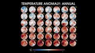
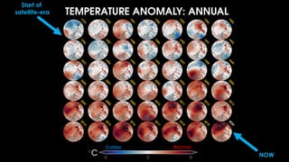
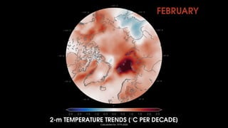
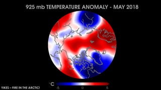
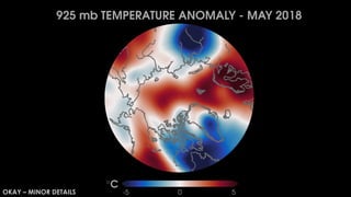
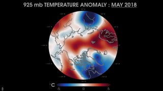
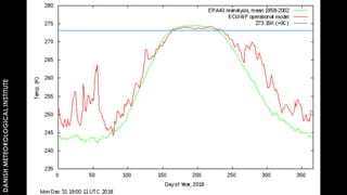
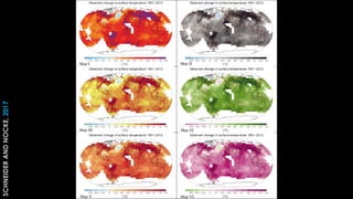
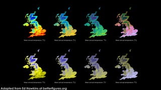
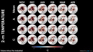
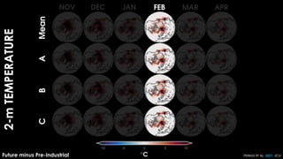
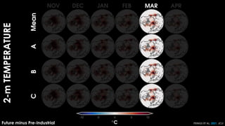
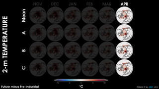
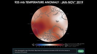
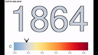
![[TWEET]: By looking at changes in air temperature over just
one day, you can see contributions from a variety of Earth
systems: land surface feedbacks, effects of land vs. water
(oceans, lakes, rivers), topography (mountains), heat
transport from storms, the diurnal cycle, etc.](https://image.slidesharecdn.com/meeting03-10-2021scicommworkshop-210311145333/85/Improving-science-communication-through-data-visualization-11-320.jpg)

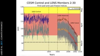


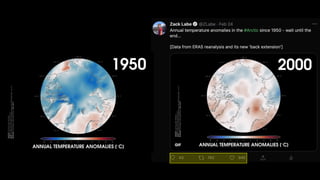

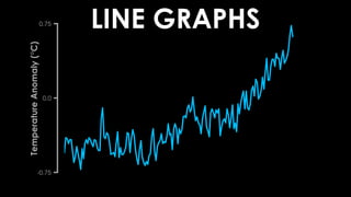
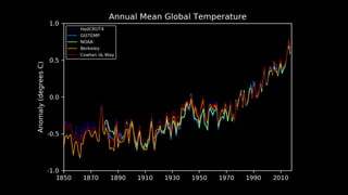
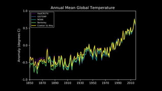
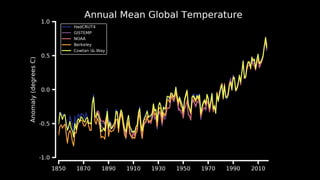
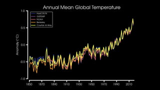
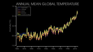
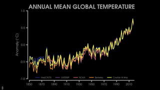
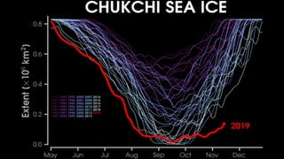
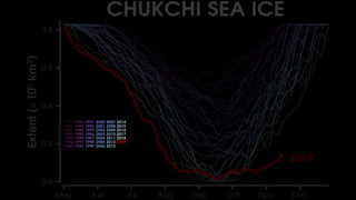
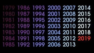
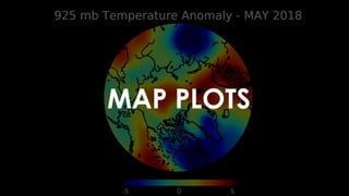
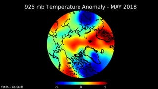
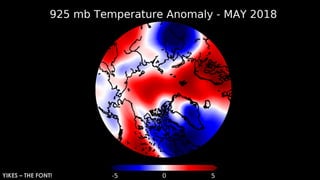
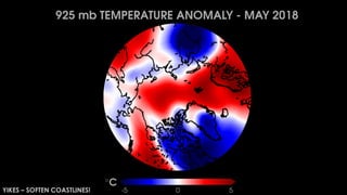
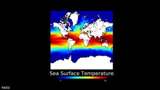
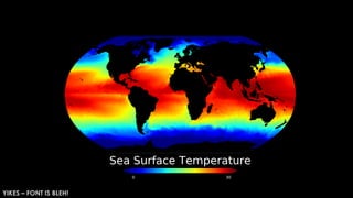

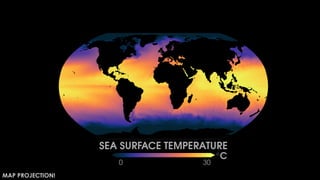
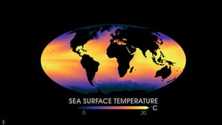
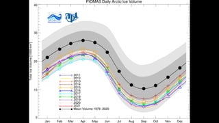
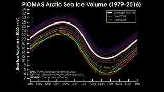
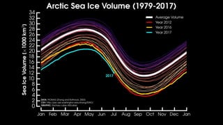
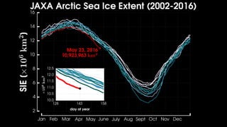
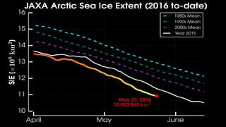
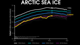
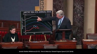
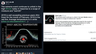

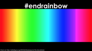
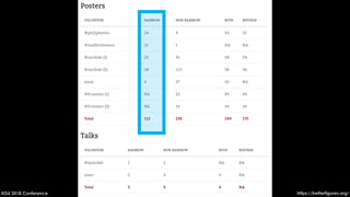
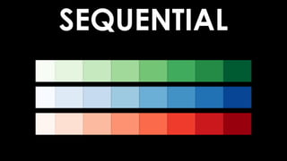
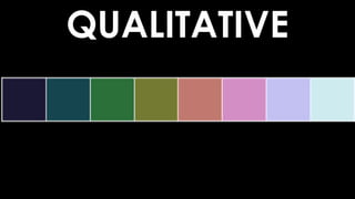

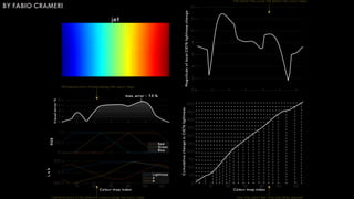
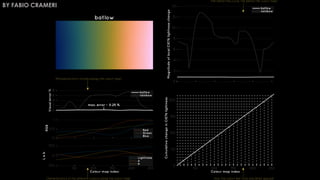
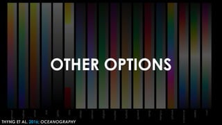
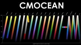


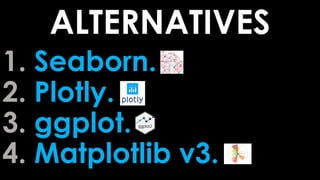
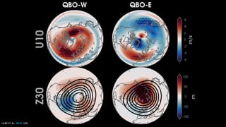
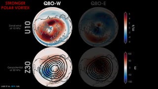
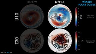


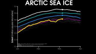
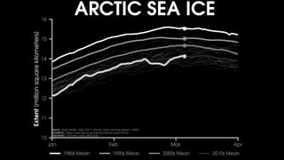
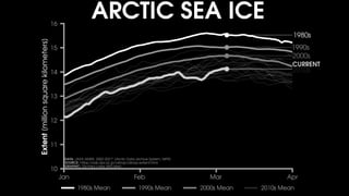
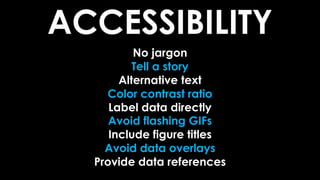
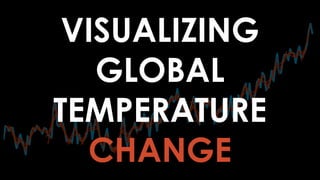


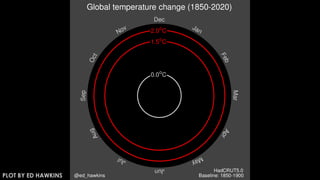
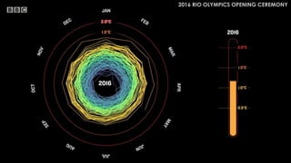
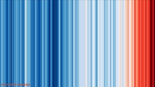

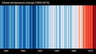

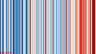
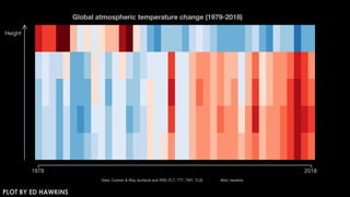
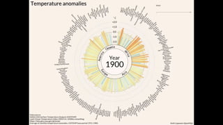
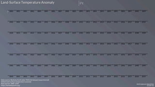
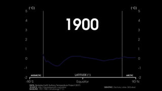
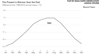
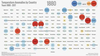


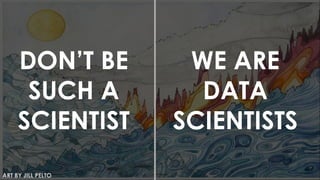
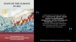
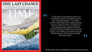
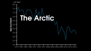
This document discusses improving science communication through data visualization. It provides examples of data visualizations created by Zachary Labe and other scientists to communicate climate change information more effectively. These visualizations use tools like maps, line graphs and color to tell stories with data on topics like rising global temperatures, sea level rise and glacier decline. The document also discusses best practices for data visualization, including using accurate and accessible colors, fonts and designs to clearly convey scientific concepts and findings.


![Polymer [ बहुलक ] Chemistry Notes PDF - Irfanullah Mehar - JJ Sir Chemistry.pdf](https://cdn.slidesharecdn.com/ss_thumbnails/polymerchemistrynotespdf-irfanullahmehar-jjsirchemistry-260210172118-3f9b37f7-thumbnail.jpg?width=640&height=640&fit=bounds)


