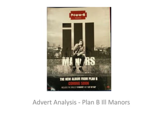
2. • This advert is for Plan B’s album Ill Manors.
The artists name is shown at t the top of the
advert, present in both the photos primary
optical area and strong fallow area. This is the
first thing that will see when they look at the
advert. This immediately informs the viewer
whose album they are reading about and will
straight away influence their decision on
whether or not to buy it. The logo is however
not very clear and is not universally friendly as
some people with vision impairments may
find it difficult to read.
3. • This hip hop album was released as a
soundtrack to the gangster/crime movie ‘Ill
Manors’ also produced by the artist, several of
the songs featured act as narration for the
movie. The songs tell the story of several
characters as they fight for survival and
respect on the streets. The background of the
advert reinforces as gangster films are
typically set in urban locations.
4. • The colour palette used on the advert
reinforce the theme of the movie, that deals
with life, death and violence. The black, white
and red colour scheme creates a contrast and
binary opposition with the meanings they
connote. Black connotes death and decay
while white represents life and renewal,
creating an opposition of life and death. The
red connotes anger, danger and violence.
5. • The picture of the advert features a man sat on
the wall smoking. The name of the album ‘Ill
Manors’ immediately connotes a theme of
rebellion. The use of dull colour in the advert
suggests the residents of this urban area are
unhappy, and possibly a reason for people to
rebel. The urban background looks cramped and
claustrophobic, also suggesting that the residents
of this area are trapped and cannot escape the
rebellion and crime in the area. The use of the
word ill in the shape of skyscrapers suggests that
this area lacks the luxury of other parts of London
and that it is one of the poorer areas.
6. • The rule of thirds can be applied to this advert.
The main centre piece which is the name of the
album is present at all intersecting lines making it
visible no matter where the viewer looks. The
Gutenberg Design principle can be applied as the
most important details such as the artists name
and the name of the album are in the primary
optical area and strong fallow area. Whereas
other details such as the songs it features are
placed in the weak fallow and terminal area. This
is because the maker wants the viewer to notice
this last and focus more on the artwork of the
album.
7. • All of the font used on the advert apart from the
artist’s logo at the top is clear and easy to read.
The use of stylistic bold font’s helps this advert to
stand out amongst others. The use of the colour
red also highlights other words such as coming
soon, and makes them stand out. This is done to
influence the reader to then go and find out
when it is out and pre order the album. By
showing no date it ensures that the viewer will be
intrigued as to when the album is out and will
then go and find out more about the album,
influencing them even more to go and buy the
album.