Advert Analysis – Ed Sheeran X
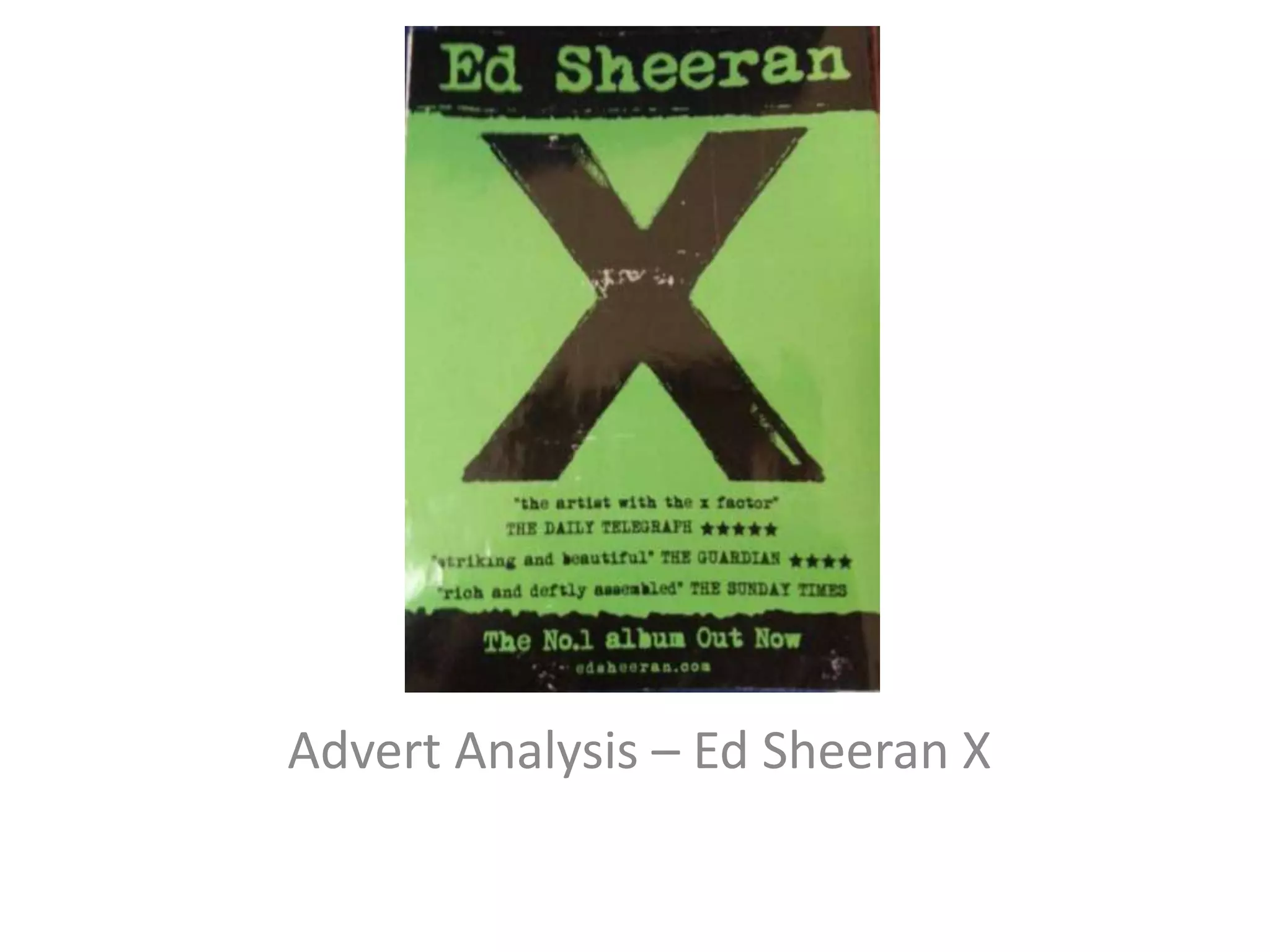
• This advert is for Ed Sheeran’s album X (multiply).
The artist’s name is visible at the top of the
advert and clearly stands out, this immediately
informs the viewer which singer’s album this is.
• The album’s logo, an X takes up the majority of
the space on the advert, drawing attention to it.
In terms of the saying ‘X marks the spot’ this
could have connotations that this album is the
best and you should buy it.
• The advert shows the album is out now and
makes reference to it being ‘the no.1 album’,
influencing people to buy it, further reinforcing
the idea that this album is better than all the rest.
• Towards the bottom of the advert is a section
that contains reviews of the albums from popular
newspapers, that haven given it 5 star reviews
and used words such as ‘striking’ and ‘deftly
assembled’ all which influence the audience to
purchase the album. Below all of this is the artists
website. By placing a link at the bottom this
would increase sales of all the artists other
merchandise as the viewer would check this
website and if they were a fan they would then
be provided with links to merchandise such as
clothing, accessories and concert tickets,
increasing the overall revenue of the artist and
his label.
• The two colours used on the advert are black
and green. Green has connotations such as
renewal, growth and is the colour that
represents the balance of emotions between
the head and the heart. Black is this case can
be seen as representative of power,
independence and confidence. The usage of
green, suggests that the artist is growing and
that some of the songs will have connotations
of love and romance. The black representing
independence implies that the artist has
written or co written all of the music.
• The albums name multiply (shown as x)
suggests that this album is better than
anything than that the artist has released
before, connoting that it is however many
times better than what he has previously
released. Just below the albums title is the
phrase ‘the artist with the x factor’. The X
factor is a TV show designed to find the next
biggest pop star, this phrase suggests that Ed
Sheeran is the next biggest thing in pop music
as he has the ‘X factor’, something all winners
of that competition must have.
• The font on the advert is clear and stylistic. It is clear and
easy to read and attracts audiences of all ages. The
simplicity of the advert suggests that the primary
audience for this advert and album is a younger
audience. The rule of thirds is used on this advertisement
as the X which is the primary feature of the advert is
present at all intersecting points on the advert, making it
the central piece on the advert. The Gutenberg design
principle can also be applied to this advert as in the
primary optical area and the strong fallow area is the
name of the artist, this is the first thing that the reader
will see and they will immediately be informed as to
who’s album this is. Other miscellaneous and smaller
details such as the artists website ae included in the
weak fallow and terminal area suggesting that they are
not as important as other features contained on the
advert.

Ed sheeran multiply

  • 1.
    Advert Analysis –Ed Sheeran X
  • 2.
    • This advertis for Ed Sheeran’s album X (multiply). The artist’s name is visible at the top of the advert and clearly stands out, this immediately informs the viewer which singer’s album this is. • The album’s logo, an X takes up the majority of the space on the advert, drawing attention to it. In terms of the saying ‘X marks the spot’ this could have connotations that this album is the best and you should buy it. • The advert shows the album is out now and makes reference to it being ‘the no.1 album’, influencing people to buy it, further reinforcing the idea that this album is better than all the rest.
  • 3.
    • Towards thebottom of the advert is a section that contains reviews of the albums from popular newspapers, that haven given it 5 star reviews and used words such as ‘striking’ and ‘deftly assembled’ all which influence the audience to purchase the album. Below all of this is the artists website. By placing a link at the bottom this would increase sales of all the artists other merchandise as the viewer would check this website and if they were a fan they would then be provided with links to merchandise such as clothing, accessories and concert tickets, increasing the overall revenue of the artist and his label.
  • 4.
    • The twocolours used on the advert are black and green. Green has connotations such as renewal, growth and is the colour that represents the balance of emotions between the head and the heart. Black is this case can be seen as representative of power, independence and confidence. The usage of green, suggests that the artist is growing and that some of the songs will have connotations of love and romance. The black representing independence implies that the artist has written or co written all of the music.
  • 5.
    • The albumsname multiply (shown as x) suggests that this album is better than anything than that the artist has released before, connoting that it is however many times better than what he has previously released. Just below the albums title is the phrase ‘the artist with the x factor’. The X factor is a TV show designed to find the next biggest pop star, this phrase suggests that Ed Sheeran is the next biggest thing in pop music as he has the ‘X factor’, something all winners of that competition must have.
  • 6.
    • The fonton the advert is clear and stylistic. It is clear and easy to read and attracts audiences of all ages. The simplicity of the advert suggests that the primary audience for this advert and album is a younger audience. The rule of thirds is used on this advertisement as the X which is the primary feature of the advert is present at all intersecting points on the advert, making it the central piece on the advert. The Gutenberg design principle can also be applied to this advert as in the primary optical area and the strong fallow area is the name of the artist, this is the first thing that the reader will see and they will immediately be informed as to who’s album this is. Other miscellaneous and smaller details such as the artists website ae included in the weak fallow and terminal area suggesting that they are not as important as other features contained on the advert.