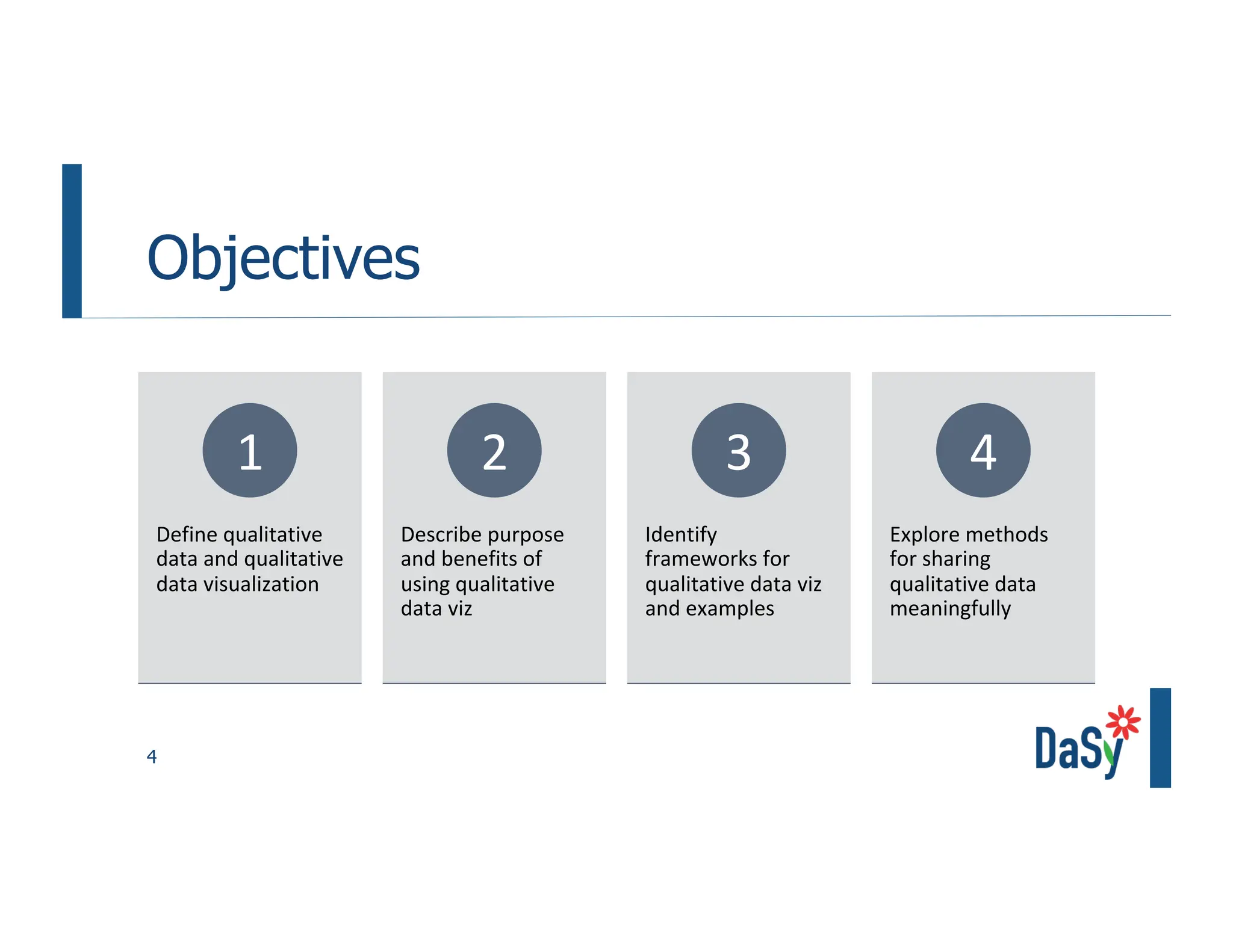
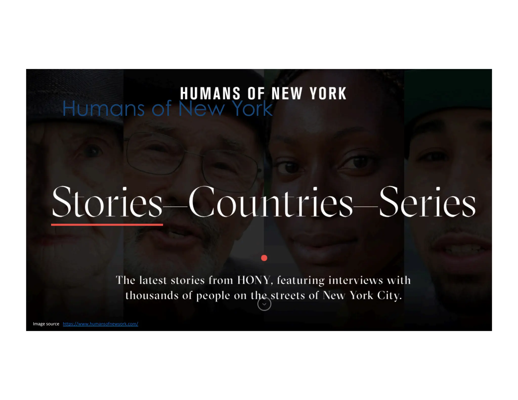
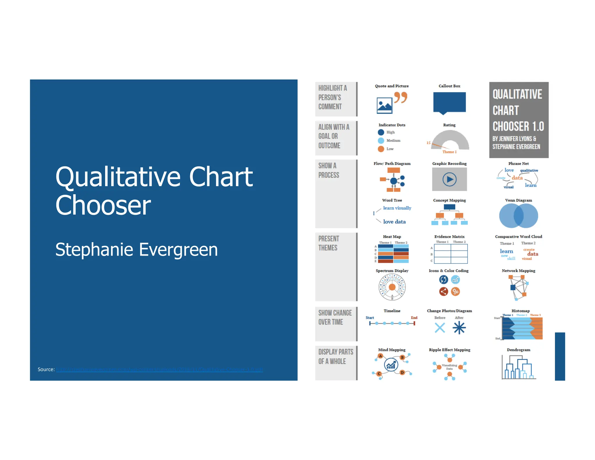
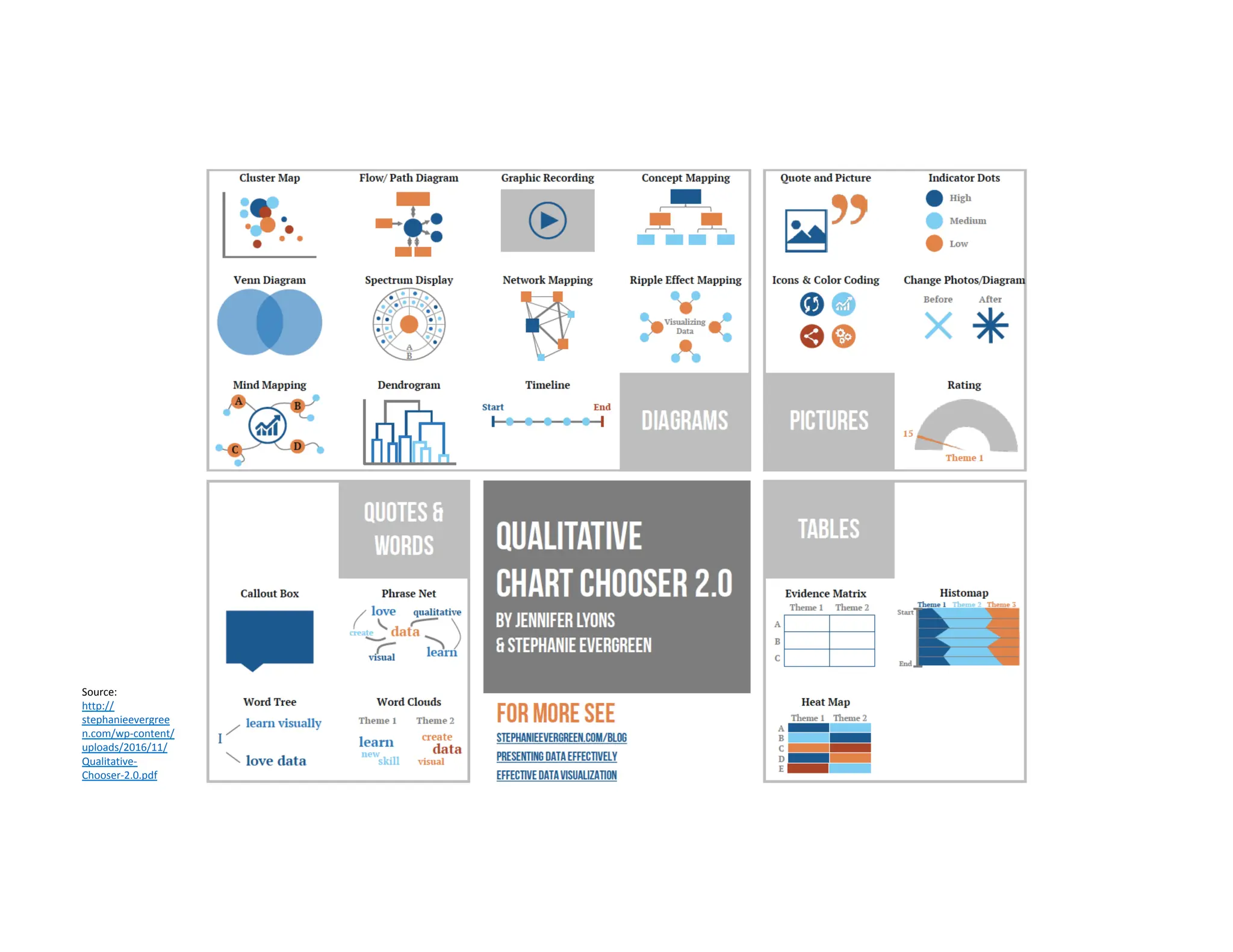
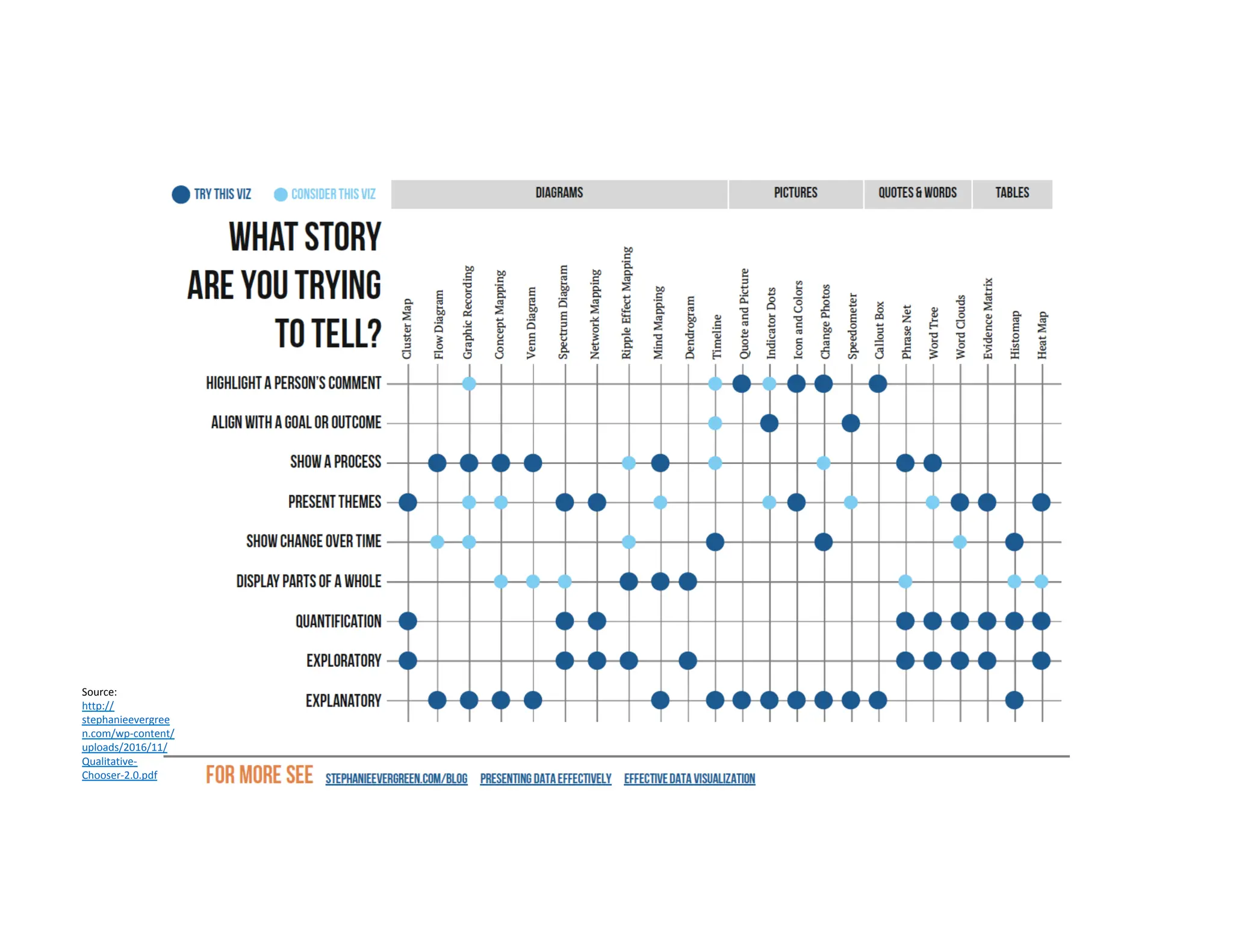
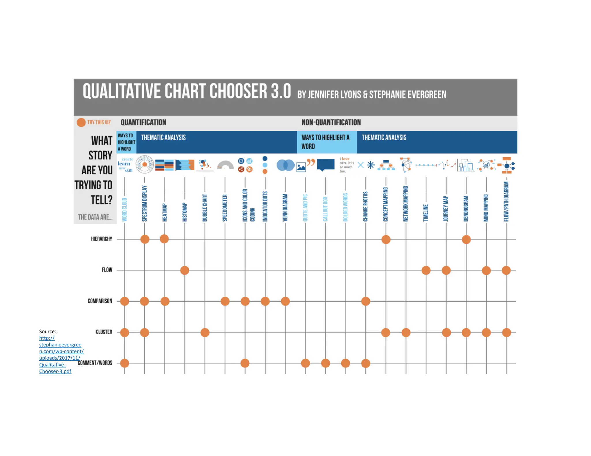
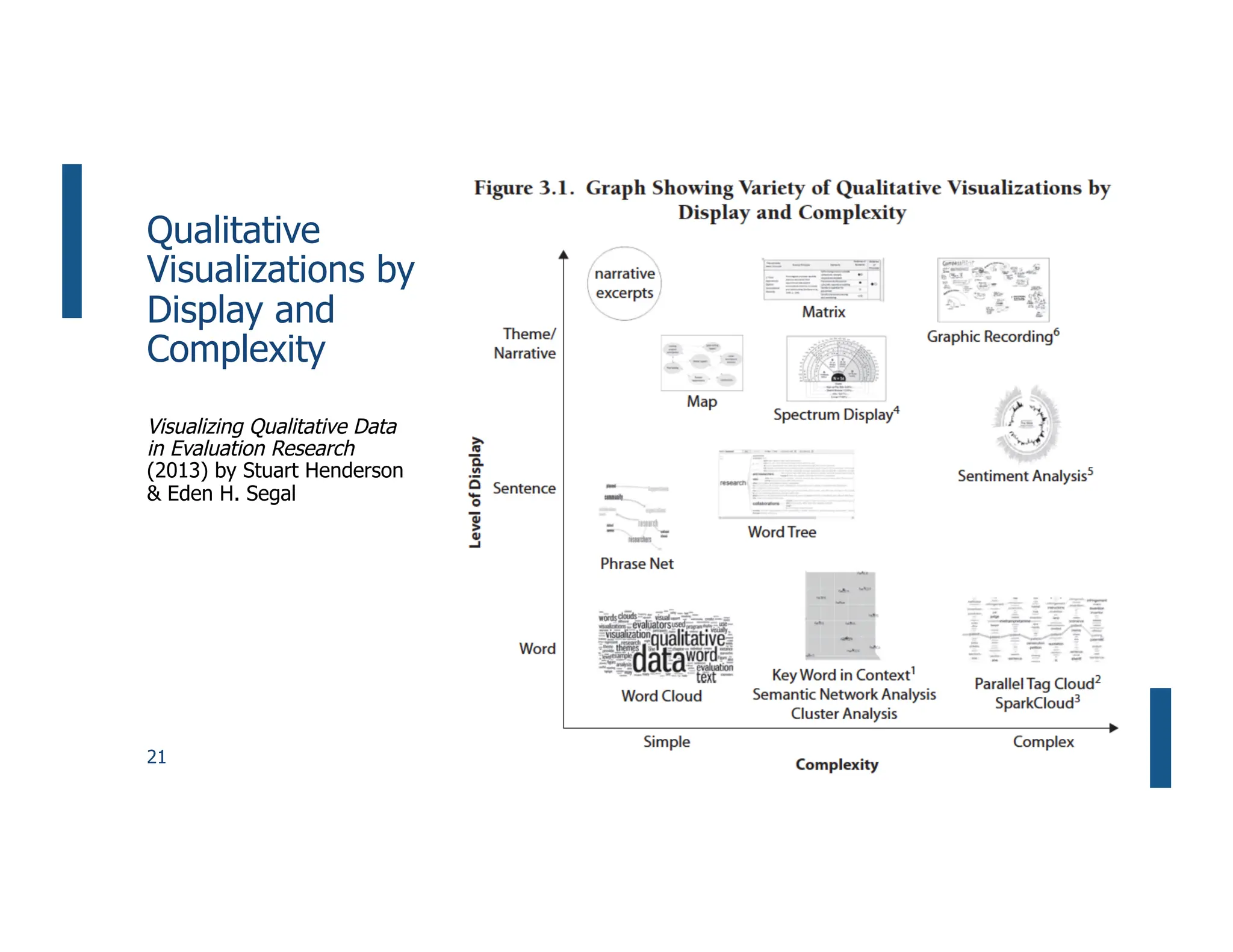
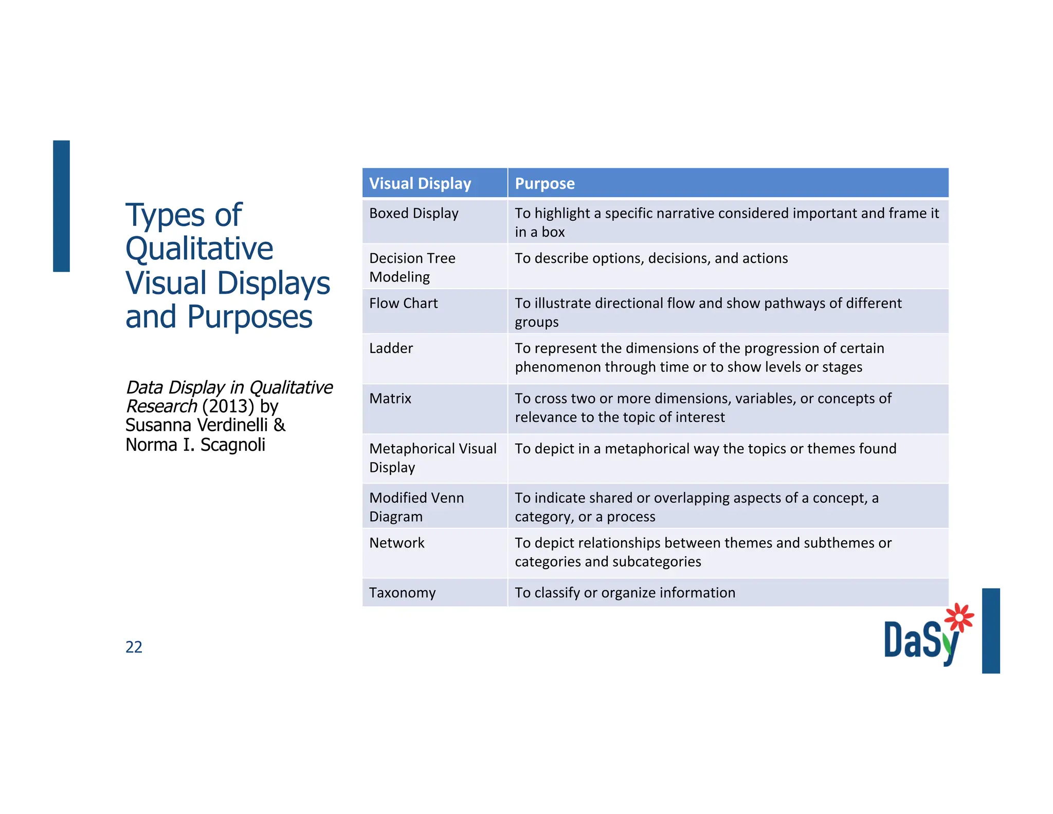
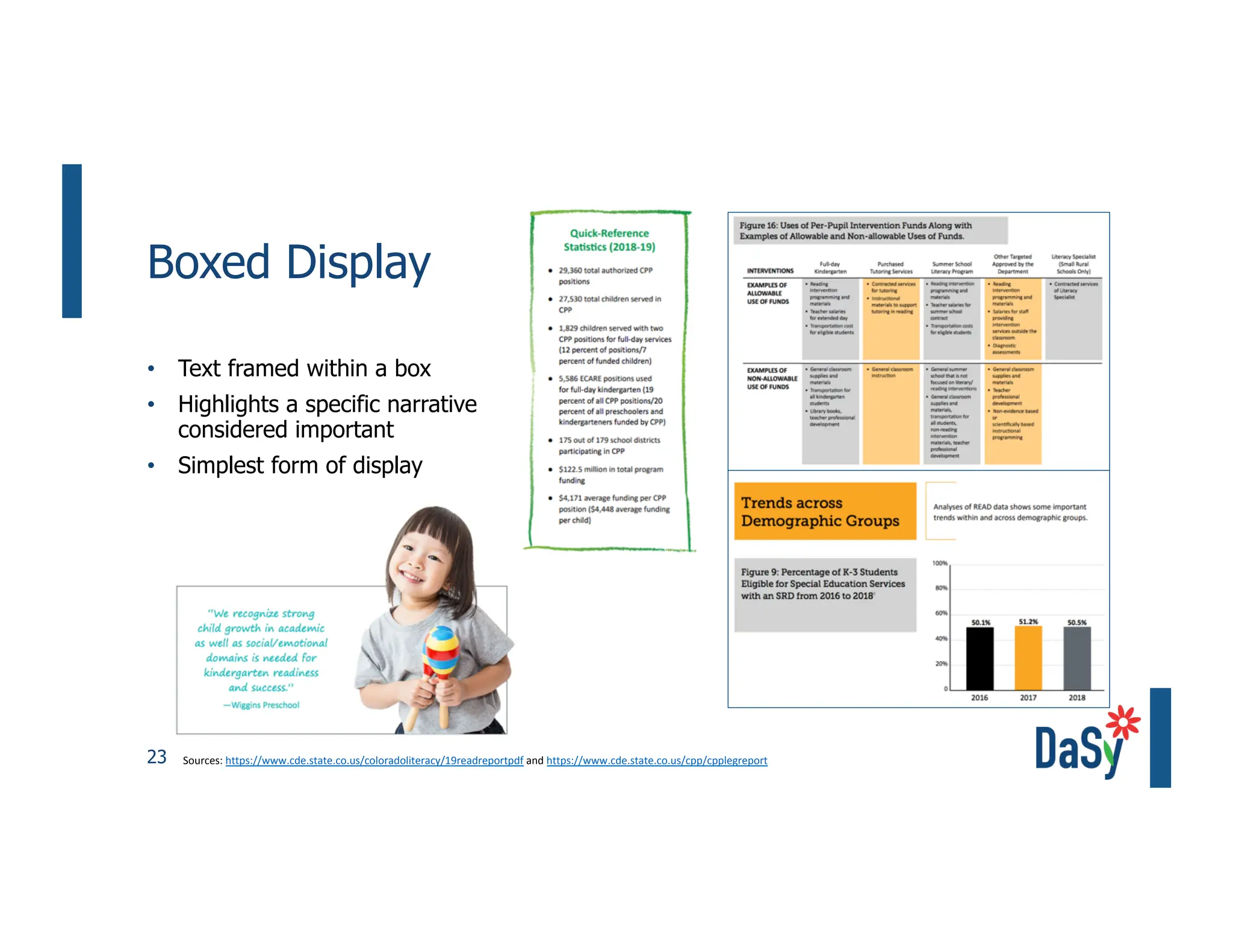
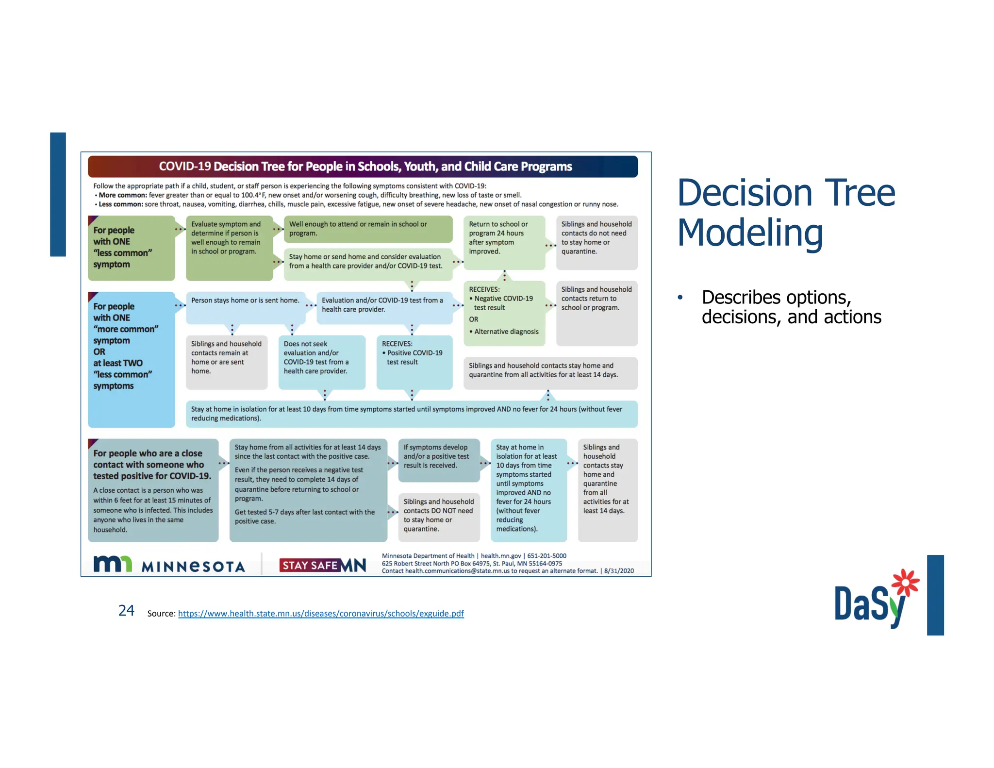
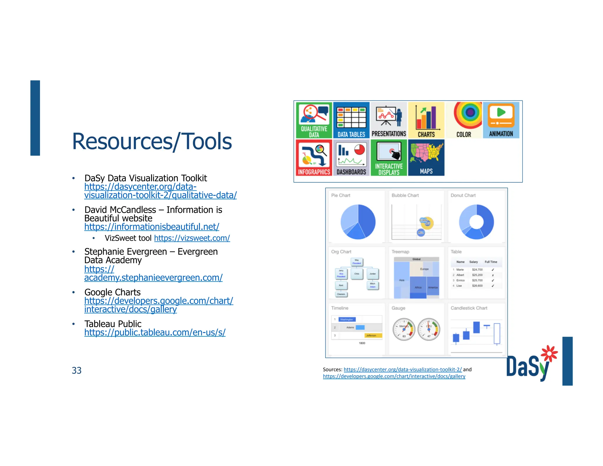
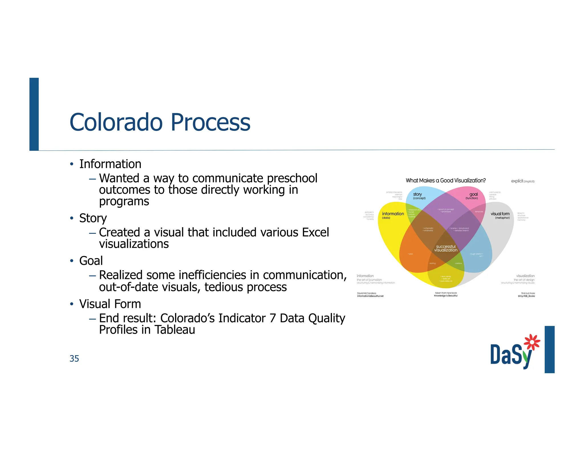
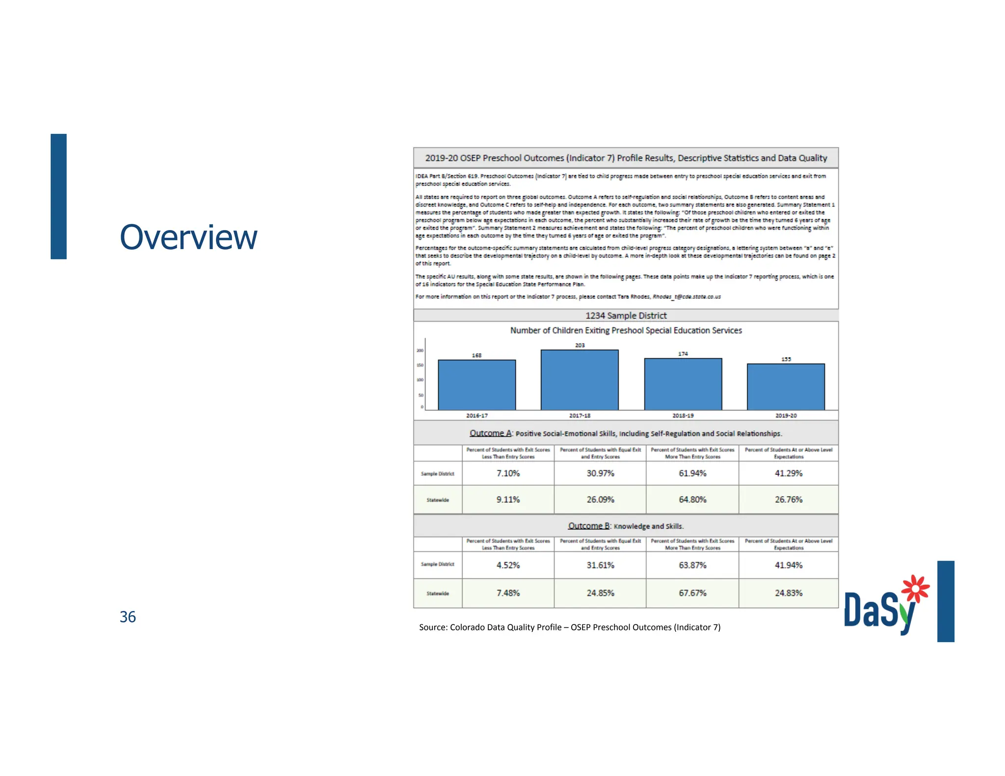
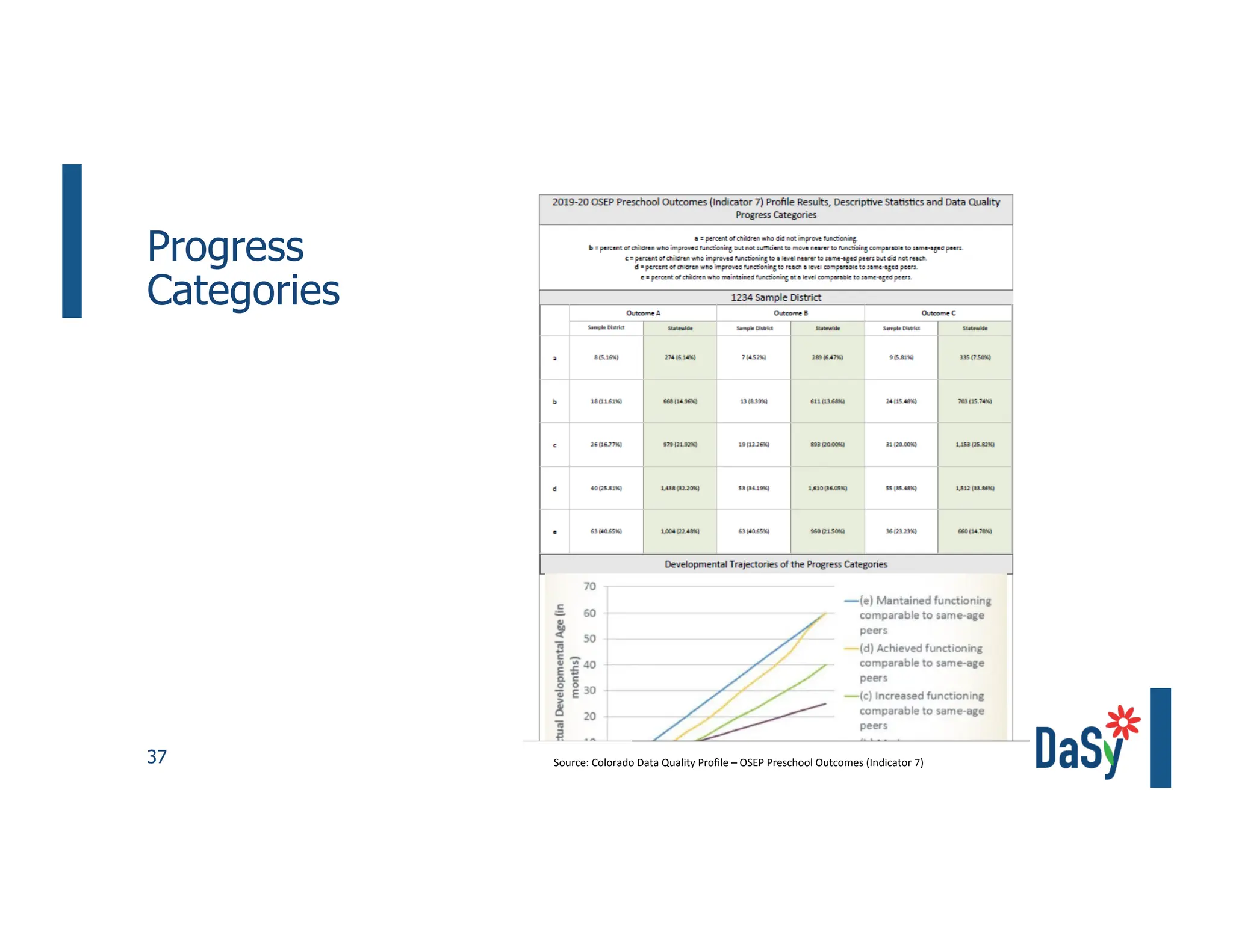
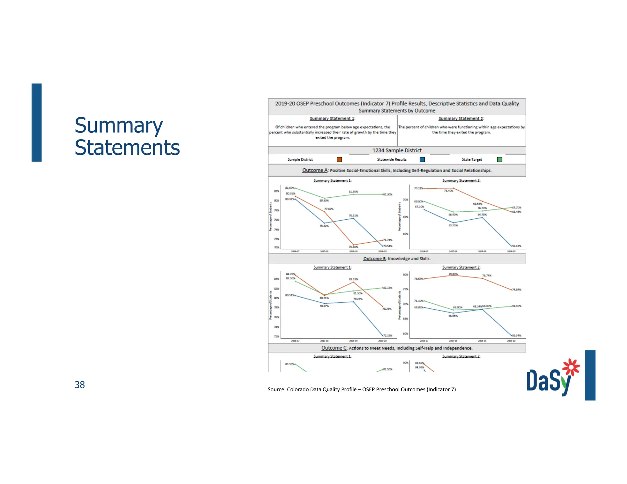
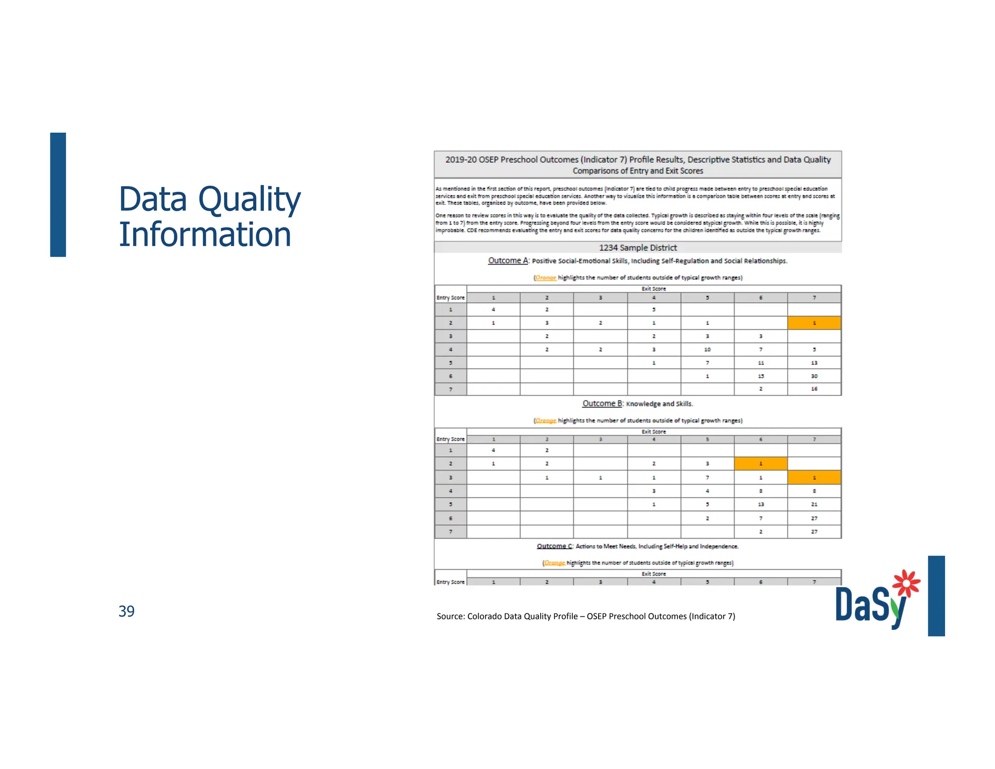
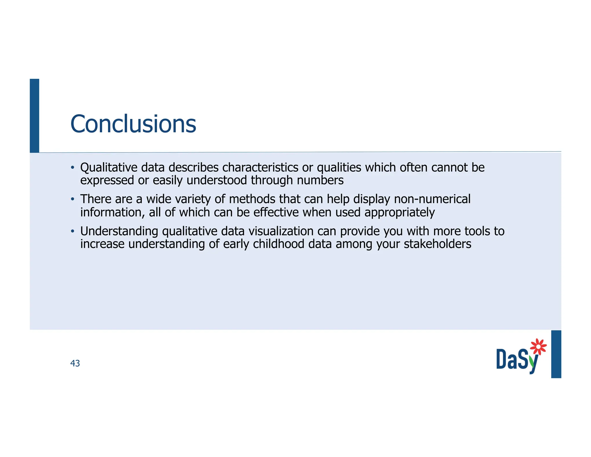
2. Unlocking the
Power of
Qualitative Data
with Data
Visualization
Fred Edora, DaSy
Jenna Nguyen, DaSy
Tara Rhodes, Colorado
IDIO Virtual Convening
October 19-22, 2020
4. 4
Objectives
Define qualitative
data and qualitative
data visualization
1
Describe purpose
and benefits of
using qualitative
data viz
2
Identify
frameworks for
qualitative data viz
and examples
3
Explore methods
for sharing
qualitative data
meaningfully
4
8. Nothing in life is to be feared, it is only to
be understood.
– Marie Curie
9. 9
What Is Qualitative
Data?
Qualitative Data Quantitative Data
Descriptive or categorical data Numerical data
Describes characteristics or
qualities which often cannot be
expressed or easily understood
through numbers (e.g., opinions,
views, attitudes)
Describes quantities or
characteristics that can
expressed numerically (e.g.,
numbers, counts, percentages,
demographics, census data)
Examples of qualitative data
collection:
• Questionnaires (i.e., open-
ended survey questions)
• Interviews
• Focus groups
• Observations
Examples of quantitative data
collection:
• Questionnaires (i.e., closed-
ended survey questions)
• Longitudinal studies
• Randomized control trials
Examples of qualitative data
visualization:
• Word clouds
• Timelines
• Matrices
Examples of quantitative data
visualization:
• Bar graphs
• Pie charts
• Scatter plots
Used to generate hypotheses Used to test hypotheses
Image source: David McCandless "365 Days of Beautiful News"
https://informationisbeautiful.net/beautifulnews/
10. 10
What Is Data Visualization?
“Data display in a graphic format is a way of
portraying information succinctly and
efficiently, illustrating details provided in
longer textual information.”
Source: Verdinelli, S., & Scagnoli, N. I. (2013)
11.
12. 12
When Should We Use
Qualitative Data Viz?
Qualitative data visualization
can be useful when:
• Much of the information
you will be collecting is
not numerical
• You want to explore the
data in a creative way to
your audience or
stakeholders
• You want to show
connections in the data
and/or generate
hypotheses
Source: Henderson, S. & Segal, E. (2013); Verdinelli, S., & Scagnoli, N. I. (2013)
Image source: https://unsplash.com/photos/iMdsjoiftZo
13. 13
What Can You Do with Qualitative Visual
Displays?
Can be used to:
• Reduce and focus text
• Highlight themes and patterns in the data
• Identify outliers
• Convey a message, discovery, or particular perspective
• Introduce new levels of understanding
• Purpose of “illuminating rather than obscuring the
message”
Source: Henderson, S. & Segal, E. (2013); Verdinelli, S., & Scagnoli, N. I. (2013)
14. 14
How Does Qualitative Data Visualization
Benefit Our Audiences?
Audiences can:
• Acquire new insights
• Develop elaborate understanding
• Appreciate new knowledge
• Build theories
• Draw conclusions
• Take action
Source: Henderson, S. & Segal, E. (2013); Verdinelli, S., & Scagnoli, N. I. (2013)
15. David McCandless
Making Data into Art
Video: https://informationisbeautiful.net/visualizations/making-data-out-of-art-a-short-film/
16. Humans of New York
Image source: https://www.humansofnewyork.com/
22. 22
Types of
Qualitative
Visual Displays
and Purposes
Data Display in Qualitative
Research (2013) by
Susanna Verdinelli &
Norma I. Scagnoli
Visual Display Purpose
Boxed Display To highlight a specific narrative considered important and frame it
in a box
Decision Tree
Modeling
To describe options, decisions, and actions
Flow Chart To illustrate directional flow and show pathways of different
groups
Ladder To represent the dimensions of the progression of certain
phenomenon through time or to show levels or stages
Matrix To cross two or more dimensions, variables, or concepts of
relevance to the topic of interest
Metaphorical Visual
Display
To depict in a metaphorical way the topics or themes found
Modified Venn
Diagram
To indicate shared or overlapping aspects of a concept, a
category, or a process
Network To depict relationships between themes and subthemes or
categories and subcategories
Taxonomy To classify or organize information
23. 23
Boxed Display
• Text framed within a box
• Highlights a specific narrative
considered important
• Simplest form of display
Sources: https://www.cde.state.co.us/coloradoliteracy/19readreportpdf and https://www.cde.state.co.us/cpp/cpplegreport
24. 24
Decision Tree
Modeling
• Describes options,
decisions, and actions
Source: https://www.health.state.mn.us/diseases/coronavirus/schools/exguide.pdf
25. 25
Flow Chart
• Illustrates directional flow
• Arranged in terms of their
relationships in a process or
through time rather than as
static entities
Sources: https://nirn.fpg.unc.edu/module-5/introduction and
https://www.health.ny.gov/publications/0532.pdf
26. 26
Ladder or Step-by-
Step Process
• Represents the progression of
certain phenomenon through
time to show levels or stages
• Additionally, indicates the
level of change at each step
• Ladders are unidirectional
MEETS REQUIREMENTS
Each year, the United States Department of Education, Office of Special
Education Programs makes a determination about how well each state
is doing with meeting the complex requirements of the Individuals with
Disabilities Special Education Act, Part C. Meets Requirements is the
highest of the four determinations followed by Needs Assistance,
Needs Intervention, and the lowest category of Needs Significant
Intervention.
2020
2019
2018
2017
2016
2015
Meets
Requirements
Meets
Requirements
Needs Assistance
Needs Assistance
Needs Assistance.
Needs Assistance
2014
Needs Intervention
2013 Needs Assistance
2012
Needs
Intervention
2011 Needs
Intervention
2010
Needs Assistance
2009 Needs Assistance
with Special
Conditions
Scaling Up Evidence Based
Practices including:
Coaching
Natural Learning Opportunities
Resource Based Capacity
Building
2008
Needs Assistance
2007 Needs Intervention
2006
Meets
Requirements
2 years in a row!
IMPROVED
COMPLIANCE
TIMELY SERVICES & 45-DAY TIMELINE &
EARLY CHILDHOOD TRANSITION
STRONGER
Collaboration Among
DDD & ASDB &
AzEIP Contractors
Data System
Enhancements
Source: Arizona Early
Intervention Program
(AzEIP)
30. 30
Modified Venn
Diagram
• Indicates shared or
overlapping aspects of a
concept, category, or process
• Often used to depict a model
or conceptual framework
31. 31
Comparative
Word Cloud
• Visual display of word counts
Image source: https://informationisbeautiful.net/visualizations/covid-19-coronavirus-infographic-datapack/
32. 32
Spectrum Display
• A data display which allows
you to display individual data
in a way that tells a story
33. 33
Resources/Tools
• DaSy Data Visualization Toolkit
https://dasycenter.org/data-
visualization-toolkit-2/qualitative-data/
• David McCandless – Information is
Beautiful website
https://informationisbeautiful.net/
• VizSweet tool https://vizsweet.com/
• Stephanie Evergreen – Evergreen
Data Academy
https://
academy.stephanieevergreen.com/
• Google Charts
https://developers.google.com/chart/
interactive/docs/gallery
• Tableau Public
https://public.tableau.com/en-us/s/
Sources: https://dasycenter.org/data-visualization-toolkit-2/ and
https://developers.google.com/chart/interactive/docs/gallery
35. 35
Colorado Process
• Information
‒ Wanted a way to communicate preschool
outcomes to those directly working in
programs
• Story
‒ Created a visual that included various Excel
visualizations
• Goal
‒ Realized some inefficiencies in communication,
out-of-date visuals, tedious process
• Visual Form
‒ End result: Colorado’s Indicator 7 Data Quality
Profiles in Tableau
43. 43
Conclusions
• Qualitative data describes characteristics or qualities which often cannot be
expressed or easily understood through numbers
• There are a wide variety of methods that can help display non-numerical
information, all of which can be effective when used appropriately
• Understanding qualitative data visualization can provide you with more tools to
increase understanding of early childhood data among your stakeholders
44. 44
Making data mean more through storytelling |
Ben Wellington | TEDxBroadway
Video: https://www.youtube.com/watch?v=6xsvGYIxJok
46. 46
References
• Henderson, S. & Segal, E. (2013). Visualizing qualitative data in evaluation
research. In T. Azzam & S. Evergreen (Eds.), Data visualization, part 1. New
Directions for Evaluation, 139, 53-71.
• Verdinelli, S., & Scagnoli, N. I. (2013). Data Display in Qualitative Research.
International Journal of Qualitative Methods, 12(1), 359–381.
49. Thank you
Visit us at http://dasycenter.org/
Follow us on Twitter: @DaSyCenter
The contents of this presentation were developed under a grant from the U.S. Department of Education,
#H373Z190002. The contents and resources do not necessarily represent the policy of the U.S. Department of
Education, and you should not assume endorsement by the Federal Government. Project Officers: Meredith Miceli
and Amy Bae.