Download as PDF, PPTX


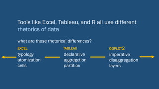
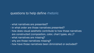


![HOW TO VISUALIZE
TWO NUMBERS
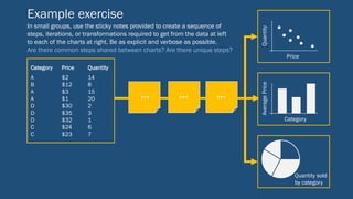
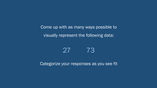
Given the data set of 27, 73 or 13, 87 , how many different ways can you think of to
visualize those data using only markers and sticky notes?
The following are responses to this prompt given in data visualization workshops over the past year — ranging
from familiar bar and pie charts to some creative deviations — categorized by the channels and modes through
which they communicate these quantities.
P_00274
P_00088
P_00243
P_00095
P_00189
P_00312
P_00017
P_00030
P_00008
P_00007
P_00063
P_00216
P_00210
P_00236
P_00321
P_00161
P_00125
P_00100
P_00093
SIZE
PROPORTION
POSITION
QUANTITY
COLOR
ANGLE
SYMBOL
TEXTURE
FREQUENCY
VALUE
NUMERACY
TEXT
AGE
WEIGHT
SEMANTICS
SIZE
PROPORTION
POSITION
QUANTITY
COLOR
ANGLE
SYMBOL
TEXTURE
FREQUENCY
VALUE
NUMERACY
TEXT
AGE
WEIGHT
SEMANTICS
SIZE
PROPORTION
POSITION
QUANTITY
COLOR
ANGLE
SYMBOL
TEXTURE
FREQUENCY
VALUE
NUMERACY
TEXT
AGE
WEIGHT
SEMANTICS
SIZE
PROPORTION
POSITION
QUANTITY
COLOR
ANGLE
SYMBOL
TEXTURE
FREQUENCY
VALUE
NUMERACY
TEXT
AGE
WEIGHT
SEMANTICS
SIZE
PROPORTION
POSITION
QUANTITY
COLOR
ANGLE
SYMBOL
TEXTURE
FREQUENCY
VALUE
NUMERACY
TEXT
AGE
WEIGHT
SEMANTICS
SIZE
PROPORTION
POSITION
QUANTITY
COLOR
ANGLE
SYMBOL
TEXTURE
FREQUENCY
VALUE
NUMERACY
TEXT
AGE
WEIGHT
SEMANTICS
SIZE
PROPORTION
POSITION
QUANTITY
COLOR
ANGLE
SYMBOL
TEXTURE
FREQUENCY
VALUE
NUMERACY
TEXT
AGE
WEIGHT
SEMANTICS
SIZE
PROPORTION
POSITION
QUANTITY
COLOR
ANGLE
SYMBOL
TEXTURE
FREQUENCY
VALUE
NUMERACY
TEXT
AGE
WEIGHT
SEMANTICS
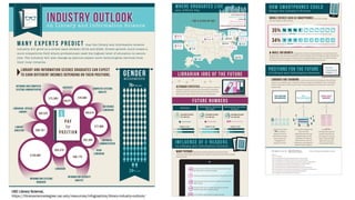
This visualization was created by Steven Braun using D3.js and Adobe Illustrator. Steven is
the Data Analytics and Visualization Specialist in Snell Library. For more information about
data visualization services offered in Snell, see subjectguides.lib.neu.edu/gis-datavis or
contact Steven at s.braun@northeastern.edu.
ABSTRACT
CHART TYPES
AREA CHART
BAR CHART
BELL CURVE OR BOX PLOT
HISTOGRAM
LINE CHART
NUMBER LINE
PICTORIAL
PIE CHART
SCATTER PLOT
STACKED COLUMNS
TALLY MARKS
TEXT
VENN DIAGRAM
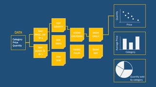
HOW TO READ THIS VISUALIZATION
Each row represents a single visualization (created on a single sticky note) of the data set
[13, 87] or [27, 73]. Columns represent different modes or channels of communicating the
values of these data, e.g., size, proportion, or color. For each visualization, the channels or
modes used by it are marked with a colored square; gray squares indicate that a particular
channel is not used by the respective visualization. Each row is colored according to
visualization or chart type, as indicated to the left.
LEARN MORE
Most of these “abstract”
visualizations did not fall into
any other traditional categories
of charts and graphs but relied
heavily on the use of
proportion and color to
communicate the data set
All of these bar charts relied on
size (length) as the primary
channel of representation,but
some went a step further and
used additional channels like
color and texture to
communicate differences within
the data set
Line charts are effective because
they rely on position as the
primary channel of
communicating value,which
enables highly accurate reading
in one and two dimensions
Pie charts are among the most
popular charts people typically
think of when it comes to
visualization,especially for data
sets where the values add up to
a unified whole (e.g.,100)
Tally marks are among the
simplest ways to visually
communicate a data set,
directly encoding quantity in a
way that is countable in
one-to-one correspondence
Although far less abstract than
other forms of visualization,
simply writing out numbers is
another way of visually
communicating data; here,text
is combined with other
channels such as size to
illustrate numeric differences](https://image.slidesharecdn.com/braun-2-training-nov16-181119145134/85/Rhetorics-of-Data-Narrative-and-Visualization-26-320.jpg)


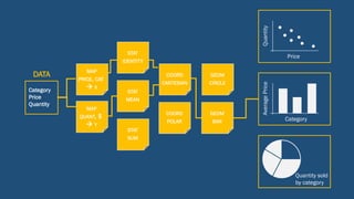
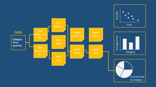
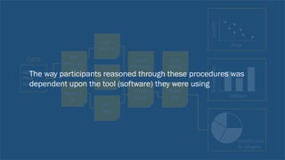
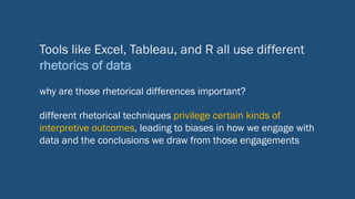
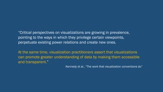
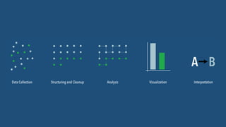
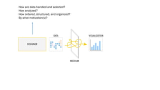
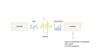
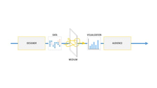
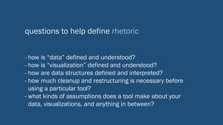
The document discusses the rhetorical aspects of data visualization and analytics, highlighting how different tools like Excel, Tableau, and R offer varying approaches and biases in interpreting data. It emphasizes the importance of understanding the processes involved in data collection, analysis, and visualization, along with critical evaluation questions to assess the narratives presented. Exercises for analyzing and redesigning visualizations are also provided to enhance understanding of how visual representations impact data interpretation.