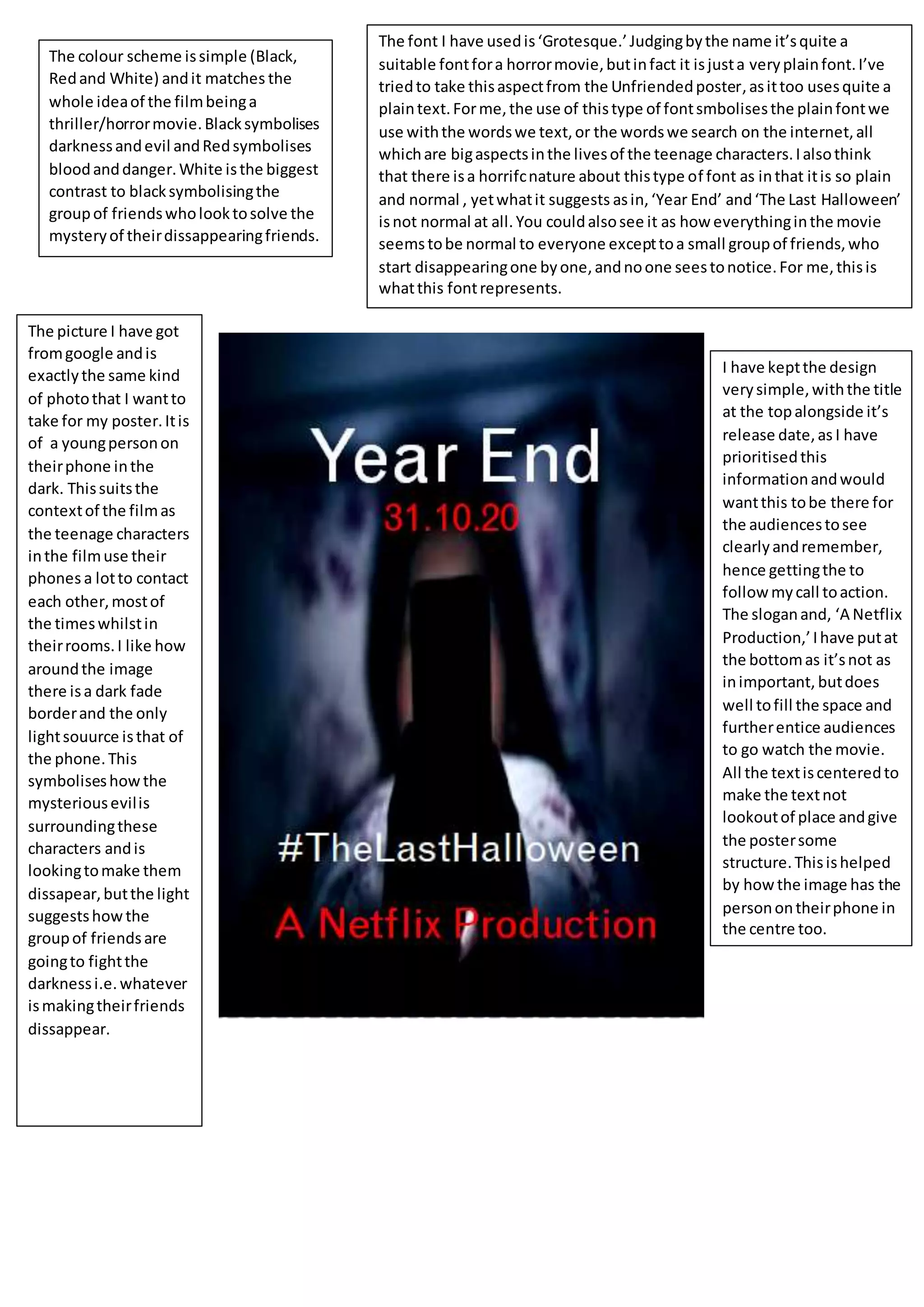
The colour scheme issimple (Black,
Redand White) andit matches the
whole ideaof the filmbeinga
thriller/horrormovie.Blacksymbolises
darknessandevil andRedsymbolises
bloodanddanger.White isthe biggest
contrast to blacksymbolisingthe
groupof friendswholooktosolve the
mysteryof theirdissappearingfriends.
The picture I have got
fromgoogle andis
exactlythe same kind
of photothat I wantto
take for my poster.Itis
of a youngpersonon
theirphone inthe
dark. Thissuitsthe
contextof the filmas
the teenage characters
inthe filmuse their
phones a lotto contact
each other,mostof
the timeswhilstin
theirrooms.I like how
aroundthe image
there isa dark fade
borderand the only
lightsouurce isthat of
the phone.This
symboliseshowthe
mysteriousevilis
surroundingthese
characters andis
lookingtomake them
dissapear,butthe light
suggestshowthe
groupof friendsare
goingto fightthe
darknessi.e.whatever
ismakingtheirfriends
dissappear.
I have keptthe design
verysimple,withthe title
at the topalongside it’s
release date,as I have
prioritisedthis
informationandwould
wantthis tobe there for
the audiencestosee
clearlyandremember,
hence gettingthe to
follow mycall toaction.
The sloganand, ‘A Netflix
Production,’Ihave putat
the bottomas it’snot as
inimportant, butdoes
well tofill the space and
furtherentice audiences
to go watch the movie.
All the textiscenteredto
make the textnot
lookoutof place andgive
the postersome
structure.Thisishelped
by how the image has the
personontheirphone in
the centre too.
The font I have usedis‘Grotesque.’Judgingbythe name it’squite a
suitable fontfora horrormovie,butinfact it isjusta veryplainfont.I’ve
triedto take thisaspectfrom the Unfriendedposter,asittoo usesquite a
plaintext.Forme,the use of thistype of fontsmbolisesthe plainfontwe
use withthe wordswe text,or the wordswe search on the internet,all
whichare bigaspectsinthe livesof the teenage characters.Ialsothink
that there isa horrifcnature about thistype of font as inthat itis so plain
and normal , yetwhatit suggests asin,‘Year End’ and‘The Last Halloween’
isnot normal at all.You couldalsosee it as how everythinginthe movie
seemstobe normal to everyone excepttoa small groupof friends,who
start disappearingone byone,andnoone seestonotice.For me,thisis
whatthis fontrepresents.

Hyuhvfu

  • 1.
    The colour schemeissimple (Black, Redand White) andit matches the whole ideaof the filmbeinga thriller/horrormovie.Blacksymbolises darknessandevil andRedsymbolises bloodanddanger.White isthe biggest contrast to blacksymbolisingthe groupof friendswholooktosolve the mysteryof theirdissappearingfriends. The picture I have got fromgoogle andis exactlythe same kind of photothat I wantto take for my poster.Itis of a youngpersonon theirphone inthe dark. Thissuitsthe contextof the filmas the teenage characters inthe filmuse their phones a lotto contact each other,mostof the timeswhilstin theirrooms.I like how aroundthe image there isa dark fade borderand the only lightsouurce isthat of the phone.This symboliseshowthe mysteriousevilis surroundingthese characters andis lookingtomake them dissapear,butthe light suggestshowthe groupof friendsare goingto fightthe darknessi.e.whatever ismakingtheirfriends dissappear. I have keptthe design verysimple,withthe title at the topalongside it’s release date,as I have prioritisedthis informationandwould wantthis tobe there for the audiencestosee clearlyandremember, hence gettingthe to follow mycall toaction. The sloganand, ‘A Netflix Production,’Ihave putat the bottomas it’snot as inimportant, butdoes well tofill the space and furtherentice audiences to go watch the movie. All the textiscenteredto make the textnot lookoutof place andgive the postersome structure.Thisishelped by how the image has the personontheirphone in the centre too. The font I have usedis‘Grotesque.’Judgingbythe name it’squite a suitable fontfora horrormovie,butinfact it isjusta veryplainfont.I’ve triedto take thisaspectfrom the Unfriendedposter,asittoo usesquite a plaintext.Forme,the use of thistype of fontsmbolisesthe plainfontwe use withthe wordswe text,or the wordswe search on the internet,all whichare bigaspectsinthe livesof the teenage characters.Ialsothink that there isa horrifcnature about thistype of font as inthat itis so plain and normal , yetwhatit suggests asin,‘Year End’ and‘The Last Halloween’ isnot normal at all.You couldalsosee it as how everythinginthe movie seemstobe normal to everyone excepttoa small groupof friends,who start disappearingone byone,andnoone seestonotice.For me,thisis whatthis fontrepresents.