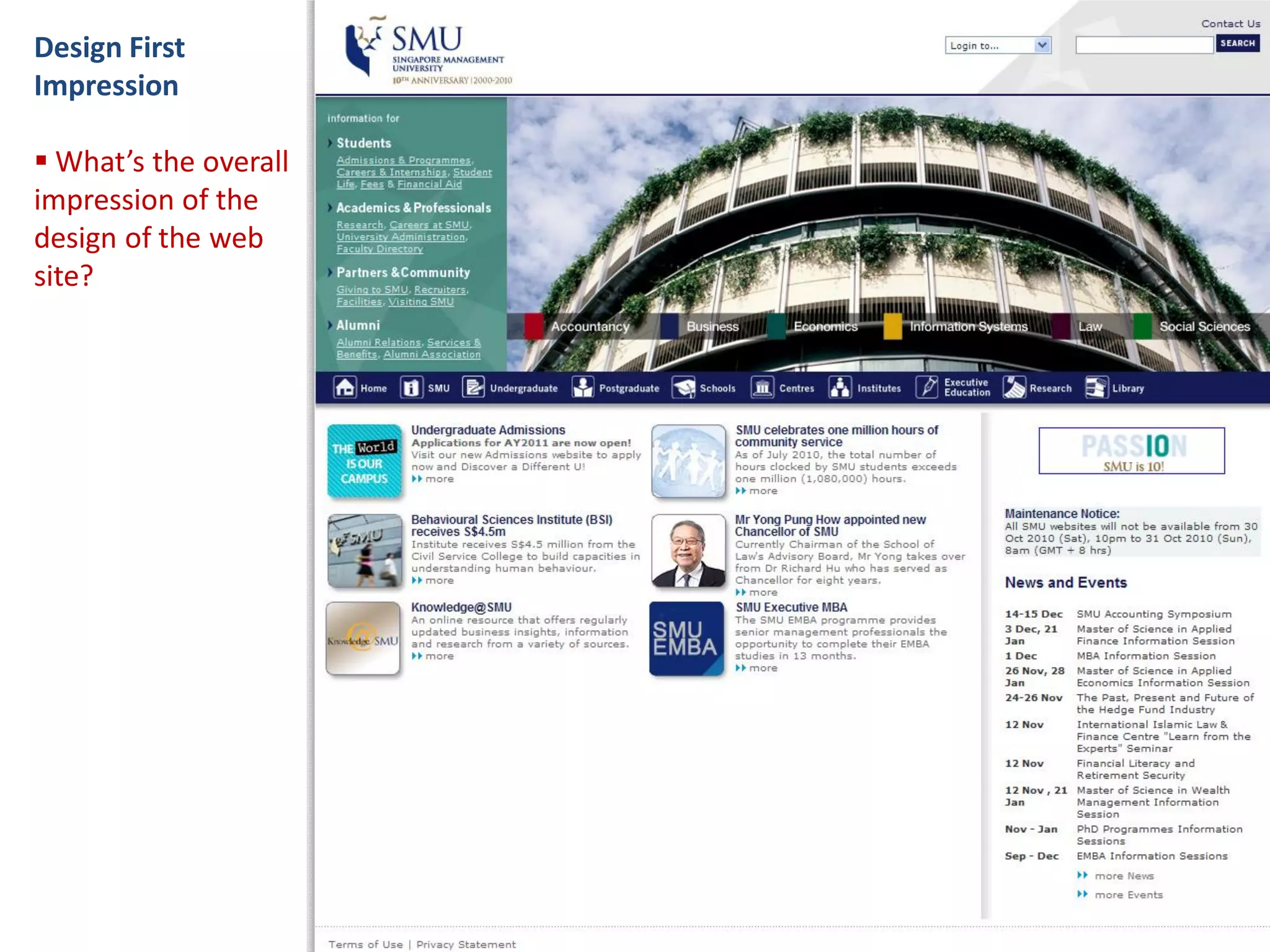
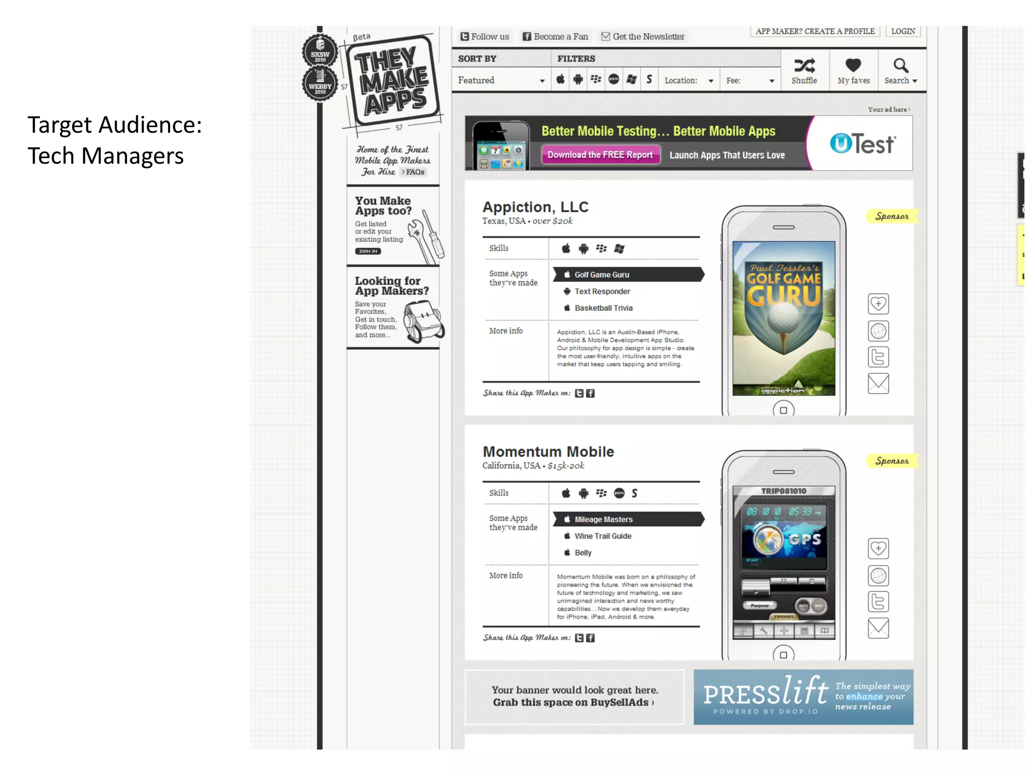
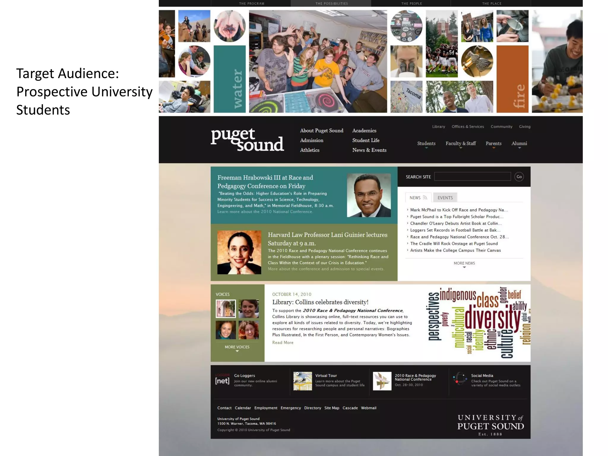
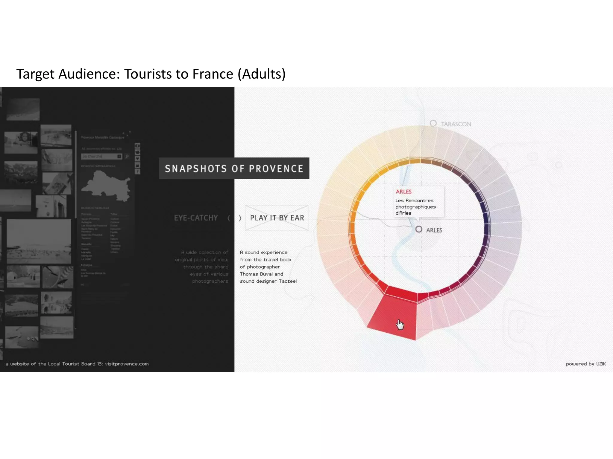
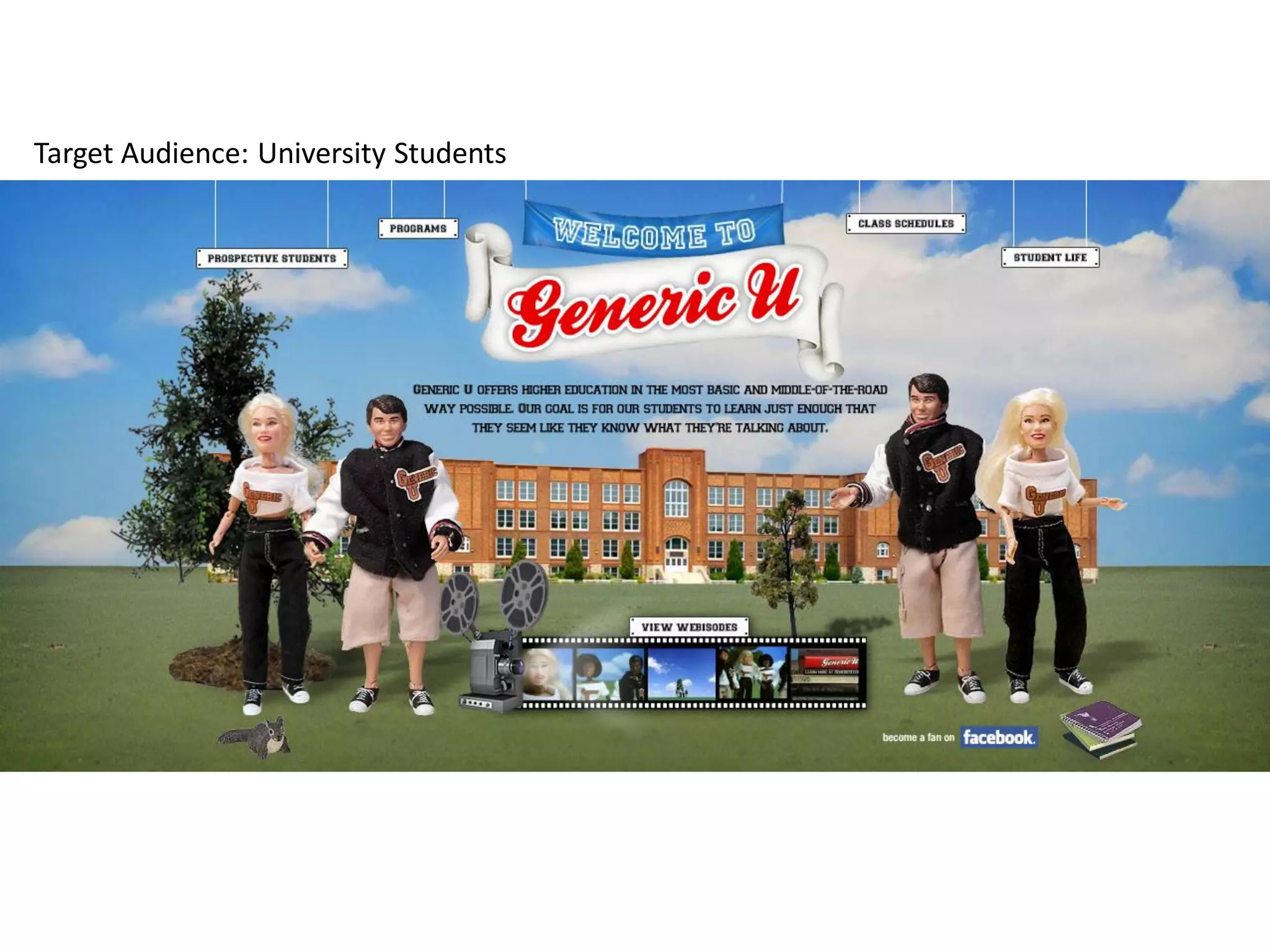
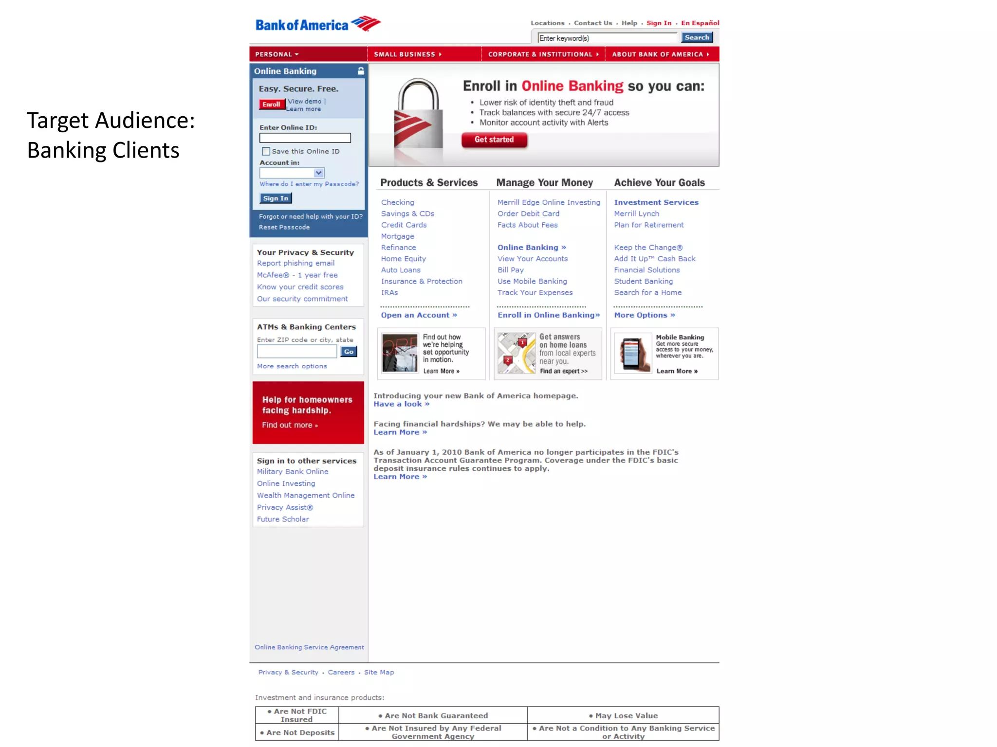
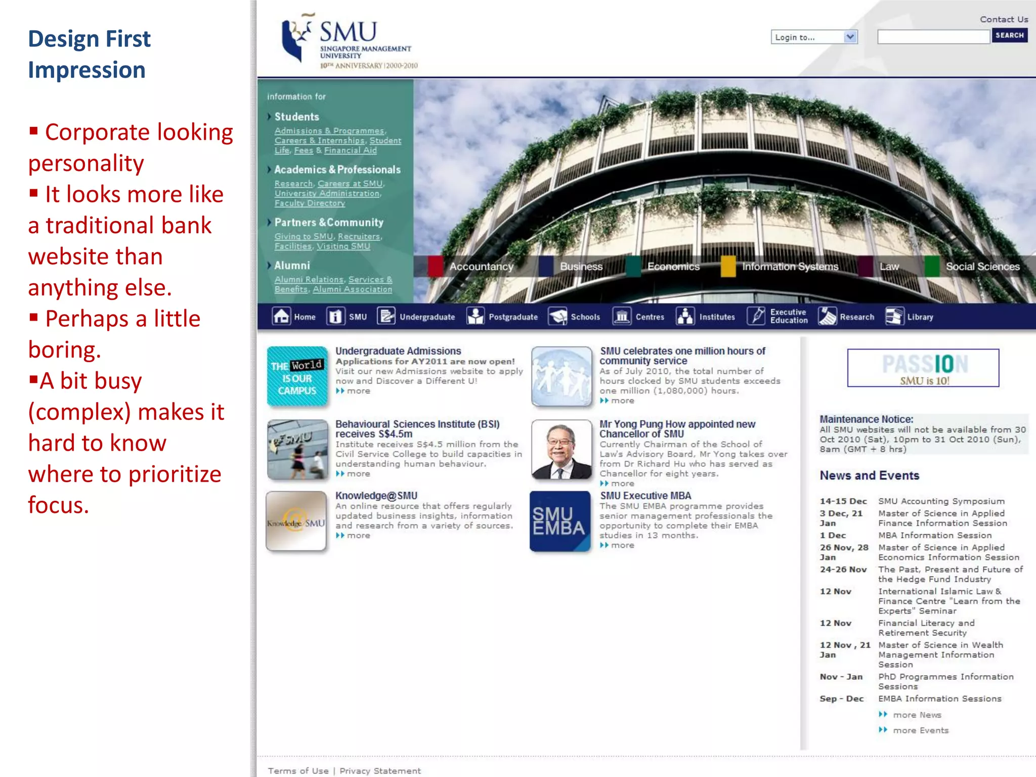
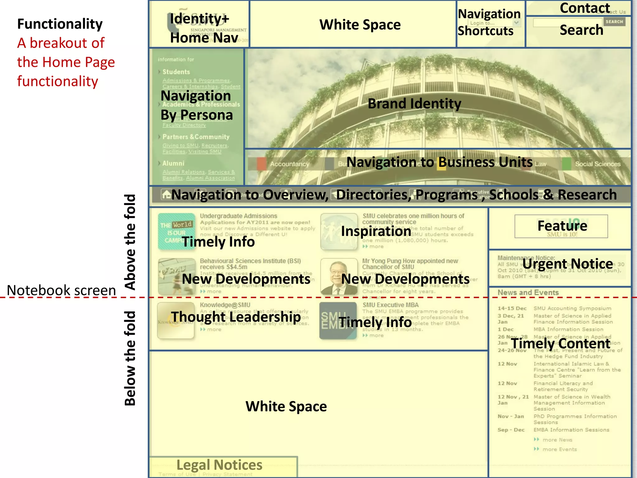
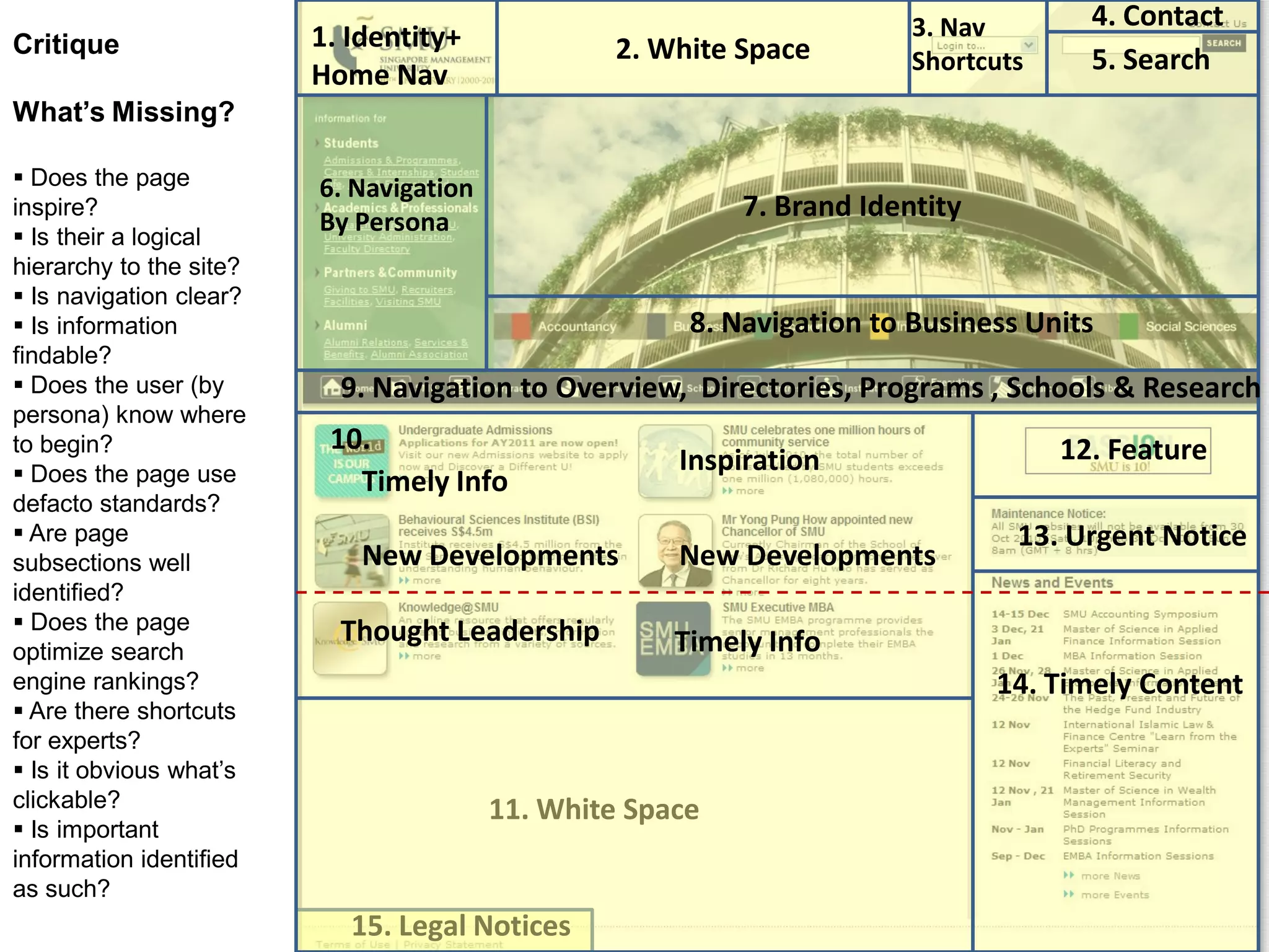
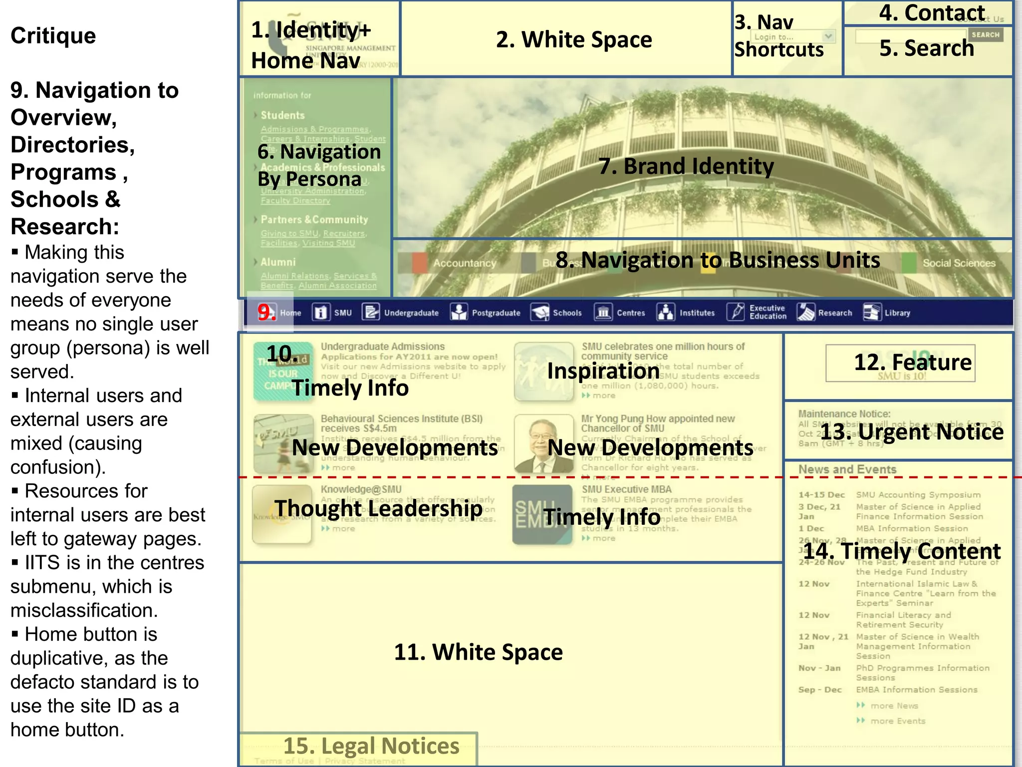
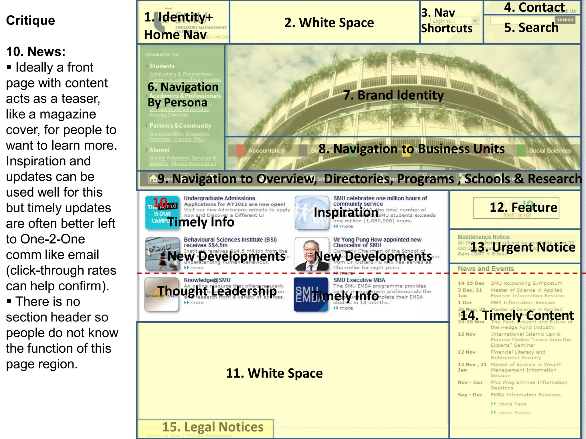
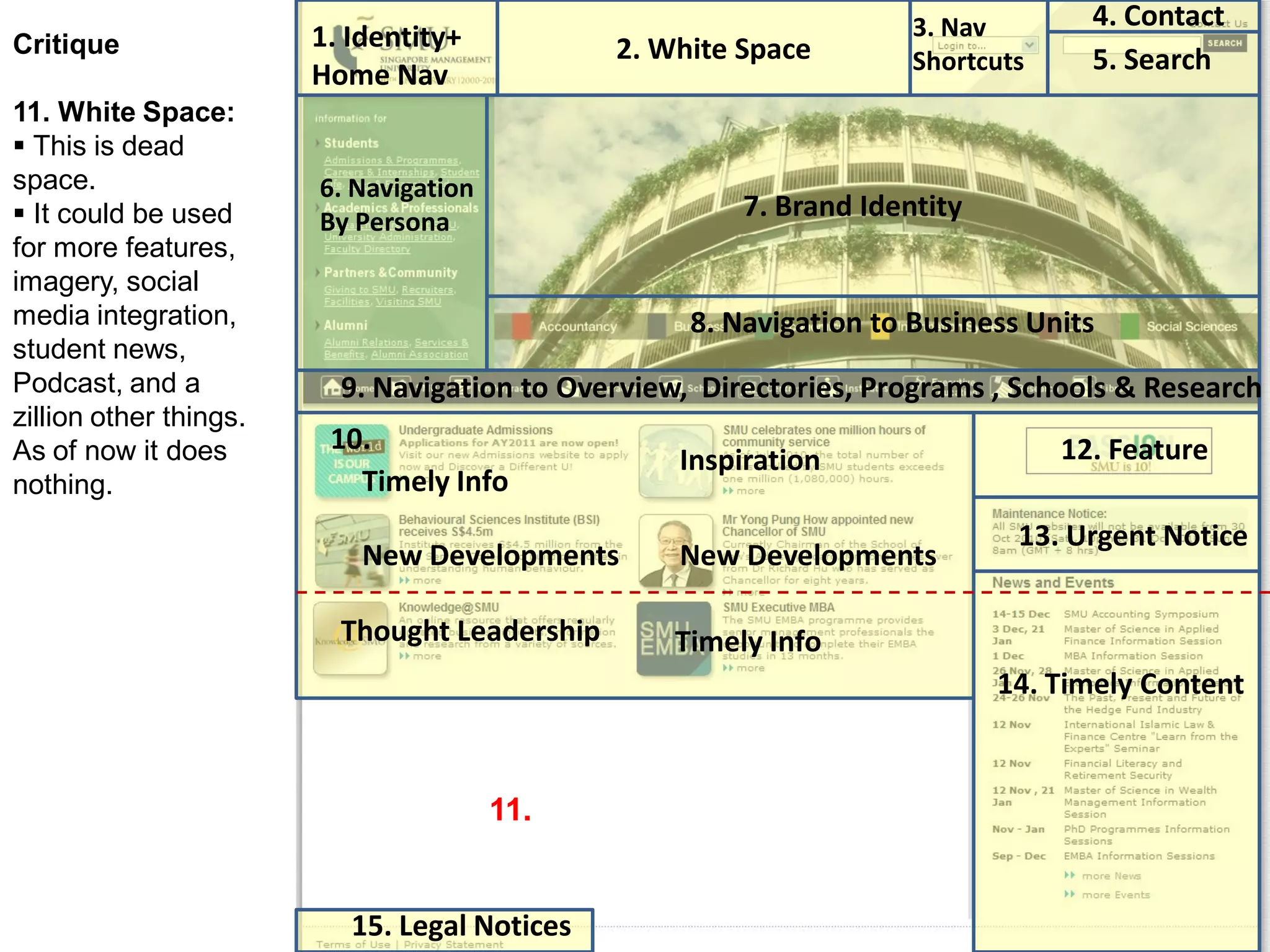
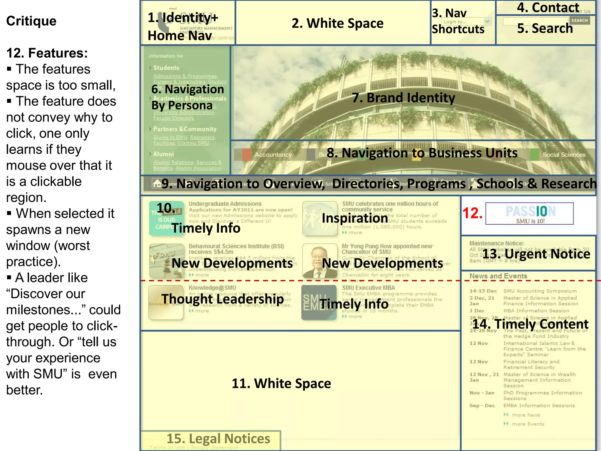
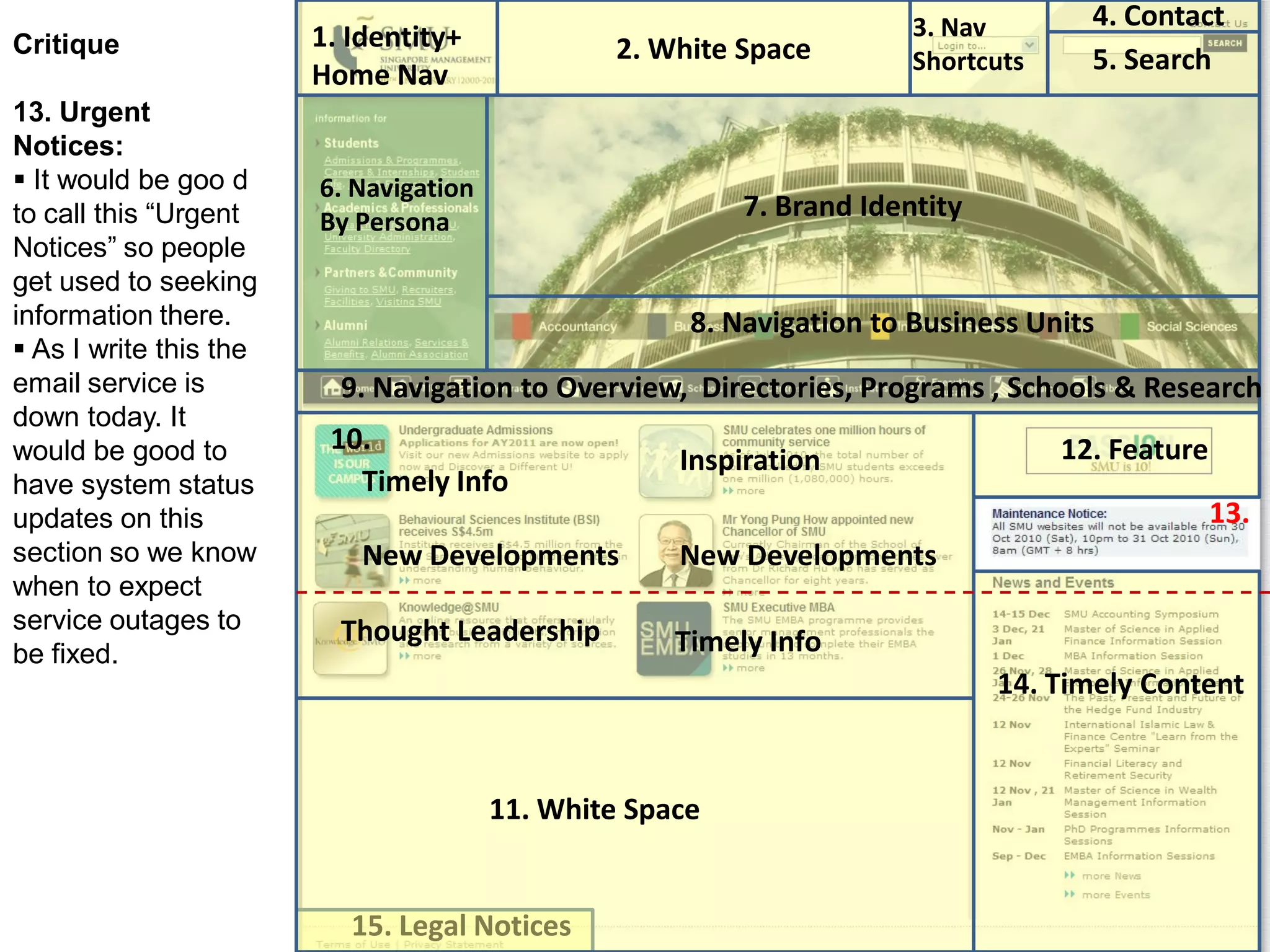
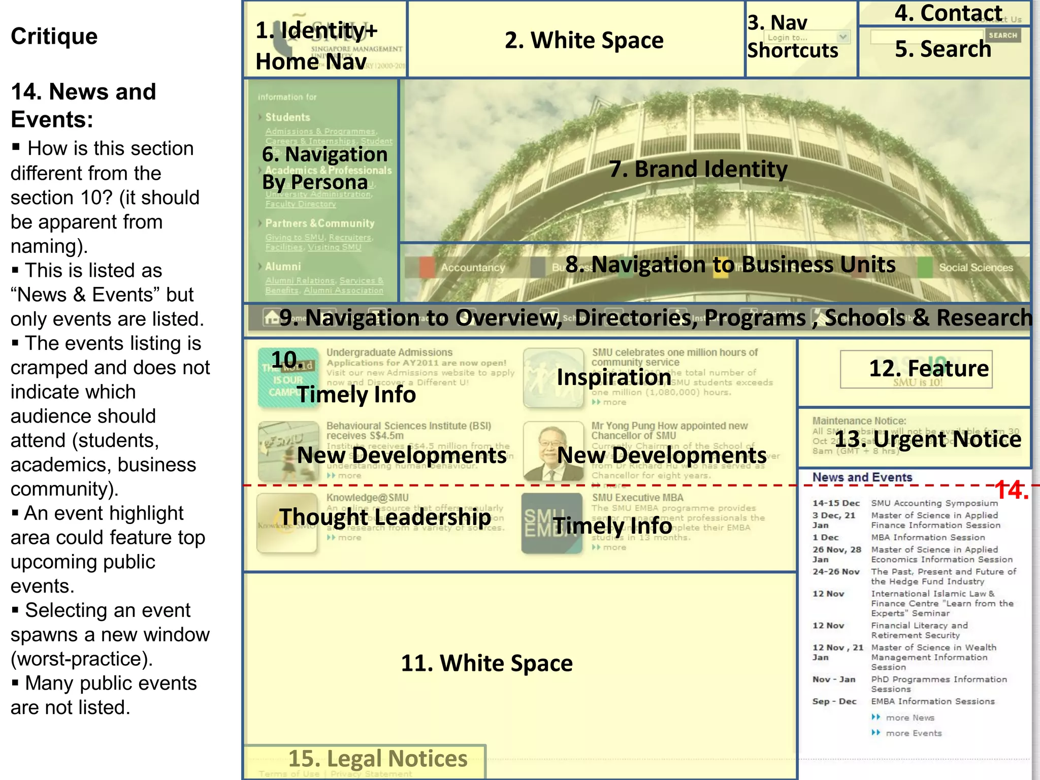
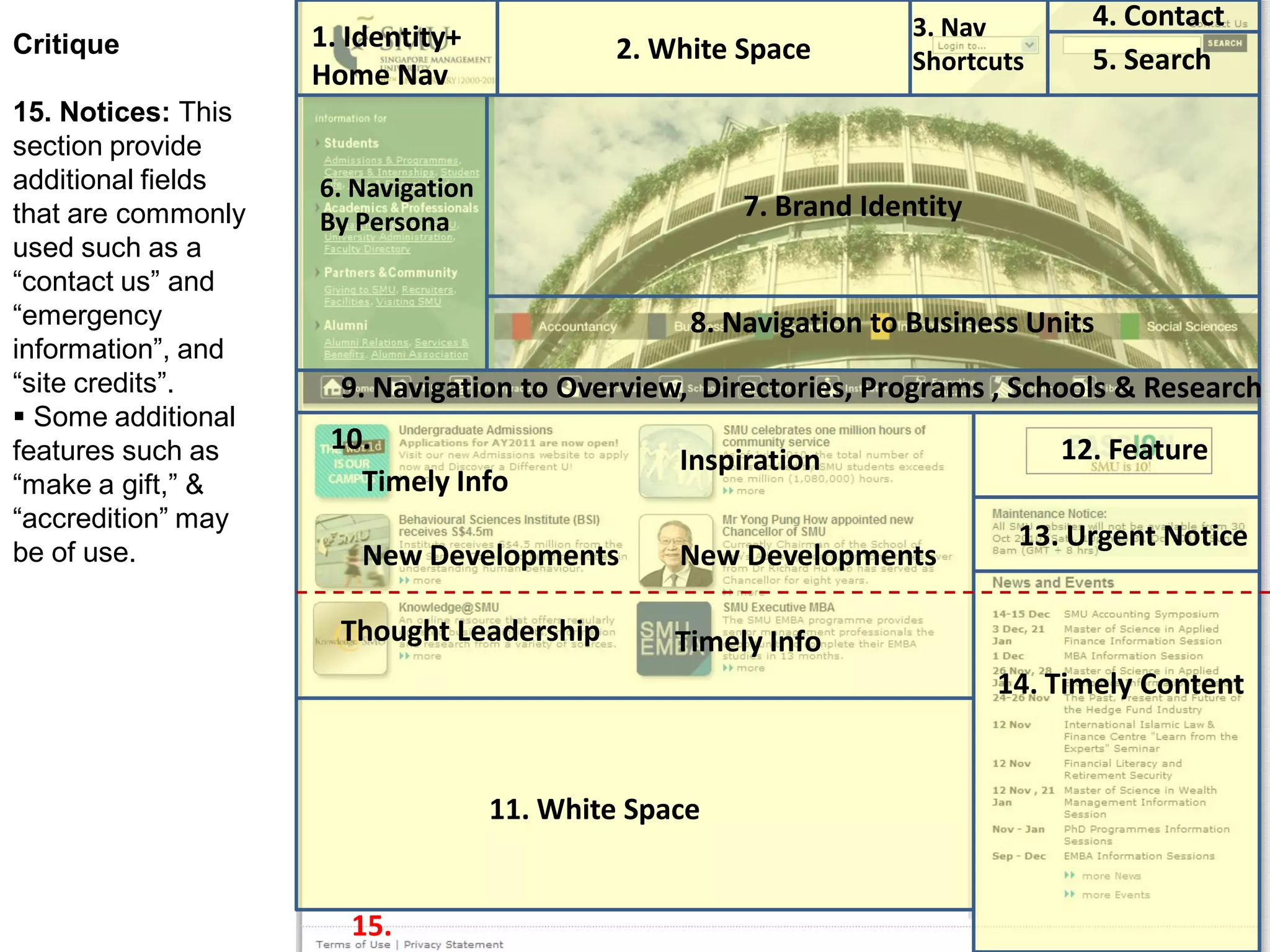
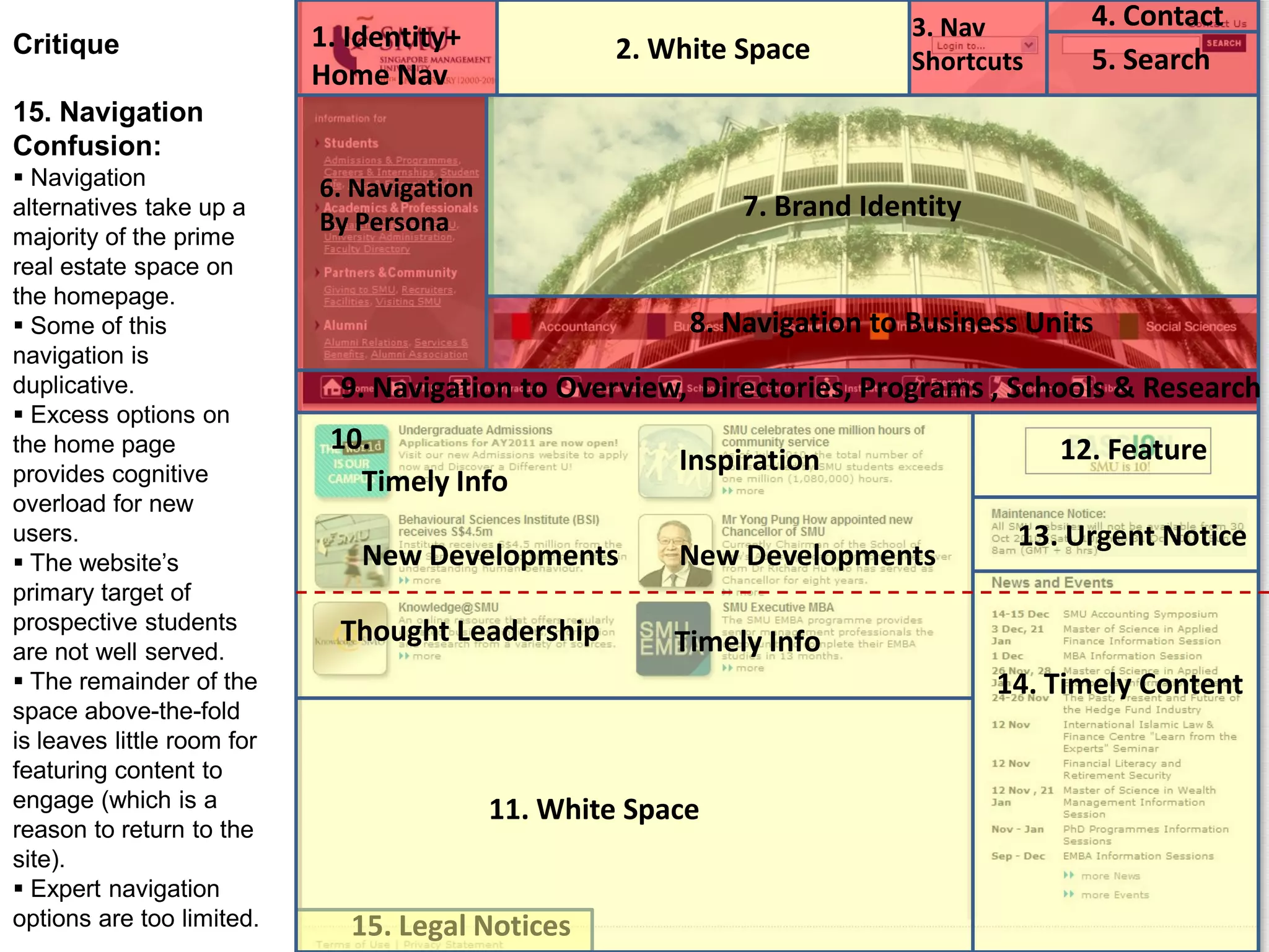
This document provides a critique of the SMU website homepage. It analyzes various design and functionality elements, including:
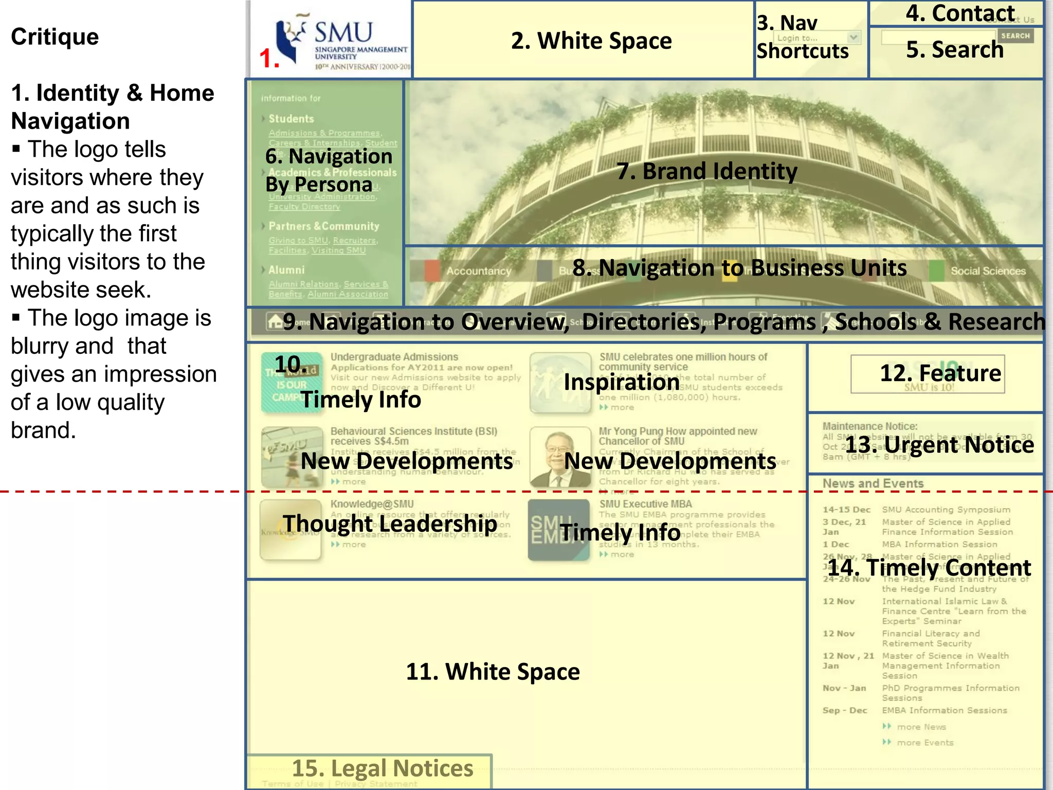
1. The logo could be higher quality as the current one looks blurry.
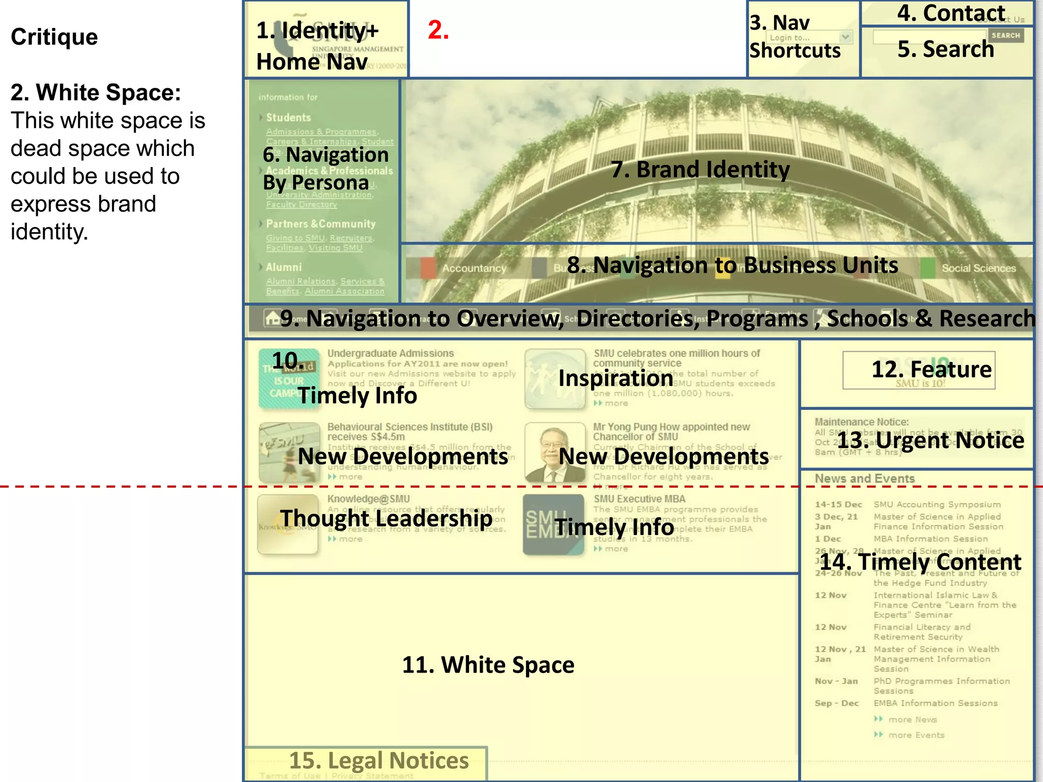
2. Significant white space is unused and could express the brand identity or include additional content.
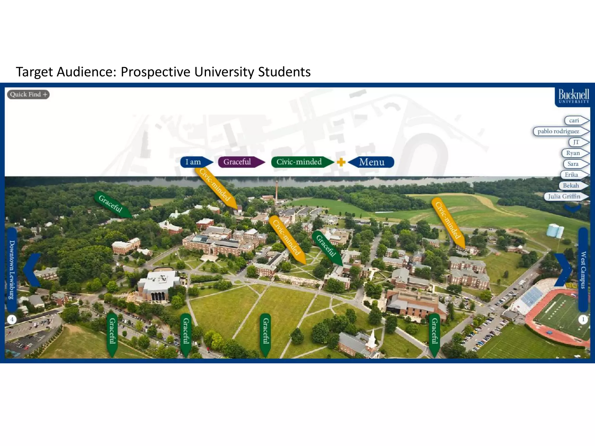
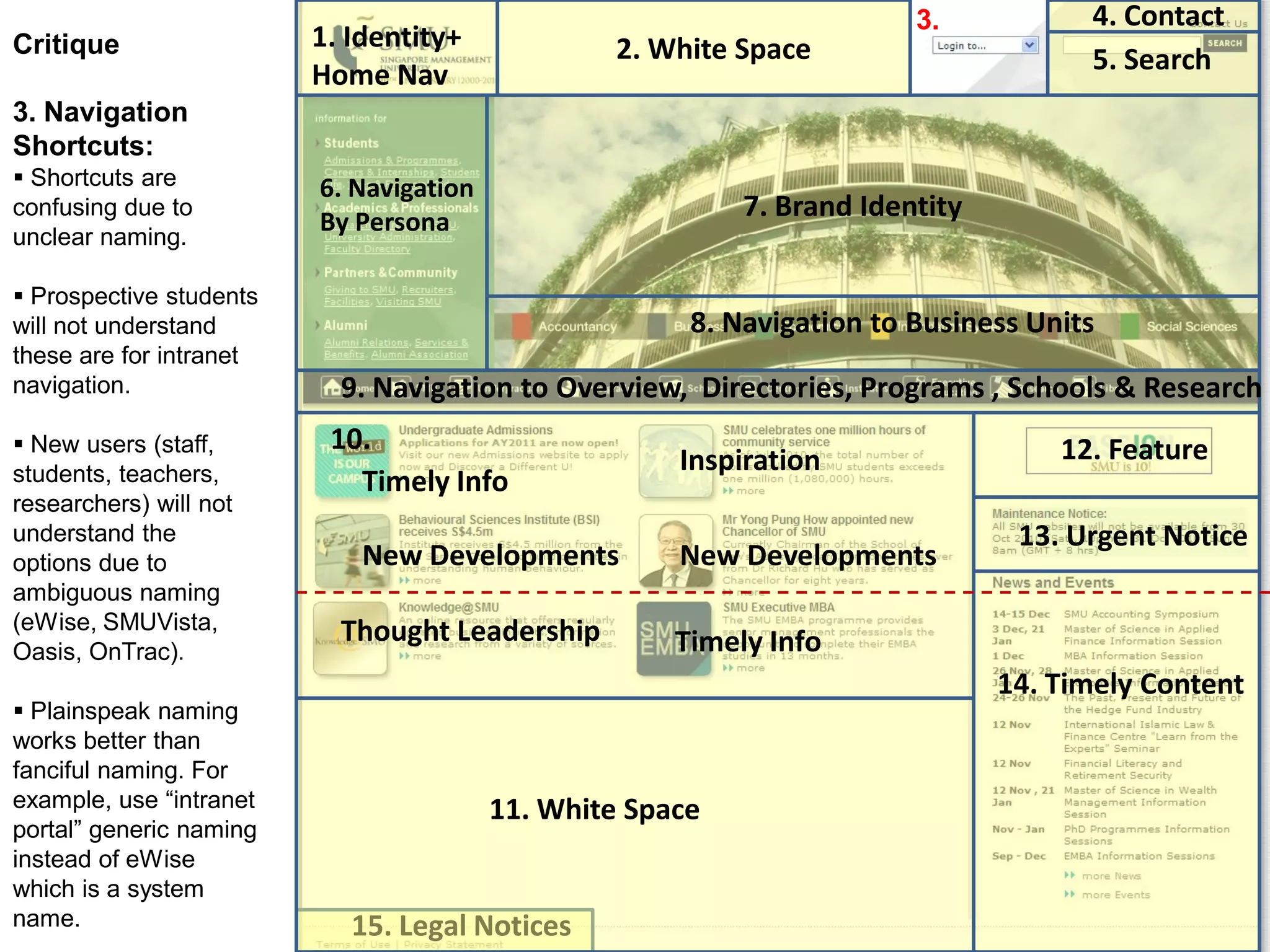
3. Navigation shortcuts are confusing due to ambiguous naming that won't be understood by new users.
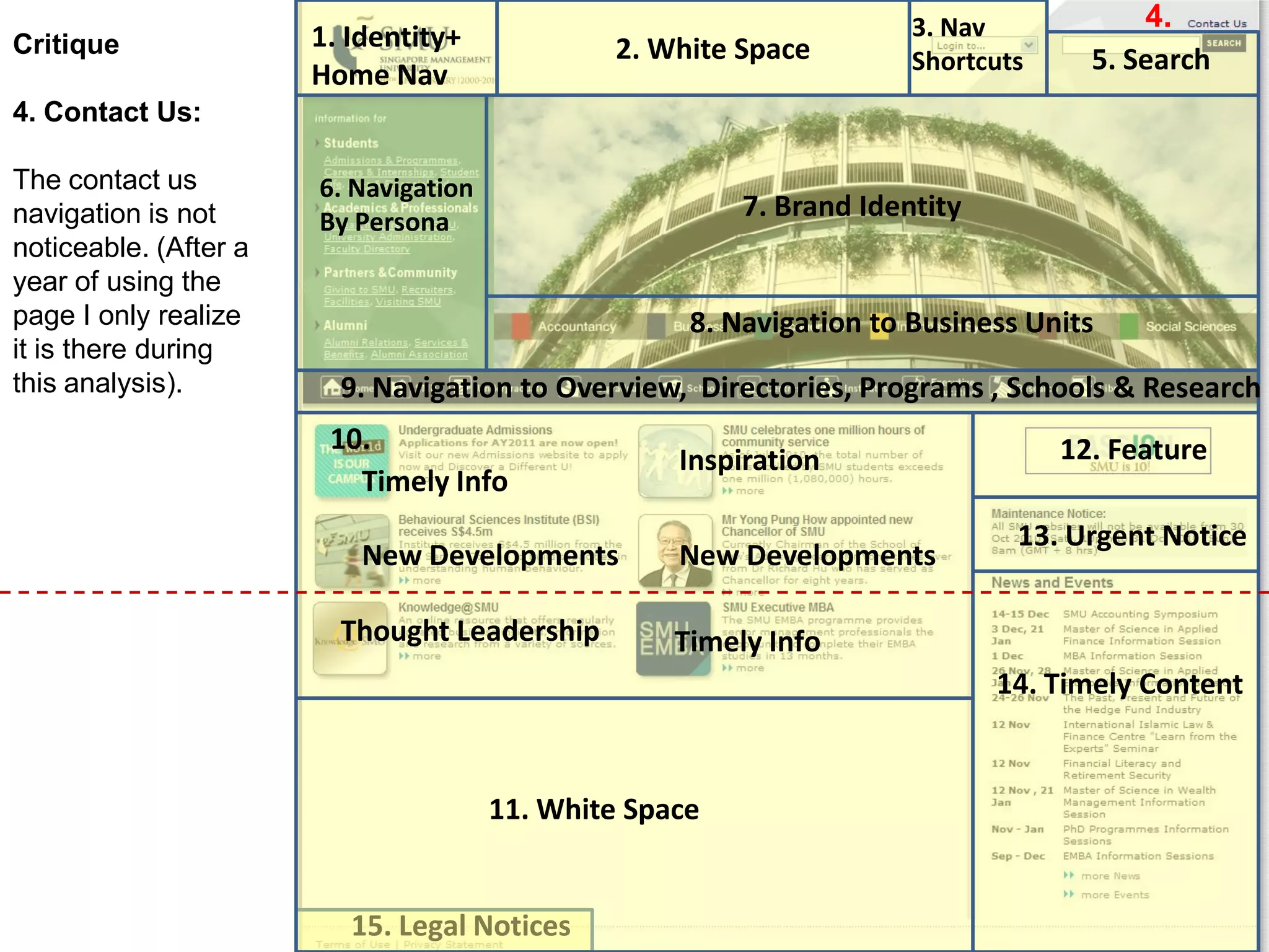
4. The contact section is not noticeable enough.
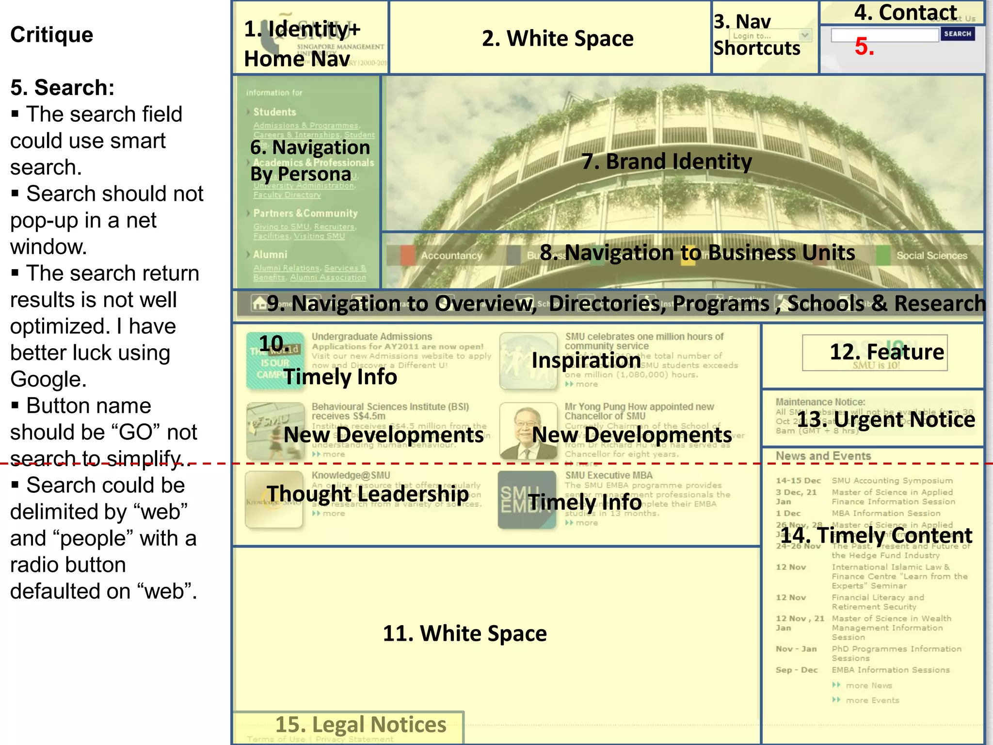
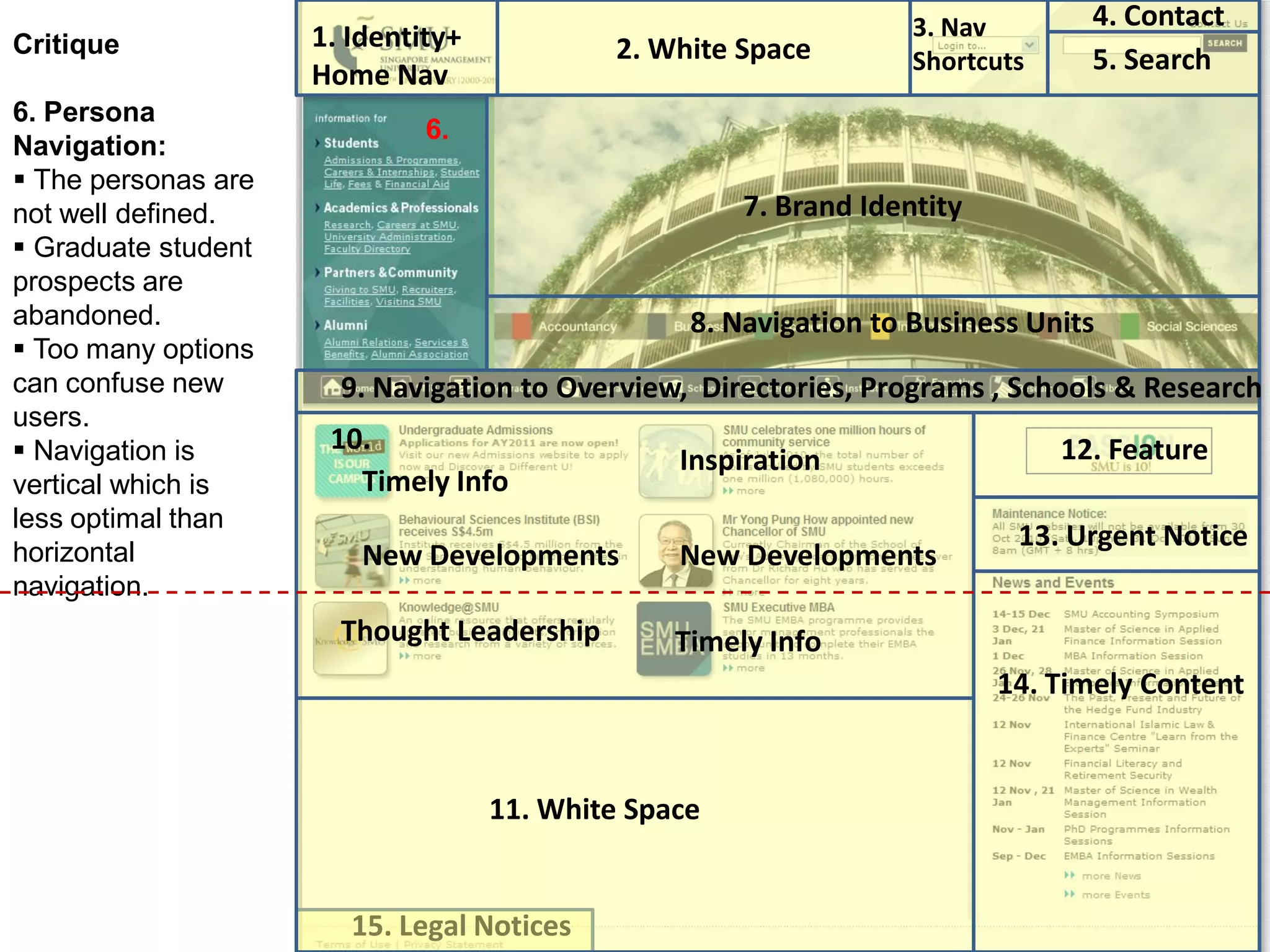
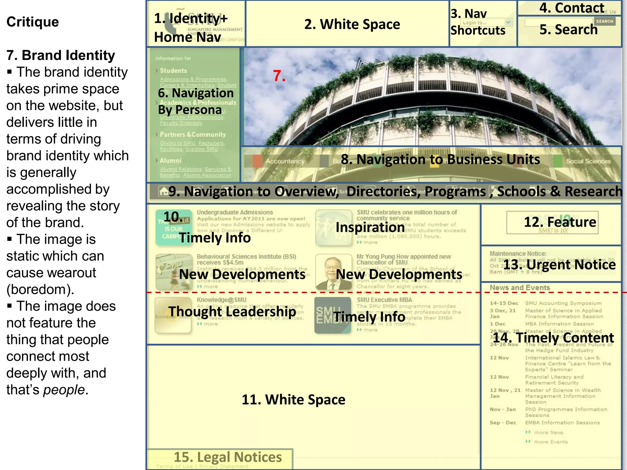
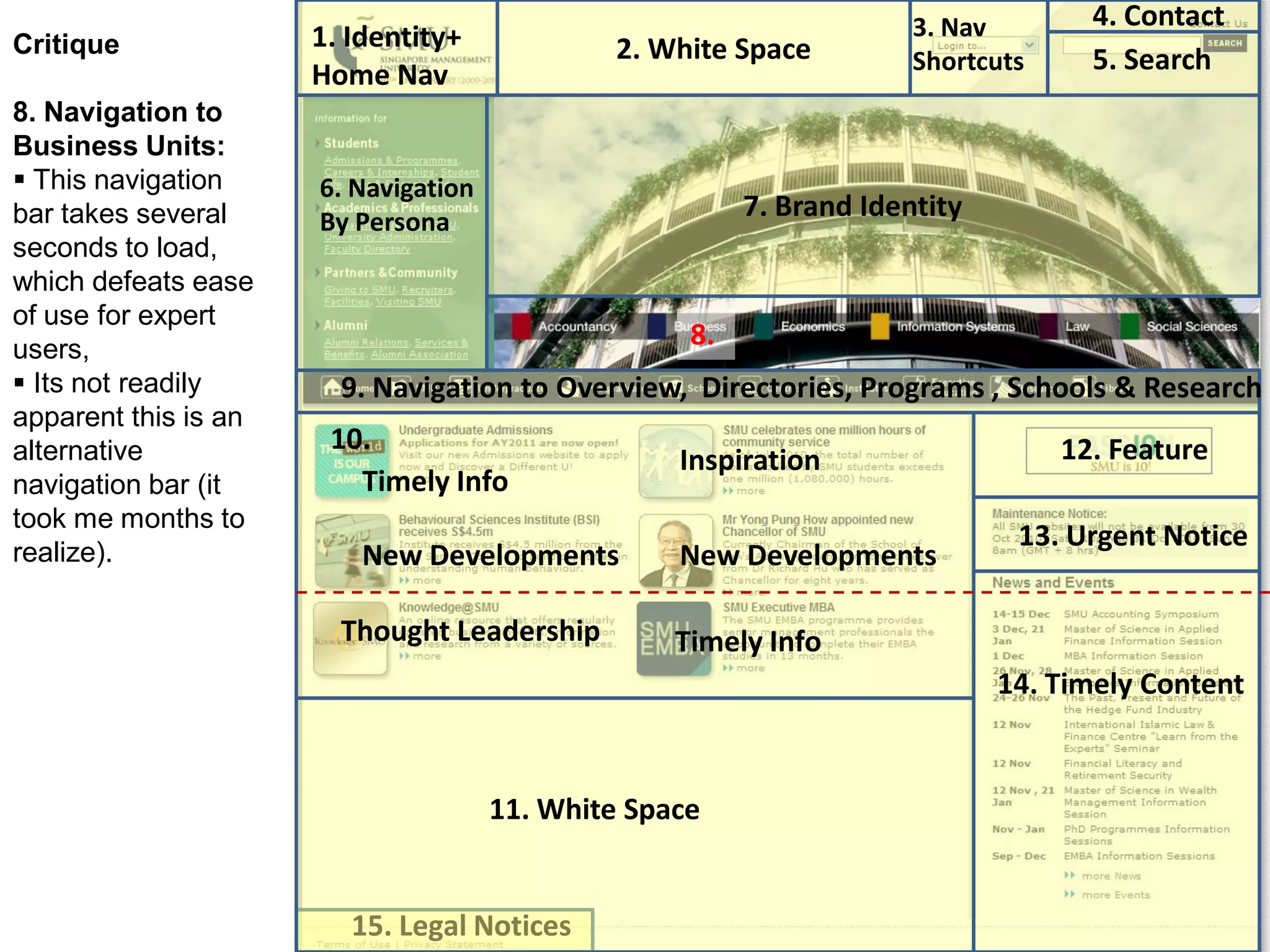
The critique provides recommendations in each area, such as using plain language over system names for shortcuts, optimizing search functionality, simplifying persona navigation, adding more engaging content, and ensuring key information like events and notices are clear and easy to access.