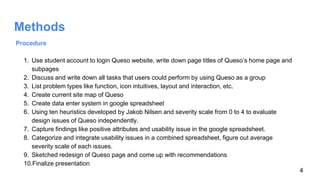
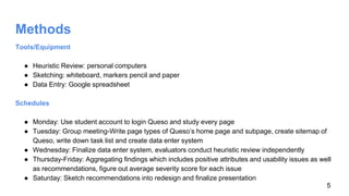
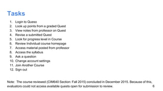
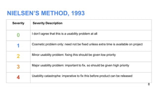
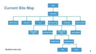
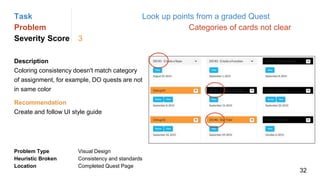
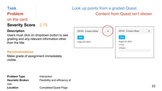
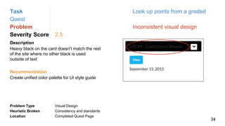
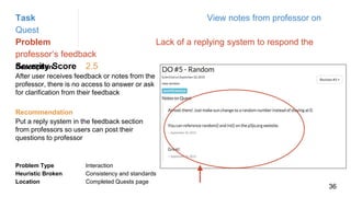
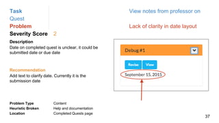
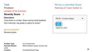
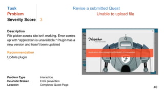
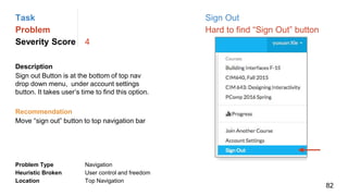
Six evaluators conducted a heuristic evaluation of the Queso learning management system website. They found 8 positive attributes to keep and 73 recommendations for improvement. The evaluators assessed each issue for severity on a scale of 0-4. Their next steps are to conduct usability testing and refine the website design based on the findings from the heuristic evaluation.
Storytelling results of heuristic evaluationUX Firm, LLC
Presents the traditional way of reporting results from a heuristic evaluation and then a better way that uses storytelling to tell the user's experience.
Storytelling the Results of Heuristic EvaluationUXPA Boston
This interactive talk focuses on the UX tool of heuristic evaluation (or expert review) and best practices for designing and reporting the results of this review. Audience members will be prompted to share their experiences in conducting reviews and reporting them. A straw poll will indicate how many follow a standard set of heuristics and how many do something else. Discussion of the whys and why nots will set the stage for focusing on how to report the results. A brief walk through the evolution of reporting from the checklist to the narrative will be reviewed with examples from reports to prompt audience stories of their process and its effectiveness. New UX practitioners and students, as well as seasoned veterans, will have the chance to defend their approach or perhaps be persuaded to change.
The activity of using methods, skills and tools to understand user engagement with a website is called a UX Audit.
Even in case this was done at the time of website development, it could not have included future traffic behaviour or change in design trends and optimisation techniques.
Per this article on Forbes, every dollar invested in improving UX has multifold returns. Good design is just good business.
Design and its fundamental process have changed with time, growing challenges among the users, devices and different platforms for UI and UX process.
In Design Fundamentals, a day-long thorough workshop, we will try to understand the fundamentals of UI and UX process, and follow the standard process and approaches to create a user-centric design. With basic Design Principles as the the backbone for our design, of course!
With increased complaints and legal action for organisations of inaccessible websites (Coles, Peapod) and apps (Westpac), now is the time for all web and app Project Managers, Developers, UX/Designers, Content Producers, Business Analysts and Testers to be ‘baking in’ accessibility into processes and work practices.
This presentation will show that accessibility is everyone’s responsibility and it is not difficult to get started or find resources that will help you and your team produce a website, app or digital presence that works for everyone!
This presentation was made by me for a basic level UI and UX training in my company. The presentation has also been designed from a UI and UX perspective and has been kept minimalistic. The presentation also contains several other important topics like the work culture in my company, Our process of developing a presentation and a short brief on E commerce platforms.
A presentation on UX Experience Design: Processes and Strategy by Dr Khong Chee Weng from Multimedia University at the UX Indonesia-Malaysia 2014 that was conducted on the 26th April 2014 in the Hotel Bidakara, Jakarta, Indonesia.
Your guide to picking the right User Interface (UI) and creating the best User Experience (UX) in just a short amount of time. Learn how to quickly create mockups, landing pages, and build mock integrations that turn into large ideas.
Have more questions about UX/UI? Contact mvp@koombea.com for additional information or questions and we will get back to you shortly.
This presentation is an introduction to the fields of User Experience and User Interface design that I created for a Google Hangout talk for Saigon CoWorkshop.
Heuristic Evaluation based on Nielsen's 10 Usability HeuristicsSebbe Isaac Kurian
Heuristic Evaluation to identify usability issues in the edX website’s (www.edx.org) Discussion Forum – based on Jakob Nielsen's 10 Usability Heuristics for User Interface Design.
This is a Heuristic evaluation of an Indian online radio site called as BC radio. BC Radio's vision is to promote emerging artists which are not part of mainstream music industry. They support new talent while always preserving their rights as musicians and attempting to curb piracy of their content.
About the test:
A heuristic evaluation is a usability inspection method for computer software that helps to identify usability problems in the user interface (UI) design. It specifically involves evaluators examining the interface and judging its compliance with recognized usability principles.
We mainly used Think aloud method to come up with the insights.
User experience is complex and multifaceted. One of those facets is making services usable to people in different situations. The needs of people with disabilities, both apparent and not, must be considered on our mobile and web platforms if we are to provide good service and abide by federal and state regulations. Cervone looks at some of the common accessibility issues people may have with mobile sites and websites and how to address those issues while still creating a visually stimulating and interactive environment for all.
User Experience (UX) and User Interface (UI) are often used as synonyms, while there is actually a stark difference between the two. UX is the experience that the user has while interacting with a digital product while UI is the aesthetic element that the user interacts with. While UX has a human first approach to product design, UI has a human-first approach to designing the aesthetic experience of a product. Both are essential to product or digital service design and work together. The representation explores the interdependence and difference between UI and UX Design. It also discusses the components of and skills required for UI/UX Design.
Here's how we at Melewi do a UX Audit of existing website, web and mobile apps to improve usability and the product's success, based on your business objectives and the target audience.
UI-UX Practical Talking, is presentation for a session I did in the GUC & the ITI, about the meaning and the difference between The UI and the UX, the key principals about building good UX of products, focusing on mobility and mobile design.
Presentation outlining recommendations from a usability study conducted for the Writing Studio (http://writing.colostate.edu). By Andrea L. Beaudin, Jeremy F. Huston, and Michael R. Trice
The newest update of Eworks Open LMS 3.10 has been released, featuring a comprehensive upgrade from OpenLMS 3.6. The most notable new features are the improved UI Design and new audio media player for seamlessly integrating Third-party content
EssayStatement of purpose in 500 words, state your purpose .docxdebishakespeare
Essay
Statement of purpose: in 500 words, state your purpose in undertaking graduate study at The George Washington University; describe your academic objectives, research interests, and career plans; and discuss your related qualifications, including collegiate, professional, and community activities, and any other substantial accomplishments not already mentioned
1
Unit 10 – Emerging Practices 2
PMGT 574
2
Recap Last Unit
n Lean Startup
n MVP
n Lean Change Management
n Kotter's Change Process
3
Opening Discussion
Discussion on previous unit assignments
4
Emerging Practices 2
5
Emerging Practices
Lean
Startup
LeanUX Lean
Change
Lean
Canvas
6
LeanUX
7
8
Lean UX
https://www.youtube.com/watch?v=F4Mry7L-vwM&t=92s
6 mins
9
1. Collaboration over Silos
2. Problem-focused over Feature-driven
3. Outcomes over Outputs
Lean UX: 3 Key Mind Shifts
10
n Small, cross-functional teams
n Product, UX, Dev, QA
n Other supporting groups where appropriate
n Engaged from project inception through completion
n No Egos, ninjas, or rock stars
n All team members are equally important
n All ideas equally worthy of consideration
n Shared product knowledge and customer understanding
Collaboration Over Silos
11
n Many teams immediately jump from a customer concern, or request, to
prescribing a solution. Lean UX asks us to step back and focus on the
problem:
n What are the users’ challenges?
n What problem(s) should we solve for the user? For the business?
n Being problem-focused:
n Shows trust in the team
n Builds shared understanding and investment
n Reduces waste
n Focuses on the customer
n Delivers innovative solutions not incremental change
Problem-focused Over Feature-driven
12
n Features = Outputs
n User Needs + Business Goals = Outcomes
n Deliver measurable results
n Analytics: we can’t validate success if we aren’t measuring
Outcomes over Outputs
13
1. Reduces waste
2. Builds shared understanding
3. Small experiments deliver rapid customer insight
Lean UX: 3 Key Benefits
14
Traditional UX
Lean UX
15
#!
16
Lean UX Process
17
1. Product identifies a project to be worked from Roadmap
2. Product and UX write problem statement
3. Gather team and Conduct Assumptions Workshop:
• Declare all assumptions embedded in problem statement
• Prioritize assumptions
• Write Hypothesis Statement
• Identify features, functionality, tactics that may satisfy the targeted outcomes
Lean UX Process: Assumptions, Hypotheses, & Outcomes
18
Learner Assignments was designed to provide Learners with access to their
required assignments. Through the Assignments screen, Learners can find
assignments based on assignment status, module or name. We have
observed that the interface does not display assignment information in a
manner that drives Learners to take action and complete assigned work. The
Assignments screen does not meet accessibility requirements nor is it mobile-
friendly. These fact.
Swizzard is best Content Management SystemGary Dragul
CMS is a buzz word in the web development industry as it helps to present their information to the internet audience. To choose a CMS for Business or Company is vital step. Flexibility, robustness, extensibility, API support & security are crucial while extracting Best CMS.. Apart from that client objectiveness is very crucial. Once we get into a CMS or framework, we start feeling that it’s easy to update our websites with content.
Sharpen existing tools or get a new toolbox? Contemporary cluster initiatives...Orkestra
UIIN Conference, Madrid, 27-29 May 2024
James Wilson, Orkestra and Deusto Business School
Emily Wise, Lund University
Madeline Smith, The Glasgow School of Art
0x01 - Newton's Third Law: Static vs. Dynamic AbusersOWASP Beja
f you offer a service on the web, odds are that someone will abuse it. Be it an API, a SaaS, a PaaS, or even a static website, someone somewhere will try to figure out a way to use it to their own needs. In this talk we'll compare measures that are effective against static attackers and how to battle a dynamic attacker who adapts to your counter-measures.
About the Speaker
===============
Diogo Sousa, Engineering Manager @ Canonical
An opinionated individual with an interest in cryptography and its intersection with secure software development.
This presentation by Morris Kleiner (University of Minnesota), was made during the discussion “Competition and Regulation in Professions and Occupations” held at the Working Party No. 2 on Competition and Regulation on 10 June 2024. More papers and presentations on the topic can be found out at oe.cd/crps.
This presentation was uploaded with the author’s consent.
This presentation, created by Syed Faiz ul Hassan, explores the profound influence of media on public perception and behavior. It delves into the evolution of media from oral traditions to modern digital and social media platforms. Key topics include the role of media in information propagation, socialization, crisis awareness, globalization, and education. The presentation also examines media influence through agenda setting, propaganda, and manipulative techniques used by advertisers and marketers. Furthermore, it highlights the impact of surveillance enabled by media technologies on personal behavior and preferences. Through this comprehensive overview, the presentation aims to shed light on how media shapes collective consciousness and public opinion.
Acorn Recovery: Restore IT infra within minutesIP ServerOne
Introducing Acorn Recovery as a Service, a simple, fast, and secure managed disaster recovery (DRaaS) by IP ServerOne. A DR solution that helps restore your IT infra within minutes.
Have you ever wondered how search works while visiting an e-commerce site, internal website, or searching through other types of online resources? Look no further than this informative session on the ways that taxonomies help end-users navigate the internet! Hear from taxonomists and other information professionals who have first-hand experience creating and working with taxonomies that aid in navigation, search, and discovery across a range of disciplines.
2. Executive Summary
Queso is a learning management system for gameful classrooms. This educational
platform helps students and instructors reshape existing class features incorporating
concepts from game design.
Six evaluators conducted a heuristic evaluation by using ten usability heuristics developed
by Jacob Nilsen & Rolf Molich. The evaluators found and categorized 8 positive attributes
to keep and 73 recommendations for change based on a set of tasks a student can
accomplish. Based on a severity scale from 1 to 4, each evaluator conducts the heuristic
evaluation independently. As a group, the team aggregates the findings and redesigns
the website, improving the usability of the site.
Next step is to conduct usability test and refine the website design.
2
3. Introduction
Product Description
Queso is a learning management system for gameful classrooms. Queso helps students and instructors take
existing classrooms and reshapes them using concepts from game design. In doing this, Queso utilizes a
unique terminology when referring to some features, such as assignments and individual instructors can use
their own custom naming.
For example:
Quests = assignments in Queso
Notices = Notifications of instructor feedback on assignment or general message in
Queso
Debug = Find and fix coding Errors homework assignment (class specific)
Do’s = Assignments to be completed in class, must be turned in by day's end & cannot be
revised.
Evaluation Objective
Find usability problems on Queso website that violate the heuristics and come up with recommendations to
redesign the website. 3
4. Methods
Procedure
1. Use student account to login Queso website, write down page titles of Queso’s home page and
subpages
2. Discuss and write down all tasks that users could perform by using Queso as a group
3. List problem types like function, icon intuitives, layout and interaction, etc.
4. Create current site map of Queso
5. Create data enter system in google spreadsheet
6. Using ten heuristics developed by Jakob Nilsen and severity scale from 0 to 4 to evaluate
design issues of Queso independently.
7. Capture findings like positive attributes and usability issue in the google spreadsheet.
8. Categorize and integrate usability issues in a combined spreadsheet, figure out average
severity scale of each issues.
9. Sketched redesign of Queso page and come up with recommendations
10.Finalize presentation
4
5. Methods
Tools/Equipment
● Heuristic Review: personal computers
● Sketching: whiteboard, markers pencil and paper
● Data Entry: Google spreadsheet
Schedules
● Monday: Use student account to login Queso and study every page
● Tuesday: Group meeting-Write page types of Queso’s home page and subpage, create sitemap of
Queso, write down task list and create data enter system
● Wednesday: Finalize data enter system, evaluators conduct heuristic review independently
● Thursday-Friday: Aggregating findings which includes positive attributes and usability issues as well
as recommendations, figure out average severity score for each issue
● Saturday: Sketch recommendations into redesign and finalize presentation
5
6. Tasks
1. Login to Queso
2. Look up points from a graded Quest
3. View notes from professor on Quest
4. Revise a submitted Quest
5. Look for progress level in Course
6. Review Individual course homepage
7. Access material posted from professor
8. Access the syllabus
9. Ask a question
10. Change account settings
11. Join Another Course
12. Sign out
Note: The course reviewed (CIM640 Section: Fall 2015) concluded in December 2015. Because of this,
evaluators could not access available quests open for submission to review. 6
7. 10 Usability Heuristics for User Interface Design
● Visibility of system status
● Match between system and the real world
● User control and freedom
● Consistency and standards
● Error prevention
● Recognition rather than recall
● Flexibility and efficiency of use
● Aesthetic and minimalist design
● Help users recognize, diagnose, and recover
from errors
● Help and documentation
7
8. NIELSEN’S METHOD, 1993
Severity Severity Description
0 I don’t agree that this is a usability problem at all
1 Cosmetic problem only: need not be fixed unless extra time is available on project
2 Minor usability problem: fixing this should be given low priority
3 Major usability problem: important to fix. so should be given high priority
4 Usability catastrophe: imperative to fix this before product can be released
8
11. Description
The choice of colors (blues, whites, greys) is consistent across the
site & font choice allows for legible text
Location
‘Welcome to Queso’ landing page; queso.com.miami.edu
Task Log in to Queso
Keeper Fonts and colors
11
12. Task Access material posted from professor
Keeper Post order
Description
Most recent posts appear on top making it easy for
user get to latest information quickly; user is also able
to search by date to find desired post
Location
Individual Class Page
12
13. Description
Search box and dropdown allowing user to sort
through quests by category assigned by instructor is
logical and useful
Location
Completed Quests Page
Task Look up points from Quest
Keeper Sort by Quest & Quest category
13
14. Description
Different colors for specific categories of Quests is a
good visual design method; In right example, it is
clear to the user that orange corresponds with Debug
Quests
Location
Completed Quests Page
Task Revise a Submitted Quest
Keeper Varied color by Quest card
14
15. Description
Including an explicit display for points left to be
earned from not-yet-submitted Quests as part of
overall progress page is helpful to better
understand standing in course and anticipate final
grade
Location
Class progress page
Task Look for progress level
Keeper See projected level
15
16. Description
The “Questions” box is visible to the instructor and all students
enrolled in class. It serves as a sort of forum where questions can be
asked on assignments and other topics related to class.
Location
Individual class page (CIM640)
Task Ask a question
Keeper Allow user to ask questions in forum
16
17. Description
Message icon is intuitive and logically indicates to
user that clicking here will expand questions &
allow user to view response and/or join
conversation.
Location Individual class page
(CIM640)
Task Ask a question
Keeper Use of Message Icon
17
20. Task Login to Queso
Problem Inconsistent Navigation from
Student registration
Severity Score 4
Description
Clicking the “Learn More” button on the Homepage creates
an error on the server because the page doesn’t exist.
Leading the user to an error page that prompts a text link
to get back to the Homepage, which will send the user into
a different Homepage
Problem Type Navigation
Heuristic Violated User control and freedom
Location Welcome to Queso! landing
page
Recommendation
Discard the secondary Homepage and update the learn
more link so it sends the user to the corresponding
page.
Secondary
Homepage
Homepage
20
21. Task Login to Queso
Problem Login credentials don't work on secondary
homepage
Severity Score 4
Description
On secondary Queso homepage, the login
credentials doesn’t work
Problem Type Navigation
Heuristic Violated Consistency and standards
Location Welcome to Queso! landing
page
Recommendation
Remove the secondary home page
URL 21
22. Task Login to Queso
Problem Error page for philosophy button
Severity Score 4
Description
The link in the Philosophy section on the Home
page, leads the user to a page that doesn’t exist
Problem Type Navigation
Heuristic Violated Help users recognize diagnose and recover from
errors
Location Welcome to Queso! landing page
Recommendation
Fix the link in the philosophy section or remove
button if additional content doesn't exist
URL 22
23. Task Login to Queso
Problem Blank page when error
Severity Score 3
Description
If the user is trying to register as a student and
has any type of error filling the text areas he will
be sent to a blank page
Problem Type Navigation
Heuristic Violated Consistency and standards
Location Welcome to Queso! landing page
Recommendation
Display a message of error in the area where the
error was committed and give the option to keep
registering instead of leading the user to a blank
page
URL 23
24. Task Login to Queso
Problem Content and User
Mismatch
Severity Score 3
Description
The create course button is intended for
teachers only but it appears on the student view.
Yet the naming of the label can create a
confusion with the students
Problem Type Navigation
Heuristic Violated Consistency and standards
Location Welcome to Queso! landing page
Recommendation
Change the label of this button to “Instructor
registration”
URL 24
25. Task Login to Queso
Problem Inconsistent button coloring
Severity Score 2
Description
The buttons’ background color are not the same,
this may Lead users to think there is a hierarchy
between buttons
Problem Type Visual Design
Heuristic Violated Consistency and standards
Location Welcome to Queso! landing page
Recommendation
Color all the buttons’ background in blue and
color the font in white
URL 25
26. Task Login to Queso
Problem Lack of contrast in visual
design of hover status
Severity Score 2
Description
There is no visible difference in the colors
between hover and normal states
Problem Type Visual Design
Heuristic Violated Consistency and standards
Location Welcome to Queso! landing page
Recommendation
When mouse is over the button, change the
button’s background to white and change the
font’s color to blue
Normal Mouse
Hover
URL 26
28. Task Look up
points from a graded Quest
Problem Unreadable visual
design
Severity Score 4Description
Dark grey font with black background header on
completed Quest cards are unreadable
Problem Type Visual Design
Heuristic Broken User control and freedom
Location Completed Quest Page
Recommendation
Get rid of black background color or make font color
white
28
29. Task Look up points from a graded
Quest
Problem Cards are wasted space and hides some
information
Severity Score 4Description
Cards provide no information other than title
and unclear date without clicking to further
pages or drop downs
Problem Type Layout
Heuristic Broken Flexibility and efficiency of
use
Location Completed Quest Page
Recommendation
Remove cards and use a list layout to
display information easily read and
understood by users
29
30. Task Look up points from a graded
Quest
Problem Notices only displayed once
when logging in
Severity Score 3Description
On the homepage for all classes, notices pop
up once and then can't be found again if
navigate to other pages
Problem Type Content
Heuristic Broken User control and freedom
Location Quest Homepage
Recommendation
Create a feed or way to find all notices, so
none are missed
30
31. Task Look up points from a
graded Quest
Problem Empty point bar in
graded quest
Severity Score 3Description
When clicking on a card to see points earned
from quest, the points show up, but the bar
chart is empty
Problem Type Visual Design
Heuristic Broken Visibility of system status
Location Completed Quest Page
Recommendation
Fill progress bar with points earned from total
possible points
31
32. Task Look up points from a graded Quest
Problem Categories of cards not clear
Severity Score 3
Description
Coloring consistency doesn't match category
of assignment, for example, DO quests are not
in same color
Problem Type Visual Design
Heuristic Broken Consistency and standards
Location Completed Quest Page
Recommendation
Create and follow UI style guide
32
33. Task Look up points from a graded Quest
Problem Content from Quest isn’t shown
on the card
Severity Score 2.75
Description
Users must click on dropdown button to see
grading and any relevant information other
than the title
Problem Type Interaction
Heuristic Broken Flexibility and efficiency of
use
Location Completed Quest Page
Recommendation
Make grade of assignment immediately
visible
33
34. Task Look up points from a graded
Quest
Problem Inconsistent visual design
Severity Score 2.5
Description
Heavy black on the card doesn't match the rest
of the site where no other black is used
outside of text
Problem Type Visual Design
Heuristic Broken Consistency and standards
Location Completed Quest Page
Recommendation
Create unified color palette for UI style guide
34
36. Task View notes from professor on
Quest
Problem Lack of a replying system to respond the
professor’s feedback
Severity Score 2.5Description
After user receives feedback or notes from the
professor, there is no access to answer or ask
for clarification from their feedback
Problem Type Interaction
Heuristic Broken Consistency and standards
Location Completed Quests page
Recommendation
Put a reply system in the feedback section
from professors so users can post their
questions to professor
36
37. Task View notes from professor on
Quest
Problem Lack of clarity in date layout
Severity Score 2
Description
Date on completed quest is unclear, it could be
submitted date or due date
Problem Type Content
Heuristic Broken Help and documentation
Location Completed Quests page
Recommendation
Add text to clarify date. Currently it is the
submission date
37
39. Task Revise a submitted Quest
Problem Naming of “view” button is
unclear of its function
Severity Score 4
Description
View button is unclear. Does naming imply feedback
from instructor, see grade or option to revise?
Problem Type Icon Intuitiveness
Heuristic Broken Match between system and the real
world
Location Completed Quest Page
Recommendation
Rename button
39
40. Task Revise a submitted Quest
Problem Unable to upload file
Severity Score 3
Description
File picker across site isn't working. Error comes
up with "application is unavailable." Plugin has a
new version and hasn't been updated
Problem Type Interaction
Heuristic Broken Error prevention
Location Completed Quest Page
Recommendation
Update plugin
40
41. Task Revise a submitted Quest
Problem Unclear button naming for first
attempted revision
Severity Score 3
Description
Clicking to revise in the view page of a graded
quest, users can click on first attempt and then
are taken to a revision page
Problem Type Content
Heuristic Broken Aesthetic and minimalist design
Location Completed Quest Page
Recommendation
Remove step and clarify differentiation between
viewing and revising assignments. View page
should show history of revisions without clicking to
a new page
41
42. Task Revise a submitted Quest
Problem Redundancy in buttons for revise
and view
Severity Score 2.8
Description
If users aren't allowed to revise, they shouldn't be
given the option. In the view page users can
revise even if it's not shown on the graded quest
card
Problem Type Layout
Heuristic Broken Match between system and the real
world
Location Completed Quest Page
Recommendation
Consolidate and clarify function . Revise should
be only to re-submit and view should only to see
notes which are instructor comments. If user
cannot revise, don't show revise button
42
43. Task Revise a submitted Quest
Problem Naming of “notes” is confusing
Severity Score 2
Description
Title of Notes on Quest not associated with notes
from professors on assignment by evaluators
Problem Type Content
Heuristic Broken Match between system and the real
world
Location Completed Quest Page
Recommendation
Rename “notes” to “Instructor feedback”
43
44. Task Revise a submitted Quest
Problem Confusion on where content
shared with other students goes
Severity Score 2
Description
Optional check box for "visible for other students"
doesn't say where assignment uploaded will go
Problem Type Navigation
Heuristic Broken Visibility of system status
Location Completed Quest Page
Recommendation
Remove function
44
45. Task Revise a submitted Quest
Problem No section division of content
Severity Score 1.5
Description
No distinction between revision area and
previously uploaded and graded content
Problem Type Layout
Heuristic Broken Consistency and standards
Location Completed Quest Page
Recommendation
Use visual design guide to standardize distinction
between content
45
47. Task Look for Progress in Course
Problem No proper context for current
standing progress
Severity Score 3
Description
Grading is based on the entire course, so until
larger projects are graded users have failing
grade and no context of their current standing
Problem Type Interaction
Heuristic Broken Recognition rather than recall
Location Course Homepage
Recommendation
A grading system based on work completed
within week of remaining weeks in the
semester
47
48. Task Look for Progress in Course
Problem Progress page is separated from
other class material
Severity Score 3
Description
Other contents are on the course homepage, but
Progress related to individual class is in the
global navigation dropdown menu
Problem Type Navigation
Heuristic Broken Flexibility and efficiency of use
Location Course Homepage
Recommendation
Put the button for progress on the course
homepage
48
49. Task Look for Progress in Course
Problem The chart style falls off the page
Severity Score 3
Description
Progress graph doesn’t fit on page. User must
scroll all the way down to see the axis points
Problem Type Layout
Heuristic Broken Aesthetic and minimalist design
Location Progress page
Recommendation
Redesign graph information into a “one-view”
overview graphic
49
50. Task Look for Progress in Course
Problem User must scroll up and down to
see progress
Severity Score 3
Description
Unable to comprehend where student points lie
when looking at the chart. Must scroll down to
see axis and then scroll further down to see what
that correlated in grading system of the class
Problem Type Layout
Heuristic Broken Recognition rather than recall
Location Progress page
Recommendation
Redesign chart style to fit without scrolling
50
51. Task Look for Progress in Course
Problem Improper color usage
Severity Score 3
Description
Area chart is red, which doesn't match green
used across the rest of the site. Red is also has a
negative connotation and this chart should show
progress in a class which is positive
Problem Type Visual design
Heuristic Broken Consistency and standards
Location Progress page
Recommendation
Change line to green for consistency and color
theory purposes
51
52. Task Look for Progress in Course
Problem Remove unnecessary levels in
course
Severity Score 2
Description
"Half way" "getting there" are arbitrary
breakpoints that mean nothing to students
Problem Type Content
Heuristic Broken Aesthetic and minimalist design
Location Progress page
Recommendation
Remove unnecessary levels in course
52
54. Task Review Individual course homepage
Problem Remove class label from home
navigation bar after login
Severity Score 3
Description
After user logins the Queso, the user could still
see the previous course label in the top right
navigation bar, which is incorrect and
confusing, for the user hasn’t opened any
class page yet
Problem Type Navigation
Heuristic Broken Consistency and standards
Location Individual course homepage
Recommendation
Remove any course label from top
navigation bar after users login the Queso
54
55. Task Review Individual course
homepage
Problem Little hierarchy of class title for
user viewing
Severity Score 2.5Description
When user is in a specific class sessions,
sh/he couldn’t know which class he/she is in,
for there is no highlight information display.
Problem Type Layout
Heuristic Broken Recognition rather than recall
Location Individual course homepage
Recommendation
Color background of class button when it is
activated, so user knows what class content
they are viewing.
55
56. Task Review Individual course
homepage
Problem Status of completed classes
aren’t “archived”
Severity Score 2.33Description
The status of archived classes are still in
current
classes section.
Problem Type Layout
Heuristic Broken Consistency and standards
Location Individual course homepage
Recommendation
Put classes that are complete in the
“Archived Classes” section
56
58. Task Access material posted from
professor
Problem Lack of relevant content to
accomplish task in current layout
Severity Score 3.33Description
Current content is not prioritized to task categories,
like slides, extra resource, syllabus, etc. It takes
users plenty of time to scroll down to find what they
want
Problem Type Layout
Heuristic Broken Recognition rather than recall
Location Individual class page
Recommendation
Add a drop down menu with content options as
follow: slides,syllabus,articles/reading videos
58
60. Task Find the Syllabus
Problem Content not prioritized based on tasks
Severity Score 3.2
Description
Important information is not prioritized or
given consistent placement on the page.
Users must scroll down to the bottom of
page to find syllabus
Problem Type Layout
Heuristic Broken Flexibility and efficiency of
use
Location Individual class page
Recommendation
Reorganize the structure of the individual
class homepage so syllabus is at the top for
the entire semester; not as simply a generic
post, but its own sticky link
60
61. Task Find the Syllabus
Problem Unclear label for section where
syllabus can be found
Severity Score 3
Description
"Example" tab in top nav is a local
navigation that houses the syllabus, and
that title is not related to a syllabus
Problem Type Navigation
Heuristic Broken Consistency & Standards
Location Individual class page
Recommendation
Add a syllabus feature to the class
homepage that sticks to the top of the page
or add to the sidebar and remove from the
top navigation
61
63. Task Ask a question
Problem No description of how user will be
notified when response is made
Severity Score 3
Description
There isn’t instruction for notification system about
the answers to user raised questions
Problem Type Interaction
Heuristic Broken Match between system and the real
world
Location Individual class page (CIM640)
Recommendation
Add directional text and notification as an alert
icon in the question section when an answer is
posted to your question
63
64. Task Ask a question
Problem No organization description of
responses to questions
Severity Score 2.5
Description
Unclear about how responses are organized
Problem Type Interaction
Heuristic Broken Visibility of system status
Location Individual class page (CIM640)
Recommendation
Add a date and potentially a time stamp to the
response in order to identify when was that
answer posted
64
65. Task Ask a question
Problem Likes are upvotes
Severity Score 2
Description
The like button functions as an upvote, but the icon
doesn't match that function
Problem Type Icon Intuitiveness
Heuristic Broken Match between system and the real
world
Location Individual class page (CIM640)
Recommendation
Change the heart icon for an arrow
65
66. Task Ask a question
Problem Inconsistent clickable area in total
grey text box
Severity Score 2
Description
Bottom half of textbox is clickable to show more of
the question, but not entire box
Problem Type Interaction
Heuristic Broken Match between system and the real
world
Location Individual class page (CIM640)
Recommendation
Make the entire box clickable to create a better
user experience
66
67. Task Ask a question
Problem Wrong affordance for Question
icon
Severity Score 2
Description
It does indicate communication, but is not clear if it
is for raising questions or a chat area
Problem Type Icon Intuitiveness
Heuristic Broken Match between system and the real
world
Location Individual class page (CIM640)
Recommendation
Change icon to a Question mark
67
69. Task Change Account Settings
Problem Error when changing profile image
Severity Score 4
Description
When clicking choose image button, an error
comes up; Can't actually change profile image
Problem Type Interaction
Heuristic Broken Help users recognize, diagnose and recover from
errors
Location Top Navigation
Recommendation
Fix error, so user can change profile image
or remove option
69
70. Task Change Account Settings
Problem Superfluous grade bar on
account settings
Severity Score 4
Description
Left sidebar showing class grade/progress
randomly appears here despite no connection
to page.
Problem Type Content
Heuristic Broken Aesthetic and minimalist design
Location Account Settings
Recommendation
Remove grade sidebar from account
settings page
70
71. Task Change Account Settings
Problem No visual hierarchy or separation
of content for account settings
Severity Score 2.33
Description
The standard profile photo is a power button
which does not match what is expected of a
blank profile photo
Problem Type Icon Intuitiveness
Heuristic Broken Match between system & the real world
Location Account Settings
Recommendation
Make icon an outline of a user
71
72. Task Change Account Settings
Problem Profile Icon Doesn’t Show a
Blank User
Severity Score 2
Description
No naming or description for the photo option;
The email address input section is clearer yet
is right up against avatar selector
Problem Type Layout
Heuristic Broken Consistency & standards
Location Account Settings
Recommendation
Consistently name features on page
72
73. Task Change Account Settings
Problem Password not on the same line as the other
settings options
Severity Score 1.66
Description
Change password link is currently located in
the top right-hand corner of page while
everything else is aligned towards the left side
of the page
Problem Type Layout
Heuristic Broken Consistency & standards
Location Account Settings
Recommendation
Left-align to border as other
buttons/options are
73
75. Task Join Another Course
Problem Unclear reasoning for error on
public courses
Severity Score 3
Description
When Clicking on Public Course List of open
classes on Queso, an error takes user from the
Public Course List page to generic error screen and
doesn’t define problem that caused the error
Problem Type Interaction
Heuristic Broken Help users recognize diagnose and recover from
errors
Location Top Navigation
Recommendation
Add reasoning that caused the error and
keep error message on the same page as
the public course list
75
76. Task Join Another Course
Problem Less functional feature prioritized
Severity Score 3
Description
Students must enter a course code to add a
course, currently. This causes unnecessary error
potential. Queso has a Public Course List users
can choose from classes without needing to enter
codes
Problem Type Navigation
Heuristic Broken User control and freedom
Location Top Navigation
Recommendation
Remove entering Registration Code feature
to Join Another Course and surface the
Public Course List to give more control to
users
76
77. Task Join Another Course
Problem Naming inconsistency for "Join
another course"
Severity Score 2.5
Description
Throughout Queso, the main navigation refers
to adding a course as Join Another Course,
but everywhere else on Queso it says Add a
Course
Problem Type Content
Heuristic Broken Consistency and
standards
Location Top Navigation
Recommendation
Unify naming across site to Add a Course
77
78. Task Join Another Course
Problem Irrelevant content on on "Add a
Course" page
Severity Score 2.5
Description
The task is to add a new course so a grade,
course title and completed quests as seen isn’t
applicable. Now the page shows content from
the last class visited. This is confusing
Problem Type Content
Heuristic Broken Aesthetic and minimalist
design
Location Top Navigation
Recommendation
Remove grade, course title and completed
quests from Add a Course page
78
79. Task Join Another Course
Problem Lack of instruction on how to Join a Course
with code
Severity Score 2
Description
When adding a course, there is no instructional text
about where to get Registration Code or an example
about what the code could look like for students to look
for a code on a syllabus or to ask from a Professor
Problem Type Content
Heuristic Broken Help and documentation
Location Top Navigation
Recommendation
Add directions to clarify that user needs code
from a professor to join a course and provide
a sample code for students to refer to when
looking at syllabus
79
80. Task Join Another Course
Problem Join Another Course functionality
poorly organized
Severity Score 2
Description
“Join Another Course,” “Archived Classes” and
“Classes in Session” are presented distally on the
homepage and in top navigation, but are related
content
Problem Type Navigation
Heuristic Broken Consistency and standards
Location Top Navigation
Recommendation
Move Add a Course to Queso homepage with
Archived Classes and Classes in Session
80
82. Task Sign Out
Problem Hard to find “Sign Out” button
Severity Score 4
Description
Sign out Button is at the bottom of top nav
drop down menu, under account settings
button. It takes user’s time to find this option.
Problem Type Navigation
Heuristic Broken User control and freedom
Location Top Navigation
Recommendation
Move “sign out” button to top navigation bar
82
84. Redesign: Landing Page
Current Design Re-Design Change the color in the hover state for a
better visualization
Use the same design for all the
buttons in the page
Give more appropriate labels to
the buttons
84
85. Align “Change
Password” “ Email
Address” in order. And
put everything in one
page
Use proper icon
for Choose
Image
Redesign:Account setting page
Current Design Re-Design
85
86. Submit or Revise buttonProgress bar shows actual
grade with actual progress
Feedback is an
automatic drop
down window
revealing instructor
feedback with
suggestions
Redesign: Completed
page
Current Design Re-Design
Two tab design to toggle forward & back
between Completed Quests and Progress
86
87. Two tab design to toggle forward & back
between Completed Quests and Progress
Progress bar shows actual grade with actual progress
on each week of the semester
Your Total
Shows current
grade for each
quest
Feedback is an automatic
drop down window
revealing instructor
feedback with
suggestions
Redesign: Progress page
Current Design Re-Design
87
88. Conclusion
After conducting the Heuristic Evaluation on the learning management tool Queso, we found eight
elements to keep and 73 recommendations for improvement. From the initial sketches our
designers have made, we will create a functional prototype of a mock course to iteratively test our
redesign.
88
The breakdown of heuristics broken:
● Visibility of system status: 5
● Match between system and the real world: 9
● User control and freedom: 7
● Consistency and standards: 18
● Error prevention: 2
● Recognition rather than recall: 5
● Flexibility and efficiency of use: 10
● Aesthetic and minimalist design: 8
● Help users recognize, diagnose, and recover from errors: 5
● Help and documentation: 4
The breakdown of heuristics followed in the Keepers:
● Visibility of system status: 1
● Match between system and the real world: 1
● User control and freedom: 2
● Consistency and standards: 1
● Aesthetic and minimalist design: 2
91. Task Login to Queso
Problem Lack of content organization on
landing page
Severity Score 2.33
Description
No user control or description of added benefits
to students
Problem Type Content
Heuristic Broken Help and documentation
Location Welcome to Queso! landing page
Recommendation
Add content categories that describes benefits
and use of Queso for students and clearly
delineate from instructor content
91
92. Task Login to Queso
Problem Inconsistent navigation
Severity Score 2
Description
When clicking on credit, the navigation bar
changes to logged out status
Problem Type Navigation
Heuristic Broken Visibility of system status
Location Welcome to Queso! landing page
Recommendation
Fix the navigation bar so it display as log in the
entire time the user is in the website
92
93. Task Login to Queso
Problem Inputting incorrect login takes user to another
page
Severity Score 2
Description
If an error is committed while logging in, it will
take you to a different page and away from the
landing page
Problem Type Interaction
Heuristic Broken Aesthetic and minimalist design
Location Welcome to Queso! landing page
Recommendation
Keep user on the landing page and show error in
the same section. Let the user try again from drop
down login area
93
94. Task Login to Queso
Problem Error for logging in is not
noticeable
Severity Score 2
Description
Error message of "the user does not exist" is in
small and black text
Problem Type Interaction
Heuristic Broken Help users recognize diagnose and recover from
errors
Location Welcome to Queso! landing page
Recommendation
Make error message red and noticeable through
bigger font
94
95. Task Login to Queso
Problem Inconsistent footer
Severity Score 2
Description
Footer provides no functionality to students and
is inconsistently placed on the website
Problem Type Layout
Heuristic Broken Consistency and standards
Location Welcome to Queso! landing page
Recommendation
Move content of copyright and thanks to open
source community to the landing page and don't
visualize it as a footer
95
97. Task Look up points from a graded Quest
Problem Total points card with improper position
Severity Score 3
Description
Total points card is at the bottom of the page,
which is inconvenient for users to look up
Problem Type Layout
Heuristic Broken Flexibility and efficiency of
use
Location Completed Quest Page
Recommendation
Surface total points to know where students
stand in course and then show individual
breakdown of quest below. Reorganize
layout of page
97
98. Task Look up points from a graded Quest
Problem Lack of information in current Graded Quest
page
Severity Score 2
Description
User needs to click on dropdown to show
points for more information
Problem Type Layout
Heuristic Broken Flexibility and efficiency of
use
Location Completed Quest Page
Recommendation
Remove the drop down and just add the
point at the end of each Quest
98
100. Task Revise a submitted Quest
Problem Pasting link doesn’t auto convert to clickable
link
Severity Score 2
Description
Most submissions for assignment are links, but
when typed in there's no prompt to convert
Problem Type Interaction
Heuristic Broken User control and freedom
Location Completed Quest Page
Recommendation
Auto suggest conversion to a clickable link
before submitting
100
101. Task Revise a submitted Quest
Problem Drop file area is too small
Severity Score 2
Description
Grabbing file and dropping area is too small
Problem Type Visual Design
Heuristic Broken Flexibility and efficiency of use
Location Completed Quest Page
Recommendation
Make “drop files here” area larger
101
102. Task Revise a submitted Quest
Problem No description of what can be entered in text
editor
Severity Score 1.5
Description
Unclear if text editor space is for assignment or
notes without instruction
Problem Type Content
Heuristic Broken Help and documentation
Location Completed Quest Page
Recommendation
Add description of purpose text above editor
102
103. Task Revise a submitted Quest
Problem Icon unclear for upload file
Severity Score 1
Description
The icon “F” doesn't match the functionality
represented
Problem Type Icon Intuitiveness
Heuristic Broken Match between system and the real
world
Location Completed Quest Page
Recommendation
Change icon to reflect uploading icon
103
105. Task Look for Progress in Course
Problem Unorganized layout of progress page
Severity Score 2
Description
Grading scale is at the bottom of the page.
User must scroll past chart to see key
Problem Type Layout
Heuristic Broken Flexibility and efficiency of use
Location Progress page
Recommendation
Reorganize layout so user knows context of chart
before trying to read it
105
106. Task Look for Progress in Course
Problem Grade point breakdown
Severity Score 2
Description
Chart isn't helpful is illustrating grade in class.
Points do a better job but are on the bottom
of page
Problem Type Layout
Heuristic Broken Flexibility and efficiency of use
Location Progress page
Recommendation
Surface points and reorganize page
106
108. Task Ask a question
Problem Unclear upvotes
Severity Score 1
Description
When liking a post the "like" doesn't show up
immediately potentially causing multiple “likes”
of one post.
Problem Type Interaction
Heuristic Broken Visibility of system status
Location Individual class page (CIM640)
Recommendation
Immediate response of button, don't make user
wait for the page’s respond
108
109. Task Ask a question
Problem Spacing issue
Severity Score 1
Description
Distance between posted content is not enough
to clarify it's a separate section from the
“Questions” section
Problem Type Visual Design
Heuristic Broken Aesthetic and minimalist design
Location Individual class page (CIM640)
Recommendation
Put margin around entire question section in order
to create a division between sections
109
111. Task Change Account Settings
Problem Account Settings content separated
Severity Score 1.5
Description
Password is not on the same page as other
account setting options, but on its own page
Problem Type Interaction
Heuristic Broken Aesthetic and minimalist design
Location Account Settings
Recommendation
Have password change as a show/hide
button and not take user to a separate page
111
113. Task Join Another Course
Problem Lack of error message for incorrect Course
Code
Severity Score 2
Description
No mention of invalid registration code when
inputting flawed course code. Queso immediately
shows the Public Course List page
Problem Type Interaction
Heuristic Broken Help users recognize diagnose and recover
from errors
Location Top Navigation
Recommendation
Show an error of invalid course code
113
115. Task Sign Out
Problem Lack of Alert when Signing Out
Severity Score 1
Description
No option or alert window pop out when user
want to cancel sign out option
Problem Type Interaction
Heuristic Broken Error prevention
Location Top Navigation
Recommendation
Add alert window to alert users they are
about to log out
115