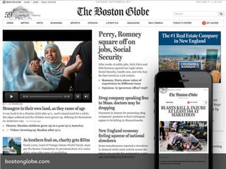
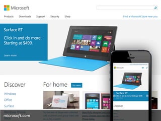
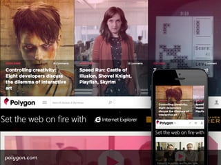
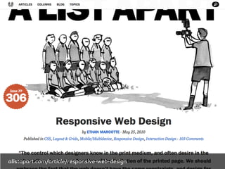
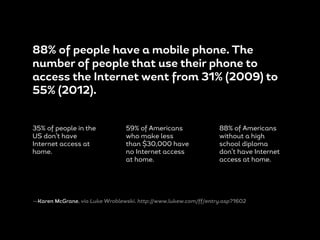
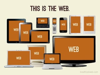
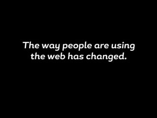
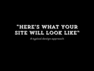
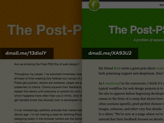
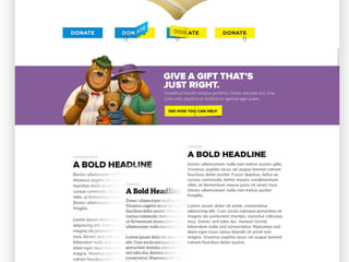
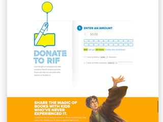
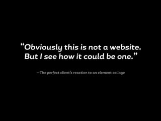
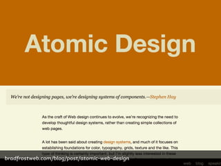
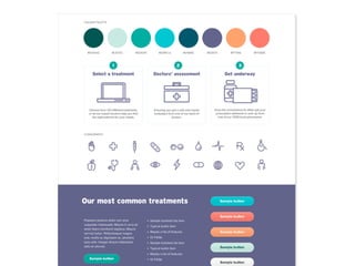
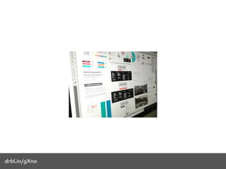
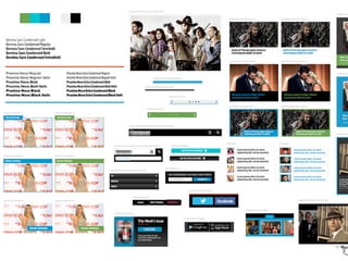
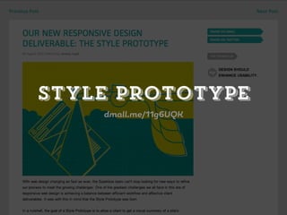
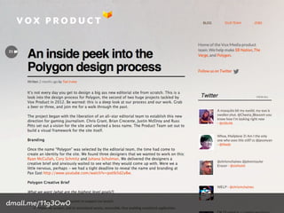
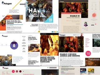
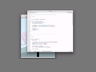
This document discusses the history and challenges of responsive web design. It notes that the way people access the internet has changed significantly since 2009, with many more people now using mobile phones to access the web. Traditional web design approaches no longer work as well. The document discusses new design methods for responsive web design, such as style tiles, element collages, and style prototypes that allow designing directly in the browser rather than with static Photoshop comps. It emphasizes the need to have real conversations with clients about the design process rather than presentations.
Taken from Future of Web Design (#FOWD), London 2015 Conference. http://futureofwebdesign.com/london-2015
Reports are in from Twitter, Medium, and the like; we can’t make full comps, use Photoshop, or even utter the phrase 'visual design' anymore. What’s a designer to do? Has our role evaporated? Fear not! Dan Mall will help redefine the tasks of the modern day designer in light of the multi -device world that snuck up on us.
We've focused on designing Web pages for long time. Pixel perfection & designing the same experience for all devices is not possible. Instead of page-based designs. We need design systems. Atomic design allows us to traverse from abstract to concrete. Creators can focus on the atoms and molecules and Clients can focus on pages and templates.
Truly Responsive Design Means Aligning to Business and User GoalsJohn Eckman
Perhaps the greatest sea-change in the industry since the “Web 2.0″ meme, Responsive Design has been the unavoidable theme of the web industry in 2011 and 2012. But too much of the focus in responsive design has been on the mechanics: media queries, responsive images, javascript polyfills, and techniques for progressive enhancement.
Not enough attention has been paid to how responsive sites and applications should be designed to take into account the needs and contexts of users. In short, we’ve been designing sites that respond to the needs (and capabilities) of *browsers* and *devices* rather than the desires and contexts of users.
In this talk I cover strategies and processes you can follow which help ensure your web applications are truly responsive to business goals and user needs, not just device capabilities.
Atomic Design: Creating systems to promote consistency and scalability.
This was a presentation I gave at #FredDev on 2/11/14 and is based on the Atomic Design Principals from @brad_frost bradfrostweb.com/blog/post/atomic-web-design/
Responsive Design Workflow (Breaking Development Conference 2012 Orlando)Stephen Hay
Slides from my presentation at Breaking Development 2012 in Orlando. This deck is not intended to be standalone, and probably made more sense in combination with my talk. At least, I hope so. I understand that video of the talk will be available in the near future on the Breaking Development website.
The legal team at Adobe is constantly seeking creative new ways to better serve our customers and employees. Part of this effort has been the development of what we call The Adobe Legal Department Style Guide. We use it as the foundation of the way we create and revise our agreements, processes, policies and trainings to ensure that they are models of clarity and simplicity, and that we communicate with a common voice. These efforts have resulted in an array of benefits including greater organizational efficiency, reduced translation and other costs, and most importantly --- happier customers and employees. Now we would like to help others in the legal profession to do the same. The Adobe Legal Department Style Guide is available to anyone free of charge under a Creative Commons license.
HTML5 is here and we should use it right now. It is fun and interesting to look at cool CSS3, Canvas and Video demos but our main goal should be to make our day-to-day life easier by using the cool things browsers offer us right now. Learn about local storage, simplifying interfaces and using HTML5 right now!
Hungarian Web Conference: HTML5 beyond the hype - let's make it work!Christian Heilmann
We're past the honeymoon period of HTML5 by now. The excitement of inflated promises is over and we start wondering what to do – use HTML5 or just build an iOS app instead? In this talk Chris Heilmann of Mozilla will show what HTML5 is really good for, what its problems are, what causes a lot of these problems and how new operating systems like Firefox OS work and conversion tools like PhoneGap work around these issues. You'll see the now of HTML5 and what is cooking in the kitchens of browser makers and standards bodies that will developing and deploying apps cross-platform much easier than it is now. We have a lot of tools at our disposal, we simply need to dare to use them.
If you’re a creative or technical professional, odds are you need a great portfolio website. What makes a good portfolio? What if you’re a writer, or a developer, and don’t have a lot of visual work to show? We’ll go over how to navigate the intimidating world of personal portfolio websites, using WordPress as our guide.
My closing talk for this year's Fronteers conference in Amsterdam, the Netherlands about just how cool it is to be someone who builds things for the web.
From Concept to Completion: Tips for Designing Great ContentVicke Cheung
Presentation for BrightonSEO with tips on designing great pieces of content from a designer's perspective. This covers the stages of the creative process and gives an overview on key design elements, along with actionable tips throughout.
Fronteers 2009 Of Hamsters, Feature Creatures and Missed OpportunitiesChristian Heilmann
My presentation at Fronteers 2009 about the opportunity we have as developers to liberate ourselves from the fail that is browsers and write some nice code to mix data on the web.
To the Pattern Lab! Better Collaboration in Drupal Using Atomic Design Princi...Daniel Ferro
Learn how to use styleguide/prototyping tools like Pattern Lab to increase collaboration between designers, themers, developers, and clients on Drupal projects. A focus on modular design early on in a Drupal project improves workflow and efficiency for the whole team.
After applying modular design principles into your design workflow you will have:
Shinier, more polished sites: You’ll improve collaboration between themers and designers without relying so much on static photoshop comps, dramatically improving the end product’s quality at a higher detail level.
Happier clients: Clients will be able to see functional visual designs earlier in the sprints, and be able to play with the site in an easy to use interface.
Happier developers: Developers can concentrate on the hard work of building the site while themers and designers concentrate on the visual design.
Project managers overcome with joy: Sites will be more easily themed, front-end bugs will be caught earlier, clients can see progress sooner, designers will be less bogged down in Photoshop iterations, and projects will be more successful.
When Web Performance Optimization was emerging as a new field of engineering we had a handful of rules to follow. Gzip here, minify there, do some caching. This was 15 years ago.
This year’s Smashing Magazine performance checklist has 62 items with hundreds of links for further research.
Have we learned so much or has the Web become so complicated?
In this talk I will try to make sense of today’s most pressing Web Performance issues with easily digestible lessons about metrics, budgets, JavaScript frameworks, functional programming, browsers and plain old HTML.
What's makes the difference between good and great design? Or for that matter, between good and great designers?
I don't pretend to know the answer. I've been designing for 10+ years and I still don't consider myself a great designer. What this presentation offers, however, are a few principles I've learned along the path to becoming a great designer.
Responsive Web Design for Universal Access 2016Kate Walser
You can improve how well your website works and looks across different devices using responsive web design techniques. But did you know you can also improve access for all users, including those with disabilities, by applying responsive techniques? Learn how.
Visual Thinking Presentation for UnitedHealth Innovation Dayburowe
Pictures are global and transcend words. They carry metaphors, symbols and meaning beyond the written word. Capturing ideas with images takes less time than reading text or verbalizing ideas, and making drawings helps you tell stories more effectively. Visual thinking can help you make sense of complexity, help find patterns and surface critical issues, help make faster, better decisions, and help you take action and do 'good' for your business.
In order to get comfortable with the skill of visual thinking, we need to
build confidence in drawing ability for those with no experience, help people develop a personal toolbox of sketching shortcuts, promote and encourage visual thinking as a useful tool at your desk and in the conference room.
The goal is to move from "let's THINK out loud" to "let's VISUALLY THINK out loud" as a way to brainstorm, collaborate and innovate together in the workplace.
I delivered this presentation at the Canadian Association of Journalists "Innovate News" conference in Toronto, ON on January 30, 2010. The topic was "Visual Thinking and the Writing Process" and looks at visual techniques that writers could use in brainstorming, gathering information and developing their stories.
After consulting with several companies on performance related issues, it became clear that one of the biggest performance issues facing websites today is the sheer amount of JavaScript needed to power the page. The demand for more interactive and responsive applications has driven JavaScript usage through the roof. It’s quite common for large sites to end up with over 1 MB of JavaScript code on their page even after minification. But do today’s web applications really need that much JavaScript?
Slides from the talk I gave at NXNE in Toronto and Halifax Pop Explosion. The corresponding sketchnotes by @IainKeith are here: http://bit.ly/T9BLwC
It’s time for the ultimate face-off: People vs. Brands.
We dissected six of the biggest trends in our industry, including storytelling, transmedia, entrepreneurialism, curation, influence & cause marketing. We looked at best-in-class examples from both brands and people.
After determining who comes out on top, we looked at what we can learn from the winner and how to apply key learnings to brand communications & marketing strategies.
Closing keynote of the Fronteers conference in Amsterdam. Blog notes are available at http://www.wait-till-i.com/2011/10/07/the-prestige-of-being-a-web-developer-fronteers-11/
Owning the Interaction in Dynamic Environmentsguestf4f7a4b38
Abstract
As the internet gets more interactive with the widespread adoption of broadband, we must continue to own user interactions across this changing landscape. This presentation will highlight the challenges from a UK design agency perspective and demonstrate my commerical, practical method for describing dynamic user interactions.
Data is all around us, which is both a good and bad thing. Good, because we need it. Bad, because there’s simply too much to know where and how to start using it. This is one of several reasons that marketing teams are currently dysfunctional – I’ll reveal the rest in my talk – but it doesn’t have to be this way. Data-Driven Design (3D) is an actionable evidence-based framework that gives marketing teams (marketers, designers, & copywriters) accelerated access to the data they really need, coupled with a process for understanding how to use that data to make informed changes to the digital marketing experiences you’re creating today. In Oli’s talk, you’ll learn how to use The 3D Playbook to narrow four hundred sources of overwhelming data into the five you actually need.
TDWI Keynote: Outside In - The Future of Business Intelligence innovationmark madsen
The real future of business intelligence rather than the retro future we've been building, and where to look for inspiration and innovation in the future.
Similar to Responsive Design is Hard/Easy! Be Afraid/Don't Worry! (20)
Unleash Your Inner Demon with the "Let's Summon Demons" T-Shirt. Calling all fans of dark humor and edgy fashion! The "Let's Summon Demons" t-shirt is a unique way to express yourself and turn heads.
https://dribbble.com/shots/24253051-Let-s-Summon-Demons-Shirt
7 Alternatives to Bullet Points in PowerPointAlvis Oh
So you tried all the ways to beautify your bullet points on your pitch deck but it just got way uglier. These points are supposed to be memorable and leave a lasting impression on your audience. With these tips, you'll no longer have to spend so much time thinking how you should present your pointers.
Expert Accessory Dwelling Unit (ADU) Drafting ServicesResDraft
Whether you’re looking to create a guest house, a rental unit, or a private retreat, our experienced team will design a space that complements your existing home and maximizes your investment. We provide personalized, comprehensive expert accessory dwelling unit (ADU)drafting solutions tailored to your needs, ensuring a seamless process from concept to completion.
White wonder, Work developed by Eva TschoppMansi Shah
White Wonder by Eva Tschopp
A tale about our culture around the use of fertilizers and pesticides visiting small farms around Ahmedabad in Matar and Shilaj.
Hello everyone! I am thrilled to present my latest portfolio on LinkedIn, marking the culmination of my architectural journey thus far. Over the span of five years, I've been fortunate to acquire a wealth of knowledge under the guidance of esteemed professors and industry mentors. From rigorous academic pursuits to practical engagements, each experience has contributed to my growth and refinement as an architecture student. This portfolio not only showcases my projects but also underscores my attention to detail and to innovative architecture as a profession.
38. 88% of people have a mobile phone. The
number of people that use their phone to
access the Internet went from 31% (2009) to
55% (2012).
35% of people in the
US don’t have
Internet access at
home.
59% of Americans
who make less
than $30,000 have
no Internet access
at home.
88% of Americans
without a high
school diploma
don’t have Internet
access at home.
—Karen McGrane, via Luke Wroblewski. http://www.lukew.com/ff/entry.asp?1602
61. “I’m not making a case for ditching
Photoshop altogether and designing
solely in the browser but rather better
understanding how we use Photoshop in
modern web design.”
—Brad Frost, Front-End Designer
62. “I don’t think we’re in a post-P S D era, but
I do think we’re moving towards a
post-‘full-comp’ era.”
—Me
111. “Obviously this is not a website.
But I see how it could be one.”
—The perfect client’s reaction to an element collage
clearleft.com/thinks/visualdesignexplorations
118. “We must move away from the place where the
client sits with arms crossed in the role of judge,
and we take to the stage with song and dance in
the role of auditioning talent. While both parties
find the showmanship of our craft titillating, the
practitioner’s is a stronger place than that of the
performer. It is this practitioner’s position from
which we must strive to operate. Practitioners do
not present. Stars do not audition.”
—Blair Enns, dmall.me/13eVrWD
123. 4 design process tips for
responsive web design
From Vox Media Director of Design Ted Irvine (@ted_irvine)
124. “Things can look beautiful in Photoshop, but having
them work responsively in code gives you a more
honest sense of the design. As designers, we're often a
bit dishonest about content. We realized that the more
quickly we got into code, the more quickly things
broke, and the more quickly we could fix them.”
be honest
j
1
126. “We still do a lot of work in Photoshop when we
needed to focus. Sometimes when you work only in
code, you work too fast. We needed to slow down.”
Slow down
j
3
127. “We always start with a 2-week typography study in a
browser. For responsive projects, design elements go
away when the viewport gets smaller, so typography
plays an important part in carrying the brand.”
Start with type
j
4
134. “How would I ever have discovered that
[animation idea] if I had to compile every time I
made a change? So much of creation is about
discovery, and you can’t discover anything if
you can’t see what you’re doing.”
—Bret Victor
135. For some, “designing in the browser” actually
means skipping design to starting building instead.
136. “Let’s change the phrase
‘designing in the browser’ to
‘deciding in the browser.’”
—Me, http://the-pastry-box-project.net/dan-mall/2012-september-12/
137. Yes, I realize I just cited myself.
Again.
I am so sorry.