Download as PDF, PPTX


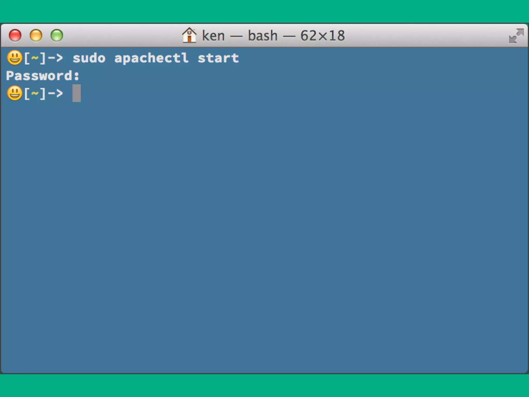
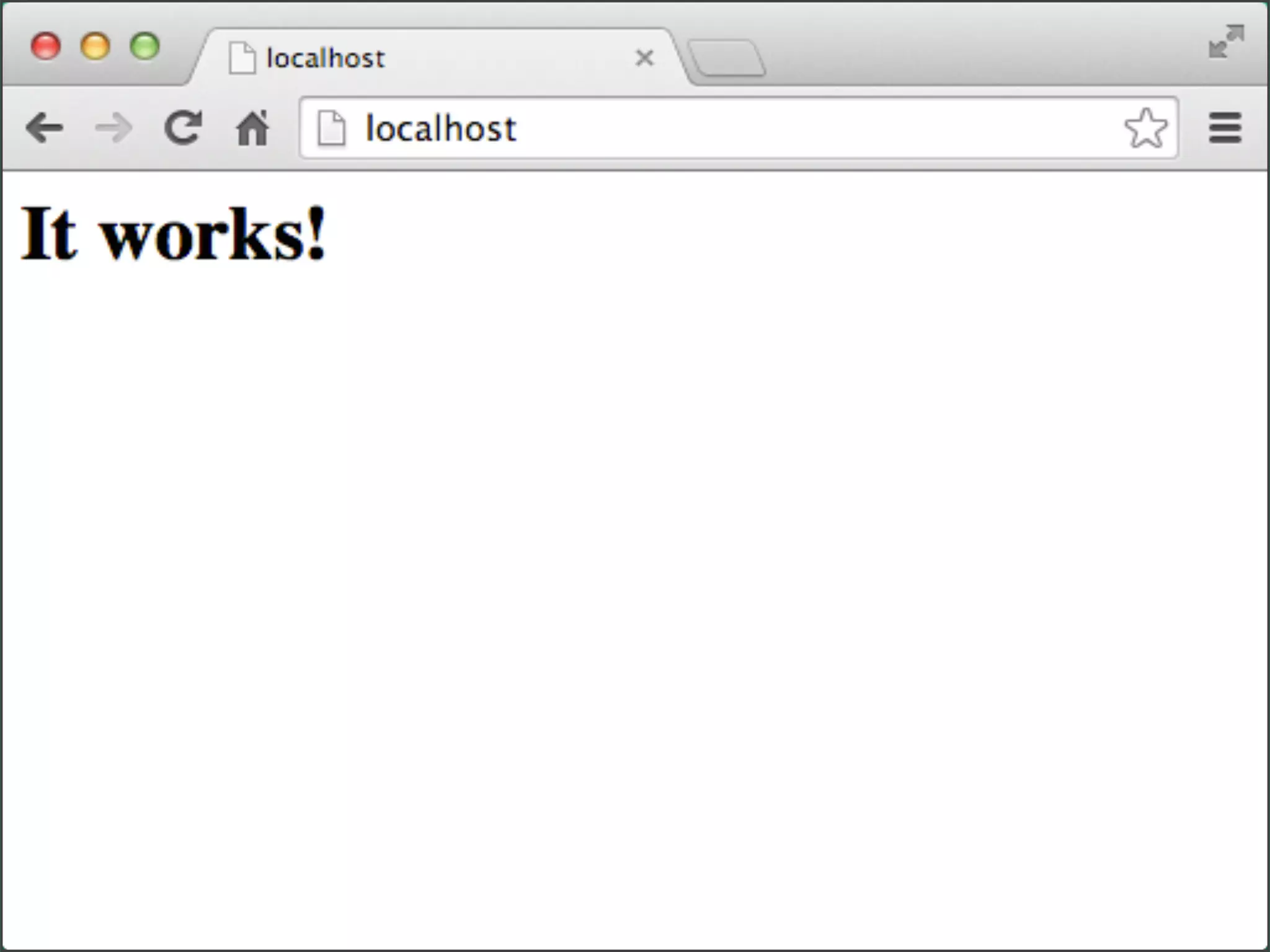
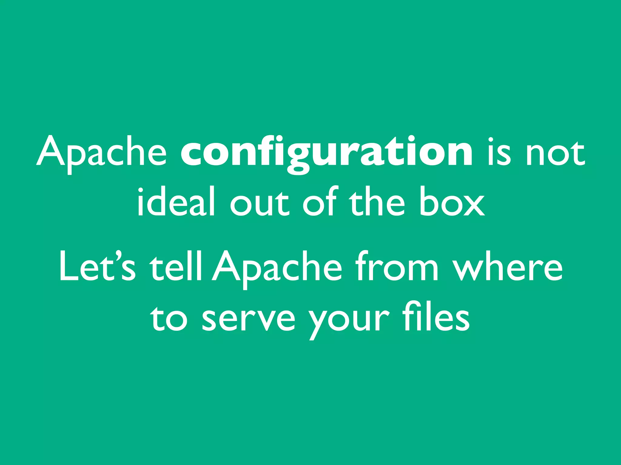
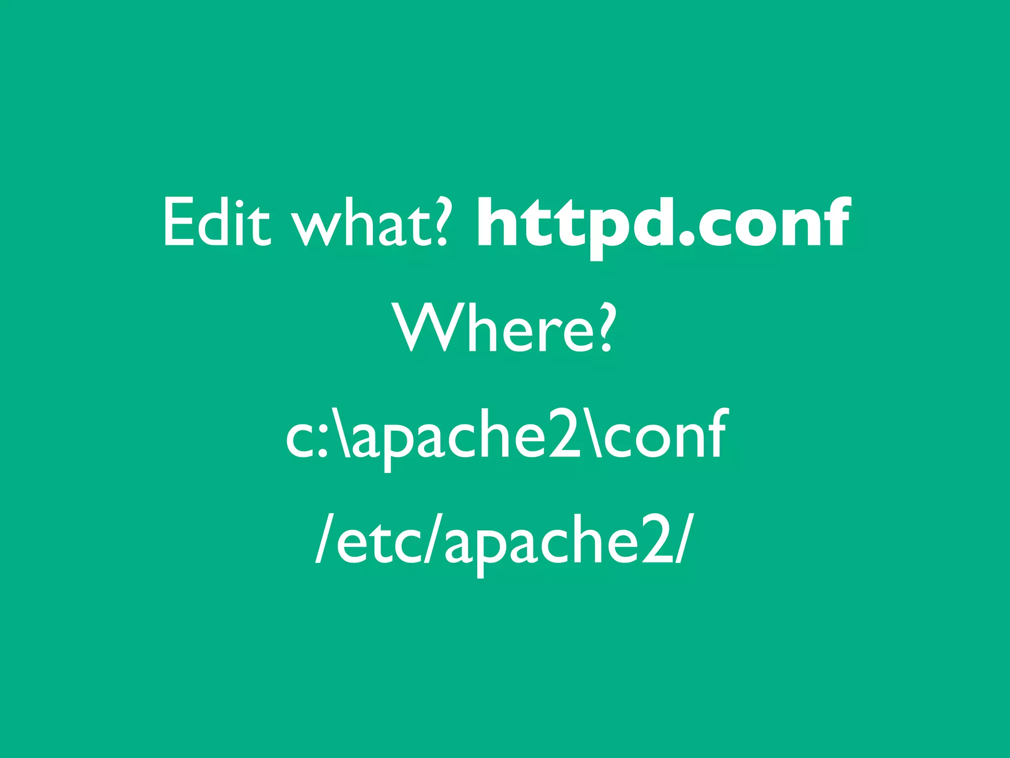
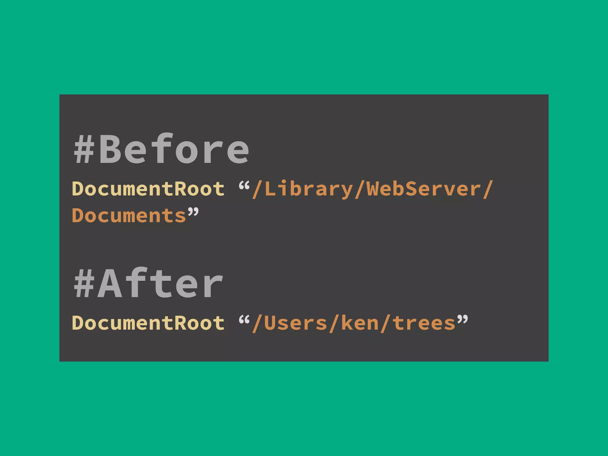
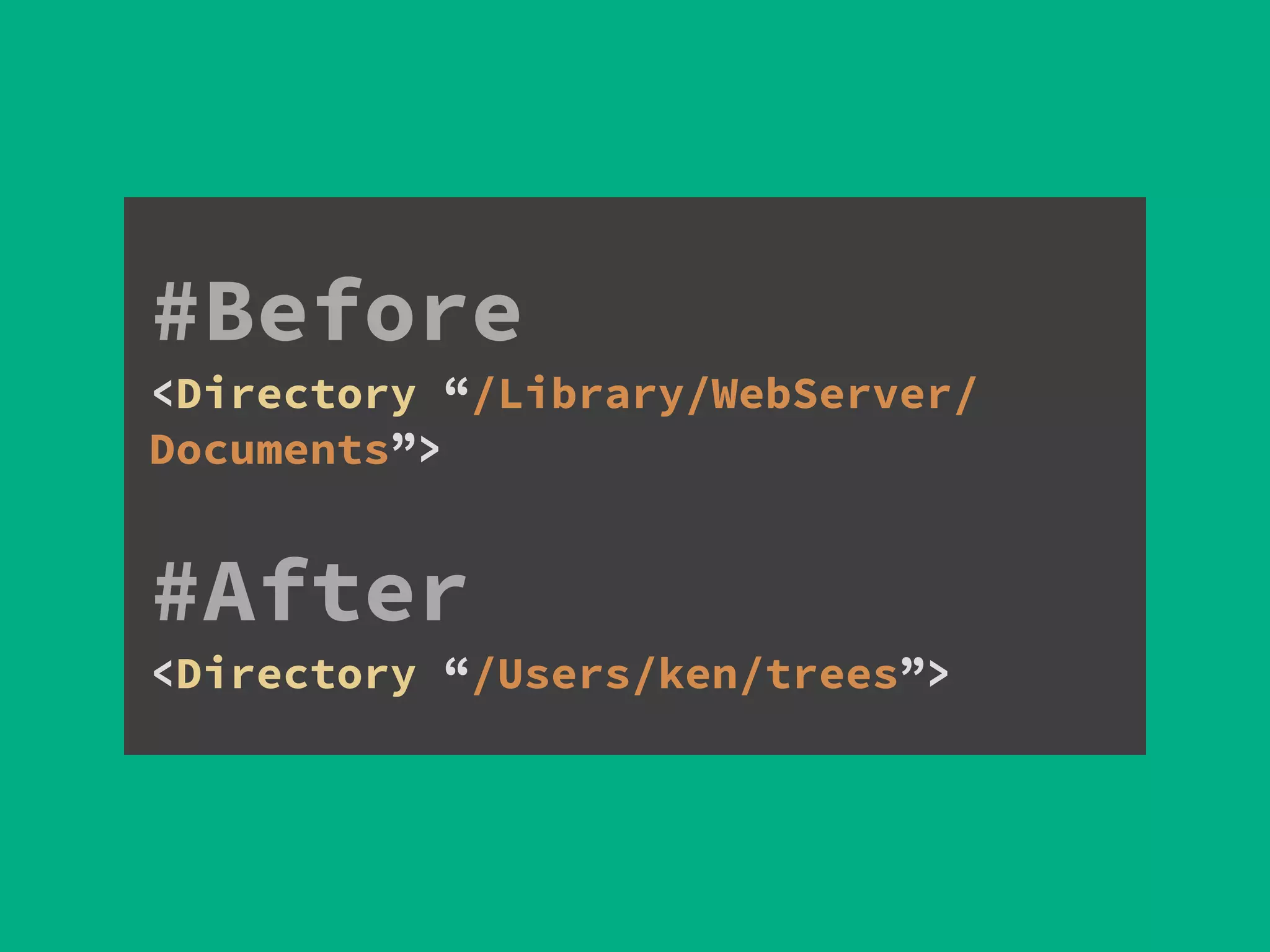
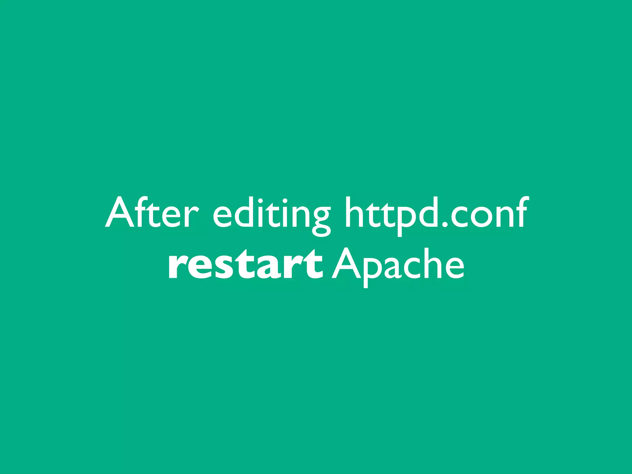
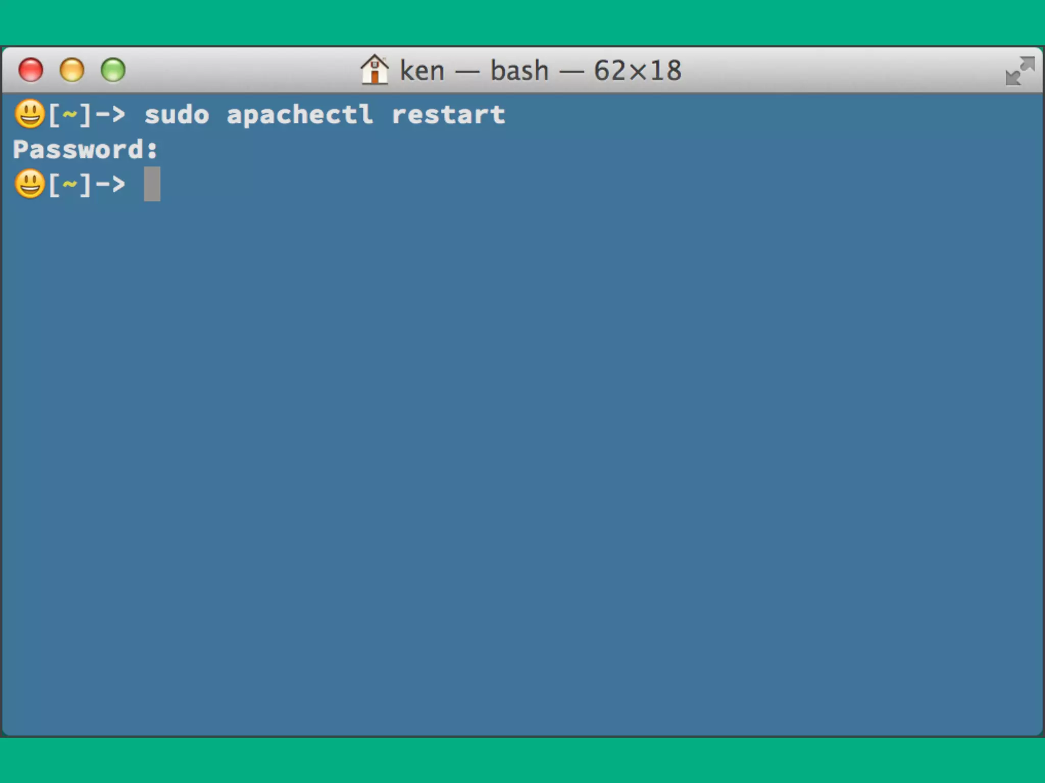


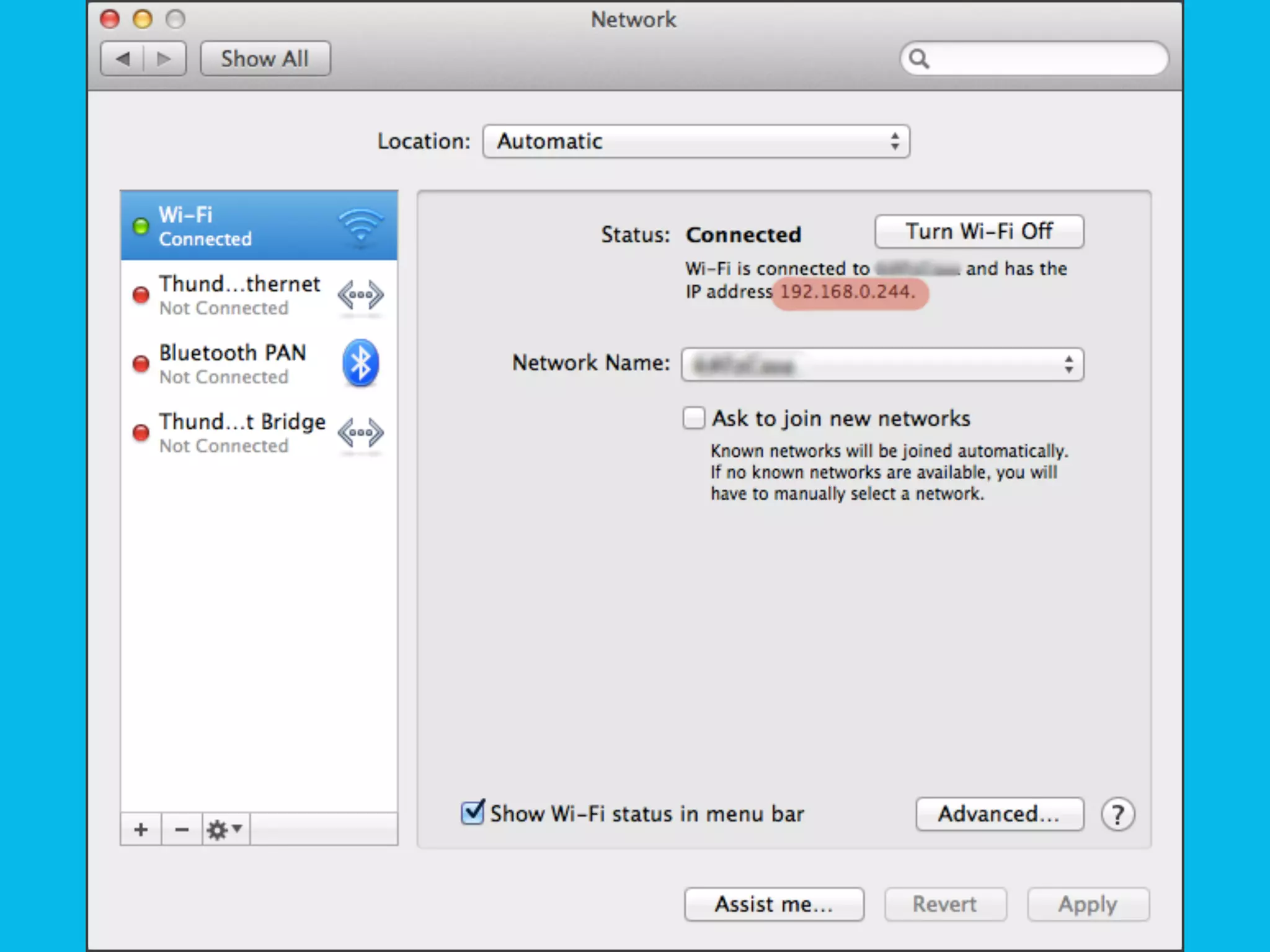


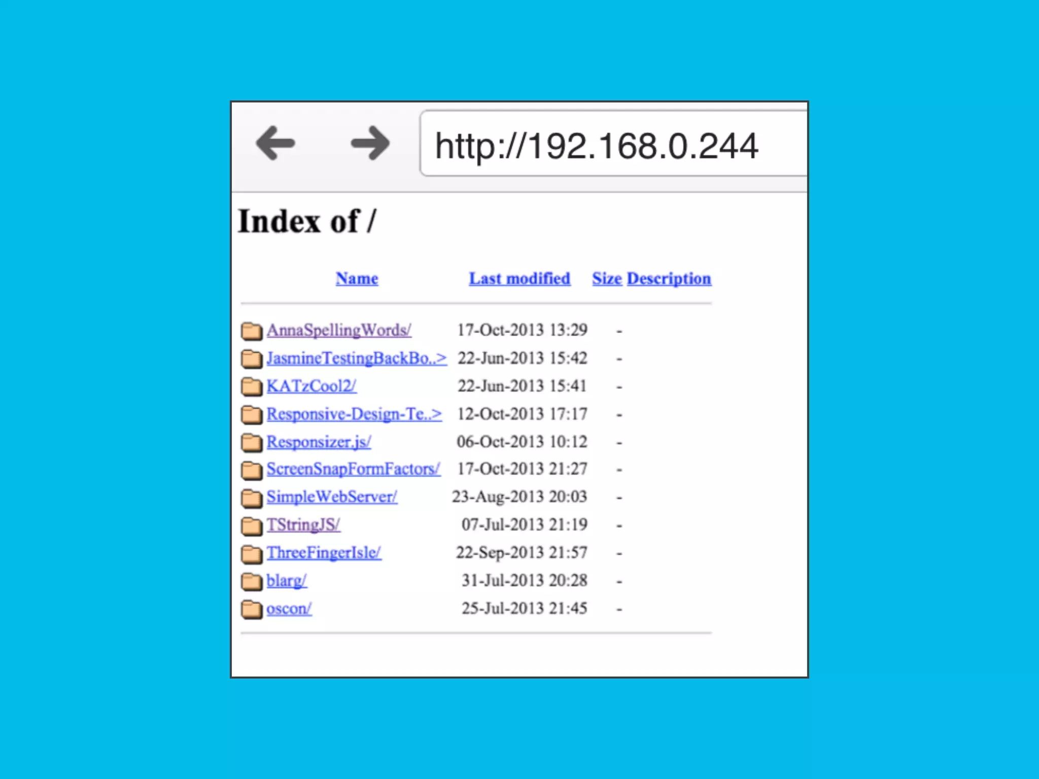
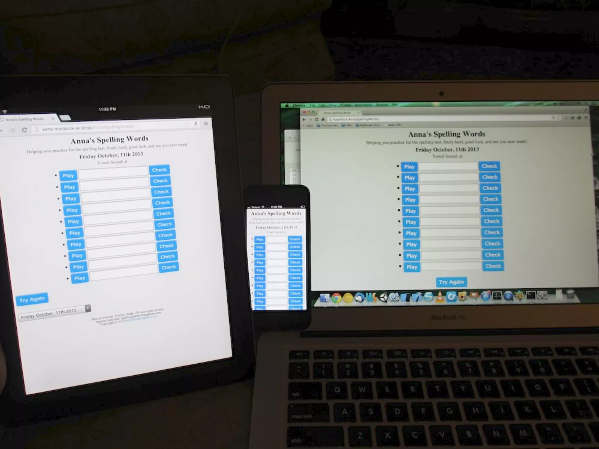


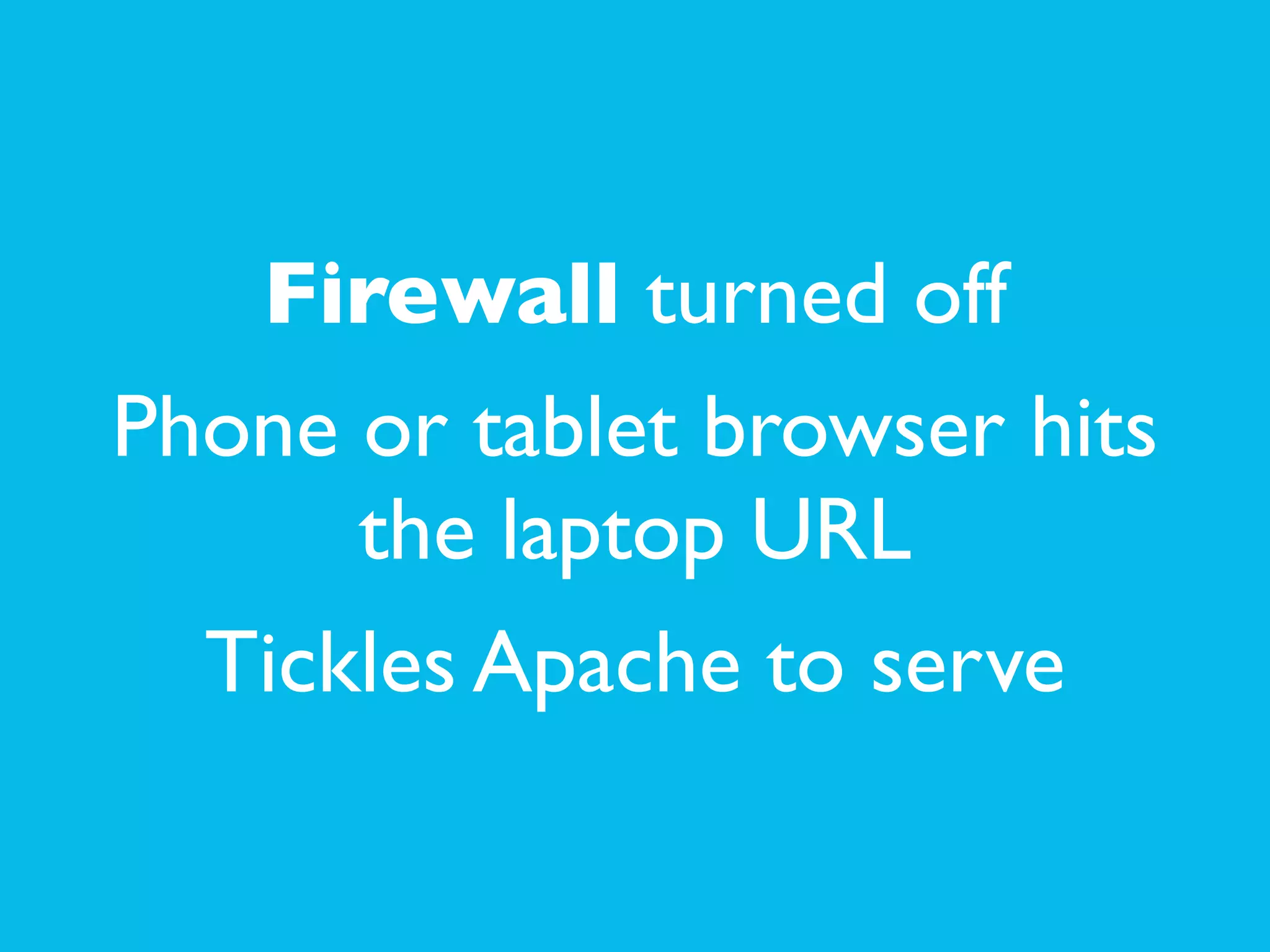

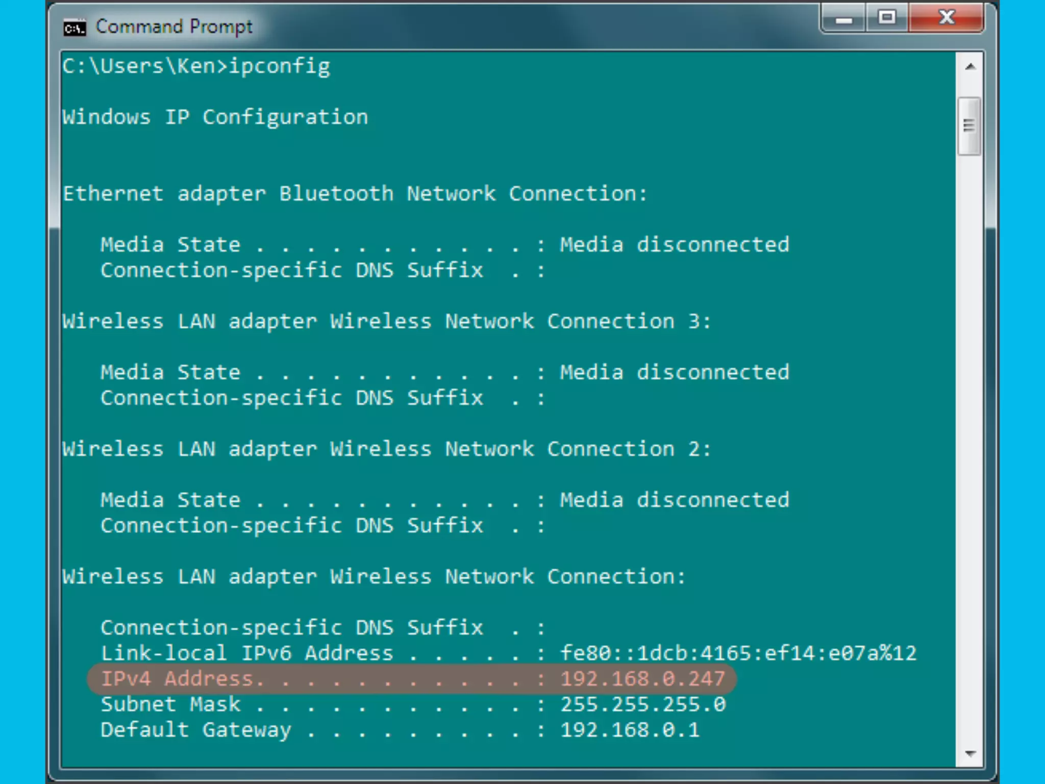
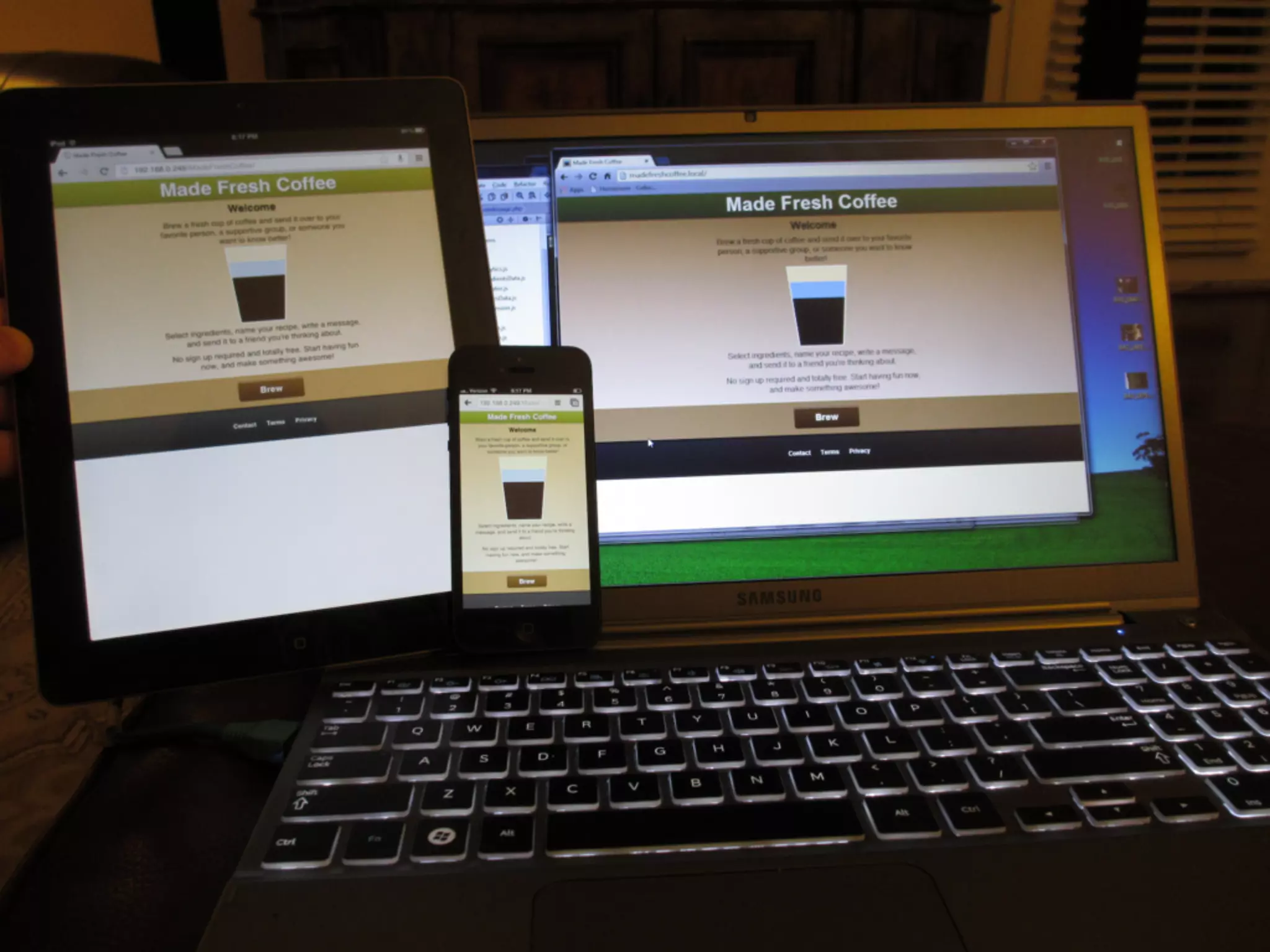


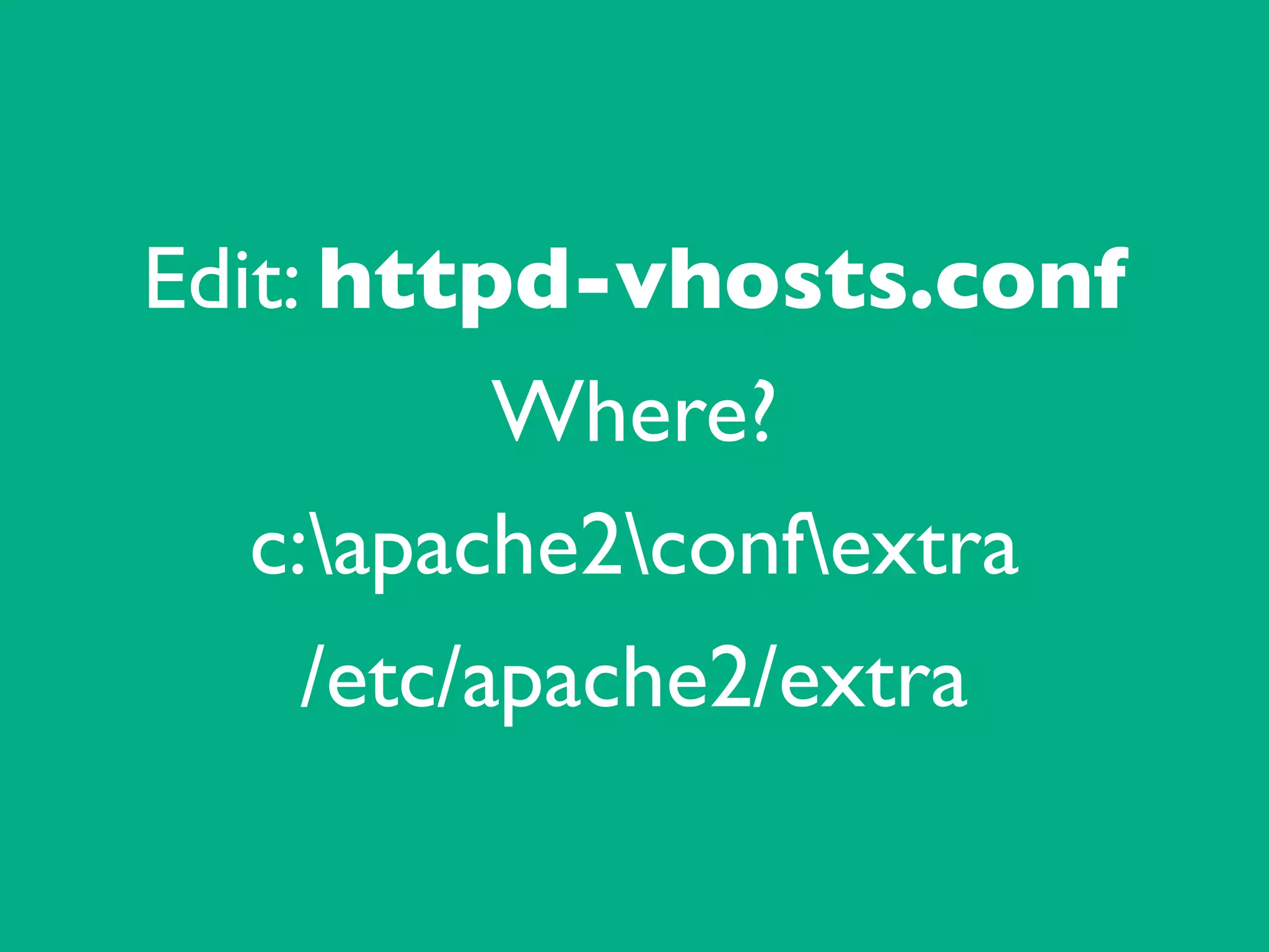
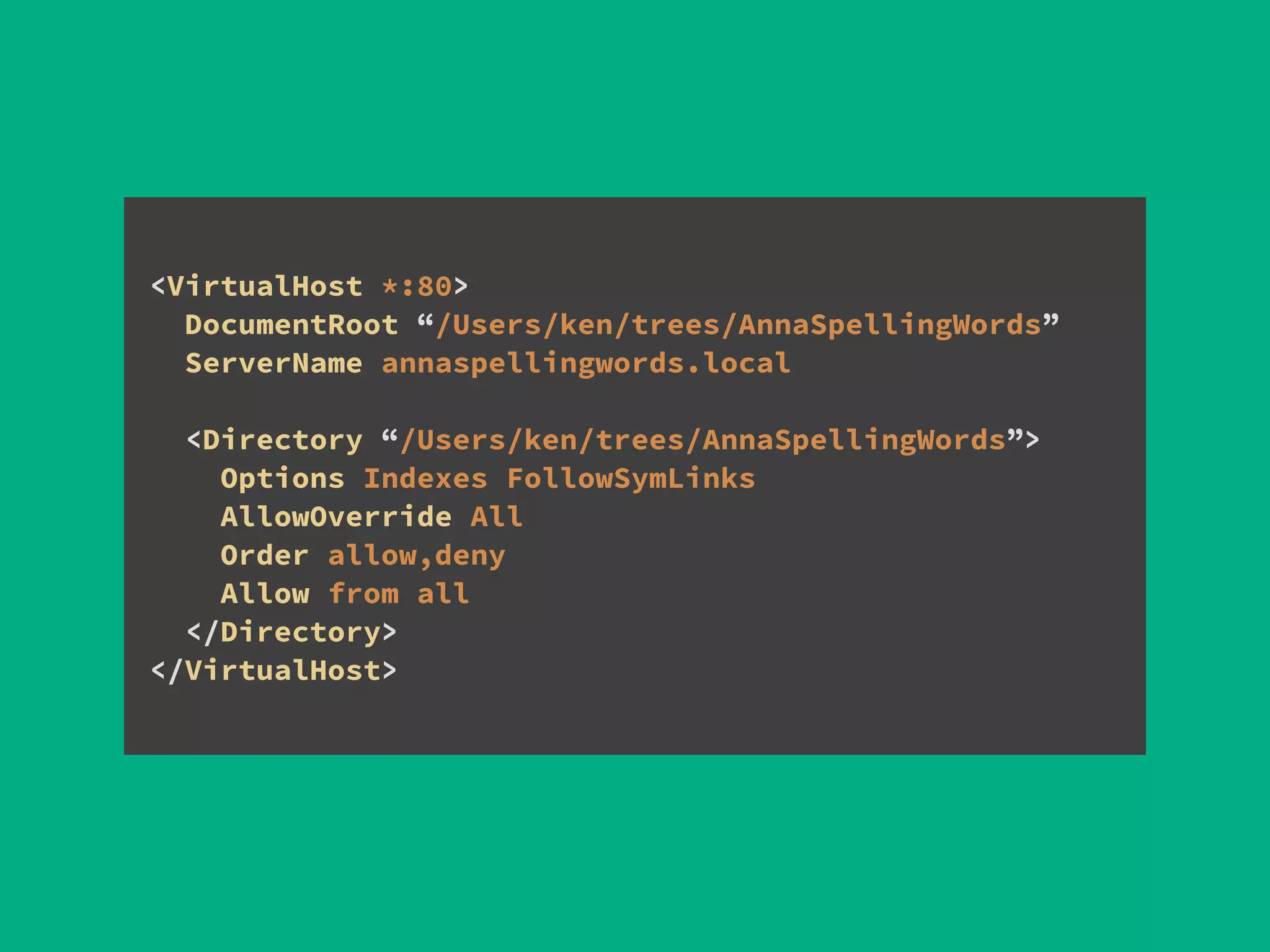

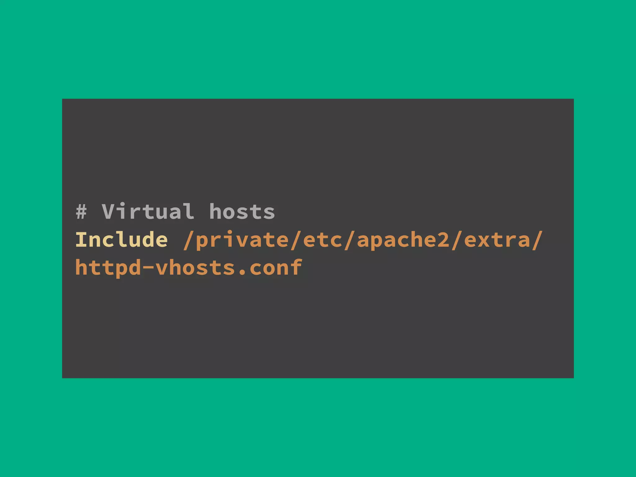
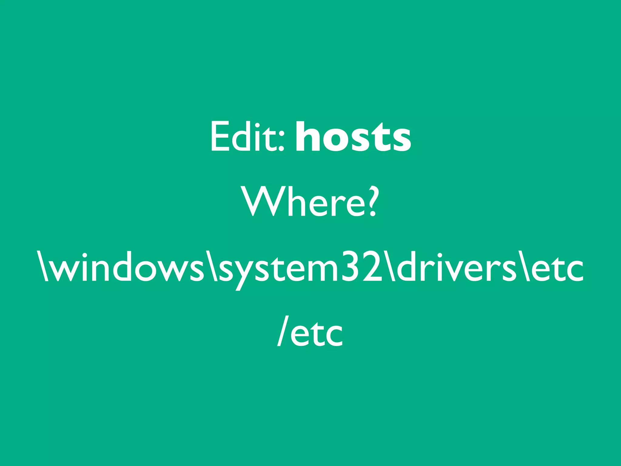
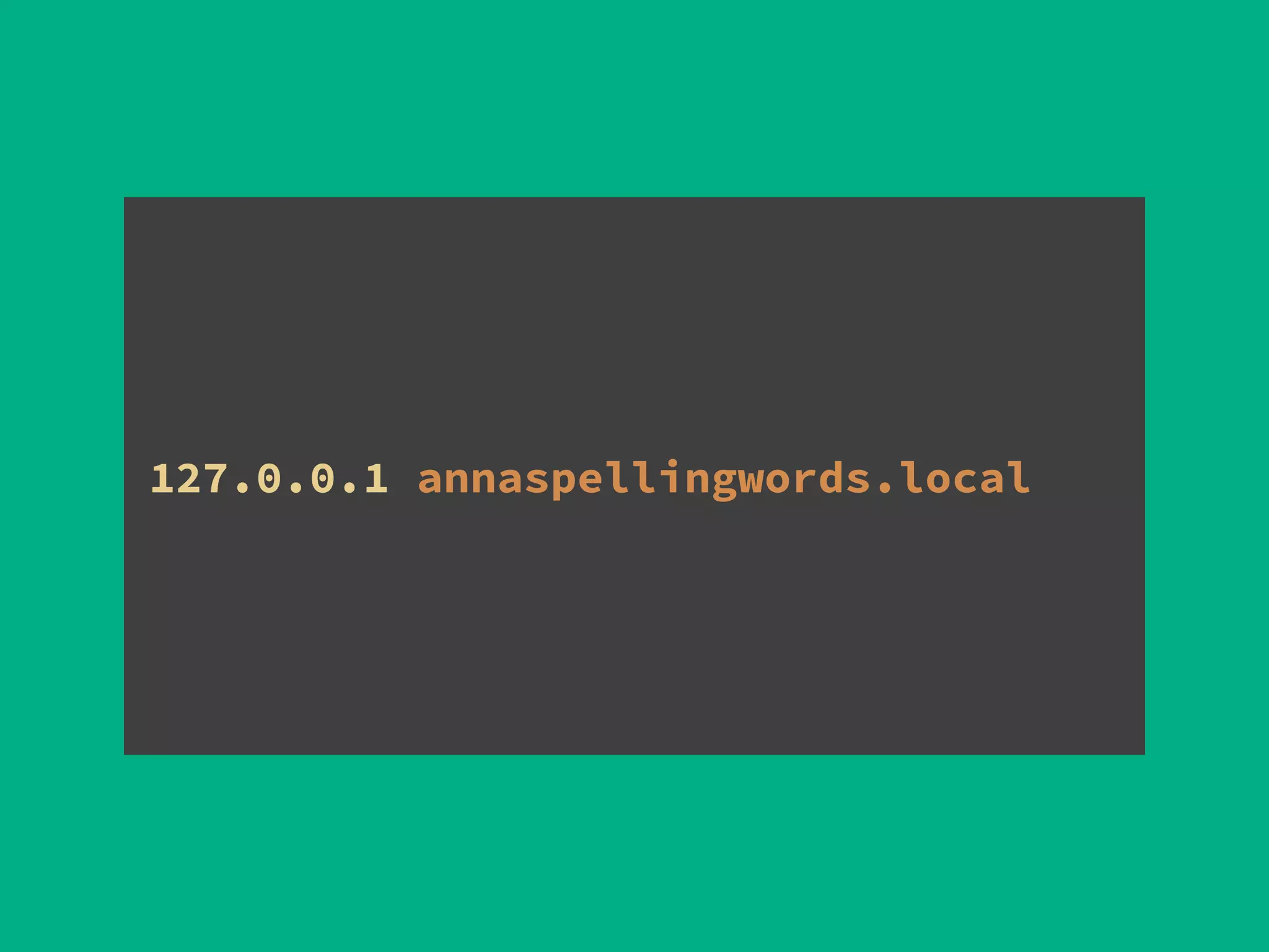
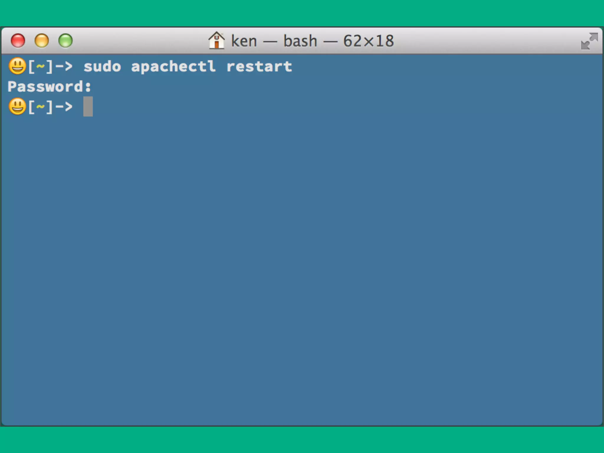


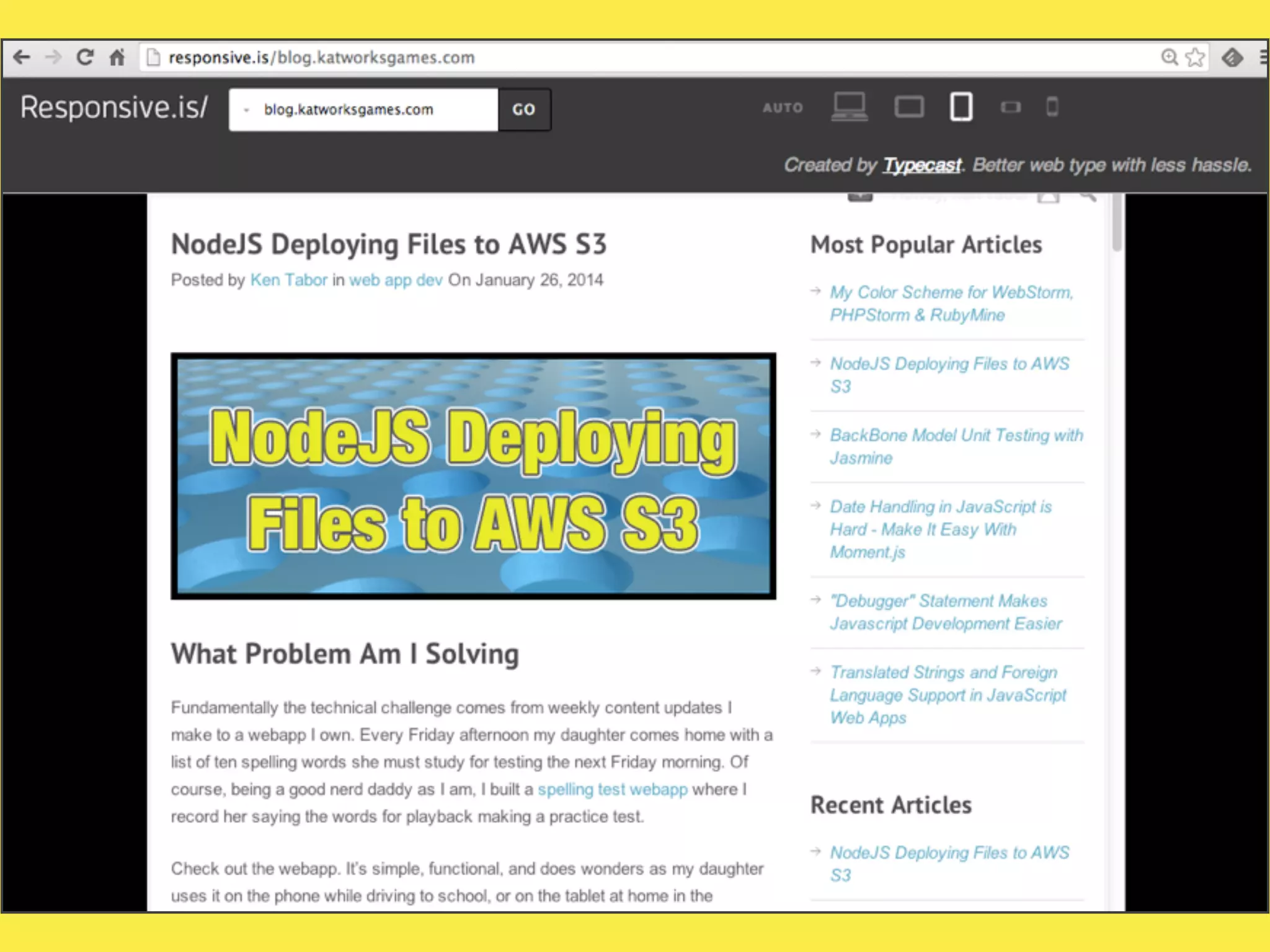
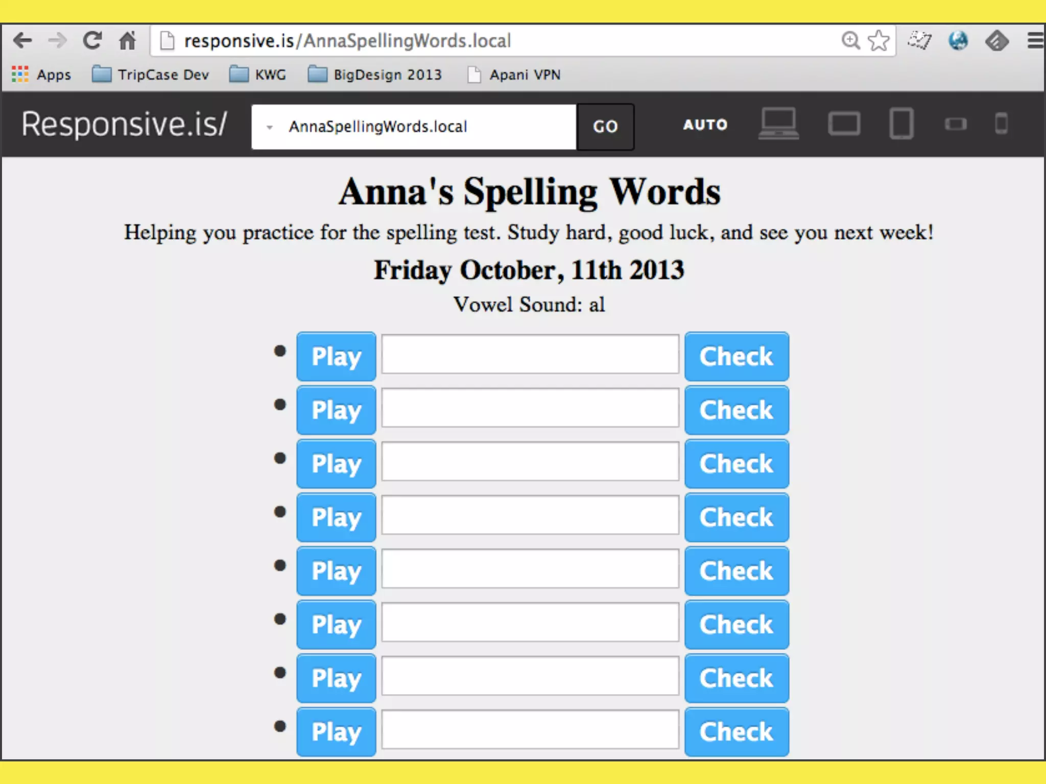


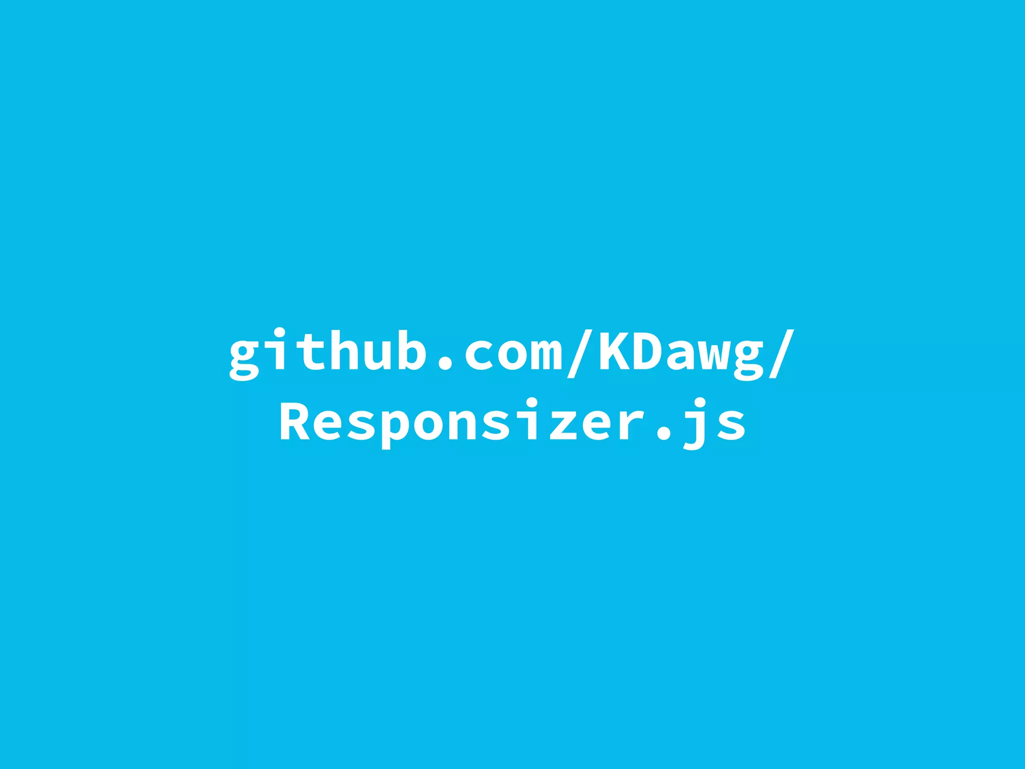
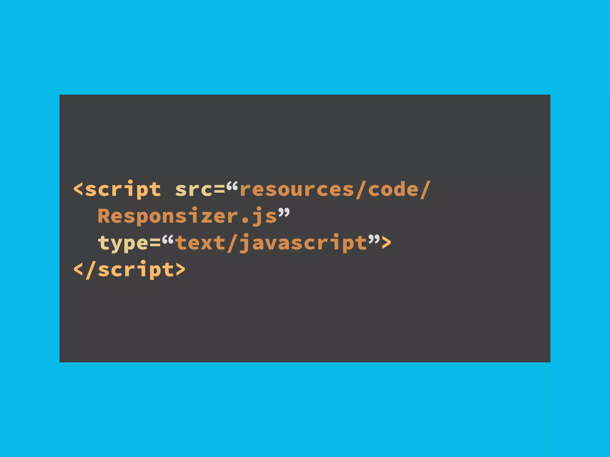


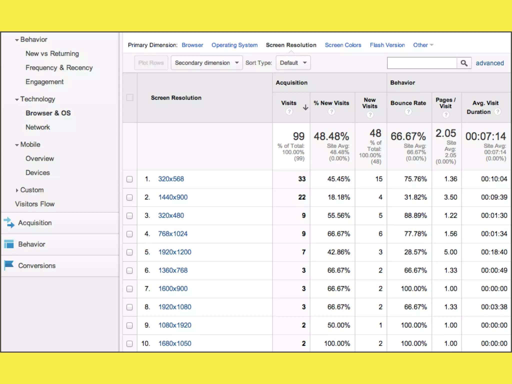
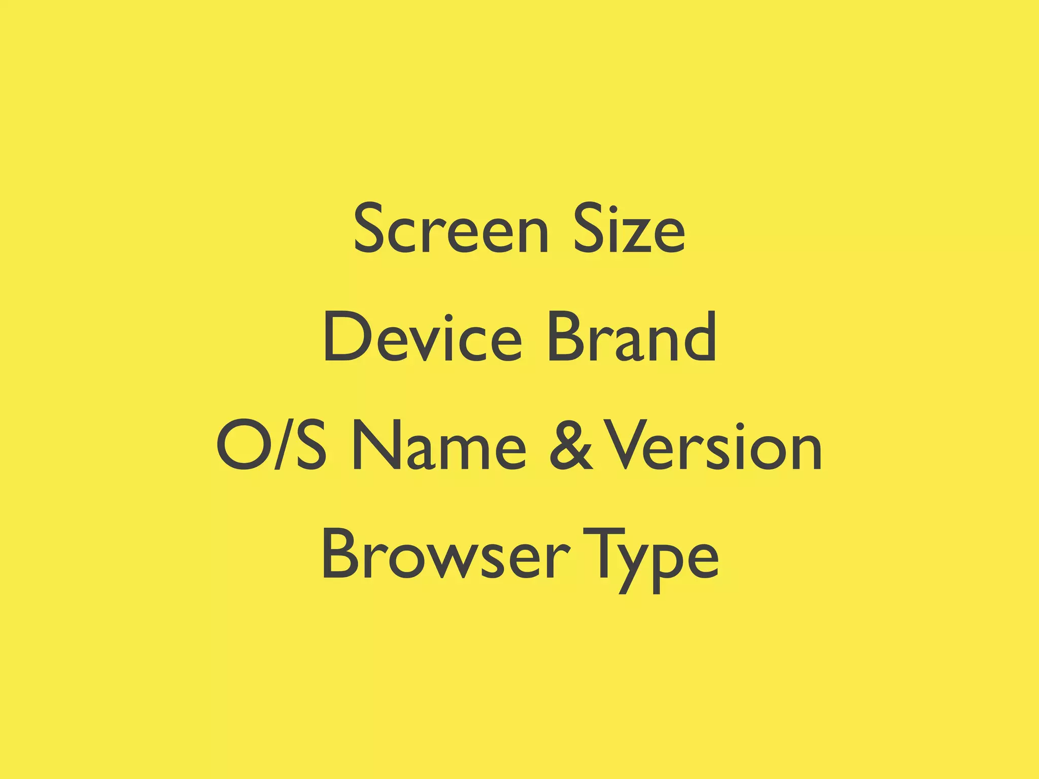


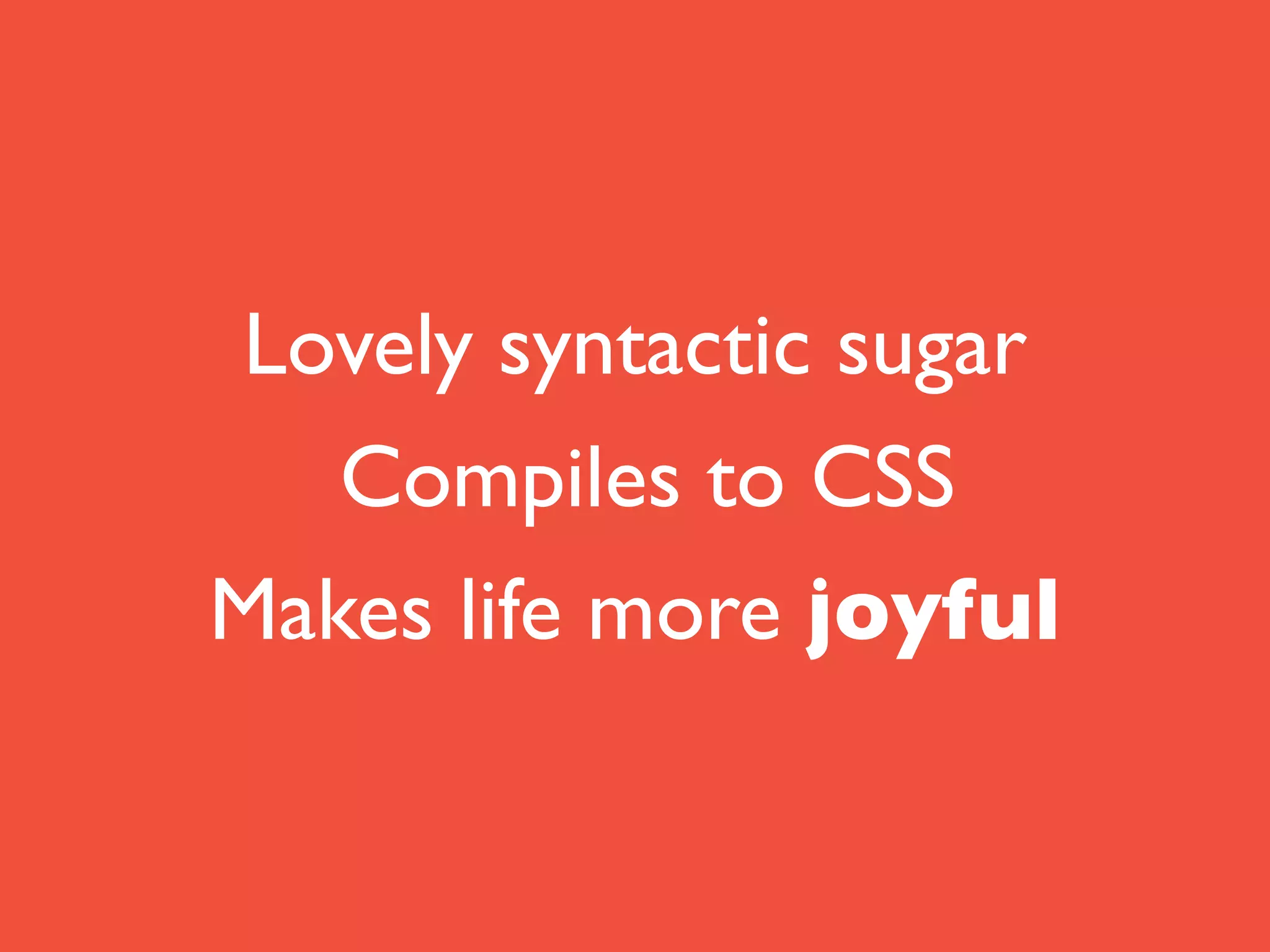
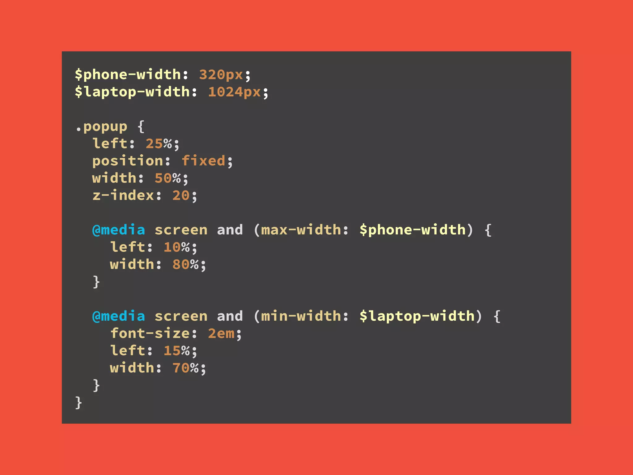
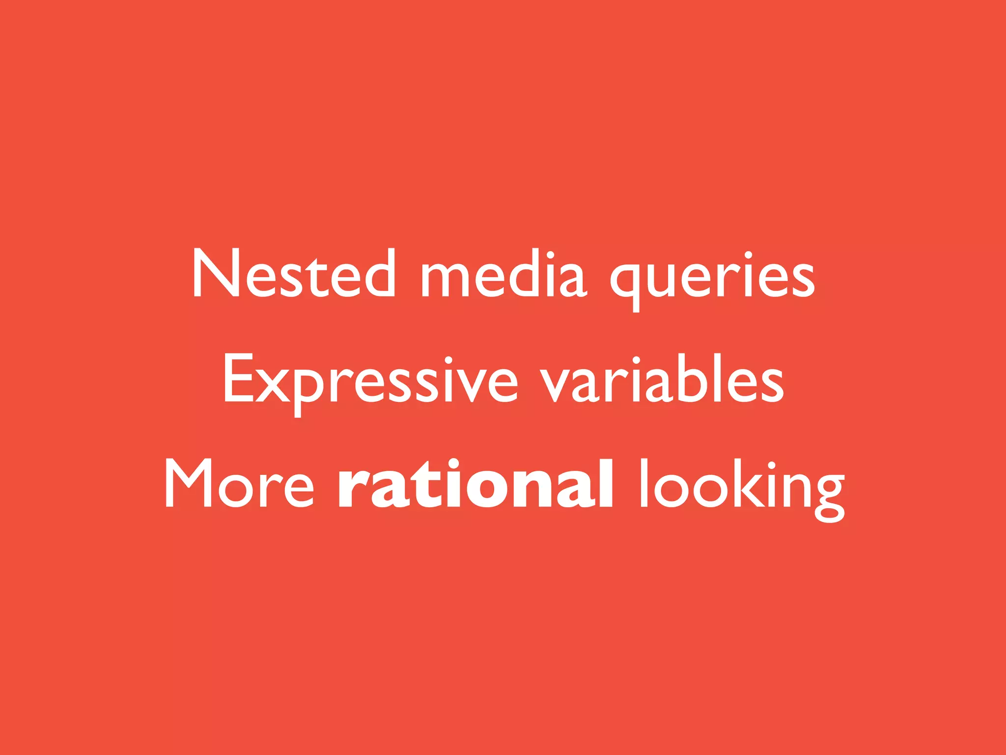


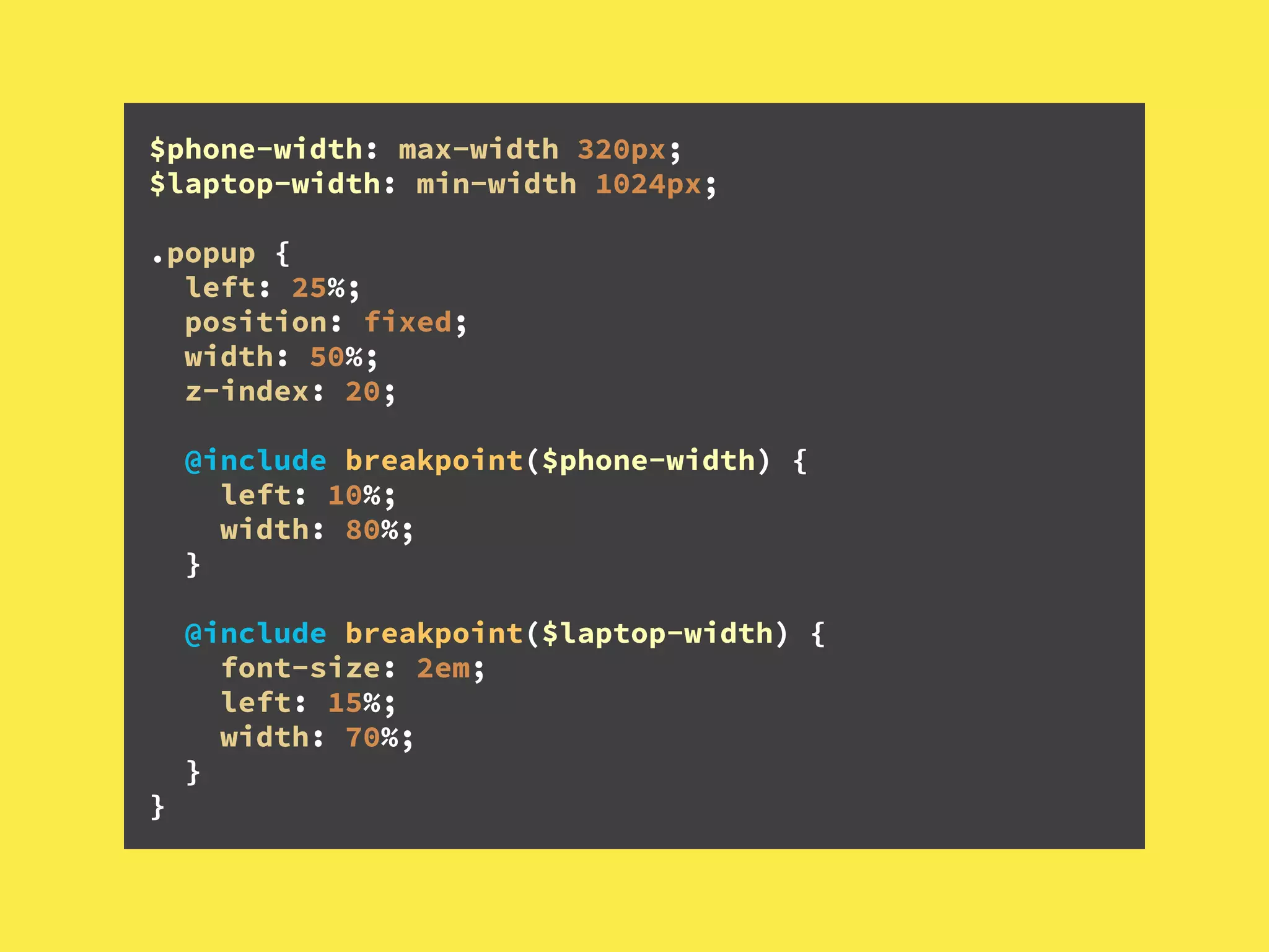


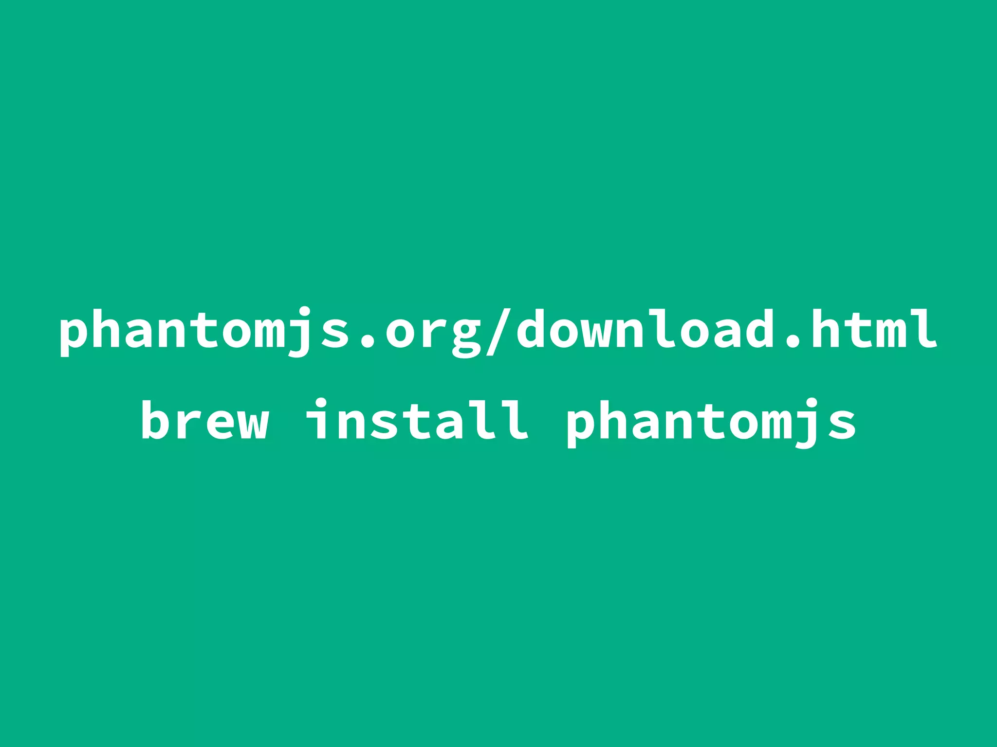
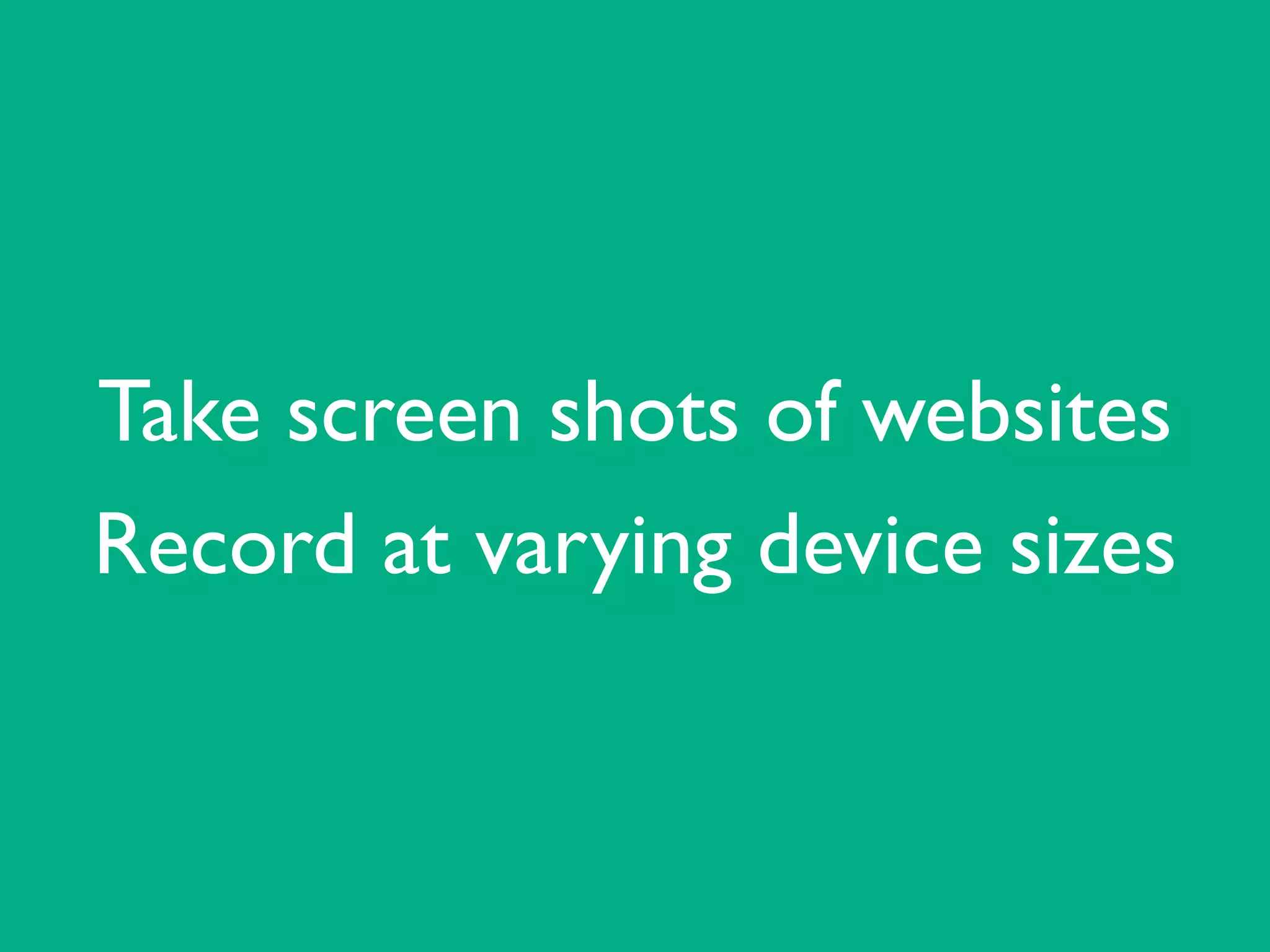
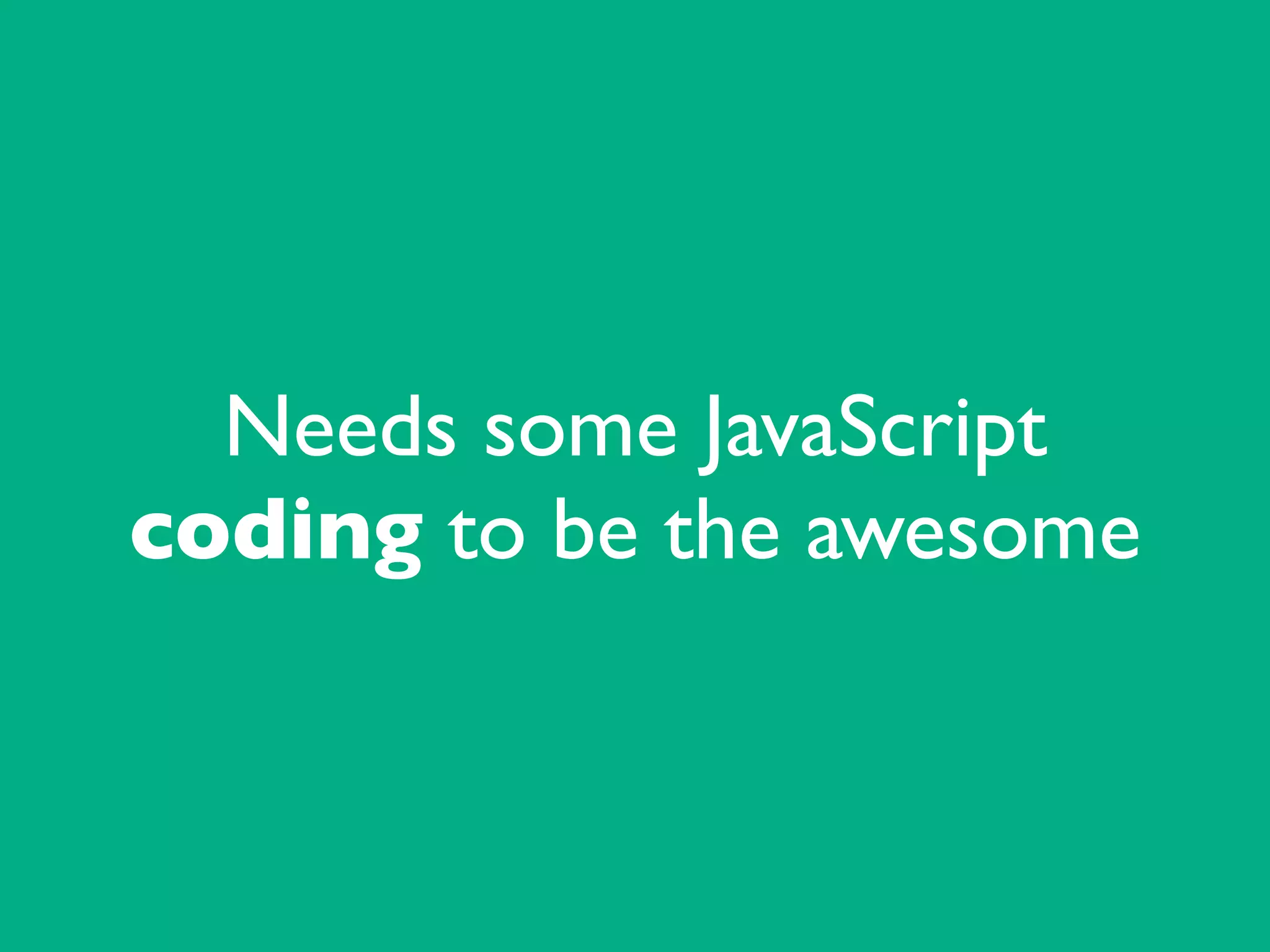
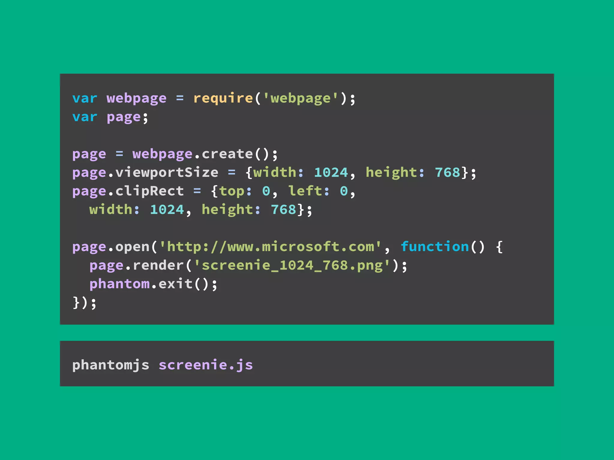


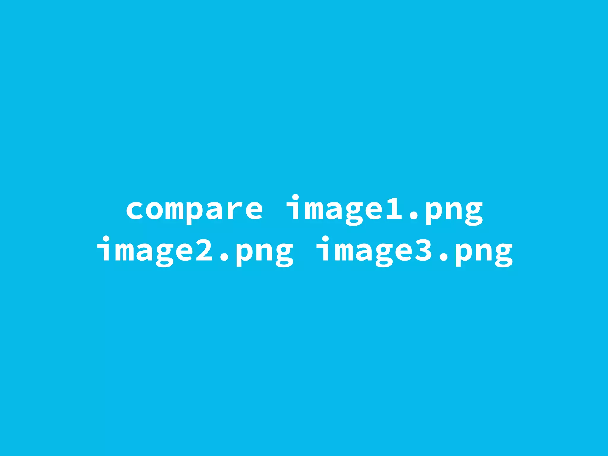
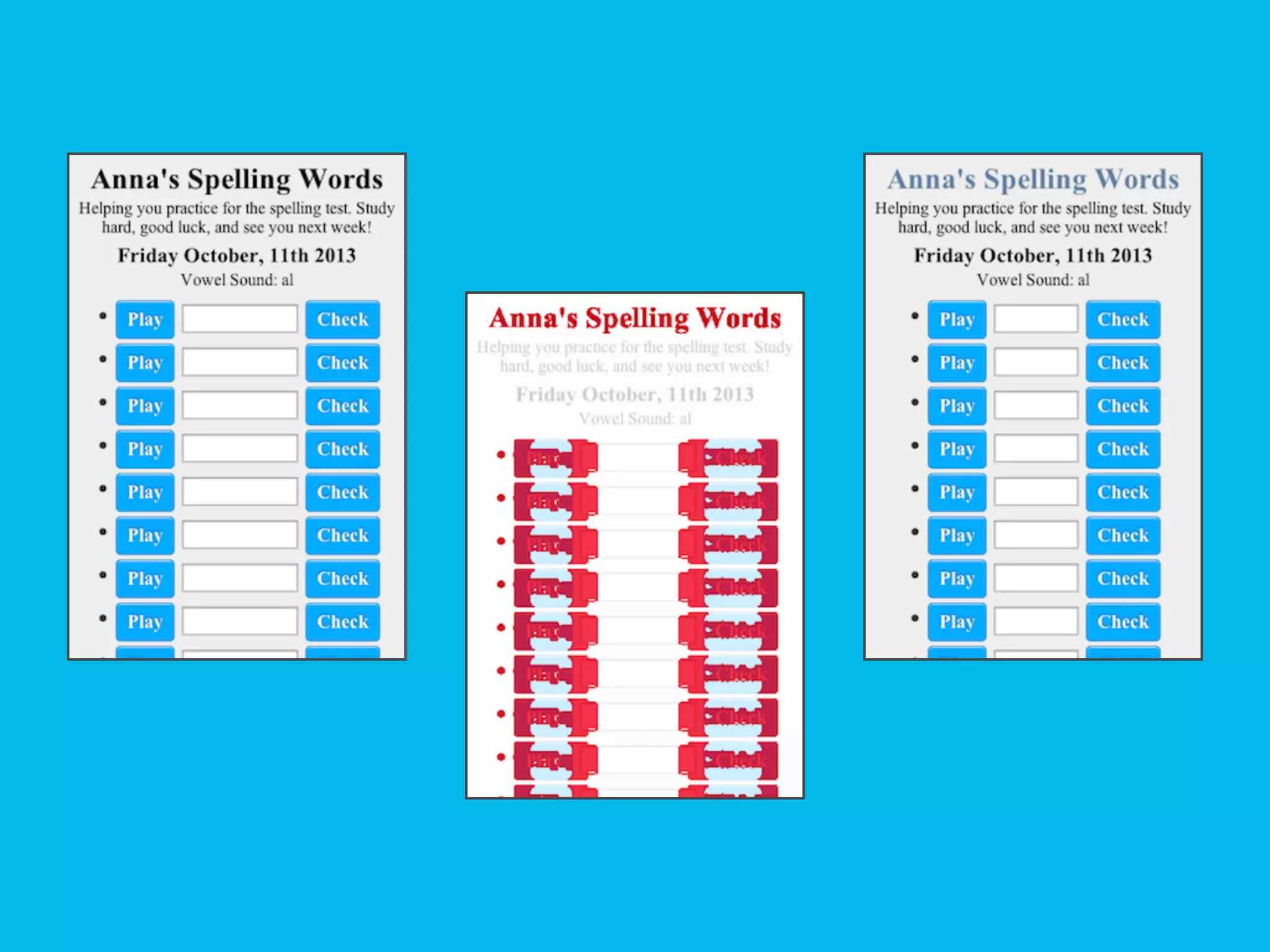
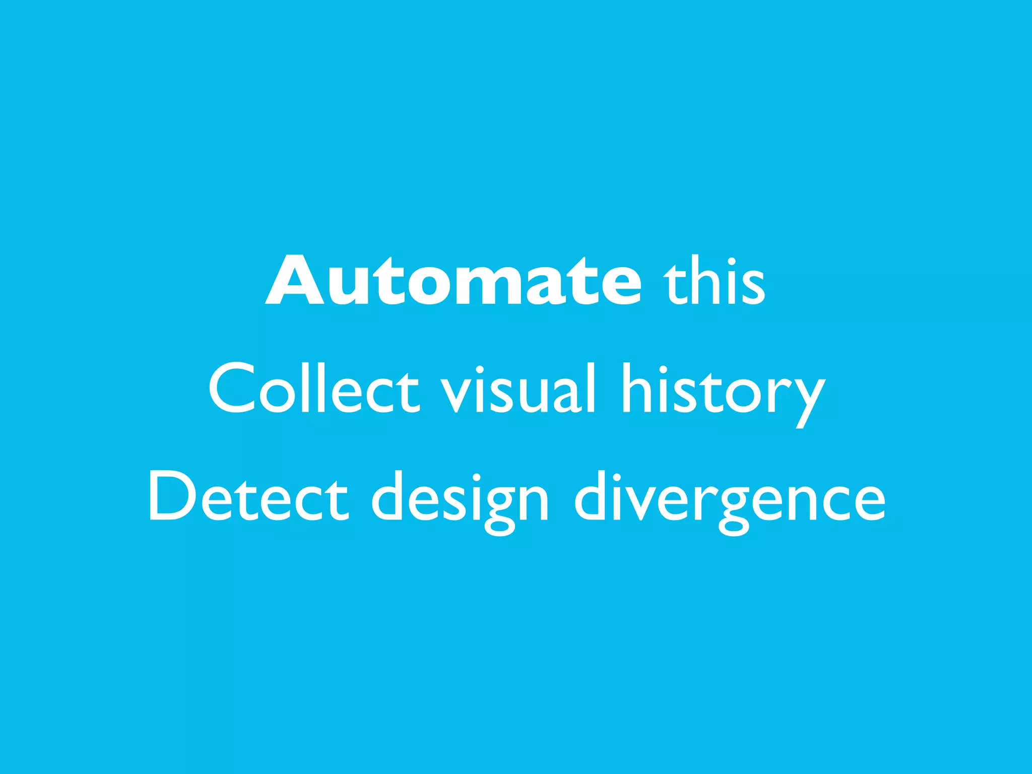


The document discusses the importance of responsive web design (RWD) and provides practical guidance on how to set up and test RWD on local servers, specifically using Apache. It also highlights tools and techniques like Sass for handling media queries and PhantomJS for automating visual testing. Additionally, it encourages sharing knowledge and tools within the web development community.


![[wcatx] Adaptive Images in Responsive Web Design](https://cdn.slidesharecdn.com/ss_thumbnails/wcatx-adaptive-images-130518143751-phpapp01-thumbnail.jpg?width=640&height=640&fit=bounds)


![Moho Pro 14.4 Crack for MacOS Works Until 2050 [Latest] pptx](https://cdn.slidesharecdn.com/ss_thumbnails/softwareoverview-251207192639-797289c4-thumbnail.jpg?width=640&height=640&fit=bounds)
![Soundtoys Mac v5.5.5.0 Crack for MacOS Full Version [Latest] pptx](https://cdn.slidesharecdn.com/ss_thumbnails/softwareoverview-251207193711-91d8ae6b-thumbnail.jpg?width=640&height=640&fit=bounds)
![Wondershare Filmora 15.0.11 Crack for Mac Key Full Download [Latest] pptx](https://cdn.slidesharecdn.com/ss_thumbnails/software-251207184836-1d16ba16-thumbnail.jpg?width=640&height=640&fit=bounds)
![PowerISO 9.2 Mac Crack + Serial Key Free Download 2026 [Latest] Software.pptx](https://cdn.slidesharecdn.com/ss_thumbnails/software-251207185653-5d5700e6-thumbnail.jpg?width=640&height=640&fit=bounds)


