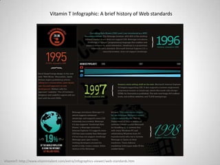
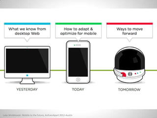
Bob Hotard and Adam Thielman present information on Responsive Web Design at Firecat Studio's Firecat First Friday coworking and brownbag, after they were inspired at An Event Apart.
2. Breaking
oi t
Bob Hotard Adam Thielman
Sports – Music – Corporate Web Design User Experience Strategist
@BobHWebDesign @adamthielman
3. Responsive Web Design
•Introduction Bob and Adam
•Outline of Presentation
•What is Responsive Web Design
•Content Concepts that Stick
•Breakpoints
•Examples
•Rolling Up Our Responsive Sleeves just like Ethan
•Techy Term of the Day
•Usability
•Case Studies
4. • Should I have an app for my business?
• Who does apps?
• Do I need to design just for an iPad?
• What about mobile devices?
• Android and iPhone?
• Windows phone?
• Blackberry?
18. PC installed base reached 100MM in 1993, cellphone / Internet users reached 1B in
2002 / 2005 respectively;25 Source: ITU, Mark Lipacis, Morgan Stanley Research.
Luke Wroblewski: Mobile to the future, AnEvenApart 2012-Austin
25. Real World Examples of
Responsive Content
http://bradfrostweb.com/blog/web/responsive-nav-patterns/
http://aarronwalter.com/speaker/realme/
http://www.lukew.com/ff/entry.asp?1585
http://bostonglobe.com/
27. “Media Queries”
/* MINOR ADJUSTMENTS FOR SMALLER SCREENS */
@media screen and (min-width: 1024px)
and (max-width: 1140px) { … }
@media screen and (max-width: 1023px) { … }
@media screen and (min-width: 768px)
and (max-width: 1024px) { … }
@media screen and (max-width: 767px) { … }
28. “Media Queries”
Search A List Apart (www.alistapart.com)
for an article by Ethan Marcotte posted May 10, 2010!
Ethan Marcotte: Responsive Sleeves, AnEvenApart 2012-Austin
29. “Media Queries”
“A media query allows us to target
not only certain device classes, but
to actually inspect the physical
characteristics of the device
rendering our work.” -- Ethan Marcotte
30. “Media Queries”
How to incorporate a query into a linked style sheet’s
media attribute:
<link rel="stylesheet" type="text/css" media="screen and
(max-device-width: 480px)" href="shetland.css" />
The query contains two components:
1. a media type (screen), and
2. the actual query enclosed within parentheses, containing
a particular media feature (max-device-width) to inspect,
followed by the target value (480px).
Ethan Marcotte: Responsive Web Design, May 25, 2010 A List Apart
31. “Media Queries”
“In plain English, we’re asking the device if its horizontal
resolution (max-device-width) is equal to or less than
480px. If the test passes—in other words, if we’re
viewing our work on a small-screen device like the
iPhone—then the device will load shetland.css.
Otherwise, the link is ignored altogether.” -- Ethan
Marcotte
32. “Media Queries”
“But a responsive design isn’t limited to layout changes. Media queries
allow us to practice some incredibly precise fine-tuning as our pages
reshape themselves: we can increase the target area on links for
smaller screens, better complying with Fitts’ Law on touch devices;
selectively show or hide elements that might enhance a page’s
navigation; we can even practice responsive typesetting to gradually
alter the size and leading of our text, optimizing the reading
experience for the display providing it.”
-- Ethan Marcotte
Bob and Adam Who are these guys?What They Said - the experts and IMHOWe’re not the subject matter experts but want to share with you what we learned from a great conference we attended recently called An Event Apart - Austin. www.aneventapart.com/2012/austin . We recommend this conference for not just web designers, content writers, HTML developers in the corporate world but also independents and what we found to be true is that eCommerce business stakeholders as well as independent business owners could benefit tremendously from attending AEA.
Today we’ll share some key take away concepts that are applicable we think to the independent entrepreneur gathered here today and even if you don’t do any web design at all these are basic principles that really do apply to your business.Hopefully we’ll have something for everyone including a Techy Term of the day – yes we will show code. But don’t be afraid we break it down to understandable parts that even non-techies can grasp.Finally we’ll take a look at a few case studies of a couple of local businesses similar to some of you that attend these First Fridays @Firecat Studios. More importantly though we’ll get you involved in creating some solutions and ideas just based on the concepts we’ve shown you. We’re not going to claim this is easy but it will force us to think in terms of a single message of a business entity and how that translates to a website. No matter what the size.
At one point in time you probably have asked yourself some of these questions when considering how to create, improve or expand your web presence. Maybe even you’ve asked similar questions when considering your company’s Social Media presence.The truth of the matter and what we are here to present for your consideration is that you shouldn’t have worry about the answers to those questions. Responsive Web Design forces you to focus on the message and the content of your business, not on how it’s being rendered in such and so browser on whatever device . . .Don’t misunderstand, no one is saying Mobile is not important in fact quite the opposite. The stats of people accessing your business’s website on a mobile device is staggering and it’s still growing.@UIE: Interesting stat: Web traffic from smartphones to e-commerce sites rose 103% in a year; iPhone up 117%, Android 85%
What is Responsive Web DesignThe Changing Web – browsers, mobile, etc. (Stats)Size really doesn’t matter or does it?iPods, iPhones and iPads oh my! (Devices)
The web is such a different place than it was just a year or two ago. We were reminded more than once during An Event Apart that in March of 2010 the iPad didn’t exist to the general public. Now Tablets have their own market and are a serious consideration when we consider how someone may be accessing your content. (We say it that way instead of how someone may looking at your website.) This is snapshot of Vitamin T’s infographic of a history of Web Standards.http://www.vitamintalent.com/vitabites/a-brief-history-of-web-standardsWhen I first started working on web projects at USAA in 1997 - Amazon had just launched it’s website. Netscape was the most used browser next to IE 2.o and Opera? those were the big three and just about the only three.]So what is going to be the Next big thing or the newest size for a mobile device. (Incidentally it was already being rumored during AEA at the end of July 2012 of a larger iPhone screen size).