Download as PDF, PPTX

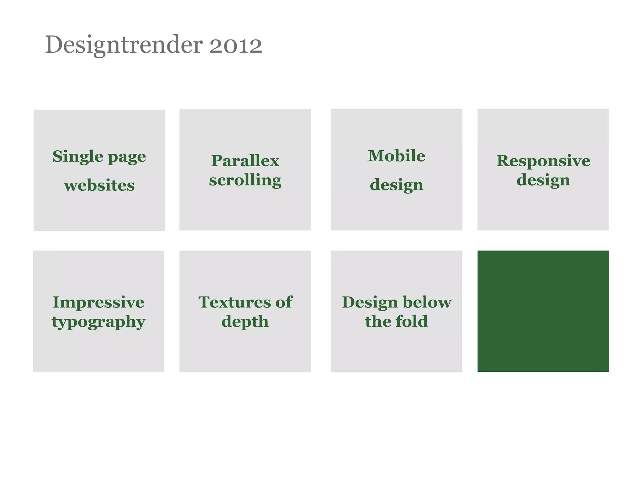
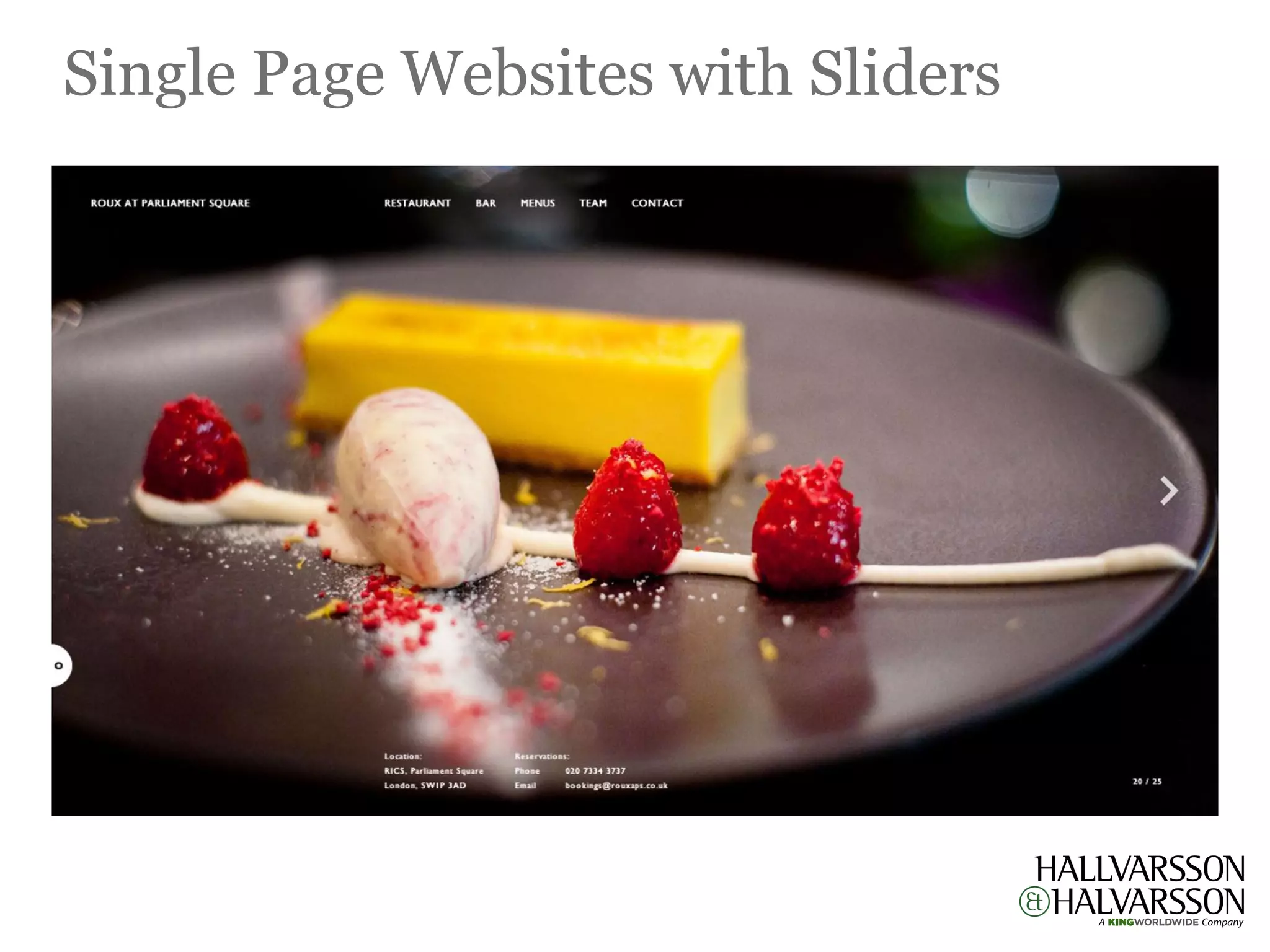
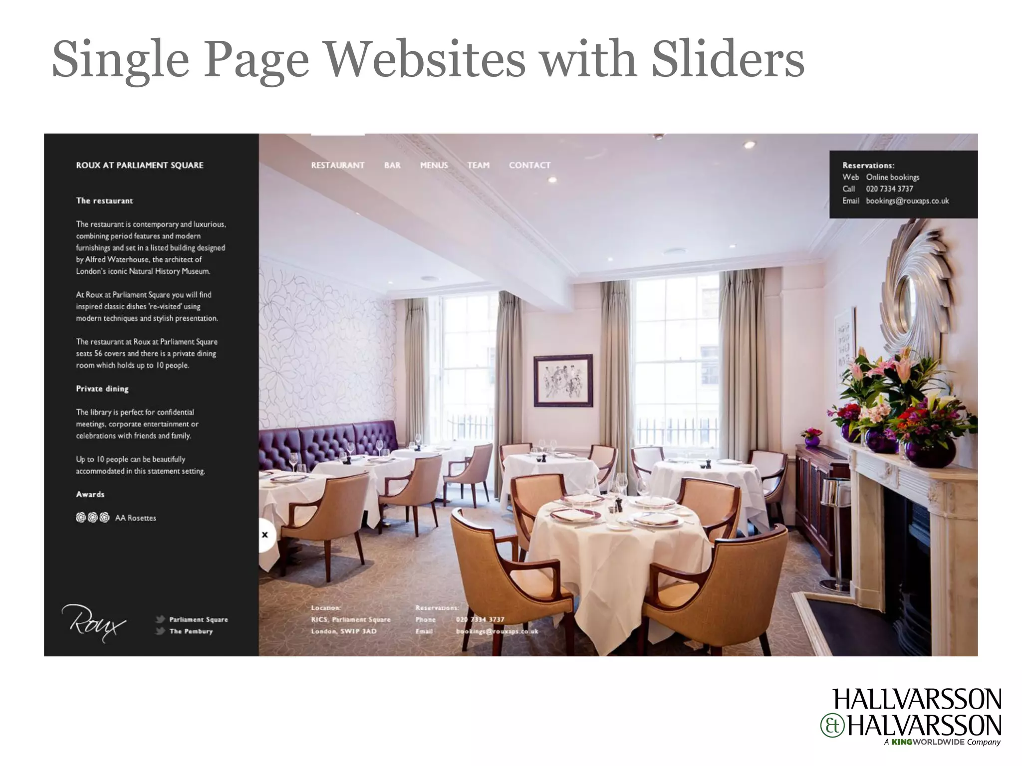
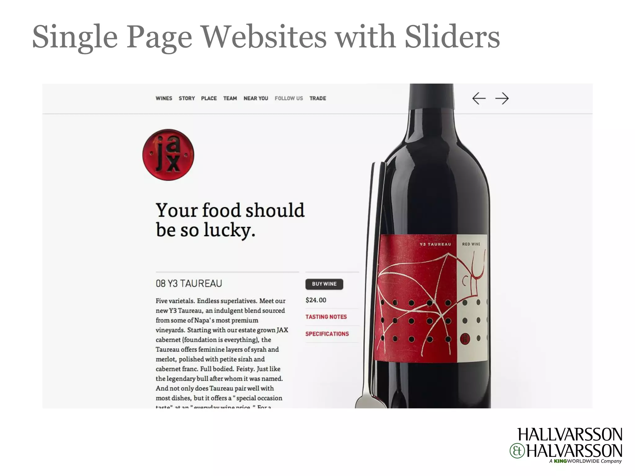
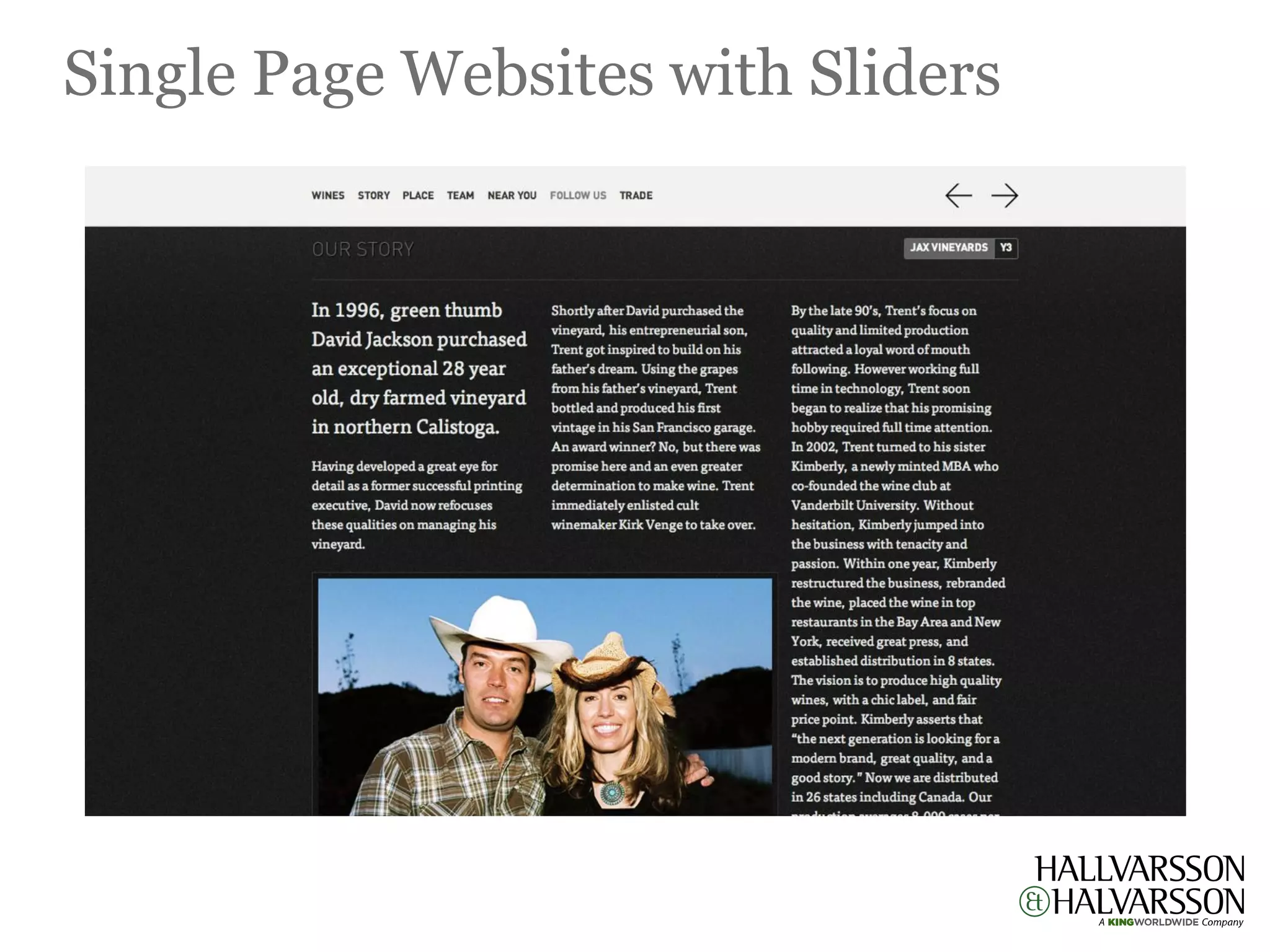
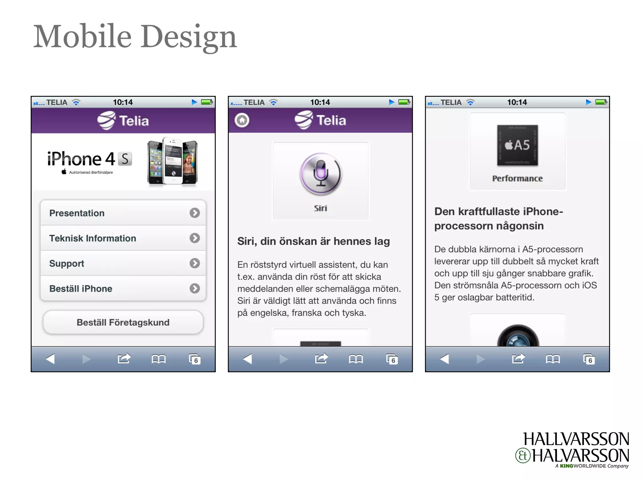
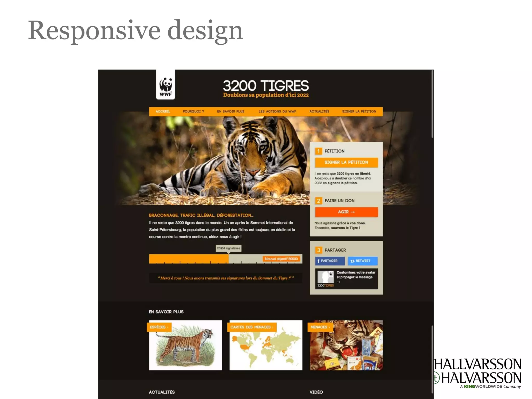
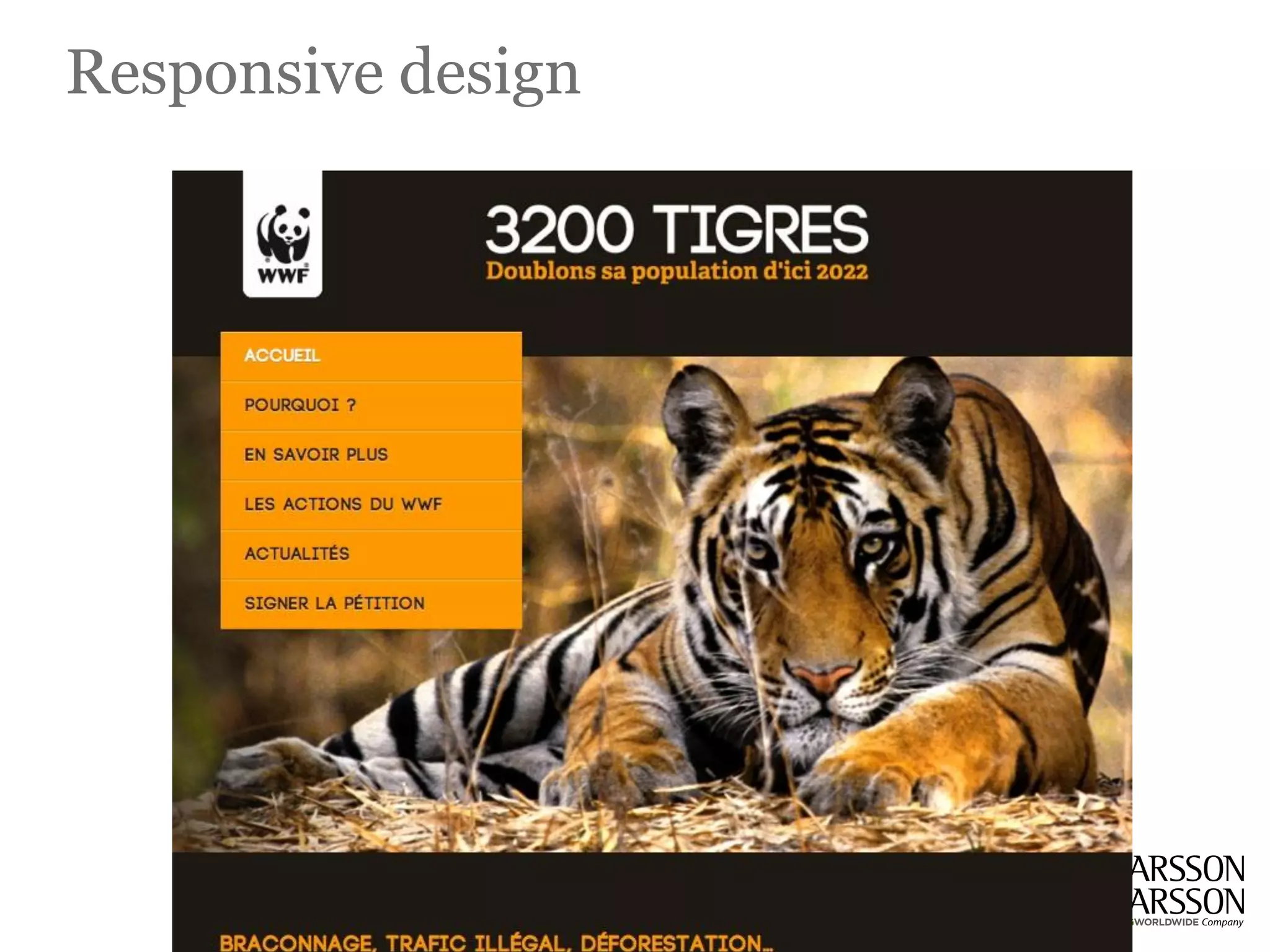
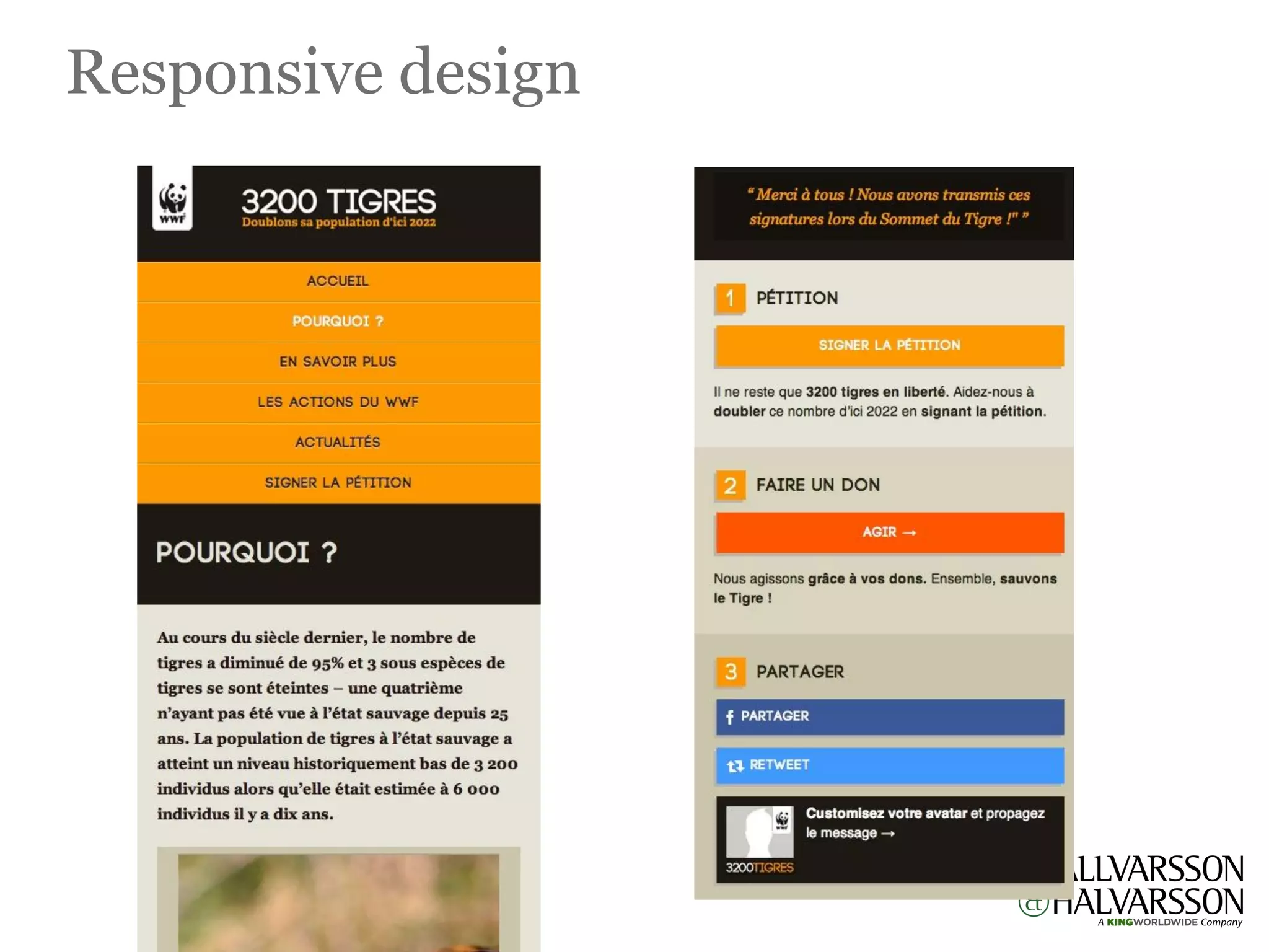
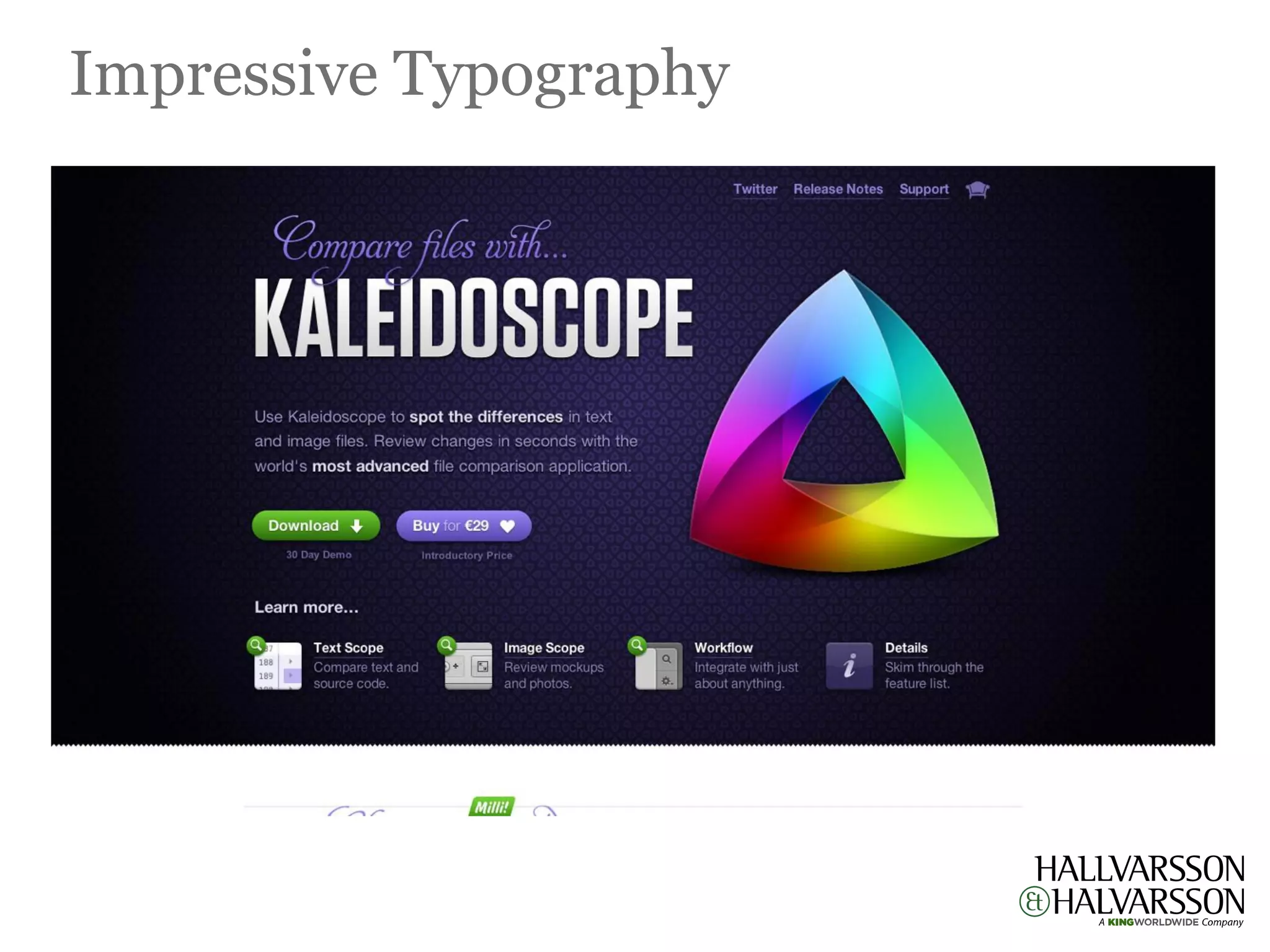

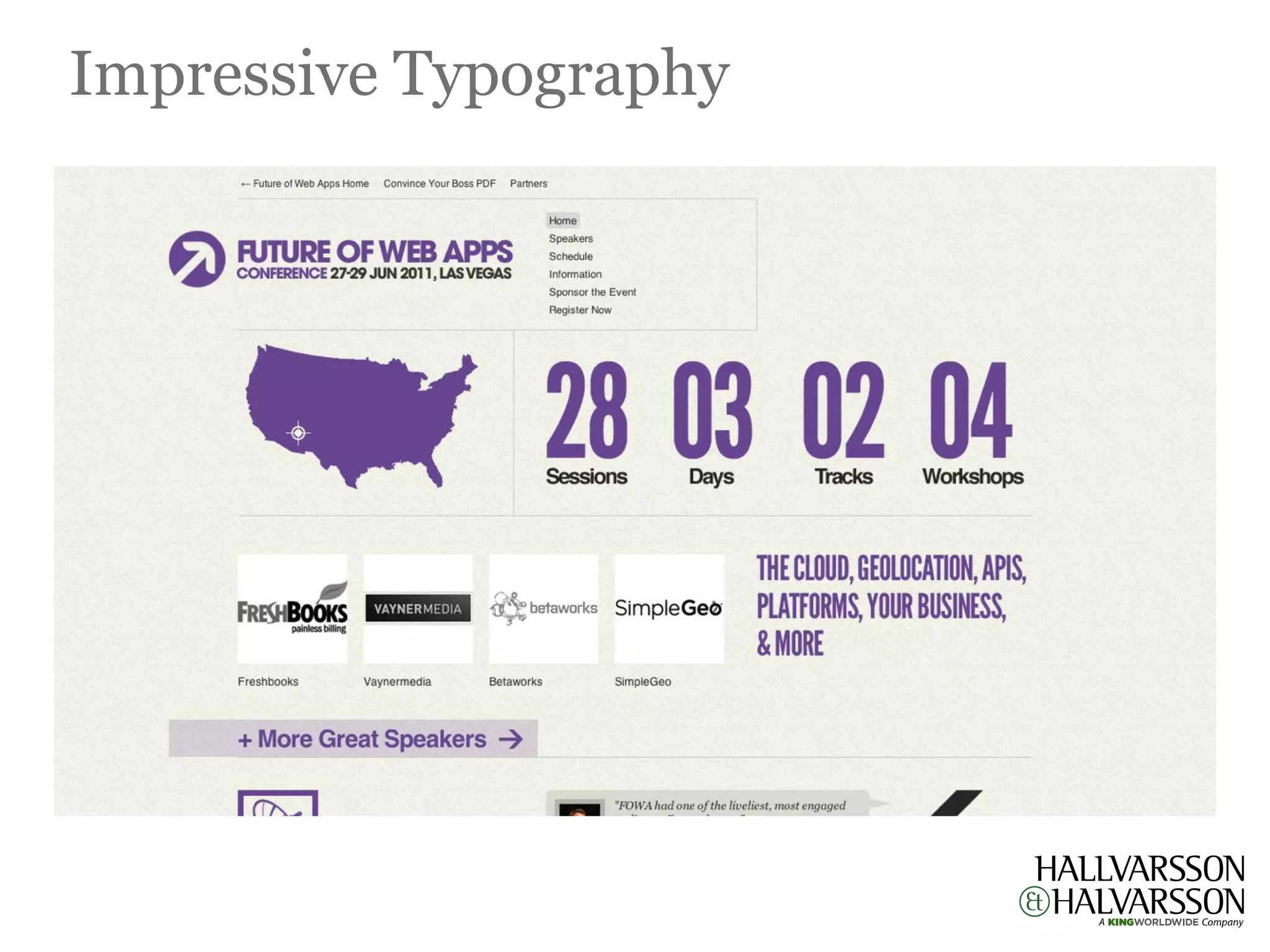
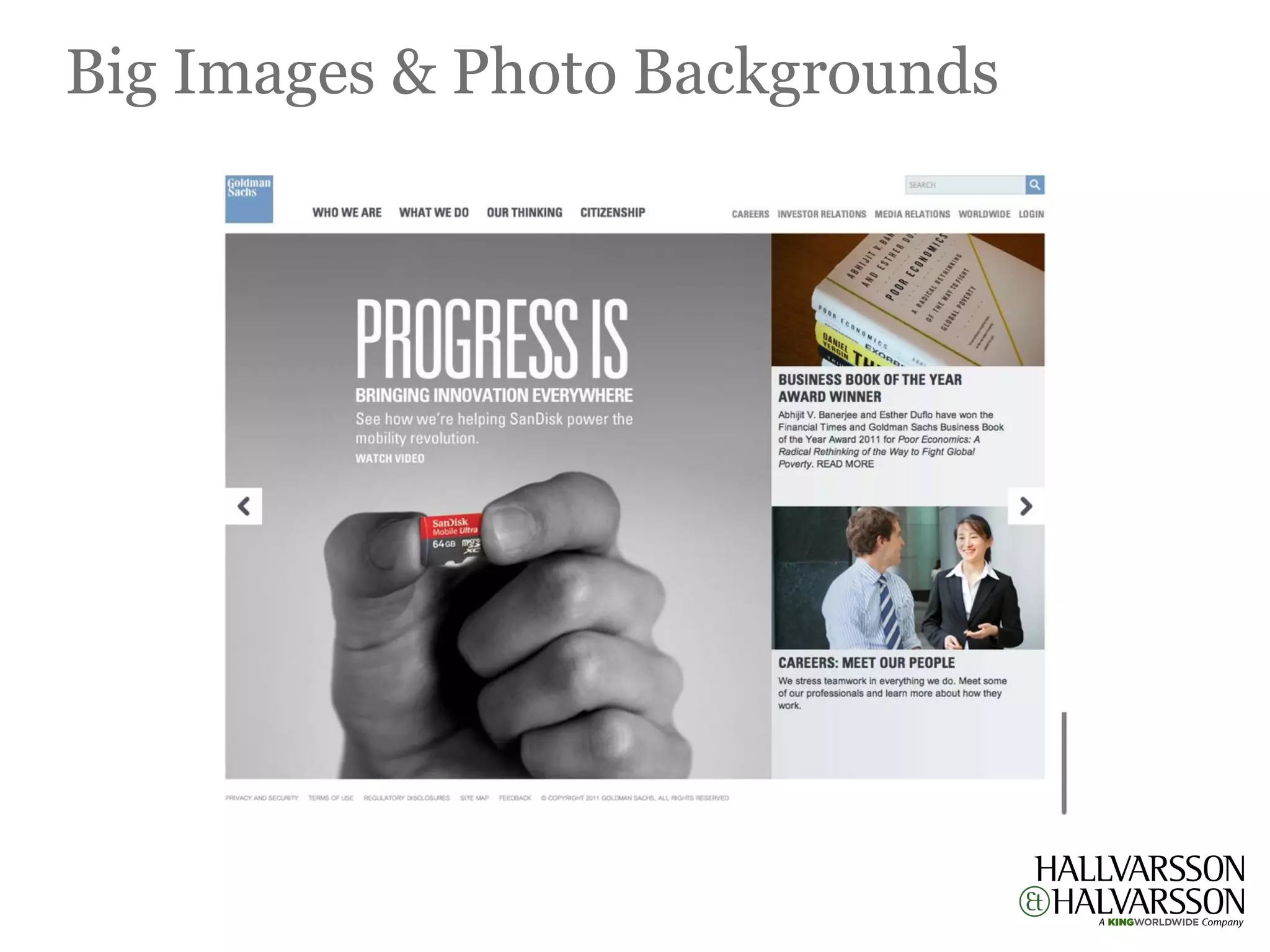
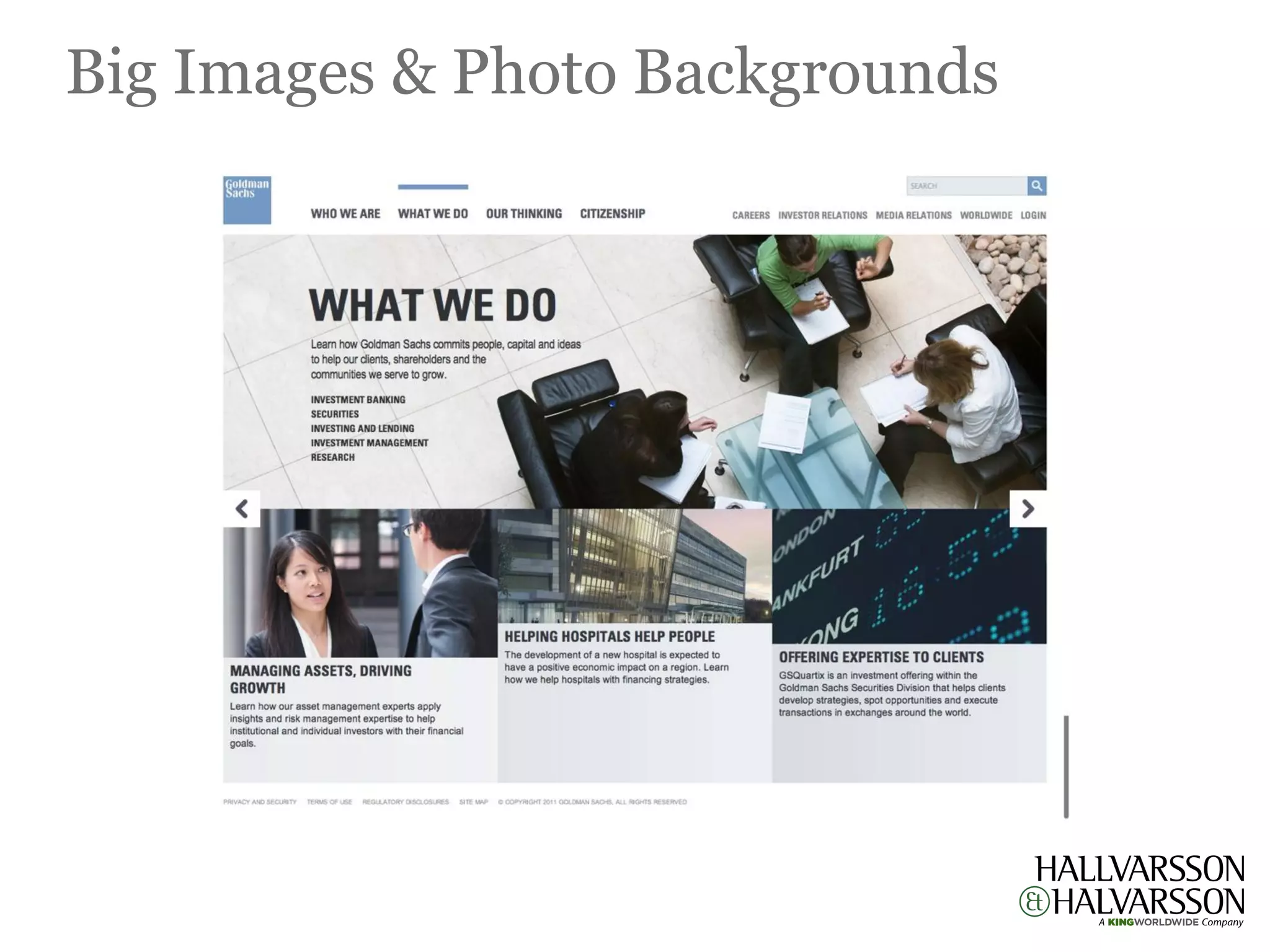
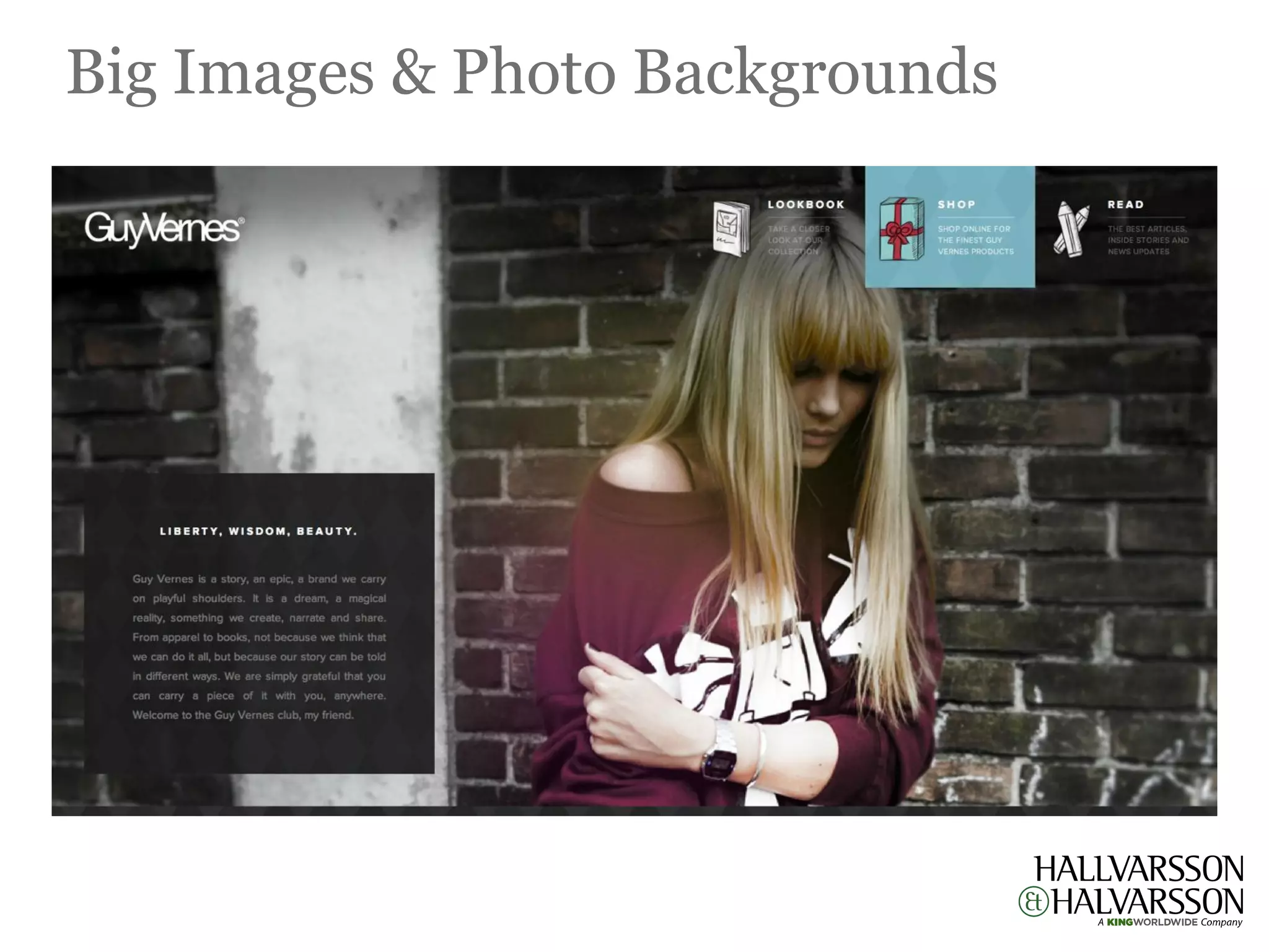
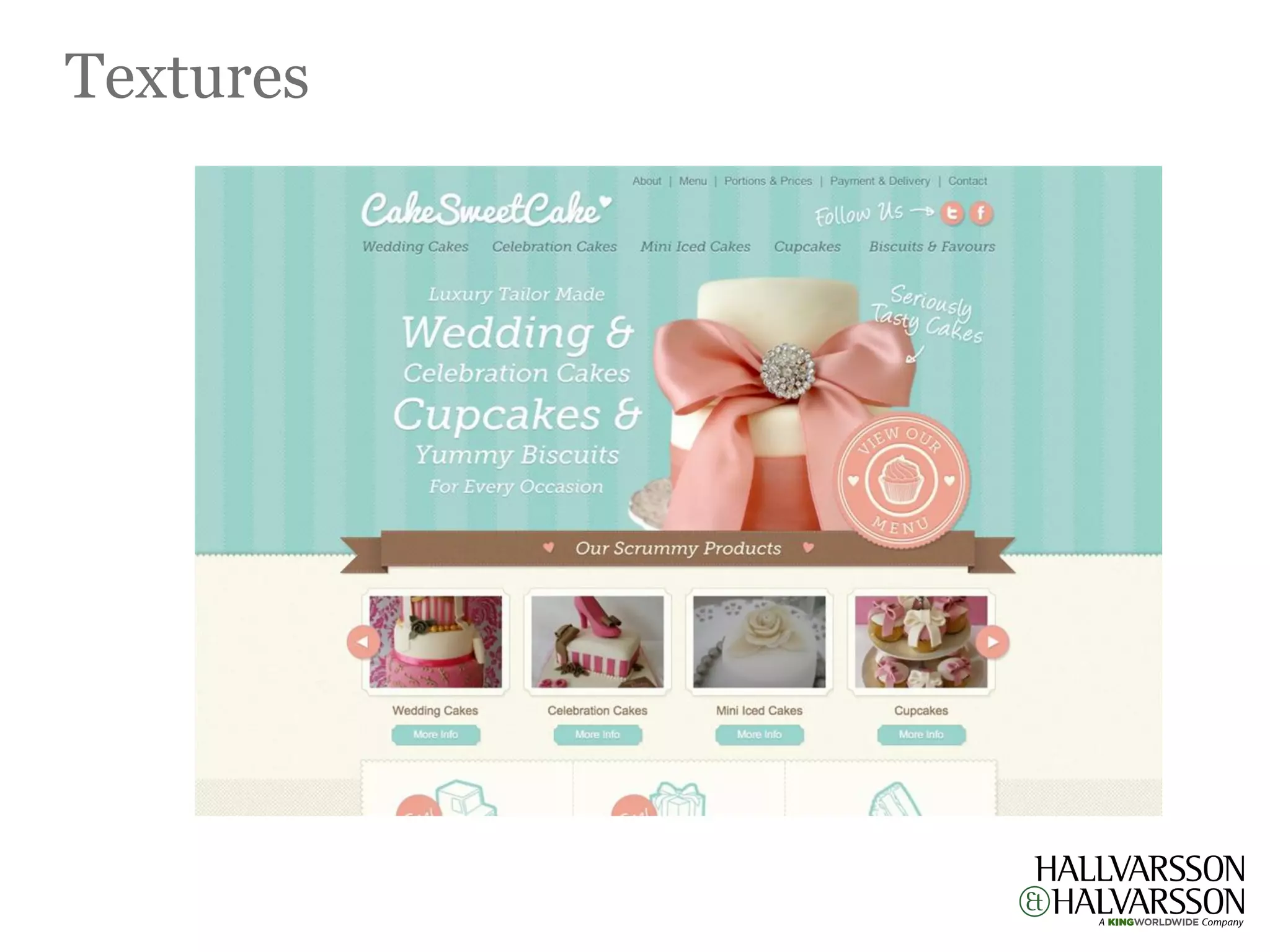
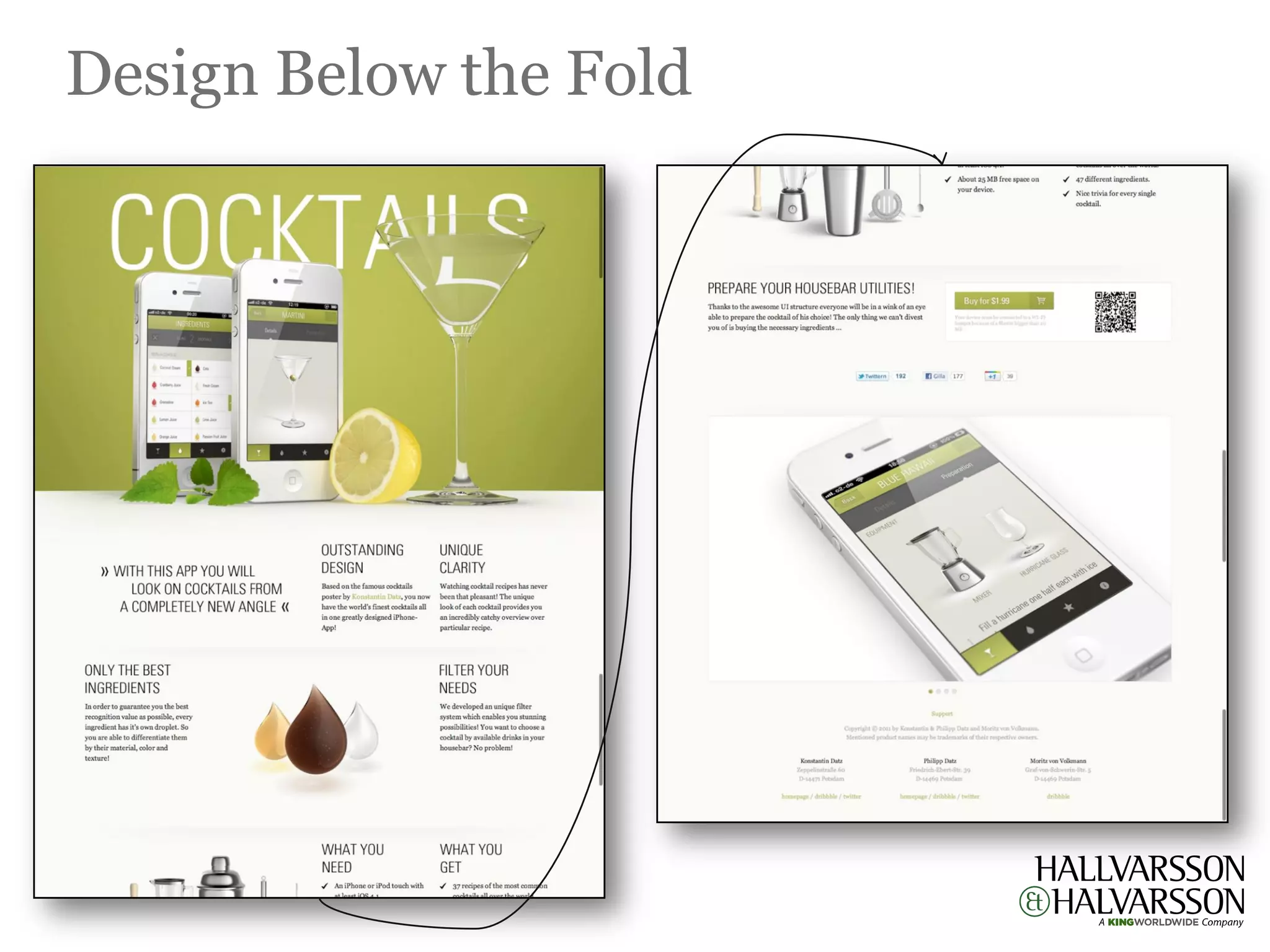

The document discusses the growing trend of single-page websites, noting their effectiveness when content is limited or related. It highlights key design considerations for mobile responsiveness, typography, parallax scrolling, and the use of large images and textures, emphasizing their impact on user experience. Additionally, it suggests strategic placement of compelling content above and below the fold to engage visitors effectively.


![digital marketing[1].pdf](https://cdn.slidesharecdn.com/ss_thumbnails/digitalmarketing1-231207151359-fbb044d9-thumbnail.jpg?width=640&height=640&fit=bounds)