Download to read offline


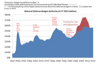
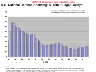
![AND NOW A CONSERVATIVE ASSESSMENT: “The Myth That America
Spends Too Much on Defense”
by Kyle Becker “defense spending has plummeted as a percentage of
GDP, as the graph below illustrates.” [emphasis added]
https://rogueoperator.wordpress.com/2012/01/06/the-myth-
that-america-spends-too-much-on-defense/
• NB: GDP=Gross Domestic Product](https://image.slidesharecdn.com/graphing-numbers-and-historical-statistics-online-his-391-s-16-160219172742/85/Graphing-Charts-Dr-Jackson-Presentation-18-320.jpg)

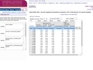

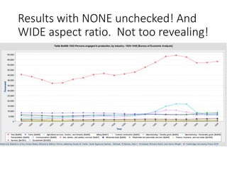
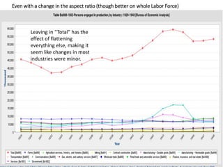

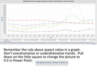
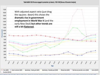
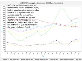

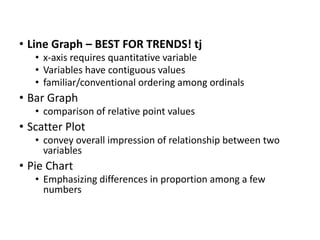
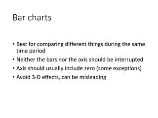
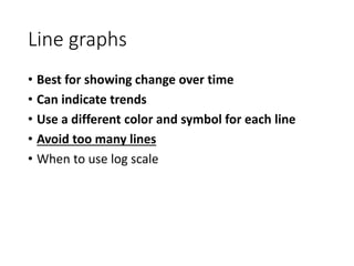
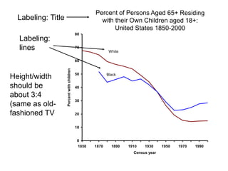
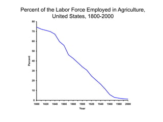
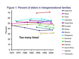
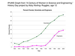
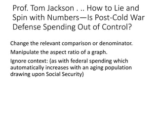
The document provides guidance on effectively graphing and summarizing data from the Cambridge Historical Statistics of the United States. It discusses best practices for graphical displays, such as focusing on trends over time using line graphs. Examples are given of misleading graphs from news sources, along with analyses of how aspects like changing the y-axis or omitting data can distort trends. Students are then assigned to select time series data from a specific category and graph it to analyze important trends, with a focus on changes during the Interwar Period and mid-20th century America.