Download as PDF, PPTX


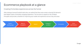


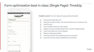
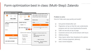

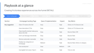


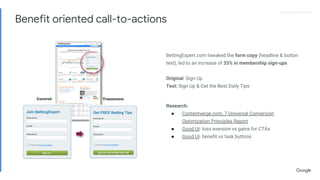


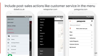
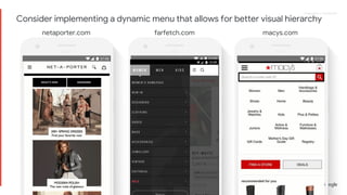


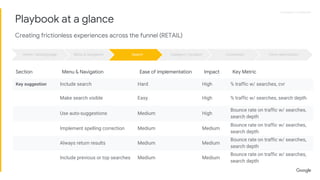


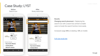
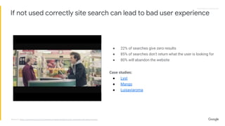
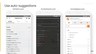
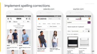


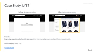


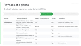


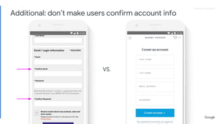
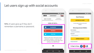
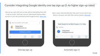


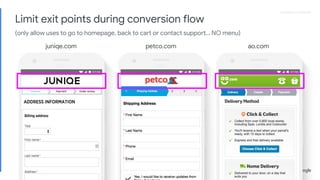
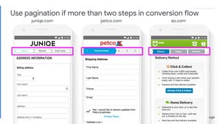
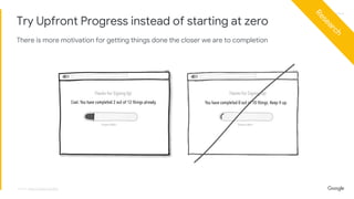
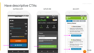
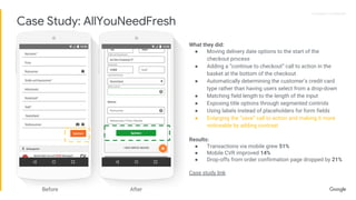
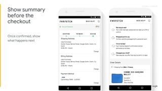

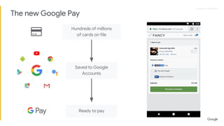

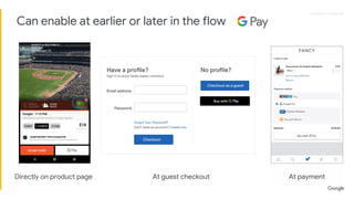
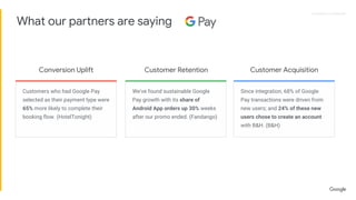


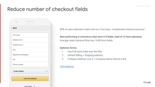


The document is a comprehensive ecommerce playbook that outlines best practices for creating frictionless user experiences across various site areas, including menu navigation, search functionality, and conversion form optimization. It provides actionable recommendations based on analysis of top retail sites, focusing on elements such as clear CTAs, legible fonts, and effective use of social proof at critical points in the user journey. Each section emphasizes the importance of continuous testing and optimization to improve user engagement and conversion rates.