
Recommended
More Related Content
Similar to Al-Majed 4 Oud E-commerce Conversion Rate Optimization
Similar to Al-Majed 4 Oud E-commerce Conversion Rate Optimization (20)
Al-Majed 4 Oud E-commerce Conversion Rate Optimization
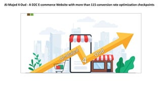
- 1. Al-Majed 4 Oud - A D2C E-commerce Website with more than 115 conversion rate optimization checkpoints
- 2. An Inspirational Digital Transformation Story of AL-Majed 4 Oud - D2C E-commerce A Frictionless experience across the funnel HomePage Cart PagePDPSearchNavigation Order Summary Checkout Use of Prominent Top App Bar Use of Persistent search bar User engaging CTA’s/Trust building elements Enabling of swiping motions that mobile users accustomed to Use of Engaging CTA’s/ Interactive Content Specifically for New Users Use of Grid Layout for Home Page Use of recommended /similar items on basis of customer previous search history Prioritization of UI content/Elements according to thumb reach of user (Natural & Stretch) USe Destination Iconography Use of eyUse of all appropriate information on display for a product e- catching color for Important elements/badges for products Use of image placeholder effectively to make pictures large enough Use of different type of views on PLP (List/Grid Views) Use of Inline feeds for filtration of products on PLP (Hyper Personalization) Use of comprehensive set of ascending/descending ranking options like price (Low to High/High to Low),popularity, relevance & new arrivals Use of all appropriate information on display for a product Usability of space on product image placeholder Users ratings and testimonials easily available CTA’s are visible above the first fold(Resting of PDP CTA’s on first fold) Use of urgency-building techniques Steps leading to checkout obvious &Display cart total on PDP to with clear CTA If a product has sold out, enable user to sign up for a reminder in case of the item reappears later Ease access of shipping & return policies on product page Use of “How to use ?” for product uasability Use of visible checkout CTA’s & other cart edit/change CTA’s Use of same urgency- building techniques on cart page like product page Ease of change/alter the content of cart page Cart persistency -Cart hold products for a least 7-30 days for unregistered customers Use of graphics that build trust, like seals, padlocks, certification logos Discount code field accessible but not obtrusive Available payment options on cart page send automated emails/push notification to customers that abandon their carts reminding them to complete the purchase Form fields have clear labels that don’t disappear when a user fills them out ? Also text field reveals the activation indicator while in focus Form fields have enough padding so content/other fields will not displace with any error/help/Assistive text Form fields have clear visible indicators like optional/required Form fields replace error text with helper/assistive text during validation Use of auto fill and previously saved options (such as credit cards/address) for repeat customers at address options Use of credit card entry /Payments fields differently to other forms to create another layer of perceived security Show complete details of order to redirect customer on my order section Show progress of customer's to avoid WISMO calls (Where is my order) Update the order status in real to be more interactive with the customers Use naming labels on the navigation menu icon Use most prominent content first to least prominent down the navigational drawer sheet Use of modal sheet with scrim Dismiss the navigational drawer by swiping towards the edge Use of Leading icon & content to navigate the customer forward Use of Login & Sign up option on navigational drawer Use of other relevant information (Account, Order, Profiile) Inclusion of appropriate category and subcategory filters so that user could narrow search results easily Comprehensive set of ascending/descending ranking options like price,popularity, relevance, and new arrivals Use of CTA’s on “No Result” Pages Advancement in search engine to detect popular misspellings Auto-suggestions, accuracy of search results Visibility of products in search results (Grid View) Use of interactive/friendly redirection for 404 Page/Empty states
- 3. Home Page First Fold Second Fold
- 4. Home Page Third Fold Fourth Fold
- 5. Home Page -Conversion Rate Optimization Checklist Use prominent top app bar Make your homepage as grid view rather than column view Always give labels to the CTA's present on app bar (It educates customers about the icon images which looks sometime confusing) Notify/Navigate customers whenever they trigger actions on CTA's like (My alerts, My Wishlist, Cart Qty, My Account- Name of customer) Use product cards with following content always ( Promotional Badges, Rich Media, Title, Support Text, Helper Text, CTA, Share & Wishlist CTA's) Use prominent top app bar with expandable search & always the put search bar place holder text. It gives an information to the customers about the products or items one website is selling. Always use trust building elements above the first fold of home page, it generates among the new customers as well as loyal users Use destination iconography right away on the home page above first fold if you are a D2C E-commerce website, it leads your customers directly to the content which is relevant to their buying intent. Give reason to scroll more by placing an engaging content or widget according to customers personas (Power user, new users, bargain buyers, churn customers) Use engaging products widgets like (Deals, Best Sellers, New Arrivals, Tredning, User choice) to engage more users & leads to conversion If your products are mostly then show “Add to Cart” on the home page itself Give them reason to register on your website or subscribe for updates (Extra discount, Reward points & Gift Cards could be consider) Open up all the windows of communication for customers so they could connect with you any time Built trust with social presence (Always use the same brand identity of social media) Use trust building elements like payment methods, shipping methods Let them know what they are looking for ? ( Write your help centre/ FAQ's in an organized way) Don't let your customer feel that your information is not correct so try to explain the content as much as possible.
- 6. Search Results & Navigation
- 7. Search results & navigation - Optimization Always design your “results page” effectively so your customer should not feel frustrated Visibility of products in search results (Grid View) Comprehensive set of ascending/descending ranking options like price,popularity, relevance, and new arrivals Auto-suggestions, accuracy of search results Show the search suggestions & historical search which a customer did in his/her past
- 8. Menu & Navigation Always put the label on hamburger menu icon to let customer navigate accordingly Navigational drawer header could be used for login/sign up CTA & Brand logo Always use modal sheet with scrim that must not displace the background screen Always use most prominent item list first then least prominently accordinly Always use leading icon before any text on navigational drawer as it notify the customer about the content inside that CTA Navigate the customers properly to narrow down their personalize queries
- 9. PLP PAGE
- 10. PLP Page - Conversion Rate Optimization Checklist Use list & grid view option for products Use of products with following contents ( Main CTA, Promotional Badges, Share & Wishlist, engaging product labels, title text, rich media, supportive text & additional if you carry with your products) App bar must have the brand logo so customer could reach to homepage whenever they want Use expandable search CTA on PLP page to forward navigate a customer according to their queries Effectively design your category/merchandising strategy with multi-select filtering option, so it will help your customers to personalize their navigation Use Inline feeds for hyper personalization to optimize your conversion rate Use inline promotional feeds for your promotional banners to redirect bargain buyers for conversion rate optimization To reduce your abandoned cart rate use “CART TOTAL & VIEW CART” either as floating CTA or in header on PLP page itself
- 11. PDP PAGE
- 12. PDP PAGE -CONVERSION RATE OPTIMIZATION CHECKLIST Use clear floating CTA on PDP page to lead your customers ahead Use product labels to educate your customer about your niche product lines Use image placeholder perfectly Use product taxonomy to reveal all the relevant information about the products Use promotional badges for urgency building to optimize the conversion rate Use the PDP page as much as to educate your customers with the content blocks like shipping & return, How to use, Description, Content or ingredient Use available shipping & payment methods with your website to build additional trust for customers Use “Cart Total & View Cart” on PDP page itself to direct them to checkout page directly
- 13. My Cart & Checkout - Optimization Checklist
- 15. CART & CHECKOUT PAGE OPTIMIZATION Always display the number items available in the cart on the app bar header Always show thumbnail images of the products present inside the cart Use coupon collapse CTA on cart page Always use clear CTA like “Save for Later” & “Remove” to let your customer decide their requirements on the verge of placing an order Always show clear folating CTA for checkout & Cart total with seals & padlocks at the first fold of your mobile scree, it generates the turst among your customers Always show the available payment methods, trusted seals & padlocks & other trust building content on the cart page, it will further reduce your abandoned cart rate by building the trust among your customers Always show a dialog box,when a customer trying remove an item from his cart. Always show clear shipping fee on shipping method screen with no hidden charges further during his journey If you are using multi-step checkout process then show your customers progress of their purchase journey by placing a progress bar indicator on right below the app bar Let your customer add the address during their journey & also show their available addresses on shipping screen itself Design your payment options effectively specially in case of credit/debit card, put the required image to educate your customers about their Define your terms & conditions clearly to opt your customers during their purchase journey. Always redirect your customers to “My Orders” section to avoid WISMO Call (Where is my order) Update the real time progress of order status on the customers account, it builds a trust among your customers
- 16. Address forms - Optimization Always use address screen app bar with no additional CTA present on it, It diverts the focus of the customers. Use only what is required in address forms, make them short & precise Always use HTML 5 for mobile & other relevant fields Always use placeholder text for the text field to let customers know about required information to be entered inside the field Always use form validation Use of leading icon also give an additional information for the customers Always show “required & optional” field to be filled accordingly Always ask users location whenever it's required
- 17. Customer Section: Build Trust & Engage More
- 18. Customer Section: Build Trust & Engage More Let your customer explore their details & edit them accordingly Engage customer by providing multiple option of communication Let them store their favourite in the wishlist section Let your customers give you the feedbacks about your services & quality of products.
- 19. Thank You - Gaurav Chaudhary