IE MDMK2011 BibianaNunesProf. Eric ReissMarch 2011Usability Assessment
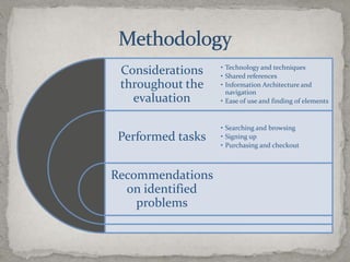
Methodology
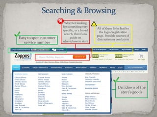
Searching & BrowsingWhether looking for something very specific, or a broad search, there’s no guide on where/how to startAll of these links lead to the login/registration page. Possible sources of distraction or confusionEasy to spot customer service numberDrilldown of the store’s goods
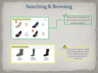
Searching & BrowsingRecommendations of previously viewed and related itemsIf the person has not visited the website before or visits from a different browser, recommendations are irrelevant
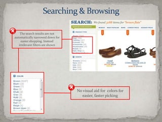
Searching & BrowsingThe search results are not automatically narrowed down for easier shopping. Instead irrelevant filters are shownNo visual aid for  colors for easier, faster picking
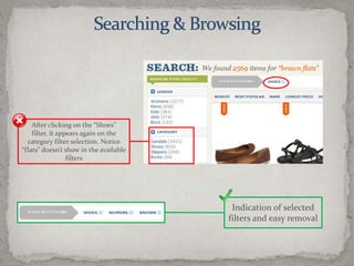
Searching & BrowsingIndication of selected filters and easy removalAfter clicking on the “Shoes” filter, it appears again on the category filter selection. Notice “flats” doesn’t show in the available filters
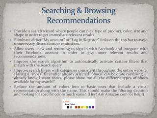
Searching & BrowsingRecommendationsProvide a search wizard where people can pick type of product, color, size and shape in order to get immediate relevant resultsEliminate either “My account” or “Log in/Register” links on the top bar to avoid unnecessary distractions or confusions.Allow users –new and returning to sign in with Facebook and integrate with their Facebook account in order to give more relevant results and recommendations.Improve the search algorithm to automatically activate certain filters that match with the search query.Improve search filters with categories consistent throughout the entire website. Having a “shoes” filter after already selected “Shoes” can be quite confusing. “I already know I want shoes, please show me all the different types of shoes available for my search!”Reduce the amount of colors into 10 basic ones that include a visual representation along with the name. This should make the filtering decision and looking for specific colors much easier. (Hey! Ask Amazon.com for help!)
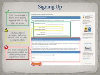
Signing UpOnly the necessary fields to complete registration, no big sign up formsLeft aligned labels are slower and more difficult to fill out than top aligned labels.Too many options and opportunities to bail out before getting to the registration button
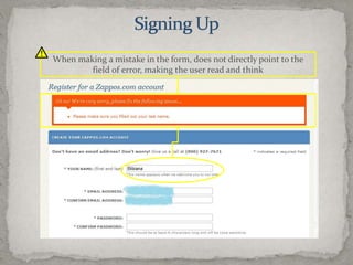
Signing UpWhen making a mistake in the form, does not directly point to the field of error, making the user read and think
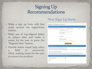
Make a sign up form with less noise around the registration button.Make use of top-aligned labels to reduce time and make it easier for the user to press the “Register Now” button.Provide better visual help when a field is incorrectly filled, making easier for the user to correct the problemNew Sign Up formSigning UpRecommendations
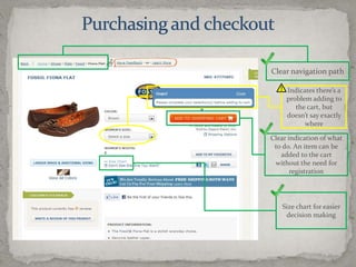
Purchasing and checkoutClear navigation pathIndicates there’s a problem adding to the cart, but doesn’t say exactly whereClear indication of what to do. An item can be added to the cart without the need for registrationSize chart for easier decision making
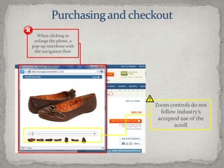
Purchasing and checkoutWhen clicking to enlarge the photo, a pop-up interferes with the navigation flowZoom controls do not follow industry’s accepted use of the scroll
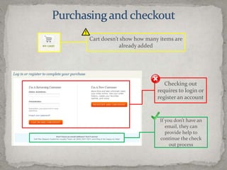
Purchasing and checkoutCart doesn’t show how many items are already addedChecking out requires to login or register an accountIf you don’t have an email, they can provide help to continue the check out process
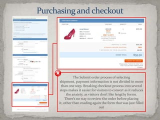
Purchasing and checkoutThe Submit order process of selecting shipment, payment information is not divided in more than one step. Breaking checkout process into several steps makes it easier for visitors to convert as it reduces the anxiety, as visitors don’t like lengthy forms.There’s no way to review the order before placing it, other than reading again the form that was just filled out
Purchasing and CheckoutRecommendationsMake use of Lightbox or any other transition product that allows enlarging a picture without a pop-up interrupting the navigation flow.Show how many items are stored in the cart while continuing shopping.Do not require a registered account to make a purchase. Offer the option to create a password if they wish to remain registered. Otherwise, just request email and send a link where the user can track the order, regardless of being registered.Make the purchasing process pleasant. It’s proven that just one step in the checking out funnel creates anxiety on the user. Divide the purchasing process in several steps and allow the user to review the order before hitting “Submit”:Shipping optionPayment/Billing informationOrder review (change quantities, shipping option or payment method)
Assessment SummaryOverall, the current purchasing experience is lacking easiness and does not provide a pleasant experience to the user. Of course these web usability issues are balanced out by Zappos’ out-of-this-world customer serviceHowever, pleasing customers is not only about having and amazing call center or an incredible twitter stream, it is also about pleasing them with a smooth purchasing process.

Zappos Usability Assessment - March 2011

  • 1.
    IE MDMK2011 BibianaNunesProf.Eric ReissMarch 2011Usability Assessment
  • 2.
  • 3.
    Searching & BrowsingWhetherlooking for something very specific, or a broad search, there’s no guide on where/how to startAll of these links lead to the login/registration page. Possible sources of distraction or confusionEasy to spot customer service numberDrilldown of the store’s goods
  • 4.
    Searching & BrowsingRecommendationsof previously viewed and related itemsIf the person has not visited the website before or visits from a different browser, recommendations are irrelevant
  • 5.
    Searching & BrowsingThesearch results are not automatically narrowed down for easier shopping. Instead irrelevant filters are shownNo visual aid for colors for easier, faster picking
  • 6.
    Searching & BrowsingIndicationof selected filters and easy removalAfter clicking on the “Shoes” filter, it appears again on the category filter selection. Notice “flats” doesn’t show in the available filters
  • 7.
    Searching & BrowsingRecommendationsProvidea search wizard where people can pick type of product, color, size and shape in order to get immediate relevant resultsEliminate either “My account” or “Log in/Register” links on the top bar to avoid unnecessary distractions or confusions.Allow users –new and returning to sign in with Facebook and integrate with their Facebook account in order to give more relevant results and recommendations.Improve the search algorithm to automatically activate certain filters that match with the search query.Improve search filters with categories consistent throughout the entire website. Having a “shoes” filter after already selected “Shoes” can be quite confusing. “I already know I want shoes, please show me all the different types of shoes available for my search!”Reduce the amount of colors into 10 basic ones that include a visual representation along with the name. This should make the filtering decision and looking for specific colors much easier. (Hey! Ask Amazon.com for help!)
  • 8.
    Signing UpOnly thenecessary fields to complete registration, no big sign up formsLeft aligned labels are slower and more difficult to fill out than top aligned labels.Too many options and opportunities to bail out before getting to the registration button
  • 9.
    Signing UpWhen makinga mistake in the form, does not directly point to the field of error, making the user read and think
  • 10.
    Make a signup form with less noise around the registration button.Make use of top-aligned labels to reduce time and make it easier for the user to press the “Register Now” button.Provide better visual help when a field is incorrectly filled, making easier for the user to correct the problemNew Sign Up formSigning UpRecommendations
  • 11.
    Purchasing and checkoutClearnavigation pathIndicates there’s a problem adding to the cart, but doesn’t say exactly whereClear indication of what to do. An item can be added to the cart without the need for registrationSize chart for easier decision making
  • 12.
    Purchasing and checkoutWhenclicking to enlarge the photo, a pop-up interferes with the navigation flowZoom controls do not follow industry’s accepted use of the scroll
  • 13.
    Purchasing and checkoutCartdoesn’t show how many items are already addedChecking out requires to login or register an accountIf you don’t have an email, they can provide help to continue the check out process
  • 14.
    Purchasing and checkoutTheSubmit order process of selecting shipment, payment information is not divided in more than one step. Breaking checkout process into several steps makes it easier for visitors to convert as it reduces the anxiety, as visitors don’t like lengthy forms.There’s no way to review the order before placing it, other than reading again the form that was just filled out
  • 15.
    Purchasing and CheckoutRecommendationsMakeuse of Lightbox or any other transition product that allows enlarging a picture without a pop-up interrupting the navigation flow.Show how many items are stored in the cart while continuing shopping.Do not require a registered account to make a purchase. Offer the option to create a password if they wish to remain registered. Otherwise, just request email and send a link where the user can track the order, regardless of being registered.Make the purchasing process pleasant. It’s proven that just one step in the checking out funnel creates anxiety on the user. Divide the purchasing process in several steps and allow the user to review the order before hitting “Submit”:Shipping optionPayment/Billing informationOrder review (change quantities, shipping option or payment method)
  • 16.
    Assessment SummaryOverall, thecurrent purchasing experience is lacking easiness and does not provide a pleasant experience to the user. Of course these web usability issues are balanced out by Zappos’ out-of-this-world customer serviceHowever, pleasing customers is not only about having and amazing call center or an incredible twitter stream, it is also about pleasing them with a smooth purchasing process.