
Recommended
Recommended
More Related Content
Viewers also liked
Similar to Fund of design unit 4 module 2 physical qualities of color
Similar to Fund of design unit 4 module 2 physical qualities of color (20)
More from kateridrex
More from kateridrex (20)
Fund of design unit 4 module 2 physical qualities of color
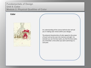
- 1. An understanding of the science behind color will aid you in making color choice within your designs. The physical characteristics of color appeal to the sense of touch and carries over into memory and sight. For example you see the blue water, you feel the blue water, you remember a time when you went swimming in a cool pool. Color Fundamentals of Design Unit 4: Color Module 2: Physical Qualities of Color
- 2. To refresh your science lessons: The eye, through the the photoreceptors located in the retina (rods and cones) translate electromagnetic energy into the colors we see. This complex process may be simplistically explained as 'encoded impulses' being received by the sight center of the brain. The brain then orders, abstracts and translates this stimuli into meaning. This, combined with previous experiences associations with color make up how we percieve color. Color Fundamentals of Design Unit 4: Color Module 2: Physical Qualities of Color
- 3. The Visible Spectrum of Light • Contains wavelengths of light. • The long wavelengths are at the red end and appear to be closer visually. • The short wavelengths are at the violet end and appear to be farther away visually. • The longer the wavelength the “hotter” the color. • The shorter the wavelength the “cooler” the color. Color Fundamentals of Design Unit 4: Color Module 2: Physical Qualities of Color
- 4. Fundamentals of Design Unit 4: Color Module 3: Fundamentals of Color Interaction 2. What color would you use for a background? 1. Identify where the longer wavelengths of light are on the spectrum.
- 5. The longer wavelengths are at the red end of the spectrum, and longer wave lengths appear to be closer, so reds would be considered dominant colors. You wouldn’t choose a dominant color for an item meant to be in the background. In the image to the left, notice the difference between the “R”s. Which ones stand out more? Why? Color Fundamentals of Design Unit 4: Color Module 3: Fundamentals of Color Interaction
- 6. The shorter wavelengths are at the violet end of the spectrum, and shorter wavelengths appear to be farther away. You wouldn’t choose a receding color for an item that is meant to be dominant or important. The image to the left demonstrates the effect of color in space. Notice how the warm colors appear larger than their cool counterparts. Color Fundamentals of Design Unit 4: Color Module 3: Fundamentals of Color Interaction