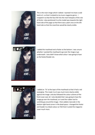
This is the main image which I edited. I wanted it to have a cold
look to it- so that it related to my music magazine genre. I
cropped it so that the face fell into the main hotspots of the rule
of thirds. I also positioned it so the model was towards the right
hand side of the page so that there was a plain area on the left
hand side so that the coverlines would be clearly visible.

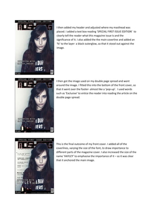
I added the masthead and a footer at the bottom. I was unsure
whether I wanted the masthead to go over the image or go
underneath. I also didn’t know what colour I was going to have
as the footer/header etc.

I added an ‘fx’ to the layer of the masthead so that it had a red
outerglow. This made it so it was much more clearly visible
against the image- and also followed the colour scheme of the
front cover over all. I also decided that I was going to have the
image go over the masthead, so I used the rubber tool to
carefully go around the image. I then added a barcode in the
bottom right hand corner in the dead space. I changed the footer
and header to a black colour as I felt that it suited the magazine
cover much more.
I then added my header and adjusted where my masthead was
placed. I added a text box reading ‘SPECIAL FIRST ISSUE EDITION’ to
clearly tell the reader what this magazine issue is and the
significance of it. I also added the the main coverline and added an
‘fx’ to the layer- a black outerglow, so that it stood out against the
image.

I then got the image used on my double page spread and went
around the image. I fitted this into the bottom of the front cover, so
that it went over the footer- almost like a ‘pop-up’. I used words
such as ‘Exclusive’ to entice the reader into reading the article on the
double page spread.

This is the final outcome of my front cover. I added all of the
coverlines, varying the size of the font, to draw importance to
different parts of the magazine cover. I also increased the size of the
name ‘HAYLEY’ to emphasise the importance of it – so it was clear
that it anchored the main image.

Front cover Screencaptures

  • 1.
    This is themain image which I edited. I wanted it to have a cold look to it- so that it related to my music magazine genre. I cropped it so that the face fell into the main hotspots of the rule of thirds. I also positioned it so the model was towards the right hand side of the page so that there was a plain area on the left hand side so that the coverlines would be clearly visible. I added the masthead and a footer at the bottom. I was unsure whether I wanted the masthead to go over the image or go underneath. I also didn’t know what colour I was going to have as the footer/header etc. I added an ‘fx’ to the layer of the masthead so that it had a red outerglow. This made it so it was much more clearly visible against the image- and also followed the colour scheme of the front cover over all. I also decided that I was going to have the image go over the masthead, so I used the rubber tool to carefully go around the image. I then added a barcode in the bottom right hand corner in the dead space. I changed the footer and header to a black colour as I felt that it suited the magazine cover much more.
  • 2.
    I then addedmy header and adjusted where my masthead was placed. I added a text box reading ‘SPECIAL FIRST ISSUE EDITION’ to clearly tell the reader what this magazine issue is and the significance of it. I also added the the main coverline and added an ‘fx’ to the layer- a black outerglow, so that it stood out against the image. I then got the image used on my double page spread and went around the image. I fitted this into the bottom of the front cover, so that it went over the footer- almost like a ‘pop-up’. I used words such as ‘Exclusive’ to entice the reader into reading the article on the double page spread. This is the final outcome of my front cover. I added all of the coverlines, varying the size of the font, to draw importance to different parts of the magazine cover. I also increased the size of the name ‘HAYLEY’ to emphasise the importance of it – so it was clear that it anchored the main image.