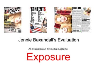
Jennie Baxandall’s EvaluationAn evaluation on my media magazine Exposure
In what ways does your media product use, develop or challenge forms and conventions of real media products?There are specific features that you would expect from the genre Indie, and these features help create the genre and communicate ideas to the audience. But what did I use to do this?- front cover = young, modern and fashionable picture, which shows the whole face of the artist.But what to expect from a specific genre like indie?- Bright, contrasted images with a bold, almost graffiti-like font. Conventions- front pages I have included subheadings, title, barcode and prices. - contents I have put a large title, page numbers featuring what is on those pages and a few pictures to show what are on the pages to draw the audience in. This is important as it almost advertises the whole magazine. - double page spread I have the feature artist on half of the page, also with an article. Codes - fonts tell audience that this magazine isn't elegant or polite, its the opposite. Which is what teenagers like and what some are like with their personality. - font is graffiti like, same with the splashed paint, this represents what our culture has become. Uneasy, a bit messy. - communicates to the audience making it clear that this magazine isn't for those who are educated, maybe high class and older.
How does your media product represent particular social groups?teenagers to young adults aged between 16-20
contents page- so I added fun topics to read about to keep the audiences attention as I find people my age can have a short attention span.- Within my double page spread I involved certain elements in my article which audience can relate to…- the person being interviewed was wearing Topshop which is a popular fashion store catered for those who like individuality which is what indie is all about. - she was listening to Paramore which is a popular indie/rock band,- made the interview chatty and friendly with the language involving slang as teenagers will find this type of language more readable than words with bigger meaning. images- the makeup is trendy and so is the hair so the audience could possibly aspire to their icons. lots of dark makeup around my eyes to represent the dark side of music and the dark side of teenagers personalities
What kind of media institution might distribute your media product and why?  A media institution that would distribute my magazine would be.. - Any  type of media institution, this way my magazine would make more money.- But not any type of genre, like a institution that sells “Top of the Pops”- But more like “Kerrang” “NME” or “Q” Who distributes those magazines, that would publish my product?
 I researched earlier in my blog and found that- IPC Media represents - Uncut and NME which are both rock magazines- Bauer Media seems to distribute the same genre too - Kerrang and Mojo magazine which are both rock.  Music stores could then sell my magazine this could lead to- Record labels buying the magazine and reading the talent featured in the magazine- Which is what my magazine is all about, Exposing artists and music.
Who would be the audience for your media product?I thought doing a magazine for my age group would be easier.- I know what people my age like and what we would like to read. Before I decided to do this genre I firstly did a questionnaire - to see what type of music people like in my class- most votes was for Indie. - This helped me choose the genre and the audience for my magazine. - Also by knowing that this is my audience I can then base the whole magazine around them to make sure that they are getting what they want.
How did you attract/address your audience? To an attract an audience, the key is to have attractive and bright images and fonts.- Do to this I..- contrasted and lightened my images to make them more bright and eye catching.- chose to use bold font which makes the whole sentence readable and overpowering which catches the eye.  But once attract the audience to the magazine, you need to keep their attraction throughout the whole magazine.

Jennie Baxandall Foundation Portfolio Evaluation

  • 1.
    Jennie Baxandall’s EvaluationAnevaluation on my media magazine Exposure
  • 2.
    In what waysdoes your media product use, develop or challenge forms and conventions of real media products?There are specific features that you would expect from the genre Indie, and these features help create the genre and communicate ideas to the audience. But what did I use to do this?- front cover = young, modern and fashionable picture, which shows the whole face of the artist.But what to expect from a specific genre like indie?- Bright, contrasted images with a bold, almost graffiti-like font. Conventions- front pages I have included subheadings, title, barcode and prices. - contents I have put a large title, page numbers featuring what is on those pages and a few pictures to show what are on the pages to draw the audience in. This is important as it almost advertises the whole magazine. - double page spread I have the feature artist on half of the page, also with an article. Codes - fonts tell audience that this magazine isn't elegant or polite, its the opposite. Which is what teenagers like and what some are like with their personality. - font is graffiti like, same with the splashed paint, this represents what our culture has become. Uneasy, a bit messy. - communicates to the audience making it clear that this magazine isn't for those who are educated, maybe high class and older.
  • 3.
    How does yourmedia product represent particular social groups?teenagers to young adults aged between 16-20
  • 4.
    contents page- soI added fun topics to read about to keep the audiences attention as I find people my age can have a short attention span.- Within my double page spread I involved certain elements in my article which audience can relate to…- the person being interviewed was wearing Topshop which is a popular fashion store catered for those who like individuality which is what indie is all about. - she was listening to Paramore which is a popular indie/rock band,- made the interview chatty and friendly with the language involving slang as teenagers will find this type of language more readable than words with bigger meaning. images- the makeup is trendy and so is the hair so the audience could possibly aspire to their icons. lots of dark makeup around my eyes to represent the dark side of music and the dark side of teenagers personalities
  • 5.
    What kind ofmedia institution might distribute your media product and why? A media institution that would distribute my magazine would be.. - Any type of media institution, this way my magazine would make more money.- But not any type of genre, like a institution that sells “Top of the Pops”- But more like “Kerrang” “NME” or “Q” Who distributes those magazines, that would publish my product?
  • 6.
    I researchedearlier in my blog and found that- IPC Media represents - Uncut and NME which are both rock magazines- Bauer Media seems to distribute the same genre too - Kerrang and Mojo magazine which are both rock. Music stores could then sell my magazine this could lead to- Record labels buying the magazine and reading the talent featured in the magazine- Which is what my magazine is all about, Exposing artists and music.
  • 7.
    Who would bethe audience for your media product?I thought doing a magazine for my age group would be easier.- I know what people my age like and what we would like to read. Before I decided to do this genre I firstly did a questionnaire - to see what type of music people like in my class- most votes was for Indie. - This helped me choose the genre and the audience for my magazine. - Also by knowing that this is my audience I can then base the whole magazine around them to make sure that they are getting what they want.
  • 8.
    How did youattract/address your audience? To an attract an audience, the key is to have attractive and bright images and fonts.- Do to this I..- contrasted and lightened my images to make them more bright and eye catching.- chose to use bold font which makes the whole sentence readable and overpowering which catches the eye. But once attract the audience to the magazine, you need to keep their attraction throughout the whole magazine.