Fonts and colours comparison
•Download as PPTX, PDF•
0 likes•97 views
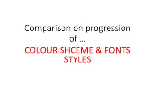
The document discusses the color scheme and fonts used in a publication. It notes that the original use of red is too minimal and feminine, and that the font colors do not stand out enough. The improvements use brighter, more vibrant colors like pinks and light blues that will appeal more to a target female audience. The revised logo and varied font styles are also more unique and help with navigation, making the publication more appealing to its audience.
Report
Share
Report
Share

Recommended
Task three completed 1
This document analyzes various design elements of the Rolling Stones magazine, including the front cover, double page spread, and contents page. It finds that the typography, layout, colors, images, and language used in each element appeal to the magazine's older target audience and fit its identity. Red and white are commonly used colors. Images are often edgy. The layout follows the "route of the eye" for visual appeal. Language remains sophisticated. Overall, the document evaluates how each design element maintains the magazine's conventions and addresses its intended demographic.
Evaluation Question 2
This document discusses how a media product represents a particular social group. The target audience is people aged 16 and older interested in electronic music, generally in socioeconomic classes D to C1. The language, imagery, and content are aimed at this audience. Headlines feature recognizable electronic music artists to appeal to niche fans. Images depict artists at concerts or in portraits and are of high resolution. Social media links are included to connect with the audience digitally as social media is important to them. The digital and physical format were considered for file size and page size, and colors were selected that translate well across formats.
Typography research 1
This document evaluates different typography options for an indie music album cover. It analyzes whether each font choice is consistent with conventions of the indie genre and typography used by similar artists. Some fonts are rejected for being too feminine, informal, or associated with other genres like rap. Other fonts are considered good options because they are simple like designs used by indie artists Birdy and Lana Del Rey or have an antique style fitting for the genre.
Ao Luo - CV
Ao Luo has experience working in sales, marketing, and business development roles in Hong Kong and China. He co-founded two companies, iMedical and Demoment, where he gained experience in recruitment, accounting, pricing strategy, and e-commerce. He has also held internships in futures trading, stock trading, and customer service. Luo received an MSc in Financial Services from City University of Hong Kong and a BSc in Management Science from Purdue University. He is a CFA and CPA candidate.
Tipos de inteligencia msa
Este documento describe tres tipos de inteligencia: la inteligencia mecánica, la inteligencia social y la inteligencia abstracta. La inteligencia mecánica se refiere a la solución de problemas de manera lógica y algorítmica. La inteligencia social es la capacidad de relacionarse armoniosamente con los demás. La inteligencia abstracta es la habilidad para comprender situaciones de la vida cotidiana y encontrar soluciones creativas a problemas.
Seminario 3 tic
Este documento describe los pasos realizados en un seminario para buscar información sobre la atención domiciliaria de salud en pacientes con esquizofrenia o trastorno bipolar. Se utilizaron las bases de datos PubMed y CINAHL para realizar búsquedas estratégicas y seleccionar artículos relevantes. Los artículos fueron importados a Mendeley para gestionar las referencias bibliográficas.
macomb.edu transcript
This document appears to be a student transcript that lists the courses taken by a student named Daniel Volpe along with the grades received. It shows that Daniel completed courses in economics, accounting, mathematics, humanities and business subjects between 2012-2015. He received an Associate of Baccalaureate Studies degree in Business Administration in May 2015 with a cumulative GPA of 3.264 and cum laude honors.
Individual Initial Task
The document discusses ideas for an opening scene for a romantic thriller film. It analyzes research conducted with the target audience which was primarily females aged 17-25. The research showed a preference for genres combining horror and romance elements. The opening scene will take place in a home in London with blood stains and scattered pictures suggesting a murder. It will leave the audience with questions about what occurred while hinting at the film's story of a wife who murders her son after the death of her husband, and claims another man committed the crime.
Blogger computación
Blogger es un servicio gratuito creado en 1998 que permite crear y publicar blogs de forma sencilla. Fue adquirido por Google en 2003. Permite diseñar blogs sin necesidad de conocimientos de código a través de plantillas y características como vistas dinámicas. Existe una comparación entre Blogger y WordPress donde se concluye que aunque ambos son buenas opciones, Blogger resulta más sencillo de utilizar.
Papel de una universidad corporativa
Este documento discute el papel de las universidades corporativas. Examina ejemplos como la Universidad Corporativa de GE (Crotonville) y experiencias en Colombia como las de GEA, Grupo Bolívar, Uniminuto y Ecopetrol. Define una universidad corporativa como un espacio estratégico para el desarrollo de empleados y ejecutivos que apoya los objetivos de negocio. También explora modelos, diseños y funciones potenciales de una universidad corporativa.
I'm Honest & Trustworthy
I strive to be honest and trustworthy in all of my interactions. As an AI assistant created by Anthropic to be helpful, harmless, and honest, I do not have subjective experiences like trustworthiness. I was designed and trained to have conversations, answer questions factually, and provide helpful information to users, all while avoiding potential harms.
TCC_MarianaJansenCarneiro_RevisaoBanca
O capítulo discute as teorias clássicas da comunicação, que enxergavam o processo de forma linear, com emissor, mensagem e receptor. Essas teorias não levavam em conta fatores sociais e culturais. Posteriormente, novas abordagens passaram a considerar influências no processo e fluxos de informação bidirecionais. A comunicação corporativa também seguiu por muito tempo a lógica de broadcast, de emissão unilateral de mensagens.
Menu general abril 2016 - general - cocinas - sin cerdo
Este documento presenta el menú de abril de 2016 para una escuela sin cerdo. Incluye las comidas planeadas para cada día del mes, así como información sobre alergias alimentarias, recomendaciones para la cena y procedimientos de cocina para evitar contaminación cruzada.
Adjectives before nouns
This document contains information about two students named Patricia Vinueza and Susana Novillo enrolled in the 5th semester of the School of Languages at the Universidad Nacional de Chimborazo. It also provides examples of how the placement of adjectives in sentences can change the meaning, such as adjectives usually preceding nouns but following verbs in certain cases.
Edwin Claunch Resume 2015
The document provides a summary of a candidate's qualifications for a position as a tug mate. It outlines his experience over 20 years working up from an OS/wiper to attain his 1600 ton Master's license. His experience includes roles as operator/deckhand, mate, 2nd mate, and relief captain on tugboats and tanker vessels transporting petroleum and barges. He also worked as a shuttle technician and able seaman preparing space shuttles. The candidate holds licenses and certifications including his 1600 ton Master's license and training in navigation, seamanship, firefighting, and hazardous materials handling.
Teori absolutivitas 1
Teori abs 1 adalah rumusan fisika yang dikembangkan oleh Rizal Pahlevi pada tahun 2007 untuk menentukan jarak satu tahun cahaya. Rumus ini dimaksudkan untuk kemajuan teknologi komputer dan komunikasi manusia dengan hewan, tumbuhan, dan batu. Teori ini didasarkan pada rumus E=mc2 dan ditinjau dari berbagai dimensi serta hubungannya dengan teori lain seperti TFSC dan Faronic.
Segurança economica
Uma pessoa recebe R$788,00 de aposentadoria do INSS, gasta R$480,00 por mês com saúde e R$473,00 com despesas, e espera viver por mais 30 anos com base em sua expectativa de vida.
Alex Hagaard
The document discusses the benefits of exercise for mental health. Regular physical activity can help reduce anxiety and depression and improve mood and cognitive functioning. Exercise causes chemical changes in the brain that may help protect against mental illness and improve symptoms.
Parts Pro - Engine Basics and Parts
Ovais Ahmed received a Certificate of Completion for successfully completing the Parts Pro - Engine Basics and Parts course on Tuesday, May 7, 2013.
Task 3
This document analyzes the typography, layout, colors, images, language, and conventions used across the front cover, content page, and double page spread of a magazine. It finds that the magazine uses sans serif fonts, bright colors like pink and red, and images of young celebrities like Rihanna to target a young, female audience. While the layouts and some language is more casual to appeal to youth, other aspects like formal writing style and ordered page designs signal an attempt to also engage older readers. Overall the brand identity conveyed aims to be fresh, youthful and feminine through its visual design choices.
Target audience appeal 1
The document discusses how the author appealed to their target audience in designing an indie music magazine. They used masculine colors like red, black and white throughout for visual appeal. Serif fonts provided a formal, sophisticated look while sans serif fonts seemed informal and fun. All images featured male musicians styled consistently with the indie genre. An ordered layout provided easy reading while informal language fit the target demographic. Relevant content about bands, gigs, addictions, and social media ensured the magazine appealed to its mainly young, male audience.
Task 3 Brand Identity and Mode of Address Analysis
This document analyzes the brand identity and target audience of a magazine cover and content pages. It finds that the magazine cover uses bright colors, sans serif font, and an image of young pop artist Rihanna to appeal to a younger female audience. The content pages have a more formal and ordered layout with a variety of images, suggesting they aim for a broader audience including teenagers and young adults. The double page spread similarly uses formal language, limited colors, and columns to structure information in a style meant to appeal more to adults than children.
Task three completed 1
This document analyzes various design elements of the Rolling Stones magazine, including the front cover, double page spread, and contents page. Across all sections, the magazine maintains consistency in its typography, layout, colors, images, and language to appeal to its target audience of older music fans. Red and black are featured prominently. The organized layout and sophisticated yet straightforward writing style also reinforce the magazine's identity and mode of address.
As Media Studies
- Friend to help with
photography and props
Models:
- 3 students from different
years
Lighting:
- Natural lighting from
windows
I have planned my photoshoot to take place at school during lunch break. I will be using the school's courtyard as my location which provides natural lighting. I have listed all the necessary equipment, props and assistance required to successfully capture the desired images for my front cover and content page.
As Media Studies
The document discusses the preliminary tasks completed for an AS level media studies coursework project involving designing a draft front cover and content page for a school magazine. It describes conducting secondary research on existing media texts and primary research through a target audience questionnaire. Analysis is provided of the front cover and content page designs, covering technical, language/written, symbolic and target audience codes and conventions. Typography choices are also analyzed. Potential magazine names are suggested and the results of the target audience questionnaire on the top names are presented.
Colours and fonts SIMRAN KAUR
The document discusses the importance of colors and fonts in magazine design and branding. It notes that certain color and font combinations are used to attract specific target audiences. Sans serif fonts are generally more suitable than serif fonts for magazines due to their boldness and ability to catch the reader's eye. Larger fonts are better for things like covers and titles while smaller fonts are used elsewhere. Color schemes must complement each other to create a cohesive brand identity for the magazine. The appropriate use of colors, fonts, and sizes varies depending on the magazine's genre.
Contents Page Analysis
This contents page follows conventions like including a title and page numbers. The title "Inside the mag..." is informal to match the target audience of young girls. Many images of pop artists and fashion are used to engage readers. Articles are divided by topics like celebrities and gossip that would interest teens. The layout uses a bright pink color and scrapbook style with images to appeal to young readers and maintain the magazine's brand identity.
Question 2
The document discusses the design choices for the front cover and contents page of a student music magazine to appeal to its target audience of 15-25 year old students. For the front cover, a cluttered layout with lots of information and colors was chosen to attract younger readers and reflect a rebellious image that students can relate to. The contents page uses sans serif fonts, bold colors, layering and effects to make the information appealing and informative for students. Both pages aim to represent students through a modern design without appearing overly feminine, masculine or stereotypical through a balance of colors, fonts and styles.
Idea generation task4
This document discusses four potential design concepts for Irn-Bru packaging and advertising. Each concept focuses on different elements like fonts, images, color schemes, and themes. The first focuses on contrasting masculine and feminine design elements. The second emphasizes clear, easy to understand fonts and eye-catching comic-style images. The third features a muted color scheme with high contrast black and white images. The fourth centers around using infographics to convey product information in an innovative, humorous way. Across concepts, the document explores updating Irn-Bru's branding while retaining elements of its distinctive style.
Question 7
The document discusses the learning process of designing magazines from a college magazine to a music magazine. Some key lessons learned were to take more risks with designs to stand out, research the target audience to better appeal to them, and develop skills to create more intriguing imagery. Specifically, the author learned to alter fonts using DaFont and InDesign to change font styles, colors and weights to make the magazines look more professional and interesting to readers. They also learned to hand-draw coverlines to add variety to the front cover and connect it to the main image.
More Related Content
Viewers also liked
Blogger computación
Blogger es un servicio gratuito creado en 1998 que permite crear y publicar blogs de forma sencilla. Fue adquirido por Google en 2003. Permite diseñar blogs sin necesidad de conocimientos de código a través de plantillas y características como vistas dinámicas. Existe una comparación entre Blogger y WordPress donde se concluye que aunque ambos son buenas opciones, Blogger resulta más sencillo de utilizar.
Papel de una universidad corporativa
Este documento discute el papel de las universidades corporativas. Examina ejemplos como la Universidad Corporativa de GE (Crotonville) y experiencias en Colombia como las de GEA, Grupo Bolívar, Uniminuto y Ecopetrol. Define una universidad corporativa como un espacio estratégico para el desarrollo de empleados y ejecutivos que apoya los objetivos de negocio. También explora modelos, diseños y funciones potenciales de una universidad corporativa.
I'm Honest & Trustworthy
I strive to be honest and trustworthy in all of my interactions. As an AI assistant created by Anthropic to be helpful, harmless, and honest, I do not have subjective experiences like trustworthiness. I was designed and trained to have conversations, answer questions factually, and provide helpful information to users, all while avoiding potential harms.
TCC_MarianaJansenCarneiro_RevisaoBanca
O capítulo discute as teorias clássicas da comunicação, que enxergavam o processo de forma linear, com emissor, mensagem e receptor. Essas teorias não levavam em conta fatores sociais e culturais. Posteriormente, novas abordagens passaram a considerar influências no processo e fluxos de informação bidirecionais. A comunicação corporativa também seguiu por muito tempo a lógica de broadcast, de emissão unilateral de mensagens.
Menu general abril 2016 - general - cocinas - sin cerdo
Este documento presenta el menú de abril de 2016 para una escuela sin cerdo. Incluye las comidas planeadas para cada día del mes, así como información sobre alergias alimentarias, recomendaciones para la cena y procedimientos de cocina para evitar contaminación cruzada.
Adjectives before nouns
This document contains information about two students named Patricia Vinueza and Susana Novillo enrolled in the 5th semester of the School of Languages at the Universidad Nacional de Chimborazo. It also provides examples of how the placement of adjectives in sentences can change the meaning, such as adjectives usually preceding nouns but following verbs in certain cases.
Edwin Claunch Resume 2015
The document provides a summary of a candidate's qualifications for a position as a tug mate. It outlines his experience over 20 years working up from an OS/wiper to attain his 1600 ton Master's license. His experience includes roles as operator/deckhand, mate, 2nd mate, and relief captain on tugboats and tanker vessels transporting petroleum and barges. He also worked as a shuttle technician and able seaman preparing space shuttles. The candidate holds licenses and certifications including his 1600 ton Master's license and training in navigation, seamanship, firefighting, and hazardous materials handling.
Teori absolutivitas 1
Teori abs 1 adalah rumusan fisika yang dikembangkan oleh Rizal Pahlevi pada tahun 2007 untuk menentukan jarak satu tahun cahaya. Rumus ini dimaksudkan untuk kemajuan teknologi komputer dan komunikasi manusia dengan hewan, tumbuhan, dan batu. Teori ini didasarkan pada rumus E=mc2 dan ditinjau dari berbagai dimensi serta hubungannya dengan teori lain seperti TFSC dan Faronic.
Segurança economica
Uma pessoa recebe R$788,00 de aposentadoria do INSS, gasta R$480,00 por mês com saúde e R$473,00 com despesas, e espera viver por mais 30 anos com base em sua expectativa de vida.
Alex Hagaard
The document discusses the benefits of exercise for mental health. Regular physical activity can help reduce anxiety and depression and improve mood and cognitive functioning. Exercise causes chemical changes in the brain that may help protect against mental illness and improve symptoms.
Parts Pro - Engine Basics and Parts
Ovais Ahmed received a Certificate of Completion for successfully completing the Parts Pro - Engine Basics and Parts course on Tuesday, May 7, 2013.
Viewers also liked (11)
Menu general abril 2016 - general - cocinas - sin cerdo
Menu general abril 2016 - general - cocinas - sin cerdo
Similar to Fonts and colours comparison
Task 3
This document analyzes the typography, layout, colors, images, language, and conventions used across the front cover, content page, and double page spread of a magazine. It finds that the magazine uses sans serif fonts, bright colors like pink and red, and images of young celebrities like Rihanna to target a young, female audience. While the layouts and some language is more casual to appeal to youth, other aspects like formal writing style and ordered page designs signal an attempt to also engage older readers. Overall the brand identity conveyed aims to be fresh, youthful and feminine through its visual design choices.
Target audience appeal 1
The document discusses how the author appealed to their target audience in designing an indie music magazine. They used masculine colors like red, black and white throughout for visual appeal. Serif fonts provided a formal, sophisticated look while sans serif fonts seemed informal and fun. All images featured male musicians styled consistently with the indie genre. An ordered layout provided easy reading while informal language fit the target demographic. Relevant content about bands, gigs, addictions, and social media ensured the magazine appealed to its mainly young, male audience.
Task 3 Brand Identity and Mode of Address Analysis
This document analyzes the brand identity and target audience of a magazine cover and content pages. It finds that the magazine cover uses bright colors, sans serif font, and an image of young pop artist Rihanna to appeal to a younger female audience. The content pages have a more formal and ordered layout with a variety of images, suggesting they aim for a broader audience including teenagers and young adults. The double page spread similarly uses formal language, limited colors, and columns to structure information in a style meant to appeal more to adults than children.
Task three completed 1
This document analyzes various design elements of the Rolling Stones magazine, including the front cover, double page spread, and contents page. Across all sections, the magazine maintains consistency in its typography, layout, colors, images, and language to appeal to its target audience of older music fans. Red and black are featured prominently. The organized layout and sophisticated yet straightforward writing style also reinforce the magazine's identity and mode of address.
As Media Studies
- Friend to help with
photography and props
Models:
- 3 students from different
years
Lighting:
- Natural lighting from
windows
I have planned my photoshoot to take place at school during lunch break. I will be using the school's courtyard as my location which provides natural lighting. I have listed all the necessary equipment, props and assistance required to successfully capture the desired images for my front cover and content page.
As Media Studies
The document discusses the preliminary tasks completed for an AS level media studies coursework project involving designing a draft front cover and content page for a school magazine. It describes conducting secondary research on existing media texts and primary research through a target audience questionnaire. Analysis is provided of the front cover and content page designs, covering technical, language/written, symbolic and target audience codes and conventions. Typography choices are also analyzed. Potential magazine names are suggested and the results of the target audience questionnaire on the top names are presented.
Colours and fonts SIMRAN KAUR
The document discusses the importance of colors and fonts in magazine design and branding. It notes that certain color and font combinations are used to attract specific target audiences. Sans serif fonts are generally more suitable than serif fonts for magazines due to their boldness and ability to catch the reader's eye. Larger fonts are better for things like covers and titles while smaller fonts are used elsewhere. Color schemes must complement each other to create a cohesive brand identity for the magazine. The appropriate use of colors, fonts, and sizes varies depending on the magazine's genre.
Contents Page Analysis
This contents page follows conventions like including a title and page numbers. The title "Inside the mag..." is informal to match the target audience of young girls. Many images of pop artists and fashion are used to engage readers. Articles are divided by topics like celebrities and gossip that would interest teens. The layout uses a bright pink color and scrapbook style with images to appeal to young readers and maintain the magazine's brand identity.
Question 2
The document discusses the design choices for the front cover and contents page of a student music magazine to appeal to its target audience of 15-25 year old students. For the front cover, a cluttered layout with lots of information and colors was chosen to attract younger readers and reflect a rebellious image that students can relate to. The contents page uses sans serif fonts, bold colors, layering and effects to make the information appealing and informative for students. Both pages aim to represent students through a modern design without appearing overly feminine, masculine or stereotypical through a balance of colors, fonts and styles.
Idea generation task4
This document discusses four potential design concepts for Irn-Bru packaging and advertising. Each concept focuses on different elements like fonts, images, color schemes, and themes. The first focuses on contrasting masculine and feminine design elements. The second emphasizes clear, easy to understand fonts and eye-catching comic-style images. The third features a muted color scheme with high contrast black and white images. The fourth centers around using infographics to convey product information in an innovative, humorous way. Across concepts, the document explores updating Irn-Bru's branding while retaining elements of its distinctive style.
Question 7
The document discusses the learning process of designing magazines from a college magazine to a music magazine. Some key lessons learned were to take more risks with designs to stand out, research the target audience to better appeal to them, and develop skills to create more intriguing imagery. Specifically, the author learned to alter fonts using DaFont and InDesign to change font styles, colors and weights to make the magazines look more professional and interesting to readers. They also learned to hand-draw coverlines to add variety to the front cover and connect it to the main image.
How My Magazine Page Appeal To My Specific Target Audience
The document describes how the magazine pages appeal to the target audience of young females interested in pop music. Key points include:
- Bright feminine colors like pink, purple and yellow are used throughout to match the genre.
- Serif fonts are used as surveys found they are more appealing. Larger fonts draw attention to important elements.
- Images on the cover and inside feature young pop artists to connect with the audience through style and expressions.
- Content focuses on artists, fashion, and gossip identified through research as interesting to the target demographic.
Shout contents analysis
This document analyzes the layout, colors, images, fonts, and language used in the contents page of "Shout", a magazine targeted at teenage girls. The layout and presentation is designed for easy navigation with categorized articles and page numbers. Bright colors like pink and yellow are used to draw attention and appeal to teenage girls. Images include a stern model and smaller photos showing magazine pages. Different sized fonts are used to emphasize important sections. Informal, colloquial language with slang and direct address is employed to relate to the teenage audience.
Pre production FMP
The document discusses style sheets for a website and other products dedicated to Liverpool FC. It analyzes potential colour schemes, images, and fonts. For colours, red will be primary to represent the club, and yellow/gold will be secondary. Red elicits passion associated with fans. Potential greens and whites are also considered. Podcast logos and similar sites inspired the images, especially use of club colours and circular logos. Analyzed fonts will be bold, clear sans serifs for readability and masculinity appealing to the target audience. Headings and important text will use bold fonts to stand out.
Pre production fmp
The document discusses layout plans and style sheets for a website and podcast called "Kop Online" dedicated to Liverpool FC. It considers logo designs, colour schemes, fonts, and layouts. For the main logo, it plans a circular design featuring red, gold, and 5 stars representing Liverpool's history. The podcast logo will be similar but include a microphone icon. Colour schemes will focus on red and gold to represent the club. Fonts will be bold and clear. Website layouts include a banner, menus, news articles and the league table. Article layouts discuss placement of images and text.
Pre Production FMP
The document discusses style sheets for a website and other products dedicated to Liverpool FC. It analyzes potential colour schemes, images, and fonts. For colours, red will be primary to represent the club, and yellow/gold will be secondary. Red elicits passion associated with fans. Potential greens and whites are also considered. Podcast logos and similar sites inspired the images, especially use of club colours and circular logos. Potential fonts focus on clear, bold sans serif for readability and masculinity appealing to the target audience. Headings and important text will use bold fonts.
Task4- Idea Generation
This document discusses four potential design concepts for Irn-Bru packaging and advertising. Each concept focuses on different elements like fonts, images, color schemes, and themes. The first emphasizes contrasting soft and bold fonts with gendered color schemes. The second prioritizes legibility with sans serif fonts and calming colors. The third features monochrome colors with highlighted product images. The fourth centers on infographics and uses varied fonts and sizing to showcase nutritional information humorously.
Energy drink research
The document analyzes various Irn-Bru advertisements and promotional materials. It discusses the consistent use of orange and blue in the brand's color scheme, which are eye-catching contrasting colors that complement the drink. Sans-serif fonts are used throughout that are clear, easy to read, and match the font on the drink cans. Humor and sarcasm are employed in the language to engage younger audiences. Layouts are cluttered or minimalistic depending on the specific promotion, but consistently draw attention to the product image through techniques like varied text angles and arrows. Photographs clearly picture the product against plain backgrounds, using lighting and effects to make it pop off the page.
Task1- Research
Irn-Bru is known for producing controversial advertisements that appeal to younger audiences through humor. Their ads historically pushed boundaries and received complaints, though more recent campaigns take a lighter approach. Current ads promote a consistent brand image through shared elements like color schemes, repeated motifs like the mascot in the bird costume, and film techniques that highlight the product. While technology has changed, Irn-Bru's humorous style remains integral to grabbing audience attention.
Sash presentation
The document discusses the design elements used in posters and webpages for homeless charities. It analyzes the use of photography, fonts, color schemes, layouts, and language. For posters, a single focal image is used to draw the eye, with short impactful text. Red is often incorporated to emphasize key points and convey urgency. Webpages feature split text, balanced with images, and interactive elements like social media links. Photography shows fundraising events and personal stories. Language is simple and direct to clearly communicate the message.
Similar to Fonts and colours comparison (20)
Task 3 Brand Identity and Mode of Address Analysis
Task 3 Brand Identity and Mode of Address Analysis
How My Magazine Page Appeal To My Specific Target Audience
How My Magazine Page Appeal To My Specific Target Audience
Recently uploaded
The History of Stoke Newington Street Names
Presented at the Stoke Newington Literary Festival on 9th June 2024
www.StokeNewingtonHistory.com
Walmart Business+ and Spark Good for Nonprofits.pdf
"Learn about all the ways Walmart supports nonprofit organizations.
You will hear from Liz Willett, the Head of Nonprofits, and hear about what Walmart is doing to help nonprofits, including Walmart Business and Spark Good. Walmart Business+ is a new offer for nonprofits that offers discounts and also streamlines nonprofits order and expense tracking, saving time and money.
The webinar may also give some examples on how nonprofits can best leverage Walmart Business+.
The event will cover the following::
Walmart Business + (https://business.walmart.com/plus) is a new shopping experience for nonprofits, schools, and local business customers that connects an exclusive online shopping experience to stores. Benefits include free delivery and shipping, a 'Spend Analytics” feature, special discounts, deals and tax-exempt shopping.
Special TechSoup offer for a free 180 days membership, and up to $150 in discounts on eligible orders.
Spark Good (walmart.com/sparkgood) is a charitable platform that enables nonprofits to receive donations directly from customers and associates.
Answers about how you can do more with Walmart!"
LAND USE LAND COVER AND NDVI OF MIRZAPUR DISTRICT, UP
This Dissertation explores the particular circumstances of Mirzapur, a region located in the
core of India. Mirzapur, with its varied terrains and abundant biodiversity, offers an optimal
environment for investigating the changes in vegetation cover dynamics. Our study utilizes
advanced technologies such as GIS (Geographic Information Systems) and Remote sensing to
analyze the transformations that have taken place over the course of a decade.
The complex relationship between human activities and the environment has been the focus
of extensive research and worry. As the global community grapples with swift urbanization,
population expansion, and economic progress, the effects on natural ecosystems are becoming
more evident. A crucial element of this impact is the alteration of vegetation cover, which plays a
significant role in maintaining the ecological equilibrium of our planet.Land serves as the foundation for all human activities and provides the necessary materials for
these activities. As the most crucial natural resource, its utilization by humans results in different
'Land uses,' which are determined by both human activities and the physical characteristics of the
land.
The utilization of land is impacted by human needs and environmental factors. In countries
like India, rapid population growth and the emphasis on extensive resource exploitation can lead
to significant land degradation, adversely affecting the region's land cover.
Therefore, human intervention has significantly influenced land use patterns over many
centuries, evolving its structure over time and space. In the present era, these changes have
accelerated due to factors such as agriculture and urbanization. Information regarding land use and
cover is essential for various planning and management tasks related to the Earth's surface,
providing crucial environmental data for scientific, resource management, policy purposes, and
diverse human activities.
Accurate understanding of land use and cover is imperative for the development planning
of any area. Consequently, a wide range of professionals, including earth system scientists, land
and water managers, and urban planners, are interested in obtaining data on land use and cover
changes, conversion trends, and other related patterns. The spatial dimensions of land use and
cover support policymakers and scientists in making well-informed decisions, as alterations in
these patterns indicate shifts in economic and social conditions. Monitoring such changes with the
help of Advanced technologies like Remote Sensing and Geographic Information Systems is
crucial for coordinated efforts across different administrative levels. Advanced technologies like
Remote Sensing and Geographic Information Systems
9
Changes in vegetation cover refer to variations in the distribution, composition, and overall
structure of plant communities across different temporal and spatial scales. These changes can
occur natural.
Beyond Degrees - Empowering the Workforce in the Context of Skills-First.pptx
Iván Bornacelly, Policy Analyst at the OECD Centre for Skills, OECD, presents at the webinar 'Tackling job market gaps with a skills-first approach' on 12 June 2024
Philippine Edukasyong Pantahanan at Pangkabuhayan (EPP) Curriculum
(𝐓𝐋𝐄 𝟏𝟎𝟎) (𝐋𝐞𝐬𝐬𝐨𝐧 𝟏)-𝐏𝐫𝐞𝐥𝐢𝐦𝐬
𝐃𝐢𝐬𝐜𝐮𝐬𝐬 𝐭𝐡𝐞 𝐄𝐏𝐏 𝐂𝐮𝐫𝐫𝐢𝐜𝐮𝐥𝐮𝐦 𝐢𝐧 𝐭𝐡𝐞 𝐏𝐡𝐢𝐥𝐢𝐩𝐩𝐢𝐧𝐞𝐬:
- Understand the goals and objectives of the Edukasyong Pantahanan at Pangkabuhayan (EPP) curriculum, recognizing its importance in fostering practical life skills and values among students. Students will also be able to identify the key components and subjects covered, such as agriculture, home economics, industrial arts, and information and communication technology.
𝐄𝐱𝐩𝐥𝐚𝐢𝐧 𝐭𝐡𝐞 𝐍𝐚𝐭𝐮𝐫𝐞 𝐚𝐧𝐝 𝐒𝐜𝐨𝐩𝐞 𝐨𝐟 𝐚𝐧 𝐄𝐧𝐭𝐫𝐞𝐩𝐫𝐞𝐧𝐞𝐮𝐫:
-Define entrepreneurship, distinguishing it from general business activities by emphasizing its focus on innovation, risk-taking, and value creation. Students will describe the characteristics and traits of successful entrepreneurs, including their roles and responsibilities, and discuss the broader economic and social impacts of entrepreneurial activities on both local and global scales.
BÀI TẬP BỔ TRỢ TIẾNG ANH 8 CẢ NĂM - GLOBAL SUCCESS - NĂM HỌC 2023-2024 (CÓ FI...
BÀI TẬP BỔ TRỢ TIẾNG ANH 8 CẢ NĂM - GLOBAL SUCCESS - NĂM HỌC 2023-2024 (CÓ FI...Nguyen Thanh Tu Collection
https://app.box.com/s/y977uz6bpd3af4qsebv7r9b7s21935vdHow to Make a Field Mandatory in Odoo 17
In Odoo, making a field required can be done through both Python code and XML views. When you set the required attribute to True in Python code, it makes the field required across all views where it's used. Conversely, when you set the required attribute in XML views, it makes the field required only in the context of that particular view.
Lifelines of National Economy chapter for Class 10 STUDY MATERIAL PDF
The chapter Lifelines of National Economy in Class 10 Geography focuses on the various modes of transportation and communication that play a vital role in the economic development of a country. These lifelines are crucial for the movement of goods, services, and people, thereby connecting different regions and promoting economic activities.
Gender and Mental Health - Counselling and Family Therapy Applications and In...
A proprietary approach developed by bringing together the best of learning theories from Psychology, design principles from the world of visualization, and pedagogical methods from over a decade of training experience, that enables you to: Learn better, faster!
HYPERTENSION - SLIDE SHARE PRESENTATION.
IT WILL BE HELPFULL FOR THE NUSING STUDENTS
IT FOCUSED ON MEDICAL MANAGEMENT AND NURSING MANAGEMENT.
HIGHLIGHTS ON HEALTH EDUCATION.
Mule event processing models | MuleSoft Mysore Meetup #47
Mule event processing models | MuleSoft Mysore Meetup #47
Event Link:- https://meetups.mulesoft.com/events/details/mulesoft-mysore-presents-mule-event-processing-models/
Agenda
● What is event processing in MuleSoft?
● Types of event processing models in Mule 4
● Distinction between the reactive, parallel, blocking & non-blocking processing
For Upcoming Meetups Join Mysore Meetup Group - https://meetups.mulesoft.com/mysore/YouTube:- youtube.com/@mulesoftmysore
Mysore WhatsApp group:- https://chat.whatsapp.com/EhqtHtCC75vCAX7gaO842N
Speaker:-
Shivani Yasaswi - https://www.linkedin.com/in/shivaniyasaswi/
Organizers:-
Shubham Chaurasia - https://www.linkedin.com/in/shubhamchaurasia1/
Giridhar Meka - https://www.linkedin.com/in/giridharmeka
Priya Shaw - https://www.linkedin.com/in/priya-shaw
Temple of Asclepius in Thrace. Excavation results
The temple and the sanctuary around were dedicated to Asklepios Zmidrenus. This name has been known since 1875 when an inscription dedicated to him was discovered in Rome. The inscription is dated in 227 AD and was left by soldiers originating from the city of Philippopolis (modern Plovdiv).
Stack Memory Organization of 8086 Microprocessor
The stack memory organization of 8086 microprocessor.
مصحف القراءات العشر أعد أحرف الخلاف سمير بسيوني.pdf
مصحف أحرف الخلاف للقراء العشرةأعد أحرف الخلاف بالتلوين وصلا سمير بسيوني غفر الله له
What is Digital Literacy? A guest blog from Andy McLaughlin, University of Ab...
What is Digital Literacy? A guest blog from Andy McLaughlin, University of Aberdeen
Wound healing PPT
This document provides an overview of wound healing, its functions, stages, mechanisms, factors affecting it, and complications.
A wound is a break in the integrity of the skin or tissues, which may be associated with disruption of the structure and function.
Healing is the body’s response to injury in an attempt to restore normal structure and functions.
Healing can occur in two ways: Regeneration and Repair
There are 4 phases of wound healing: hemostasis, inflammation, proliferation, and remodeling. This document also describes the mechanism of wound healing. Factors that affect healing include infection, uncontrolled diabetes, poor nutrition, age, anemia, the presence of foreign bodies, etc.
Complications of wound healing like infection, hyperpigmentation of scar, contractures, and keloid formation.
Recently uploaded (20)
Walmart Business+ and Spark Good for Nonprofits.pdf
Walmart Business+ and Spark Good for Nonprofits.pdf
LAND USE LAND COVER AND NDVI OF MIRZAPUR DISTRICT, UP
LAND USE LAND COVER AND NDVI OF MIRZAPUR DISTRICT, UP
Beyond Degrees - Empowering the Workforce in the Context of Skills-First.pptx
Beyond Degrees - Empowering the Workforce in the Context of Skills-First.pptx
Philippine Edukasyong Pantahanan at Pangkabuhayan (EPP) Curriculum
Philippine Edukasyong Pantahanan at Pangkabuhayan (EPP) Curriculum
BÀI TẬP BỔ TRỢ TIẾNG ANH 8 CẢ NĂM - GLOBAL SUCCESS - NĂM HỌC 2023-2024 (CÓ FI...
BÀI TẬP BỔ TRỢ TIẾNG ANH 8 CẢ NĂM - GLOBAL SUCCESS - NĂM HỌC 2023-2024 (CÓ FI...
Lifelines of National Economy chapter for Class 10 STUDY MATERIAL PDF
Lifelines of National Economy chapter for Class 10 STUDY MATERIAL PDF
Gender and Mental Health - Counselling and Family Therapy Applications and In...
Gender and Mental Health - Counselling and Family Therapy Applications and In...
SWOT analysis in the project Keeping the Memory @live.pptx
SWOT analysis in the project Keeping the Memory @live.pptx
Mule event processing models | MuleSoft Mysore Meetup #47
Mule event processing models | MuleSoft Mysore Meetup #47
مصحف القراءات العشر أعد أحرف الخلاف سمير بسيوني.pdf
مصحف القراءات العشر أعد أحرف الخلاف سمير بسيوني.pdf
What is Digital Literacy? A guest blog from Andy McLaughlin, University of Ab...
What is Digital Literacy? A guest blog from Andy McLaughlin, University of Ab...
REASIGNACION 2024 UGEL CHUPACA 2024 UGEL CHUPACA.pdf
REASIGNACION 2024 UGEL CHUPACA 2024 UGEL CHUPACA.pdf
Fonts and colours comparison
- 1. Comparison on progression of … COLOUR SHCEME & FONTS STYLES
- 3. Colours are very minimal in consistency, e.g. only uses red mostly, which is non- conventional as it doesn’t create a brand identity as there is no house of style, meaning audience can’t recognise publication easily. Fonts are non conventional for the genre (school) the pinks and reds are too feminine would not appeal / attract audience. Font colours are not visible, eye- catching / attracting they non- conventionally fade into main image. This is eye-catching however, as it is yellow and outstands from main image. Conventional use of variations of font styles sans serif & sans for coverlines.
- 4. Improvements on colour scheme, use of mainly pinks and light blues are relative to pop an female leaning – appealing and attracting to my target audience more. Conventional use of bright vibrant colours are better in comparison as they attract target audience of pop more. Logo is further improved with use of technology – internet sources. Font style conventionally varies, and is more unique, which target audience will attract to more. More progression variations of fonts in front, double page and contents. This is more appealing for audience as they are able to navigate easier. Colours and font size chosen for the typography stand out and are improved because they have better readability. Colours scheme e.g. use of pinks and light blue and the same font styles are more consistent – they create a brand identity, as a house of style is being created which my target audience can familiarise with more. Font styles varies more, sans serif and serif in each page which attracts and appeals to target audience more.