
Recommended
More Related Content
What's hot
What's hot (20)
Similar to Fonts
Similar to Fonts (20)
More from IsabellaBown
More from IsabellaBown (20)
Recently uploaded
Recently uploaded (20)
Fonts
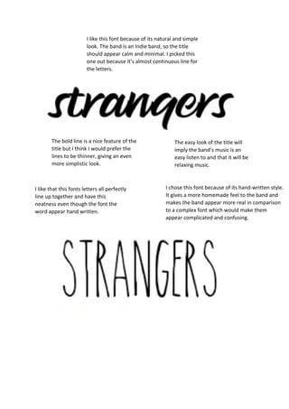
- 1. I like this font because of its natural and simple look. The band is an Indie band, so the title should appear calm and minimal. I picked this one out because it’s almost continuous line for the letters. The easy look of the title will imply the band’s music is an easy listen to and that it will be relaxing music. The bold line is a nice feature of the title but I think I would prefer the lines to be thinner, giving an even more simplistic look. I like that this fonts letters all perfectly line up together and have this neatness even though the font the word appear hand written. I chose this font because of its hand-written style. It gives a more homemade feel to the band and makes the band appear more real in comparison to a complex font which would make them appear complicated and confusing.
- 2. The fact all the letters are capital makes the band appear more sophisticated which will attract a more mature target audience. I chose this once because this stands out from the other ones since it has a black boarder. I chose this because lots of indie band used the colour scheme of black and white in their titles, so when someone sees this title they might already assume it’s for an indie band. The spacing between the letters links well to the title, ‘strangers’, which implies people who don’t know each other. I like the way the letters are shape slightly out of proportion which gives a unique sense to the font and therefore the band.