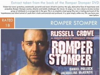
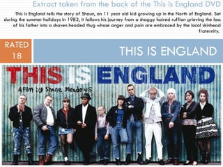
The document examines different fonts used on movie DVD covers and posters to summarize their effectiveness and appropriateness for the targeted genre and audience. Key points analyzed include font style, color, simplicity, and how well each draws attention and reflects the film's tone. After reviewing several options, the author decides a plain block font like that of Title Choice 1 best suits their abusive drama film while maintaining readability.