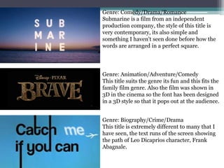
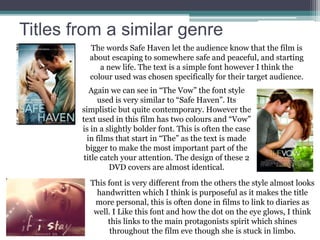
The importance of film titles,
font and colour
On the next few slides I will be analyzing a few titles from both
mainstream and independent films. I think its important to see
how genre influences the style of the title.
Genre: Sci-Fi/Fantasy
Star wars is an extremely famous franchise
so this logo is a very important trademark. I
like the simplicity of this logo and how a
bright colour (yellow) is used to make the
logo standout!
Genre: Crime/Drama
Reservoir Dogs is a famous controversial film,
As its an old film (1992) the traditional black
and white, bold font suits the style of the film.
I love the silhouettes of the characters in the
text, it makes what could have been a boring
title much more interesting.
Genre: Action/Drama/Romance
Pearl harbor is an extremely emotional film
about the attack on pearl harbor. This text
suits the film as its calming and solemn. It
symbolizes the calm once the war is one.
Genre: Comedy/Drama/Romance
Submarine is a film from an independent
production company, the style of this title is
very contemporary, its also simple and
something I haven't seen done before how the
words are arranged in a perfect square.
Genre: Biography/Crime/Drama
This title is extremely different to many that I
have seen, the text runs of the screen showing
the path of Leo Dicaprios character, Frank
Abagnale.
Genre: Animation/Adventure/Comedy
This title suits the genre its fun and this fits the
family film genre. Also the film was shown in
3D in the cinema so the font has been designed
in a 3D style so that it pops out at the audience.
Titles from a similar genre
The words Safe Haven let the audience know that the film is
about escaping to somewhere safe and peaceful, and starting
a new life. The text is a simple font however I think the
colour used was chosen specifically for their target audience.
Again we can see in “The Vow” the font style
used is very similar to “Safe Haven”. Its
simplistic but quite contemporary. However the
text used in this film has two colours and “Vow”
is in a slightly bolder font. This is often the case
in films that start in “The” as the text is made
bigger to make the most important part of the
title catch your attention. The design of these 2
DVD covers are almost identical.
This font is very different from the others the style almost looks
handwritten which I think is purposeful as it makes the title
more personal, this is often done in films to link to diaries as
well. I Like this font and how the dot on the eye glows, I think
this links to the main protagonists spirit which shines
throughout the film eve though she is stuck in limbo.

Titles

  • 1.
    The importance offilm titles, font and colour On the next few slides I will be analyzing a few titles from both mainstream and independent films. I think its important to see how genre influences the style of the title.
  • 2.
    Genre: Sci-Fi/Fantasy Star warsis an extremely famous franchise so this logo is a very important trademark. I like the simplicity of this logo and how a bright colour (yellow) is used to make the logo standout! Genre: Crime/Drama Reservoir Dogs is a famous controversial film, As its an old film (1992) the traditional black and white, bold font suits the style of the film. I love the silhouettes of the characters in the text, it makes what could have been a boring title much more interesting. Genre: Action/Drama/Romance Pearl harbor is an extremely emotional film about the attack on pearl harbor. This text suits the film as its calming and solemn. It symbolizes the calm once the war is one.
  • 3.
    Genre: Comedy/Drama/Romance Submarine isa film from an independent production company, the style of this title is very contemporary, its also simple and something I haven't seen done before how the words are arranged in a perfect square. Genre: Biography/Crime/Drama This title is extremely different to many that I have seen, the text runs of the screen showing the path of Leo Dicaprios character, Frank Abagnale. Genre: Animation/Adventure/Comedy This title suits the genre its fun and this fits the family film genre. Also the film was shown in 3D in the cinema so the font has been designed in a 3D style so that it pops out at the audience.
  • 4.
    Titles from asimilar genre The words Safe Haven let the audience know that the film is about escaping to somewhere safe and peaceful, and starting a new life. The text is a simple font however I think the colour used was chosen specifically for their target audience. Again we can see in “The Vow” the font style used is very similar to “Safe Haven”. Its simplistic but quite contemporary. However the text used in this film has two colours and “Vow” is in a slightly bolder font. This is often the case in films that start in “The” as the text is made bigger to make the most important part of the title catch your attention. The design of these 2 DVD covers are almost identical. This font is very different from the others the style almost looks handwritten which I think is purposeful as it makes the title more personal, this is often done in films to link to diaries as well. I Like this font and how the dot on the eye glows, I think this links to the main protagonists spirit which shines throughout the film eve though she is stuck in limbo.