Finalplan
•Download as PPTX, PDF•
0 likes•132 views
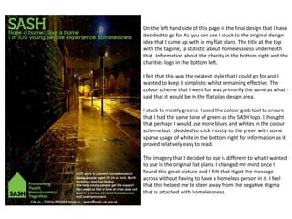
The final design for a charity poster stuck to the original design idea of including the charity's title, tagline, and statistic about homelessness at the top, and information about the charity and logo at the bottom. The designer chose a simple, neat style using a primarily green color scheme to match the charity's logo. An impactful image replaced plans to depict homelessness directly in order to reduce stigma.
Report
Share
Report
Share
Recommended
Task 8 re done
Jess Britton plans to create a poster and billboard to promote the work of SASH. Photographs will be edited down to a monotone look so that accompanying text stands out clearly. The poster will include more detailed stories while the billboard uses a simple but eye-catching image and brief text to convey its message quickly to passersby. Both are designed to draw attention to SASH's efforts in helping those without access to basic necessities like housing.
Table of Contents
This document discusses the planning and design process for a table of contents page. It includes analysis of two photo shoots that could be used, including who and where the photos would take place. The document discusses choosing images that depict socializing to set an impression that the magazine focuses on social life and school. It also describes establishing a color scheme of red, blue, black and white to match the front cover. The final table of contents design maintains a white background with simple, clear fonts and photos adjusted to a "Hard Light" layer.
5. pre production (jrw) visual
The document discusses plans for creating a magazine mockup, including:
- Exploring different color schemes and fonts for the magazine cover
- Considering two layout designs, one with the main image on the left and masthead on top, the other with the main image centered
- Identifying props and locations needed, such as stock images from Google and fonts from DaFont
- Outlining a one-week schedule to design the magazine cover and interior spread
6. production reflection(3)
Jay Birkin reflects on the process of creating a magazine layout in Photoshop. He discusses setting up the page size in A4 format and centimeters, using tools like the shape tool and color bucket tool to design page elements. He also searched for images and fonts online to incorporate into the layout. Birkin created a draft layout before adding all images and text. To design the double page spread, he used guidelines down the center and planned out where images and articles would go. The finished product included articles on top movies, a movie-to-game adaptation, and a new game console.
Vegan mood board
The document outlines a proposed design for the front cover of an article on veganism. It suggests using pastel colors to represent nature and veganism, along with various types of typography and infographics circled around the text. Images of fruits and vegetables are also proposed to draw the reader's eye to the key messages in a simple, uncluttered layout with ample white space.
Chloe Forrer: Final portfolio
This portfolio documents projects that I have recently completed and describes my style in design. I have shown my experience with Adobe programs and more through this portfolio.
Print based media production evaluation
The document discusses revisions made to a CD cover design based on feedback. The original design featured a lion decal in a gray, black, and white style. Most people who provided feedback liked the lion but suggested improvements. Specifically, they thought adding elements of fire to represent the lion would make it more interesting. The designer then updated the background using effects in Photoshop to add a red and yellow gradient and sunburst pattern representing fire. Additional film grain and text changes were made to complete the updated design incorporating the suggestion to include fire elements.
evaluation 7
The document provides an evaluation of the author's magazine cover project. It summarizes their research, planning, time management, technical qualities, aesthetic qualities, and audience appeal. For their research, they focused on magazine covers but not double page spreads, which impacted their final product. Their planning process went well and included idea generation, choosing a genre, and creating a mood board and schedule. However, their schedule lacked detail. They completed the project on time but felt they ran out of time to improve it. Key technical elements included banners, images, and stories lined up. Aspects like the title, cover lines, and colors worked well but the main image and layout could have been improved. The author believes their target audience would
En 2014 llega el taxi eléctrico a Barcelona
El Ayuntamiento de Barcelona ha firmado un acuerdo con Nissan para incorporar al servicio de taxis un vehículo 100% eléctrico el año que viene.
La Fundación José Manuel Entrecanales apoya la movilidad eléctrica
La Fundación José Manuel Entrecanales, en su impulso a la movilidad eléctrica, apoya el motosharing en las principales ciudades españolas.
comprension lectora tema 4
La Dama Tapada era un ser de origen desconocido que se aparecía a hombres borrachos cerca de la medianoche en callejones poco concurridos. Usaba un vestido elegante y un velo que cubría su rostro. Despedía una fragancia agradable que hipnotizaba a sus víctimas para que la siguieran, alejándolas de la ciudad hasta que su rostro se descomponía en un cadáver en putrefacción con ojos como bolas de fuego. La mayoría de las víctimas morían de convulsiones y esp
El Plan Senda de Endesa galardonado por los Premios Cegos con Equipos&Talento...
El Plan Senda de Endesa galardonado por los Premios Cegos con Equipos&Talento...El_Blog_De_La_Energia
El documento proporciona una dirección web para obtener más información sobre noticias relacionadas con la energía. Se recomienda visitar www.elblogdelaenergia.org para leer más sobre energía.dxn colombia equipo alfa cafe dxn oportunidad de negocio
dxn colombia equipoa alfa cafe dxn oportunidad de negocio
E.ON pone en marcha el SmartRegion Pellworm
El documento proporciona un enlace a un blog sobre noticias de energía. El blog www.elblogdelaenergia.org ofrece información actualizada sobre temas relacionados con la energía.
Press Release Sample
The Nasher Sculpture Center has named internationally renowned artist Rick Lowe as its inaugural artist-in-residence. Lowe will continue his community project Trans.lation, which he initiated for the Nasher's 10th anniversary exhibition Nasher XChange. Trans.lation highlights the cultural diversity of the Vickery Meadow neighborhood through workshops, exhibitions, and pop-up markets. Lowe is respected for his successful community art project Project Row Houses in Houston. The residency will allow Lowe to further develop Trans.lation and connect with other Dallas artists and communities.
Cono
Este documento describe los diferentes tipos de reproducción en los seres vivos. Explica que la reproducción puede ser asexual o sexual. En la reproducción sexual, intervienen dos individuos, uno produce gametos femeninos y el otro masculinos. En los animales, la reproducción sexual ocurre en tres fases: producción de gametos, fecundación y desarrollo del cigoto. En las plantas, los órganos reproductores son generalmente las flores, que contienen estambres (parte masculina) y pistilos (parte femenina). La reproducción sexual de las plantas
Presentación EFROvida
Este documento presenta los servicios de orientación profesional de EFROvida. La misión de EFROvida es enseñar para la vida y su visión es ser líder en servicios integrales de orientación. Ofrecen servicios de orientación educativa, familiar, recreativa, ocupacional, vocacional e individual. Cuentan con un equipo interdisciplinario de orientadores, psicólogos, recreacionistas y otros especialistas. Proporcionan servicios de desarrollo humano y empresarial como talleres de habilidades para la vida, orientación educativa y vocacional,
«Къырымтатархалкънынъ дженк къараманлары»
Мемедэминов Дилявер
МБОУ «Средняя школа №18 с крымскотатарским языком обучения г.Евпатория», 9 класс
«Къырымтатархалкънынъ дженк къараманлары»
Presentatie xPage & Beer
This document discusses coding Java for XPage developers. It covers topics like functions, classes, code comments, error handling, and the OpenNTF Domino API project. The OpenNTF Domino API provides Java classes for working with Domino sessions and databases that can make development easier. Instructions are given on how to install the API JAR files and configure the Domino server to use the API classes.
Viaje a marte
Un grupo de estudiantes del MIT analizó la propuesta de Mars One de enviar humanos a Marte de forma permanente y determinó que el plan tal como está planteado es inviable. Según sus cálculos, se necesitarían al menos 15 lanzamientos de cohetes Falcon a un costo de $4.5 mil millones, y los colonos podrían morir asfixiados por oxígeno excesivo de sus cultivos alrededor del día 68. El equipo concluye que la tecnología actual no es suficiente para soportar una colonia en Marte de forma s
Survey
The document is a survey that asks questions about a respondent's enjoyment of hip hop music, demographic information, favorite artists, and opinions on important aspects of hip hop culture. It inquires about the respondent's familiarity with and favorite artist from the American hip hop collective Odd Future. Finally, it asks the respondent to rate how important certain elements are to hip hop culture and whether they would be necessary to include in a hip hop music video.
Historia
Los Sanfermines son unas fiestas que se celebran anualmente en Pamplona del 6 al 14 de julio en honor a San Fermín. Sus orígenes se remontan a la Edad Media aunque adquirieron fama mundial más recientemente. Una de sus actividades más conocidas es el encierro, donde los toros son conducidos a través de las calles de la ciudad hacia la plaza de toros.
Social action evaluation
The document provides an analysis and reflection on social action evaluation projects involving the design of promotional materials for a homeless charity called SASH.
The designer created a sticker and poster promoting SASH. For the sticker, they chose images and colors that portrayed SASH's message of caring and togetherness. The poster uses typography and color to guide the eye and stress the serious issue while still promoting SASH's services.
The designer compares their work to existing charity materials, noting techniques like using questions and shapes to engage viewers while still prioritizing informative content over aesthetics. They believe their techniques effectively communicate SASH's message and services in a way that could positively impact the public.
Task 7
The document provides details on four different ideas for promoting a charity called SASH that helps prevent youth homelessness:
1. A poster with equal text and imagery, including facts, images of happy people, and information on how to help.
2. A three-page leaflet with information on "what, how, why, where" the charity works on the inside and contact details on the back.
3. A billboard ad with the charity name and logo at the top, an image below, and brief details at the bottom near images of houses.
4. A circular sticker with the charity name, a large image of smiling teenagers, and a helpline number and slogan. The simple designs aim
Social Action Evaluation
The document discusses an evaluation of a social action advertising campaign for a charity called SASH. The evaluation addresses whether the campaign is fit for purpose, clearly communicates its message, and is appropriate for its target audience. The creator believes the campaign is effective because each ad highlights specific information simply and clearly. Images of regular teenagers help viewers relate to homeless youths. Contact details are prominently featured to allow urgent access to help. The tone is welcoming without being formal. Comparisons are made between the creator's intentions and final outcomes, noting changes made to improve layouts, colors and organization.
More Related Content
Viewers also liked
En 2014 llega el taxi eléctrico a Barcelona
El Ayuntamiento de Barcelona ha firmado un acuerdo con Nissan para incorporar al servicio de taxis un vehículo 100% eléctrico el año que viene.
La Fundación José Manuel Entrecanales apoya la movilidad eléctrica
La Fundación José Manuel Entrecanales, en su impulso a la movilidad eléctrica, apoya el motosharing en las principales ciudades españolas.
comprension lectora tema 4
La Dama Tapada era un ser de origen desconocido que se aparecía a hombres borrachos cerca de la medianoche en callejones poco concurridos. Usaba un vestido elegante y un velo que cubría su rostro. Despedía una fragancia agradable que hipnotizaba a sus víctimas para que la siguieran, alejándolas de la ciudad hasta que su rostro se descomponía en un cadáver en putrefacción con ojos como bolas de fuego. La mayoría de las víctimas morían de convulsiones y esp
El Plan Senda de Endesa galardonado por los Premios Cegos con Equipos&Talento...
El Plan Senda de Endesa galardonado por los Premios Cegos con Equipos&Talento...El_Blog_De_La_Energia
El documento proporciona una dirección web para obtener más información sobre noticias relacionadas con la energía. Se recomienda visitar www.elblogdelaenergia.org para leer más sobre energía.dxn colombia equipo alfa cafe dxn oportunidad de negocio
dxn colombia equipoa alfa cafe dxn oportunidad de negocio
E.ON pone en marcha el SmartRegion Pellworm
El documento proporciona un enlace a un blog sobre noticias de energía. El blog www.elblogdelaenergia.org ofrece información actualizada sobre temas relacionados con la energía.
Press Release Sample
The Nasher Sculpture Center has named internationally renowned artist Rick Lowe as its inaugural artist-in-residence. Lowe will continue his community project Trans.lation, which he initiated for the Nasher's 10th anniversary exhibition Nasher XChange. Trans.lation highlights the cultural diversity of the Vickery Meadow neighborhood through workshops, exhibitions, and pop-up markets. Lowe is respected for his successful community art project Project Row Houses in Houston. The residency will allow Lowe to further develop Trans.lation and connect with other Dallas artists and communities.
Cono
Este documento describe los diferentes tipos de reproducción en los seres vivos. Explica que la reproducción puede ser asexual o sexual. En la reproducción sexual, intervienen dos individuos, uno produce gametos femeninos y el otro masculinos. En los animales, la reproducción sexual ocurre en tres fases: producción de gametos, fecundación y desarrollo del cigoto. En las plantas, los órganos reproductores son generalmente las flores, que contienen estambres (parte masculina) y pistilos (parte femenina). La reproducción sexual de las plantas
Presentación EFROvida
Este documento presenta los servicios de orientación profesional de EFROvida. La misión de EFROvida es enseñar para la vida y su visión es ser líder en servicios integrales de orientación. Ofrecen servicios de orientación educativa, familiar, recreativa, ocupacional, vocacional e individual. Cuentan con un equipo interdisciplinario de orientadores, psicólogos, recreacionistas y otros especialistas. Proporcionan servicios de desarrollo humano y empresarial como talleres de habilidades para la vida, orientación educativa y vocacional,
«Къырымтатархалкънынъ дженк къараманлары»
Мемедэминов Дилявер
МБОУ «Средняя школа №18 с крымскотатарским языком обучения г.Евпатория», 9 класс
«Къырымтатархалкънынъ дженк къараманлары»
Presentatie xPage & Beer
This document discusses coding Java for XPage developers. It covers topics like functions, classes, code comments, error handling, and the OpenNTF Domino API project. The OpenNTF Domino API provides Java classes for working with Domino sessions and databases that can make development easier. Instructions are given on how to install the API JAR files and configure the Domino server to use the API classes.
Viaje a marte
Un grupo de estudiantes del MIT analizó la propuesta de Mars One de enviar humanos a Marte de forma permanente y determinó que el plan tal como está planteado es inviable. Según sus cálculos, se necesitarían al menos 15 lanzamientos de cohetes Falcon a un costo de $4.5 mil millones, y los colonos podrían morir asfixiados por oxígeno excesivo de sus cultivos alrededor del día 68. El equipo concluye que la tecnología actual no es suficiente para soportar una colonia en Marte de forma s
Survey
The document is a survey that asks questions about a respondent's enjoyment of hip hop music, demographic information, favorite artists, and opinions on important aspects of hip hop culture. It inquires about the respondent's familiarity with and favorite artist from the American hip hop collective Odd Future. Finally, it asks the respondent to rate how important certain elements are to hip hop culture and whether they would be necessary to include in a hip hop music video.
Historia
Los Sanfermines son unas fiestas que se celebran anualmente en Pamplona del 6 al 14 de julio en honor a San Fermín. Sus orígenes se remontan a la Edad Media aunque adquirieron fama mundial más recientemente. Una de sus actividades más conocidas es el encierro, donde los toros son conducidos a través de las calles de la ciudad hacia la plaza de toros.
Viewers also liked (19)
La Fundación José Manuel Entrecanales apoya la movilidad eléctrica
La Fundación José Manuel Entrecanales apoya la movilidad eléctrica
El Plan Senda de Endesa galardonado por los Premios Cegos con Equipos&Talento...
El Plan Senda de Endesa galardonado por los Premios Cegos con Equipos&Talento...
dxn colombia equipo alfa cafe dxn oportunidad de negocio
dxn colombia equipo alfa cafe dxn oportunidad de negocio
Mobile apps promotion: downloads or reputation - Galina Divakova - Clickky
Mobile apps promotion: downloads or reputation - Galina Divakova - Clickky
Similar to Finalplan
Social action evaluation
The document provides an analysis and reflection on social action evaluation projects involving the design of promotional materials for a homeless charity called SASH.
The designer created a sticker and poster promoting SASH. For the sticker, they chose images and colors that portrayed SASH's message of caring and togetherness. The poster uses typography and color to guide the eye and stress the serious issue while still promoting SASH's services.
The designer compares their work to existing charity materials, noting techniques like using questions and shapes to engage viewers while still prioritizing informative content over aesthetics. They believe their techniques effectively communicate SASH's message and services in a way that could positively impact the public.
Task 7
The document provides details on four different ideas for promoting a charity called SASH that helps prevent youth homelessness:
1. A poster with equal text and imagery, including facts, images of happy people, and information on how to help.
2. A three-page leaflet with information on "what, how, why, where" the charity works on the inside and contact details on the back.
3. A billboard ad with the charity name and logo at the top, an image below, and brief details at the bottom near images of houses.
4. A circular sticker with the charity name, a large image of smiling teenagers, and a helpline number and slogan. The simple designs aim
Social Action Evaluation
The document discusses an evaluation of a social action advertising campaign for a charity called SASH. The evaluation addresses whether the campaign is fit for purpose, clearly communicates its message, and is appropriate for its target audience. The creator believes the campaign is effective because each ad highlights specific information simply and clearly. Images of regular teenagers help viewers relate to homeless youths. Contact details are prominently featured to allow urgent access to help. The tone is welcoming without being formal. Comparisons are made between the creator's intentions and final outcomes, noting changes made to improve layouts, colors and organization.
Design Pro Forma (with improvements)
The document describes the development of an advertisement design for an energy drink. It discusses initial ideas including using a panda character and pouring drinks. Various font and color scheme options are explored. The final advertisement features the panda character repeated on a black background with the drink pouring behind. The brand name and can image are placed over the top with the background opacity lowered so they are clearer. Overall, the advertisement aims to have a minimal, printed look to promote the Japanese-inspired energy drink brand.
Design for Advertising pro forma
This document describes the development process for an advertising design project. It discusses font and color scheme options explored for the logo, including mood boards and experiments in Photoshop. Packaging designs are presented for different drink flavors. An advertisement design is created featuring the panda mascot character overlaid with the drink image. Various iterations are shown making adjustments to text visibility, background opacity, and social media links. The final advertisement and an alternative concept are evaluated.
Evaluation
The document provides an evaluation of a social action advertising campaign. It discusses whether the campaign is fit for purpose by clearly communicating its message to the target audience. The evaluation notes that the campaign catches attention with bright colors and happy images. It also keeps the message simple to understand. The campaign maintains consistency across different publications using the same colors, fonts, and positive tone. While original intentions changed somewhat in execution, key elements like the color scheme and fonts remained the same.
Evaluation
The document is an evaluation by Savannah Hardwick of advertising products created for the charity SASH. Savannah believes the products are fit for purpose because they relate to the charity's message and use bright colors to catch attention. Savannah used techniques like fading colors and emotive images to draw in audiences. While the products provide some information about the charity, Savannah notes they could provide more details about services. Overall, the evaluation examines the effectiveness, appropriateness and potential impact of the advertising campaign.
Evaluation
Jordan Bohill evaluates their Veganuary booklet design project. For the front cover, Jordan aimed to catch people's eye with bright colors and soft illustrations. Feedback was positive about the front cover. The multipage article had an informal, chatty style but design elements were confusing and could be improved. The infographic design did not follow conventions well and would benefit from a simpler, more organized design. The welcome pack pages had strong design elements but could be improved by changing fonts and filling empty spaces better. Overall, Jordan gained skills in design, layout, and receiving feedback to incorporate on future projects.
Production
This document provides an evaluation of creative pieces produced for a recycling campaign, including a logo, poster, merchandise, and bus panel.
The logo effectively communicates the message of recycling through a tree symbol, modified recycling symbol using hearts, and slogan in three tones of green. The poster reinforces the message while adding impact through an additional slogan in contrasting colors. Some merchandise was created but could be improved by choosing more relevant products. The bus panel layout is clear but could benefit from a bolder font size for greater visibility.
Overall, the pieces are deemed generally successful in fitting their intended purposes to promote recycling awareness through memorable, simple, and visually appealing design elements. Some opportunities for enhancement are identified, such as
Flat plan hp
The document discusses the design of posters and advertisements to promote awareness of homelessness and encourage volunteering. It explores using images and minimal text to grab readers' attention and make them think about how they view homeless people. Colour schemes aim to attract volunteers and not portray anything in a negative light. Layouts follow conventional structures but aim to be simple enough for messages to be understood quickly from a moving bus. The goal is to increase compassion and action through thought-provoking yet accessible designs.
Progress
The artist created many thumbnail sketches of ideas for a book cover design. They selected two sketches to develop further as draft designs. After getting feedback, the artist focused on one design and improved it by changing colors, adding forest elements like leaves and flowers, and repositioning elements. The final design incorporated professional feedback and hand-drawn elements to create a cohesive forest-themed cover that the artist was happy with.
Evaluation
The document discusses the extent to which the author's intentions for their fanzine were realized. It analyzes specific elements like articles, layout, and design choices. For articles, the author's topics were followed except one was adjusted for easier research. The layout stayed similar to the plan to be artistic but realistic. Color schemes mostly matched intentions but some pages used different colors. Overall, the author found their original ideas were largely realized in the finished fanzine.
Design Pro Forma (improved 2)
This document summarizes the development of an advertisement design for an energy drink. The designer experimented with different font styles and colors before selecting a bold green font with a Japanese influence. Packaging designs were created for different drink flavors using complementary color schemes. An initial magazine advertisement featured a large panda logo with the brand name in Japanese and English. Through iterations, the designer improved readability by reducing the background opacity and enhancing the can design details. The final advertisement prominently features the refined can design alongside the repeating panda pattern and brand name.
Evaluationhomeless
The document discusses the author's advertising campaign posters for a homeless charity. The author created 3 posters with similar color schemes and layouts that convey the message that homelessness can be hidden and isn't always obvious. One poster shows a street to represent homelessness, another shows a house, and another shows an abandoned train station. The posters have the word "home" faded into them to represent how homelessness can be difficult to see. The author aimed to create eye-catching posters that raise awareness of homelessness without using negative imagery.
Front%20cover%20changes
This document discusses the layout and design choices made in creating a magazine cover. It describes moving different elements like teasers and images around the cover to reduce clutter and improve balance. It also details final design decisions like font sizes, colors and styles to draw attention to key elements and finalize the overall look of the cover.
Devlopment
This document outlines several packaging design ideas for an energy drink called Irn-Bru 32. The first design changes the font and makes it bolder and 3D. The second design uses a blue base color instead of orange and includes designing a diet version similarly. The third design uses blue and green diagonal colors with an orange splash effect and 3D text. Across the designs, colors, fonts, and added elements like symbols are tweaked to make the packaging more eye-catching and appropriate for marketing an energy drink to younger audiences.
Overallevaluation
The document provides an evaluation of a design project for an IRN-BRU can. It summarizes the key technical skills learned, including using gradients, blending options, clipping masks, and creating animated GIFs. It also evaluates the aesthetic qualities of the can design and several poster concepts. The poster concepts feature superheroes to appeal to the target demographic. Feedback indicates room for improvement on backgrounds but that the concepts are generally fit for purpose in promoting the drink.
6. production reflection f
1) The document provides a reflection on the process of creating the front cover and double page spread for a magazine production project.
2) Key aspects of the front cover production included planning the layout, selecting images and colors, and adding design elements like banners and advertisements.
3) For the double page spread, the process involved planning the layout, framing the page with banners, adding a large cover line, and incorporating photos and an interview article about a fake band.
4) Reflections on the process note the importance of pre-production planning, adjustments made along the way, and ensuring both pieces conveyed a cohesive brand identity for the magazine.
Photoshoot.pptx
The document provides details about the creation of a photoshoot poster aimed at discouraging underage drinking. It describes the steps taken to edit a background photo, add text and logos from the Better Health Campaign and NHS. Noise was added to the background photo to distort it and represent being drunk. Based on feedback, the creator would show the alcohol bottle more clearly and consider adding more text, while maintaining the visual focus over extensive text. The goal was to appeal to younger audiences through visual elements rather than lots of words.
Strengths and weaknesses
The document summarizes the strengths and weaknesses of a book cover design project. Some strengths included creating a likeness of the subject despite a simple design, effective use of layering and placement of elements, and a custom font that fit the forest theme. Some weaknesses were empty space under the subject's face that could have been used better, a logo color that stood out in a distracting way, and lack of variety in the green colors. Overall, the designer felt the concept worked well but there were opportunities to improve details and add more complexity in some areas.
Similar to Finalplan (20)
More from Callumknight
Unit 57 photography evidence template
Unit 57: Photography and Photographic Practice
Camera Settings Evidence Template
The document discusses various camera settings and how they affect photographs, including ISO, white balance, shutter speed, and aperture. ISO measures light sensitivity - lower ISO results in clearer images while higher ISO allows for low-light photography but introduces noise. White balance compensates for different lighting conditions. Shutter speed controls exposure time - faster speeds freeze motion while slower speeds blur motion. Aperture sets depth of field - wider apertures shallow focus while smaller apertures maintain focus throughout. Understanding these settings is important for photo quality.
T shirt%20 designs%20pro-forma(1)[1]
The proposal is for a t-shirt design featuring a cartoon wolf dressed in a sheep onesie. The goal is to depict the saying "a wolf in sheep's clothing" in a cute and humorous way to appeal to both male and female audiences aged 16-30. Key elements of the design include a fluffy-looking wolf in a zip-up onesie among other cartoon sheep. The target audience is primarily females due to the cute art style and onesie element.
Evaluationfinal
For a class project, the author created front covers for a tabloid, broadsheet, and double-page spread for a fanzine. They researched existing media to understand conventions and create professional-looking pieces. The author managed their time well, creating extra drafts. Feedback from peers helped improve the work. The author was most creative with the fanzine, experimenting with layouts. Overall, the author is happy with how they applied their technical and creative skills to realize their intentions for pieces appropriate to each audience.
Finalevaluation
The document discusses new skills the author learned in using InDesign, including using grids for layout and organizing content. They summarize how grids helped them ensure columns of text were evenly spaced and images were placed correctly. The author also discusses learning about typographical hierarchy and how it impacts readability. They applied this knowledge in creating a gig poster without words by varying font sizes to show importance. The author further discusses experimenting with typography tasks and creating style sheets to plan projects, including researching fonts, images and colors. They reflect on learning new terminology related to writing and publications.
Finaldrafts
The document contains final draft decisions from a previous meeting or process. It likely includes the outcomes of discussions, debates, or votes on various topics that were considered. The final draft decisions represent the conclusions reached and next steps that were agreed upon for pending issues or courses of action.
Tabloidcomparisons
The document compares two draft designs of a student-created tabloid newspaper. For the first draft, the student used a large bold font with spaced letters and included a football score infographic. The second draft had a smaller text box, enlarged font with tighter letter spacing, and added a tagline and issue number. While the first draft included more color, the student felt the overall layout of the second draft looked more professional. Feedback is provided on elements liked from each, such as the side story layout and use of color in the first draft.
Spread annotation
This document discusses various design elements used in publications such as headlines, pull quotes, columns, page numbers, borders, and different orientations. It touches on concepts like white space, negative space, blobs, stars, drop caps, spreads, and crossheadings to structure information visually across pages in portrait and landscape layouts.
Photographystuff
David Hockney is a British artist born in 1937 who was an important contributor to pop art. He is known for his experimentation with photomontages in the 1970s and 1980s, creating collages from multiple photographs. The document discusses Hockney's technique of taking many close-up photos of a subject and arranging them to form a composite image. It also explains how modern photographers can create photomontages digitally using Photoshop.
Experimental evaluation
The document describes an experiment with multiple exposure photography. The photographer took an original image of a temple and applied a lomography effect to give it a darkened style. They then tried double exposing the image to make cracks appear in the building as if it had deteriorated over time. They realized overlay and soft light effects could be used to add elements to the darkened cloud areas as well. The finished image is shown using a storm cloud found online overlaid on the temple image. Another image shows cracks stretched across a building with different layer styles tested before deciding on overlay. Overall the photographer was happy with the results and says they will provide step-by-step instructions for how the finished effect was achieved.
Leafletsanalysis
This document discusses the analysis of several different types of documents. It examines a health information leaflet that clearly explains an issue and necessary prevention steps. It also analyzes a biased article aggressively promoting vegetarianism using one-sided opinions. Additionally, it looks at an instructional diagram that is concise yet accurate through use of images and text. The document emphasizes the importance of clarity, accuracy, and conciseness across different types of informational documents.
Planning form 2 finished
1) The document outlines a plan to combine photography and editing techniques to give interesting outcomes.
2) The plan is to take outside photos of Castle Howard and then take interior photos of different rooms.
3) These photos will then be combined in Photoshop by making windows in the outside photo "crack and peel" to reveal the interior room photos, giving the impression of seeing inside the building from the outside.
Proposal formfinished
The document proposes a photography project focused on architectural photography. The main subjects will be older styles of buildings, with a preference to return to Castle Howard where previous photos were taken. This will allow comparison of the new photographic and editing techniques to past work. Locations proposed include Castle Howard, the college for interior and exterior shots, and local areas like the photographer's own home. Techniques will include long exposures to capture movement, and post-production techniques like double exposures and merging interior and exterior shots. The goal is to combine enjoyment of architecture photography with new editing styles to continue improving skills.
Planning form 1 finished
The document outlines a photography experiment that combines different techniques:
1) Photos will be taken of the outside of a building and opened in Photoshop.
2) Photos of various rooms inside the building will also be taken from different angles.
3) Using editing techniques like "crack and peel" corners, windows from the outside photo will be made to show glimpses of the inside room photos, giving insight into the building from the outside.
4) The experiment aims to combine the photographer's favorite styles of photography and editing to create an interesting new outcome through trial and error.
Photomoodboards
These images showcase discovery in various ways. The first image shows a puppy discovering how to play with a toy as captured by the photographer. The second image shows both baby animals discovering their surroundings for the first time and the discovery of friendship between different animal species. Overall, the images highlight discovery through well-timed photos of animals experiencing new things like swimming or playing.
Furthertechniques
The Harris Shutter technique involves taking multiple exposures of the same scene through different colored filters to capture the color layers separately. This creates an effect where moving objects in the scene appear colored. There are several ways to achieve this technique, including using an in-camera multiple exposure function, using a drop filter with colored gels, or taking separate photos and combining the color layers digitally. The multiple exposure technique more broadly involves superimposing two or more images to combine them into a single photo, which can be used to show movement or transition between images. This was traditionally done in a darkroom but can now be achieved digitally using photo editing software.
Experiments evidence template
The document discusses the photographer's experiments with different photography styles including out of focus images, images showing movement, photo merging, and reflection photography. For the out of focus style, the photographer used manual focus to blur everyday objects like lights. They found this style gave interesting interpretations of ordinary things. They also discuss experiments with longer shutter speeds to capture movement, and merging multiple photos into panoramic or portrait images using Photoshop. Their favorite technique was reflection photography using shiny surfaces like trash cans to create multiple reflections.
More from Callumknight (20)
Finalplan
- 1. On the left hand side of this page is the final design that I have decided to go for As you can see I stuck to the original design idea that I came up with in my flat plans. The title at the top with the tagline, a statistic about homelessness underneath that. Information about the charity in the bottom right and the charities logo in the bottom left. I felt that this was the neatest style that I could go for and I wanted to keep it simplistic whilst remaining effective. The colour scheme that I went for was primarily the same as what I said that it would be in the flat plan design area. I stuck to mostly greens. I used the colour grab tool to ensure that I had the same tone of green as the SASH logo. I thought that perhaps I would use more blues and whites in the colour scheme but I decided to stick mostly to the green with some sparse usage of white in the bottom right for information as it proved relatively easy to read. The imagery that I decided to use is different to what I wanted to use in the original flat plans. I changed my mind once I found this great picture and I felt that it got the message across without having to have a homeless person in it. I feel that this helped me to steer away from the negative stigma that is attached with homelessness.