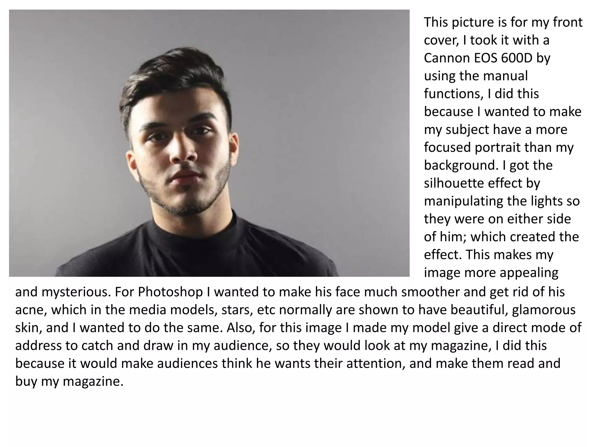
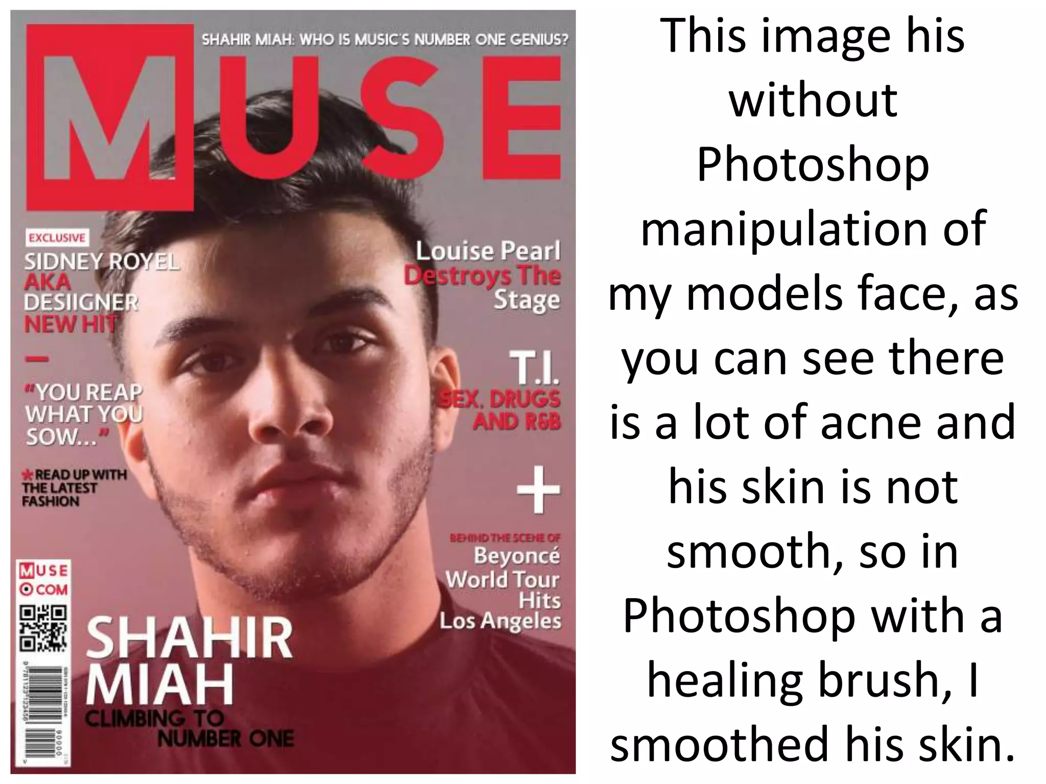
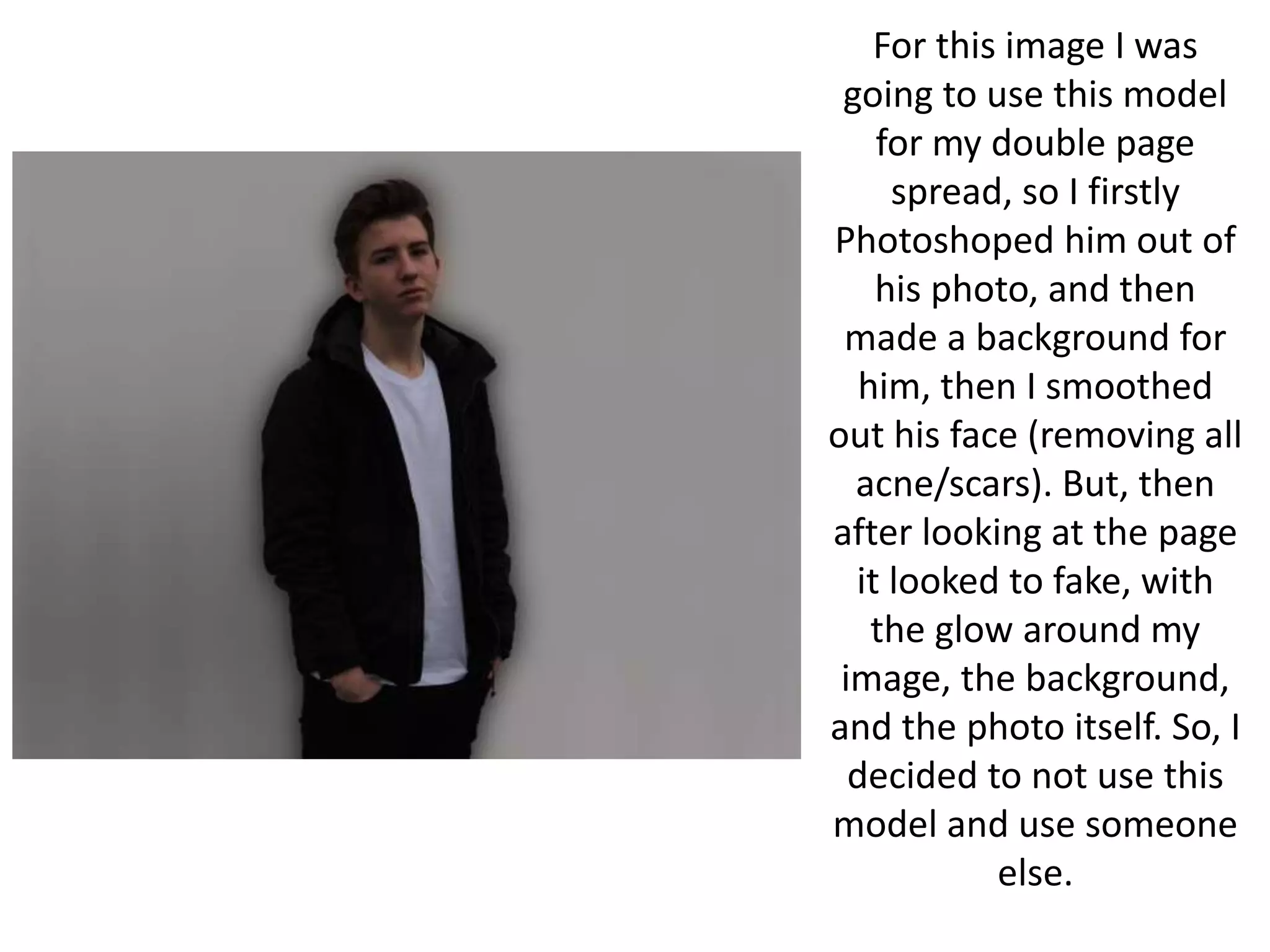
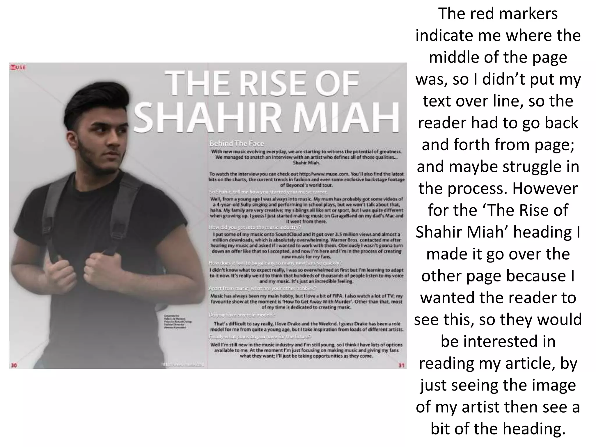
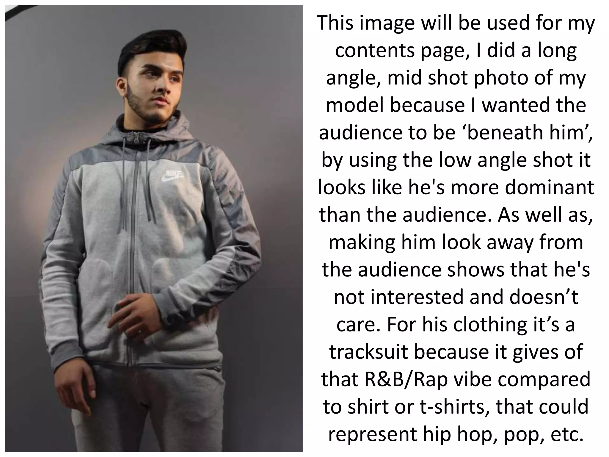
Final Outcome Photoshop
Manipulation
This picture is for my front
cover, I took it with a
Cannon EOS 600D by
using the manual
functions, I did this
because I wanted to make
my subject have a more
focused portrait than my
background. I got the
silhouette effect by
manipulating the lights so
they were on either side
of him; which created the
effect. This makes my
image more appealing
and mysterious. For Photoshop I wanted to make his face much smoother and get rid of his
acne, which in the media models, stars, etc normally are shown to have beautiful, glamorous
skin, and I wanted to do the same. Also, for this image I made my model give a direct mode of
address to catch and draw in my audience, so they would look at my magazine, I did this
because it would make audiences think he wants their attention, and make them read and
buy my magazine.
This image his
without
Photoshop
manipulation of
my models face, as
you can see there
is a lot of acne and
his skin is not
smooth, so in
Photoshop with a
healing brush, I
smoothed his skin.
This is
the
outcome
of no
acne on
his face.
After, sorting and
rearranging my text,
the cover looked
too simple and not
eye-appealing
enough, so I made a
drop shadow effect
on my text, this just
gave a tiny detail to
the font, but made I
much pleasing to
look at.
For this image I
wanted it for my
double page spread
because of how he's
trying to show off his
muscle, which shows
his masculinity as
well as trying to
impress. Also, he's
got his bag on which
helps show that
R&B/Rap vibe.
However, the image
is really dull, so on
Photoshop I will
have to increase the
brightness and
contrast, as well as,
smooth his skin.
Compared to my
draft double page
spread, the text is
on the left side, and
in my opinion I
much prefer, as well
as I tried to make
my magazine look
sophisticated by
putting his arm on
the other page, so
when the reader
folds the page the
text will be going
around his arm.
Also, the red really
backs up my house
style. In addition, I
added @Muse
social media at the
bottom so people
can get more info or
follow muse to get
the latest.
For this image I was
going to use this model
for my double page
spread, so I firstly
Photoshoped him out of
his photo, and then
made a background for
him, then I smoothed
out his face (removing all
acne/scars). But, then
after looking at the page
it looked to fake, with
the glow around my
image, the background,
and the photo itself. So, I
decided to not use this
model and use someone
else.
For this image, I was going to
use it for my double page
spread, but then decided not to
because it didn’t give me that
feel of a double page spread, as
well as, the page didn’t look
appealing to me. However I
made a draft copy and started
to fiddle around with it. Firstly, I
smoothed my models face out
removing all acne, scars, etc.
Then I wanted the image to
brighter, so on Photoshop I
increased the brightness and
lowered the contrast, so it
wouldn’t make the image look
distorted.
The red markers
indicate me where the
middle of the page
was, so I didn’t put my
text over line, so the
reader had to go back
and forth from page;
and maybe struggle in
the process. However
for the ‘The Rise of
Shahir Miah’ heading I
made it go over the
other page because I
wanted the reader to
see this, so they would
be interested in
reading my article, by
just seeing the image
of my artist then see a
bit of the heading.
This is the
double page
spread
without the
lines, as well
as, my image
without any
manipulation
to his face.
After, playing
around with the
image and
background, the
white text looked
to dull, and not
appealing, so I
decided to use a
bit of red to add a
bit on contrast
through the page
,as well as
keeping a house
style of red, after
that I gave a drop
shadow to my
heading to give a
subtle detail to
improve the look
of my page.
This is just a draft
of my contents
page, which I
wanted to see how
it look with this
model, I really
liked the outcome
of the page, but it
really didn’t fit
with my music
genre, so I decided
to scrap it.
This is another draft copy
of my contents page as
well with a different
model, I firstly wanted to
reduce the amount of
acne on my model face
and reduce the redness,
so I would do this first on
Photoshop, as well as, I
wanted to brighten the
image just a bit more and
increase a bit of the
contrast, so I could get my
models features to pop.
This is before
any
Photoshop
manipulation
of my
models
image.
This after
Photoshoping my
models face and
brightening the
image and contrast.
As you can see my
models face is still
quite pink/red, but I
left this because I
didn’t want to make
him look lifeless
and dead.
Like my double page
spread the look of the
page looked double
with just black and
white colour scheme,
but adding that red
just make the page
more appealing, so I
decided to give my sub
heading of ‘Features’
and ‘Fashion’ a red
font to give the subtly
of the page.
This image will be used for my
contents page, I did a long
angle, mid shot photo of my
model because I wanted the
audience to be ‘beneath him’,
by using the low angle shot it
looks like he's more dominant
than the audience. As well as,
making him look away from
the audience shows that he's
not interested and doesn’t
care. For his clothing it’s a
tracksuit because it gives of
that R&B/Rap vibe compared
to shirt or t-shirts, that could
represent hip hop, pop, etc.
After putting
the page
together I
realised its too
bland, and not
enough to draw
people in,
however I liked
the subtly of
the red.
So, I changed the
colour of the text
from black to white,
which changed the
page drastically in my
opinion, and then I
got rid of the white
gradient that was
cover the whole
page, which also
made the page look
more pleasing to look
at.

Final Product Photoshop

  • 1.
  • 2.
    This picture isfor my front cover, I took it with a Cannon EOS 600D by using the manual functions, I did this because I wanted to make my subject have a more focused portrait than my background. I got the silhouette effect by manipulating the lights so they were on either side of him; which created the effect. This makes my image more appealing and mysterious. For Photoshop I wanted to make his face much smoother and get rid of his acne, which in the media models, stars, etc normally are shown to have beautiful, glamorous skin, and I wanted to do the same. Also, for this image I made my model give a direct mode of address to catch and draw in my audience, so they would look at my magazine, I did this because it would make audiences think he wants their attention, and make them read and buy my magazine.
  • 3.
    This image his without Photoshop manipulationof my models face, as you can see there is a lot of acne and his skin is not smooth, so in Photoshop with a healing brush, I smoothed his skin.
  • 4.
  • 5.
    After, sorting and rearrangingmy text, the cover looked too simple and not eye-appealing enough, so I made a drop shadow effect on my text, this just gave a tiny detail to the font, but made I much pleasing to look at.
  • 6.
    For this imageI wanted it for my double page spread because of how he's trying to show off his muscle, which shows his masculinity as well as trying to impress. Also, he's got his bag on which helps show that R&B/Rap vibe. However, the image is really dull, so on Photoshop I will have to increase the brightness and contrast, as well as, smooth his skin.
  • 7.
    Compared to my draftdouble page spread, the text is on the left side, and in my opinion I much prefer, as well as I tried to make my magazine look sophisticated by putting his arm on the other page, so when the reader folds the page the text will be going around his arm. Also, the red really backs up my house style. In addition, I added @Muse social media at the bottom so people can get more info or follow muse to get the latest.
  • 8.
    For this imageI was going to use this model for my double page spread, so I firstly Photoshoped him out of his photo, and then made a background for him, then I smoothed out his face (removing all acne/scars). But, then after looking at the page it looked to fake, with the glow around my image, the background, and the photo itself. So, I decided to not use this model and use someone else.
  • 9.
    For this image,I was going to use it for my double page spread, but then decided not to because it didn’t give me that feel of a double page spread, as well as, the page didn’t look appealing to me. However I made a draft copy and started to fiddle around with it. Firstly, I smoothed my models face out removing all acne, scars, etc. Then I wanted the image to brighter, so on Photoshop I increased the brightness and lowered the contrast, so it wouldn’t make the image look distorted.
  • 10.
    The red markers indicateme where the middle of the page was, so I didn’t put my text over line, so the reader had to go back and forth from page; and maybe struggle in the process. However for the ‘The Rise of Shahir Miah’ heading I made it go over the other page because I wanted the reader to see this, so they would be interested in reading my article, by just seeing the image of my artist then see a bit of the heading.
  • 11.
    This is the doublepage spread without the lines, as well as, my image without any manipulation to his face.
  • 13.
    After, playing around withthe image and background, the white text looked to dull, and not appealing, so I decided to use a bit of red to add a bit on contrast through the page ,as well as keeping a house style of red, after that I gave a drop shadow to my heading to give a subtle detail to improve the look of my page.
  • 14.
    This is justa draft of my contents page, which I wanted to see how it look with this model, I really liked the outcome of the page, but it really didn’t fit with my music genre, so I decided to scrap it.
  • 15.
    This is anotherdraft copy of my contents page as well with a different model, I firstly wanted to reduce the amount of acne on my model face and reduce the redness, so I would do this first on Photoshop, as well as, I wanted to brighten the image just a bit more and increase a bit of the contrast, so I could get my models features to pop.
  • 16.
  • 17.
    This after Photoshoping my modelsface and brightening the image and contrast. As you can see my models face is still quite pink/red, but I left this because I didn’t want to make him look lifeless and dead.
  • 18.
    Like my doublepage spread the look of the page looked double with just black and white colour scheme, but adding that red just make the page more appealing, so I decided to give my sub heading of ‘Features’ and ‘Fashion’ a red font to give the subtly of the page.
  • 19.
    This image willbe used for my contents page, I did a long angle, mid shot photo of my model because I wanted the audience to be ‘beneath him’, by using the low angle shot it looks like he's more dominant than the audience. As well as, making him look away from the audience shows that he's not interested and doesn’t care. For his clothing it’s a tracksuit because it gives of that R&B/Rap vibe compared to shirt or t-shirts, that could represent hip hop, pop, etc.
  • 20.
    After putting the page togetherI realised its too bland, and not enough to draw people in, however I liked the subtly of the red.
  • 21.
    So, I changedthe colour of the text from black to white, which changed the page drastically in my opinion, and then I got rid of the white gradient that was cover the whole page, which also made the page look more pleasing to look at.