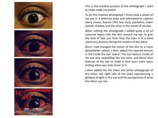
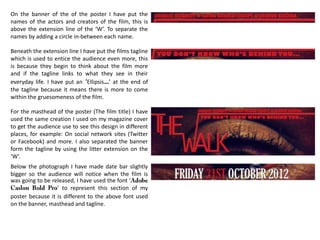
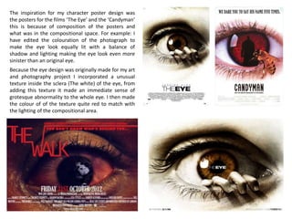
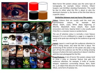
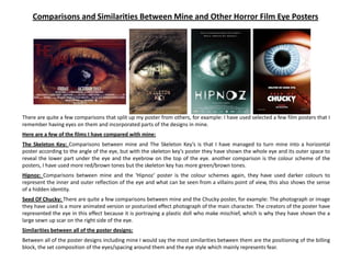
Film Poster Analysis
Shanice.S©
This is the creative process of the photograph I used
to make make my poster.
To do this creative photograph I firstly took a photo of
my eye in a widened state and attempted to capture
every crease, feature (The tear duct, eyelashes, lower
eyelid), shadow and the veins in the inside of my eye.
When editing the photograph I added quite a lot of
coloured layers into the skin around my eye to give
the look of fear just from how the eyes is in a fixed
stationary position facing the viewers of the piece.
Once I had changed the colour of the skin to a more
deep/darker colour, I then added the layered texture
in the inside the eye ‘sclera’. The hair texture inside of
my eye also resembled the the veins and blood shot
features of my eye to make it look even more spine
chilling when you look closer to it.
I then added the the black and white photograph of
the villain the right side of the pupil representing a
glimpse of light in the eye and the perspective of what
the villain can see.
On the banner of the of the poster I have put the
names of the actors and creators of the film, this is
above the extension line of the ‘W’. To separate the
names by adding a circle in-between each name.
Beneath the extension line I have put the films tagline
which is used to entice the audience even more, this
is because they begin to think about the film more
and if the tagline links to what they see in their
everyday life. I have put an ‘Ellipsis…’ at the end of
the tagline because it means there is more to come
within the gruesomeness of the film.
For the masthead of the poster (The film title) I have
used the same creation I used on my magazine cover
to get the audience use to see this design in different
places, for example: On social network sites (Twitter
or Facebook) and more. I also separated the banner
form the tagline by using the litter extension on the
‘W’.
Below the photograph I have made date bar slightly
bigger so the audience will notice when the film is
was going to be released, I have used the font ‘
’ to represent this section of my
poster because it is different to the above font used
on the banner, masthead and tagline.
To create the billing I used the billing block of ‘The Eye’ poster as a template and a breakdown billing block Ben Schott of The New York
Times did as a template for media students. from using these two different design billing blocks I managed to make a similar layout on
mine.
My billing block consists of the Production companies, The associating company, Music, Costume designer Editing, Production
design, Director of production, Line producer, Executive Producers, What the film was based on and Screenplay.
Besides the last line of the billing block I have put the production companies logo I used which was ‘New Line Cinema’ and I made my
own production company logo inspired my A2 Media Studies subject called ‘A2 Media Production’, I have done these in a light grey colour
to layer on top of the dark colour of the right side of the photograph. And bellow the the last line of the billing block I have put the films
website in the same colour as the billing block.
The inspiration for my character poster design was
the posters for the films ‘The Eye’ and the ‘Candyman’
this is because of composition of the posters and
what was in the compositional space. For example: I
have edited the colouration of the photograph to
make the eye look equally lit with a balance of
shadow and lighting making the eye look even more
sinister than an original eye.
Because the eye design was originally made for my art
and photography project I incorporated a unusual
texture inside the sclera (The white) of the eye, from
adding this texture it made an immediate sense of
grotesque abnormality to the whole eye. I then made
the colour of of the texture quite red to match with
the lighting of the compositional area.
Most horror film posters always uses the same type of
iconography, for example: Colour Scheme, Villain/
Suspect, Last Girl/Man standing Character(s). This could
be due to either what the film is about or who the
dominant character is, the theme of the film that links to
a specific colour.
Similarities between most eye horror film posters:
Colour: Colours that are usually used the most are
representation colours, for example: Red
(Blood, Death, Love), White (New beginning or
Afterlife, Black/Dark Tones (Death, Near death
encounters and more, Swamp Green is also usually used
if the film is a monster movie or zombie horror.
The use of selective colour is normally a main feature
because if it is on a billboard or a page in a magazine it
needs to be quite eye-catching for the audience to go and
see it.
Layout: Layout is used to get the audiences attention to
what is being shown, also what the film is about. The
positioning of the content on the poster also plays a big
part of how the audience see the film as being amazing
because of where the text is placed so it doesn’t interfere
with the main photograph for the film.
Props/Features: A lot of horror film posters always tend
to show a prop or character feature that gets the
audiences attention, for example: A knife or murder
weapon, mysterious surrounding (House, Barn, Hotel
etc…), an object that obscures the main character(s) face
(Mask, some form of eyewear etc..
Comparisons and Similarities Between Mine and Other Horror Film Eye Posters
There are quite a few comparisons that split up my poster from others, for example: I have used selected a few film posters that I
remember having eyes on them and incorporated parts of the designs in mine.
Here are a few of the films I have compared with mine:
The Skeleton Key: Comparisons between mine and The Skeleton Key’s is that I have managed to turn mine into a horizontal
poster according to the angle of the eye, but with the skeleton key’s poster they have shown the whole eye and its outer space to
reveal the lower part under the eye and the eyebrow on the top of the eye. another comparison is the colour scheme of the
posters, I have used more red/brown tones but the skeleton key has more green/brown tones.
Hipnoz: Comparisons between mine and the ‘Hipnoz’ poster is the colour schemes again, they have used darker colours to
represent the inner and outer reflection of the eye and what can be seen from a villains point of view, this also shows the sense
of a hidden identity.
Seed Of Chucky: There are quite a few comparisons between mine and the Chucky poster, for example: The photograph or image
they have used is a more animated version or posturized effect photograph of the main character. The creators of the poster have
represented the eye in this effect because it is portraying a plastic doll who make mischief, which is why they have shown the a
large sewn up scar on the right side of the eye.
Similarities between all of the poster designs:
Between all of the poster designs including mine I would say the most similarities between them are the positioning of the billing
block, the set composition of the eyes/spacing around them and the eye style which mainly represents fear.

Film poster analysis eye

  • 1.
  • 2.
    This is thecreative process of the photograph I used to make make my poster. To do this creative photograph I firstly took a photo of my eye in a widened state and attempted to capture every crease, feature (The tear duct, eyelashes, lower eyelid), shadow and the veins in the inside of my eye. When editing the photograph I added quite a lot of coloured layers into the skin around my eye to give the look of fear just from how the eyes is in a fixed stationary position facing the viewers of the piece. Once I had changed the colour of the skin to a more deep/darker colour, I then added the layered texture in the inside the eye ‘sclera’. The hair texture inside of my eye also resembled the the veins and blood shot features of my eye to make it look even more spine chilling when you look closer to it. I then added the the black and white photograph of the villain the right side of the pupil representing a glimpse of light in the eye and the perspective of what the villain can see.
  • 3.
    On the bannerof the of the poster I have put the names of the actors and creators of the film, this is above the extension line of the ‘W’. To separate the names by adding a circle in-between each name. Beneath the extension line I have put the films tagline which is used to entice the audience even more, this is because they begin to think about the film more and if the tagline links to what they see in their everyday life. I have put an ‘Ellipsis…’ at the end of the tagline because it means there is more to come within the gruesomeness of the film. For the masthead of the poster (The film title) I have used the same creation I used on my magazine cover to get the audience use to see this design in different places, for example: On social network sites (Twitter or Facebook) and more. I also separated the banner form the tagline by using the litter extension on the ‘W’. Below the photograph I have made date bar slightly bigger so the audience will notice when the film is was going to be released, I have used the font ‘ ’ to represent this section of my poster because it is different to the above font used on the banner, masthead and tagline.
  • 4.
    To create thebilling I used the billing block of ‘The Eye’ poster as a template and a breakdown billing block Ben Schott of The New York Times did as a template for media students. from using these two different design billing blocks I managed to make a similar layout on mine. My billing block consists of the Production companies, The associating company, Music, Costume designer Editing, Production design, Director of production, Line producer, Executive Producers, What the film was based on and Screenplay. Besides the last line of the billing block I have put the production companies logo I used which was ‘New Line Cinema’ and I made my own production company logo inspired my A2 Media Studies subject called ‘A2 Media Production’, I have done these in a light grey colour to layer on top of the dark colour of the right side of the photograph. And bellow the the last line of the billing block I have put the films website in the same colour as the billing block.
  • 5.
    The inspiration formy character poster design was the posters for the films ‘The Eye’ and the ‘Candyman’ this is because of composition of the posters and what was in the compositional space. For example: I have edited the colouration of the photograph to make the eye look equally lit with a balance of shadow and lighting making the eye look even more sinister than an original eye. Because the eye design was originally made for my art and photography project I incorporated a unusual texture inside the sclera (The white) of the eye, from adding this texture it made an immediate sense of grotesque abnormality to the whole eye. I then made the colour of of the texture quite red to match with the lighting of the compositional area.
  • 6.
    Most horror filmposters always uses the same type of iconography, for example: Colour Scheme, Villain/ Suspect, Last Girl/Man standing Character(s). This could be due to either what the film is about or who the dominant character is, the theme of the film that links to a specific colour. Similarities between most eye horror film posters: Colour: Colours that are usually used the most are representation colours, for example: Red (Blood, Death, Love), White (New beginning or Afterlife, Black/Dark Tones (Death, Near death encounters and more, Swamp Green is also usually used if the film is a monster movie or zombie horror. The use of selective colour is normally a main feature because if it is on a billboard or a page in a magazine it needs to be quite eye-catching for the audience to go and see it. Layout: Layout is used to get the audiences attention to what is being shown, also what the film is about. The positioning of the content on the poster also plays a big part of how the audience see the film as being amazing because of where the text is placed so it doesn’t interfere with the main photograph for the film. Props/Features: A lot of horror film posters always tend to show a prop or character feature that gets the audiences attention, for example: A knife or murder weapon, mysterious surrounding (House, Barn, Hotel etc…), an object that obscures the main character(s) face (Mask, some form of eyewear etc..
  • 7.
    Comparisons and SimilaritiesBetween Mine and Other Horror Film Eye Posters There are quite a few comparisons that split up my poster from others, for example: I have used selected a few film posters that I remember having eyes on them and incorporated parts of the designs in mine. Here are a few of the films I have compared with mine: The Skeleton Key: Comparisons between mine and The Skeleton Key’s is that I have managed to turn mine into a horizontal poster according to the angle of the eye, but with the skeleton key’s poster they have shown the whole eye and its outer space to reveal the lower part under the eye and the eyebrow on the top of the eye. another comparison is the colour scheme of the posters, I have used more red/brown tones but the skeleton key has more green/brown tones. Hipnoz: Comparisons between mine and the ‘Hipnoz’ poster is the colour schemes again, they have used darker colours to represent the inner and outer reflection of the eye and what can be seen from a villains point of view, this also shows the sense of a hidden identity. Seed Of Chucky: There are quite a few comparisons between mine and the Chucky poster, for example: The photograph or image they have used is a more animated version or posturized effect photograph of the main character. The creators of the poster have represented the eye in this effect because it is portraying a plastic doll who make mischief, which is why they have shown the a large sewn up scar on the right side of the eye. Similarities between all of the poster designs: Between all of the poster designs including mine I would say the most similarities between them are the positioning of the billing block, the set composition of the eyes/spacing around them and the eye style which mainly represents fear.