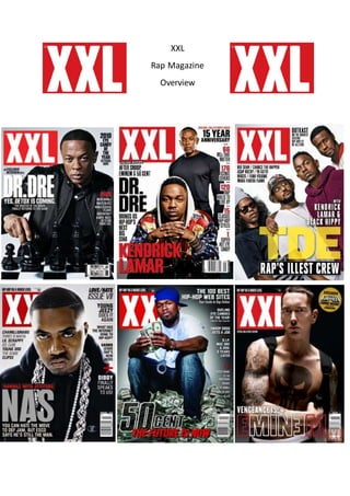
XXL 
Rap Magazine 
Overview
These are my 6 different front covers that have appeared in the rap magazine that is XXL. This is an 
overview of the rap magazine XXL in which I am going to cover the similarities and differences 
between each magazine. 
One similarity throughout XXL’s magazines is the logo XXL. You can see that they have the same text 
types in each issue. One example is the title of XXL and that in each issue it is placed in the same 
place and is the same colour, text size and text style. This is to create and keep a brand identity so 
then the target audience and customers will know what to look for to know it is a XXL magazine. As 
you can see from the images the XXL logo is a reoccurring theme to the magazine. Furthermore 
because of this they have created a brand identity so they can place hip hop artists in front of the 
logo because people are still going to know it is the magazine XXL. 
Another similarity of these magazines are that they have a reoccurring theme of the text being big 
and bold with the use of black and red mainly. This is because the magazine is mainly aimed towards 
young males so in order for the magazine to appeal to a young male from the working class it should 
have masculine colours because this is what they prefer over say a pop magazine with bright bubbly 
colours. So the colours red and black do this job well and the magazine uses these colours mainly in 
each issue. 
From looking at a lot of rap magazine front covers, most artists have a straight, plain face with the 
emotions of aggression and serious. This is because rap artists want to be taken seriously and want 
to be seen as a strong and tough male figure. Having this theme throughout every artist on the front 
cover of most XXL magazines they can really relate to hip hop fans and so people will know that that 
magazine is a rap one. In addition to this, there is a common costume theme of the artists in each 
issue of XXL magazines. The costumes usually follow dark clothing or plain white t -shirts and lots of 
jewellery and tattoos. 
However XXL sometimes breaks away from the common theme as we can see in the first image with 
Dr Dre playing chess. This shows us that he is a tactical player in the game of rap and that he controls 
what goes on in the hip hop society, which he is boss so to speak. Also on that particular front cover 
because it is the end of the year issue you can see that it says “2010 Eye Candy of the Year” which 
most magazines don’t have. This will add additional features to the magazine and will appeal to the 
target audience even further because they are mostly seen to be young males, so they will be 
interested in this sell line.

Overview For Rap Magazines

  • 1.
  • 2.
    These are my6 different front covers that have appeared in the rap magazine that is XXL. This is an overview of the rap magazine XXL in which I am going to cover the similarities and differences between each magazine. One similarity throughout XXL’s magazines is the logo XXL. You can see that they have the same text types in each issue. One example is the title of XXL and that in each issue it is placed in the same place and is the same colour, text size and text style. This is to create and keep a brand identity so then the target audience and customers will know what to look for to know it is a XXL magazine. As you can see from the images the XXL logo is a reoccurring theme to the magazine. Furthermore because of this they have created a brand identity so they can place hip hop artists in front of the logo because people are still going to know it is the magazine XXL. Another similarity of these magazines are that they have a reoccurring theme of the text being big and bold with the use of black and red mainly. This is because the magazine is mainly aimed towards young males so in order for the magazine to appeal to a young male from the working class it should have masculine colours because this is what they prefer over say a pop magazine with bright bubbly colours. So the colours red and black do this job well and the magazine uses these colours mainly in each issue. From looking at a lot of rap magazine front covers, most artists have a straight, plain face with the emotions of aggression and serious. This is because rap artists want to be taken seriously and want to be seen as a strong and tough male figure. Having this theme throughout every artist on the front cover of most XXL magazines they can really relate to hip hop fans and so people will know that that magazine is a rap one. In addition to this, there is a common costume theme of the artists in each issue of XXL magazines. The costumes usually follow dark clothing or plain white t -shirts and lots of jewellery and tattoos. However XXL sometimes breaks away from the common theme as we can see in the first image with Dr Dre playing chess. This shows us that he is a tactical player in the game of rap and that he controls what goes on in the hip hop society, which he is boss so to speak. Also on that particular front cover because it is the end of the year issue you can see that it says “2010 Eye Candy of the Year” which most magazines don’t have. This will add additional features to the magazine and will appeal to the target audience even further because they are mostly seen to be young males, so they will be interested in this sell line.