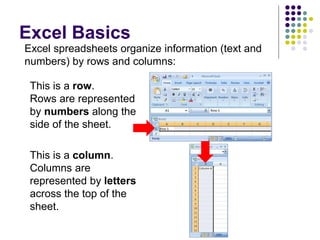
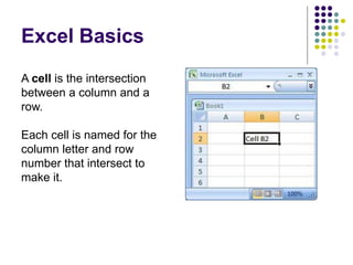
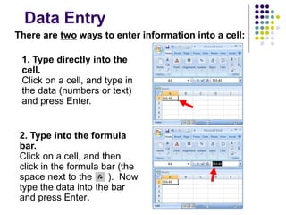
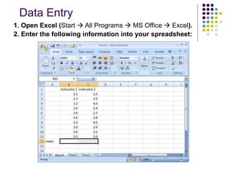
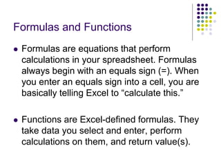
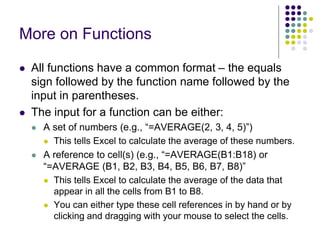
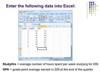
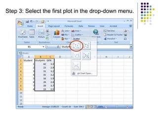
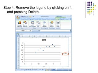
Introduction to Excel 2007
Part 1: Basics and Descriptive Statistics
Psych 209
In Psych 209, we will use Excel to:
1. Store and organize data,
2. Analyze data, and
3. Represent data graphically (e.g., in bar
graphs, histograms, and scatterplots)
Excel Basics
This is a row.
Rows are represented
by numbers along the
side of the sheet.
This is a column.
Columns are
represented by letters
across the top of the
sheet.
Excel spreadsheets organize information (text and
numbers) by rows and columns:
Excel Basics
A cell is the intersection
between a column and a
row.
Each cell is named for the
column letter and row
number that intersect to
make it.
Data Entry
There are two ways to enter information into a cell:
1. Type directly into the
cell.
Click on a cell, and type in
the data (numbers or text)
and press Enter.
2. Type into the formula
bar.
Click on a cell, and then
click in the formula bar (the
space next to the ). Now
type the data into the bar
and press Enter.
Data Entry
1. Open Excel (Start  All Programs  MS Office  Excel).
2. Enter the following information into your spreadsheet:
Formulas and Functions
 Formulas are equations that perform
calculations in your spreadsheet. Formulas
always begin with an equals sign (=). When
you enter an equals sign into a cell, you are
basically telling Excel to “calculate this.”
 Functions are Excel-defined formulas. They
take data you select and enter, perform
calculations on them, and return value(s).
More on Functions
 All functions have a common format – the equals
sign followed by the function name followed by the
input in parentheses.
 The input for a function can be either:
 A set of numbers (e.g., “=AVERAGE(2, 3, 4, 5)”)
 This tells Excel to calculate the average of these numbers.
 A reference to cell(s) (e.g., “=AVERAGE(B1:B18) or
“=AVERAGE (B1, B2, B3, B4, B5, B6, B7, B8)”
 This tells Excel to calculate the average of the data that
appear in all the cells from B1 to B8.
 You can either type these cell references in by hand or by
clicking and dragging with your mouse to select the cells.
Functions for Descriptive Statistics
=AVERAGE(first cell:last cell): calculates the mean
=MEDIAN(first cell:last cell): calculates the median
=MODE(first cell:last cell): calculates the mode
=VARP(first cell:last cell): calculates the variance
=STDEVP(first cell:last cell): calculates the standard deviation
 You may directly write the functions for these statistics into
cells or the formula bar, OR
 You may use the function wizard ( in the toolbar)
Below are several functions you will need to
learn for this class. Try them out with the
practice data set.
Functions for Descriptive Statistics
 Your Excel
spreadsheet should
now look like this:
Part 2: Scatterplots
Enter the following data into Excel:
StudyHrs = average number of hours spent per week studying for 209
GPA = grade-point average earned in 209 at the end of the quarter
Scatterplots
 A scatterplot is an excellent way to visually
display the relationship (correlation) between
two variables.
 Each point on the scatterplot represents an
individual’s data on the two variables.
 We will now create a scatterplot for StudyHrs
and GPA.
Step 1: Select both columns of variables you
wish to plot (StudyHrs and GPA).
Step 2: Click on the tab labeled ‘Insert’, and then
select ‘Scatter’ in the ‘Charts’ menu.
Step 3: Select the first plot in the drop-down menu.
Step 4: Remove the legend by clicking on it
and pressing Delete.
Step 5: Add axis titles by selecting the ‘Layout’ tab
and clicking on ‘Axis Titles.’ For the horizontal title,
you want it below the x-axis. For the vertical title,
you want the ‘Rotated Title’ option.
NOTE: Your chart
must be
highlighted for
the ‘Layout’ tab to
appear under
‘Chart Tools.’
 For scatterplots, it does not matter which variable
goes on each axis (this is NOT true for other
types of charts).
 However, you need to make sure you label your
axes with the proper variable name.
 In this example, GPA is on the y-axis and Study
Hours is on the x-axis (we can tell this based on
their different ranges of values).
 As a helpful hint, Excel will automatically put the
first variable (left-hand column) on the x-axis, and
the second variable (right-hand column) on the y-
axis.
A note about x- and y-axes:
Step 6: Change the chart title by selecting it, typing a
new one, and pressing Enter. Chart and axis titles
may be altered by right-clicking on them.
Your scatterplot is now finished!
Remember: Each point in the scatterplot represents an
individual’s data.
Knowledge check: Identify Student 8 in the scatterplot.
Describing Correlations and
Scatterplots
 Scatterplots and correlations are described:
 As positive or negative.
 As weak, moderate, or strong.
 Using the r value.
 Sentence 1: There is a strong, positive correlation (r = 0.88)
between the number of hours studied and GPA.
 Then you want to describe the general relationship
between the two variables:
 Sentence 2: More hours of studying for Psych 209 was
associated with a higher GPA earned in the class at the end of
the quarter.
 NOTE: We cannot say “More studying led to a higher
GPA” – this implies causation, which cannot be
determined using correlational research.

Excel Basics.ppt

  • 1.
    Introduction to Excel2007 Part 1: Basics and Descriptive Statistics Psych 209
  • 2.
    In Psych 209,we will use Excel to: 1. Store and organize data, 2. Analyze data, and 3. Represent data graphically (e.g., in bar graphs, histograms, and scatterplots)
  • 3.
    Excel Basics This isa row. Rows are represented by numbers along the side of the sheet. This is a column. Columns are represented by letters across the top of the sheet. Excel spreadsheets organize information (text and numbers) by rows and columns:
  • 4.
    Excel Basics A cellis the intersection between a column and a row. Each cell is named for the column letter and row number that intersect to make it.
  • 5.
    Data Entry There aretwo ways to enter information into a cell: 1. Type directly into the cell. Click on a cell, and type in the data (numbers or text) and press Enter. 2. Type into the formula bar. Click on a cell, and then click in the formula bar (the space next to the ). Now type the data into the bar and press Enter.
  • 6.
    Data Entry 1. OpenExcel (Start  All Programs  MS Office  Excel). 2. Enter the following information into your spreadsheet:
  • 7.
    Formulas and Functions Formulas are equations that perform calculations in your spreadsheet. Formulas always begin with an equals sign (=). When you enter an equals sign into a cell, you are basically telling Excel to “calculate this.”  Functions are Excel-defined formulas. They take data you select and enter, perform calculations on them, and return value(s).
  • 8.
    More on Functions All functions have a common format – the equals sign followed by the function name followed by the input in parentheses.  The input for a function can be either:  A set of numbers (e.g., “=AVERAGE(2, 3, 4, 5)”)  This tells Excel to calculate the average of these numbers.  A reference to cell(s) (e.g., “=AVERAGE(B1:B18) or “=AVERAGE (B1, B2, B3, B4, B5, B6, B7, B8)”  This tells Excel to calculate the average of the data that appear in all the cells from B1 to B8.  You can either type these cell references in by hand or by clicking and dragging with your mouse to select the cells.
  • 9.
    Functions for DescriptiveStatistics =AVERAGE(first cell:last cell): calculates the mean =MEDIAN(first cell:last cell): calculates the median =MODE(first cell:last cell): calculates the mode =VARP(first cell:last cell): calculates the variance =STDEVP(first cell:last cell): calculates the standard deviation  You may directly write the functions for these statistics into cells or the formula bar, OR  You may use the function wizard ( in the toolbar) Below are several functions you will need to learn for this class. Try them out with the practice data set.
  • 10.
    Functions for DescriptiveStatistics  Your Excel spreadsheet should now look like this:
  • 11.
  • 12.
    Enter the followingdata into Excel: StudyHrs = average number of hours spent per week studying for 209 GPA = grade-point average earned in 209 at the end of the quarter
  • 13.
    Scatterplots  A scatterplotis an excellent way to visually display the relationship (correlation) between two variables.  Each point on the scatterplot represents an individual’s data on the two variables.  We will now create a scatterplot for StudyHrs and GPA.
  • 14.
    Step 1: Selectboth columns of variables you wish to plot (StudyHrs and GPA). Step 2: Click on the tab labeled ‘Insert’, and then select ‘Scatter’ in the ‘Charts’ menu.
  • 15.
    Step 3: Selectthe first plot in the drop-down menu.
  • 16.
    Step 4: Removethe legend by clicking on it and pressing Delete.
  • 17.
    Step 5: Addaxis titles by selecting the ‘Layout’ tab and clicking on ‘Axis Titles.’ For the horizontal title, you want it below the x-axis. For the vertical title, you want the ‘Rotated Title’ option. NOTE: Your chart must be highlighted for the ‘Layout’ tab to appear under ‘Chart Tools.’
  • 18.
     For scatterplots,it does not matter which variable goes on each axis (this is NOT true for other types of charts).  However, you need to make sure you label your axes with the proper variable name.  In this example, GPA is on the y-axis and Study Hours is on the x-axis (we can tell this based on their different ranges of values).  As a helpful hint, Excel will automatically put the first variable (left-hand column) on the x-axis, and the second variable (right-hand column) on the y- axis. A note about x- and y-axes:
  • 19.
    Step 6: Changethe chart title by selecting it, typing a new one, and pressing Enter. Chart and axis titles may be altered by right-clicking on them.
  • 20.
    Your scatterplot isnow finished! Remember: Each point in the scatterplot represents an individual’s data. Knowledge check: Identify Student 8 in the scatterplot.
  • 21.
    Describing Correlations and Scatterplots Scatterplots and correlations are described:  As positive or negative.  As weak, moderate, or strong.  Using the r value.  Sentence 1: There is a strong, positive correlation (r = 0.88) between the number of hours studied and GPA.  Then you want to describe the general relationship between the two variables:  Sentence 2: More hours of studying for Psych 209 was associated with a higher GPA earned in the class at the end of the quarter.  NOTE: We cannot say “More studying led to a higher GPA” – this implies causation, which cannot be determined using correlational research.