“Oh GOSH! Reflecting on Hackteria's Collaborative Practices in a Global Do-It...
Evaluation question 2
1. How effective is the Combination of your Main Product
and Ancillary Texts?
I feel that the combination of our short film with
our poster and magazine cover were very
effective. I believe this because I know we used
successful examples of real media texts to
base our ancillary products on.
For example, for our magazine cover we used
the real film magazine ‘Empire’ for our
template. We took pictures of several different
Empire magazines and said what we liked from
each one, for example on each magazine we
liked how the colour of text connoted a different
meaning.
For example, here we said that the golden font
represented royalty and pride, whereas on our
front cover we used red because it is a very
conventional colour to do with romance, in the
same way that gold is directly linked to wealth
and money.
We used a different, darker shade of red for
our Headlines because we know from
researching and from what ideologies we have
been taught, that dark red is a very passionate,
romantic colour.
For our poster we use posters
from successful films with a
similar run to the story such as
Titanic with the love
triangle and Schindler’s
List with the one item in
colour in a black and
white film.
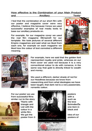
We got the idea of our
poster from 3 posters of
2. different, but successful films, Schindler’s List, Pride and
Prejudice and Titanic. Similar to the magazines, we picked things
we liked from each one and incorporated it into our own work, to
make it look more professional and help it to be more successful.
The poster we used for the basic layout was the Pride and
Prejudice poster (shown on the left)We particularly liked the way
that the banner separated the page to show 2 different images.
The body language of the couple was something we felt was
really important because we wanted to show they were in love,
but we also wanted to shown that there is a twist to the story.
We used colours to darken William’s hair in the photograph so it
looks like he is hiding in the dark as her dirty secret. However the
passionate love can be shown thorough the way she is gazing
into his eyes. The inspiration for this can be see
in this Titanic poster:
Although in this picture it appears Rose isn’t
very interested, you can see the difference in
their clothes and you can see she is looking
away in case anyone sees her, because she is
already engaged, and dating someone of a
lower class was frowned upon!
However, the gentle touching of their heads
and hands together shows that there is love
there, just hidden.
We liked the Schindler’s list poster because,
although there is so much going on in the
pictures, your attention is instantly drawn to the
only colour on the page, the symbolic red.
This is where we got the idea to
put our red rose in with the black and
white poster. We felt the idea of
the little girl in the red coat on the
poster is what made it
successful, therefore if we used it,
we had more chance of success.