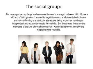
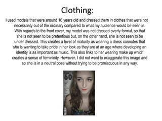
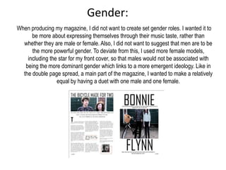
How does your media product represent particular
               social groups?
The social group:
For my magazine, my target audience was those who are aged between 16 to 19 years
     old and of both genders. I wanted to target those who are known to be individual
        and not conforming to a particular stereotype; being known for standing as
      independent and not conforming to the majority. So, these were these are the
       members of the kind of social groups that I wanted to represent to make the
                                 magazine more relatable.
Clothing:
I used models that were around 16 years old and dressed them in clothes that were not
      necessarily out of the ordinary compared to what my audience would be seen in.
      With regards to the front cover, my model was not dressed overly formal, so that
        she is not seen to be pretentious but, on the other hand, she is not seen to be
      under dressed. This creates a level of maturity as wearing a dress connotes that
     she is wanting to take pride in her look as they are at an age where developing an
       identity is as important as music. This also links to her wearing make up which
    creates a sense of femininity. However, I did not want to exaggerate this image and
           so she is in a neutral pose without trying to be promiscuous in any way.
Gender:
When producing my magazine, I did not want to create set gender roles. I wanted it to
      be more about expressing themselves through their music taste, rather than
  whether they are male or female. Also, I did not want to suggest that men are to be
      the more powerful gender. To deviate from this, I used more female models,
    including the star for my front cover, so that males would not be associated with
   being the more dominant gender which links to a more emergent ideology. Like in
  the double page spread, a main part of the magazine, I wanted to make a relatively
                 equal by having a duet with one male and one female.
Title
The title used is “Sixty60” to represent a decade that is influential to
  the social group. It is what determined this kind of genre of music
  and has also help to determine their sort of fashion sense. The
  font style and the effects that I used on the title, also help to
  implement the particular ethos that they are known to follow. The
  sans serif font “Bauhaus 93” is slightly retro and is not pompous or
  overly complex. It links to the fact that they are the kind of people
  who just act naturally and are not set on becoming something that
  they clearly aren’t. The effect used on the title made the title look
  grainy which can be associated with things that are old looking and
  vintage. It shows that they are not focused on looking pristine all
  the time; which also associates with the dominant ideology of this
  age range.
Colours
The colours used throughout the magazine are not very
  bright or variant. The selection it kept to black, white
  and a off shade of red. This links to the specific age
  group that I wanted to represent. Children are more
  likely to be attracted to bright colours that are in your
  face, where as teenagers/young adults are more likely
  to see this unappealing and so it was something that I
  wanted to avoid. Keeping the colour choice quite subtle
  also demonstrates a sense of maturity; something that
  this kind of social group would have encountered by
  now.
Layout
Like the choice of colours, I have also kept the layout
  quite simple. It has allowed me to strip down to the
  very basics in order to create a greater impact;
  something that could be associated with this social
  group. Once again, it shows them to not to cover
  themselves with unnecessary things to make them
  to be something that they aren’t.

Evaluation question 2

  • 1.
    How does yourmedia product represent particular social groups?
  • 2.
    The social group: Formy magazine, my target audience was those who are aged between 16 to 19 years old and of both genders. I wanted to target those who are known to be individual and not conforming to a particular stereotype; being known for standing as independent and not conforming to the majority. So, these were these are the members of the kind of social groups that I wanted to represent to make the magazine more relatable.
  • 3.
    Clothing: I used modelsthat were around 16 years old and dressed them in clothes that were not necessarily out of the ordinary compared to what my audience would be seen in. With regards to the front cover, my model was not dressed overly formal, so that she is not seen to be pretentious but, on the other hand, she is not seen to be under dressed. This creates a level of maturity as wearing a dress connotes that she is wanting to take pride in her look as they are at an age where developing an identity is as important as music. This also links to her wearing make up which creates a sense of femininity. However, I did not want to exaggerate this image and so she is in a neutral pose without trying to be promiscuous in any way.
  • 4.
    Gender: When producing mymagazine, I did not want to create set gender roles. I wanted it to be more about expressing themselves through their music taste, rather than whether they are male or female. Also, I did not want to suggest that men are to be the more powerful gender. To deviate from this, I used more female models, including the star for my front cover, so that males would not be associated with being the more dominant gender which links to a more emergent ideology. Like in the double page spread, a main part of the magazine, I wanted to make a relatively equal by having a duet with one male and one female.
  • 5.
    Title The title usedis “Sixty60” to represent a decade that is influential to the social group. It is what determined this kind of genre of music and has also help to determine their sort of fashion sense. The font style and the effects that I used on the title, also help to implement the particular ethos that they are known to follow. The sans serif font “Bauhaus 93” is slightly retro and is not pompous or overly complex. It links to the fact that they are the kind of people who just act naturally and are not set on becoming something that they clearly aren’t. The effect used on the title made the title look grainy which can be associated with things that are old looking and vintage. It shows that they are not focused on looking pristine all the time; which also associates with the dominant ideology of this age range.
  • 6.
    Colours The colours usedthroughout the magazine are not very bright or variant. The selection it kept to black, white and a off shade of red. This links to the specific age group that I wanted to represent. Children are more likely to be attracted to bright colours that are in your face, where as teenagers/young adults are more likely to see this unappealing and so it was something that I wanted to avoid. Keeping the colour choice quite subtle also demonstrates a sense of maturity; something that this kind of social group would have encountered by now.
  • 7.
    Layout Like the choiceof colours, I have also kept the layout quite simple. It has allowed me to strip down to the very basics in order to create a greater impact; something that could be associated with this social group. Once again, it shows them to not to cover themselves with unnecessary things to make them to be something that they aren’t.