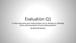
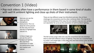
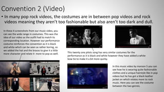
This document discusses conventions used in pop rock music videos and album packaging. It analyzes how the student's media product both reinforces and develops conventions.
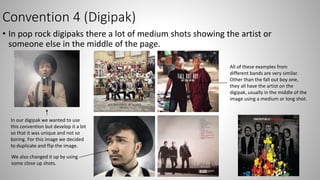
The conventions discussed include: 1) Using well-lit studio performances with close-ups of instruments in music videos 2) Costumes that are between pop and rock styles 3) Black borders and color centers in magazine advertisements 4) Medium shots of artists in the center of digipak packaging.
The student explains how their music video and packaging incorporates these conventions, such as close-ups and lighting, but also develops them with unique elements like different costumes matching locations and flipping/duplicating images on the digipak. Examples are provided of other artists' works demonstrating


![Presentation research and planning.[1].ppt christianah](https://cdn.slidesharecdn.com/ss_thumbnails/presentationresearchandplanning-1-ppt-christianah-110412052016-phpapp02-thumbnail.jpg?width=640&height=640&fit=bounds)


