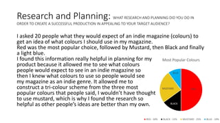
The document discusses research and planning for an indie magazine. The creator surveyed 20 people about their color preferences for an indie magazine. Red was the most popular, followed by mustard and black. Using this feedback, the creator designed the magazine with a color scheme of red, black, and mustard. During production, the creator used fonts recommended as edgy and alternative. Photography was done in a studio rather than outside to look smarter. Feedback from audiences praised the contrasting colors that stood out from typical magazines and recognized the magazine as indie based on its unusual design elements.