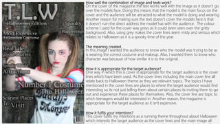
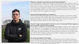
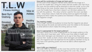
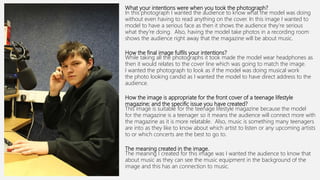
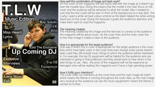
EVALUATION LO4
What your intentions were when you took the photograph?
In this photograph I wanted the model to be outside wrapped up nice and warm as the
theme for my magazine is winter fashion. I did this by making the model wear different
layers of clothing for example, this model is wearing a thick jumper and a big furry coat.
Also, I made the model have her hand in her pockets wrapping her coat around her more
to make her look like she is getting more cosy.
How the final image fulfils your intentions?
While taking all the photographs it took different attempts to get the correct way of
conveying to the audience of wrapping up warm in winter time. This image fulfils this
because the audience can tell that it is winter time because the trees have no leaves on
which only happens in winter time so without looking at the clothing the audience already
have an idea that the image relates to winter. In this photograph, the model is wearing
suitable clothing which would be worn in winter time as it is cosy and will keep you warm
well which conveys further the winter theme for the mgaazine.
How the image is appropriate for the front cover of a teenage lifestyle
magazine; and the specific issue you have created?
This image is suitable for the teenage lifestyle magazine because the model used for the
magazine is a teenager so it means the audience will connect more with the magazine as
is more relatable. Another reason why is the theme I have used for the magazine of
fashion relates to teenagers as everyone wants to know which is the in clothes to be
wearing and wants to keep up with all the trends as that’s something teenagers are
interested in.
The meaning created in the image.
For this image the meaning I wanted to create is I wanted the audience to feel that even
though it is cold outside and the leaves aren’t on the trees that they can still dress
fashionable and keep warm at the same time.
How well the combination of image and texts work?
On the cover of the magazine the text works well with the image as it doesn’t go over the
models face. Doing this means that the model is the main focus on the cover and the
audience will be attracted to what the model is doing and wearing. Another reason for
making sure the text doesn’t cover the models face is that then it doesn’t ruin the direct
address the model has with the audience. In addition, the colour scheme I used for the
relates to the theme winter. This is because the dark colours reflect the dark nights that
happen during winter time.
The meaning created.
In this image I wanted the audience to feel even though its winter that they can still dress
fashionable while keeping warm at the same time. By making sure the text isn’t covering
too much off the clothes makes sure that the audience can still see which ways is best to
dress during winter time.
How it is appropriate for the target audience?
One way in which this is cover is appropriate for the target audience is the
lines which have been used. As the cover lines including the main cover line all
relate back to fashion or winter theme it is still appealing for the audience.
Another way they appeal to the audience is that they include big well known
brands for example, I mentioned Canada Goose as that’s a popular coat brand
which teenagers will be interested in wearing. Also, as the magazine is for
teenagers the price of the magazine isn’t expensive as the target audience
have a high spending power and wont be able to afford the magazine if it was
too much.
How it fulfils your intentions?
This cover fulfils my intentions as a running theme throughout about winter
fashion which interests the target audience as the cover lines and the main
What your intentions were when you took the photograph?
In this photograph I wanted the model to dressed as Harley Quinn as then it would
to the theme of the magazine which is Halloween. I did this because Harley Quinn was a
very popular Halloween costume of 2016. To make the model look like this character I
made her wear the same top of the characters and do her hair and make up in the
way as well. Doing this makes it relate back to the mise en scene as the props used for
the image relate back to the character as in the film she is based from she has a bat. I
the model hold up the bat in the photograph as it relates back to the character she is
portraying.
How the final image fulfils your intentions?
While taking all the photographs it took different attempts to get the correct way of
conveying to the audience that the model was Harley Quinn as I made the model do
different poses with the bat too see which's the best way to portray the character. I had
the model in the right location as well to match the mise en scene of the picture. As the
background is gritty and dirty it matches the personality of the character.
How the image is appropriate for the front cover of a teenage lifestyle
magazine; and the specific issue you have created?
This image is suitable for the teenage lifestyle magazine because the model used for
magazine is a teenager so it means the audience will connect more with the magazine
it is more relatable. Another reason why is the theme I have used for the magazine of
Halloween is appropriate as a lot of teenagers are interested in Halloween and do like
know which are the best costumes to wear.
The meaning created in the image.
For this image the meaning I wanted to create is I wanted the audience to know who
charcter was before having the read any of the cover lines as I wanted the model to lo
the Margot Robbie version of this character.
How well the combination of image and texts work?
On the cover of the magazine the text works well with the image as it doesn’t go
over the models face. Doing this means that the model is the main focus on the
cover and the audience will be attracted to what the model is doing and wearing.
Another reason for making sure the text doesn’t cover the models face is that
it doesn’t ruin the direct address the model has with the audience. The colour
scheme I used for the cover was greys as it could been seen over the gritty
background. Also, using grey makes the cover lines seem misty and serious which
relates to Halloween as it is a spooky time of the year.
The meaning created.
In this image I wanted the audience to know who the model was trying to be as
is wearing the correct costume and makeup. Also, I wanted them to know who
character was because of how similar it is to the original.
How it is appropriate for the target audience?
One way in which this is cover is appropriate for the target audience is the cover
lines which have been used. As the cover lines including the main cover line all
relate back to Halloween theme as they are relevant topics. The topics I have
mentioned in the cover lines are places to where the target audience would find
interesting so its not just telling them about certain places its inviting them to go
out and experience these places for themselves. Also, the cover line are topic to
which teenagers would be interested in. Another reason, the magazine is
appropriate for the target audience as it isn't expensive.
How it fulfils your intentions?
This cover fulfils my intentions as a running theme throughout about Halloween
which interests the target audience as the cover lines and the main image all
What your intentions were when you took the photograph?
In this photograph I wanted the model to look serious to show that he is serious
about what he does. That’s why I made the model look down at the camera and
have his arms crossed as this way it shows that to the audience. Also, as the
was for the sport magazine I made sure he was outside and near a football court
and a basket ball court as then without the audience having to read the main
line to know what the magazine was about.
How the final image fulfils your intentions?
While taking all the photographs it took different attempts to make the model
serious and sport like enough. When the photograph was taken as it was bright
helped the image as sports usually happen a lot more when its sunnier so it
the audience further about the sport and fitness theme.
How the image is appropriate for the front cover of a teenage lifestyle magazine;
and the specific issue you have created?
This image is suitable for the teenage lifestyle magazine because the model used
for the magazine is a teenager so it means the audience will connect more with
magazine as it is more relatable. Another reason it is okay for the audience as a
of teenager are bothered about the way they look and want to know which they
can improve their image so a fitness and health magazine would help them
improve things they're confident on.
The meaning created in the image.
For this image the meaning I wanted to create was for the model to look very
serious to show that the model is serious about sport and fitness. Also, showing
serious can show the audience that keeping healthy and keeping up with fitness
How well the combination of image and texts work?
On the cover of the magazine the text works well with the image as it
go over the models face. Doing this means that the model is the main focus
the cover and the audience will be attracted to what the model as his is the
main thing on the cover. Another reason for making sure the text doesn’t
cover the models face is that then it doesn’t ruin the direct address the
has with the audience. The colour scheme I used for the cover was black
white. Using these colours made the writing stand out against the bright
background which makes the audience be interested in fitness and health as
the magazine is bright.
The meaning created.
In this image I wanted the audience to know that the magazine was about
fitness because the words are bold and the cover line relates to this because
as white behind it which makes the writing sand out more.
How it is appropriate for the target audience?
One way in which this is cover is appropriate for the target audience is the
cover lines which have been used. All the cover lines relate to health and
fitness which teenagers are interested in as its way to how they could
improve their bodies as that’s a factor which teenagers are bothered about.
Also, the magazine won’t be expensive for the audience members to buy as
they have a low spending power and wont be able to afford expensive
magazines.
How it fulfils your intentions?
This cover fulfils my intentions as the cover lines and the main image all
which means the theme is running throughout the cover. Also, as the
What your intentions were when you took the photograph?
In this photograph I wanted the audience to know what the model was doing
without even having to read anything on the cover. In this image I wanted to
model to have a serious face as then it shows the audience they’re serious
what they’re doing. Also, having the model take photos in a recording room
shows the audience right away that the magazine will be about music.
How the final image fulfils your intentions?
While taking all the photographs it took made the model wear headphones as
then it would relates to the cover line which was going to match the image.
I wanted the photograph to look as if the model was doing musical work
the photo looking candid as I wanted the model to have direct address to the
audience.
How the image is appropriate for the front cover of a teenage lifestyle
magazine; and the specific issue you have created?
This image is suitable for the teenage lifestyle magazine because the model
for the magazine is a teenager so it means the audience will connect more with
the magazine as it is more relatable. Also, music is something many teenagers
are into as they like to know about which artist to listen or any upcoming artists
to or which concerts are the best to go to.
The meaning created in the image.
The meaning I created for this image was I wanted the audience to know that
about music as they can see the music equipment in the background of the
image and this has an connection to music.
How well the combination of image and texts work?
On the cover of the magazine the text works well with the image as it doesn’t go
over the models face. Doing this means that the model is the main focus on the
cover and the audience will be attracted to what the model. Also I needed to
sure that the text could still be seen in front of the background as it was dark. This
is why I used a white ad back colour scheme as the black helped the white writing
stand out on the cover. Doing this because it grabs the audiences attention and
make them want to read the magazine.
The meaning created.
The meaning created by this image and the text was to convey to the audience
the magazine will be about music. As the cover lines and the main cover line
to the main image it makes it clear to the audience.
How it is appropriate for the target audience?
One way in which this is cover is appropriate for the target audience is the cover
lines which have been used. In the cover lines even though artist names haven't
been used they still include music things to which the audience will be interested
in. For example, the top DJ equipment will be helpful for the audience who are
interested in going in that profession and they would want to hear which is the
best things to use. Also, the price of the magazine will not be expensive as
teenagers who will be reading the magazine won’t have a high spending power.
How it fulfils your intentions?
This cover fulfils my intentions as the cover lines and the main image all match
which means the theme is running throughout the cover. Also, as the main image
very musical as the audience can see the music equipment's means the theme is
carried on further.

Evaluation LO4

  • 1.
  • 2.
    What your intentionswere when you took the photograph? In this photograph I wanted the model to be outside wrapped up nice and warm as the theme for my magazine is winter fashion. I did this by making the model wear different layers of clothing for example, this model is wearing a thick jumper and a big furry coat. Also, I made the model have her hand in her pockets wrapping her coat around her more to make her look like she is getting more cosy. How the final image fulfils your intentions? While taking all the photographs it took different attempts to get the correct way of conveying to the audience of wrapping up warm in winter time. This image fulfils this because the audience can tell that it is winter time because the trees have no leaves on which only happens in winter time so without looking at the clothing the audience already have an idea that the image relates to winter. In this photograph, the model is wearing suitable clothing which would be worn in winter time as it is cosy and will keep you warm well which conveys further the winter theme for the mgaazine. How the image is appropriate for the front cover of a teenage lifestyle magazine; and the specific issue you have created? This image is suitable for the teenage lifestyle magazine because the model used for the magazine is a teenager so it means the audience will connect more with the magazine as is more relatable. Another reason why is the theme I have used for the magazine of fashion relates to teenagers as everyone wants to know which is the in clothes to be wearing and wants to keep up with all the trends as that’s something teenagers are interested in. The meaning created in the image. For this image the meaning I wanted to create is I wanted the audience to feel that even though it is cold outside and the leaves aren’t on the trees that they can still dress fashionable and keep warm at the same time.
  • 3.
    How well thecombination of image and texts work? On the cover of the magazine the text works well with the image as it doesn’t go over the models face. Doing this means that the model is the main focus on the cover and the audience will be attracted to what the model is doing and wearing. Another reason for making sure the text doesn’t cover the models face is that then it doesn’t ruin the direct address the model has with the audience. In addition, the colour scheme I used for the relates to the theme winter. This is because the dark colours reflect the dark nights that happen during winter time. The meaning created. In this image I wanted the audience to feel even though its winter that they can still dress fashionable while keeping warm at the same time. By making sure the text isn’t covering too much off the clothes makes sure that the audience can still see which ways is best to dress during winter time. How it is appropriate for the target audience? One way in which this is cover is appropriate for the target audience is the lines which have been used. As the cover lines including the main cover line all relate back to fashion or winter theme it is still appealing for the audience. Another way they appeal to the audience is that they include big well known brands for example, I mentioned Canada Goose as that’s a popular coat brand which teenagers will be interested in wearing. Also, as the magazine is for teenagers the price of the magazine isn’t expensive as the target audience have a high spending power and wont be able to afford the magazine if it was too much. How it fulfils your intentions? This cover fulfils my intentions as a running theme throughout about winter fashion which interests the target audience as the cover lines and the main
  • 4.
    What your intentionswere when you took the photograph? In this photograph I wanted the model to dressed as Harley Quinn as then it would to the theme of the magazine which is Halloween. I did this because Harley Quinn was a very popular Halloween costume of 2016. To make the model look like this character I made her wear the same top of the characters and do her hair and make up in the way as well. Doing this makes it relate back to the mise en scene as the props used for the image relate back to the character as in the film she is based from she has a bat. I the model hold up the bat in the photograph as it relates back to the character she is portraying. How the final image fulfils your intentions? While taking all the photographs it took different attempts to get the correct way of conveying to the audience that the model was Harley Quinn as I made the model do different poses with the bat too see which's the best way to portray the character. I had the model in the right location as well to match the mise en scene of the picture. As the background is gritty and dirty it matches the personality of the character. How the image is appropriate for the front cover of a teenage lifestyle magazine; and the specific issue you have created? This image is suitable for the teenage lifestyle magazine because the model used for magazine is a teenager so it means the audience will connect more with the magazine it is more relatable. Another reason why is the theme I have used for the magazine of Halloween is appropriate as a lot of teenagers are interested in Halloween and do like know which are the best costumes to wear. The meaning created in the image. For this image the meaning I wanted to create is I wanted the audience to know who charcter was before having the read any of the cover lines as I wanted the model to lo the Margot Robbie version of this character.
  • 5.
    How well thecombination of image and texts work? On the cover of the magazine the text works well with the image as it doesn’t go over the models face. Doing this means that the model is the main focus on the cover and the audience will be attracted to what the model is doing and wearing. Another reason for making sure the text doesn’t cover the models face is that it doesn’t ruin the direct address the model has with the audience. The colour scheme I used for the cover was greys as it could been seen over the gritty background. Also, using grey makes the cover lines seem misty and serious which relates to Halloween as it is a spooky time of the year. The meaning created. In this image I wanted the audience to know who the model was trying to be as is wearing the correct costume and makeup. Also, I wanted them to know who character was because of how similar it is to the original. How it is appropriate for the target audience? One way in which this is cover is appropriate for the target audience is the cover lines which have been used. As the cover lines including the main cover line all relate back to Halloween theme as they are relevant topics. The topics I have mentioned in the cover lines are places to where the target audience would find interesting so its not just telling them about certain places its inviting them to go out and experience these places for themselves. Also, the cover line are topic to which teenagers would be interested in. Another reason, the magazine is appropriate for the target audience as it isn't expensive. How it fulfils your intentions? This cover fulfils my intentions as a running theme throughout about Halloween which interests the target audience as the cover lines and the main image all
  • 6.
    What your intentionswere when you took the photograph? In this photograph I wanted the model to look serious to show that he is serious about what he does. That’s why I made the model look down at the camera and have his arms crossed as this way it shows that to the audience. Also, as the was for the sport magazine I made sure he was outside and near a football court and a basket ball court as then without the audience having to read the main line to know what the magazine was about. How the final image fulfils your intentions? While taking all the photographs it took different attempts to make the model serious and sport like enough. When the photograph was taken as it was bright helped the image as sports usually happen a lot more when its sunnier so it the audience further about the sport and fitness theme. How the image is appropriate for the front cover of a teenage lifestyle magazine; and the specific issue you have created? This image is suitable for the teenage lifestyle magazine because the model used for the magazine is a teenager so it means the audience will connect more with magazine as it is more relatable. Another reason it is okay for the audience as a of teenager are bothered about the way they look and want to know which they can improve their image so a fitness and health magazine would help them improve things they're confident on. The meaning created in the image. For this image the meaning I wanted to create was for the model to look very serious to show that the model is serious about sport and fitness. Also, showing serious can show the audience that keeping healthy and keeping up with fitness
  • 7.
    How well thecombination of image and texts work? On the cover of the magazine the text works well with the image as it go over the models face. Doing this means that the model is the main focus the cover and the audience will be attracted to what the model as his is the main thing on the cover. Another reason for making sure the text doesn’t cover the models face is that then it doesn’t ruin the direct address the has with the audience. The colour scheme I used for the cover was black white. Using these colours made the writing stand out against the bright background which makes the audience be interested in fitness and health as the magazine is bright. The meaning created. In this image I wanted the audience to know that the magazine was about fitness because the words are bold and the cover line relates to this because as white behind it which makes the writing sand out more. How it is appropriate for the target audience? One way in which this is cover is appropriate for the target audience is the cover lines which have been used. All the cover lines relate to health and fitness which teenagers are interested in as its way to how they could improve their bodies as that’s a factor which teenagers are bothered about. Also, the magazine won’t be expensive for the audience members to buy as they have a low spending power and wont be able to afford expensive magazines. How it fulfils your intentions? This cover fulfils my intentions as the cover lines and the main image all which means the theme is running throughout the cover. Also, as the
  • 8.
    What your intentionswere when you took the photograph? In this photograph I wanted the audience to know what the model was doing without even having to read anything on the cover. In this image I wanted to model to have a serious face as then it shows the audience they’re serious what they’re doing. Also, having the model take photos in a recording room shows the audience right away that the magazine will be about music. How the final image fulfils your intentions? While taking all the photographs it took made the model wear headphones as then it would relates to the cover line which was going to match the image. I wanted the photograph to look as if the model was doing musical work the photo looking candid as I wanted the model to have direct address to the audience. How the image is appropriate for the front cover of a teenage lifestyle magazine; and the specific issue you have created? This image is suitable for the teenage lifestyle magazine because the model for the magazine is a teenager so it means the audience will connect more with the magazine as it is more relatable. Also, music is something many teenagers are into as they like to know about which artist to listen or any upcoming artists to or which concerts are the best to go to. The meaning created in the image. The meaning I created for this image was I wanted the audience to know that about music as they can see the music equipment in the background of the image and this has an connection to music.
  • 9.
    How well thecombination of image and texts work? On the cover of the magazine the text works well with the image as it doesn’t go over the models face. Doing this means that the model is the main focus on the cover and the audience will be attracted to what the model. Also I needed to sure that the text could still be seen in front of the background as it was dark. This is why I used a white ad back colour scheme as the black helped the white writing stand out on the cover. Doing this because it grabs the audiences attention and make them want to read the magazine. The meaning created. The meaning created by this image and the text was to convey to the audience the magazine will be about music. As the cover lines and the main cover line to the main image it makes it clear to the audience. How it is appropriate for the target audience? One way in which this is cover is appropriate for the target audience is the cover lines which have been used. In the cover lines even though artist names haven't been used they still include music things to which the audience will be interested in. For example, the top DJ equipment will be helpful for the audience who are interested in going in that profession and they would want to hear which is the best things to use. Also, the price of the magazine will not be expensive as teenagers who will be reading the magazine won’t have a high spending power. How it fulfils your intentions? This cover fulfils my intentions as the cover lines and the main image all match which means the theme is running throughout the cover. Also, as the main image very musical as the audience can see the music equipment's means the theme is carried on further.