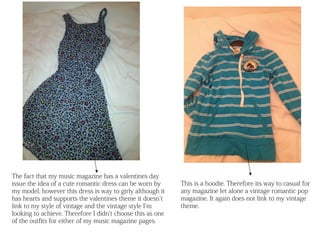
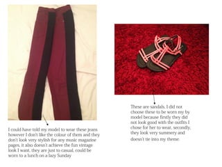
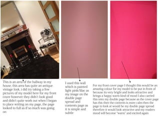
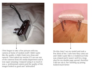
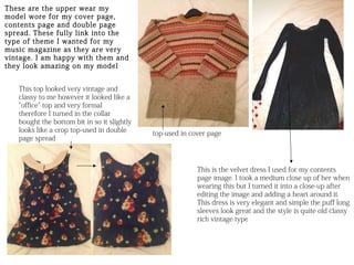
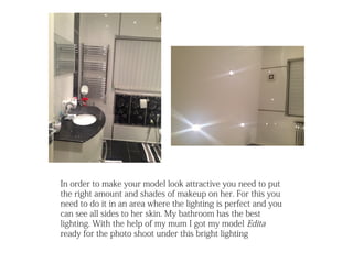
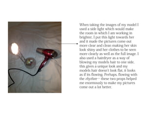
p s
                          r o          e
                        p          u s
                    n d         ’t
                  a           n
              n t       d id
            e         d
        p m         n
    u i           a
E q         d id
        t I
   h a
 w
The fact that my music magazine has a valentines day
issue the idea of a cute romantic dress can be worn by      This is a hoodie. Therefore its way to casual for
my model, however this dress is way to girly although it    any magazine let alone a vintage romantic pop
has hearts and supports the valentines theme it doesn’t     magazine. It again does not link to my vintage
link to my style of vintage and the vintage style I’m       theme.
looking to achieve. Therefore I didn’t choose this as one
of the outfits for either of my music magazine pages.
These are sandals, I did not
                                                   choose these to be worn my by
                                                   model because firstly they did
                                                   not look good with the outfits I
I could have told my model to wear these jeans     chose for her to wear, secondly,
however I don’t like the colour of them and they   they look very summery and
don’t look very stylish for any music magazine     doesn’t tie into my theme.
pages, it also doesn’t achieve the fun vintage
look I want, they are just to casual, could be
worn to a lunch on a lazy Sunday
This is an area of the hallway in my     I used this wall
house, this area has quite an antique                          For my front cover page I thought this would be an
                                         which is painted
vintage look, i did try taking a few                           amazing colour for my model to be put in front of
                                         light pink/lilac as
pictures of my model here for my front                         because its very bright and looks attractive and
                                         my image on the       brings a happy warm kind of mood I also carried
cover however they didn’t look good      double page
and didn’t quite work out when I began                         this onto my double page because as the cover page
                                         spread and            has this then the contents is more calm then the
to place writing on my page, the page    contents page as      page to look at would be my double page spread
looked to full as if so much was going   it is simple and      therefore it would look attractive and my readers
on                                       subtle                mood will become “warm” and excited again
I first began to take a few pictures with my        On this chair I sat my model and took a
camera at home of random stuff, I didn’t quite      few shots of her, I saw how they came out
like the quality, it didn’t look very clean and     and I didn’t quite like it, it looked as if she
natural. I then asked my teacher if I can use one   was relaxed and it wasn’t well for a long
of the cameras from the media department and it     shot for my double page spread, therefore
was super amazing. I enjoyed using it so much it    I did not use it, her standing up posing
was a professional camera and the quality of the    looked much better
images looked so good and “airbrushed”
These are the upper wear my
model wore for my cover page,
contents page and double page
spread. These fully link into the
type of theme I wanted for my
music magazine as they are very
vintage. I am happy with them and
they look amazing on my model


   This top looked very vintage and
   classy to me however it looked like a
   “office” top and very formal
   therefore I turned in the collar
   bought the bottom bit in so it slightly
   looks like a crop top-used in double      top-used in cover page
   page spread


                                                           This is the velvet dress I used for my contents
                                                           page image. I took a medium close up of her when
                                                           wearing this but I turned it into a close-up after
                                                           editing the image and adding a heart around it.
                                                           This dress is very elegant and simple the puff long
                                                           sleeves look great and the style is quite old classy
                                                           rich vintage type
In order to make your model look attractive you need to put
the right amount and shades of makeup on her. For this you
need to do it in an area where the lighting is perfect and you
can see all sides to her skin. My bathroom has the best
lighting. With the help of my mum I got my model Edita
ready for the photo shoot under this bright lighting
When taking the images of my model I
used a side light which would make
the room in which I am working in
brighter, I put this light towards her
and it made the pictures come out
more clear and clean making her skin
look shiny and her clothes to be seen
more clearly as well as the full image. I
also used a hairdryer as a way of
blowing my models hair to one side,
this gives a unique look and my
models hair doesn’t look flat, it looks
as if its flowing. Perhaps, flowing with
the rhythm… these two props helped
me enormously to make my pictures
come out a lot better.

equipment and props

  • 1.
    p s r o e p u s n d ’t a n n t d id e d p m n u i a E q d id t I h a w
  • 2.
    The fact thatmy music magazine has a valentines day issue the idea of a cute romantic dress can be worn by This is a hoodie. Therefore its way to casual for my model, however this dress is way to girly although it any magazine let alone a vintage romantic pop has hearts and supports the valentines theme it doesn’t magazine. It again does not link to my vintage link to my style of vintage and the vintage style I’m theme. looking to achieve. Therefore I didn’t choose this as one of the outfits for either of my music magazine pages.
  • 3.
    These are sandals,I did not choose these to be worn my by model because firstly they did not look good with the outfits I I could have told my model to wear these jeans chose for her to wear, secondly, however I don’t like the colour of them and they they look very summery and don’t look very stylish for any music magazine doesn’t tie into my theme. pages, it also doesn’t achieve the fun vintage look I want, they are just to casual, could be worn to a lunch on a lazy Sunday
  • 4.
    This is anarea of the hallway in my I used this wall house, this area has quite an antique For my front cover page I thought this would be an which is painted vintage look, i did try taking a few amazing colour for my model to be put in front of light pink/lilac as pictures of my model here for my front because its very bright and looks attractive and my image on the brings a happy warm kind of mood I also carried cover however they didn’t look good double page and didn’t quite work out when I began this onto my double page because as the cover page spread and has this then the contents is more calm then the to place writing on my page, the page contents page as page to look at would be my double page spread looked to full as if so much was going it is simple and therefore it would look attractive and my readers on subtle mood will become “warm” and excited again
  • 5.
    I first beganto take a few pictures with my On this chair I sat my model and took a camera at home of random stuff, I didn’t quite few shots of her, I saw how they came out like the quality, it didn’t look very clean and and I didn’t quite like it, it looked as if she natural. I then asked my teacher if I can use one was relaxed and it wasn’t well for a long of the cameras from the media department and it shot for my double page spread, therefore was super amazing. I enjoyed using it so much it I did not use it, her standing up posing was a professional camera and the quality of the looked much better images looked so good and “airbrushed”
  • 6.
    These are theupper wear my model wore for my cover page, contents page and double page spread. These fully link into the type of theme I wanted for my music magazine as they are very vintage. I am happy with them and they look amazing on my model This top looked very vintage and classy to me however it looked like a “office” top and very formal therefore I turned in the collar bought the bottom bit in so it slightly looks like a crop top-used in double top-used in cover page page spread This is the velvet dress I used for my contents page image. I took a medium close up of her when wearing this but I turned it into a close-up after editing the image and adding a heart around it. This dress is very elegant and simple the puff long sleeves look great and the style is quite old classy rich vintage type
  • 7.
    In order tomake your model look attractive you need to put the right amount and shades of makeup on her. For this you need to do it in an area where the lighting is perfect and you can see all sides to her skin. My bathroom has the best lighting. With the help of my mum I got my model Edita ready for the photo shoot under this bright lighting
  • 8.
    When taking theimages of my model I used a side light which would make the room in which I am working in brighter, I put this light towards her and it made the pictures come out more clear and clean making her skin look shiny and her clothes to be seen more clearly as well as the full image. I also used a hairdryer as a way of blowing my models hair to one side, this gives a unique look and my models hair doesn’t look flat, it looks as if its flowing. Perhaps, flowing with the rhythm… these two props helped me enormously to make my pictures come out a lot better.