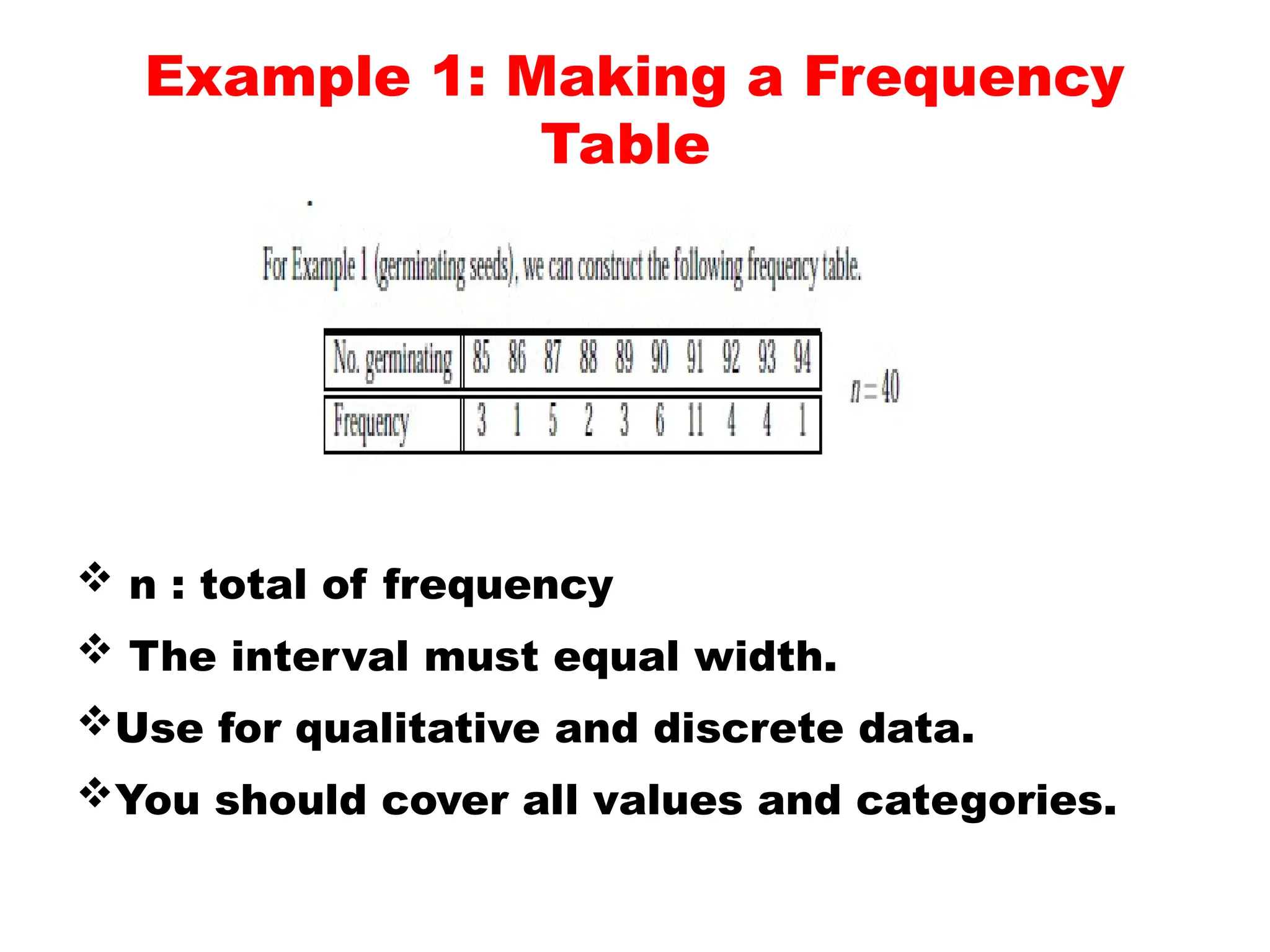
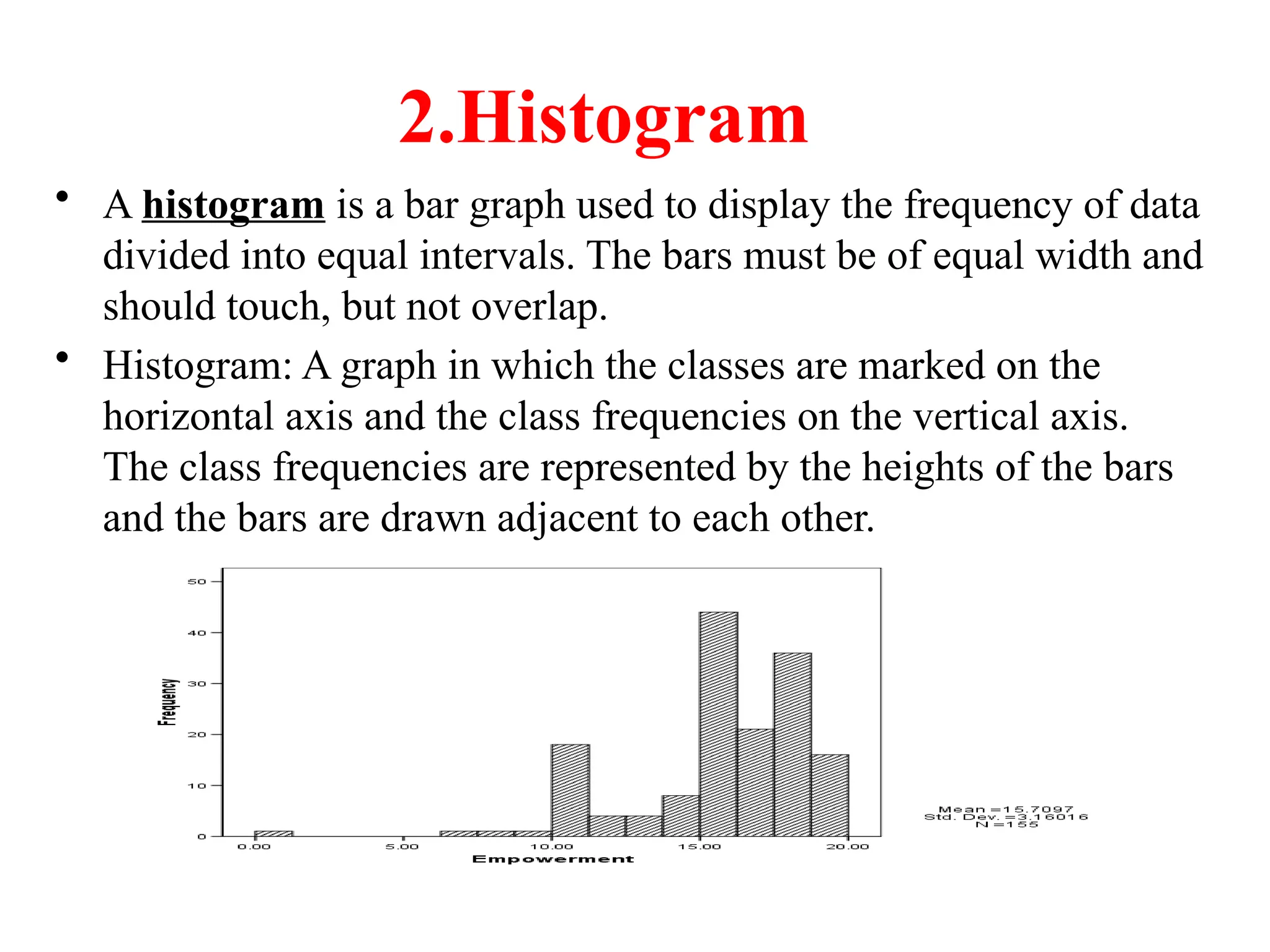
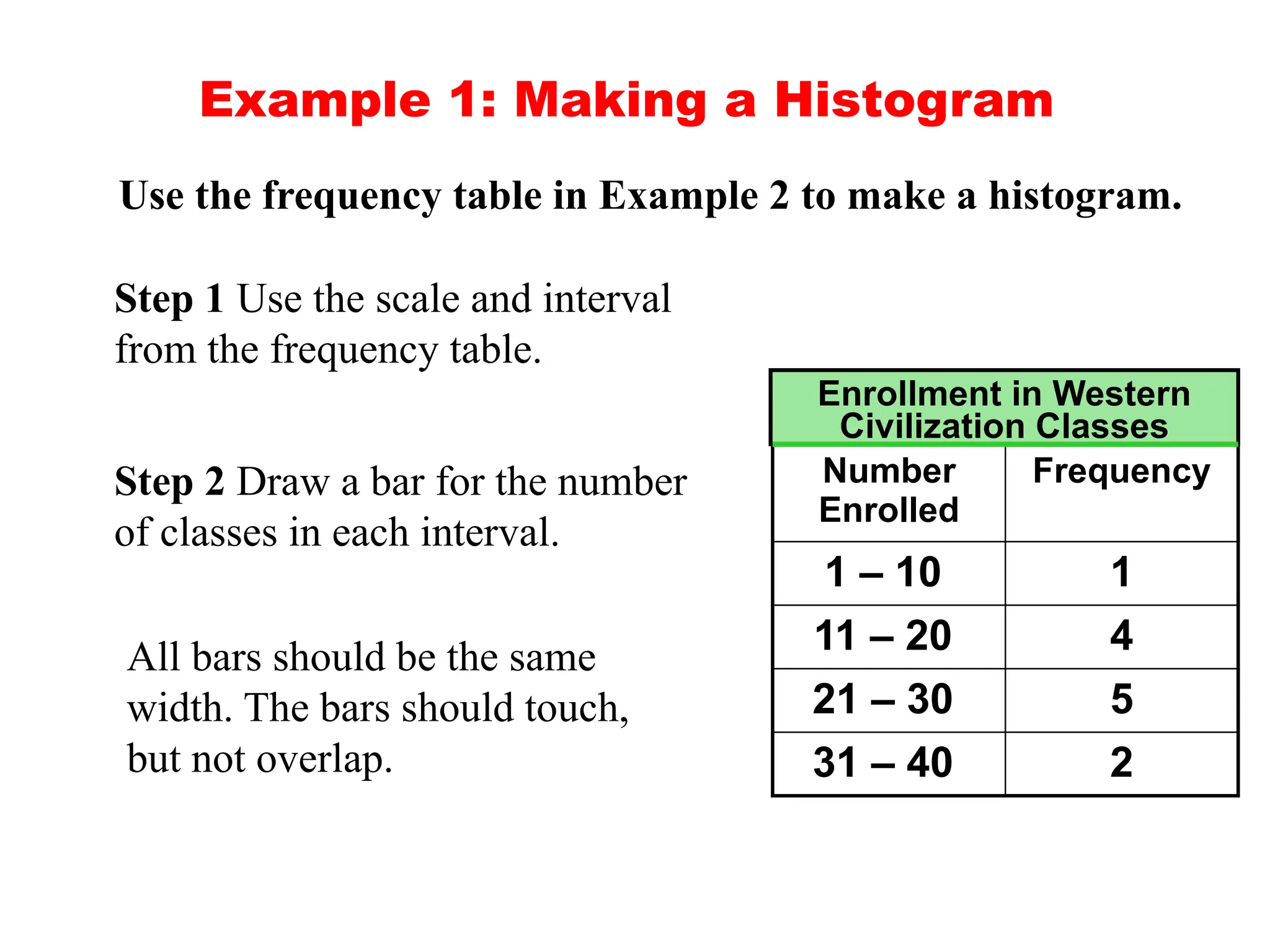
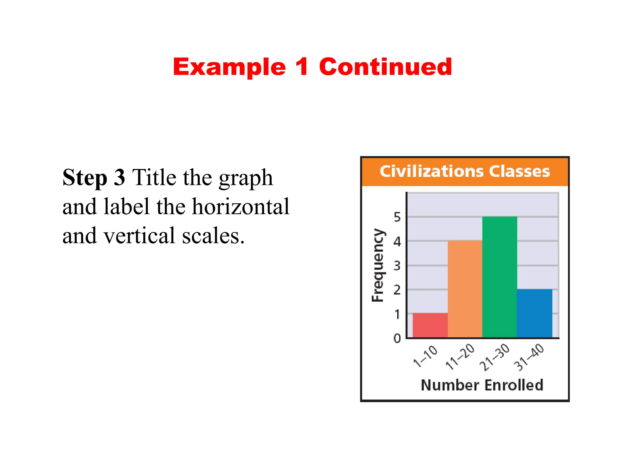
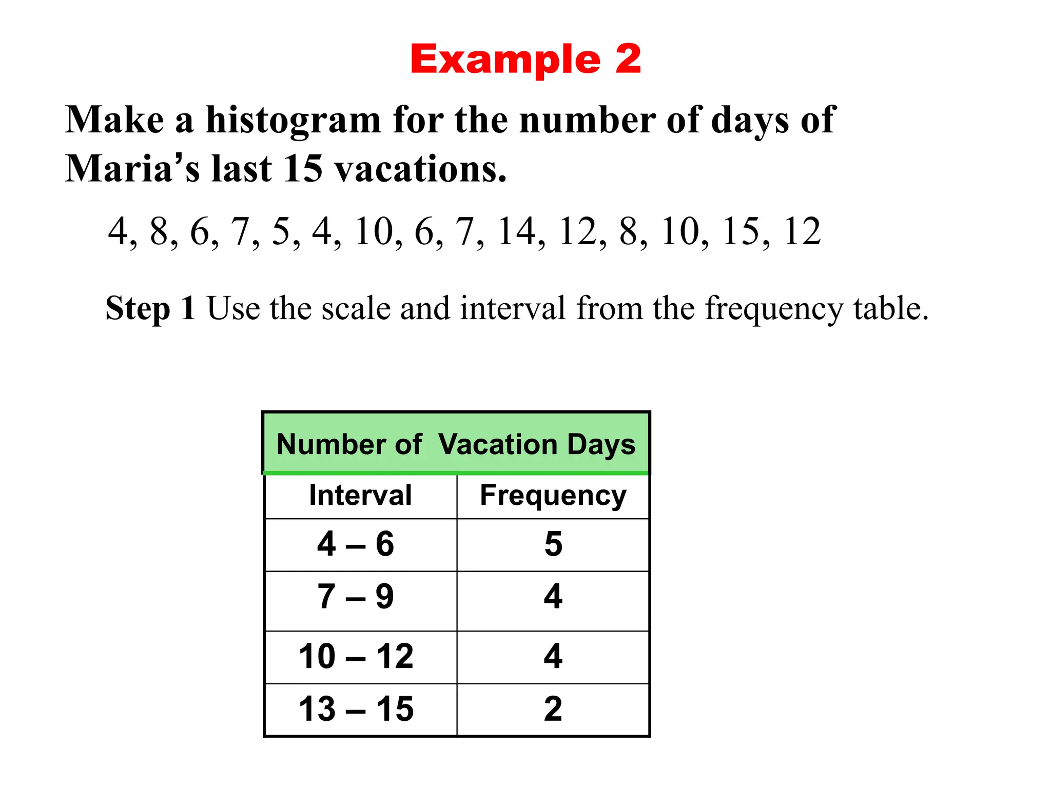
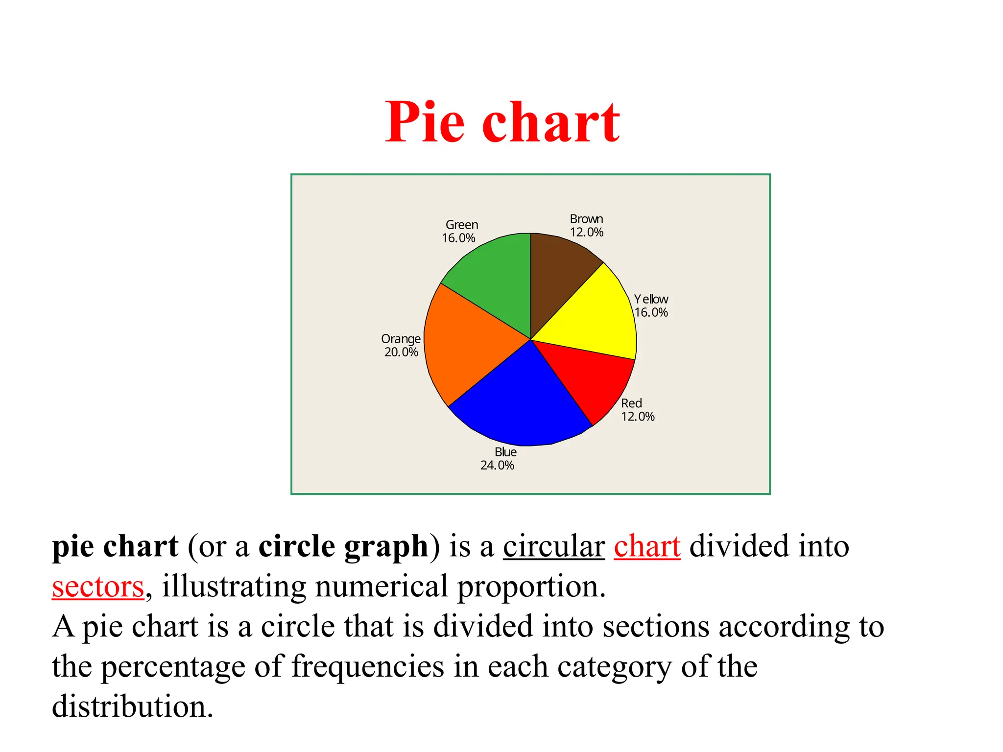
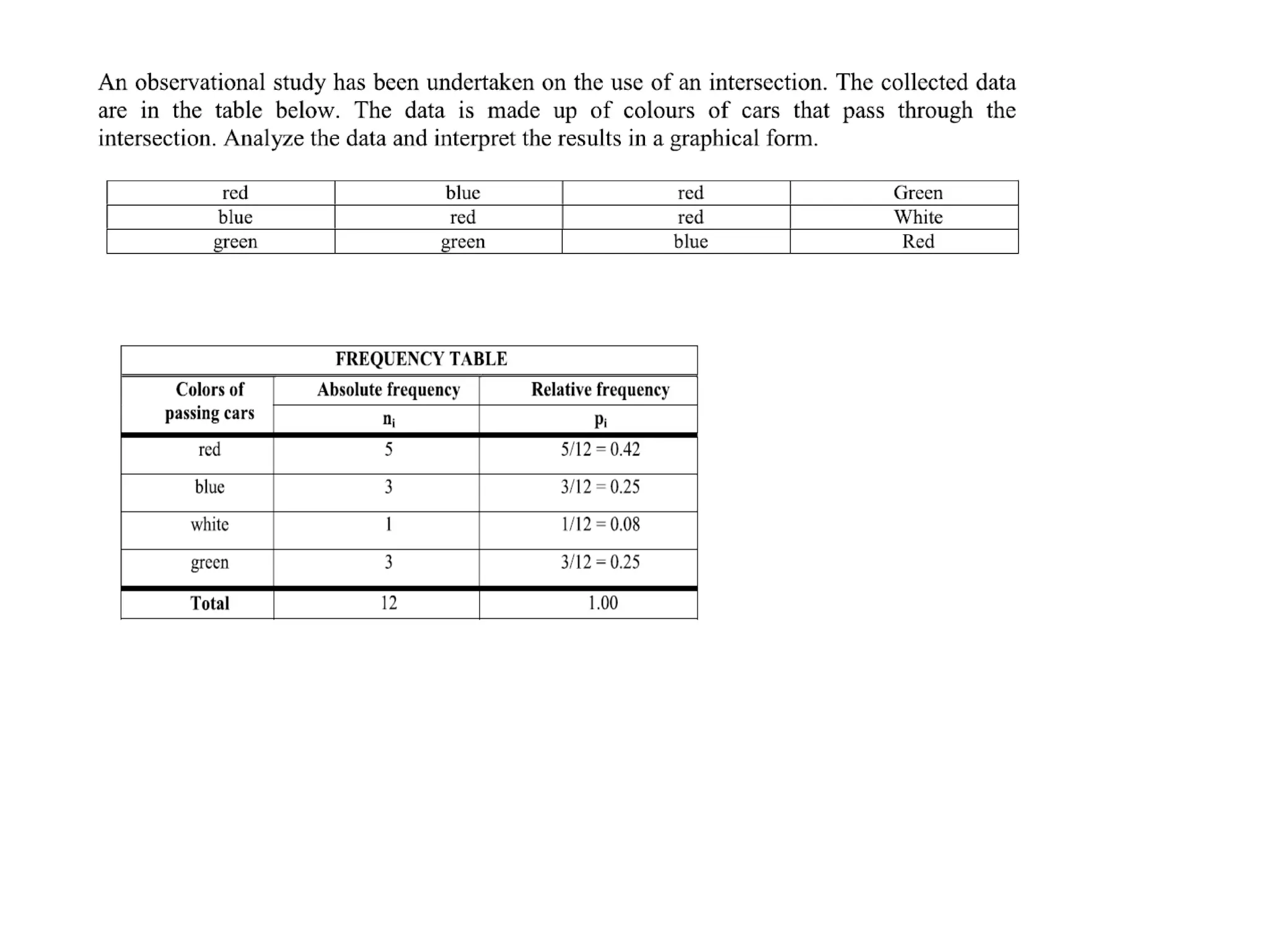
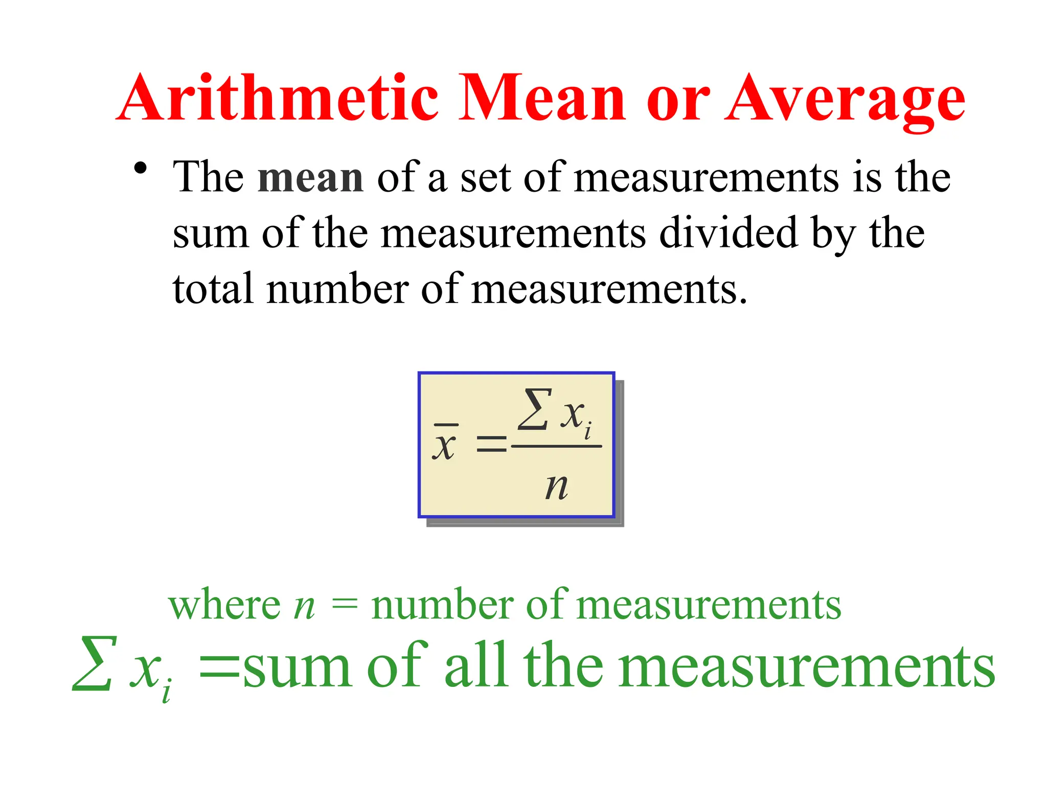
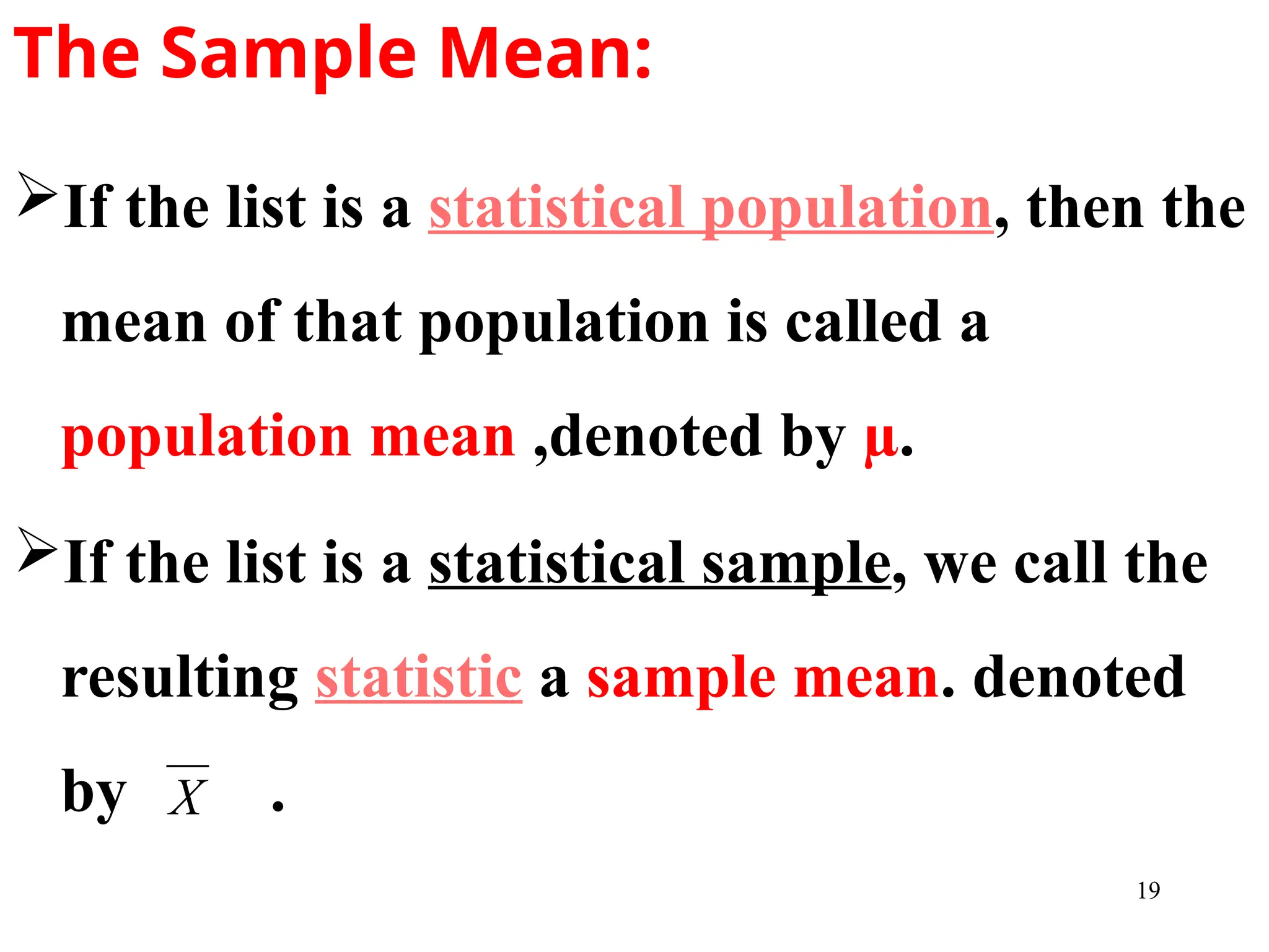
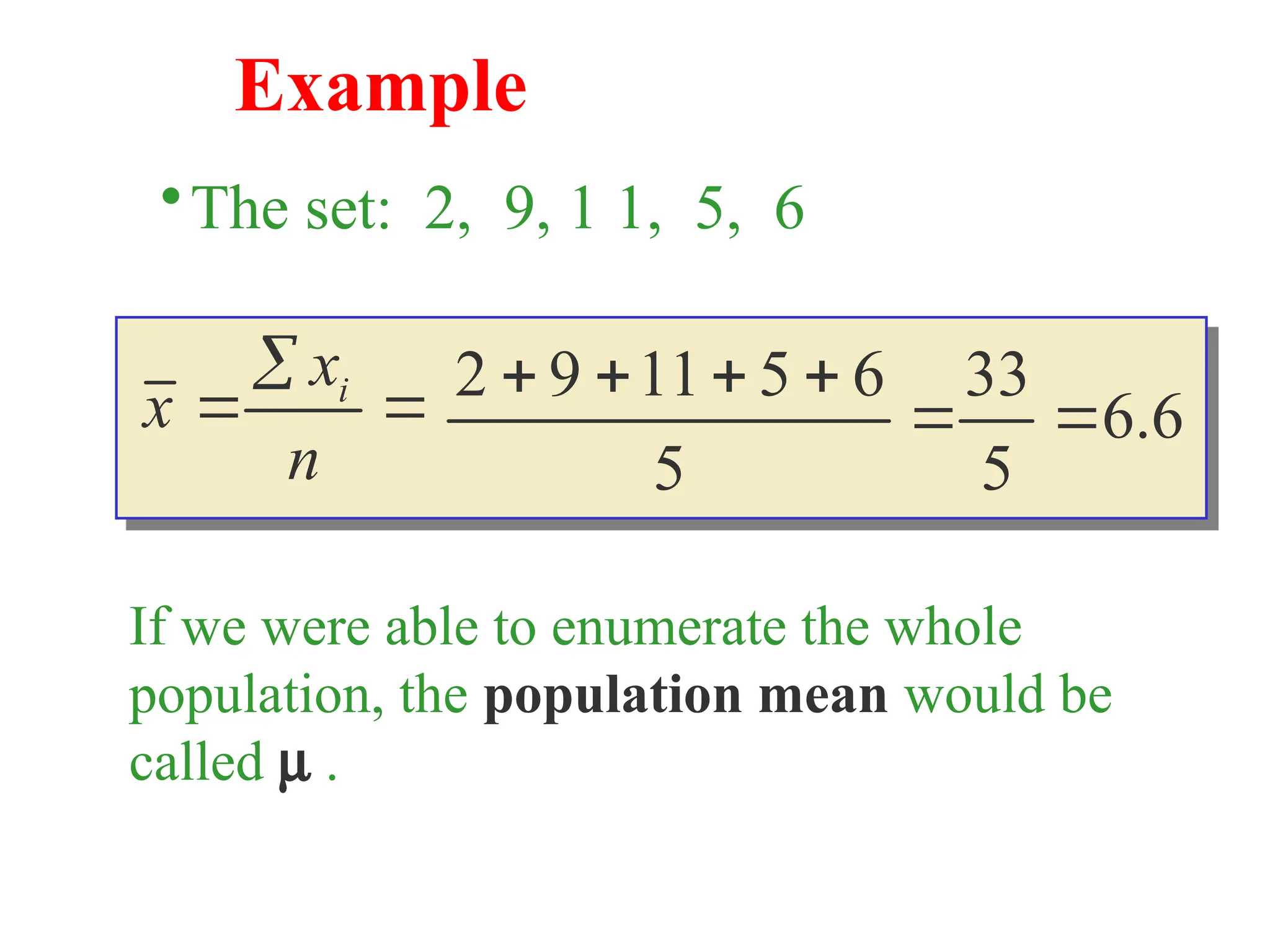
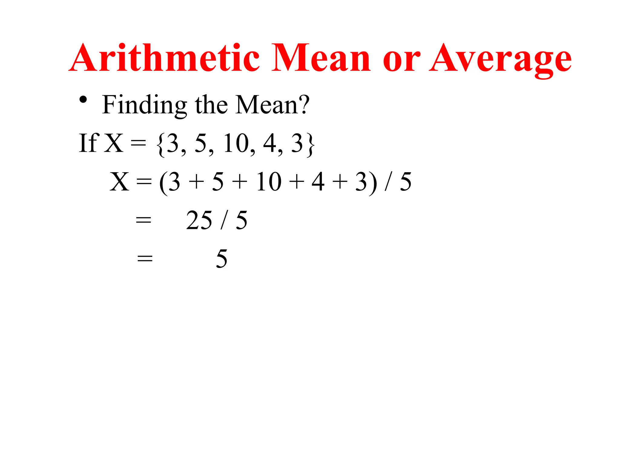
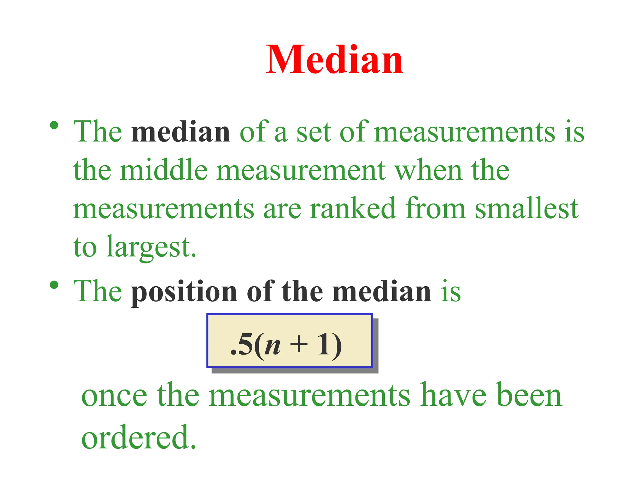
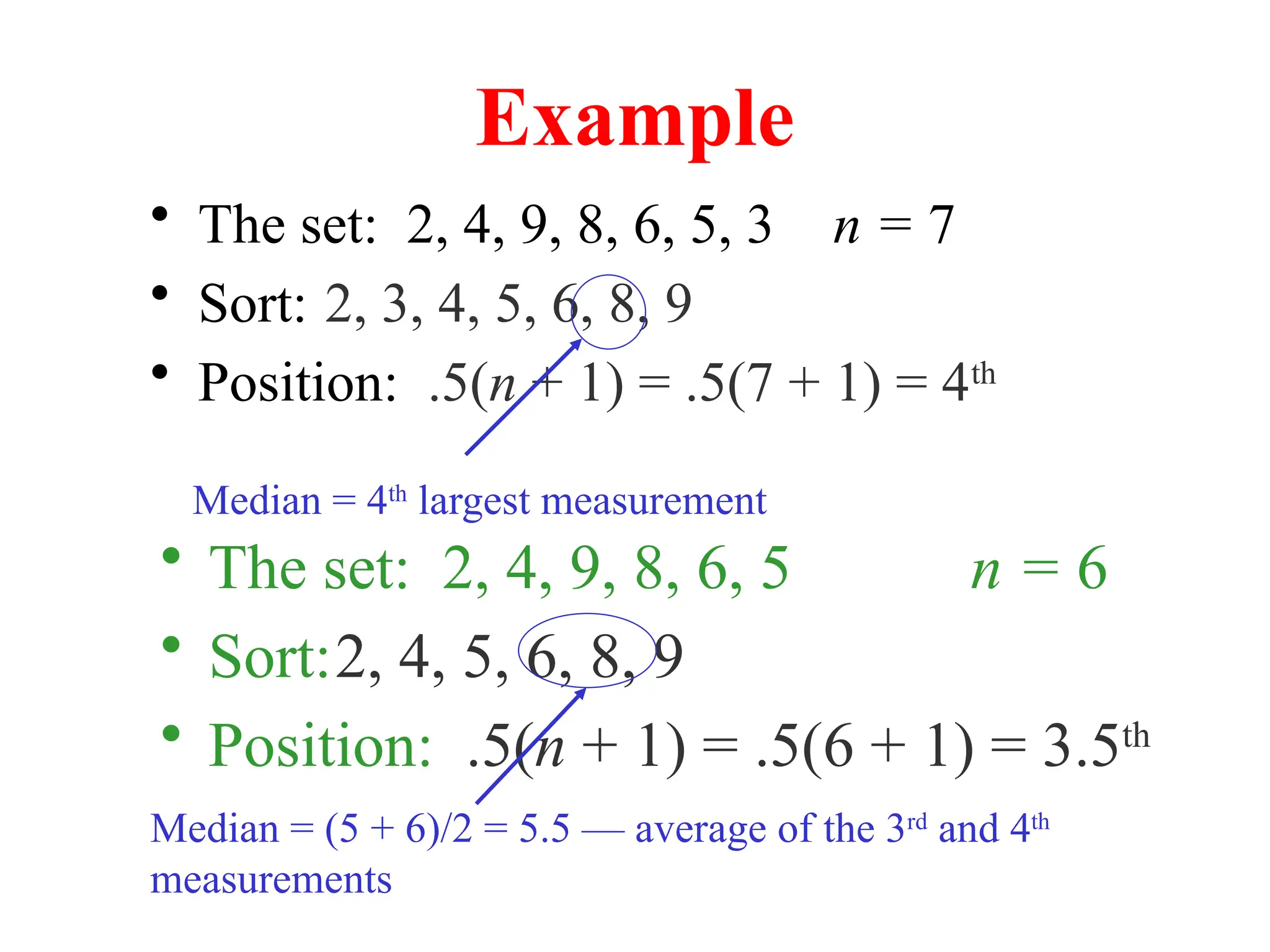
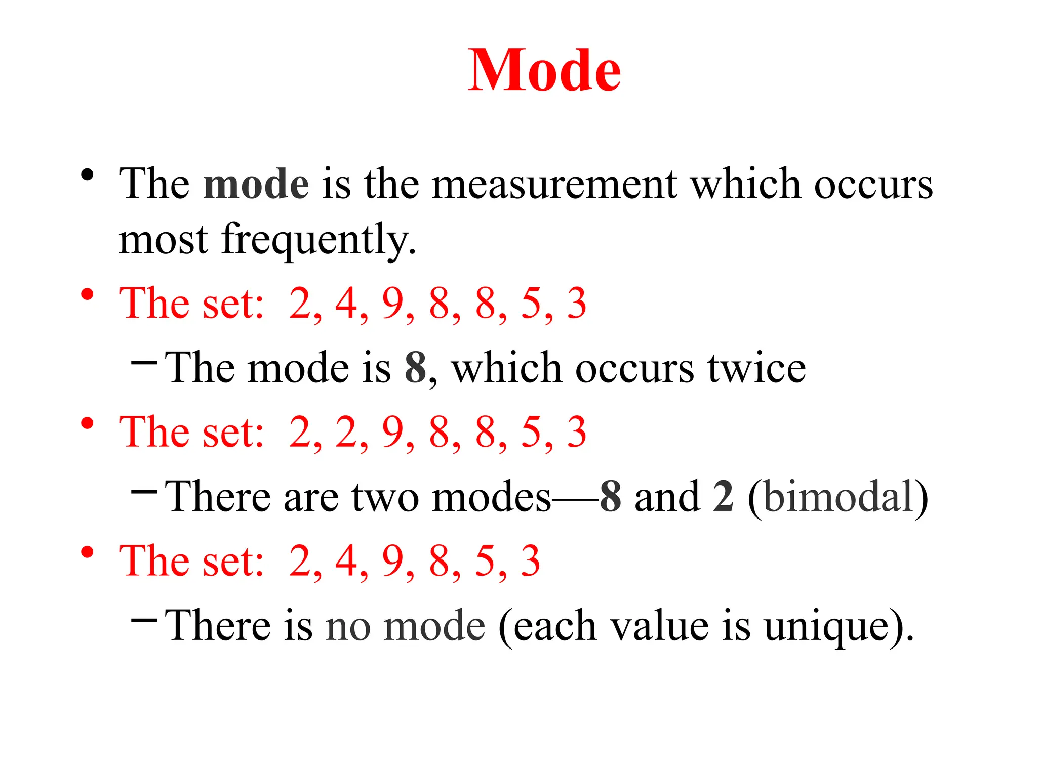
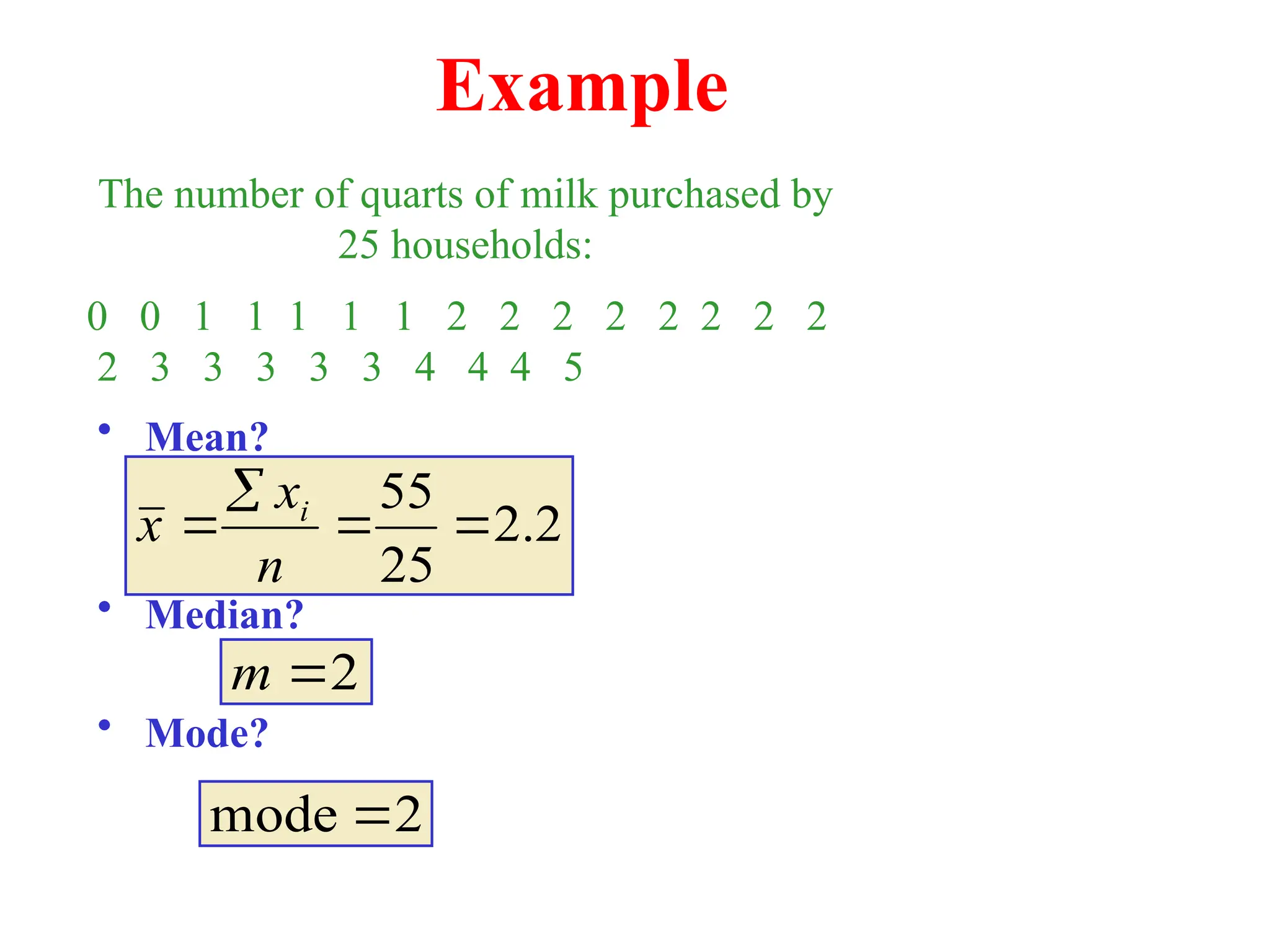
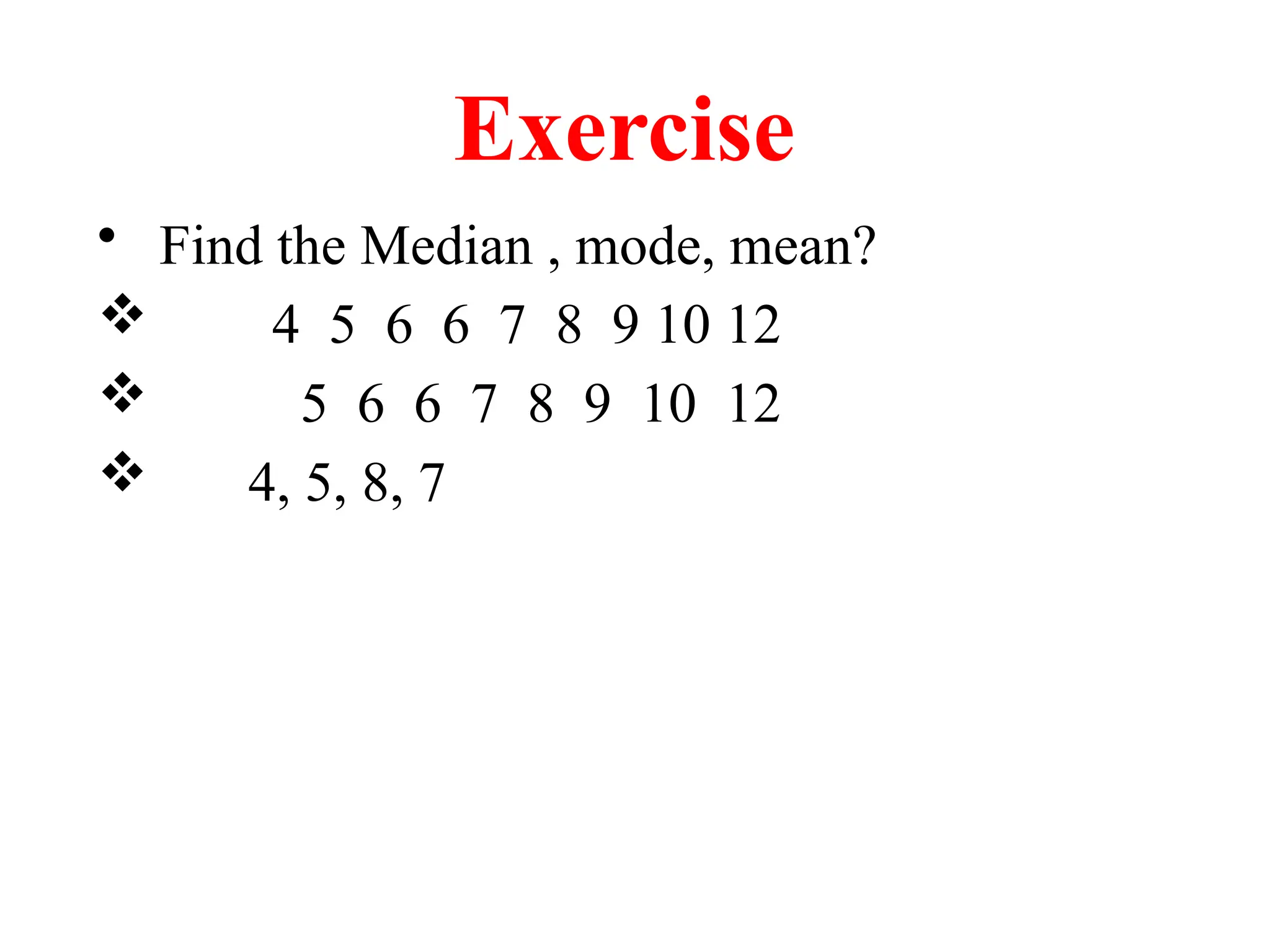
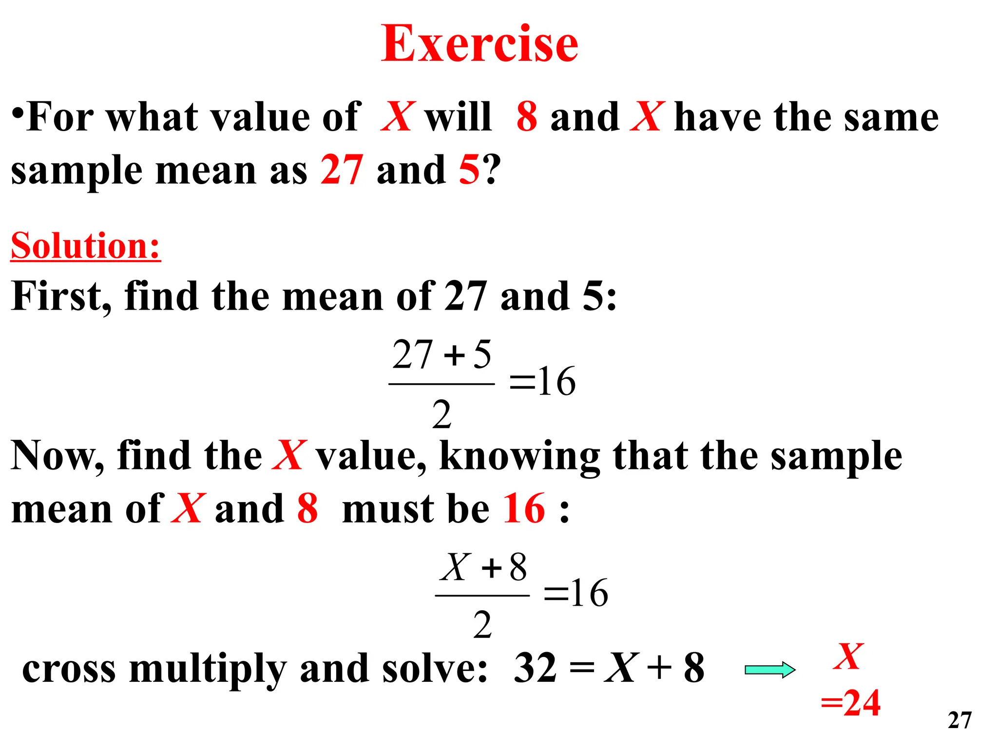
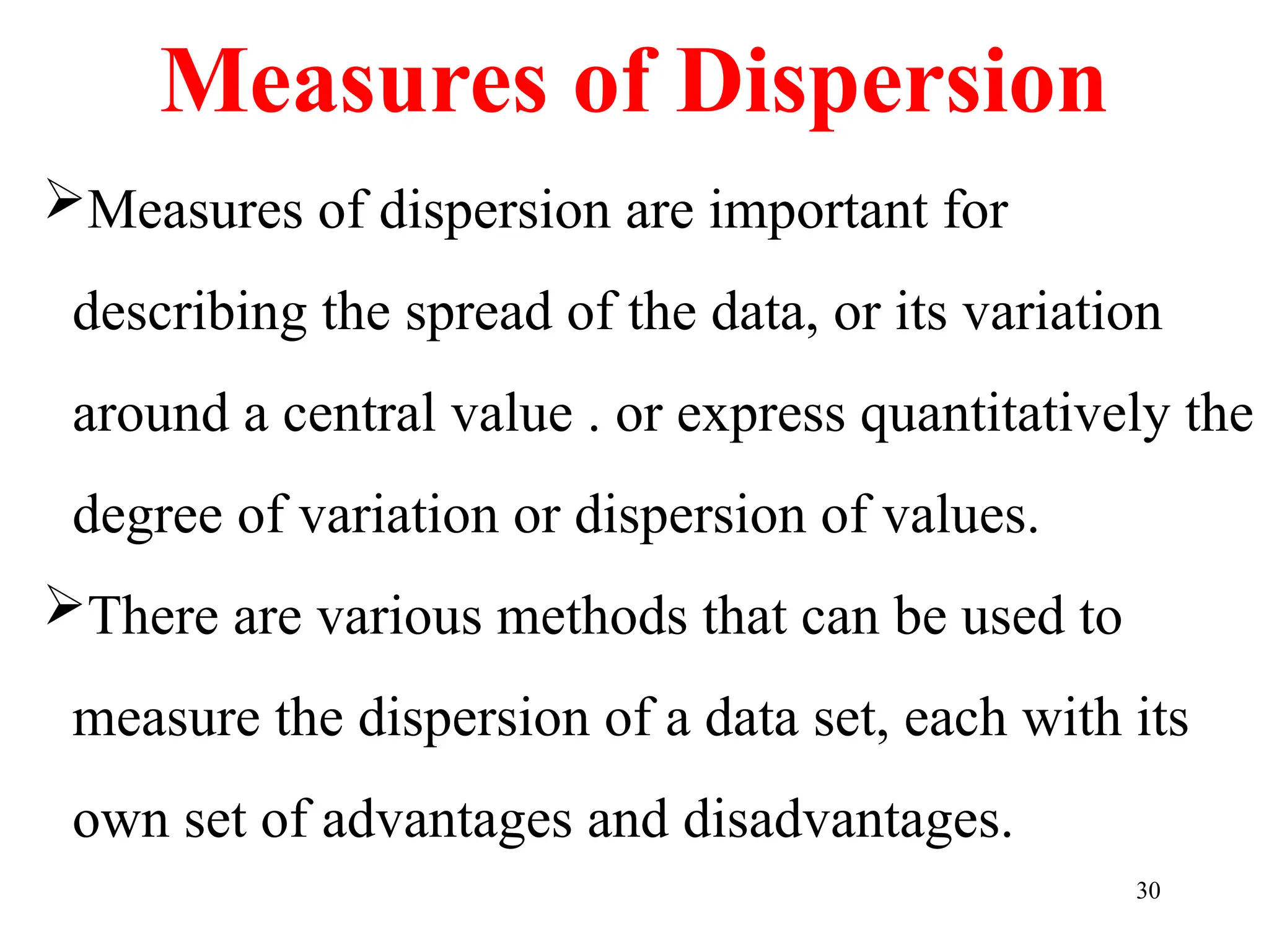
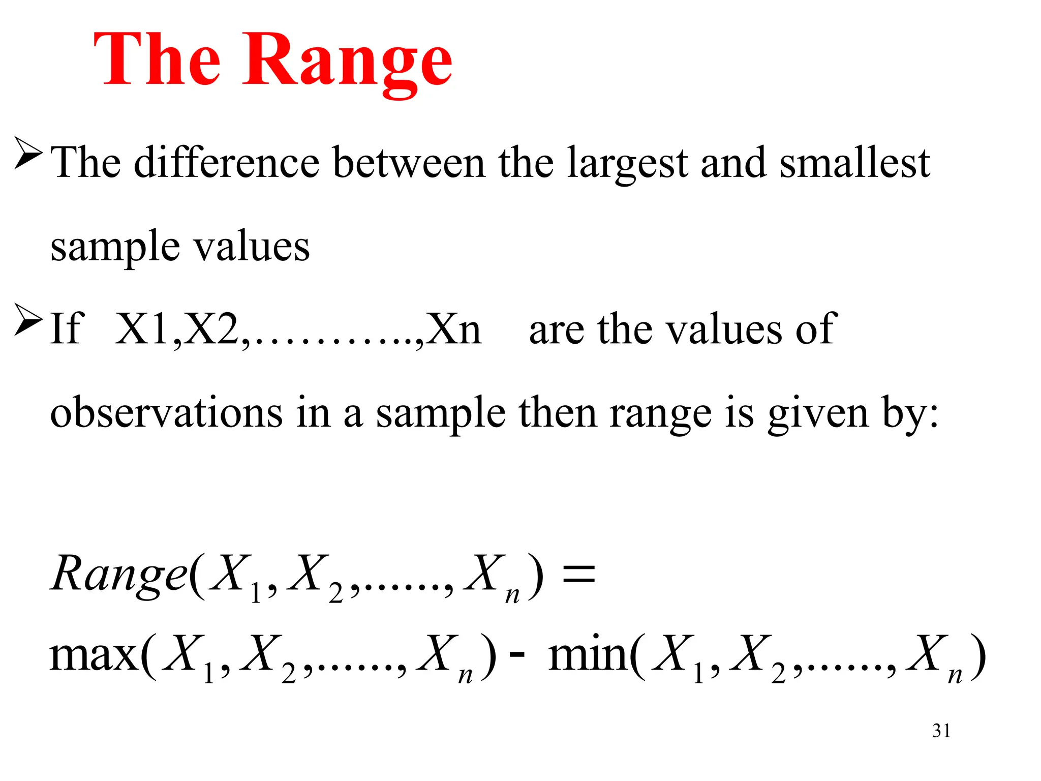
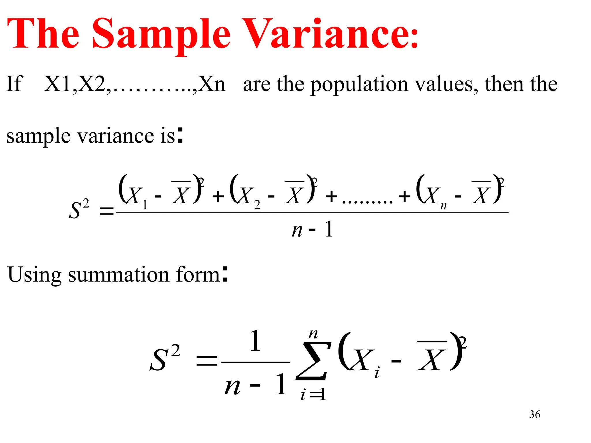
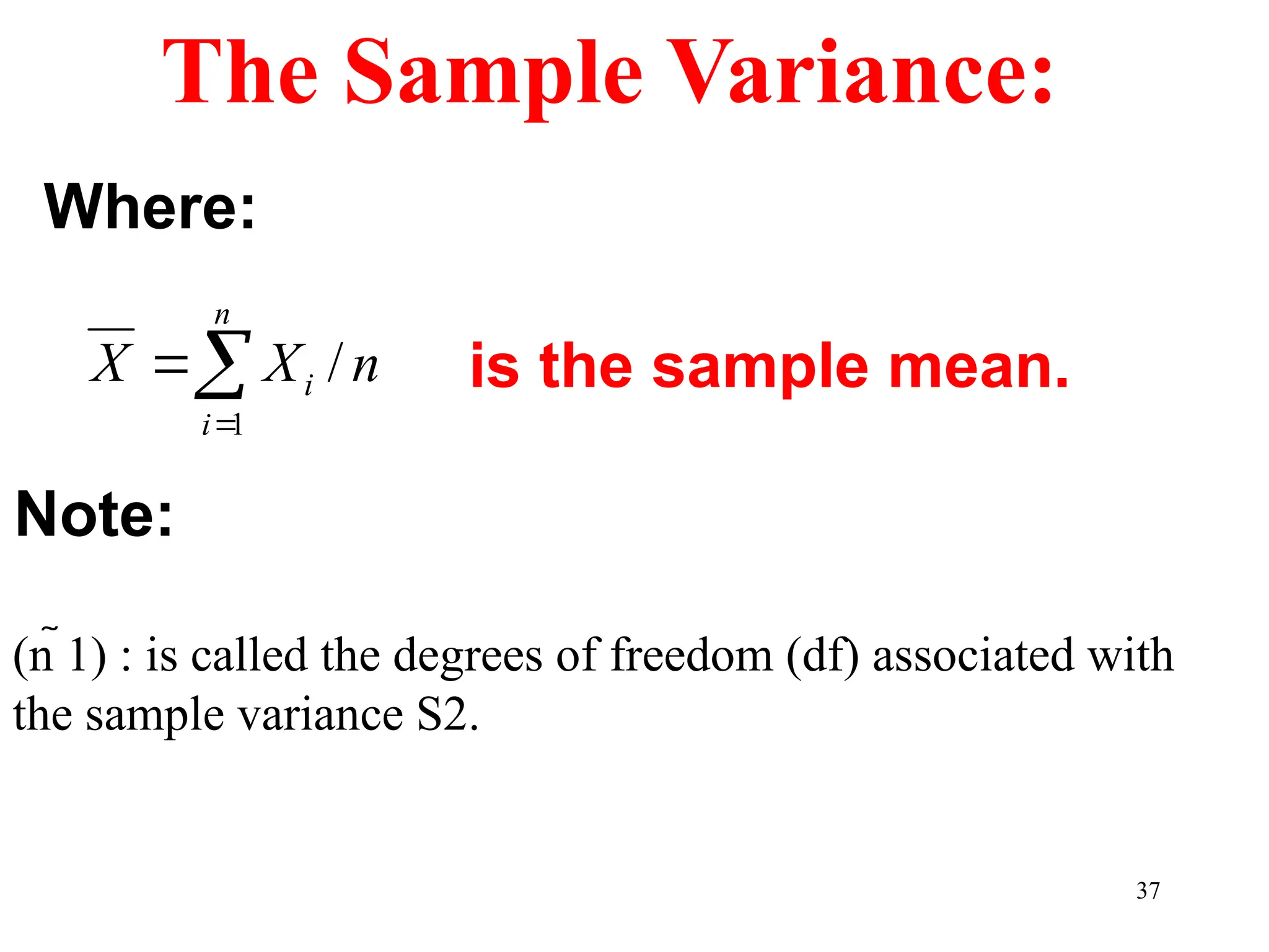
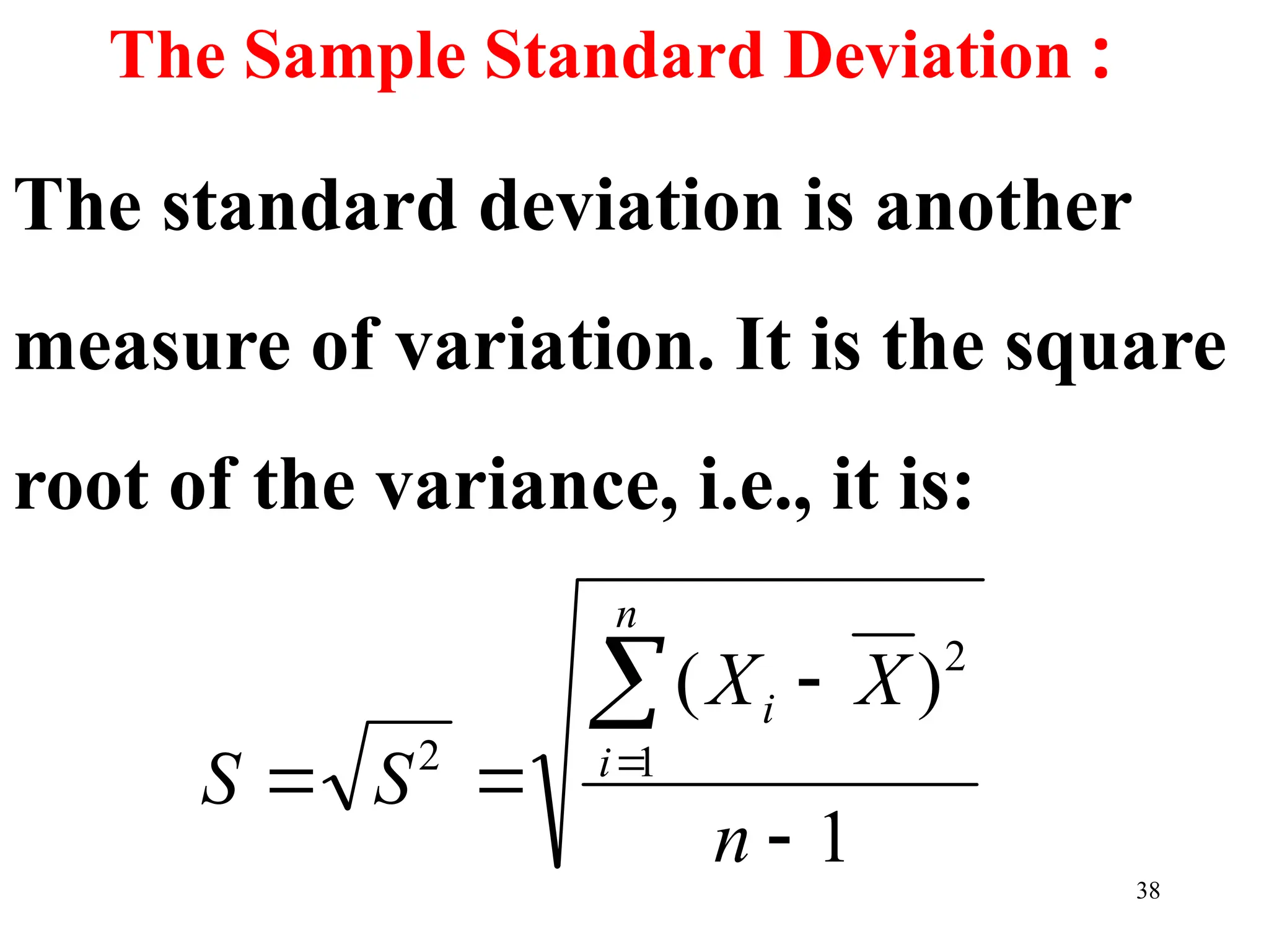
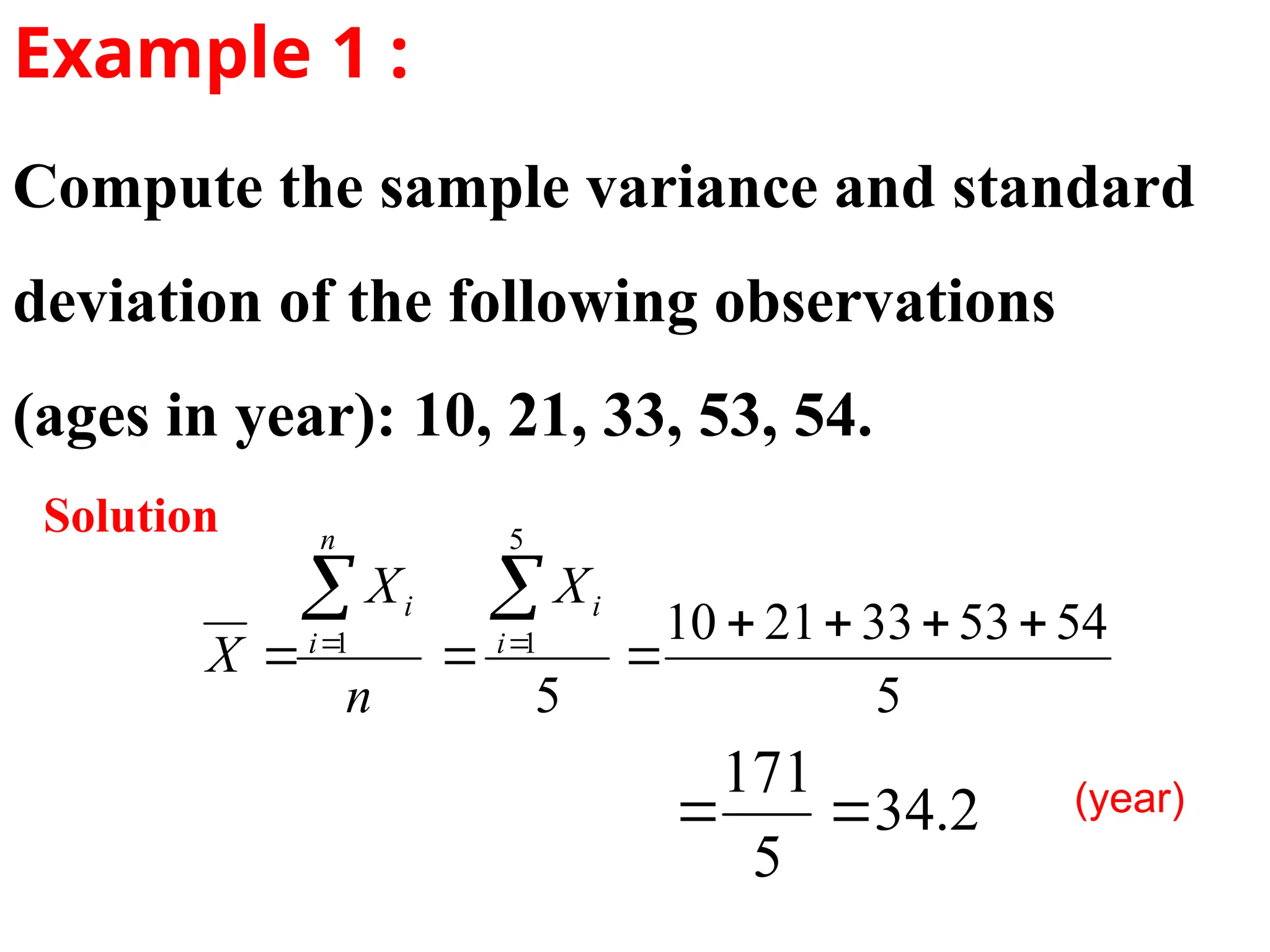
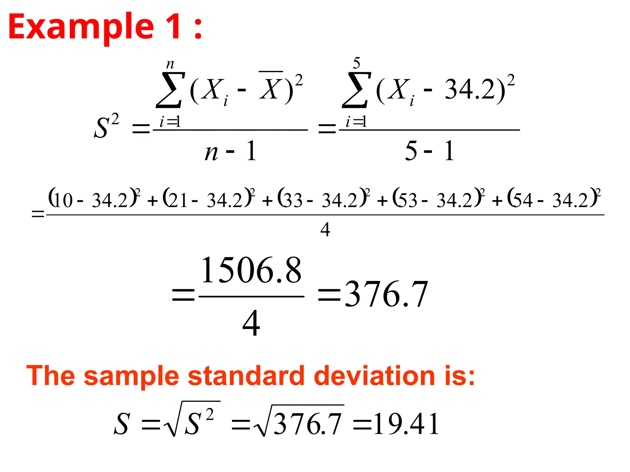
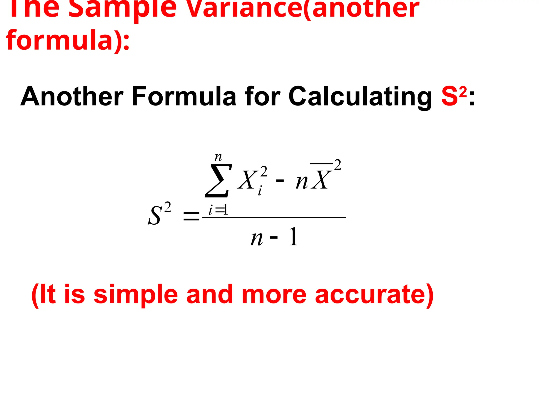
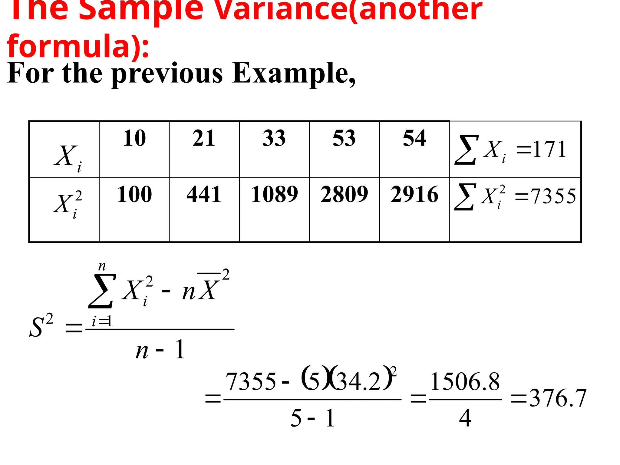
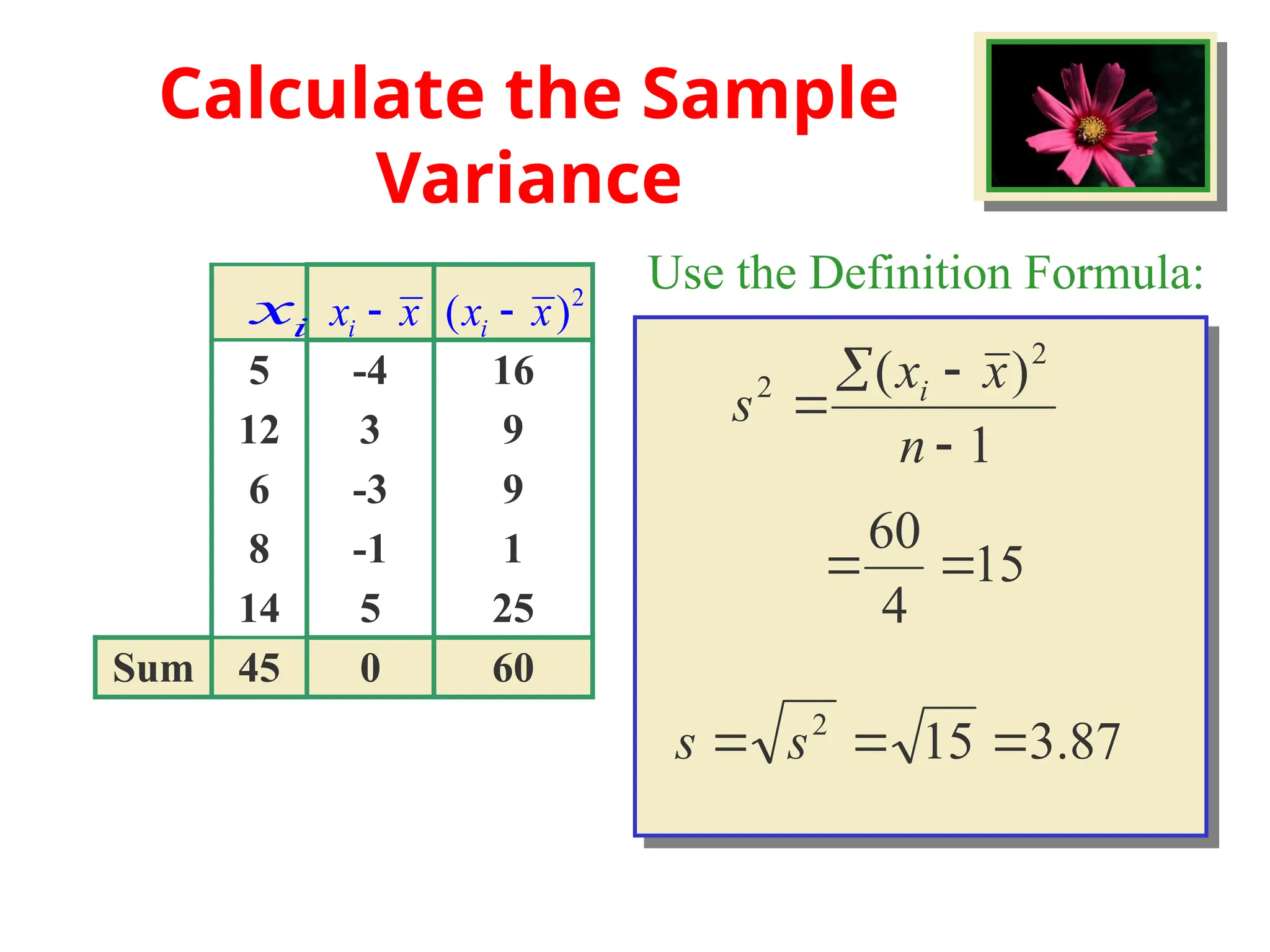
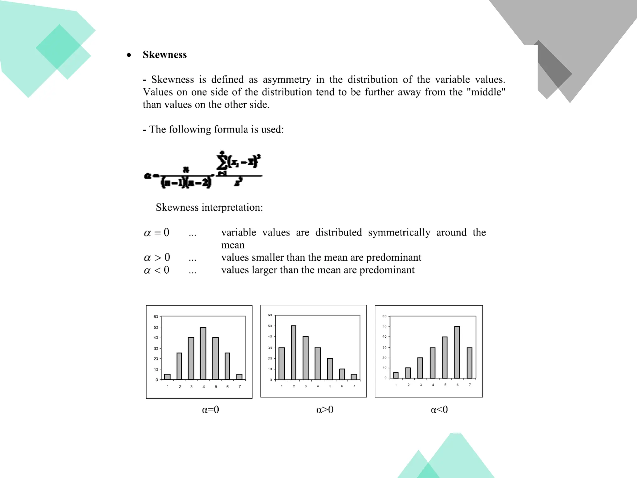
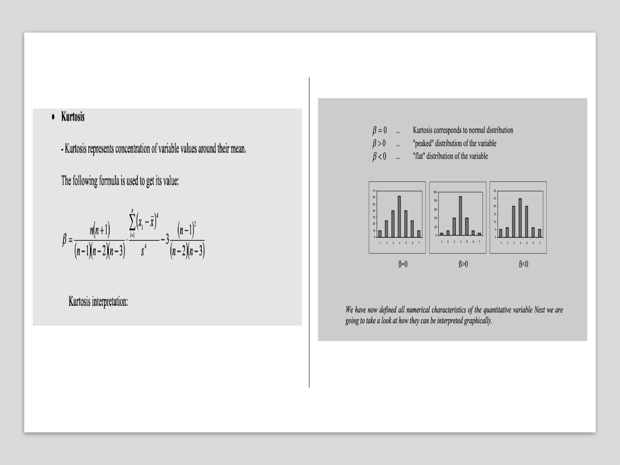
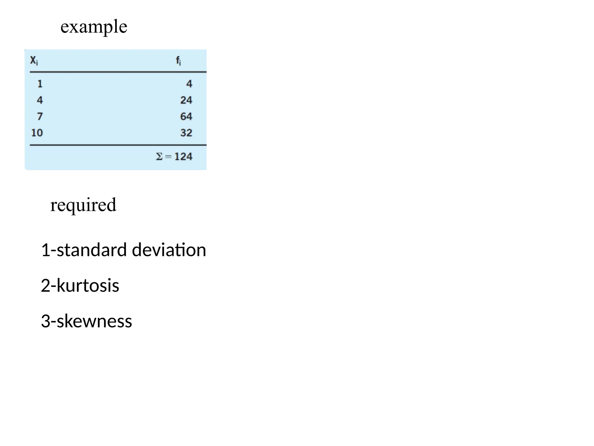
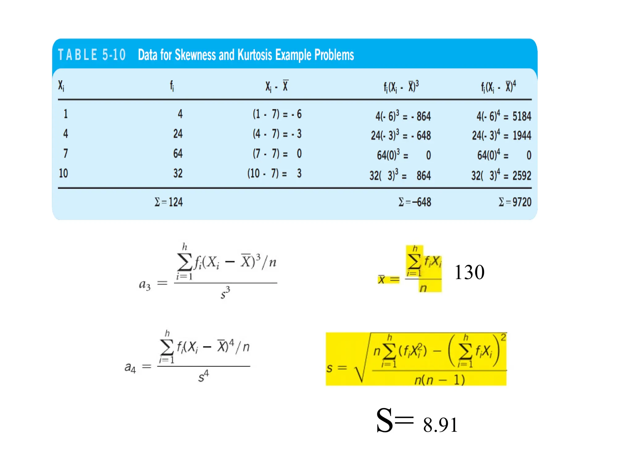
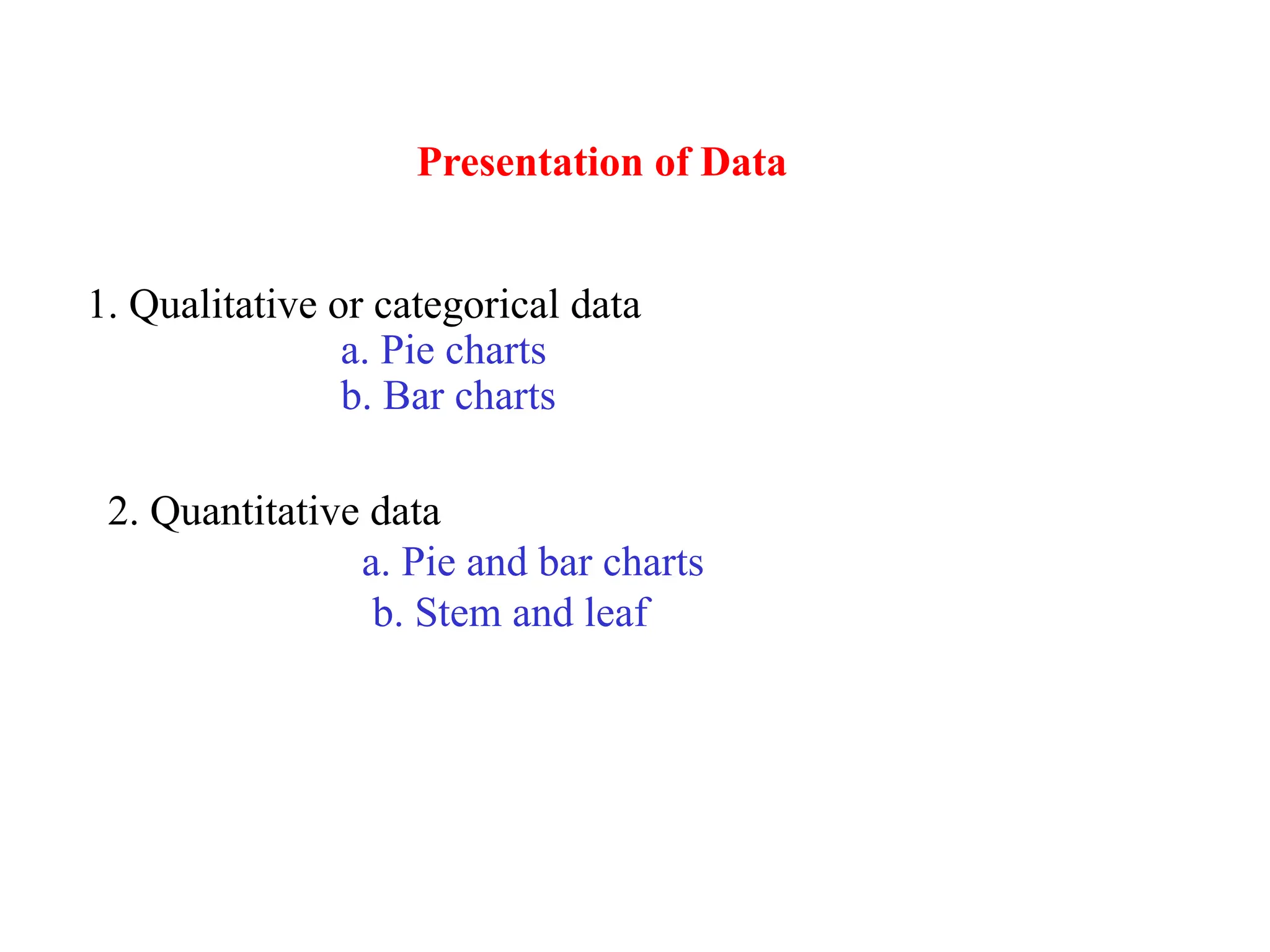
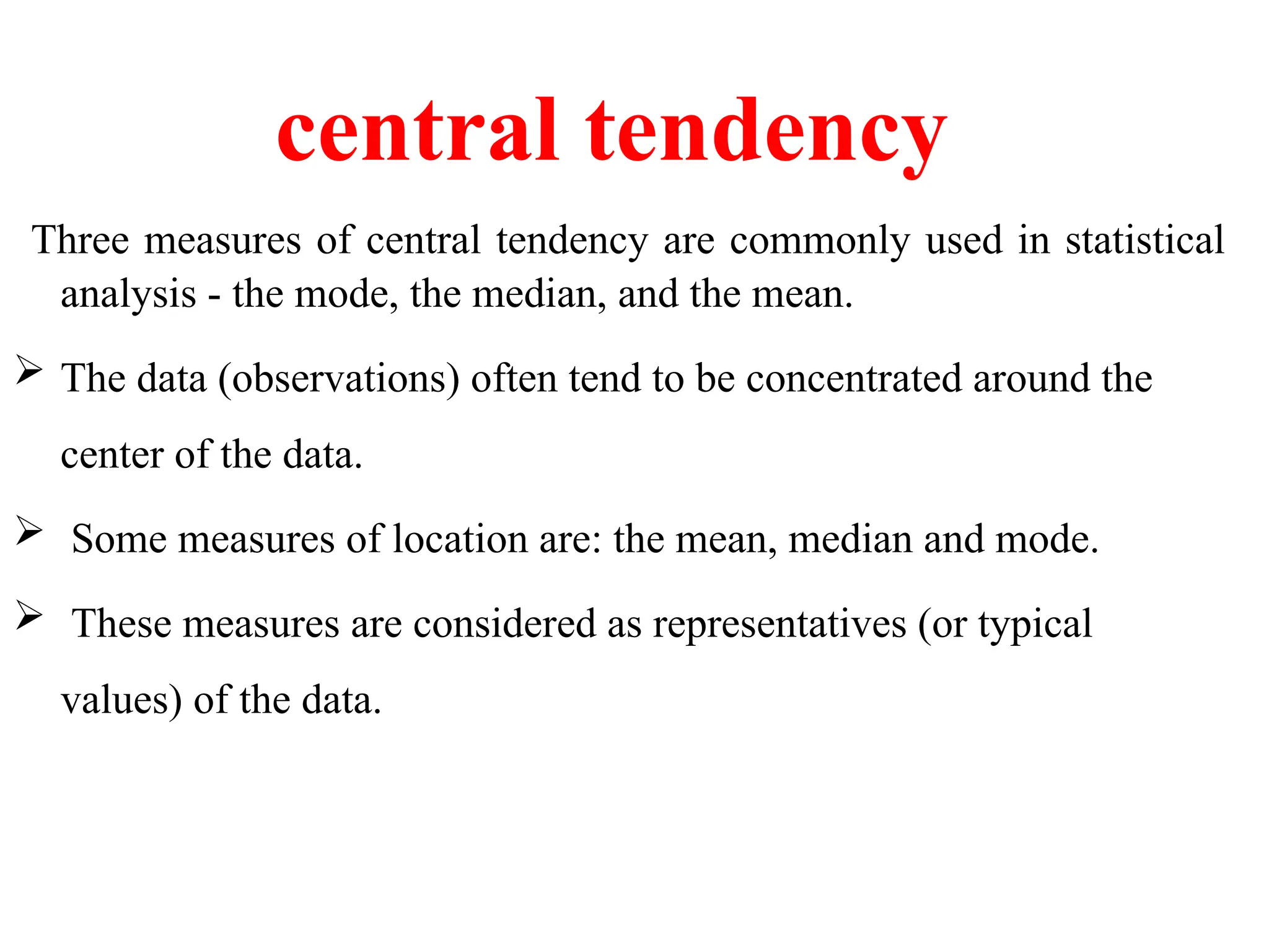
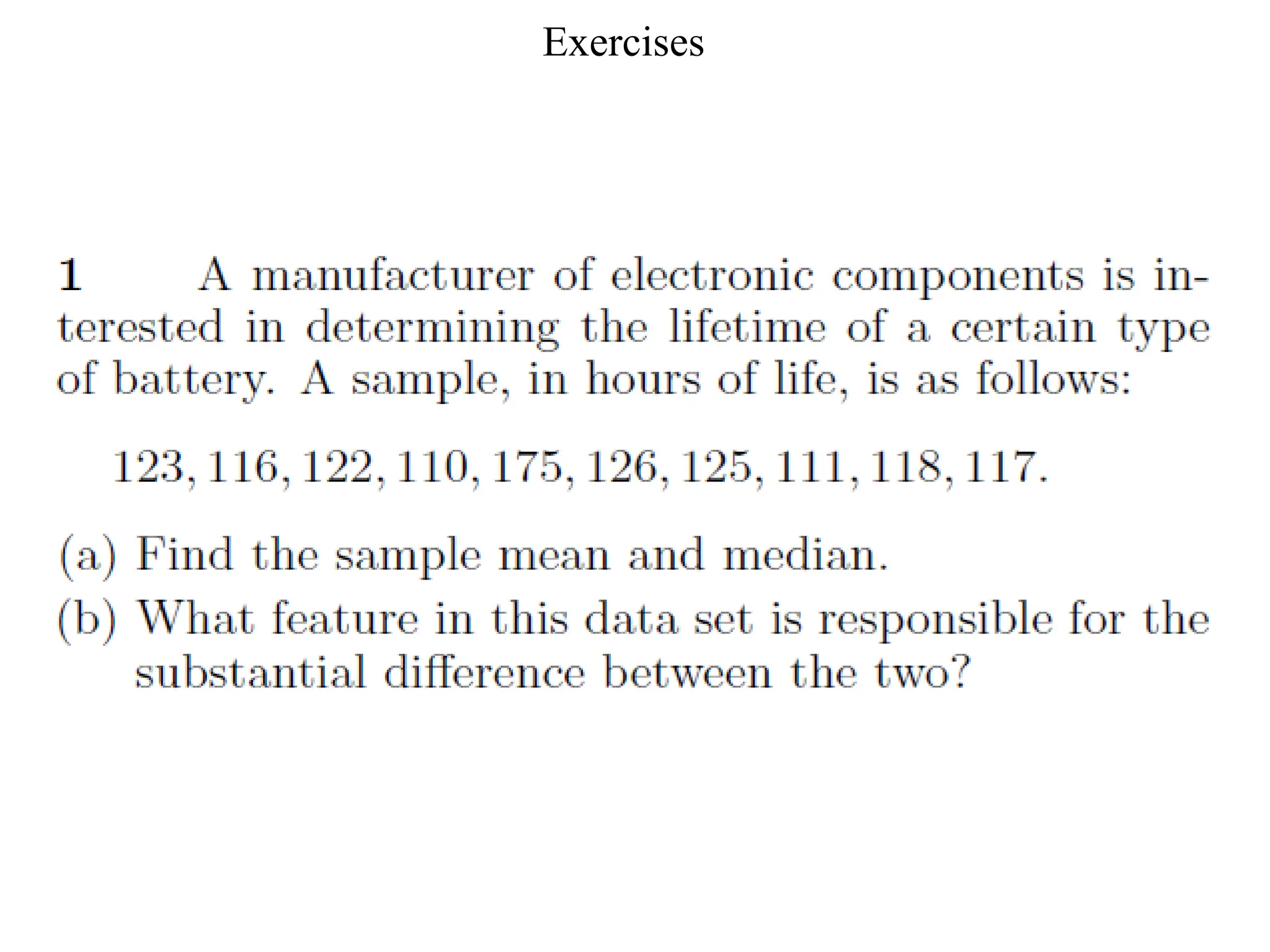
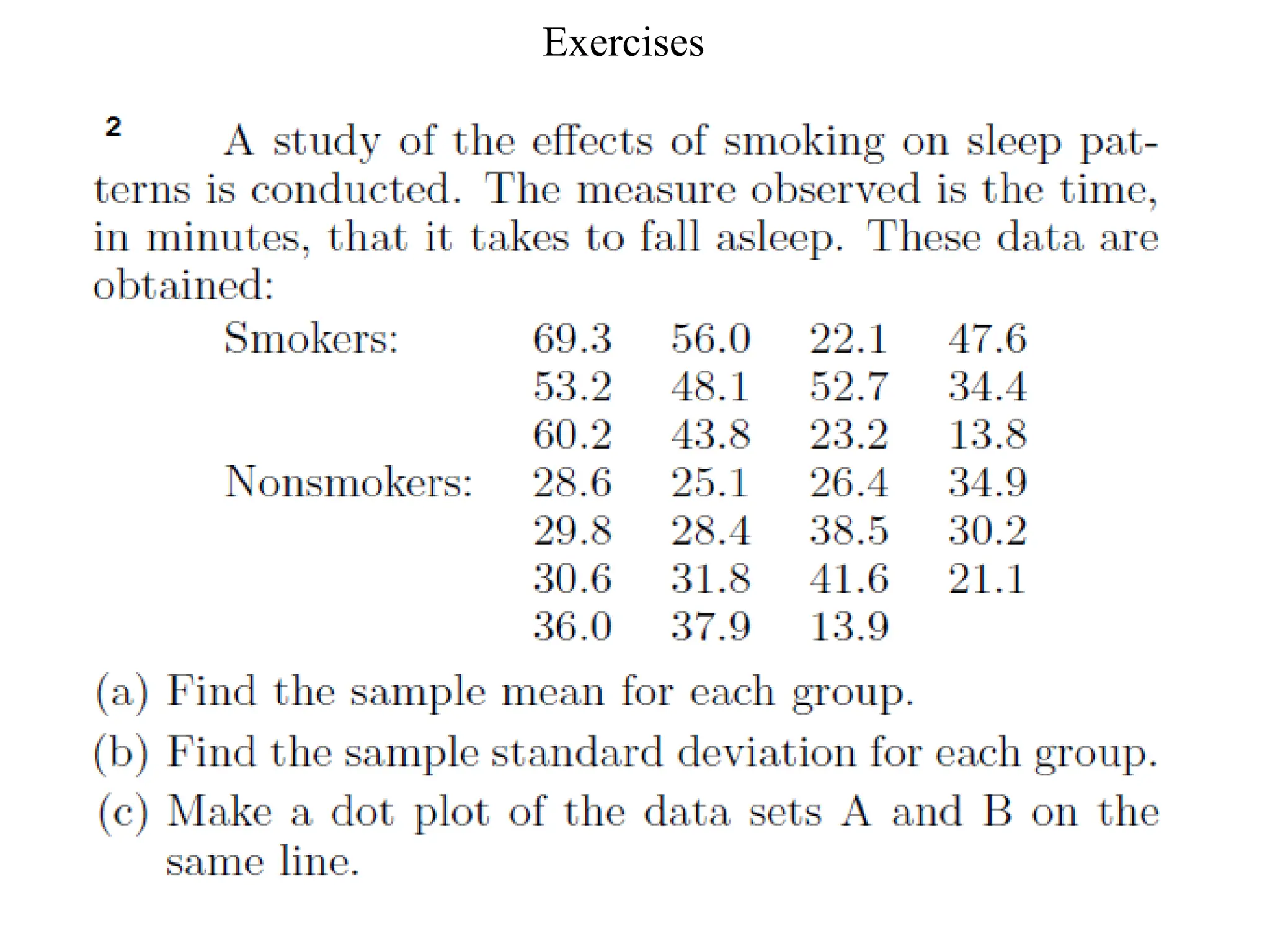
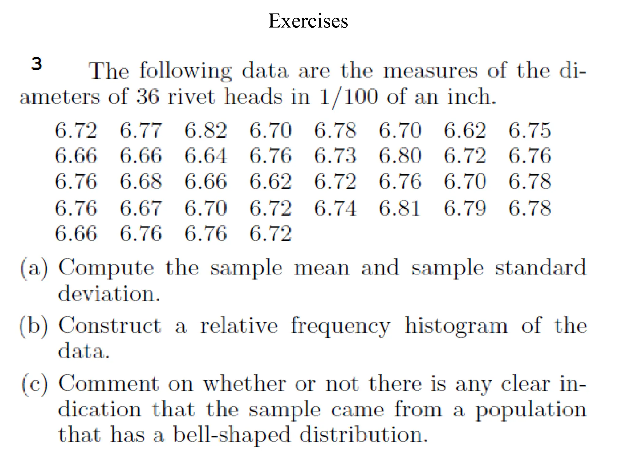
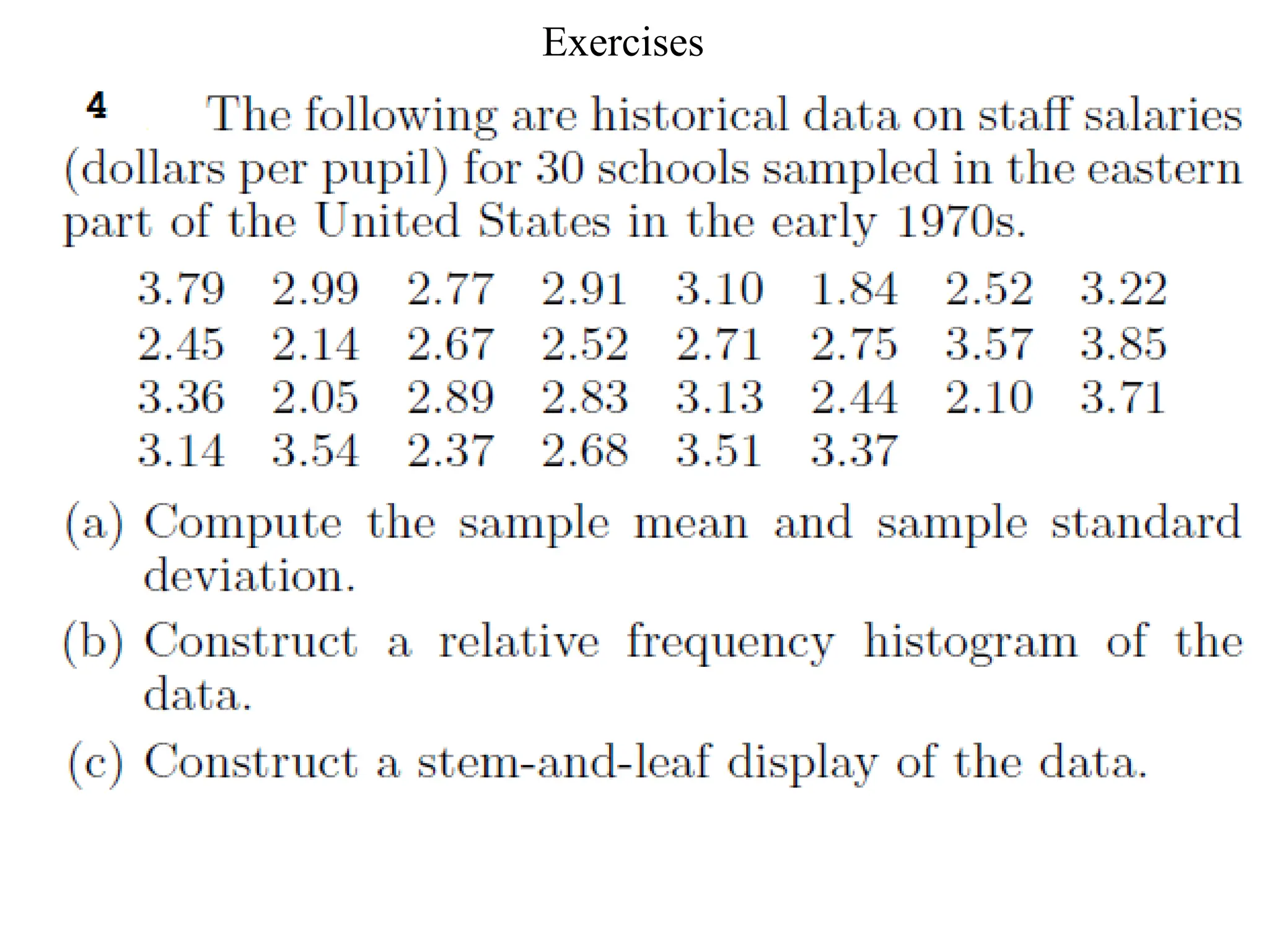
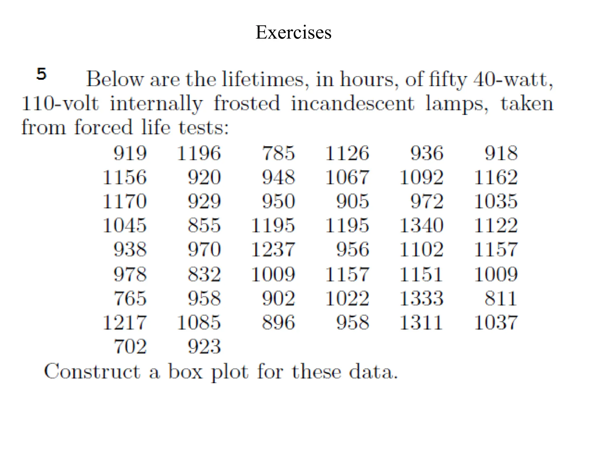
Probability and Statistics for Engineers
Lecture 2
Presentation of Data
Central Tendency: Mode, Median, Mean
Dispersion: Variance, Standard Deviation
Chapter 1: lesson 2
Example 1: Making a Frequency
Table
 n : total of frequency
 The interval must equal width.
Use for qualitative and discrete data.
You should cover all values and categories.
2.Histogram
• A histogram is a bar graph used to display the frequency of data
divided into equal intervals. The bars must be of equal width and
should touch, but not overlap.
• Histogram: A graph in which the classes are marked on the
horizontal axis and the class frequencies on the vertical axis.
The class frequencies are represented by the heights of the bars
and the bars are drawn adjacent to each other.
Example 1: Making a Histogram
Use the frequency table in Example 2 to make a histogram.
Step 1 Use the scale and interval
from the frequency table.
Step 2 Draw a bar for the number
of classes in each interval.
Number
Enrolled
Frequency
1 – 10 1
11 – 20 4
21 – 30 5
31 – 40 2
Enrollment in Western
Civilization Classes
All bars should be the same
width. The bars should touch,
but not overlap.
Example 1 Continued
Step 3 Title the graph
and label the horizontal
and vertical scales.
Example 2
Make a histogram for the number of days of
Maria’s last 15 vacations.
4, 8, 6, 7, 5, 4, 10, 6, 7, 14, 12, 8, 10, 15, 12
Interval Frequency
4 – 6 5
7 – 9 4
10 – 12 4
13 – 15 2
Number of Vacation Days
Step 1 Use the scale and interval from the frequency table.
Example 2 Continued
Step 2 Draw a bar for the number of scores in each
interval.
Step 3 Title the graph
and label the horizontal
and vertical scales.
Vacations
3. Bar chart and frequency
polygon
Bar chart
The scores/categories along the x-axis and the frequencies on the
y-axis.
When data discrete and the frequency refer to individual values we
use bar chart.
The bars do not touch (unlike a histogram).
The scores are not ordered.
The heights correspond to the number of times the score occurs.
Color
Frequency
Green
Orange
Blue
Red
Yellow
Brown
6
5
4
3
2
1
0
The following table represents distribution of students
according to their faculties in one of universities:
Example
Faculty Students
Science 150
Medicine 100
Arts 250
Education 300
Economics 200
Total 1000
Example
3. Bar chart and frequency
polygon
frequency polygon
The scores/categories along the x-axis
and the frequencies on the
y-axis.
A frequency polygon consists of line
segments connecting the points formed
by the class midpoint and the class
frequency.
A frequency polygon is similar to a
histogram, except line segments are
used instead of bars – the points formed
by the intersections of the class
midpoints and the class frequencies.
Draw a polygon for the following data
Example
To draw polygon we need to compute classes midpoints
Example
Compare the Frequency Polygon
to the Histogram
To turn a histogram into a frequency polygon, just draw a line
from the top center of each bar
16.0%
Green
20.0%
Orange
24.0%
Blue
12.0%
Red
16.0%
Yellow
12.0%
Brown
Pie chart
pie chart (or a circle graph) is a circular chart divided into
sectors, illustrating numerical proportion.
A pie chart is a circle that is divided into sections according to
the percentage of frequencies in each category of the
distribution.
Solution
Arithmetic Mean or Average
• The mean of a set of measurements is the
sum of the measurements divided by the
total number of measurements.
n
x
x i


where n = number of measurements
ts
measuremen
the
all
of
sum

 i
x
The Sample Mean:
If the list is a statistical population, then the
mean of that population is called a
population mean ,denoted by µ.
If the list is a statistical sample, we call the
resulting statistic a sample mean. denoted
by .
X
19
Example
•The set: 2, 9, 1 1, 5, 6



n
x
x i
6
.
6
5
33
5
6
5
11
9
2






If we were able to enumerate the whole
population, the population mean would be
called m .
Arithmetic Mean or Average
• Finding the Mean?
If X = {3, 5, 10, 4, 3}
X = (3 + 5 + 10 + 4 + 3) / 5
= 25 / 5
= 5
• The median of a set of measurements is
the middle measurement when the
measurements are ranked from smallest
to largest.
• The position of the median is
Median
.5(n + 1)
once the measurements have been
ordered.
Example
• The set: 2, 4, 9, 8, 6, 5, 3 n = 7
• Sort: 2, 3, 4, 5, 6, 8, 9
• Position: .5(n + 1) = .5(7 + 1) = 4th
Median = 4th
largest measurement
• The set: 2, 4, 9, 8, 6, 5 n = 6
• Sort:2, 4, 5, 6, 8, 9
• Position: .5(n + 1) = .5(6 + 1) = 3.5th
Median = (5 + 6)/2 = 5.5 — average of the 3rd
and 4th
measurements
Mode
• The mode is the measurement which occurs
most frequently.
• The set: 2, 4, 9, 8, 8, 5, 3
–The mode is 8, which occurs twice
• The set: 2, 2, 9, 8, 8, 5, 3
–There are two modes—8 and 2 (bimodal)
• The set: 2, 4, 9, 8, 5, 3
–There is no mode (each value is unique).
Example
• Mean?
• Median?
• Mode?
The number of quarts of milk purchased by
25 households:
0 0 1 1 1 1 1 2 2 2 2 2 2 2 2
2 3 3 3 3 3 4 4 4 5
2
.
2
25
55




n
x
x i
2

m
2
mode 
Exercise
• Find the Median , mode, mean?
 4 5 6 6 7 8 9 10 12
 5 6 6 7 8 9 10 12
 4, 5, 8, 7
•For what value of X will 8 and X have the same
sample mean as 27 and 5?
Solution:
First, find the mean of 27 and 5:
Now, find the X value, knowing that the sample
mean of X and 8 must be 16 :
cross multiply and solve: 32 = X + 8 X
=24
16
2
5
27


16
2
8


X
27
Exercise
• On his first 5 Stat. tests, Omer received the
following marks : 72, 86, 92, 63, and 77. What
test mark must Omer earn on his sixth test so
that his average for all six tests will be 80? .
• Solution
Set up an equation to represent the situation.
80
6
77
63
92
86
72





 X
Omer must get a 90 on the sixth test.
X= 90
28
Exercise
29
Measures of Dispersion
The variation or dispersion in a set of data refers to
how spread out the observations are from each
other.
The variation is small when the observations are
close together. There is no variation if the
observations are the same.
Measures of dispersion are important for
describing the spread of the data, or its variation
around a central value . or express quantitatively the
degree of variation or dispersion of values.
There are various methods that can be used to
measure the dispersion of a data set, each with its
own set of advantages and disadvantages.
30
Measures of Dispersion
The Range
The difference between the largest and smallest
sample values
If X1,X2,………..,Xn are the values of
observations in a sample then range is given by:
31
)
,......,
,
min(
)
,......,
,
max(
)
,......,
,
(
2
1
2
1
2
1
n
n
n
X
X
X
X
X
X
X
X
X
Range


find The range of (12, 24, 19, 20, 7) .
Solution:
32
The Range (Example):
17
7
24 


Range
 One of the simplest measures of variability to calculate.
 Depends only on extreme values and provides no
information about how the remaining data is distributed.
Mean Absolute
Deviation(M.A.D.)
The key concept for describing normal distributions
and making predictions from them is called
deviation from the mean.
We could just calculate the average distance between each
observation and the mean.
• We must take the absolute value of the distance, otherwise
they would just cancel out to zero!
Formula:
| |
i
X X
n


Mean Deviation: An Example
1. Compute X (Average)
2. Compute X – X and take
the Absolute Value to get
Absolute Deviations
3. Sum the Absolute
Deviations
4. Divide the sum of the
absolute deviations by N
X – Xi Abs. Dev.
7 – 6 1
7 – 10 3
7 – 5 2
7 – 4 3
7 – 9 2
7 – 8 1
Data: X = {6, 10, 5, 4, 9, 8} X = 42 / 6 = 7
Total: 12 12 / 6 = 2
If X1,X2,………..,XN are the population values, then the
population variance is:
35
The Population Variance:
Using summation form:
     
N
X
X
X N
2
2
2
2
1
2 ......... 










 




N
i
i
X
N 1
2
2 1


Where μ is population mean
If X1,X2,………..,Xn are the population values, then the
sample variance is:
36
The Sample Variance:
Using summation form:
     
1
.........
2
2
2
2
1
2








n
X
X
X
X
X
X
S n
 





n
i
i X
X
n
S
1
2
2
1
1
37
The Sample Variance:
Where:
is the sample mean.
n
X
X
n
i
i /
1



(n 1) : is called the degrees of freedom (df) associated with
the sample variance S2.
Note:
38
The Sample Standard Deviation :
The standard deviation is another
measure of variation. It is the square
root of the variance, i.e., it is:
1
)
(
1
2
2






n
X
X
S
S
n
i
i
Compute the sample variance and standard
deviation of the following observations
(ages in year): 10, 21, 33, 53, 54.
5
54
53
33
21
10
5
5
1
1 







 
 i
i
n
i
i X
n
X
X
Example 1 :
Solution
(year)
2
.
34
5
171


Example 1 :
1
5
)
2
.
34
(
1
)
(
5
1
2
1
2
2







 
 i
i
n
i
i X
n
X
X
S
         
4
2
.
34
54
2
.
34
53
2
.
34
33
2
.
34
21
2
.
34
10
2
2
2
2
2










7
.
376
4
8
.
1506


The sample standard deviation is:
41
.
19
7
.
376
2


 S
S
(It is simple and more accurate)
The Sample Variance(another
formula):
1
1
2
2
2





n
X
n
X
S
n
i
i
Another Formula for Calculating S2
:
i
X  171
i
X
 7355
2
i
X
10 21 33 53 54
100 441 1089 2809 2916
2
i
X
   7
.
376
4
8
.
1506
1
5
2
.
34
5
7355
2





The Sample Variance(another
formula):
For the previous Example,
1
1
2
2
2





n
X
n
X
S
n
i
i
Calculate the Sample
Variance
1
)
( 2
2




n
x
x
s i
5 -4 16
12 3 9
6 -3 9
8 -1 1
14 5 25
Sum 45 0 60
Use the Definition Formula:
i
x i
x x
 2
( )
i
x x

15
4
60


87
.
3
15
2


 s
s
example
required
1-standard deviation
2-kurtosis
3-skewness
S= 8.91
130
Exercise
• Compute the Range, sample variance
and standard deviation of the following
observations :5,12,6,8,14
1
)
( 2
2
2





n
n
x
x
s
i
i
5 25
12 144
6 36
8 64
14 196
Sum 45 465
i
x
2
i
x
15
4
5
45
465
2



87
.
3
15
2


 s
s
Exercise
4.Stem and Leaf Plots
• A simple graph for quantitative data
• Uses the actual numerical values of each data
point.
–Divide each measurement into two parts: the stem
and the leaf.
–List the stems in a column, with a vertical line to
their right.
–For each measurement, record the leaf portion in the
same row as its matching stem.
–Order the leaves from lowest to highest in each
stem.
–The range is the difference between the greatest and
the least value.
4.Stem and Leaf Plots
• To write 42 in a stem-and-leaf plot, write
each digit in a separate column.
Example
The prices ($) of 18 brands of walking shoes:
90 70 70 70 75 70 65 68 60
74 70 95 75 70 68 65 40 65
4 0
5
6 5 8 0 8 5 5
7 0 0 0 5 0 4 0 5 0
8
9 0 5
4 0
5
6 0 5 5 5 8 8
7 0 0 0 0 0 0 4 5 5
8
9 0 5
Reorder
Leaf unit = 1
stem unit = 10
n= 18
least value =40
greatest value=95
Range=95-40=55
Example : Creating Stem-and-Leaf Plots
Use the data in the table to make a stem-and-
leaf plot.
Test Scores
75 86 83 91 94
88 84 99 79 86
What is the least value?
What is the greatest value?
n=?
Leaf unit?
Stream unit?
Range?
Exercise
Use the data in the table to make a stem-
and-leaf plot.
Find the least value, greatest value,
range of the data.
Test Scores
72 88 64 79 61
84 83 76 74 67
1. Qualitative or categorical data
a. Pie charts
b. Bar charts
2. Quantitative data
a. Pie and bar charts
b. Stem and leaf
Presentation of Data
central tendency
Three measures of central tendency are commonly used in statistical
analysis - the mode, the median, and the mean.
 The data (observations) often tend to be concentrated around the
center of the data.
 Some measures of location are: the mean, median and mode.
 These measures are considered as representatives (or typical
values) of the data.
InterQuartile Range (1/7)
(The Range of the middle 50% of scores)
IQR = Q3 – Q1
What are Q3 and Q1?
Q1 is the lower quartile of 25th
percentile.
Q3 is the upper quartile of 75th
percentile.
Example 1
1, 3, 5, 6, 7, 8, 8
Median =
6
Q3 =
Middle of
top half.
8 Q1 =
Middle of
lower half.
3
IQR = Q3 - Q1
= 8 - 3
= 5
Inter-quartile Range
Example 2
2, 3, 6, 6, 7, 8.
Median =
6
Q3 =
Middle of
top half.
7 Q1 =
Middle of
lower half.
3 IQR = Q3 - Q1
= 7 - 3
= 4
Example 3
2, 3, 5, 6, 7, 9, 9, 10.
Median =
6.5
Q3 =
Middle of
top half.
9 Q1 =
Middle of
lower half.
4 IQR = Q3 - Q1
= 9 - 4
= 5
Inter-quartile Range and Dot Plots
0 1 2 3 4 5 6 7 8
Median
Q1 Q3
IQR = Q3 – Q1
= 5 – 2
= 3
Lower
Quartile
= 5½
Q1
Upper
Quartile
= 9
Q3
Median
= 8
Q2
4 5 6 7 8 9 10 11 12
4, 4, 5, 6, 8, 8, 8, 9, 9, 9, 10, 12
Example 1: Draw a Box plot for the data below
Drawing a Box Plot.
Upper
Quartile
= 10
Q3
Lower
Quartile
= 4
Q1
Median
= 8
Q2
3, 4, 4, 6, 8, 8, 8, 9, 10, 10, 15,
Example 2: Draw a Box plot for the data below
Drawing a Box Plot.
3 4 5 6 7 8 9 10 11 12 13 14 15
Question: Stuart recorded the heights in cm of boys in his
class as shown below. Draw a box plot for this data.
Drawing a Box Plot.
137, 148, 155, 158, 165, 166, 166, 171, 171, 173, 175, 180, 184, 186, 186
Upper
Quartile
= 180
Qu
Lower
Quartile
= 158
QL
Median
= 171
Q2
Question: Stuart recorded the heights in cm of boys in his
class as shown below. Draw a box plot for this data.
Drawing a Box Plot.
137, 148, 155, 158, 165, 166, 166, 171, 171, 173, 175, 180, 184, 186, 186
130 140 150 160 170 180 190
cm
Exercises
Exercises
Exercises
Exercises
Exercises

Lesson2 lecture two in Measures mean.pptx

  • 1.
    Probability and Statisticsfor Engineers Lecture 2
  • 2.
    Presentation of Data CentralTendency: Mode, Median, Mean Dispersion: Variance, Standard Deviation Chapter 1: lesson 2
  • 3.
    Example 1: Makinga Frequency Table  n : total of frequency  The interval must equal width. Use for qualitative and discrete data. You should cover all values and categories.
  • 4.
    2.Histogram • A histogramis a bar graph used to display the frequency of data divided into equal intervals. The bars must be of equal width and should touch, but not overlap. • Histogram: A graph in which the classes are marked on the horizontal axis and the class frequencies on the vertical axis. The class frequencies are represented by the heights of the bars and the bars are drawn adjacent to each other.
  • 5.
    Example 1: Makinga Histogram Use the frequency table in Example 2 to make a histogram. Step 1 Use the scale and interval from the frequency table. Step 2 Draw a bar for the number of classes in each interval. Number Enrolled Frequency 1 – 10 1 11 – 20 4 21 – 30 5 31 – 40 2 Enrollment in Western Civilization Classes All bars should be the same width. The bars should touch, but not overlap.
  • 6.
    Example 1 Continued Step3 Title the graph and label the horizontal and vertical scales.
  • 7.
    Example 2 Make ahistogram for the number of days of Maria’s last 15 vacations. 4, 8, 6, 7, 5, 4, 10, 6, 7, 14, 12, 8, 10, 15, 12 Interval Frequency 4 – 6 5 7 – 9 4 10 – 12 4 13 – 15 2 Number of Vacation Days Step 1 Use the scale and interval from the frequency table.
  • 8.
    Example 2 Continued Step2 Draw a bar for the number of scores in each interval. Step 3 Title the graph and label the horizontal and vertical scales. Vacations
  • 9.
    3. Bar chartand frequency polygon Bar chart The scores/categories along the x-axis and the frequencies on the y-axis. When data discrete and the frequency refer to individual values we use bar chart. The bars do not touch (unlike a histogram). The scores are not ordered. The heights correspond to the number of times the score occurs. Color Frequency Green Orange Blue Red Yellow Brown 6 5 4 3 2 1 0
  • 10.
    The following tablerepresents distribution of students according to their faculties in one of universities: Example Faculty Students Science 150 Medicine 100 Arts 250 Education 300 Economics 200 Total 1000
  • 11.
  • 12.
    3. Bar chartand frequency polygon frequency polygon The scores/categories along the x-axis and the frequencies on the y-axis. A frequency polygon consists of line segments connecting the points formed by the class midpoint and the class frequency. A frequency polygon is similar to a histogram, except line segments are used instead of bars – the points formed by the intersections of the class midpoints and the class frequencies.
  • 13.
    Draw a polygonfor the following data Example To draw polygon we need to compute classes midpoints
  • 14.
  • 15.
    Compare the FrequencyPolygon to the Histogram To turn a histogram into a frequency polygon, just draw a line from the top center of each bar
  • 16.
    16.0% Green 20.0% Orange 24.0% Blue 12.0% Red 16.0% Yellow 12.0% Brown Pie chart pie chart(or a circle graph) is a circular chart divided into sectors, illustrating numerical proportion. A pie chart is a circle that is divided into sections according to the percentage of frequencies in each category of the distribution.
  • 17.
  • 18.
    Arithmetic Mean orAverage • The mean of a set of measurements is the sum of the measurements divided by the total number of measurements. n x x i   where n = number of measurements ts measuremen the all of sum   i x
  • 19.
    The Sample Mean: Ifthe list is a statistical population, then the mean of that population is called a population mean ,denoted by µ. If the list is a statistical sample, we call the resulting statistic a sample mean. denoted by . X 19
  • 20.
    Example •The set: 2,9, 1 1, 5, 6    n x x i 6 . 6 5 33 5 6 5 11 9 2       If we were able to enumerate the whole population, the population mean would be called m .
  • 21.
    Arithmetic Mean orAverage • Finding the Mean? If X = {3, 5, 10, 4, 3} X = (3 + 5 + 10 + 4 + 3) / 5 = 25 / 5 = 5
  • 22.
    • The medianof a set of measurements is the middle measurement when the measurements are ranked from smallest to largest. • The position of the median is Median .5(n + 1) once the measurements have been ordered.
  • 23.
    Example • The set:2, 4, 9, 8, 6, 5, 3 n = 7 • Sort: 2, 3, 4, 5, 6, 8, 9 • Position: .5(n + 1) = .5(7 + 1) = 4th Median = 4th largest measurement • The set: 2, 4, 9, 8, 6, 5 n = 6 • Sort:2, 4, 5, 6, 8, 9 • Position: .5(n + 1) = .5(6 + 1) = 3.5th Median = (5 + 6)/2 = 5.5 — average of the 3rd and 4th measurements
  • 24.
    Mode • The modeis the measurement which occurs most frequently. • The set: 2, 4, 9, 8, 8, 5, 3 –The mode is 8, which occurs twice • The set: 2, 2, 9, 8, 8, 5, 3 –There are two modes—8 and 2 (bimodal) • The set: 2, 4, 9, 8, 5, 3 –There is no mode (each value is unique).
  • 25.
    Example • Mean? • Median? •Mode? The number of quarts of milk purchased by 25 households: 0 0 1 1 1 1 1 2 2 2 2 2 2 2 2 2 3 3 3 3 3 4 4 4 5 2 . 2 25 55     n x x i 2  m 2 mode 
  • 26.
    Exercise • Find theMedian , mode, mean?  4 5 6 6 7 8 9 10 12  5 6 6 7 8 9 10 12  4, 5, 8, 7
  • 27.
    •For what valueof X will 8 and X have the same sample mean as 27 and 5? Solution: First, find the mean of 27 and 5: Now, find the X value, knowing that the sample mean of X and 8 must be 16 : cross multiply and solve: 32 = X + 8 X =24 16 2 5 27   16 2 8   X 27 Exercise
  • 28.
    • On hisfirst 5 Stat. tests, Omer received the following marks : 72, 86, 92, 63, and 77. What test mark must Omer earn on his sixth test so that his average for all six tests will be 80? . • Solution Set up an equation to represent the situation. 80 6 77 63 92 86 72       X Omer must get a 90 on the sixth test. X= 90 28 Exercise
  • 29.
    29 Measures of Dispersion Thevariation or dispersion in a set of data refers to how spread out the observations are from each other. The variation is small when the observations are close together. There is no variation if the observations are the same.
  • 30.
    Measures of dispersionare important for describing the spread of the data, or its variation around a central value . or express quantitatively the degree of variation or dispersion of values. There are various methods that can be used to measure the dispersion of a data set, each with its own set of advantages and disadvantages. 30 Measures of Dispersion
  • 31.
    The Range The differencebetween the largest and smallest sample values If X1,X2,………..,Xn are the values of observations in a sample then range is given by: 31 ) ,......, , min( ) ,......, , max( ) ,......, , ( 2 1 2 1 2 1 n n n X X X X X X X X X Range  
  • 32.
    find The rangeof (12, 24, 19, 20, 7) . Solution: 32 The Range (Example): 17 7 24    Range  One of the simplest measures of variability to calculate.  Depends only on extreme values and provides no information about how the remaining data is distributed.
  • 33.
    Mean Absolute Deviation(M.A.D.) The keyconcept for describing normal distributions and making predictions from them is called deviation from the mean. We could just calculate the average distance between each observation and the mean. • We must take the absolute value of the distance, otherwise they would just cancel out to zero! Formula: | | i X X n  
  • 34.
    Mean Deviation: AnExample 1. Compute X (Average) 2. Compute X – X and take the Absolute Value to get Absolute Deviations 3. Sum the Absolute Deviations 4. Divide the sum of the absolute deviations by N X – Xi Abs. Dev. 7 – 6 1 7 – 10 3 7 – 5 2 7 – 4 3 7 – 9 2 7 – 8 1 Data: X = {6, 10, 5, 4, 9, 8} X = 42 / 6 = 7 Total: 12 12 / 6 = 2
  • 35.
    If X1,X2,………..,XN arethe population values, then the population variance is: 35 The Population Variance: Using summation form:       N X X X N 2 2 2 2 1 2 .........                  N i i X N 1 2 2 1   Where μ is population mean
  • 36.
    If X1,X2,………..,Xn arethe population values, then the sample variance is: 36 The Sample Variance: Using summation form:       1 ......... 2 2 2 2 1 2         n X X X X X X S n        n i i X X n S 1 2 2 1 1
  • 37.
    37 The Sample Variance: Where: isthe sample mean. n X X n i i / 1    (n 1) : is called the degrees of freedom (df) associated with the sample variance S2. Note:
  • 38.
    38 The Sample StandardDeviation : The standard deviation is another measure of variation. It is the square root of the variance, i.e., it is: 1 ) ( 1 2 2       n X X S S n i i
  • 39.
    Compute the samplevariance and standard deviation of the following observations (ages in year): 10, 21, 33, 53, 54. 5 54 53 33 21 10 5 5 1 1            i i n i i X n X X Example 1 : Solution (year) 2 . 34 5 171  
  • 40.
    Example 1 : 1 5 ) 2 . 34 ( 1 ) ( 5 1 2 1 2 2          i i n i i X n X X S           4 2 . 34 54 2 . 34 53 2 . 34 33 2 . 34 21 2 . 34 10 2 2 2 2 2           7 . 376 4 8 . 1506   The sample standard deviation is: 41 . 19 7 . 376 2    S S
  • 41.
    (It is simpleand more accurate) The Sample Variance(another formula): 1 1 2 2 2      n X n X S n i i Another Formula for Calculating S2 :
  • 42.
    i X  171 i X 7355 2 i X 10 21 33 53 54 100 441 1089 2809 2916 2 i X    7 . 376 4 8 . 1506 1 5 2 . 34 5 7355 2      The Sample Variance(another formula): For the previous Example, 1 1 2 2 2      n X n X S n i i
  • 43.
    Calculate the Sample Variance 1 ) (2 2     n x x s i 5 -4 16 12 3 9 6 -3 9 8 -1 1 14 5 25 Sum 45 0 60 Use the Definition Formula: i x i x x  2 ( ) i x x  15 4 60   87 . 3 15 2    s s
  • 46.
  • 47.
  • 48.
    Exercise • Compute theRange, sample variance and standard deviation of the following observations :5,12,6,8,14
  • 49.
    1 ) ( 2 2 2      n n x x s i i 5 25 12144 6 36 8 64 14 196 Sum 45 465 i x 2 i x 15 4 5 45 465 2    87 . 3 15 2    s s Exercise
  • 50.
    4.Stem and LeafPlots • A simple graph for quantitative data • Uses the actual numerical values of each data point. –Divide each measurement into two parts: the stem and the leaf. –List the stems in a column, with a vertical line to their right. –For each measurement, record the leaf portion in the same row as its matching stem. –Order the leaves from lowest to highest in each stem. –The range is the difference between the greatest and the least value.
  • 51.
    4.Stem and LeafPlots • To write 42 in a stem-and-leaf plot, write each digit in a separate column.
  • 52.
    Example The prices ($)of 18 brands of walking shoes: 90 70 70 70 75 70 65 68 60 74 70 95 75 70 68 65 40 65 4 0 5 6 5 8 0 8 5 5 7 0 0 0 5 0 4 0 5 0 8 9 0 5 4 0 5 6 0 5 5 5 8 8 7 0 0 0 0 0 0 4 5 5 8 9 0 5 Reorder Leaf unit = 1 stem unit = 10 n= 18 least value =40 greatest value=95 Range=95-40=55
  • 53.
    Example : CreatingStem-and-Leaf Plots Use the data in the table to make a stem-and- leaf plot. Test Scores 75 86 83 91 94 88 84 99 79 86 What is the least value? What is the greatest value? n=? Leaf unit? Stream unit? Range?
  • 54.
    Exercise Use the datain the table to make a stem- and-leaf plot. Find the least value, greatest value, range of the data. Test Scores 72 88 64 79 61 84 83 76 74 67
  • 55.
    1. Qualitative orcategorical data a. Pie charts b. Bar charts 2. Quantitative data a. Pie and bar charts b. Stem and leaf Presentation of Data
  • 56.
    central tendency Three measuresof central tendency are commonly used in statistical analysis - the mode, the median, and the mean.  The data (observations) often tend to be concentrated around the center of the data.  Some measures of location are: the mean, median and mode.  These measures are considered as representatives (or typical values) of the data.
  • 57.
    InterQuartile Range (1/7) (TheRange of the middle 50% of scores) IQR = Q3 – Q1 What are Q3 and Q1? Q1 is the lower quartile of 25th percentile. Q3 is the upper quartile of 75th percentile. Example 1 1, 3, 5, 6, 7, 8, 8 Median = 6 Q3 = Middle of top half. 8 Q1 = Middle of lower half. 3 IQR = Q3 - Q1 = 8 - 3 = 5
  • 58.
    Inter-quartile Range Example 2 2,3, 6, 6, 7, 8. Median = 6 Q3 = Middle of top half. 7 Q1 = Middle of lower half. 3 IQR = Q3 - Q1 = 7 - 3 = 4 Example 3 2, 3, 5, 6, 7, 9, 9, 10. Median = 6.5 Q3 = Middle of top half. 9 Q1 = Middle of lower half. 4 IQR = Q3 - Q1 = 9 - 4 = 5
  • 59.
    Inter-quartile Range andDot Plots 0 1 2 3 4 5 6 7 8 Median Q1 Q3 IQR = Q3 – Q1 = 5 – 2 = 3
  • 60.
    Lower Quartile = 5½ Q1 Upper Quartile = 9 Q3 Median =8 Q2 4 5 6 7 8 9 10 11 12 4, 4, 5, 6, 8, 8, 8, 9, 9, 9, 10, 12 Example 1: Draw a Box plot for the data below Drawing a Box Plot.
  • 61.
    Upper Quartile = 10 Q3 Lower Quartile = 4 Q1 Median =8 Q2 3, 4, 4, 6, 8, 8, 8, 9, 10, 10, 15, Example 2: Draw a Box plot for the data below Drawing a Box Plot. 3 4 5 6 7 8 9 10 11 12 13 14 15
  • 62.
    Question: Stuart recordedthe heights in cm of boys in his class as shown below. Draw a box plot for this data. Drawing a Box Plot. 137, 148, 155, 158, 165, 166, 166, 171, 171, 173, 175, 180, 184, 186, 186
  • 63.
    Upper Quartile = 180 Qu Lower Quartile = 158 QL Median =171 Q2 Question: Stuart recorded the heights in cm of boys in his class as shown below. Draw a box plot for this data. Drawing a Box Plot. 137, 148, 155, 158, 165, 166, 166, 171, 171, 173, 175, 180, 184, 186, 186 130 140 150 160 170 180 190 cm
  • 64.
  • 65.
  • 66.
  • 67.
  • 68.