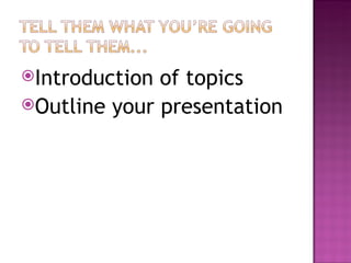
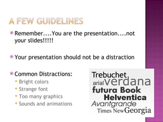
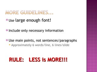
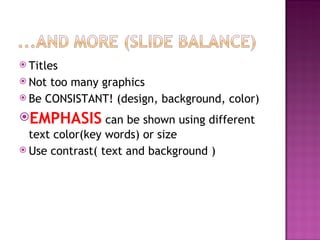
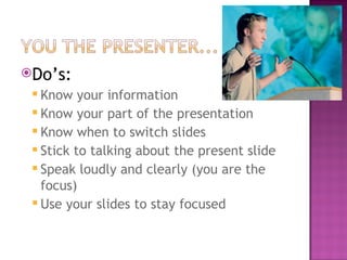
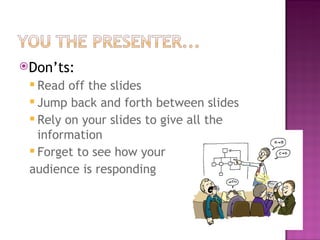
...and what NOT to do
Introduction of topics Outline your presentation
 
Are bad because they distract people when they are driving Because they keep people from having real face to face discussions, and especially when people are with other people, they don’t pay attention to what the person is saying. Waste money People use them in class, cause disruptions They are thought to cause brain cancer because of the radiation they emit Even little kids have them
 
I like cell phones, and think they are cool!
 
Remember....You are the presentation....not your slides!!!!! Your presentation should not be a distraction Common Distractions: Bright colors Strange font Too many graphics Sounds and animations
Use  large enough font! Include only necessary information Use main points, not sentences/paragraphs Approximately 6 words/line, 6 lines/slide RULE:  LESS is MORE!!!
Titles Not too many graphics Be CONSISTANT! (design, background, color) EMPHASIS  can be shown using different text color(key words) or size Use contrast( text and background )
Do’s:  Know your information Know your part of the presentation Know when to switch slides Stick to talking about the present slide Speak loudly and clearly (you are the focus) Use your slides to stay focused
Don’ts: Read off the slides Jump back and forth between slides Rely on your slides to give all the information Forget to see how your  audience is responding
....Make it interesting!!!!
 

Effective Powerpoint Presentations

  • 1.
  • 2.
    Introduction of topicsOutline your presentation
  • 3.
  • 4.
    Are bad becausethey distract people when they are driving Because they keep people from having real face to face discussions, and especially when people are with other people, they don’t pay attention to what the person is saying. Waste money People use them in class, cause disruptions They are thought to cause brain cancer because of the radiation they emit Even little kids have them
  • 5.
  • 6.
    I like cellphones, and think they are cool!
  • 7.
  • 8.
    Remember....You are thepresentation....not your slides!!!!! Your presentation should not be a distraction Common Distractions: Bright colors Strange font Too many graphics Sounds and animations
  • 9.
    Use largeenough font! Include only necessary information Use main points, not sentences/paragraphs Approximately 6 words/line, 6 lines/slide RULE: LESS is MORE!!!
  • 10.
    Titles Not toomany graphics Be CONSISTANT! (design, background, color) EMPHASIS can be shown using different text color(key words) or size Use contrast( text and background )
  • 11.
    Do’s: Knowyour information Know your part of the presentation Know when to switch slides Stick to talking about the present slide Speak loudly and clearly (you are the focus) Use your slides to stay focused
  • 12.
    Don’ts: Read offthe slides Jump back and forth between slides Rely on your slides to give all the information Forget to see how your audience is responding
  • 13.
  • 14.