Eduweb2
•
0 likes•280 views

The document discusses how UCSD transitioned to using responsive web design to create websites and apps that adapt to different screen sizes, allowing a single code base to be used across devices. It provides statistics on growing mobile usage and outlines the steps taken, including adopting responsive frameworks, replacing existing apps, making content responsive, and testing on real devices. The approach helped create a more unified experience across platforms using fluid layouts, media queries, and responsive images while reducing development costs.

More Related Content
What's hot
What's hot (18)
Similar to Eduweb2
Similar to Eduweb2 (20)
More from Brett Pollak
Recently uploaded
Recently uploaded (20)
Eduweb2
- 1. Using Responsive Web Design to future proof your Websites & Apps
- 2. Emily Deere Brett Pollak Exec. Director, IT Applications Director, CWO E: edeere@ucsd.edu E: bpollak@ucsd.edu T: @edeere T: @brettcpollak • Stats • Mobile framework • Mobile & UCSD • Transition to Responsive • Organizational support Web Design of central web services • Looking ahead
- 3. In about 2 months… …there will be more connected phones than people in the world
- 4. 5 years ago, the iPhone didn’t exist… …now it generates $100 Billion per year
- 5. The iPhone is bigger than
- 6. By the fall of 2013 more tablets will be sold than PC’s
- 8. Higher Ed. Home Page Visits May 2010 2.19% of visits from mobile
- 9. Higher Ed. Home Page Visits May 2011 4.77% of visits from mobile
- 10. Higher Ed. Home Page Visits May 2012 9.82% of visits from mobile
- 11. Higher Ed. Home Page Visits 112% average increase year over year
- 12. This is so 2009
- 13. iPhone Application Launch - 2009
- 14. This is so 2009
- 18. We hosted a competition!
- 19. UI Design Guidelines for Apps
- 20. An organizational shift occurred
- 23. Benefits of the Transition
- 26. Step 1 Find a framework
- 28. Student Academic Admin Affairs Affairs Computing IT IT Housing & Libraries Dining IT IT Student Academic Affairs Computing IT Framework that required data feeds had downsides
- 29. Student Academic Admin Affairs Affairs Computing IT IT Housing & Libraries Dining IT IT Student Academic Affairs Computing IT
- 32. What about our iPad App?
- 33. Step 2 Replace the App
- 34. iOS App: powered by m.ucsd.edu
- 35. m.ucsd.edu iPhone App
- 36. iPad App
- 37. Android App: powered by m.ucsd.edu
- 38. uxt.ucsd.edu
- 40. What about all the CMS content?
- 41. Piloted with the Libraries
- 43. We weren’t the only ones trying to solve this problem Tantek Celik, Dan Cedarholm, Jeremy Keith, Eric Meyer, Ethan Marcotte, Jeffrey Zeldman, Nicole Sullivan, Wendy Chisolm
- 44. One of them wrote and article that started a buzz…
- 45. The dude even wrote a book about it!
- 47. The solution is based off existing web technologies .HTML .CSS (structure) (layout)
- 48. Fluid Layouts Media Queries + CSS3 @media
- 49. Fluid images & media
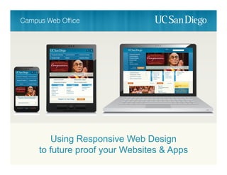
- 50. One website that works on all devices
- 51. One website that works on all devices
- 53. What about the Mobile Web Framework?
- 54. You want me to make THIS responsive??
- 56. Responsive design for Websites & Apps Mobile Framework when RWD won’t work
- 58. Works for apps too
- 61. Make sure your design looks good in all resolutions Add breakpoints when the design starts to break down
- 63. Device resolutions to access ucsd.edu in one month
- 64. Responsive Design fluid layouts using percentages Adaptive Design fixed width layouts targeted for specific devices
- 66. Be ready to iterate Adjust development cycles to be agile
- 67. Does it take more time? Yes. It will increase the length of a project by 32.6345%
- 68. There is no more “fold” Work with content owners to pair down content
- 69. Test on real devices Ask different teams to pitch in and help test
- 70. Downsides
- 71. Images Devices with smaller resolutions still need to download the full image
- 72. RESS Responsive Design + Server Side Components Offload some of the work to the server…
- 73. The Idea is to: Deliver certain components based on the device, rather than loading all at once for every device. RWD .js .jpg .php
- 76. 1. Use a Responsive Web Design framework as the primary way to deliver websites & web apps 2. Use a Mobile Framework to augment when responsive design won’t work 3. Deliver the frameworks through a central host and allow other IT units to leverage the capabilities 4. Finally…
- 77. Do it!
- 78. Resources RESPONSIVE WEB DESIGN By Ethan Marcotte alistapart.com mediaqueri.es FRAMEWORKS Foundation3 HTML5 Boilerplate Twitter Bootstrap
- 79. cwo.ucsd.edu