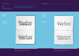
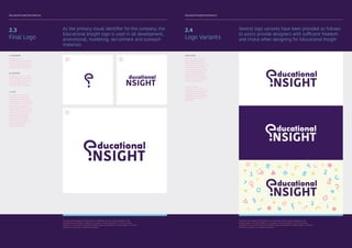
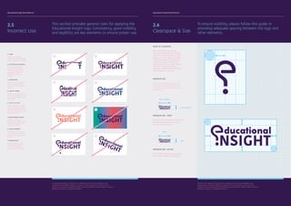
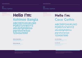
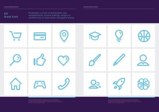
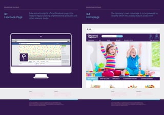
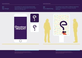
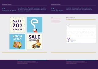
Brand Manual
Educational Insight is an Australian retail store
specialising in educational toys & school furniture.
Thebriefwastocreateanidentitythatwasfriendly,
approachable, down-to-earth and pragmatic. A
brand that was less ‘suits and ties’ and more a
community-centric start-up. It also needed to feel
at home in an online space given that Educational
Insight would have a strong online presence.
The question mark was the ideal symbol and
solution to personify these values and create the
right attitude for the brand. A simple, yet elegant
icon was devised and from this stemmed the
overall brand expression.
One of the challenging aspects of this brief was
articulating the fine balance between appealing
to the general consumer base of parents and the
wholesale supply of products to the education
sector.
Swinburne University of
Technology
Osama Sarakibi
7666241
Semester 2016
Simone Taffe
DCO20001	
Brand and
Identity Design	
School of Design
Mission Statement
Educational Insight Brand Manual Educational Insight Brand Manual
1.0
Brand
4.0
Media
2.0
Logo
5.0
Stationary
3.0
Typography
1.1
Brand
Brand Values
2.3
Logo
Logo Variations
4.1
Media
Facebook Page
5.1
Stationary
Letterhead
1.3
Brand
Colour Palette
2.5
Logo
Size & Clearspace
4.3
Media
App Design
5.3
Stationary
Envelope
2.1
Logo
Concept Designs
3.2
Typography
Secondary Typeface
4.5
Media
Social Media
5.5
Stationary
Retail Bag
6.1
Assets
Company Vehicle
1.2
Brand
Moodboard
2.4
Logo
Incorrect Use
4.2
Media
Homepage
5.2
Stationary
Business Card
1.4
Brand
Toolbox
3.1
Typography
Primary Typeface
4.4
Media
Print Advertising
5.4
Stationary
Invoice
2.2
Logo
Final Logo
3.3
Typography
Brand Icons
4.6
Media
Email Signature
Of utmost importance to the creation and impact of
Eduational Insight is the proper implementation of its
visual brand identity; one that reflects the premium
quality of its products and services. This book will help
you implement Educational Insight’s visual identity
properly and gives clear directions on the use of the
different representations of the brand.
Just as music
creates a mood,
a brand creates
a perception
Brand Manual
Introduction
Brand Manual
Contents
6.0
Assets
7.0
Mock Ups
7.1
Mock Ups
Showcase
6.2
Assets
Brand Apparel
To protect the integrity of the brand it is important that any future designers and
collaborating institutions adhere to all aspects of this document. It aims to provide
guidance as to how the Educational Insight logo and wordmarks need to appear in various
mediums as well as on collateral materials.
Educational Insight Brand Manual Educational Insight Brand Manual
Our values are an expression of who we are and
what we stand for. They tell audiences what is
important to us and help guide our decision-making
1.1
Brand Values
To protect the integrity of the brand it is important that any future designers and
collaborating institutions adhere to all aspects of this document. It aims to provide
guidance as to how the Educational Insight logo and wordmarks need to appear in various
mediums as well as on collateral materials.
Performance
“Our focus is achieving extraordinary performance, comfort and durability with minimal upkeep and
great looks to match.”
High Quality
“Every one of our pieces is designed and manufactured to exacting quality and safety standards,
using the best materials and treatments.”
Vibrant
Simply put, at Educational Insight, we’re for children. This means that our products and brand
maintain a vibrant and youthful aesthetic that is both easy on the eye as well as appealing to
Creative
“We encourage creativity and innovation through our educational products. We invite children of all
ages to grow their creative learning capabilities and aim to represent knowledge in its youngest and
UNDERSTANDING VALUE
“Brand integrity is the
ability to present one’s
brand both in words
and deeds to be true,
respectable and acceptable
without compromising
on standards (brand’s
promise).”
- Bernard Kelvin Clive
Too often, marketers orient
messaging around what
they believe to be the most
important features of their
product or service, instead
of looking into what’s
actually important to
target customers. Take the
time to understand your
customers and their values,
then align your messaging
accordingly.
Featured here are primary sources of inspiration and
reference to the company’s aesthetics in the form of
a moodboard
1.2
Moodboard
To protect the integrity of the brand it is important that any future designers and
collaborating institutions adhere to all aspects of this document. It aims to provide
guidance as to how the Educational Insight logo and wordmarks need to appear in various
mediums as well as on collateral materials.
1 2 3
4
5
6
7 8 9
Innovative
“We’re new in the game and we’re proud of that fact. We look to work off new platforms to expand
our reach and approach situations particularly in the education sector in a forward-thinking
Educational Insight Brand Manual Educational Insight Brand Manual
To protect the integrity of the brand it is important that any future designers and
collaborating institutions adhere to all aspects of this document. It aims to provide
guidance as to how the Educational Insight logo and wordmarks need to appear in various
mediums as well as on collateral materials.
1.3
Colour Palette
The current colour palette has been chosen to
reflect our values as well as to communicate our
diverse range of products and facets as a company
The more dynamic colour palette has been created
for core brand campaigns and communication
materials. The purple remains the dominant colour
for corporate and business to business material.
CMYK
C090/M100/Y037/K037
Web
#321a4d
RGB
R050/G026/B077
Pantone
Solid Coated 2627 C
CMYK
C051/M005/Y008/K000
Web
#73c4df
RGB
R115/G196/B223
Pantone
Solid Coated 297 C
CMYK
C003/M046/Y011/K000
Web
#ed9fb4
RGB
R237/G159/B180
Pantone
Solid Coated 197 C
CMYK
C009/M011/Y060/K000
Web
#e9d680
RGB
R233/G214/B128
Pantone
Solid Coated 460 C
WHY PURPLE?
A universal connection that people make
with purple is its association with royalty,
nobility, and prestige. These notions of
royalty cause purple to communicate a
sense of value. For this reason, brands
such as Yahoo have used the colour purple
to demonstrate the value of information.
Similiarly, purple has been used here to
communicate the importance and value
placed upon education by the brand. It
also creates a stark contrast between the
patterns incorporated into the brand and
the brand itself. What this means is that
while Educational Insight does specialise in
children’s furniture and toys, the company
itself should also be seen as a mature and
dependable company.
Primary Secondary Content Accent
The following elements are repetitive patterns to
be used by other web, graphic, interior or other
designers in accordance with the brand’s guidlines
1.4
Toolbox
To protect the integrity of the brand it is important that any future designers and
collaborating institutions adhere to all aspects of this document. It aims to provide
guidance as to how the Educational Insight logo and wordmarks need to appear in various
mediums as well as on collateral materials.
RECREATIONAL
The recreational block
contains elements
referencing the brand’s
own miscellaneous or
‘recreational’ products
category. The pattern
features various shapes
and objects relevant to the
aforementioned categories.
LITERACY
The literacy block
showcases various
letters and number to be
used relative to its own
category.
COMPILED
The compiled block will
be the most commonly
used pattern as it will
work in conjucntion with
the logo in various assets
and media. The elements
are scattered across the
pattern with the intent
of resembling child-like
doodles to contrast the
overall corporate aspect of
the brand.
NUMERACY
The numeracy block
is to be used for the
numeracy catgory of the
website store or any other
relevant areas. Various
math symbols are used to
reference this category.
Recreational Literacy
Numeracy
Compiled
Educational Insight Brand Manual Educational Insight Brand Manual
The following is a series of sketches made in the
earliest stages of the branding process
2.1
Concept Designs
To protect the integrity of the brand it is important that any future designers and
collaborating institutions adhere to all aspects of this document. It aims to provide
guidance as to how the Educational Insight logo and wordmarks need to appear in various
mediums as well as on collateral materials.
A
B
A. JOINED LETTERING
The first concept for
the brand logo was to
only feature a ‘touch’ of
child-like elements in the
form of a round edged
font as a the letter e and i
joined together.
B. LIGHTBULB
The second concept utilised
the shape of a lightbulb
as a first attempt at
incorporating symbolism
into the overall logo. It was
difficult to make the logo
truly resemble a lightbulb
and rather looked forced.
To protect the integrity of the brand it is important that any future designers and
collaborating institutions adhere to all aspects of this document. It aims to provide
guidance as to how the Educational Insight logo and wordmarks need to appear in various
mediums as well as on collateral materials.
C
D
C. EYE
This logo concept
attempted to incorporate
an eye. In an attempt to
develops symbols from
the words educational and
insight, the use of the eye
represented insight quite
well however is also conse-
quentially drew away from
the aesthetic appeal.
D. QUESTION MARK
This logo design seemed
to best meet the brand’s
designated criteria as it
embodies both minimalsim
and child-friendly
aesthetics.
Educational Insight Brand Manual Educational Insight Brand Manual
As the primary visual identifier for the company, the
Educational Insight logo is used in all development,
promotional, marketing, recruitment and outreach
materials
2.3
Final Logo
A. LOGOMARK
A logomark is an
identifying mark or symbol
that doesn’t contain the
business name. Think of the
Nike ‘swoosh’, Shell, WWF,
B. LOGOTYPE
A logotype refers to words
or the name of a business
that is designed in a special
way. Examples include
Pinterest, eBay or Google.
C. LOGO
As a general rule, third
parties may not use the
Educational Insight logo.
On this page are the limited
circumstances under which
third parties may use the
Temply logo. The logo must
always be used pursuant to
the specifications on this
page to identify Temply
Corporation, or Temply
products or services. Any
use that falls outside of
these specifications is
strictly prohibited.
A
C
B
To protect the integrity of the brand it is important that any future designers and
collaborating institutions adhere to all aspects of this document. It aims to provide
guidance as to how the Educational Insight logo and wordmarks need to appear in various
mediums as well as on collateral materials.
Several logo variants have been provided as follows
to asists provide designers with sufficient freedom
and choice when designing for Educational Insight
2.4
Logo Variants
LOGO USAGE
There are two versions of
the Educational Insight
logo, one which is to be
used on a white background
only and the other which
is a reversed out logo with
a dark purple background.
The reversed out logo is
to be used when dropping
the logo onto an image or a
coloured background.
The third option
incorporates the pattern
elements which accompany
the company’s branding.
Examples of its use will be
provided throughout this
document.
To protect the integrity of the brand it is important that any future designers and
collaborating institutions adhere to all aspects of this document. It aims to provide
guidance as to how the Educational Insight logo and wordmarks need to appear in various
mediums as well as on collateral materials.
Educational Insight Brand Manual Educational Insight Brand Manual
This section provides general rules for applying the
Educational Insight logo. Consistency, good visibility,
and legibility are key elements to ensure proper use.
2.5
Incorrect Use
To protect the integrity of the brand it is important that any future designers and
collaborating institutions adhere to all aspects of this document. It aims to provide
guidance as to how the Educational Insight logo and wordmarks need to appear in various
mediums as well as on collateral materials.
A. CROP
Never crop or block
portions of the Educational
Insight logotype or symbol.
B. LETTER SIZE & SPACING
Never alter the space
between the letters of
the Educational Insight
logotype —always use
approved electronic
artwork.
C. DISTORTION
Never alter the shape of
the Educational Insight
symbol from the approved
artwork.
D. USE OF STROKE
Never use a line or stroke
around any elements of the
Educational Insight symbol
or logotype.
G. LOGO ELEMENTS
Never alter an element of
the Educational Insight
symbol from the approved
artwork.
F. BACKGROUND CHOICE
Never reproduce the
Educational Insight logo on
a background that is too
complex or similar.
E. USE OF COLOUR
Never change the colour
of the Educational Insight
symbol to anything other
than those specified in the
colour variations section of
this design guide.
H. ORIENTATION
When using the 1 color
reverse logo, the face
elements should go to
black or the color of the
A B
C D
E F
G H
To ensure visibility, please follow this guide in
providing adequate spacing between the logo and
other elements.
2.6
Clearspace & Size
WHAT IS CLEARSPACE
The area that surrounds the
logo is as important as the logo
itself. The minimum area of 2 “x”,
known as “clear space,” provides
breathing room to the logo and
eliminates visual clutter (text,
graphic elements or other logos)
that can compete with logo
legibility – thereby diminishing the
effectiveness of the logo.
A
A
A
To protect the integrity of the brand it is important that any future designers and
collaborating institutions adhere to all aspects of this document. It aims to provide
guidance as to how the Educational Insight logo and wordmarks need to appear in various
mediums as well as on collateral materials.
MINIMUM SIZE - PRINT
For print use, the logo should never
be reduced below the minimum
size of 20 mm x 5.5 mm.
5.5mm (.2165”)
20mm (.7874”)
MINIMUM SIZE - DIGITAL
Don’t make the logo smaller than
50 px wide in digital executions.
14 px
50 px
MINIMUM SIZE
To ensure visibility, legibility and
accessibility, the logo, wherever
possible, a minimum size must be
established
Educational Insight Brand Manual Educational Insight Brand Manual
3.1
Primary Typeface
WHY KOHINOO BANGLA?
Kohinoo Bangla says “approachable” and
“straightforward” and is easy to read. A
humanistic sans-serif typeface, Myriad
Pro’s great for retailing and communicating
“low prices.”
Hello I’m:
Kohinoo Bangla
ABCDEFGHIJKLNO
PQRSTUVWXYZ
abcdefghijklno
pqrstuvwxyz
1234567890
Kohinoor Bangla Medium
ABCDEFGHIJKLNOPQRSTUVWXYZ
abcdefghijklnopqrstuvwxyz
Kohinoor Bangla Light
ABCDEFGHIJKLNOPQRSTUVWXYZ
abcdefghijklnopqrstuvwxyz
To protect the integrity of the brand it is important that any future designers and
collaborating institutions adhere to all aspects of this document. It aims to provide
guidance as to how the Educational Insight logo and wordmarks need to appear in various
mediums as well as on collateral materials.
3.2
Secondary Typeface
WHY COCO GOTHIC?
In addition Coco Gothic is available. The
wide range of different weight available
within the typeface family allows for both
flexibility and continuity. The Coco Gothic
has also been used for packaging, label and
headings. Hello I’m:
Coco Gothic
ABCDEFGHIJKLNO
PQRSTUVWXYZ
abcdefghijklno
pqrstuvwxyz
1234567890
Coco Gothic Regular
ABCDEFGHIJKLNOPQRSTUVWXYZ
abcdefghijklnopqrstuvwxyz
Coco Gothic Light
ABCDEFGHIJKLNOPQRSTUVWXYZ
abcdefghijklnopqrstuvwxyz
1234567890!@£$%^&
To protect the integrity of the brand it is important that any future designers and
collaborating institutions adhere to all aspects of this document. It aims to provide
guidance as to how the Educational Insight logo and wordmarks need to appear in various
mediums as well as on collateral materials.
Educational Insight Brand Manual Educational Insight Brand Manual
3.3
Brand Icons
Pictography is a form of writing which uses
representational, pictorial drawings, similarly to
cuneiform and, to some extent, hieroglyphic writing
To protect the integrity of the brand it is important that any future designers and
collaborating institutions adhere to all aspects of this document. It aims to provide
guidance as to how the Educational Insight logo and wordmarks need to appear in various
mediums as well as on collateral materials.
Educational Insight Brand Manual Educational Insight Brand Manual
4.1
Facebook Page
Educational Insight’s official Facebook page is to
feature regular posting of promotional products and
other relevant media
MEDIA
Examples of promotional media has been
provided in section 4.5 showcasing the
style and composition in which posts will
be made on social media platforms.
CONTENT
Posts made by the page owners must also
include Images or other forms of media.
This is done to boost visual appeal as well
as to captures the users’ attention.
Homepage
To protect the integrity of the brand it is important that any future designers and
collaborating institutions adhere to all aspects of this document. It aims to provide
guidance as to how the Educational Insight logo and wordmarks need to appear in various
mediums as well as on collateral materials.
4.2
Homepage
The company’s own homepage is to be powered by
Shopify which will already feature a back-end
DESIGN
Note the use of all branding elements
including brand colours, pictographs and
fonts. All elements must be incorporated
into the overall design.
AVAILABILITY
The page must responsive and SEO (search
engine optimization must be considered in the
final product.
To protect the integrity of the brand it is important that any future designers and
collaborating institutions adhere to all aspects of this document. It aims to provide
guidance as to how the Educational Insight logo and wordmarks need to appear in various
mediums as well as on collateral materials.
Educational Insight Brand Manual Educational Insight Brand Manual
4.3
App Design
An example of an app for Educational Insight
demonstrating the homescreen and two colour
options for the app icon
To protect the integrity of the brand it is important that any future designers and
collaborating institutions adhere to all aspects of this document. It aims to provide
guidance as to how the Educational Insight logo and wordmarks need to appear in various
mediums as well as on collateral materials.
4.4
Print Advertising
An example of print media or billboard advertising
made for the company to increase consumer
awareness
To protect the integrity of the brand it is important that any future designers and
collaborating institutions adhere to all aspects of this document. It aims to provide
guidance as to how the Educational Insight logo and wordmarks need to appear in various
mediums as well as on collateral materials.
Educational Insight Brand Manual Educational Insight Brand Manual
4.5
Promotional Media
Several examples of possible promotional media to
be used in posts to Facebook, Instagram, Twitters or
other relevant platforms
To protect the integrity of the brand it is important that any future designers and
collaborating institutions adhere to all aspects of this document. It aims to provide
guidance as to how the Educational Insight logo and wordmarks need to appear in various
mediums as well as on collateral materials.
4.6
Email Signature
An email signature is to be used by all senior
members of staff operating under a work email
GUIDES
Staff should include a signature on all email
messages. The email signature should include:
- The staff member’s current contact details
- The company’s own icon and details
- A confidentiality notice (recommended for all
emails and essential when the email contains
any sensitive or confidential information)
Email Signature
Regards,
John Smith
CEO
info@educationalinsight.com.au
www.educationalinsight.com.au
T +1 020 7800 8000
F +1 020 7800 8800
100 Washington Ave, Mill Park 3082 VIC
Dear Customer,
Lorem ipsum dolor sit amet, consectetur adipiscing elit. Nunc et maximus sapien, vel fringilla velit. Curabitur condimentum porttitor odio, id
malesuada risus. Integer ac malesuada nulla. Sed vel libero porttitor, egestas risus tristique, pulvinar ligula. Cras lorem ligula, ornare vitae
ultricies vitae, egestas eget elit. Fusce lacinia rhoncus erat et vestibulum. Proin id leo nunc. Praesent ipsum ante, pharetra ac commodo
sit amet, facilisis vel libero. Etiam lorem est, dignissim non suscipit a, pellentesque ut arcu. Donec a urna diam. Donec consequat libero et
lorem lacinia ultricies. Ut non quam dui. Cras urna lectus, dapibus pretium tortor in, cursus commodo mi. Duis tempus metus vitae quam
tempus ornare.
To protect the integrity of the brand it is important that any future designers and
collaborating institutions adhere to all aspects of this document. It aims to provide
guidance as to how the Educational Insight logo and wordmarks need to appear in various
mediums as well as on collateral materials.
Educational Insight Brand Manual Educational Insight Brand Manual
5.1
Letterhead
The corporate letterhead template to be used in
conjunction with the branded envelope design
Letterhead Front Letterhead Back
To protect the integrity of the brand it is important that any future designers and
collaborating institutions adhere to all aspects of this document. It aims to provide
guidance as to how the Educational Insight logo and wordmarks need to appear in various
mediums as well as on collateral materials.
TYPE
All text should be in Kohinoor Bangla
Regular if the document will be printed for
distribution. In the case that the document
is to be distributed electronically, use the
alternate typeface, Coco Gothic.
FORMAT
The same templates are used for all
letter paper. This enables efficient and
systematic information management within
the company. The reverse side shows the
brand’s repeating pattern provided in the
toolbox section. The basic template has
been compiled based on A4 format. The
horizontal lines serve as a guide when
positioning all details.
This letter paper is used by the head office,
association, transport and the divisions.
Educational Insight Brand Manual Educational Insight Brand Manual
5.2
Business Card
A branded business card branded is to be given
to all senior staff with their details replacing the
template’s
100 Washington Ave,
Mill Park
3082 VIC
T +1 020 7800 8000
F +1 020 7800 8800
info@educationalinsight.com.au
www.educationalinsight.com.au
John Smith
CEO
Business Card Front
Business Card Back
To protect the integrity of the brand it is important that any future designers and
collaborating institutions adhere to all aspects of this document. It aims to provide
guidance as to how the Educational Insight logo and wordmarks need to appear in various
mediums as well as on collateral materials.
5.3
Envelope
A standard-sized branded envelope used in
cojunction with corporate letterheads
SIZE
DL
110 × 220mm
4.33 x 8.66
1/3 A4
Envelope Back
Envelope Front
To protect the integrity of the brand it is important that any future designers and
collaborating institutions adhere to all aspects of this document. It aims to provide
guidance as to how the Educational Insight logo and wordmarks need to appear in various
mediums as well as on collateral materials.
FORMAT
All business cards use the same template.
This enables efficient and systematic
information management within the
company. Consideration has also been
given to enabling all types of details, both
national and international. The reverse
side shows the brand’s repeating pattern
provided in the toolbox section as well as
the brand symbol in the centre of the card.
Educational Insight Brand Manual Educational Insight Brand Manual
5.4
Invoice
A standard A4 invoice available in both digital and
printable format to be given to customers
Sample Invoice
To protect the integrity of the brand it is important that any future designers and
collaborating institutions adhere to all aspects of this document. It aims to provide
guidance as to how the Educational Insight logo and wordmarks need to appear in various
mediums as well as on collateral materials.
J O H N S M I T H
Graphic and Web Designer
INVOICE #1456
June, 14 2016
John Smith
CEO
DESCRIPTION AMOUNT RATE TOTAL
SUB TOTAL
TAX
TOTAL
Lorem ipsum dolor sit amet, ut vero munere
gubergren duo
Lorem ipsum
1
1
100.00 AUD
1000.00 AUD
1100.00 AUD
100.00 AUD
1000.00 AUD
0.00 AUD
1100.00 AUD
Terms and conditions:
Lorem ipsum dolor sit amet, ut vero munere gubergren duo, erant propriae eum id. Eu convenire erroribus nec. Eu autem
laudem euismod vis. Mei an copiosae verterem eleifend, vero abhorreant definitiones ea eos.
Aperiri explicari maluisset eu vis, eum nullam fuisset ea. Vis ne tamquam partiendo forensibus. Pri erat commodo reformidans
ad. Te platonem reprimique definitionem his, ad epicuri platonem argumentum eum.
Payment terms:
Lorem ipsum dolor sit amet, ut vero munere gubergren duo, erant propriae eum id. Eu convenire erroribus nec. Eu autem
laudem euismod vis. Mei an copiosae verterem eleifend, vero abhorreant definitiones ea eos.
100 Washington Ave,
Mill Park
3082 VIC
TAX
SUB TOTAL
5.5
Retail Bag
A standard sized retail bag for in-store purchases
featuring the compiled pattern taken from the tool
box section of the document
Retail Bag
To protect the integrity of the brand it is important that any future designers and
collaborating institutions adhere to all aspects of this document. It aims to provide
guidance as to how the Educational Insight logo and wordmarks need to appear in various
mediums as well as on collateral materials.
Educational Insight Brand Manual Educational Insight Brand Manual
Vehicle wrapping by is a form of print advertising
where a vehicle can be completely covered in full
coloured images
6.1
Company Vehicle
All company vehicles used for transportation of
furniture and other products must be branded with
the Educational Insight logo. The logo must be clear
and placed in the centre of the panel. Two colour
scheme options have been provided on the right.
Truck
To protect the integrity of the brand it is important that any future designers and
collaborating institutions adhere to all aspects of this document. It aims to provide
guidance as to how the Educational Insight logo and wordmarks need to appear in various
mediums as well as on collateral materials.
Vehicle wrapping enables you to use full colour
photos or your company artwork to produce
eye-catching results which helps attract more clients
Colour Scheme 1
Colour Scheme 2
To protect the integrity of the brand it is important that any future designers and
collaborating institutions adhere to all aspects of this document. It aims to provide
guidance as to how the Educational Insight logo and wordmarks need to appear in various
mediums as well as on collateral materials.
Educational Insight Brand Manual Educational Insight Brand Manual
Clients and staff members will recieved a silkscreen
printed t-shirt in one of two colours
6.2
Brand Apparel
SCREENPRINT
Screen printing is a printing technique
whereby a mesh is used to transfer ink
onto a substrate, except in areas made
impermeable to the ink by a blocking
stencil.
White
To protect the integrity of the brand it is important that any future designers and
collaborating institutions adhere to all aspects of this document. It aims to provide
guidance as to how the Educational Insight logo and wordmarks need to appear in various
mediums as well as on collateral materials.
The design features 2 print colours and is printed on
both the front and the back of the shirt
Dark
To protect the integrity of the brand it is important that any future designers and
collaborating institutions adhere to all aspects of this document. It aims to provide
guidance as to how the Educational Insight logo and wordmarks need to appear in various
mediums as well as on collateral materials.
Educational Insight Brand Manual Educational Insight Brand Manual
To help contextualize these concepts and provide
greater understanding of the brand’s intent, a
showcase has been made compiling all designs and
print media.
7.1
Showcase
To protect the integrity of the brand it is important that any future designers and
collaborating institutions adhere to all aspects of this document. It aims to provide
guidance as to how the Educational Insight logo and wordmarks need to appear in various
mediums as well as on collateral materials.
The mock ups should assist in grasping the
Educational Insight brand’s overall vision and
identity.
To protect the integrity of the brand it is important that any future designers and
collaborating institutions adhere to all aspects of this document. It aims to provide
guidance as to how the Educational Insight logo and wordmarks need to appear in various
mediums as well as on collateral materials.
References
CITED
1 VIZCAÍNO, B 2015, ‘THE NOMAD’ [IMAGE], IN VIZCAÍNO’S PORTFOLIO, BEHANCE, VIEWED 10 MAY 2016,
<HTTPS://WWW.BEHANCE.NET/GALLERY/29697995/THE-NOMAD-BRANDING>.
2 HARJU, D 2014, ‘DOODLE ART’ [IMAGE], CLASSIC PLAY , VIEWED 10 MAY 2016,
<HTTP://WWW.CLASSIC-PLAY.COM/WP-CONTENT/UPLOADS/2014/06/DOODLE7.JPG>.
3 PETERS, A 2015, ‘TARGET BRANDING’ [IMAGE], IN PETERS’ PORTFOLIO, BEHANCE, VIEWED 10 MAY 2016,
<HTTP://DIEGOGUEVARA.COM/BLOG/WP-CONTENT/UPLOADS/2015/03/THEEBLOG_TARGET2015CAMPAIGN.JPG>.
4 ZAGNOLI, 0 2012, ‘THE NEW SCIENCE OF MIND’ [IMAGE], IN ZAGNOLI’S PORTFOLIO, CARGO COLLECTIVE, VIEWED 10 MAY 2016,
<HTTP://WWW.OLIMPIAZAGNOLI.COM/OLIMPIAZAGNOLI_NYTSUNDAYREVIEW12>.
5 RENSONNET, 0 2016, ‘DELCAMPE’ [IMAGE], IN RENSONNET’S PORTFOLIO, BEHANCE, VIEWED 10 MAY 2016,
<HTTPS://WWW.BEHANCE.NET/GALLERY/35539869/DELCAMPE>.
6 PETERS, A 2015, ‘TARGET BRANDING’ [IMAGE], IN PETERS’ PORTFOLIO, BEHANCE, VIEWED 10 MAY 2016,
<HTTP://WWW.GRAPHIS.COM/MEDIA/UPLOADS/CFE/ENTRY/50C57FA1-7125-4DD1-A532-27B06BC4436B/04_BUBBLE_GUM.PNG>.
7 WINDMILL 2015, ‘WINDMILL EDUCATIONAL TOYS & EQUIPMENT’, VIEWED 10 MAY 2016,
<HTTP://WWW.WINDMILL.NET.AU>.
8 SHENOY, P 2009, ‘DOODLE ART’ [IMAGE], IN SHENOY’S PERSONAL BLOG, PREETISHENOY, VIEWED 10 MAY 2016,
<HTTP://4.BP.BLOGSPOT.COM/_LNMMANFSTSC/SWW2QRA6EAI/AAAAAAAAB2K/KITIUDC8SBI/S1600/DOODLE+ART+A.JPG>.
9 VENEZIANO, P 2015, ‘C’ [IMAGE], IN VENEZIANO’S PORTFOLIO, BEHANCE, VIEWED 10 MAY 2016,
<HTTPS://WWW.BEHANCE.NET/GALLERY/25647935/MIDNIGHT-STUDIES>.
REFERENCED
KIDSU 2016, ‘KIDS’ [IMAGE], ON KIDSU.CA, VIEWED 10 MAY 2016,
<HTTP://WWW.KIDSU.CA/WP-CONTENT/UPLOADS/2015/06/MOM-AND-KIDS-IMG.JPG>.
FLIPCART 2015 ‘KIDS’ [IMAGE], ON FLIPCART.COM, VIEWED 10 MAY 2016,
<HTTP://FLIPKART-STORIES.AZUREEDGE.NET/WP-CONTENT/UPLOADS/2015/12/KIDS-TOYS.JPG>.
Educational Insight Brand Guide

Educational Insight Brand Guide

  • 1.
  • 2.
    Educational Insight isan Australian retail store specialising in educational toys & school furniture. Thebriefwastocreateanidentitythatwasfriendly, approachable, down-to-earth and pragmatic. A brand that was less ‘suits and ties’ and more a community-centric start-up. It also needed to feel at home in an online space given that Educational Insight would have a strong online presence. The question mark was the ideal symbol and solution to personify these values and create the right attitude for the brand. A simple, yet elegant icon was devised and from this stemmed the overall brand expression. One of the challenging aspects of this brief was articulating the fine balance between appealing to the general consumer base of parents and the wholesale supply of products to the education sector. Swinburne University of Technology Osama Sarakibi 7666241 Semester 2016 Simone Taffe DCO20001 Brand and Identity Design School of Design Mission Statement
  • 3.
    Educational Insight BrandManual Educational Insight Brand Manual 1.0 Brand 4.0 Media 2.0 Logo 5.0 Stationary 3.0 Typography 1.1 Brand Brand Values 2.3 Logo Logo Variations 4.1 Media Facebook Page 5.1 Stationary Letterhead 1.3 Brand Colour Palette 2.5 Logo Size & Clearspace 4.3 Media App Design 5.3 Stationary Envelope 2.1 Logo Concept Designs 3.2 Typography Secondary Typeface 4.5 Media Social Media 5.5 Stationary Retail Bag 6.1 Assets Company Vehicle 1.2 Brand Moodboard 2.4 Logo Incorrect Use 4.2 Media Homepage 5.2 Stationary Business Card 1.4 Brand Toolbox 3.1 Typography Primary Typeface 4.4 Media Print Advertising 5.4 Stationary Invoice 2.2 Logo Final Logo 3.3 Typography Brand Icons 4.6 Media Email Signature Of utmost importance to the creation and impact of Eduational Insight is the proper implementation of its visual brand identity; one that reflects the premium quality of its products and services. This book will help you implement Educational Insight’s visual identity properly and gives clear directions on the use of the different representations of the brand. Just as music creates a mood, a brand creates a perception Brand Manual Introduction Brand Manual Contents 6.0 Assets 7.0 Mock Ups 7.1 Mock Ups Showcase 6.2 Assets Brand Apparel To protect the integrity of the brand it is important that any future designers and collaborating institutions adhere to all aspects of this document. It aims to provide guidance as to how the Educational Insight logo and wordmarks need to appear in various mediums as well as on collateral materials.
  • 4.
    Educational Insight BrandManual Educational Insight Brand Manual Our values are an expression of who we are and what we stand for. They tell audiences what is important to us and help guide our decision-making 1.1 Brand Values To protect the integrity of the brand it is important that any future designers and collaborating institutions adhere to all aspects of this document. It aims to provide guidance as to how the Educational Insight logo and wordmarks need to appear in various mediums as well as on collateral materials. Performance “Our focus is achieving extraordinary performance, comfort and durability with minimal upkeep and great looks to match.” High Quality “Every one of our pieces is designed and manufactured to exacting quality and safety standards, using the best materials and treatments.” Vibrant Simply put, at Educational Insight, we’re for children. This means that our products and brand maintain a vibrant and youthful aesthetic that is both easy on the eye as well as appealing to Creative “We encourage creativity and innovation through our educational products. We invite children of all ages to grow their creative learning capabilities and aim to represent knowledge in its youngest and UNDERSTANDING VALUE “Brand integrity is the ability to present one’s brand both in words and deeds to be true, respectable and acceptable without compromising on standards (brand’s promise).” - Bernard Kelvin Clive Too often, marketers orient messaging around what they believe to be the most important features of their product or service, instead of looking into what’s actually important to target customers. Take the time to understand your customers and their values, then align your messaging accordingly. Featured here are primary sources of inspiration and reference to the company’s aesthetics in the form of a moodboard 1.2 Moodboard To protect the integrity of the brand it is important that any future designers and collaborating institutions adhere to all aspects of this document. It aims to provide guidance as to how the Educational Insight logo and wordmarks need to appear in various mediums as well as on collateral materials. 1 2 3 4 5 6 7 8 9 Innovative “We’re new in the game and we’re proud of that fact. We look to work off new platforms to expand our reach and approach situations particularly in the education sector in a forward-thinking
  • 5.
    Educational Insight BrandManual Educational Insight Brand Manual To protect the integrity of the brand it is important that any future designers and collaborating institutions adhere to all aspects of this document. It aims to provide guidance as to how the Educational Insight logo and wordmarks need to appear in various mediums as well as on collateral materials. 1.3 Colour Palette The current colour palette has been chosen to reflect our values as well as to communicate our diverse range of products and facets as a company The more dynamic colour palette has been created for core brand campaigns and communication materials. The purple remains the dominant colour for corporate and business to business material. CMYK C090/M100/Y037/K037 Web #321a4d RGB R050/G026/B077 Pantone Solid Coated 2627 C CMYK C051/M005/Y008/K000 Web #73c4df RGB R115/G196/B223 Pantone Solid Coated 297 C CMYK C003/M046/Y011/K000 Web #ed9fb4 RGB R237/G159/B180 Pantone Solid Coated 197 C CMYK C009/M011/Y060/K000 Web #e9d680 RGB R233/G214/B128 Pantone Solid Coated 460 C WHY PURPLE? A universal connection that people make with purple is its association with royalty, nobility, and prestige. These notions of royalty cause purple to communicate a sense of value. For this reason, brands such as Yahoo have used the colour purple to demonstrate the value of information. Similiarly, purple has been used here to communicate the importance and value placed upon education by the brand. It also creates a stark contrast between the patterns incorporated into the brand and the brand itself. What this means is that while Educational Insight does specialise in children’s furniture and toys, the company itself should also be seen as a mature and dependable company. Primary Secondary Content Accent The following elements are repetitive patterns to be used by other web, graphic, interior or other designers in accordance with the brand’s guidlines 1.4 Toolbox To protect the integrity of the brand it is important that any future designers and collaborating institutions adhere to all aspects of this document. It aims to provide guidance as to how the Educational Insight logo and wordmarks need to appear in various mediums as well as on collateral materials. RECREATIONAL The recreational block contains elements referencing the brand’s own miscellaneous or ‘recreational’ products category. The pattern features various shapes and objects relevant to the aforementioned categories. LITERACY The literacy block showcases various letters and number to be used relative to its own category. COMPILED The compiled block will be the most commonly used pattern as it will work in conjucntion with the logo in various assets and media. The elements are scattered across the pattern with the intent of resembling child-like doodles to contrast the overall corporate aspect of the brand. NUMERACY The numeracy block is to be used for the numeracy catgory of the website store or any other relevant areas. Various math symbols are used to reference this category. Recreational Literacy Numeracy Compiled
  • 6.
    Educational Insight BrandManual Educational Insight Brand Manual The following is a series of sketches made in the earliest stages of the branding process 2.1 Concept Designs To protect the integrity of the brand it is important that any future designers and collaborating institutions adhere to all aspects of this document. It aims to provide guidance as to how the Educational Insight logo and wordmarks need to appear in various mediums as well as on collateral materials. A B A. JOINED LETTERING The first concept for the brand logo was to only feature a ‘touch’ of child-like elements in the form of a round edged font as a the letter e and i joined together. B. LIGHTBULB The second concept utilised the shape of a lightbulb as a first attempt at incorporating symbolism into the overall logo. It was difficult to make the logo truly resemble a lightbulb and rather looked forced. To protect the integrity of the brand it is important that any future designers and collaborating institutions adhere to all aspects of this document. It aims to provide guidance as to how the Educational Insight logo and wordmarks need to appear in various mediums as well as on collateral materials. C D C. EYE This logo concept attempted to incorporate an eye. In an attempt to develops symbols from the words educational and insight, the use of the eye represented insight quite well however is also conse- quentially drew away from the aesthetic appeal. D. QUESTION MARK This logo design seemed to best meet the brand’s designated criteria as it embodies both minimalsim and child-friendly aesthetics.
  • 7.
    Educational Insight BrandManual Educational Insight Brand Manual As the primary visual identifier for the company, the Educational Insight logo is used in all development, promotional, marketing, recruitment and outreach materials 2.3 Final Logo A. LOGOMARK A logomark is an identifying mark or symbol that doesn’t contain the business name. Think of the Nike ‘swoosh’, Shell, WWF, B. LOGOTYPE A logotype refers to words or the name of a business that is designed in a special way. Examples include Pinterest, eBay or Google. C. LOGO As a general rule, third parties may not use the Educational Insight logo. On this page are the limited circumstances under which third parties may use the Temply logo. The logo must always be used pursuant to the specifications on this page to identify Temply Corporation, or Temply products or services. Any use that falls outside of these specifications is strictly prohibited. A C B To protect the integrity of the brand it is important that any future designers and collaborating institutions adhere to all aspects of this document. It aims to provide guidance as to how the Educational Insight logo and wordmarks need to appear in various mediums as well as on collateral materials. Several logo variants have been provided as follows to asists provide designers with sufficient freedom and choice when designing for Educational Insight 2.4 Logo Variants LOGO USAGE There are two versions of the Educational Insight logo, one which is to be used on a white background only and the other which is a reversed out logo with a dark purple background. The reversed out logo is to be used when dropping the logo onto an image or a coloured background. The third option incorporates the pattern elements which accompany the company’s branding. Examples of its use will be provided throughout this document. To protect the integrity of the brand it is important that any future designers and collaborating institutions adhere to all aspects of this document. It aims to provide guidance as to how the Educational Insight logo and wordmarks need to appear in various mediums as well as on collateral materials.
  • 8.
    Educational Insight BrandManual Educational Insight Brand Manual This section provides general rules for applying the Educational Insight logo. Consistency, good visibility, and legibility are key elements to ensure proper use. 2.5 Incorrect Use To protect the integrity of the brand it is important that any future designers and collaborating institutions adhere to all aspects of this document. It aims to provide guidance as to how the Educational Insight logo and wordmarks need to appear in various mediums as well as on collateral materials. A. CROP Never crop or block portions of the Educational Insight logotype or symbol. B. LETTER SIZE & SPACING Never alter the space between the letters of the Educational Insight logotype —always use approved electronic artwork. C. DISTORTION Never alter the shape of the Educational Insight symbol from the approved artwork. D. USE OF STROKE Never use a line or stroke around any elements of the Educational Insight symbol or logotype. G. LOGO ELEMENTS Never alter an element of the Educational Insight symbol from the approved artwork. F. BACKGROUND CHOICE Never reproduce the Educational Insight logo on a background that is too complex or similar. E. USE OF COLOUR Never change the colour of the Educational Insight symbol to anything other than those specified in the colour variations section of this design guide. H. ORIENTATION When using the 1 color reverse logo, the face elements should go to black or the color of the A B C D E F G H To ensure visibility, please follow this guide in providing adequate spacing between the logo and other elements. 2.6 Clearspace & Size WHAT IS CLEARSPACE The area that surrounds the logo is as important as the logo itself. The minimum area of 2 “x”, known as “clear space,” provides breathing room to the logo and eliminates visual clutter (text, graphic elements or other logos) that can compete with logo legibility – thereby diminishing the effectiveness of the logo. A A A To protect the integrity of the brand it is important that any future designers and collaborating institutions adhere to all aspects of this document. It aims to provide guidance as to how the Educational Insight logo and wordmarks need to appear in various mediums as well as on collateral materials. MINIMUM SIZE - PRINT For print use, the logo should never be reduced below the minimum size of 20 mm x 5.5 mm. 5.5mm (.2165”) 20mm (.7874”) MINIMUM SIZE - DIGITAL Don’t make the logo smaller than 50 px wide in digital executions. 14 px 50 px MINIMUM SIZE To ensure visibility, legibility and accessibility, the logo, wherever possible, a minimum size must be established
  • 9.
    Educational Insight BrandManual Educational Insight Brand Manual 3.1 Primary Typeface WHY KOHINOO BANGLA? Kohinoo Bangla says “approachable” and “straightforward” and is easy to read. A humanistic sans-serif typeface, Myriad Pro’s great for retailing and communicating “low prices.” Hello I’m: Kohinoo Bangla ABCDEFGHIJKLNO PQRSTUVWXYZ abcdefghijklno pqrstuvwxyz 1234567890 Kohinoor Bangla Medium ABCDEFGHIJKLNOPQRSTUVWXYZ abcdefghijklnopqrstuvwxyz Kohinoor Bangla Light ABCDEFGHIJKLNOPQRSTUVWXYZ abcdefghijklnopqrstuvwxyz To protect the integrity of the brand it is important that any future designers and collaborating institutions adhere to all aspects of this document. It aims to provide guidance as to how the Educational Insight logo and wordmarks need to appear in various mediums as well as on collateral materials. 3.2 Secondary Typeface WHY COCO GOTHIC? In addition Coco Gothic is available. The wide range of different weight available within the typeface family allows for both flexibility and continuity. The Coco Gothic has also been used for packaging, label and headings. Hello I’m: Coco Gothic ABCDEFGHIJKLNO PQRSTUVWXYZ abcdefghijklno pqrstuvwxyz 1234567890 Coco Gothic Regular ABCDEFGHIJKLNOPQRSTUVWXYZ abcdefghijklnopqrstuvwxyz Coco Gothic Light ABCDEFGHIJKLNOPQRSTUVWXYZ abcdefghijklnopqrstuvwxyz 1234567890!@£$%^& To protect the integrity of the brand it is important that any future designers and collaborating institutions adhere to all aspects of this document. It aims to provide guidance as to how the Educational Insight logo and wordmarks need to appear in various mediums as well as on collateral materials.
  • 10.
    Educational Insight BrandManual Educational Insight Brand Manual 3.3 Brand Icons Pictography is a form of writing which uses representational, pictorial drawings, similarly to cuneiform and, to some extent, hieroglyphic writing To protect the integrity of the brand it is important that any future designers and collaborating institutions adhere to all aspects of this document. It aims to provide guidance as to how the Educational Insight logo and wordmarks need to appear in various mediums as well as on collateral materials. To protect the integrity of the brand it is important that any future designers and collaborating institutions adhere to all aspects of this document. It aims to provide guidance as to how the Educational Insight logo and wordmarks need to appear in various mediums as well as on collateral materials.
  • 11.
    Educational Insight BrandManual Educational Insight Brand Manual 4.1 Facebook Page Educational Insight’s official Facebook page is to feature regular posting of promotional products and other relevant media MEDIA Examples of promotional media has been provided in section 4.5 showcasing the style and composition in which posts will be made on social media platforms. CONTENT Posts made by the page owners must also include Images or other forms of media. This is done to boost visual appeal as well as to captures the users’ attention. Homepage To protect the integrity of the brand it is important that any future designers and collaborating institutions adhere to all aspects of this document. It aims to provide guidance as to how the Educational Insight logo and wordmarks need to appear in various mediums as well as on collateral materials. 4.2 Homepage The company’s own homepage is to be powered by Shopify which will already feature a back-end DESIGN Note the use of all branding elements including brand colours, pictographs and fonts. All elements must be incorporated into the overall design. AVAILABILITY The page must responsive and SEO (search engine optimization must be considered in the final product. To protect the integrity of the brand it is important that any future designers and collaborating institutions adhere to all aspects of this document. It aims to provide guidance as to how the Educational Insight logo and wordmarks need to appear in various mediums as well as on collateral materials.
  • 12.
    Educational Insight BrandManual Educational Insight Brand Manual 4.3 App Design An example of an app for Educational Insight demonstrating the homescreen and two colour options for the app icon To protect the integrity of the brand it is important that any future designers and collaborating institutions adhere to all aspects of this document. It aims to provide guidance as to how the Educational Insight logo and wordmarks need to appear in various mediums as well as on collateral materials. 4.4 Print Advertising An example of print media or billboard advertising made for the company to increase consumer awareness To protect the integrity of the brand it is important that any future designers and collaborating institutions adhere to all aspects of this document. It aims to provide guidance as to how the Educational Insight logo and wordmarks need to appear in various mediums as well as on collateral materials.
  • 13.
    Educational Insight BrandManual Educational Insight Brand Manual 4.5 Promotional Media Several examples of possible promotional media to be used in posts to Facebook, Instagram, Twitters or other relevant platforms To protect the integrity of the brand it is important that any future designers and collaborating institutions adhere to all aspects of this document. It aims to provide guidance as to how the Educational Insight logo and wordmarks need to appear in various mediums as well as on collateral materials. 4.6 Email Signature An email signature is to be used by all senior members of staff operating under a work email GUIDES Staff should include a signature on all email messages. The email signature should include: - The staff member’s current contact details - The company’s own icon and details - A confidentiality notice (recommended for all emails and essential when the email contains any sensitive or confidential information) Email Signature Regards, John Smith CEO info@educationalinsight.com.au www.educationalinsight.com.au T +1 020 7800 8000 F +1 020 7800 8800 100 Washington Ave, Mill Park 3082 VIC Dear Customer, Lorem ipsum dolor sit amet, consectetur adipiscing elit. Nunc et maximus sapien, vel fringilla velit. Curabitur condimentum porttitor odio, id malesuada risus. Integer ac malesuada nulla. Sed vel libero porttitor, egestas risus tristique, pulvinar ligula. Cras lorem ligula, ornare vitae ultricies vitae, egestas eget elit. Fusce lacinia rhoncus erat et vestibulum. Proin id leo nunc. Praesent ipsum ante, pharetra ac commodo sit amet, facilisis vel libero. Etiam lorem est, dignissim non suscipit a, pellentesque ut arcu. Donec a urna diam. Donec consequat libero et lorem lacinia ultricies. Ut non quam dui. Cras urna lectus, dapibus pretium tortor in, cursus commodo mi. Duis tempus metus vitae quam tempus ornare. To protect the integrity of the brand it is important that any future designers and collaborating institutions adhere to all aspects of this document. It aims to provide guidance as to how the Educational Insight logo and wordmarks need to appear in various mediums as well as on collateral materials.
  • 14.
    To protect theintegrity of the brand it is important that any future designers and collaborating institutions adhere to all aspects of this document. It aims to provide guidance as to how the Educational Insight logo and wordmarks need to appear in various mediums as well as on collateral materials. Educational Insight Brand Manual Educational Insight Brand Manual 5.1 Letterhead The corporate letterhead template to be used in conjunction with the branded envelope design Letterhead Front Letterhead Back To protect the integrity of the brand it is important that any future designers and collaborating institutions adhere to all aspects of this document. It aims to provide guidance as to how the Educational Insight logo and wordmarks need to appear in various mediums as well as on collateral materials. TYPE All text should be in Kohinoor Bangla Regular if the document will be printed for distribution. In the case that the document is to be distributed electronically, use the alternate typeface, Coco Gothic. FORMAT The same templates are used for all letter paper. This enables efficient and systematic information management within the company. The reverse side shows the brand’s repeating pattern provided in the toolbox section. The basic template has been compiled based on A4 format. The horizontal lines serve as a guide when positioning all details. This letter paper is used by the head office, association, transport and the divisions.
  • 15.
    Educational Insight BrandManual Educational Insight Brand Manual 5.2 Business Card A branded business card branded is to be given to all senior staff with their details replacing the template’s 100 Washington Ave, Mill Park 3082 VIC T +1 020 7800 8000 F +1 020 7800 8800 info@educationalinsight.com.au www.educationalinsight.com.au John Smith CEO Business Card Front Business Card Back To protect the integrity of the brand it is important that any future designers and collaborating institutions adhere to all aspects of this document. It aims to provide guidance as to how the Educational Insight logo and wordmarks need to appear in various mediums as well as on collateral materials. 5.3 Envelope A standard-sized branded envelope used in cojunction with corporate letterheads SIZE DL 110 × 220mm 4.33 x 8.66 1/3 A4 Envelope Back Envelope Front To protect the integrity of the brand it is important that any future designers and collaborating institutions adhere to all aspects of this document. It aims to provide guidance as to how the Educational Insight logo and wordmarks need to appear in various mediums as well as on collateral materials. FORMAT All business cards use the same template. This enables efficient and systematic information management within the company. Consideration has also been given to enabling all types of details, both national and international. The reverse side shows the brand’s repeating pattern provided in the toolbox section as well as the brand symbol in the centre of the card.
  • 16.
    Educational Insight BrandManual Educational Insight Brand Manual 5.4 Invoice A standard A4 invoice available in both digital and printable format to be given to customers Sample Invoice To protect the integrity of the brand it is important that any future designers and collaborating institutions adhere to all aspects of this document. It aims to provide guidance as to how the Educational Insight logo and wordmarks need to appear in various mediums as well as on collateral materials. J O H N S M I T H Graphic and Web Designer INVOICE #1456 June, 14 2016 John Smith CEO DESCRIPTION AMOUNT RATE TOTAL SUB TOTAL TAX TOTAL Lorem ipsum dolor sit amet, ut vero munere gubergren duo Lorem ipsum 1 1 100.00 AUD 1000.00 AUD 1100.00 AUD 100.00 AUD 1000.00 AUD 0.00 AUD 1100.00 AUD Terms and conditions: Lorem ipsum dolor sit amet, ut vero munere gubergren duo, erant propriae eum id. Eu convenire erroribus nec. Eu autem laudem euismod vis. Mei an copiosae verterem eleifend, vero abhorreant definitiones ea eos. Aperiri explicari maluisset eu vis, eum nullam fuisset ea. Vis ne tamquam partiendo forensibus. Pri erat commodo reformidans ad. Te platonem reprimique definitionem his, ad epicuri platonem argumentum eum. Payment terms: Lorem ipsum dolor sit amet, ut vero munere gubergren duo, erant propriae eum id. Eu convenire erroribus nec. Eu autem laudem euismod vis. Mei an copiosae verterem eleifend, vero abhorreant definitiones ea eos. 100 Washington Ave, Mill Park 3082 VIC TAX SUB TOTAL 5.5 Retail Bag A standard sized retail bag for in-store purchases featuring the compiled pattern taken from the tool box section of the document Retail Bag To protect the integrity of the brand it is important that any future designers and collaborating institutions adhere to all aspects of this document. It aims to provide guidance as to how the Educational Insight logo and wordmarks need to appear in various mediums as well as on collateral materials.
  • 17.
    Educational Insight BrandManual Educational Insight Brand Manual Vehicle wrapping by is a form of print advertising where a vehicle can be completely covered in full coloured images 6.1 Company Vehicle All company vehicles used for transportation of furniture and other products must be branded with the Educational Insight logo. The logo must be clear and placed in the centre of the panel. Two colour scheme options have been provided on the right. Truck To protect the integrity of the brand it is important that any future designers and collaborating institutions adhere to all aspects of this document. It aims to provide guidance as to how the Educational Insight logo and wordmarks need to appear in various mediums as well as on collateral materials. Vehicle wrapping enables you to use full colour photos or your company artwork to produce eye-catching results which helps attract more clients Colour Scheme 1 Colour Scheme 2 To protect the integrity of the brand it is important that any future designers and collaborating institutions adhere to all aspects of this document. It aims to provide guidance as to how the Educational Insight logo and wordmarks need to appear in various mediums as well as on collateral materials.
  • 18.
    Educational Insight BrandManual Educational Insight Brand Manual Clients and staff members will recieved a silkscreen printed t-shirt in one of two colours 6.2 Brand Apparel SCREENPRINT Screen printing is a printing technique whereby a mesh is used to transfer ink onto a substrate, except in areas made impermeable to the ink by a blocking stencil. White To protect the integrity of the brand it is important that any future designers and collaborating institutions adhere to all aspects of this document. It aims to provide guidance as to how the Educational Insight logo and wordmarks need to appear in various mediums as well as on collateral materials. The design features 2 print colours and is printed on both the front and the back of the shirt Dark To protect the integrity of the brand it is important that any future designers and collaborating institutions adhere to all aspects of this document. It aims to provide guidance as to how the Educational Insight logo and wordmarks need to appear in various mediums as well as on collateral materials.
  • 19.
    Educational Insight BrandManual Educational Insight Brand Manual To help contextualize these concepts and provide greater understanding of the brand’s intent, a showcase has been made compiling all designs and print media. 7.1 Showcase To protect the integrity of the brand it is important that any future designers and collaborating institutions adhere to all aspects of this document. It aims to provide guidance as to how the Educational Insight logo and wordmarks need to appear in various mediums as well as on collateral materials. The mock ups should assist in grasping the Educational Insight brand’s overall vision and identity. To protect the integrity of the brand it is important that any future designers and collaborating institutions adhere to all aspects of this document. It aims to provide guidance as to how the Educational Insight logo and wordmarks need to appear in various mediums as well as on collateral materials.
  • 20.
    References CITED 1 VIZCAÍNO, B2015, ‘THE NOMAD’ [IMAGE], IN VIZCAÍNO’S PORTFOLIO, BEHANCE, VIEWED 10 MAY 2016, <HTTPS://WWW.BEHANCE.NET/GALLERY/29697995/THE-NOMAD-BRANDING>. 2 HARJU, D 2014, ‘DOODLE ART’ [IMAGE], CLASSIC PLAY , VIEWED 10 MAY 2016, <HTTP://WWW.CLASSIC-PLAY.COM/WP-CONTENT/UPLOADS/2014/06/DOODLE7.JPG>. 3 PETERS, A 2015, ‘TARGET BRANDING’ [IMAGE], IN PETERS’ PORTFOLIO, BEHANCE, VIEWED 10 MAY 2016, <HTTP://DIEGOGUEVARA.COM/BLOG/WP-CONTENT/UPLOADS/2015/03/THEEBLOG_TARGET2015CAMPAIGN.JPG>. 4 ZAGNOLI, 0 2012, ‘THE NEW SCIENCE OF MIND’ [IMAGE], IN ZAGNOLI’S PORTFOLIO, CARGO COLLECTIVE, VIEWED 10 MAY 2016, <HTTP://WWW.OLIMPIAZAGNOLI.COM/OLIMPIAZAGNOLI_NYTSUNDAYREVIEW12>. 5 RENSONNET, 0 2016, ‘DELCAMPE’ [IMAGE], IN RENSONNET’S PORTFOLIO, BEHANCE, VIEWED 10 MAY 2016, <HTTPS://WWW.BEHANCE.NET/GALLERY/35539869/DELCAMPE>. 6 PETERS, A 2015, ‘TARGET BRANDING’ [IMAGE], IN PETERS’ PORTFOLIO, BEHANCE, VIEWED 10 MAY 2016, <HTTP://WWW.GRAPHIS.COM/MEDIA/UPLOADS/CFE/ENTRY/50C57FA1-7125-4DD1-A532-27B06BC4436B/04_BUBBLE_GUM.PNG>. 7 WINDMILL 2015, ‘WINDMILL EDUCATIONAL TOYS & EQUIPMENT’, VIEWED 10 MAY 2016, <HTTP://WWW.WINDMILL.NET.AU>. 8 SHENOY, P 2009, ‘DOODLE ART’ [IMAGE], IN SHENOY’S PERSONAL BLOG, PREETISHENOY, VIEWED 10 MAY 2016, <HTTP://4.BP.BLOGSPOT.COM/_LNMMANFSTSC/SWW2QRA6EAI/AAAAAAAAB2K/KITIUDC8SBI/S1600/DOODLE+ART+A.JPG>. 9 VENEZIANO, P 2015, ‘C’ [IMAGE], IN VENEZIANO’S PORTFOLIO, BEHANCE, VIEWED 10 MAY 2016, <HTTPS://WWW.BEHANCE.NET/GALLERY/25647935/MIDNIGHT-STUDIES>. REFERENCED KIDSU 2016, ‘KIDS’ [IMAGE], ON KIDSU.CA, VIEWED 10 MAY 2016, <HTTP://WWW.KIDSU.CA/WP-CONTENT/UPLOADS/2015/06/MOM-AND-KIDS-IMG.JPG>. FLIPCART 2015 ‘KIDS’ [IMAGE], ON FLIPCART.COM, VIEWED 10 MAY 2016, <HTTP://FLIPKART-STORIES.AZUREEDGE.NET/WP-CONTENT/UPLOADS/2015/12/KIDS-TOYS.JPG>.