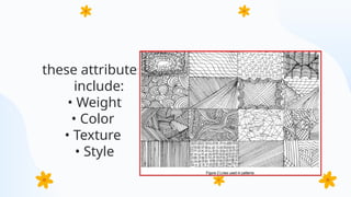
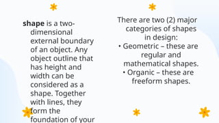
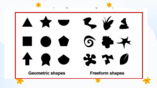
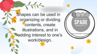
MODULE 7:
IMAGING AND
DESIGN FOR
SOCIAL IMPACT
Here is where your presentation begins
At the end of this module, you should be able to:
• Understand the basic concepts like colors, typography, images
; • Understand the principles and techniques of design using
applications (whether open source or proprietary) to develop
contents for social campaigns; and
• Discuss the importance of having a good design to
communicate visually.
Objectives
Introduction
The graphic design concepts are almost like
building blocks. Each layer is on top of each
other before you have the base to create
something unbelievable — whether you're
creating a logo, a website, or a unique picture.
The basic principles of graphic design comes
with different fundamentals to consider. In this
module, we will explore some of it for us to be
able to create a good design
Graphic Design
Fundamentals
What is Graphic
Design?
is a process in which we
use typography, images,
colors, icons and other
illustrations to
communicate visually. This
term was first coined by
William Addison Dwiggins
on 1992 as he called
himself a “graphic
designer”.
However, graphic design is a thousand-year-old craft
which dates back to ancient cave drawings. In today’s
era, we use graphic design not just to communicate
visually but also to having good user experience (for
software developers) and also to boost/improve one’s
emotions (with the use of colors). The fundamentals of
graphic design varies from PowerPoint presentations,
web/mobile applications, posters, logos, and even
paintings
The basic elements of graphic design
are the following
• Lines
• Shapes
• Form
• Texture
• Balance
line
is a kind of shape which connects two or
more points. It is also considered as one of
the essential element of graphic design.
Lines can be thick, thin, curved, or jagged.
A picture is worth a thousand words
Lines can be used and commonly found in drawings
or illustrations, textures or patterns, as well as on text
composition – whether to give emphasis, divide or
organize content, or to guide the viewer’s eye.
Impacts on lines also differs based on their attributes.
these attributes
include:
• Weight
• Color
• Texture
• Style
shape is a two-
dimensional
external boundary
of an object. Any
object outline that
has height and
width can be
considered as a
shape. Together
with lines, they
form the
foundation of your
There are two (2) major
categories of shapes
in design:
• Geometric – these are
regular and
mathematical shapes.
• Organic – these are
freeform shapes.
Shapes can be used in
organizing or dividing
contents, create
illustrations, and in
adding interest to one’s
work/design.
form is a three-dimensional shape.
Shadows, perspective, depth, and
sometimes texture creates a form. Without
these attributes, a form is just a shape or
series of shapes. Plain images/objects and
flat designs can be enhanced by adding
shadows or lightings to create an illusion of
a form. It also gives the object a sense of
place. Figure 5 shows that a ball, if you
make it two-dimensional is just a circle
Texture refers to the physical quality of the
surface of an object in an artwork or design. It
also refers to how an object look or feels like. An
object might be smooth, rough, shiny, hard, or
soft. It can be in 3D (real texture) or 2D (visual
texture). Texture adds depth and visual interest to
the flat images or objects
texture can be used for:
• Establishing visual value or a focal point in
an artwork.
• Having contrast within a design
• Making an artwork visually balanced.
Balance
Visual balance is the creation of visual
equilibrium by relating elements such as
line, shape, color, space or form in terms of
their visual weight. Basically, there are two
kinds of visual balance:
● 1. Symmetrical balance. From the name itself,
symmetrical balance, which includes radial
symmetry is when both two sides of a piece are
equal. If you fold your artwork or piece into two
or if you put an imaginary line between your
artwork, each half is identical or visually similar
to the other half
● 2. Asymmetrical balance. Both sides of your
composition does not contain the same
elements but contain almost the same visual
● Branding and identity can be found everywhere. Look around you,
you may see some of your personal items, product packaging,
documents, or some sort of advertising. All of them have one in
common – identity.
● Branding is simply what people thinks about you, your company, your
product or your service. For example, we think of Albert Einstein as
the epitome of intelligence, and that is how he was branded. Identity
or visual identity is the visual representation of a brand. It can be in a
form of image, choice of color or typography, and many more. For
example, we quickly recognize the company and its service but just
looking at its logo, typeface, or color combinations.
Branding and Identity
●Branding and identity are not just for
products and services, we can even apply it
to how we work or what type of output we
produce. For example, the use of bright and
bold colors are often associated with the
famous painter, Vincent Van Gogh.
1. Establish clear purpose and positioning. Recall why you or your
company exists, who your target audience are, and what makes you
or your service unique from your competitors.
2. Conduct thorough market research. Having a deep analysis on your
target audience on what their personalities are which will lead you to
the next step.
3. Get a personality. Based on your research, determine your brand’s
personality. Brand personality make a huge impact on the visuals of
your marketing materials
Lucidpress (2018) enumerated the seven steps to
creating a brand identity design
4. Create a polished logo. In creating your logo, it should be
simple, scalable, and memorable. Observe the logos of famous
companies like Amazon, Google, and IBM. What do these logos
have in common?
5. Create an attractive color palleted. Your color palleted
should be simple and contain one to three primary colors. Once
you have established your color palleted, you may play with their
color family. For example, if you choose blue as you primary
color, you may use sky blue, baby blue, and other colors under
the blue family to support your primary color.
6. Select professional typography. When selecting fonts, it is
important to consider these things:
a. Do not make it fancy. Fancy typefaces only make your text
confusing. Example:
b. Don’t mix fonts/typefaces. Do not mix fonts or typefaces in
a word or sentence as it may give mixed interpretations to
your audience. Example:
c. Mix contrasting fonts/typefaces. This is not similar to the
above item. This means you may use serif typefaces for your
product title and sans serif for the subtitle.
● 7. Choose on-brand supporting graphics. Your
brand identity should have a visual library that
include icons, images/photographs, design assets,
and other supporting graphics
CREDITS: This presentation template was created by Slidesgo,
and includes icons by Flaticon, and infographics & images by
Freepik
Thanks!
Do you have any questions?
youremail@freepik.com
+34 654 321 432
yourwebsite.com
Please keep this slide for attribution

Grapic design power point presentation in beed

  • 1.
    MODULE 7: IMAGING AND DESIGNFOR SOCIAL IMPACT Here is where your presentation begins
  • 2.
    At the endof this module, you should be able to: • Understand the basic concepts like colors, typography, images ; • Understand the principles and techniques of design using applications (whether open source or proprietary) to develop contents for social campaigns; and • Discuss the importance of having a good design to communicate visually. Objectives
  • 3.
    Introduction The graphic designconcepts are almost like building blocks. Each layer is on top of each other before you have the base to create something unbelievable — whether you're creating a logo, a website, or a unique picture. The basic principles of graphic design comes with different fundamentals to consider. In this module, we will explore some of it for us to be able to create a good design
  • 4.
  • 5.
    What is Graphic Design? isa process in which we use typography, images, colors, icons and other illustrations to communicate visually. This term was first coined by William Addison Dwiggins on 1992 as he called himself a “graphic designer”.
  • 6.
    However, graphic designis a thousand-year-old craft which dates back to ancient cave drawings. In today’s era, we use graphic design not just to communicate visually but also to having good user experience (for software developers) and also to boost/improve one’s emotions (with the use of colors). The fundamentals of graphic design varies from PowerPoint presentations, web/mobile applications, posters, logos, and even paintings
  • 7.
    The basic elementsof graphic design are the following • Lines • Shapes • Form • Texture • Balance
  • 8.
    line is a kindof shape which connects two or more points. It is also considered as one of the essential element of graphic design. Lines can be thick, thin, curved, or jagged.
  • 10.
    A picture isworth a thousand words
  • 11.
    Lines can beused and commonly found in drawings or illustrations, textures or patterns, as well as on text composition – whether to give emphasis, divide or organize content, or to guide the viewer’s eye. Impacts on lines also differs based on their attributes.
  • 12.
    these attributes include: • Weight •Color • Texture • Style
  • 13.
    shape is atwo- dimensional external boundary of an object. Any object outline that has height and width can be considered as a shape. Together with lines, they form the foundation of your There are two (2) major categories of shapes in design: • Geometric – these are regular and mathematical shapes. • Organic – these are freeform shapes.
  • 15.
    Shapes can beused in organizing or dividing contents, create illustrations, and in adding interest to one’s work/design.
  • 16.
    form is athree-dimensional shape. Shadows, perspective, depth, and sometimes texture creates a form. Without these attributes, a form is just a shape or series of shapes. Plain images/objects and flat designs can be enhanced by adding shadows or lightings to create an illusion of a form. It also gives the object a sense of place. Figure 5 shows that a ball, if you make it two-dimensional is just a circle
  • 18.
    Texture refers tothe physical quality of the surface of an object in an artwork or design. It also refers to how an object look or feels like. An object might be smooth, rough, shiny, hard, or soft. It can be in 3D (real texture) or 2D (visual texture). Texture adds depth and visual interest to the flat images or objects
  • 19.
    texture can beused for: • Establishing visual value or a focal point in an artwork. • Having contrast within a design • Making an artwork visually balanced.
  • 21.
    Balance Visual balance isthe creation of visual equilibrium by relating elements such as line, shape, color, space or form in terms of their visual weight. Basically, there are two kinds of visual balance:
  • 22.
    ● 1. Symmetricalbalance. From the name itself, symmetrical balance, which includes radial symmetry is when both two sides of a piece are equal. If you fold your artwork or piece into two or if you put an imaginary line between your artwork, each half is identical or visually similar to the other half ● 2. Asymmetrical balance. Both sides of your composition does not contain the same elements but contain almost the same visual
  • 23.
    ● Branding andidentity can be found everywhere. Look around you, you may see some of your personal items, product packaging, documents, or some sort of advertising. All of them have one in common – identity. ● Branding is simply what people thinks about you, your company, your product or your service. For example, we think of Albert Einstein as the epitome of intelligence, and that is how he was branded. Identity or visual identity is the visual representation of a brand. It can be in a form of image, choice of color or typography, and many more. For example, we quickly recognize the company and its service but just looking at its logo, typeface, or color combinations. Branding and Identity
  • 24.
    ●Branding and identityare not just for products and services, we can even apply it to how we work or what type of output we produce. For example, the use of bright and bold colors are often associated with the famous painter, Vincent Van Gogh.
  • 25.
    1. Establish clearpurpose and positioning. Recall why you or your company exists, who your target audience are, and what makes you or your service unique from your competitors. 2. Conduct thorough market research. Having a deep analysis on your target audience on what their personalities are which will lead you to the next step. 3. Get a personality. Based on your research, determine your brand’s personality. Brand personality make a huge impact on the visuals of your marketing materials Lucidpress (2018) enumerated the seven steps to creating a brand identity design
  • 26.
    4. Create apolished logo. In creating your logo, it should be simple, scalable, and memorable. Observe the logos of famous companies like Amazon, Google, and IBM. What do these logos have in common? 5. Create an attractive color palleted. Your color palleted should be simple and contain one to three primary colors. Once you have established your color palleted, you may play with their color family. For example, if you choose blue as you primary color, you may use sky blue, baby blue, and other colors under the blue family to support your primary color. 6. Select professional typography. When selecting fonts, it is important to consider these things:
  • 27.
    a. Do notmake it fancy. Fancy typefaces only make your text confusing. Example: b. Don’t mix fonts/typefaces. Do not mix fonts or typefaces in a word or sentence as it may give mixed interpretations to your audience. Example: c. Mix contrasting fonts/typefaces. This is not similar to the above item. This means you may use serif typefaces for your product title and sans serif for the subtitle.
  • 28.
    ● 7. Chooseon-brand supporting graphics. Your brand identity should have a visual library that include icons, images/photographs, design assets, and other supporting graphics
  • 29.
    CREDITS: This presentationtemplate was created by Slidesgo, and includes icons by Flaticon, and infographics & images by Freepik Thanks! Do you have any questions? youremail@freepik.com +34 654 321 432 yourwebsite.com Please keep this slide for attribution