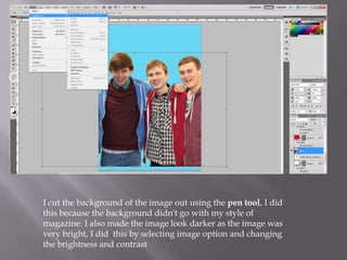
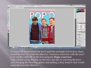
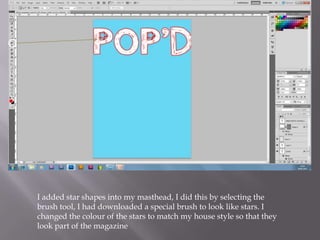
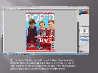
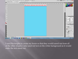
Nathan Tugwell
I cut the background of the image out using the pen tool, I did
this because the background didn't go with my style of
magazine. I also made the image look darker as the image was
very bright, I did this by selecting image option and changing
the brightness and contrast
To create the boxes round the text I used the rectangle tool to draw these
round the text. To create the effect for “exclusive interview with the boys”
I cut out the white fill on the text using the Magic wand tool
I also added a drop shadow on the box I did this by selecting the layer
and changing the blending option and adding a drop shadow that would
make the text look effective
I added star shapes into my masthead, I did this by selecting the
brush tool, I had downloaded a special brush to look like stars. I
changed the colour of the stars to match my house style so that they
look part of the magazine
On the boxes behind the texts I used a drop shadow and a
stroke to make it stand out, I did this by selecting the shape
that I wanted to put these features on and went on blending
options and added each of the features to the boxes
I used Rectangles to create my boxes so that they would stand out from all
of the other shapes. I also used red text on the white background as it would
make the text stand out.

Editing process

  • 1.
  • 2.
    I cut thebackground of the image out using the pen tool, I did this because the background didn't go with my style of magazine. I also made the image look darker as the image was very bright, I did this by selecting image option and changing the brightness and contrast
  • 3.
    To create theboxes round the text I used the rectangle tool to draw these round the text. To create the effect for “exclusive interview with the boys” I cut out the white fill on the text using the Magic wand tool I also added a drop shadow on the box I did this by selecting the layer and changing the blending option and adding a drop shadow that would make the text look effective
  • 4.
    I added starshapes into my masthead, I did this by selecting the brush tool, I had downloaded a special brush to look like stars. I changed the colour of the stars to match my house style so that they look part of the magazine
  • 5.
    On the boxesbehind the texts I used a drop shadow and a stroke to make it stand out, I did this by selecting the shape that I wanted to put these features on and went on blending options and added each of the features to the boxes
  • 6.
    I used Rectanglesto create my boxes so that they would stand out from all of the other shapes. I also used red text on the white background as it would make the text stand out.