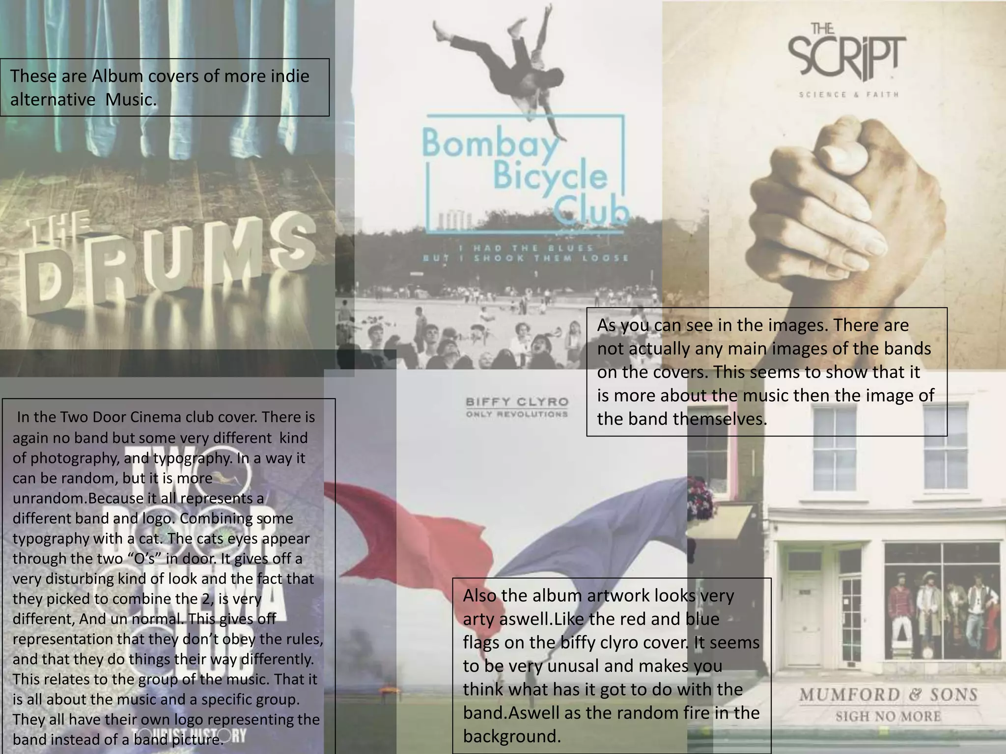
This document discusses album covers of indie and alternative bands. It notes that these covers often do not feature images of the bands themselves, instead focusing on logos, artwork, and typography. This emphasizes that the music is more important than the band's image. It then examines covers for specific bands like Biffy Clyro and Two Door Cinema Club in more detail, discussing elements of the designs and what they communicate about the bands' styles and genres.
The document discusses conventions in album packaging across different genres and artists. It analyzes the album covers, CDs, and back covers of albums by Beyoncé, Arctic Monkeys, Taylor Swift, Katy Perry, Bastille, and Drake. Some key conventions discussed include using close-ups of the artist on the cover, consistent color schemes and typography throughout, and keeping the back cover simple with text. Unconventional approaches are also examined, such as Arctic Monkey's use of a friend in the cover photo rather than the band.
The document provides an analysis of an album cover for the band Combat Sports. It examines various design elements of the cover including the placement of the band's name at the top, the retro color scheme, the image of a man wearing a t-shirt with the album name, and how the lighting is used to draw attention to certain elements like the man's fist and a hat. The analysis also considers how the cover style fits with the band's genre of garage rock music and makes comparisons to other album cover designs.
This document provides a detailed analysis and summary of the layout, design elements, and stylistic choices made in a music album booklet and CD packaging. The booklet uses bold fonts, close-up images of the singers, and club-inspired visuals and colors to portray an image of upbeat, danceable music aimed at teenagers. Photographs and background designs depict partying, dancing, and attractive people to appeal to both male and female audiences. Consistent stylistic elements like wavy lines and colors are used throughout to tie the package together and maintain the club/party atmosphere implied by the music.
The document discusses conventions of R&B album digipak covers. It provides examples from several albums and analyzes aspects like the use of the artist's image, colors, fonts, and inclusion of track lists or lyrics. Common conventions highlighted include prominent display of the artist's name or image, bold colors like black, gold and red, minimal or revealing clothing on the cover, and consistency in design elements across the front and back covers.
The document provides a textual analysis of the magazines Q and NME. It analyzes their circulation numbers, mission statements, publishers, target audiences, and use of images, language, layout and design. For both magazines, the target audience is music enthusiasts in their late teens to late 20s, and the magazines aim to keep readers informed on the latest music and connect them to their favorite artists through in-depth interviews and reviews. Visual elements like covers, photos and color palettes are designed to attract readers and align with the magazines' rock/indie genres.
The document analyzes and compares the album packaging (digipaks) of several popular artists. It discusses design elements like images, colors, fonts and layouts used on the front and back covers as well as inside panels of the CDs. Specific elements that contribute to effective designs are highlighted, such as using bold images that represent the theme or genre of the album. Consistent use of colors, fonts and other stylistic elements helps create a cohesive look and reinforce the artist's brand. Imaginative or symbolic imagery can make an album more memorable compared to straightforward photos of the artist.
The document summarizes magazine covers and contents pages for two pop music magazines - "Billboard" and "we love pop". It analyzes iconic images of pop stars on the covers that would be recognizable to the target audience. Color schemes and layouts are also described as appealing to younger female readers. Both preferred and opposing readings are given, such as the magazines portraying positive role models but also unrealistic standards of appearance.
The document analyzes and summarizes the design elements of digipak album covers from four different artists: Red Hot Chili Peppers, AC/DC, Foo Fighters, and Emineh. For each album cover, key design elements like colors, images, text styles and placements are described. Comparisons are made between how the designs fit or diverge from conventions within their respective genres of rock or rap music. Overall impressions and opinions on what design aspects work well or could be improved are also provided.
The double page spread features a large main image of the band Arctic Monkeys covering both pages. Their casual stance and leather jackets symbolize their indie music style. The title "Leather Trousers" stands out in bold red text against a natural brown and green background. A quote from the article is pulled out in red to entice readers. Only a short extract of the main article is included, acting as a taster to draw readers into the larger piece on the inside pages. The layout uses mainly black and blue colors which reflects the band's more understated music style compared to pop genres.
This document analyzes the digipak and promotional poster for Lady Gaga's album "Joanne" to understand how they effectively attract her target audience. The album cover features only a small part of Gaga's face, making it simplistic and focusing attention on her. The third song is highlighted differently, suggesting it is important. The poster matches the album cover's theme and colors, showing Gaga casually dressed and holding headphones to imply the album is worth listening to. Phrases are included to intrigue audiences and direct them to listen across music platforms.
The document discusses analyzing the target audience for the song "Bird Set Free" by Sia. It notes that while the target audience for pop and electropop music can be wide-ranging, Sia's music often appeals to older audiences due to mature lyrics. Younger audiences still listen to her songs though. Research found the most common age group that listens to electropop is 25-35. Both individuals and groups enjoy this style of music. Example target audience profiles are provided for a 19-year-old female named Ella and a 26-year-old male named Adam who would likely listen to the song.
The document provides an analysis of an album cover for Drake's album. It discusses various elements of the main image including Drake telling his audience that "the sky is the limit" and that he is in his own league. It also notes that the image includes the CN Tower in Toronto, where Drake is from, and suggests the urban background relates to his music. Additional elements analyzed include the simplicity of the image, Drake's recognition in Toronto, and the implication that his album could have incredible views. The small image of Drake on the tower is said to imply he doesn't need to be big to make a loud song.
The document provides details about various music magazines, including their target audiences, layouts, and content. It analyzes the covers, contents pages, and double page spreads of magazines like Vibe, Kerrang, NME, Blender, Rolling Stone, and FHM. Key findings are that NME is the most popular magazine, readers prefer a mixture of pictures and text on double page spreads, and covers and content most attract readers to buy a magazine.
Media cw music magazine reaserch and ideas annabel luceybell101
The document summarizes and compares the covers, contents pages, and sample article spreads of several music magazines, including Vibe, NME, Kerrang, Blender, Rolling Stone, and FHM. Key details noted include the target audiences, visual styles, mastheads, color schemes, and genres of music covered for each magazine. The FHM magazine covers and spreads primarily feature scantily-clad female celebrities to appeal to its male readership.
The document summarizes and compares the covers, contents pages, and sample spreads of several music magazines, including Vibe, NME, Kerrang, Blender, Rolling Stone, and FHM. Key details noted include the target audiences, masthead designs, color schemes, layouts, and types of music featured in each publication. Across magazines, common elements included centering cover images and using colors and designs that relate to the genres of music discussed.
The document analyzes several music magazines, describing their target audiences, layouts, and content. It finds that NME is the most popular magazine, readers prefer a mixture of pictures and text on double page spreads, and they expect to see the UK Top 40 chart. Research shows the target reader is interested in R&B, spends £2-3 on magazines, and is attracted to magazines based on their front covers.
The document analyzes and compares the digipaks of three musical artists: Ariana Grande, The 1975, and Disclosure. It summarizes that Ariana Grande's digipak depicts a more mature, glamorous image compared to her previous girly style in order to widen her audience. The 1975's all-black digipak is described as sleek and professional to focus on the music rather than the artists' images. Disclosure's digipak features ordinary photos of the band members and neutral colors to portray an approachable, suburban style.
The document contains summaries of magazine covers and articles aimed at different music genres and audiences. Key details include:
- Magazines target specific genres like rock (Kerrang), metal (Metal Hammer), hip hop (The Word), and drumming (Drummer).
- Covers feature well-known artists, promote concerts/albums, and highlight exclusive articles to attract readers.
- Design elements like fonts, colors and images are used to represent the targeted genre and appeal to the intended audience, usually male teens/young adults.
- Contents include band profiles, reviews, and festival/tour listings to inform and engage fans of the featured music styles.
Music magazine reaserch and ideas annabel luceybell101
The document summarizes and compares the covers, contents pages, and sample spreads of several music magazines, including Vibe, NME, Kerrang, Blender, Rolling Stone, and FHM. Key details noted include the target audiences, masthead designs, color schemes, layouts, and types of music featured in each publication. Across magazines, common elements included centering cover images and using colors and fonts that relate to the featured music genres. Differences were also highlighted, such as magazines including one or two cover stars and the use of more or less text in sample spreads.
Textual analysis of cd covers and print magazinescobes1
This document contains summaries of three CD covers and three print magazine advertisements for music albums. The Justin Bieber CD cover shows him posing in black and white, indicating a pop genre. The High School Musical cover features teenagers jumping, showing its upbeat soundtrack. The band Les Moustaches CD depicts four men with mustaches in traditional outfits, suggesting Mexican music. The magazine ads summarize the album details, images, and promotional text used to attract buyers. Kings of Leon features an owl-faced band, appealing to men. Tom Odell depicts the casually dressed singer, targeting younger audiences. Plan B shows the artist in retro clothing and reviews to promote the album. Overall, the document analyzes how the visual elements and text of CD covers
The document discusses several music magazines aimed at different audiences. Kerrang targets rock fans aged 18+ and discusses bands, new albums, and tours. It uses red, white, and yellow colors and offers free posters. Q targets an older, middle class audience that prefers LPs and articles about older music. It costs £3.45. NME focuses on current music and uses yellow, white, and red. It has a major article on The Killers. Drummer targets drummers and fans of bands like Gorillaz and System of a Down, using bright colors and offering free posters. It covers different music genres like rock and jazz.
This double page spread in NME magazine features the band The Teenagers. The large main image shows the band casually laying on a bed in a messy bedroom, reflecting their youthful and laidback style. Blue is the dominant color used, representing the indie genre. The title uses a bold retro font that relates to the band's name. The article aims to connect with young readers by discussing the band's sexual references and use of language typically associated with teenagers. Overall, the layout and design elements aim to attract NME's target audience by representing the indie scene and establishing a connection to the featured band.
This document summarizes a double page spread from NME magazine featuring the band The Vaccines. The summary includes:
- The large main image of the band takes up the first page and quarter of the second page, representing its importance.
- The colors blue, black and white are used throughout to represent the indie genre and maintain the magazine's brand identity.
- The article provides insight into the band's increased popularity and short, catchy songs unlike other bands.
The document provides an analysis of the cover designs and packaging of several music albums, including albums by Ed Sheeran, The Vamps, and Olly Murs. Key aspects discussed include the use of color schemes, images, text placement, and promotional elements. Simplistic designs that focus on the artist's face are described for Ed Sheeran's album, while the covers for The Vamps and Olly Murs emphasize the band/artist name and draw attention to the lead members. Common elements like barcodes and production credits are also analyzed across the different album designs.
1) Advertising is a form of mass promotion used to widely promote a product or service to potential customers.
2) This document contains analyses of different advertisements for music albums and bands. It examines the target audiences, messages, and design elements of each ad.
3) The ads employ various visuals, fonts, colors, and layouts to promote new albums, tours, and band websites to audiences interested in genres like rock, alternative, techno, indie, and pop-punk music.
This Digi-pack promotes Rihanna's album through imagery of the artist appearing lonely and vulnerable while also being a strong, independent woman. The front cover uses a soft pink color suggesting Rihanna's soft interior side, while the back has a sexualized image of her promoting her as an object to be looked at. Song titles and the record label logo also promote both the artist and label.
The document analyzes several album covers and discusses their design elements. It notes how rock album covers tend to use darker themes like skulls and fire, while dance and pop albums favor brighter colors. Across genres, common design conventions include displaying the artist prominently, using consistent fonts, and including track listings and barcodes on the back cover. Specific album covers analyzed provide examples like The Killers engaging the audience with a direct gaze, and Flo Rida's shirtless image reflecting his stated "addiction to being shirtless."
The document provides background on indie music videos and analyzes several examples. It finds that indie music videos typically have low budgets and focus on visuals of the artist rather than expensive concepts. Analyzing videos by Jessie Ware, Florence & the Machine, and The Smiths, it identifies several genre characteristics: an emphasis on the relationship between lyrics and visuals; use of lighting, costumes, and editing to match the music; and a voyeuristic treatment of artists that creates mystery rather than overt sexualization. The analyses provide guidance for creating an original indie music video that incorporates these conventions.
This document provides an overview of the process for selecting secondary schools in the UK, including boarding versus day schools and state versus private options. It outlines the roles of different parties in the selection process and the steps parents need to take such as visiting schools and considering factors like location, curriculum, and cost. The document also gives overviews of the transition to years 5 and 6.
This document contains research on the Arctic Monkeys band from multiple sources. It summarizes articles about a criticism of their live shows from the band Orwells, interviews with Alex Turner discussing their progression and albums, and a Wikipedia article providing background on the band members, albums, and awards. Research topics proposed include finding full interviews and analyzing fan and critic reactions to their albums. The document aims to understand different perspectives on the Arctic Monkeys' music and live performances.
The video for Bloc Party's song "I Still Remember" tells its concept through a single continuous shot that lasts the entire duration of the video. Members of the band are the main actors and are shown repeatedly throughout with slight variations in costume to emphasize the song's theme of not forgetting. The video establishes an urban setting by starting on a train track and moving inside a train to highlight that the band is from an urban background like many indie bands.
This document provides an introduction to the musical genres of pop, rock, and rap. It defines each genre and provides examples of famous artists within each. Pop is defined as popular music that is recorded in studios and aims for the top 10. Examples given are Cheryl Cole, Lady Gaga, and Chris Brown. Rock involves a band playing instruments like guitar and drums live. Examples include Arctic Monkeys and Red Hot Chili Peppers. Rap is talking or singing fast over a beat. Jay-Z, 50 Cent, and Kanye West are provided as rap artists. The document quizzes the reader to guess specific famous artists like Michael Jackson, Elvis Presley, and Eminem. It concludes by offering a sweet to
The document provides information about various musical artists and bands, including their names, genres, member numbers, and popular performance venues and songs. It includes quiz questions to test knowledge of the artists. The document encourages writing, speaking, and presenting about which artists are performing that night and their venues.
The album cover for Rizzle Kicks' 2011 album "Stereo Typical" portrays the duo in a scruffy, lazy manner that goes against stereotypes of hip hop artists. They are slouched casually dressed in the chairs with tired facial expressions. While the album genre is British hip hop, the cover presents a dull, unconventional image compared to the artists' usual lively personas. Throughout the booklet and lyrics, additional clues suggest the artists aim to subvert expectations through their "stereotypical" appearance and song titles.
This document analyzes and makes inferences about several musical artists based solely on images of them. For the band The 1975, the black and white photo suggests an indie or rock band. Years & Years is analyzed next; the colored lighting of their faces implies electronic music. Solo artist Tom Odell is pictured in dull lighting, suggesting indie or indie pop music. James Bay stands in nature, implying his music could be uplifting and meaningful. Finally, the casual photo of Disclosure, two brothers messing around, implies their electronic music is less serious.
Analysis of existing products- The ScriptMediaAmelia
The video for The Script's "Man Who Can't Be Moved" uses various camera shots and angles of the lead singer to introduce him and the band to the audience. It draws on conventions of the pop rock genre through the members' clothing, instrumentation, and positioning. The album digipak for "Science and Faith" symbolically represents its themes through hand images and includes lyrics and messages to fans. The band's website prominently features live performance photos to promote an image of them as serious performers and allows fans to easily access their music, merchandise, and tour information.
The album cover for The 1975's self-titled debut album features a simple black and white rectangular design with the band's name in a unique lit-up font. This rectangle acts as a motif representing the band and helps fans recognize their style. The lack of photos emphasizes that the band wants their music to speak for itself rather than their image. Additionally, the monochrome color scheme and indie rock-inspired photo on the back portray the band as laid-back while still drawing attention to their name.
Textual analysis of an artist’s artworkStefan_Mekki
The document analyzes and compares the artwork for two musical singles - "Steal My Girl" by One Direction and "I Like Turtles" by Diplo. For One Direction's single, the artwork features a photo of the band posing confidently with their names and the single title displayed prominently. In contrast, Diplo's single cover is a close-up photo of a boy with face paint that suggests sadness or anger, with the title "I Like Turtles" displayed in red text that implies death or loss. The document examines elements like composition, styling, colors, fonts and their intended meanings for representing the different genres and target audiences of the two singles.
The album cover for The 1975's self-titled debut album has a simple, monochrome design featuring a rectangular box with illuminated letters spelling out the band's name. This minimalist design establishes the band's identity and style while suggesting they want to be judged on their music rather than their image. The lack of photos emphasizes the music over visuals. Additionally, the retro font and feel of the design links the band to an earlier era of rock music in the 1970s.
This document analyzes and summarizes several band photos based on composition, clothing, and context clues. Key points noted include how lead singers are typically positioned in the center to draw focus, black and white filters suggest an "old style", casual clothing and poses imply a less serious approach, and stylish outfits hint at fashionable genres like rock. Context clues about tattoos, graffiti, and surroundings provide additional insights into possible musical styles. Overall, the document examines visual elements that convey information about bands and their music.
This poster features all three members of the band Paramore, following the typical style of many bands showing all members. The art style is similar to their album cover but with different positioning of members and the band name. The lighting focuses on the female member, making her stand out as the possible lead singer, as she is the only one looking at the viewer. The casual clothing of the members matches their pop punk music genre. The poster solely promotes the band and their album without additional details.
The Arctic Monkeys album cover features a black and white photo of a man with a casual, laid-back style smoking a cigarette to portray the band's indie, reckless attitude. Details like the cigarettes stubbed out on the CD, the man's beard, and the angled logo match conventions of the indie genre and the album's anticipated, rough-around-the-edges sound. While minimal text and an untidy feel present the album's simple style, continued themes of smoking and tiredness across the front and back covers hint at an ongoing struggle with addiction.
Analysis of Similar Artists to The Hype TheoryVickii Randell
This document analyzes similar artists to The Hype Theory, including Paramore, All Time Low, and You Me At Six. It summarizes key details about each band such as their album covers, websites, and music videos. Common themes identified across the bands include alternative designs, prominent logos, use of similar colors, and narrative or performance-focused music videos.
The album cover of Queen's "News of the World" depicts a robot holding the dead bodies of the band members. The image was adapted from a science fiction painting and features the band members in the robot's hand against a green background. The thick red font used for the band name "Queen" promotes the rock genre.
The album cover of The Beatles' "Abbey Road" shows the band members casually crossing the street outside Abbey Road Studios. Dressed in different outfits, the band members are the main focus at the front of the image with cars and trees in the background. The cover established Abbey Road as an iconic London landmark.
The CD cover analysis document provides details on the album covers of
The album cover features a close-up photo of Rihanna looking directly at the camera with her hair covering part of her face. She has dark makeup and her tongue is sticking out, giving her a rebellious and seductive look. The large photo emphasizes Rihanna as the central focus of the cover. Her tattooed arm displays the album title "Talk That Talk," representing the album's R&B and pop genres through its bold and provocative imagery targeted at younger audiences.
This document analyzes and summarizes the key elements and intended messages communicated through the CD cover designs of four different artists: Ke$ha, Spice Girls, Sex Pistols, and Jack Penate. For each cover, it identifies visual cues that indicate the artist/album name, genre of music, and themes or qualities the artist aims to represent through the cover design. Overall, the document examines how CD cover art can clearly identify the artist and aim to promote recognition, while also conveying messages about the music through symbolic colors, imagery and design elements.
The digipak for Green Day's "International Superhits!" album uses psychedelic visuals and retro fonts to appeal to multiple generations. On the cover, the silhouettes of the band members are depicted in an Austin Powers-style from the 1970s. The back cover shows the band members in monochrome, suggesting drug use, with expressions representing different mindsets. Throughout the digipak, a running theme of bold retro fonts and colors connects the pages and represents Green Day's style as a mainstream alternative rock band.
This image shows the cover of Fall Out Boy's greatest hits album "Believers Never Die Greatest Hits Bonus Edition", which includes a CD with bonus tracks and a DVD of their music videos. The album contains some of their most popular songs. The cover displays panels showing information about the band, pictures of their album covers, and images of the band members over the years. As a greatest hits compilation, it is aimed at existing Fall Out Boy fans familiar with their previous work.
The six front covers of Country Weekly magazine all feature typical conventions like a dominant main image of a solo country music artist at the center making direct eye contact. This draws the reader in and connects them to the featured artist. Most of the artists depicted are male, reflecting the larger number of male versus female country music stars. The costumes shown emphasize the genre, with males in shirts, jeans and sometimes cowboy hats and females in simple dresses using earthtone and blue colors. Together these consistent elements across the covers attract readers who are fans of country music.
The document contains summaries of various album covers, website designs, and a music magazine cover. Some key details summarized include:
- Album covers often include imagery that relates to the title, represents band members, or promotes the artist's brand.
- Band websites typically feature upcoming releases, news, ways to stream music, and areas for fan signup/engagement on social media.
- Tour posters advertise tour dates, locations, artists, sponsors, and ways for fans to find more information or buy tickets.
- The magazine cover introduces the main guest (Jay-Z), shows other featured artists, and uses consistent color schemes and imagery to look professional and attract readers.
The digipak for the Jonas Brothers' album "Lines Vines and Trying Times" uses contrasting black and white colors and elegant font to represent the album's themes and mature sound. Photographs of the brothers staring intensely attract their target audience of teenage girls. The simple and natural design reflects the album's pop/rock genre. Lyrics included in the booklet provide unique insight for fans.
Similar to My Presntation researching about the bands. (20)
2. These are Album covers of more indie
alternative Music.
As you can see in the images. There are
not actually any main images of the bands
on the covers. This seems to show that it
is more about the music then the image of
the band themselves.
Also the album artwork looks very
arty aswell.Like the red and blue
flags on the biffy clyro cover. It seems
to be very unusal and makes you
think what has it got to do with the
band.Aswell as the random fire in the
background.
In the Two Door Cinema club cover. There is
again no band but some very different kind
of photography, and typography. In a way it
can be random, but it is more
unrandom.Because it all represents a
different band and logo. Combining some
typography with a cat. The cats eyes appear
through the two “O’s” in door. It gives off a
very disturbing kind of look and the fact that
they picked to combine the 2, is very
different, And un normal. This gives off
representation that they don’t obey the rules,
and that they do things their way differently.
This relates to the group of the music. That it
is all about the music and a specific group.
They all have their own logo representing the
band instead of a band picture.
3. The Music
So they are bands that focus on the softer alternative indie genre.
It becomes more about the music then the people who make it.
They don’t often appear on the album covers, just a simple logo to represent the
music.
It becomes more a of a genre that people know as a group, and some bands
even have club in their name, just representing that it is a club and people know
the music that they listen to e.g. Bombay bicycle club.
The main bands I am going to focus on 3 of who's album covers have been
pictured on the first slide. Biffy Clyro, Two Door Cinema Club and Bombay Bicycle
Club.
They all play similar kind of music, and most of them all have that vibe about
them that’s its more about the music.
They are not all very well known, some more then others but they all target
pretty much the same audience, and that audience know them well.
4. The Band and The Music.
They are a Scottish rock band. But lately
have become a much softer genre of
music. The band is made up of 3 people.
A base guitarist, drummer and lead
vocalist who also plays guitar. The
drummer and Base also contribute
vocals too.
Up to now they have had 5 albums. But
the last 2 have been the biggest by far.
The fourth album “Puzzle” got them
much further, selling over 100,000.Then
the latest album “Only Revolutions” was
released in 2009 and from the day of
release. It hit 3rd in the UK album chart.
Later then being nominated for a
mercury music prize in 2010.
Their appearance
Behind is a image of the band sat on some
steps when they went out. 2 out of the 3
of them have Tattoos showing on their
arms. This shows that they are slightly
more punky and “cool”. They all seem to
be wearing very casual clothing. Not all
smart incasepeople see them but just a
casual style and a not to bothered kind of
look. Two of them have cigarettes in their
hands. This can represent the rebally kind
of look. Yet they are out in open toed
sandals.It is pictured so that the drummer
is at the back and the main man, lead
singer is at the front. Showing that he is
the main man in the band.Also they all
have a american kind of look to them the
way they are dressed is much more
american. Like the main singer wearing
purple shorts pink t shirt and the sandals.
This is a very different look to what you
would picture a slightly more heavy indie
band to wear. Again the main singer also
looks like he has posed for for the picture
where as the other 2 just seem to be
looking elsewhere.Seem to be a much
more mature heavy indie band.
5. The Band and The Music.
Bombay Bicycle Club are a young indie band from London.
Formed of three guys who started when they were
15.They were first called the Canals but then a fourth
member joined and they decided upon Bombay Bicycle
Club.
In 2006 it started for them properly when they were
entered into a competition called “ Virgin Mobiles Road to
V” shown on Channel 4. They went on to be announced
one of the 2 winners to win. And were given the spot to
play the opening act at the 2006 V festival. Playing on the
Channel 4 stage. Then also played on the small stage at
Reading and Leeds Festivals in 2007. After finishing school
in 2008 they managed to get into music full time and
release their first single. They went onto playing small gigs
and concerts and then got a record label with Island
Records to release more singles and albums. They made
their first album and their first single with the label which
was called ‘Always Like This’. This was release at the end of
2008 and reached number 97 in the UK Charts.
In 2010 a song off of their album was used as a bonus
track on the Twilight Eclipse Soundtrack. In July 2010 they
released a second album “Flaws” and the released album
single “Ivy and Gold” reached number 56 in the UK Chart.
The Appearance.
From first look you can see that the 3 guys on the right hand side are wearing
similar colour shirts and jeans. And the person on the far left is in a red t shirt
and darker jeans. This is a way of representing that he is the drummer in the
band. Also the main Lead vocalist you would imagine to find standing out in the
image but he isn’t. But he is Partly positioned in the middle and he is the third
guy from the left.
As a band shot you can see that they are a young immature indie band. They're
not all looking and posing, But they are laughing and chuckling with a grin on
their faces. They are all dressed very casualy with a much younger look and
appeal to the audience.
6. The Band and The Music.
Two Door Cinema Club are a alternative band from
Northern Ireland. It is formed of 3 members and
sometimes a 4th drummer. They only started in 2007
and they bought their debut album out In March
2010.They have release 6 singles so far and have more
to come. They became Two door cinema club.
Because one of the band mates, miss pronounced a
local cinema “ Tudour” Cinema. And hence Two Door
Cinema Club was formed. They started out on social
site MySpace. But as more interest grew. They gave up
university and went into music. They became more
popular and were talked about on blogs, and
magazines. Then NME held interviews with them and
they became more well known. They have now
become know and have a song featured on the
soundtrack for Fifa 11 and 2 songs used in
advertisements on TV for Vodafone. So gradually they
are getting bigger and bigger, and much more popular.
By playing more live gigs and concerts.
The Appearance
From first look at the picture you can tell that the guy at the front in
the red jumper is the lead singer. He stands out in the front so you can
tell straight away who is the main man of the band. All 3 of the
members have a much more casual yet formal look to them. With
shirts, jumpers and waistcoats. It is a much different appeal to the two
bands before. It is a more humorous look to make them different and
stand out that they don’t really care about the fashion. That its all for
fun, with the old looking hair styles preppy clothing. But worn all in a
different way to attract the attention of a nerdier look.It gives them a
much younger look to attract attention to the difference of them.
7. The same as the three bands I have looked at previously. My band is
going to be a more indie alternative, with a modern casual look.
Like Two door cinema club and Biffy Clyro be made of 3 people.
But to have the younger look compared to the mature look of Biffy
Clyro.
For the shot maybe a not so posed look.
But to keep the who look and appearance younger and more modern.
8. To have a indie casual younger kind
of look. With one person to look
slightly different to be the
drummer. Maybe different colour
shoes.
The band
members will
probably wear
either high top
shoes or
plimsolls. And
the drummer will
wear different
colour shoes to
stand out slightly
Then top
halves can be
just simple
shirts ,and t
shirts or even
hoodies. To
keep the
casual look.
But not too
look to preppy
nor skater
either.
Then to keep with the
casual styled look.
Hairstyles will be styled
normally but not too
much so that they
stand out. But enough
to show a good look.
9. Like the picture on the right
hand side. Just a very casual
look with jeans and high-top
shoes, with some kind of
shirt and jumper. To keep
the style together. It looks
good together and the other
band members will be
wearing more or less the
same image, so that nobody
is different that much.
Relating to the fact its about
the music and not who is
who.
And then the appearance of the shot.
Will be slightly different to make him
stand out by being placed slightly
more forward then the other
members like the two bands on the
right.
For the main shot, The leading
person will be slightly more forward
to stand out. But the fashion look
will be more or less the same as the
others. To show that they are a
band and that’s its not about the
main singer.
So to keep the same indie look but
just to stand out slightly more in the
picture to show who he is.
10. The Location of the picture shots. Some of
the band shots will be taken in a studio with
a white studio background so that it can be
an easy edited background and also can be
very easily used on a magazine cover to give
a good effect and easy to use text over the
top of the image and the background.
Then I will also take some shots that use a
location in the background to give it a better
effect. I am going to use a surburban/urban
kind of background to give it that effect that
they are very normal and its all about the
music.
This would be a good kind of scene as a background
location because it is very suburban and simple yet
has lots of room to put the band into and get a
good shot.
Or maybe a scene
like this, a simple
wall in a suburban
area. The band
could maybe be
stood up leaning
on it or sat next to
it. Yet would give
a good effect for a
location image.
A street would also be quite
a good location , to show
that they are normal people
from normal places. Giving
the effect to make the band
stand out.